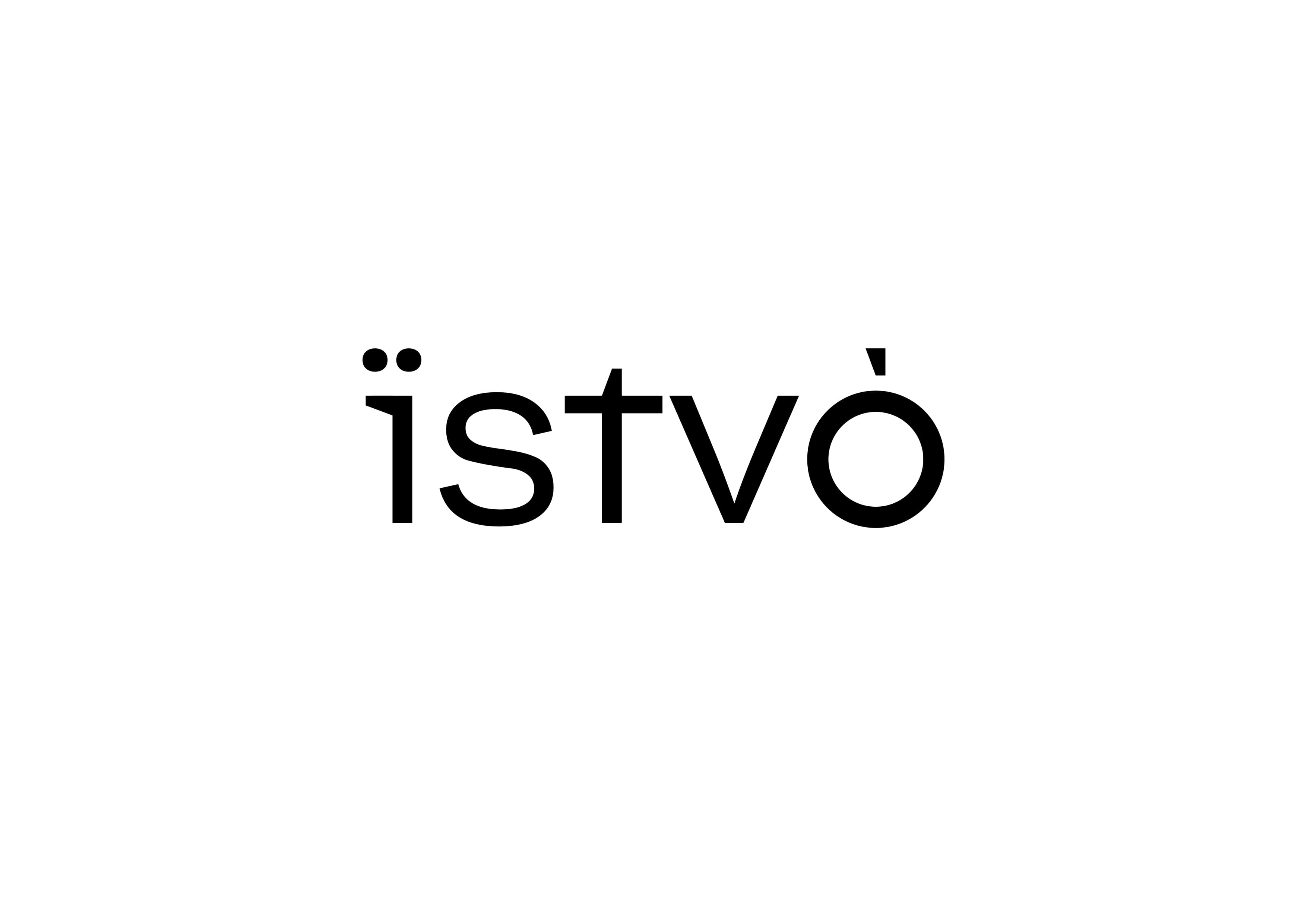
The logo itself was created from the brand naming. we emphasized the presence of the Ukrainian symbol “ї”, which is even more in contrast to the other characters in the Latin alphabet. in addition, we left the accent at the end of the naming, which emphasizes its authenticity.
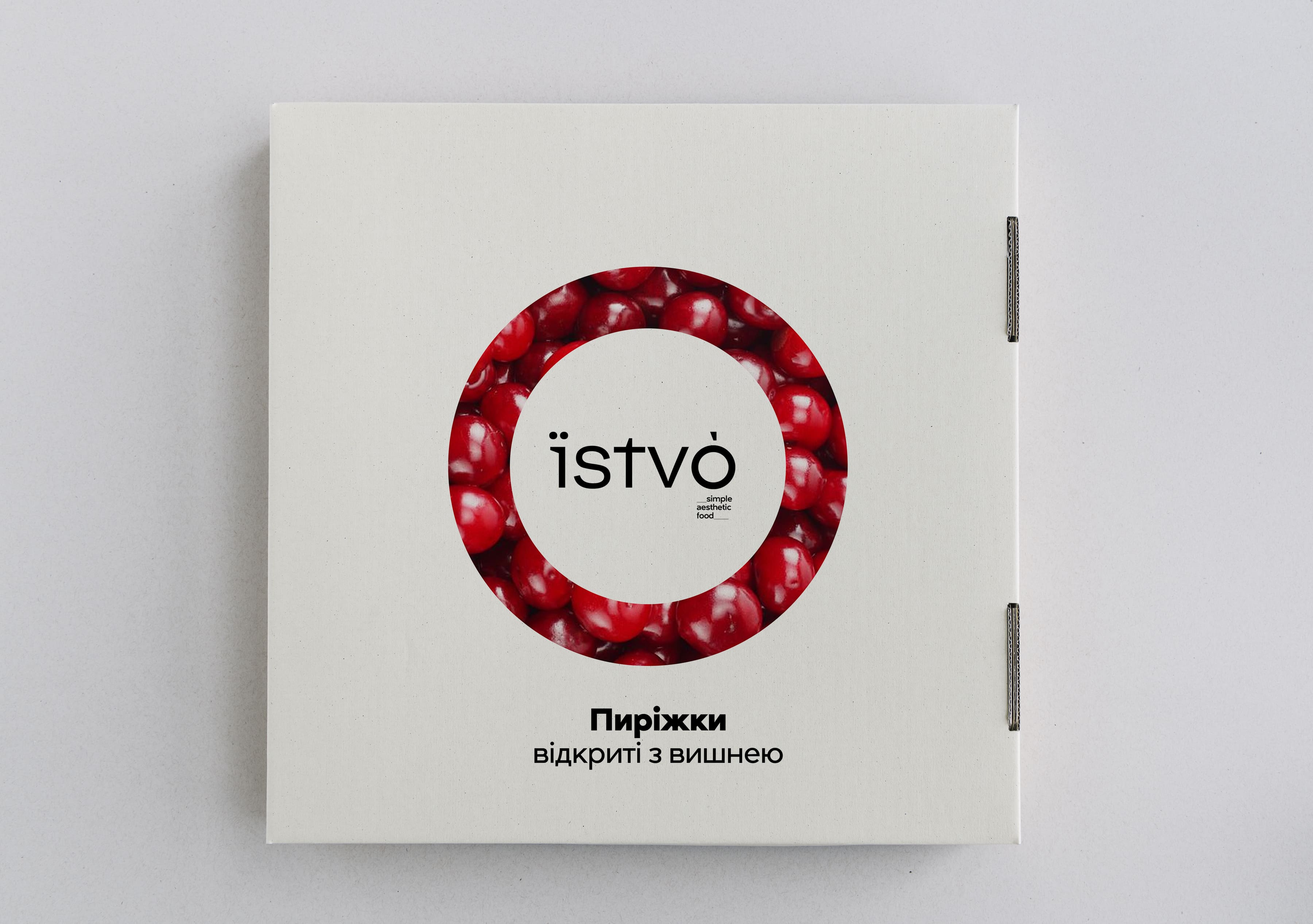
All the attention is focused on the final element of the naming, which is hit by a syllable and is reminiscent of the shape of a circle.
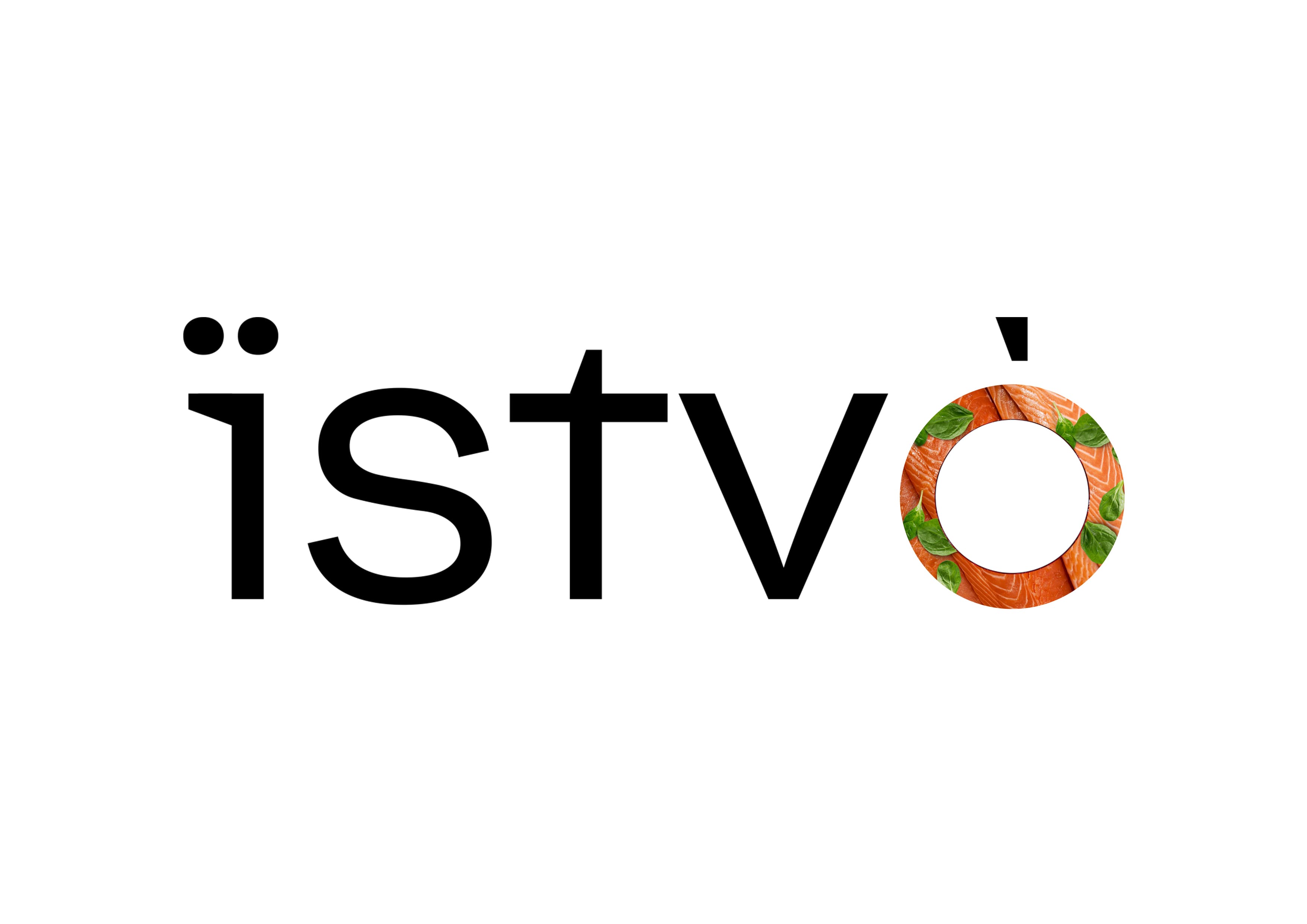
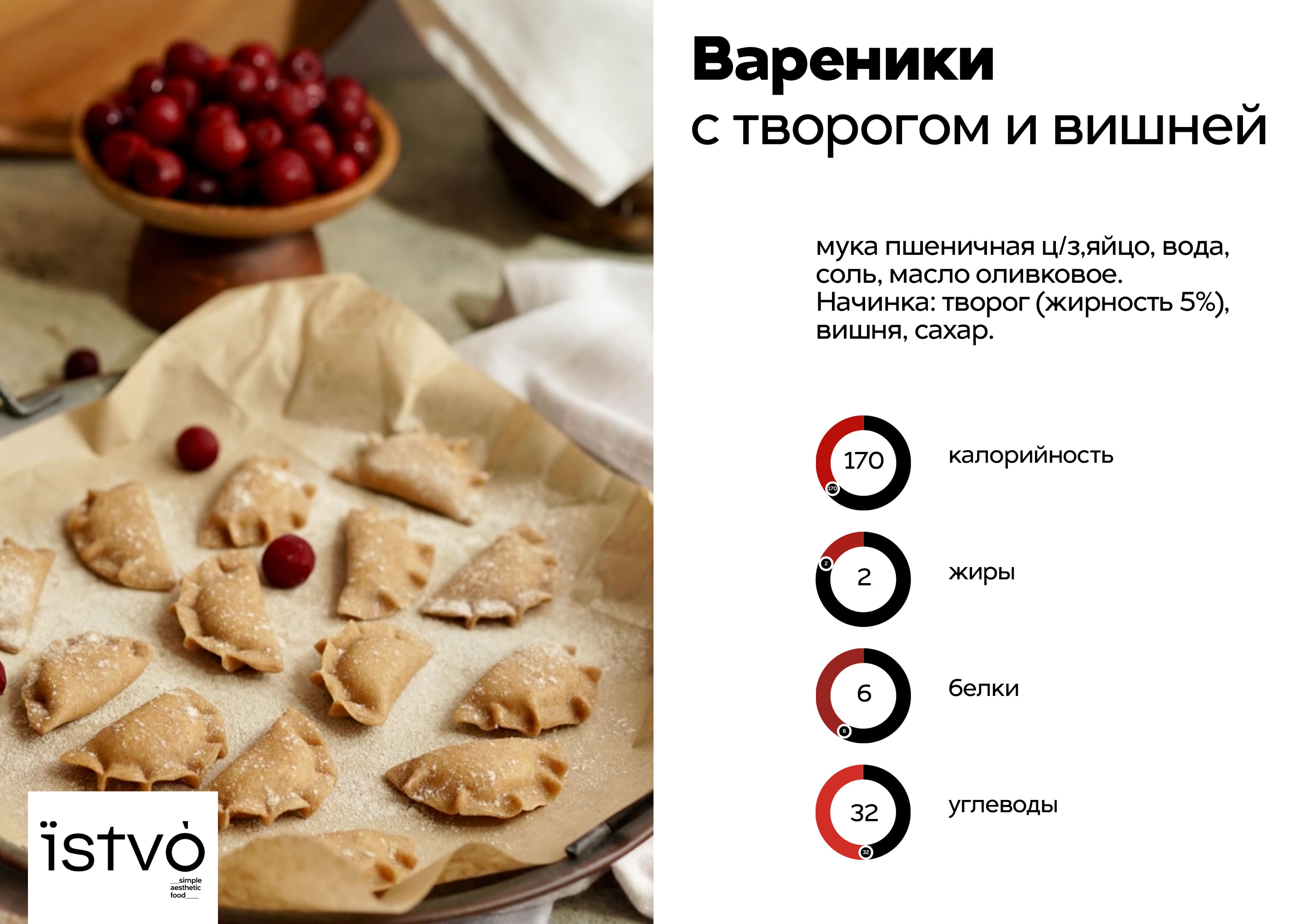
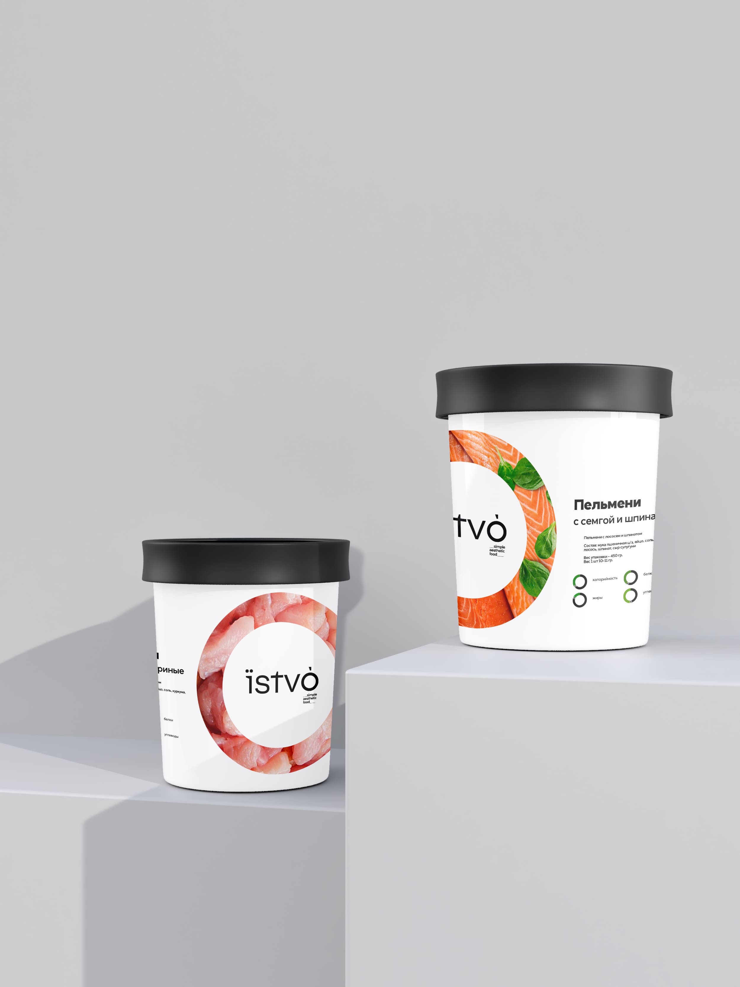
Filling is the main thing that distinguishes the ѕtvо brand from all sorts of competitors, so we bring these textures to the forefront graphically. Have you come across salmon and spinach dumplings anywhere? We haven’t.
And when you think that a nutritionist has compiled the recipe and calculated all the calories, carbs, fats and proteins, you’re in a tizzy.
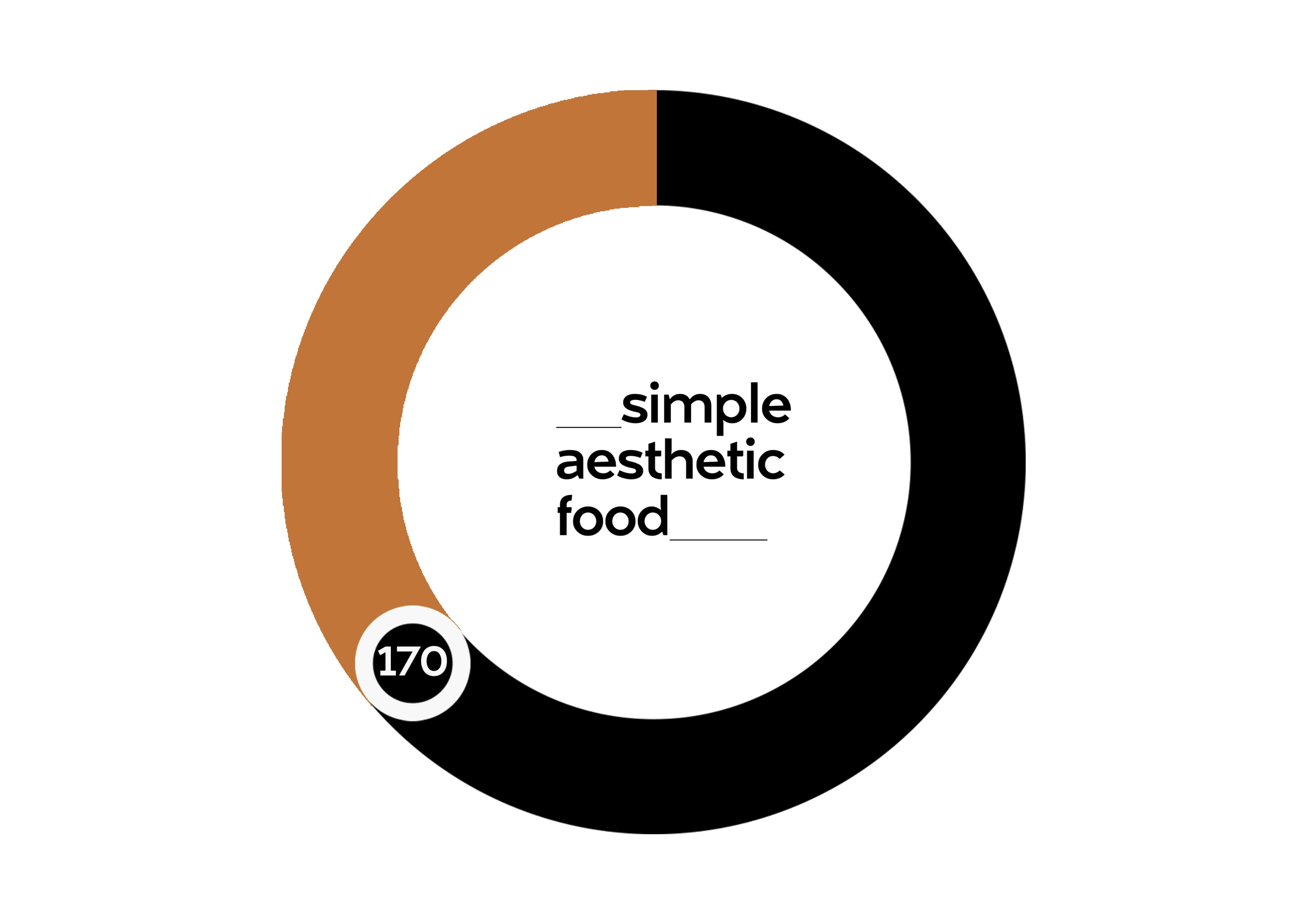
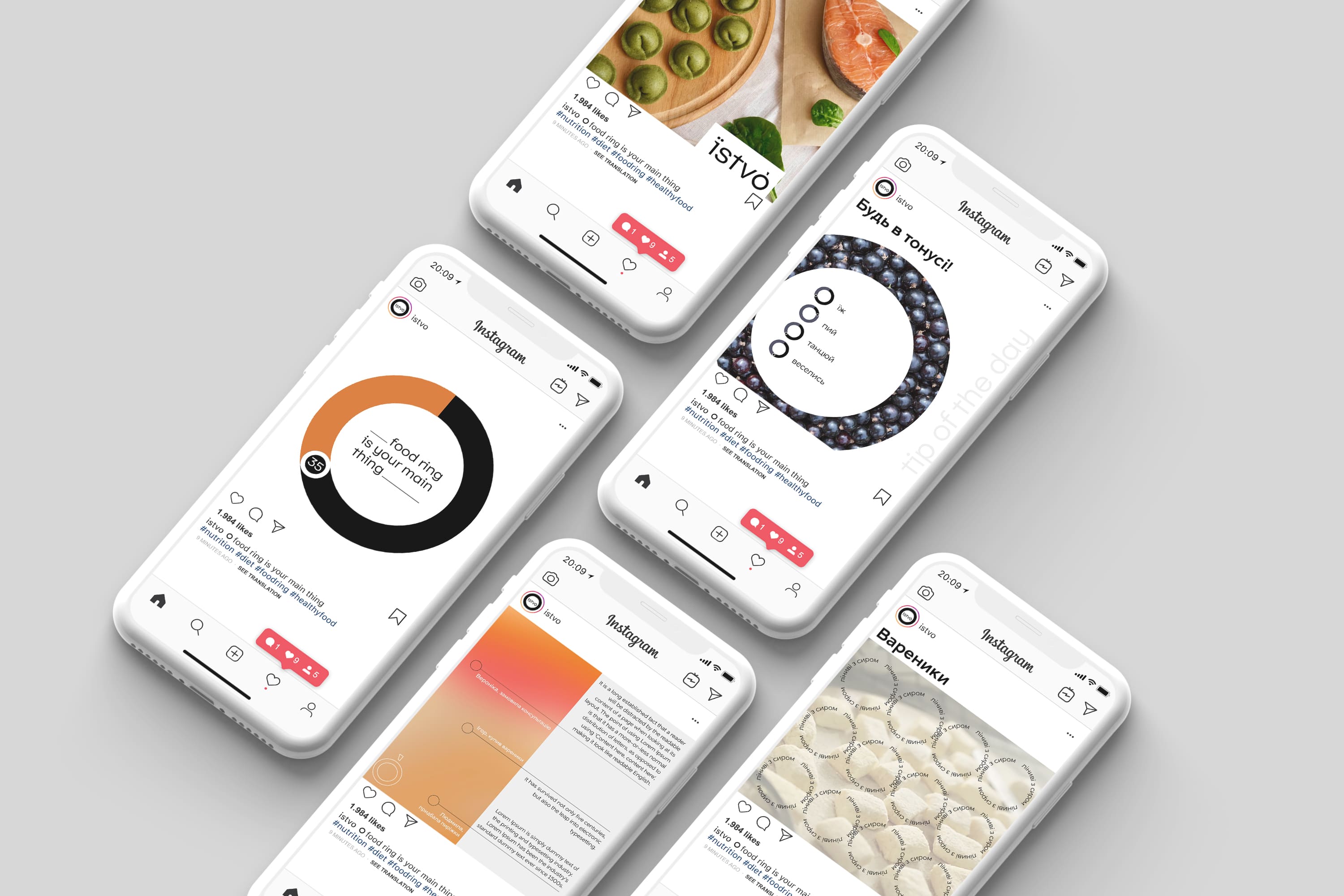
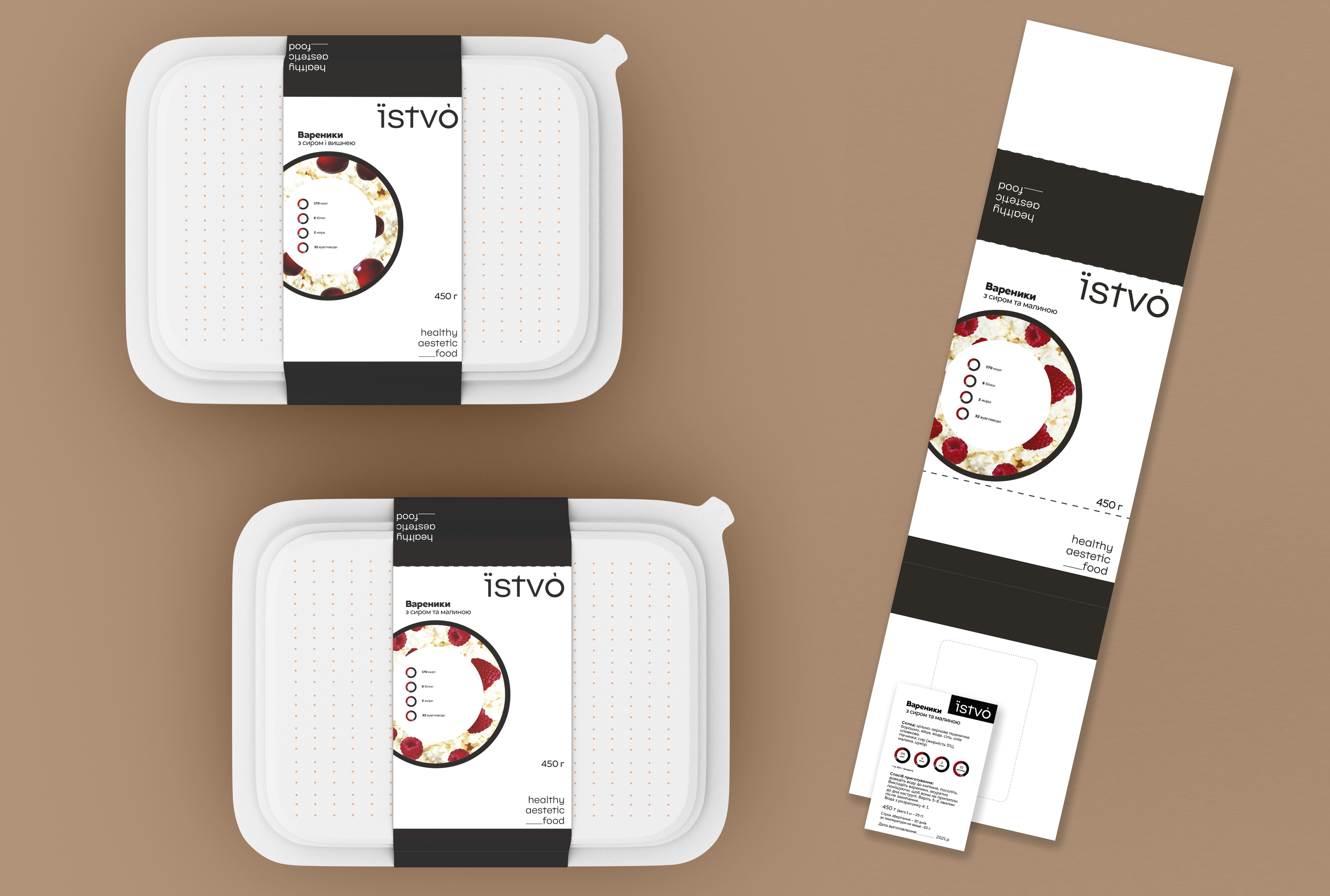
The circles are not only the basis for the unusual filling, but also a guide to the numbers in a balanced diet. These circles also form the nutrition rings of a balanced diet, in which all nutrition facts are recorded numerically. As a result, you can easily calculate how many nutrients you have consumed in each meal and distribute these nutrients throughout the day, week and onwards, according to the nutritionist’s recommendations.
Where do these circles come from? The basis and constant constant of the brand, the visual layout of which we present – the products themselves. as we have noticed, they are mainly made of dough, the preparation of which is a very laborious process. the most important message – they can be not only tasty, but also healthy, aesthetic and varied not only in filling, but also in their appearance. Our aunts, mothers and grandmothers used tumblers to create the shape of the product, like dumplings and dumplings. Moreover, in the logo itself we meet not only the symbol “o” but also the dots over the “¿”.
A variant descriptor. We would like to focus on the prefix simple, which is at the heart of the brand – simple, nothing superfluous – and gives associations with home food, not with complicated molecular cuisine. Aesthetic, on the other hand, continues the line towards healthy, wholesome food without shouting it out loud.
The combination of a purely achromatic gamut in the brand identity works as a counterbalance to the delicate and delicious product photos, ultimately forming a cohesive visual identity for the branding and complementing each other.
The packaging products themselves and their appearance may vary from future tasks: dimensions, desired shapes, texturing
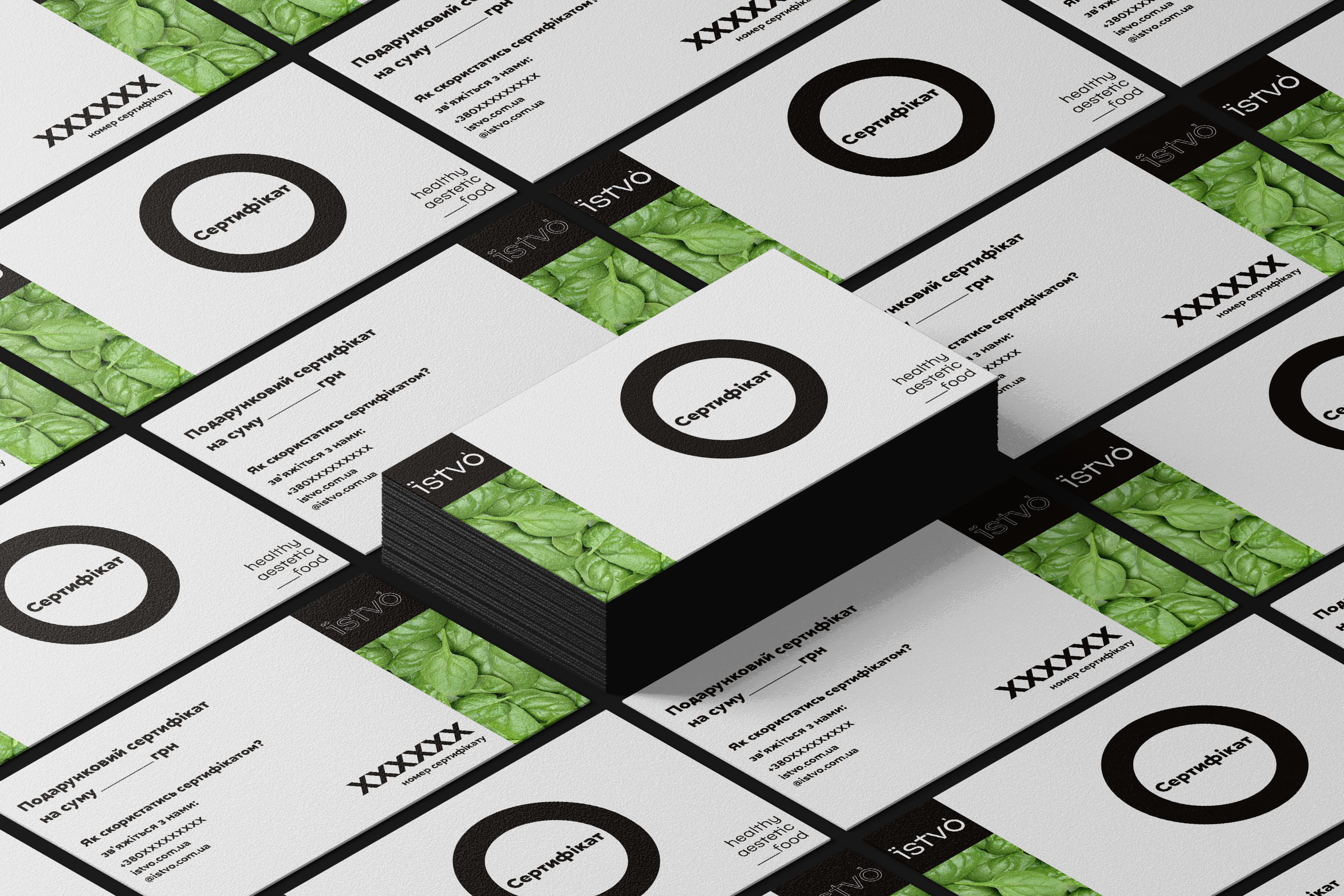
but the continuation of the radial compositions will reinforce the brand in the consumer’s mind. In order not to buy “a pig in a poke” and at the same time not to mix and match labels and products themselves, such packaging options are possible. Radial shapes, iconography, logo and a tasty circle of filling are the basis for all sorts of box variations. It can even be transparent to show the product itself inside.
CREDIT
- Agency/Creative: Kontora Design Agency
- Article Title: Їstvó Brand Design by Kontora Design Agency
- Organisation/Entity: Agency
- Project Type: Product
- Project Status: Non Published
- Agency/Creative Country: Ukraine
- Agency/Creative City: Lviv
- Market Region: Europe
- Project Deliverables: Advertising, Brand Creation, Brand Design, Brand Naming, Packaging Design
- Industry: Food/Beverage
- Keywords: Semi-finished, Food, Circle, Products
-
Credits:
Art Director: Alexander Romanchuk


