


Task: to develop a brand platform for the brand and create a Zytlyn brand identity based on the updated image.
Background
Where technology meets tourism, we can get acquainted with the brand Zytlyn – AI ML, a startup specializing in data forecasting in the tourism and hospitality industry. Based on these forecasts and data, companies make management decisions to optimize.
It is a complex niche, an incomprehensible product. How can we explain to the market the importance of the data obtained from the forecast? We had analytics and creative thinking in our arsenal.
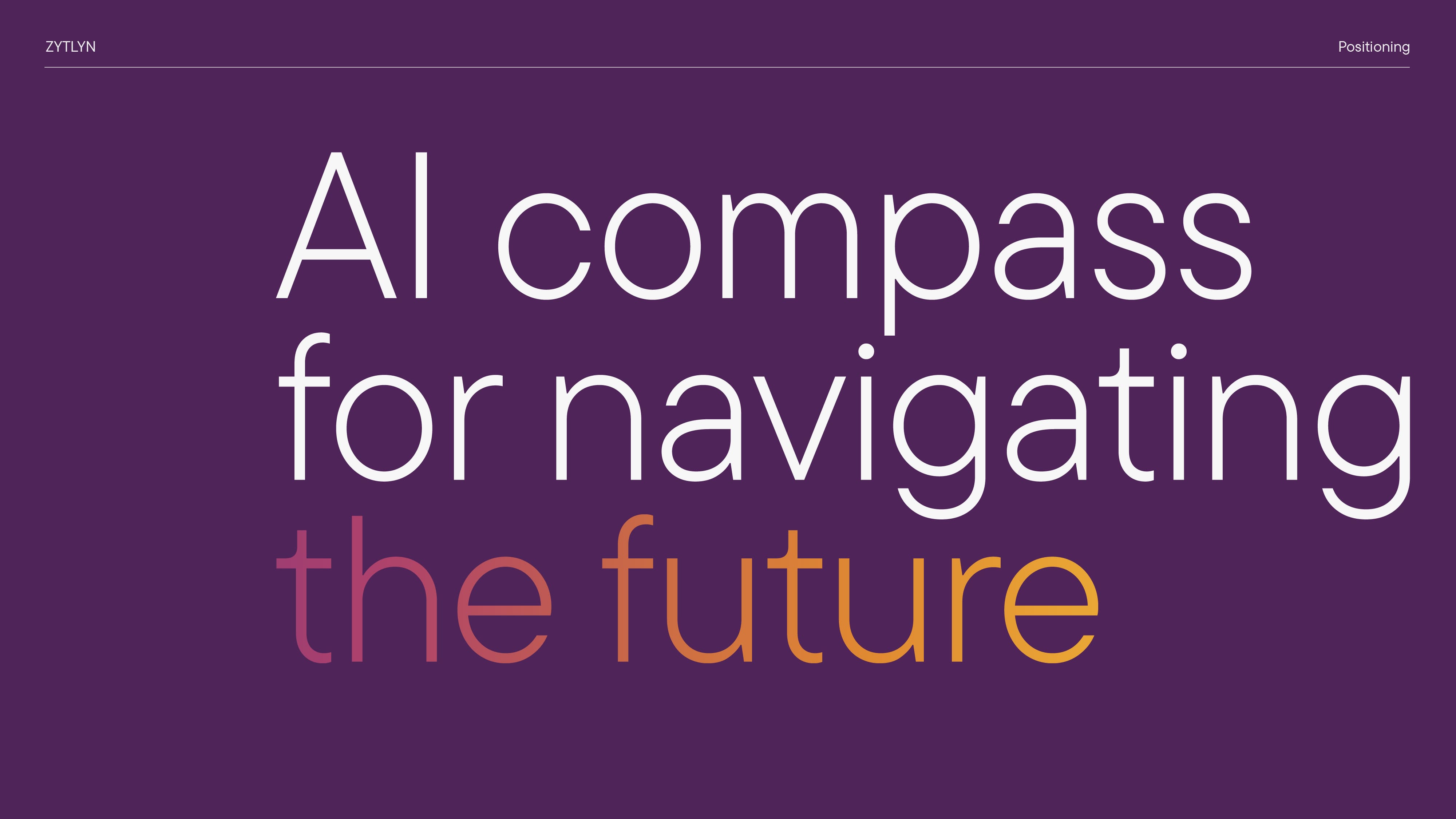
The way Zytlyn, by providing forecast data to its customers, points them in the right direction in terms of management and development is like… a traveler’s compass.
This simple but spacious and understandable allegory formed the essence of the updated brand positioning: AI compass for navigating the future. They guide companies toward a thriving future by showing the way through a complex decision-making landscape.
Brand identity
Many explicit and implicit meanings are intertwined in the visual representation of Zytlyn.
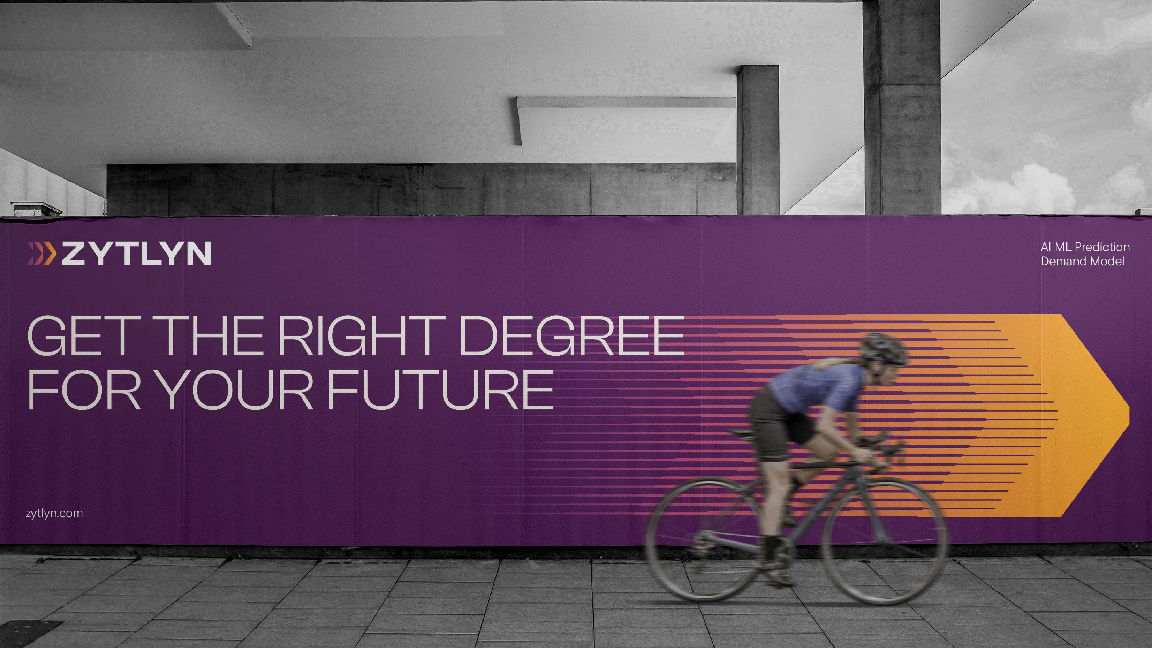
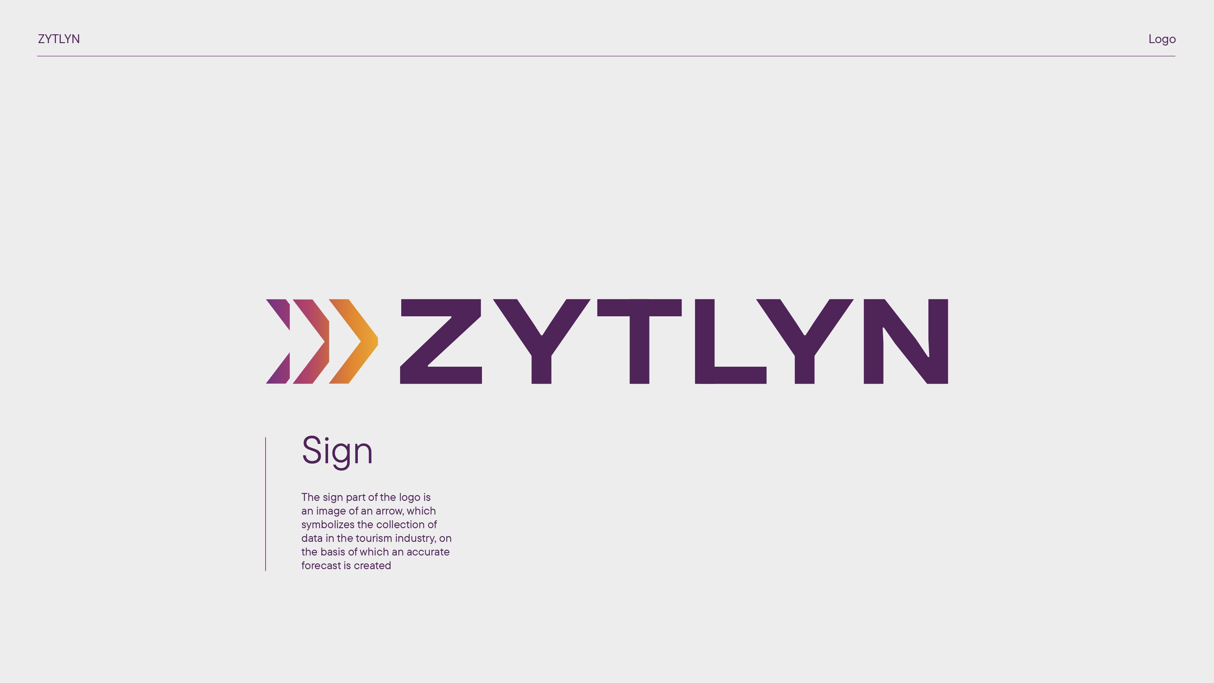
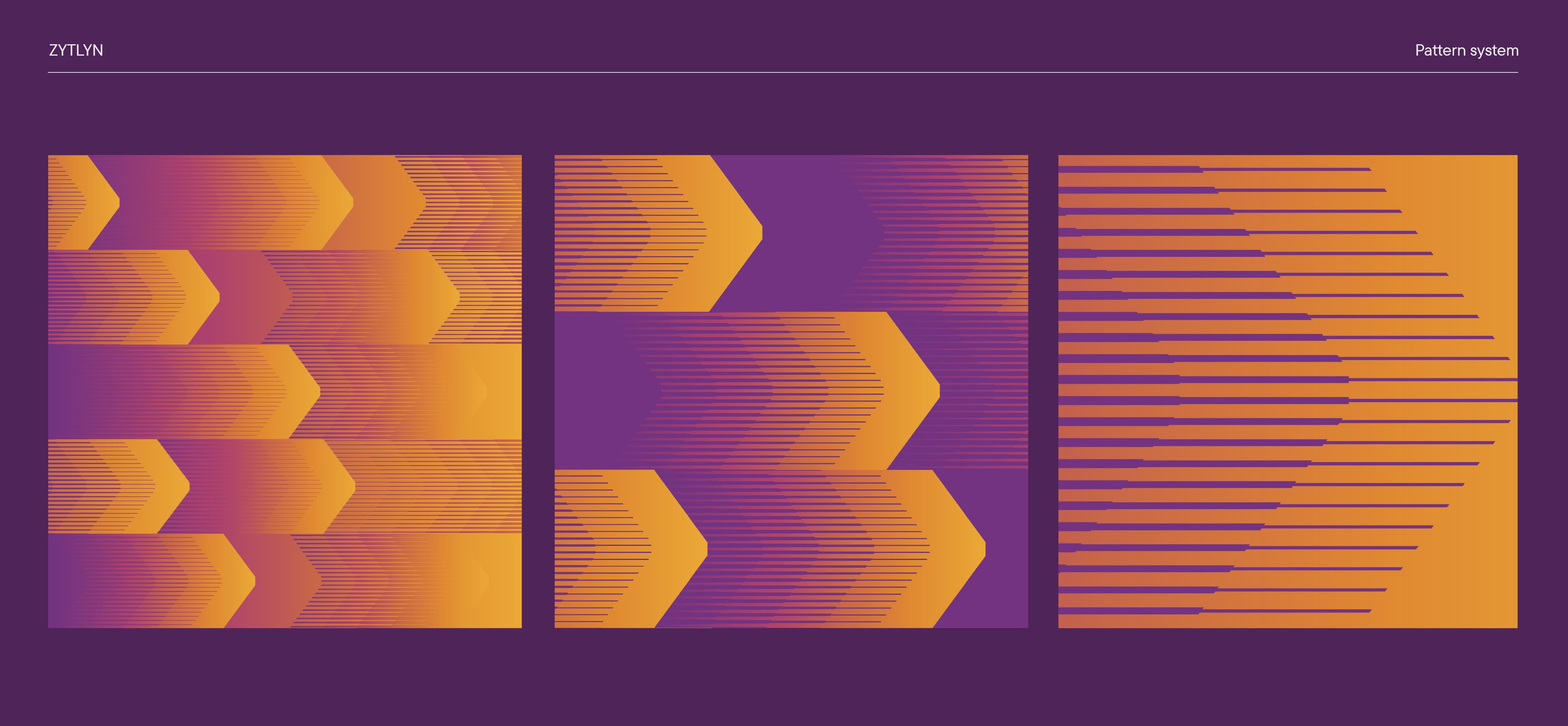
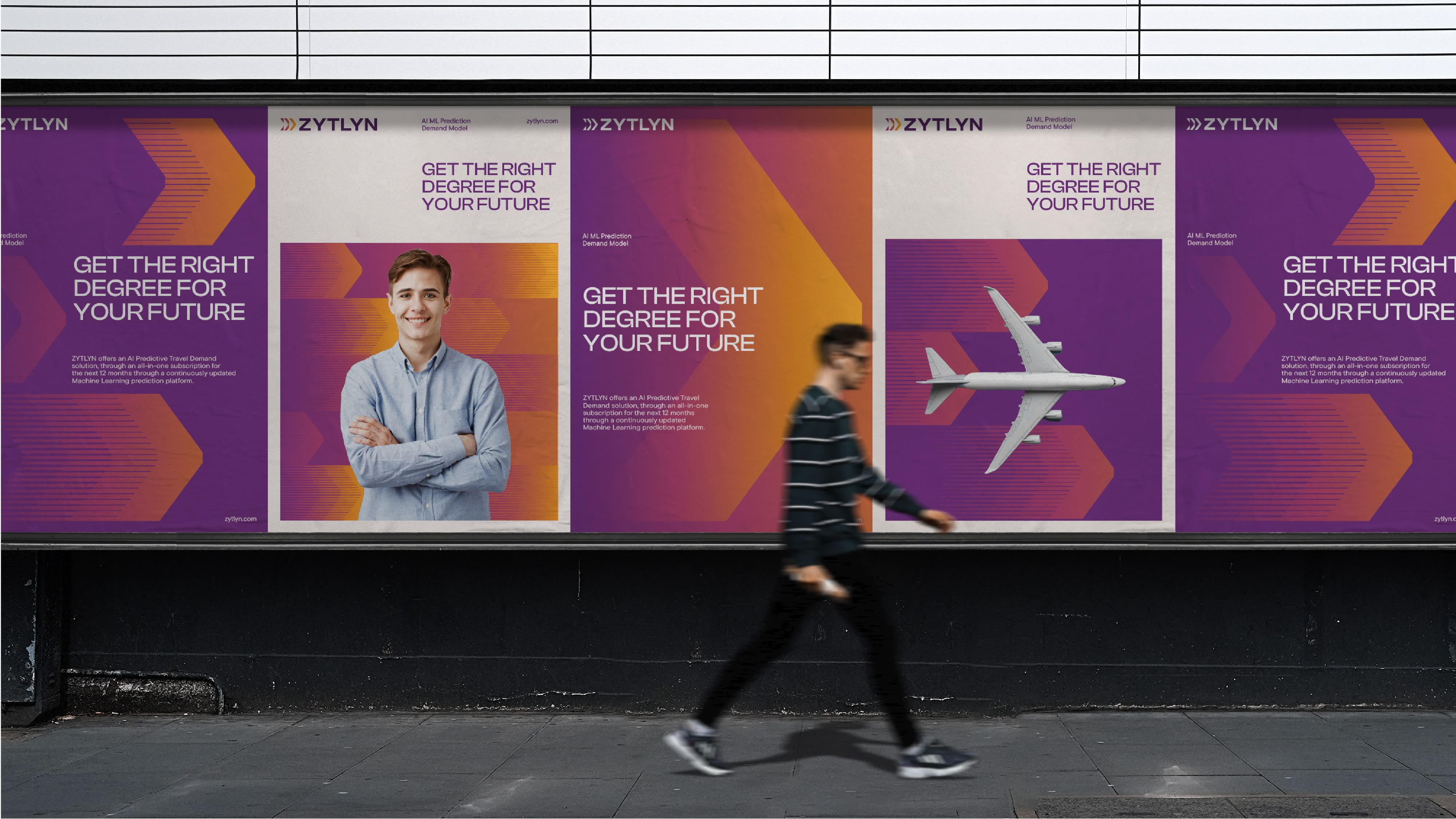
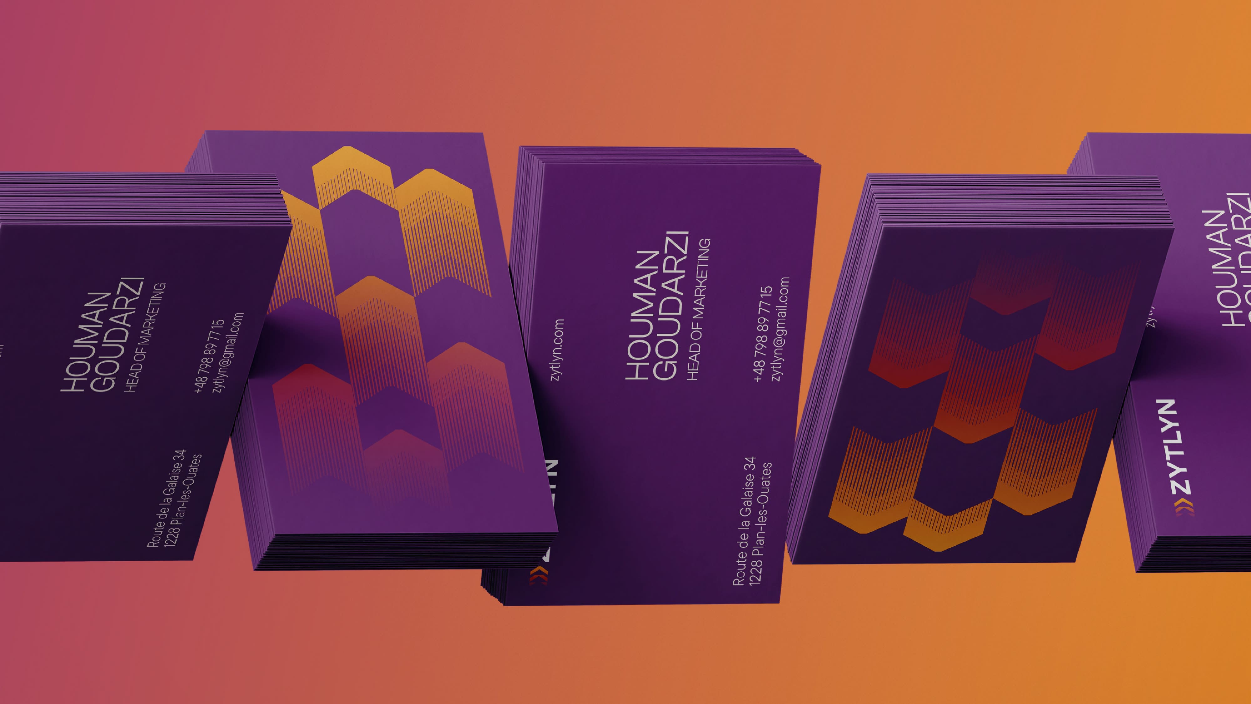
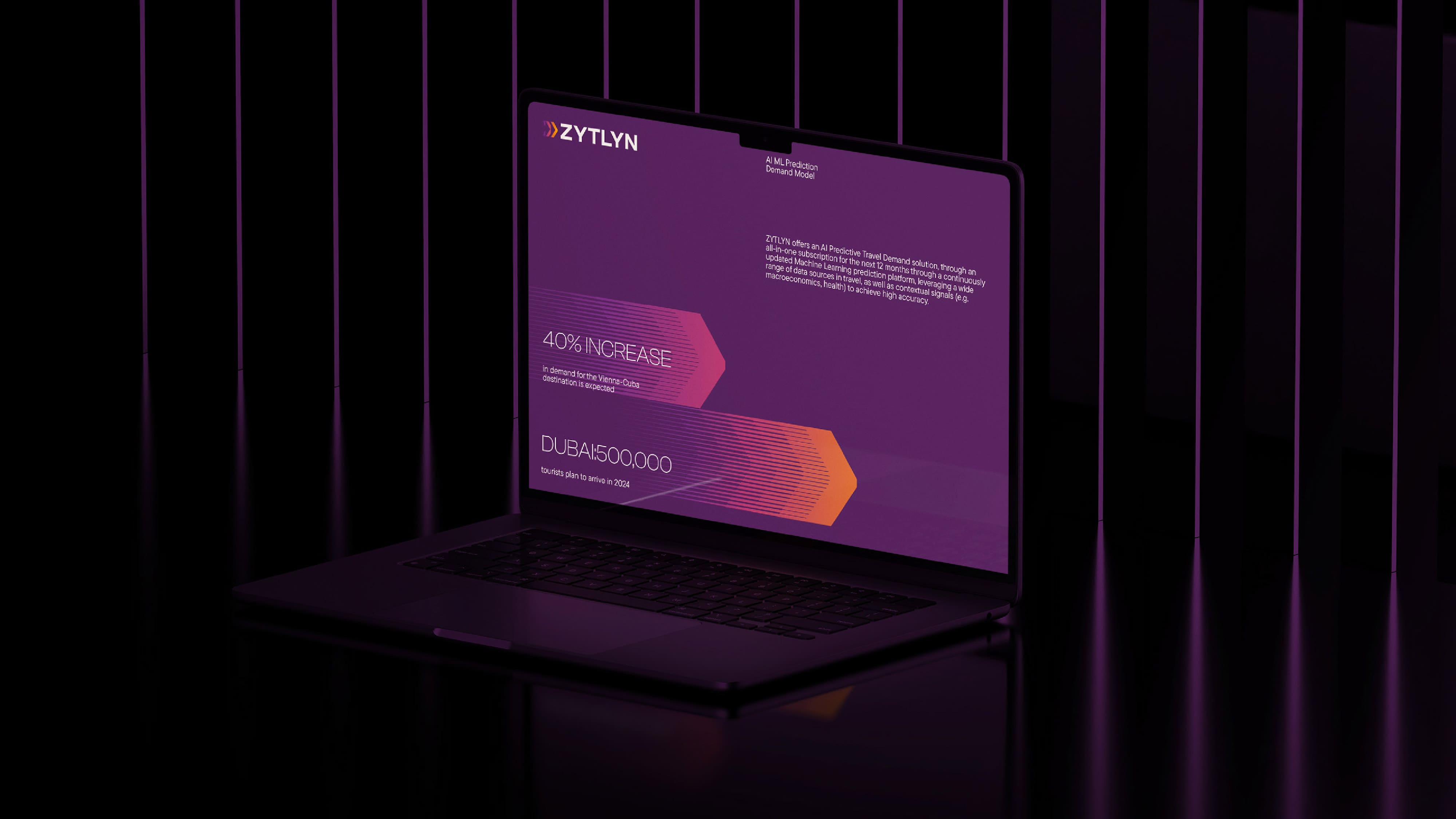
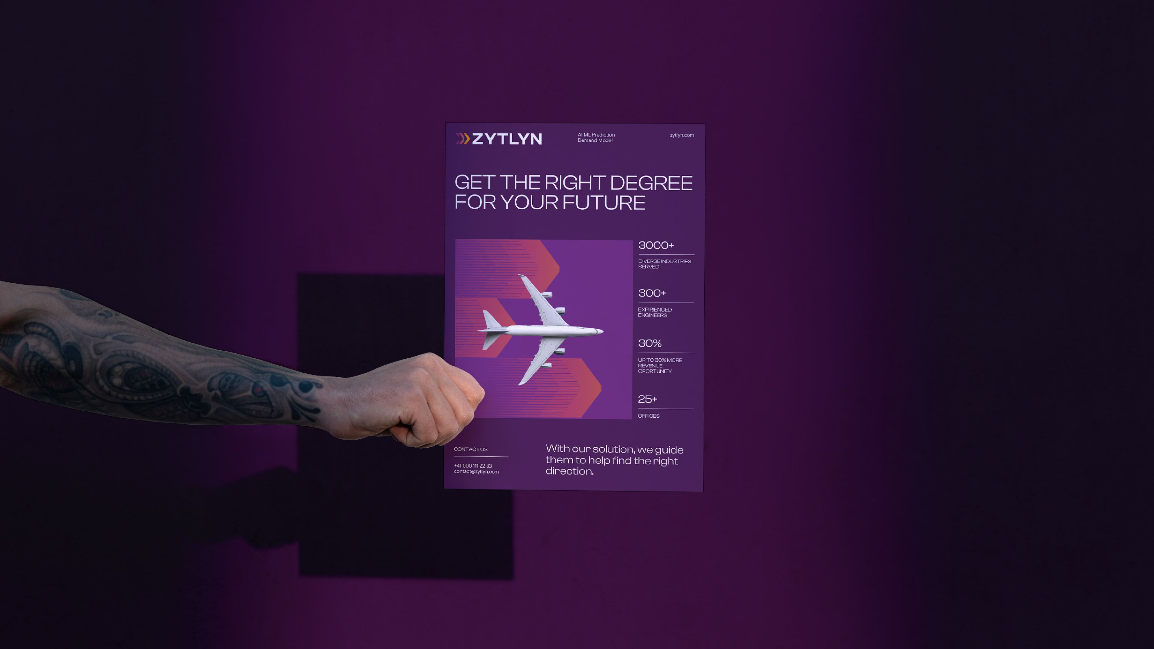
The brand logo was created to be minimalistic and versatile, but at the same time, the symbol reflects the essence of data collection and processing, and the arrow indicates the direction of the correct movement for the brand – this is how we remember the positioning and insight about the compass.
The elements of corporate identity reveal more about the process of «data collection» and thus give the brand dynamism and adaptability. So, a whole pattern was created in the gradient, which immediately provides movement.
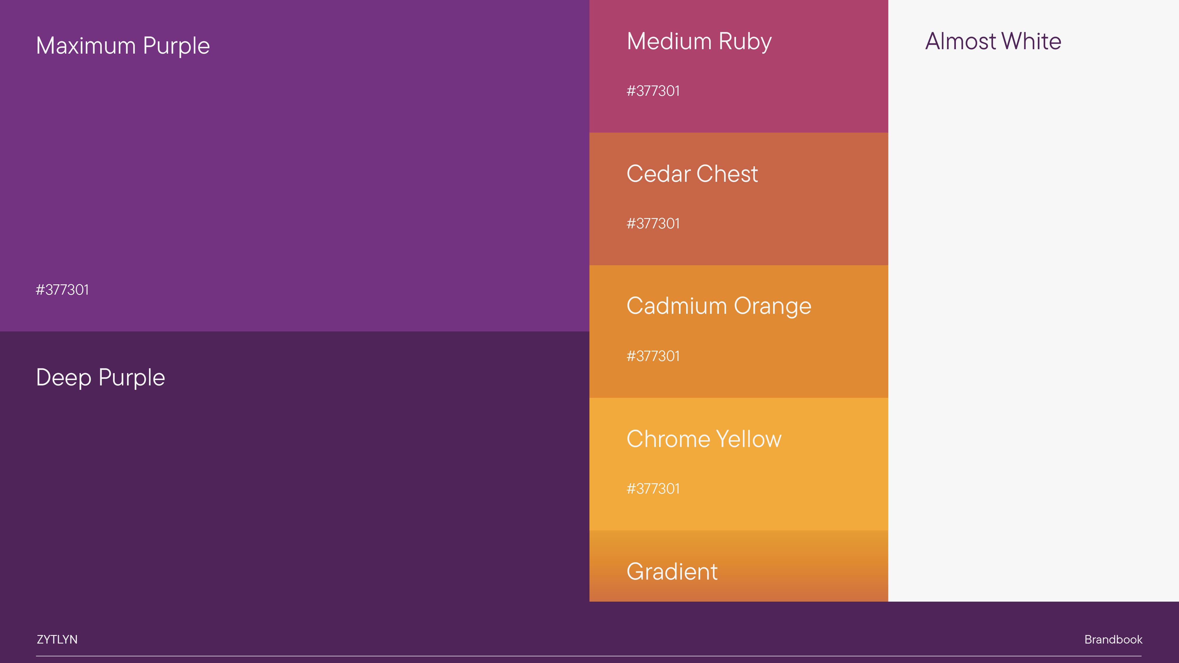
The color palette was also chosen to stand out from the competitive environment.
As shown by the design research and design session, most technology companies use shades of blue or dark colors. We decided to stand out and create new meanings in the category – that’s why warm yellow and accent purple are present in the palette, inspiring trust and emphasizing the brand’s professionalism.
It was also essential to make corporate identity elements universal; thus, the created arrows and patterns can be adapted and used in data presentation and infographics while maintaining the integrity of the brand image.
CREDIT
- Agency/Creative: Moloko Creative
- Article Title: Zytlyn Brand Identity: Navigating the Future
- Organisation/Entity: Agency
- Project Type: Identity
- Project Status: Published
- Agency/Creative Country: Lithuania
- Agency/Creative City: Vilnius
- Market Region: Global
- Project Deliverables: Brand Strategy, Identity System, Rebranding
- Industry: Technology
- Keywords: Branding, identity development, IT
-
Credits:
Creative Director: Denis Misyulya
Brand Strategist: Darya Ivashka
Art Director: Anna Mikhnevich
Designer: Maxim Baranov


