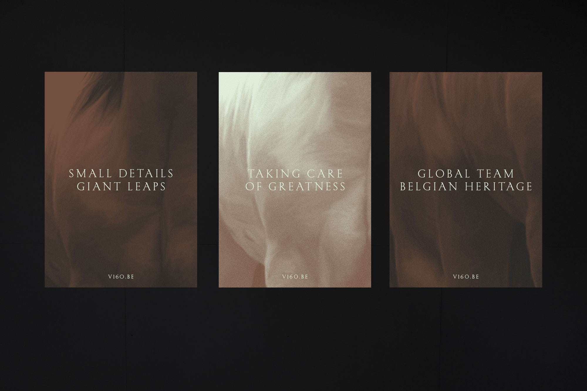
V160 provides the highest standard in veterinary care, founded on the highest level of attention and diagnostics. Their premium client roster includes multiple Grand Prix and Gold medal winners around the world.
The work of a DVMs often remains unseen, but it plays an important role and has an enormous impact on the life & success of a horse and its team. “They actually co-create winners. That’s why we wanted to make the seldom recognised part of their role more recognizable.” says Zware Jongens’ Brand Strategist Cristina Garriga.
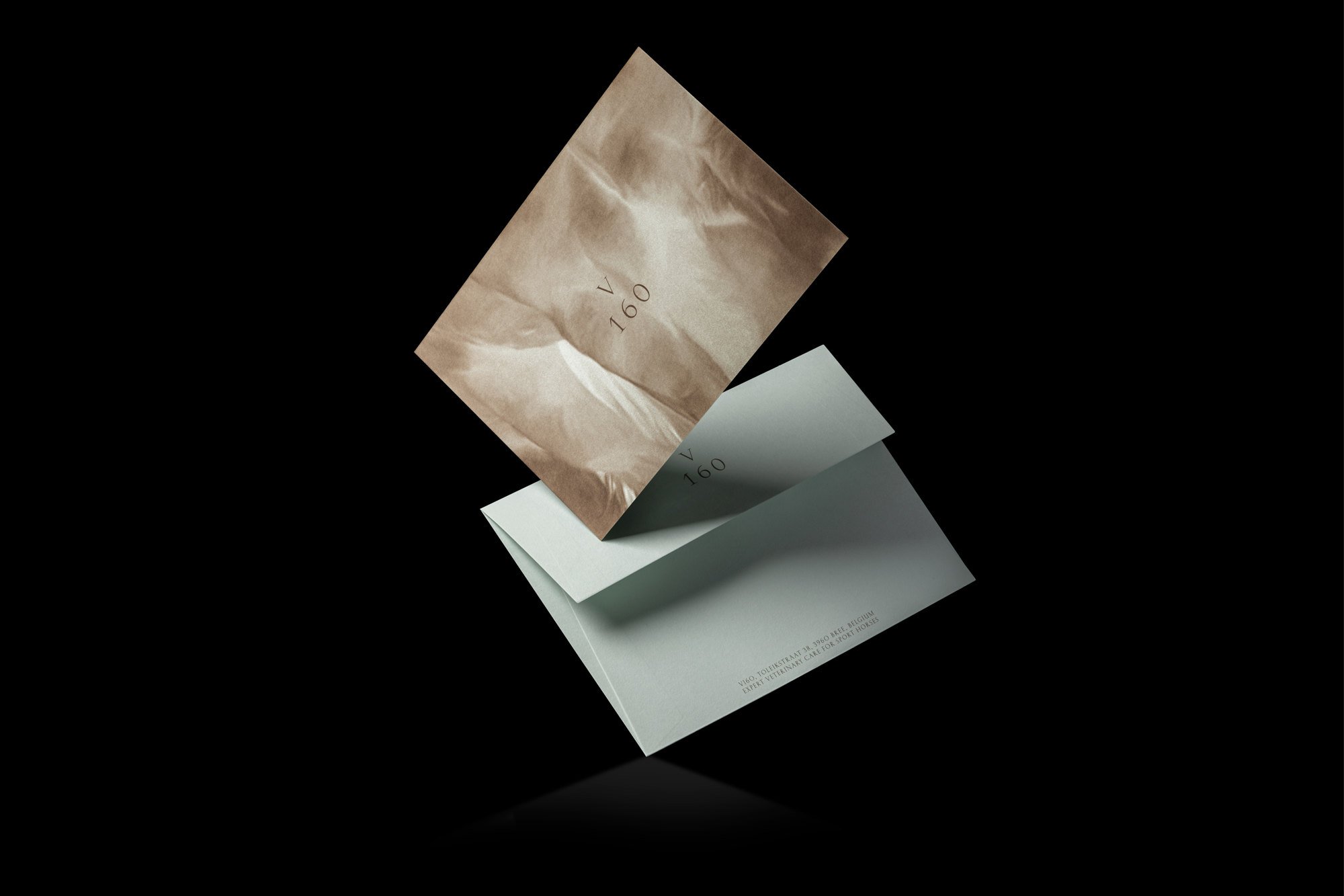
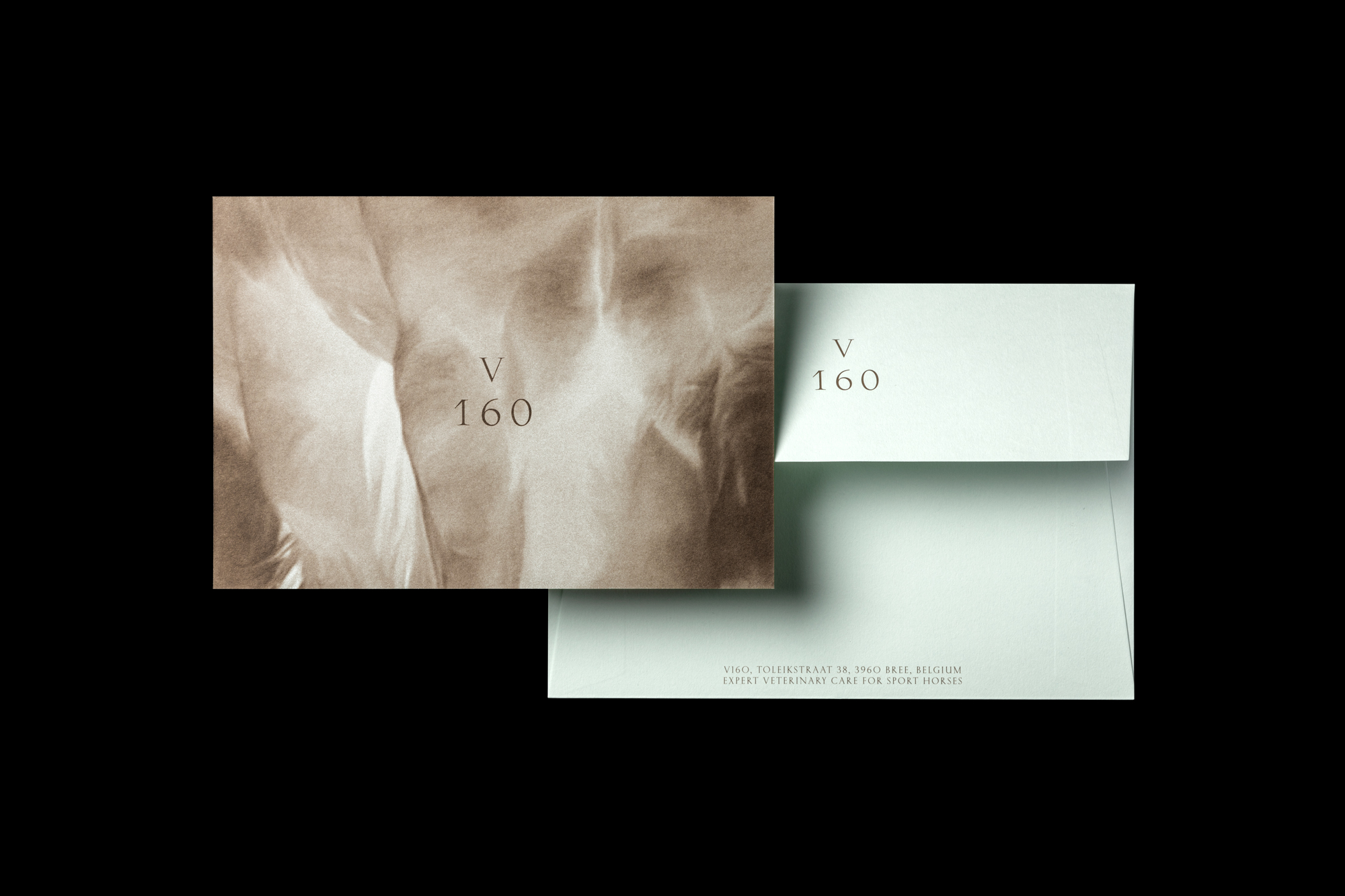
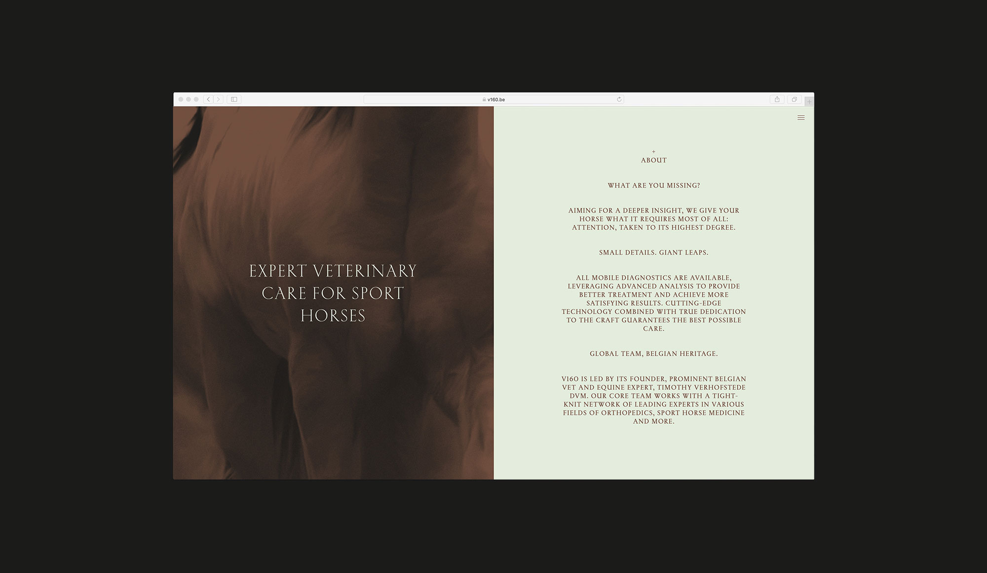
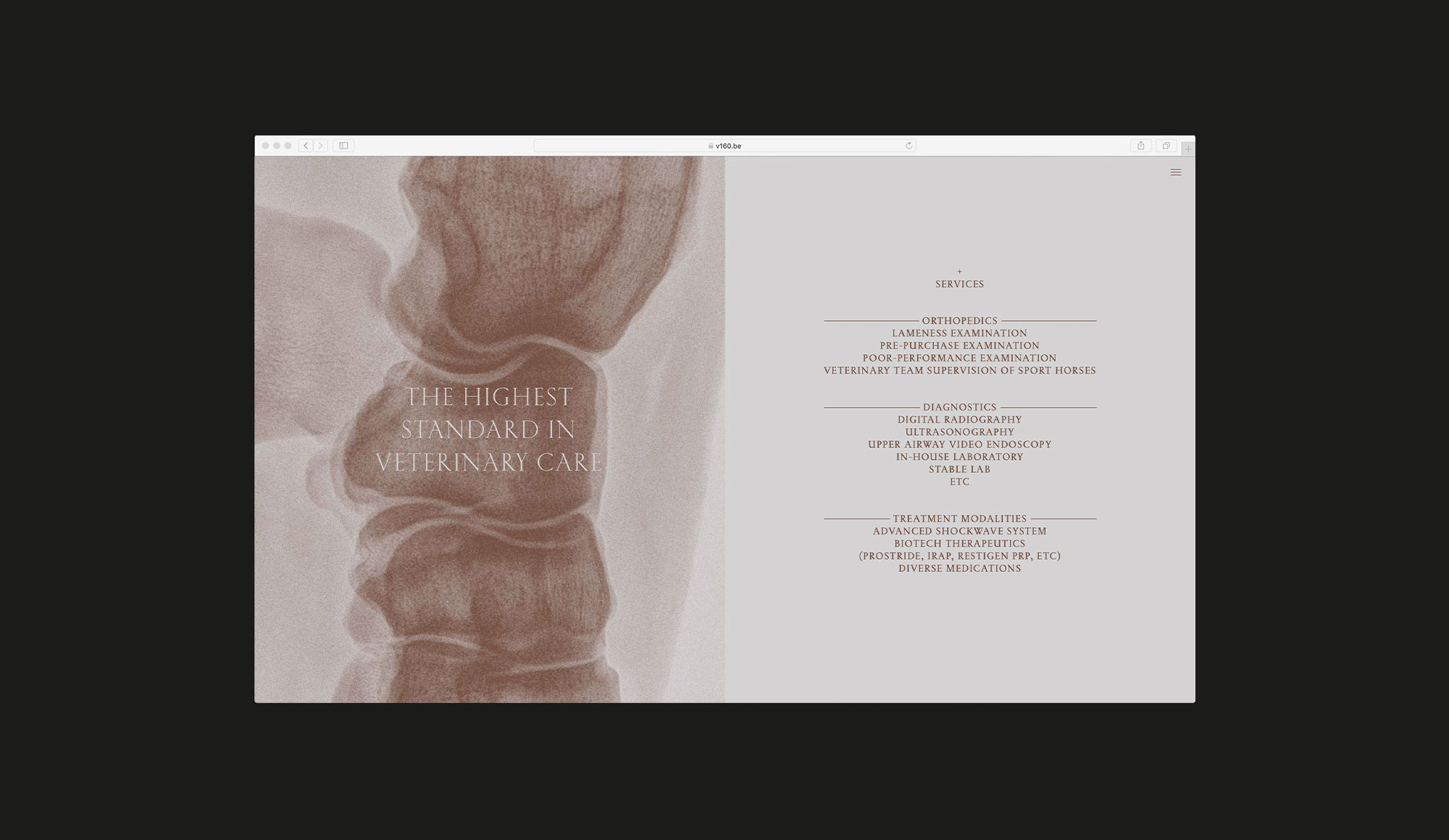
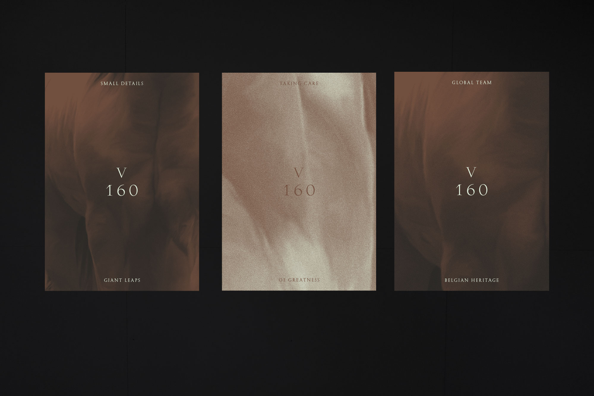
The branding concept is quite layered, both visually and conceptually. “Aside from having a sensitive character, the branding also contains a lot of details. For example, the lines & diagrams used in anatomy make hidden aspects more visible. The subtle lines that we integrated mainly refer to this source. X-Rays also play an important role in the world of DVM’s. They often hold the mystery of what is happening for the horse, shown through subtle movements, emotions and needs. It happens through a seductive game of shadow and light. Of seeing and not being seen. This is what we wanted to capture in the visual language. You can see this in the patterns & backgrounds we created,” adds Zware Jongens’ Cristina Garriga.
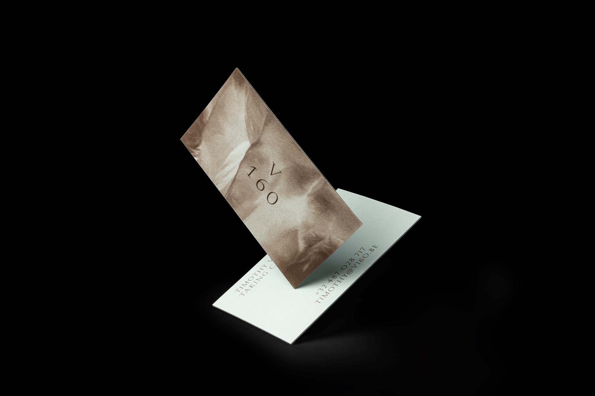
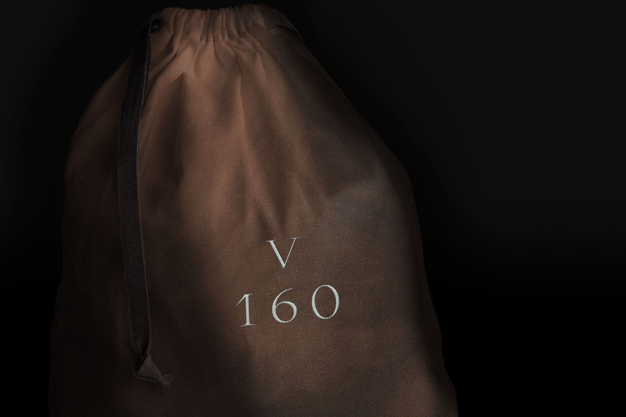
The shape of the logo is a combination of 2 elements: the horse’s hoof sole & the typical movement of a jumping horse. The supporting font choice – Kessler Super Display – refers to the medical diagrams, lines and symbols. The typography system visualizes class and has a winning feel.
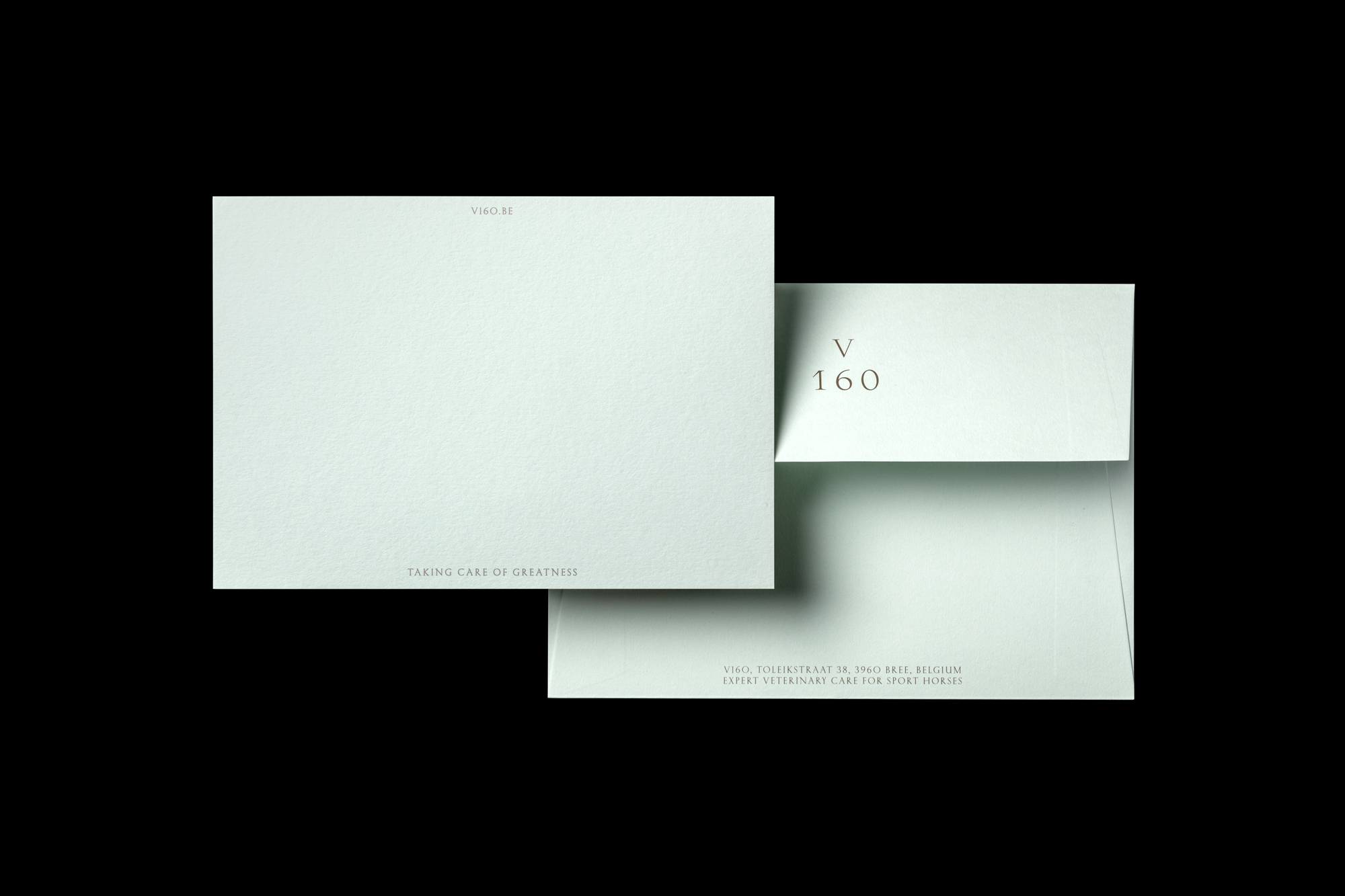
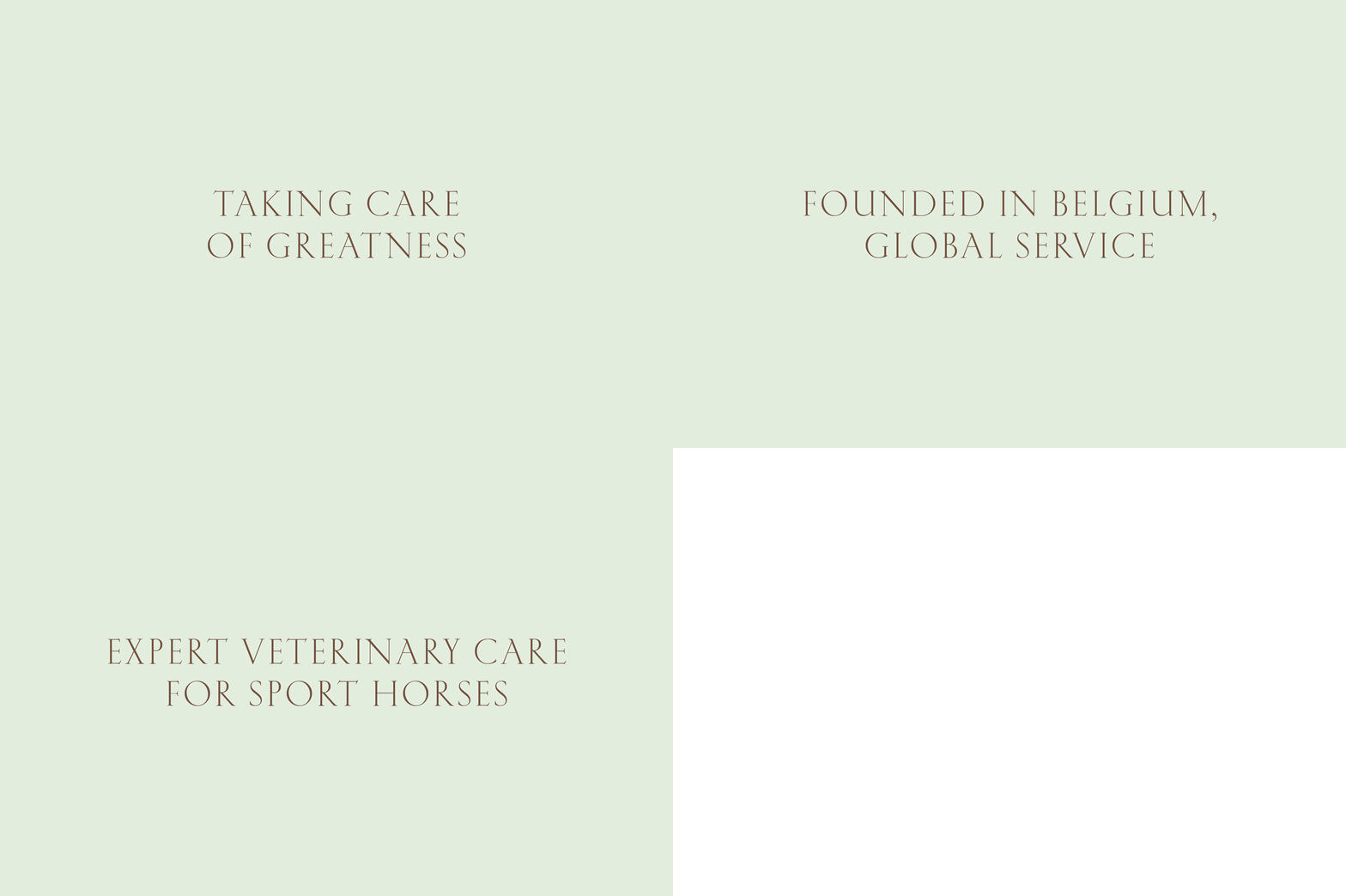
The visual colour palette holds a combination of a few subtle & fresh tones. Light green & dark brown, complemented by a few grey & anthracite tones. To get a premium brand expression, Zware Jongens collaborated with UK-based paper company G.F. Smith and their beautiful Colorplan collection.
The name?
The ‘V’ in the name not only refers to the name of the founder, a prominent Belgian vet and equine expert, but also to ‘V for Victory’. V160 helps their clients win. Not just short-term, but long-term, too. 160 as a number refers to the highest possible jump in show jumping. It sets the tone for the level V160 & its clients are performing at. The best of the best. The tagline ‘Taking care of greatness’ obviously says a lot about the respect the V160 team has for its clientele & their horses. “It’s a genuine brand expression, incorporating both a heroic & an emotional feeling.” explains Garriga.
“We are very happy with the end result. Zware Jongens guided us in a super professional way throughout the whole process: from concept to naming strategy, to visual identity, the creation of the story & the implementation of it all. I must admit it’s quite exciting – and sometimes even a bit scary – putting the future of your company in someone else’s hands. However, I do think it’s a matter of trusting the partner you’ve selected. In the end you chose them for a reason so trust should be a given. The totality exceeds our expectations. It feels mysterious, pays attention to detail (just like we do on a daily basis), it’s very elegant & has a heroic touch,” declares T. Verhofstede, founder of V160.
CREDIT
- Agency/Creative: Zware Jongens
- Article Title: Zware Jongens Brands World-Stage Sport Horse Veterinarians
- Organisation/Entity: Agency, Published Commercial Design
- Project Type: Identity
- Agency/Creative Country: Netherlands
- Market Region: Global
- Project Deliverables: Brand Identity, Brand Naming, Brand Strategy, Brand World, Branding, Identity System, Research, Tone of Voice
- Industry: Health Care
- Keywords: #olympics #sports #equine #horses #veterinary #care #premium #victory


