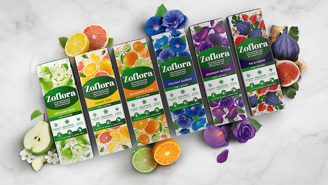
Consumers have a deep affection for Zoflora, Thornton & Ross’s disinfectant brand. The brand has a loyal customer base who have fallen in love with this versatile household product that has passed through the generations. However, with a new generation of Instagram-loving Zoflora fans and proliferation of ‘me-too’ products entering the market, it was time to revisit the brand’s range design and cement Zoflora as the market leader in the category.
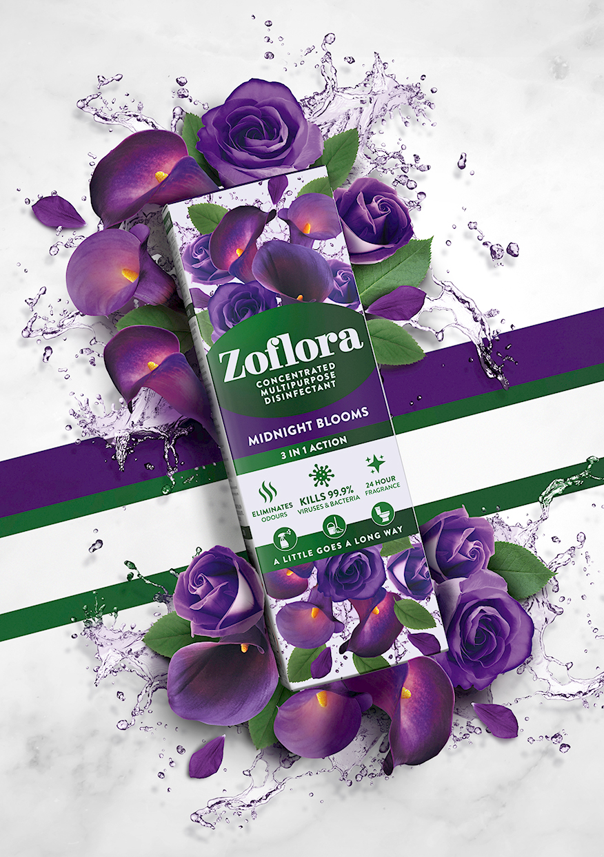
Zoflora is proudly manufactured in the UK and is the country’s leading disinfectant brand. It has been helping UK households stay safe from germs for almost 100 years. Its range of beautifully fragranced, perfumer developed, concentrated disinfectants is inspired by nature and represents the perfect partner for a hygienically clean home. The brand’s 3-in-1 action formula kills 99.9% of bacteria and viruses that can cause illness, whilst eliminating odours and filling homes with beautiful, long-lasting fragrance that lasts for at least 24 hours.
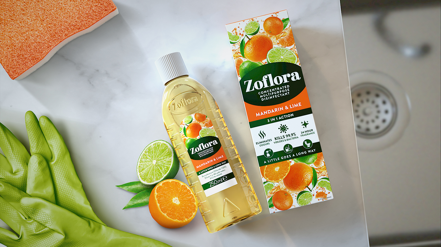
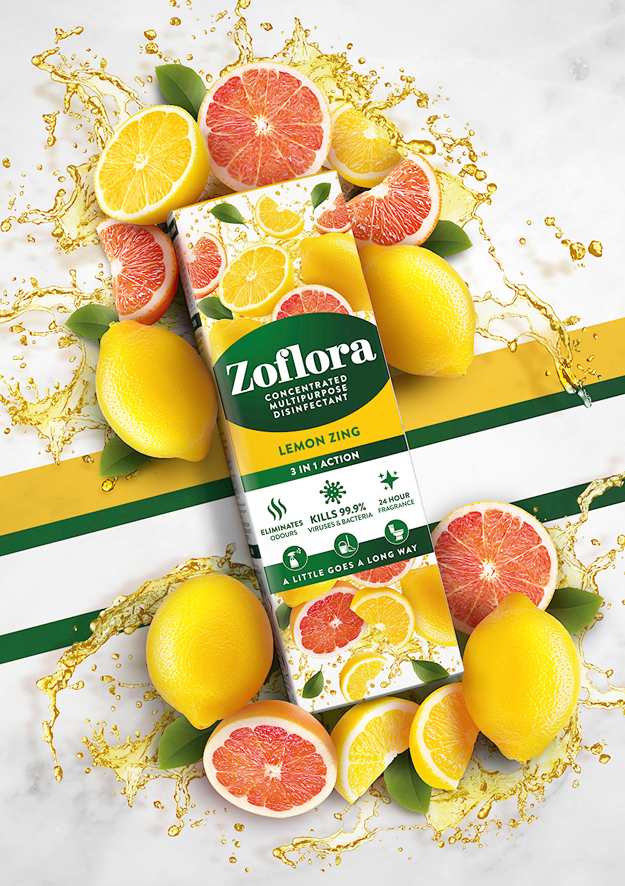
PB Creative was briefed to create a contemporary and desirable look and feel for the brand that was more appealing and relevant to new consumers, with increased stand out on shelf, but without alienating the brand’s existing and very loyal users. PB also sought to celebrate the abundance and explosion of ingredients within the products and champion the fragrance story of each variant, whilst still communicating the efficacious nature of the brand.
“This project has given us a great opportunity to upgrade and enhance the Zoflora brand.”: says Agata Racka, Design Director at PB Creative.
“We knew that the new designs would need to entice and resonate with all Zoflora consumers, both old and new. It was key that we kept existing consumers at the heart of the brand, whilst leveraging appeal and excitement for new ones.”
“With a unique and diverse range of ingredients, it was clear that we needed to develop a strong design system that was robust enough to work across a large number of fragrance variants, while giving us the scope to communicate a distinct product story that was easy to understand. The addition of the tag line, ‘A little goes a long way,’ helps to clarify the formulation’s efficacious and concentrated nature.”
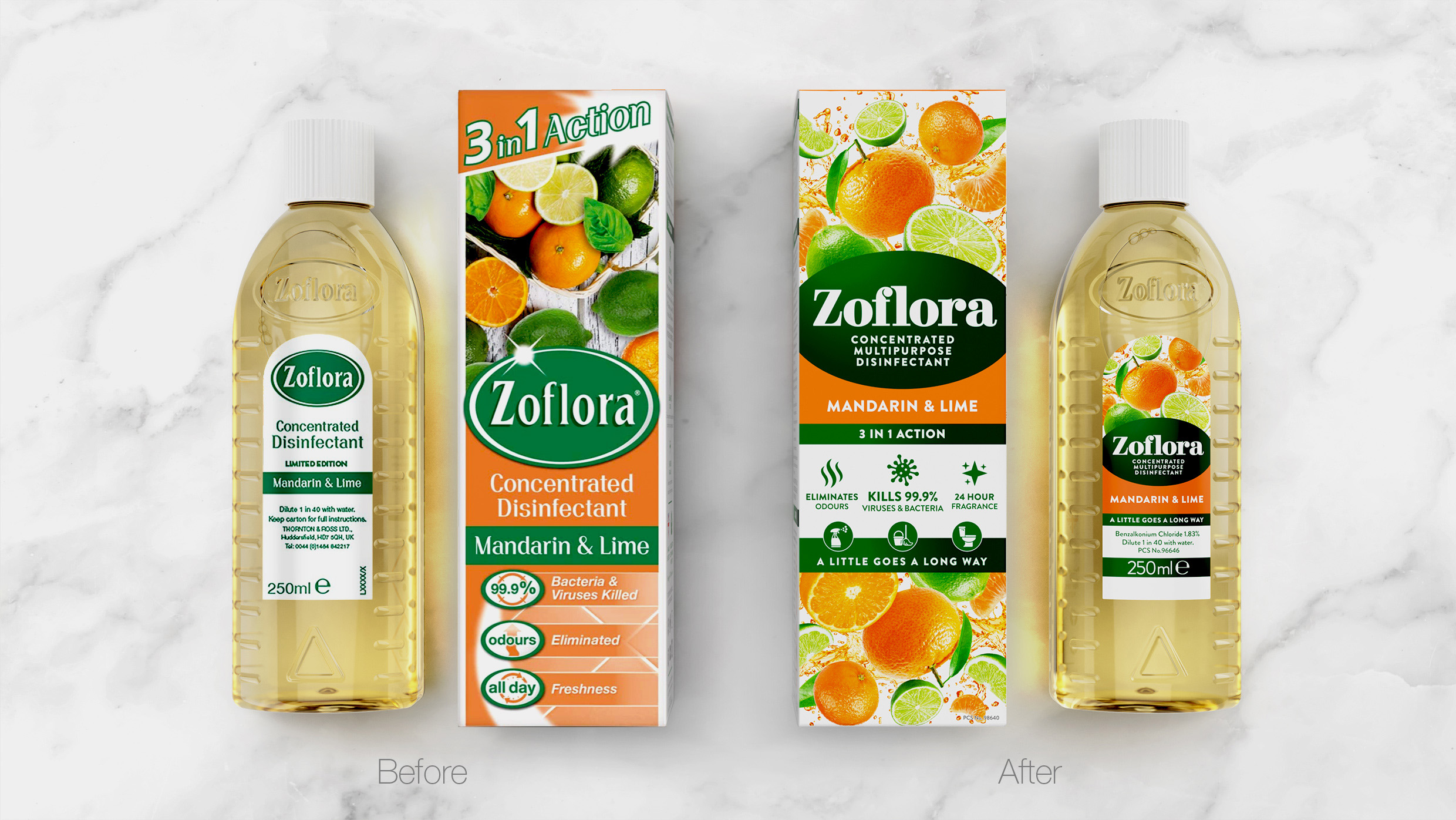
“By refreshing the Zoflora colour palette and enhancing the fragrance story (which wasn’t coming through as a USP previously), we’ve created a bold, fresh new range design that retains the brand’s uplifting personality, but now makes it more relevant and appealing to a new generation of Zoflora devotees. Our main challenge was to remain distinct and unique in an ever-growing category increasingly populated by copy-cat brands.”
Sarah Fozzard, Head of Marketing, Home Hygiene, Thornton & Ross added: “PB’s new range design for Zoflora delivers instant fragrance impact and product clarity – not an easy task for such a complex brand. The team has succeeded in modernising Zoflora without losing its distinctive character and whilst striking the difficult balance between fragrance and efficacy which we knew would be key to the success of the redesign. This new contemporary classic aesthetic will allow Zoflora to continue to lead in the category and to communicate clearly with a new generation of Zoflora consumers.”
She continued: “Now more than ever, we’re keen to highlight Zoflora as a brand that can help keep us protected as we go through these unprecedented times. Zoflora offers consumers an opportunity to create not only a hygienic, but also a welcoming space where they can all feel safe and comfortable.”
The new range design is being rolled out across 120ml, 250ml and 500ml formats this month and will launch across other markets throughout 2021.
CREDIT
- Agency/Creative: PB Creative
- Article Title: Zoflora Gets a Makeover for the Instagram Generation by PB Creative
- Organisation/Entity: Agency, Published Commercial Design
- Project Type: Packaging
- Agency/Creative Country: United Kingdom
- Market Region: Global
- Project Deliverables: Brand Architecture, Brand Identity, Brand Redesign, Branding, Graphic Design, Packaging Design, Rebranding
- Format: Bottle, Box
- Substrate: Plastic, Pulp Carton


