Zirca
In the vivid world of entertainment and artistic performances, few entities captivate the masses like a circus. Breathtaking acrobatics, mesmerising visual effects, and awe-inspiring storytelling have dazzled countless individuals. Zirca is a liqueur brand that captures this essence in its storytelling.
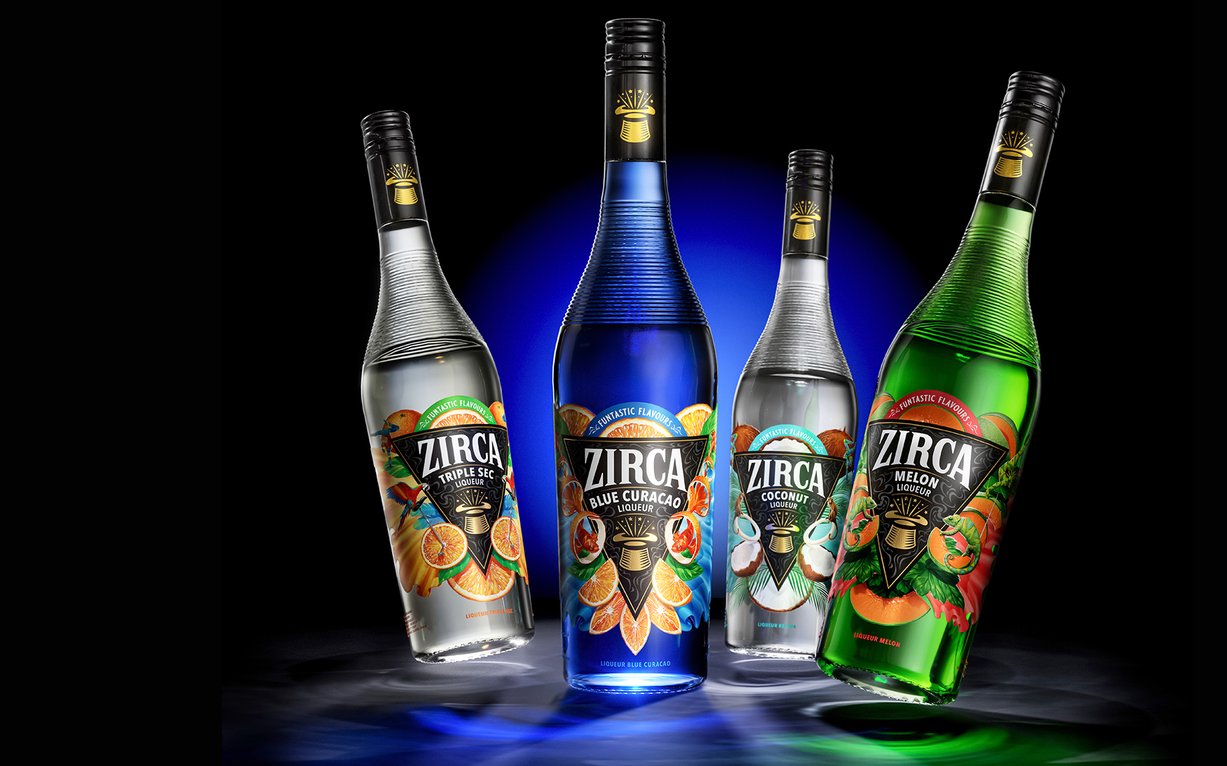
A range of fruit-flavoured liqueurs encompasses the fun and playfulness of theatre, from which the name is a play on the word ‘circus’, relating the bartender to the ringmaster, in charge of creating new and wondrous cocktails that leave you wide-eyed and amazed.
The Challenge
The original design lacked all of the above. It was uninspiring, dated, and lacked any enjoyment and magic that was the core identity of the brand. Its reference to the circus was that of the past, with a dusty vaudeville design focusing too much on a ringmaster’s top hat—a design bartenders were reluctant to showcase behind the bar, lacking any drama and elegance to add to the show of a cocktail’s creation.
The Solution
BlackMoon Studio dived straight into the ring and took full inspiration from the quirky and imaginative shows of Cirque du Soleil. Watching a Cirque du Soleil performance is akin to stepping into a dreamlike realm where the boundaries of what is possible are blurred. We recognised that the label design needed to mirror the enchantment and breathtaking experience of witnessing one of these magical shows.
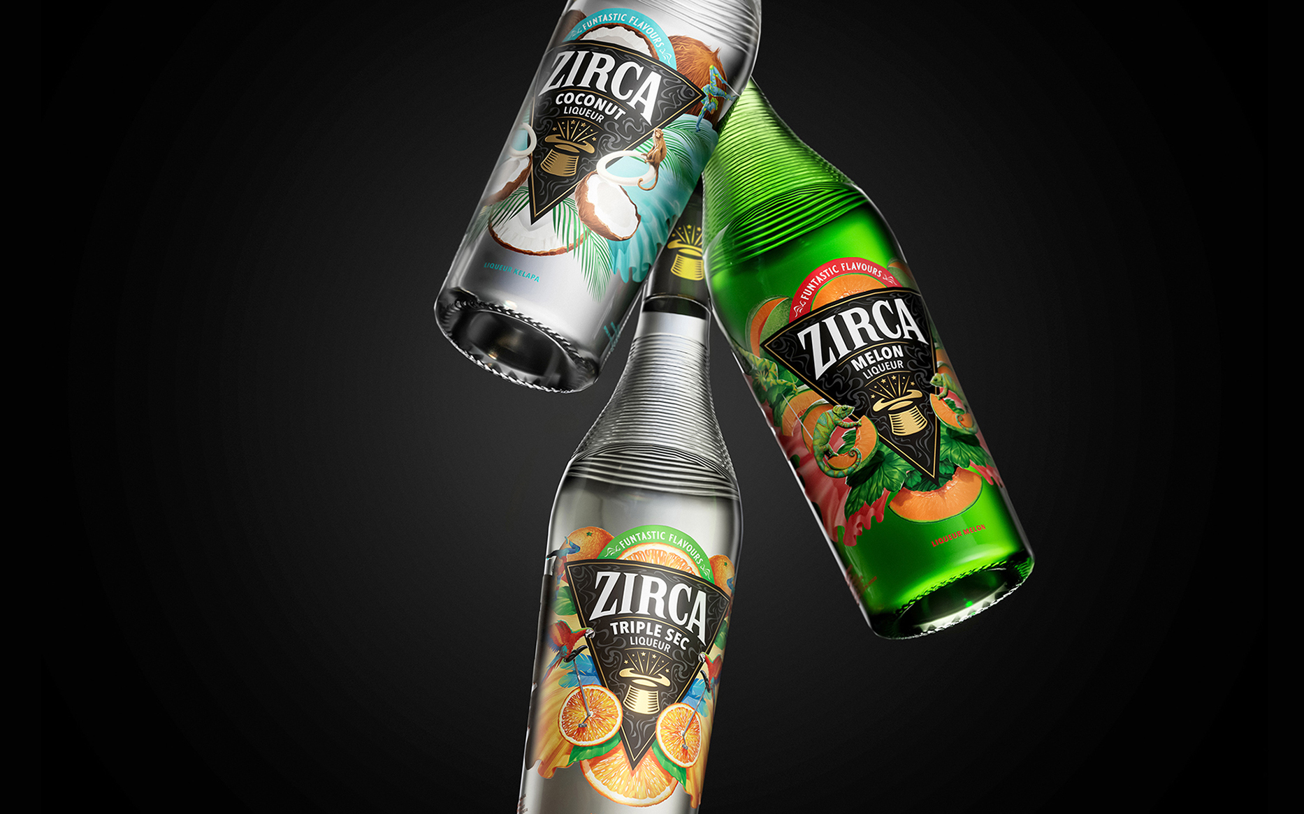
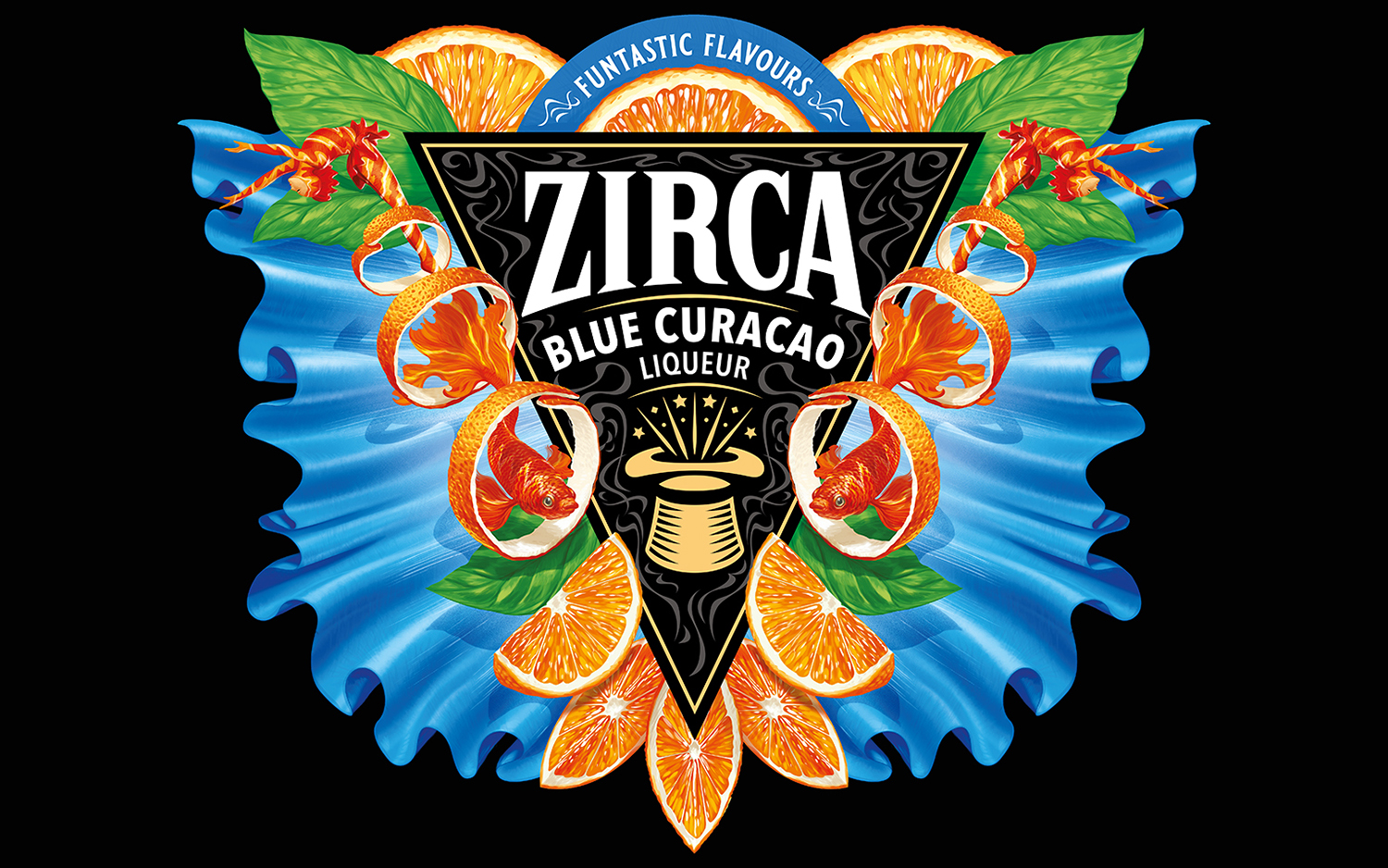
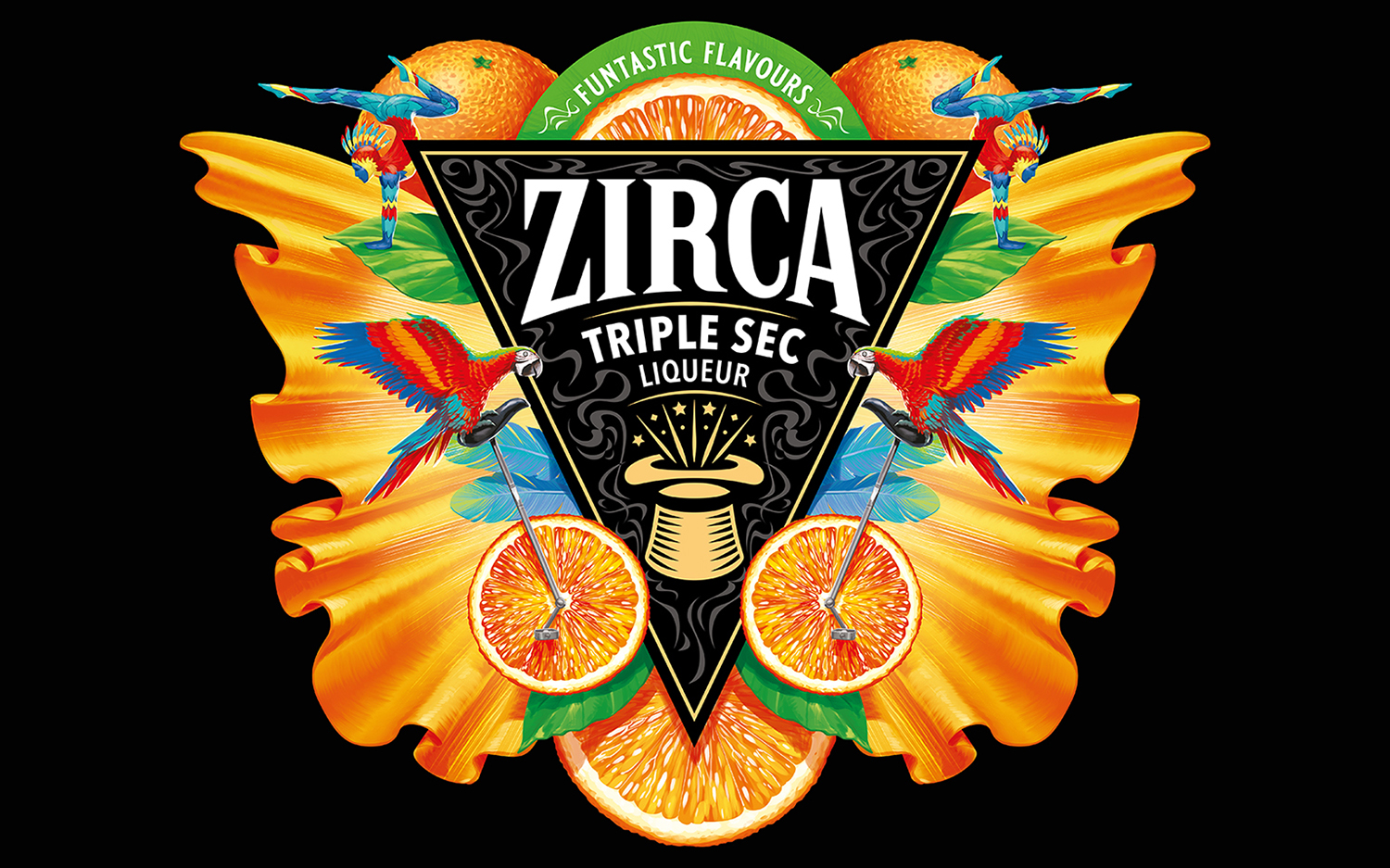
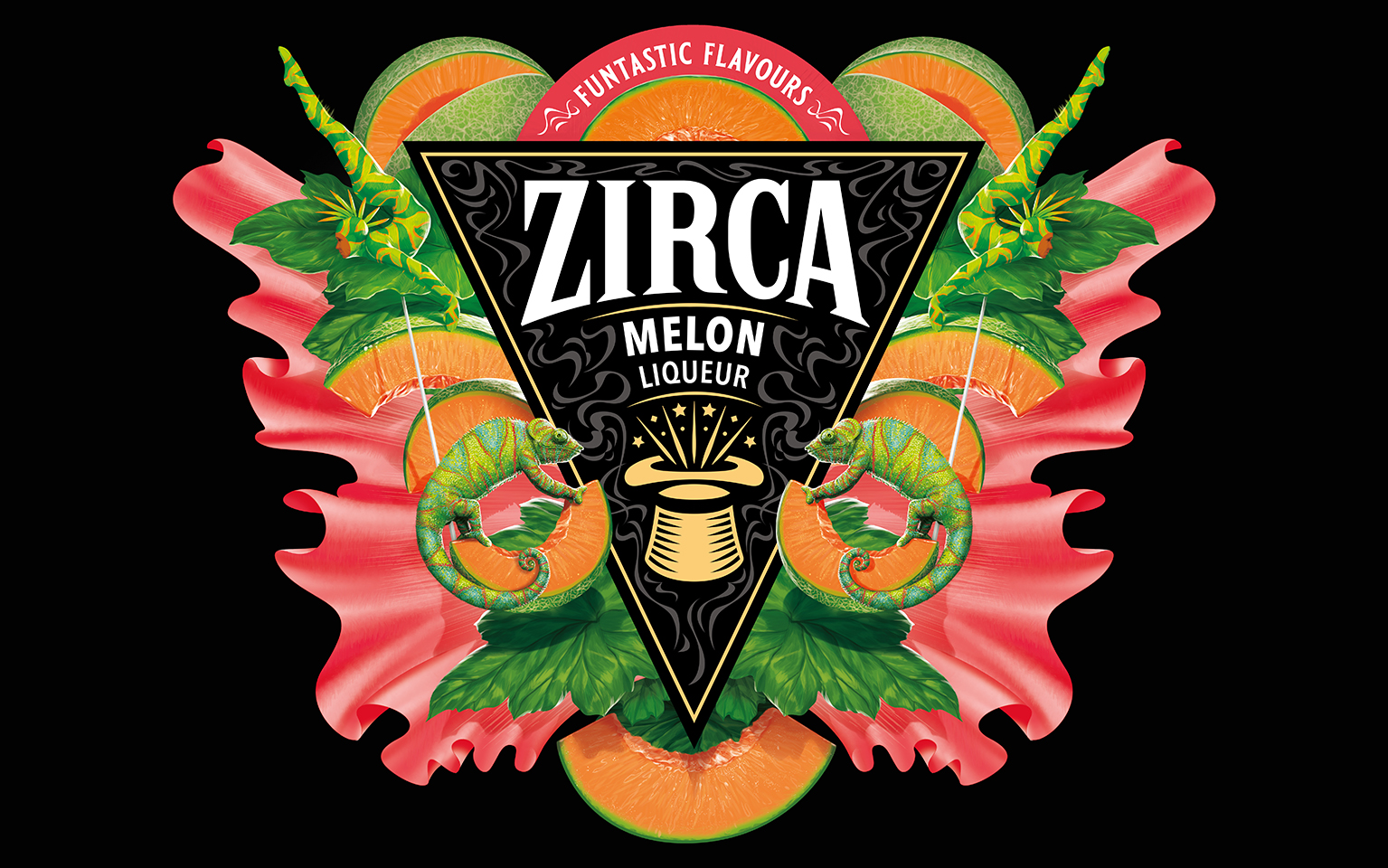
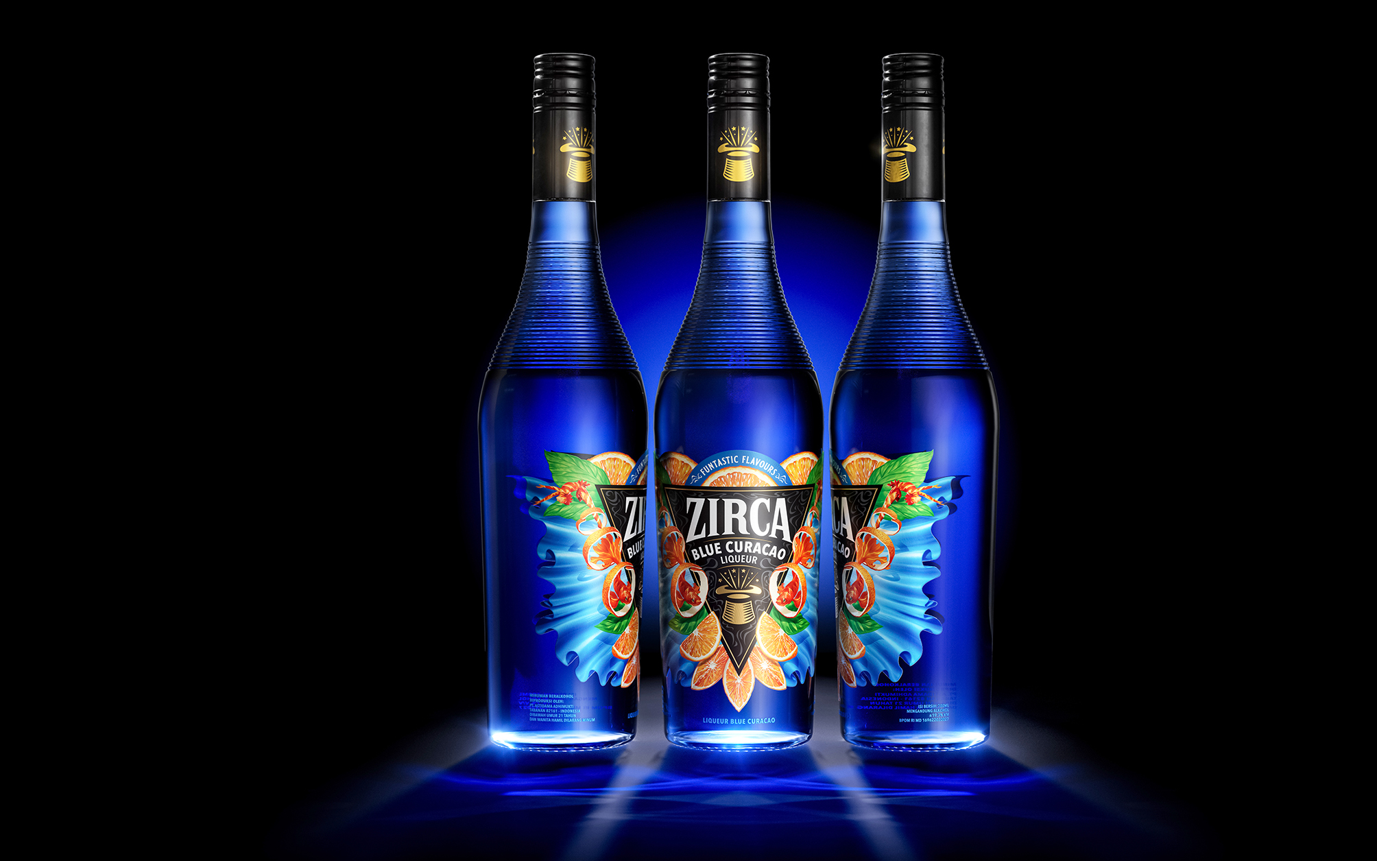
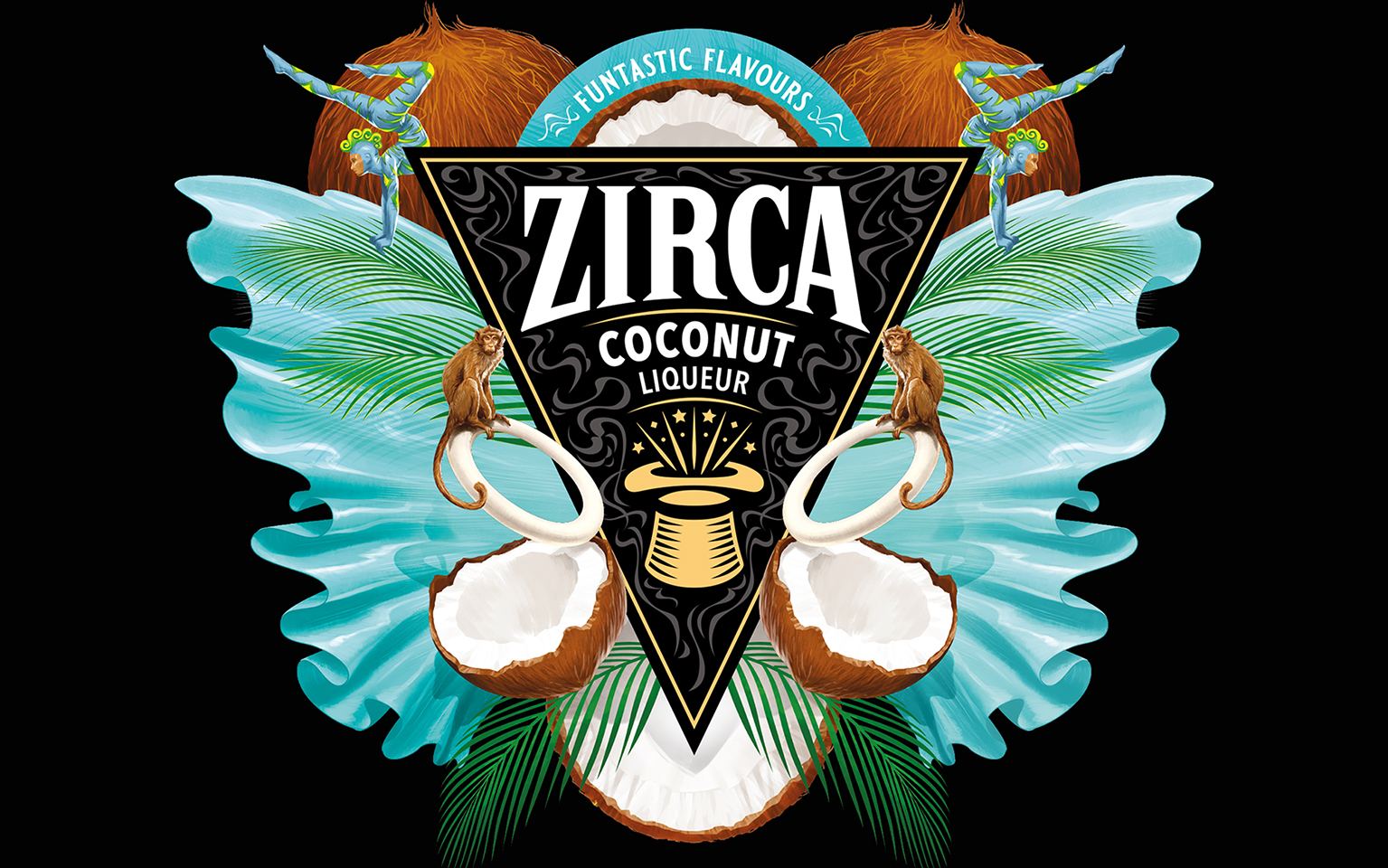
BlackMoon took the essence of how Cirque du Soleil could transport its audiences into a realm of wonder and enchantment, using fabulous textures from the performers. The label design exudes elegance and sophistication, drawing inspiration from the graceful movements and impeccable costumes of the performers. Also, capturing the show’s dramatic lighting and using exotic animals to weave together and create the fabulous and surreal world for Zirca on-pack. Each label becomes a performance, a show that uniquely illustrates the flavour of the fruit liqueur with the acrobatic majesty and unique flamboyant look and feel of the product, creating its stage on the pack.
Zirca now reflects the elegance and artistry of Cirque du Soleil, with intricate designs and bold colours that catch the eye. Each bottle tells a story, much like the performances, taking consumers on a sensory journey through its taste and aroma. The result is contemporary—an explosion of textures, dynamic and unexpected. Our design literally jumps out at you—an experience that not only delights the taste buds but also transports consumers to a world of magic and wonder. A design a ringmaster would be proud of and a barman to show off with pride.
BlackMoon has created a palette of assets that can be used off-pack and across many touchpoints to bring Zirca’s brand world to life.
John Hughes, Founder and Creative Director of BlackMoon Studio, expresses, “Zirca sought to capture the essence of wonder, excitement, and elegance symbolised by Cirque du Soleil. They recognised the sheer creativity and innovation that it brings to the world of entertainment, and we aimed to translate these qualities into the design.”
CREDIT
- Agency/Creative: BlackMoon Studio
- Article Title: Zirca Liqueur Packaging Design That Transcends The Ordinary
- Organisation/Entity: Agency
- Project Type: Packaging
- Project Status: Published
- Agency/Creative Country: Singapore
- Agency/Creative City: BlackMoon Studio
- Market Region: Asia
- Project Deliverables: Packaging Design
- Format: Bottle
- Industry: Financial
- Keywords: brand design, packaging design, illustration, design
-
Credits:
John Hughes: Creative Partner
James Diaz Alberdi: Creative Partner
Grace Ng: Managing Partner


