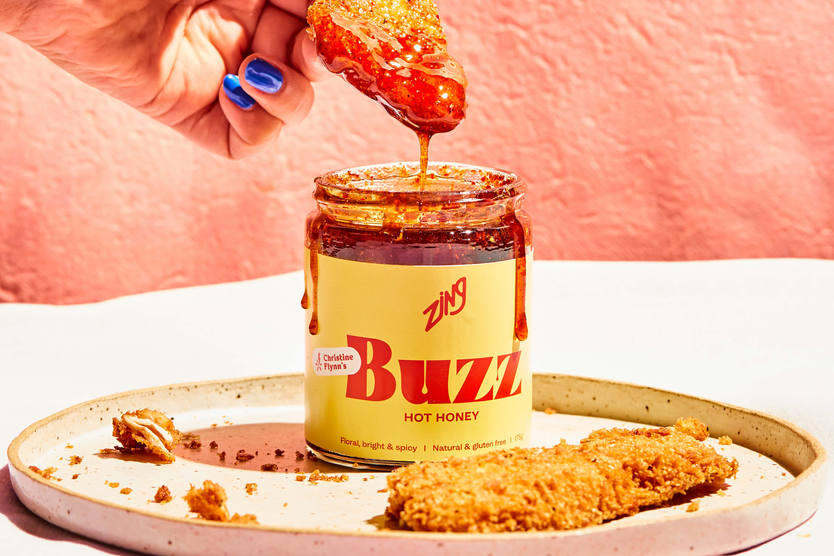
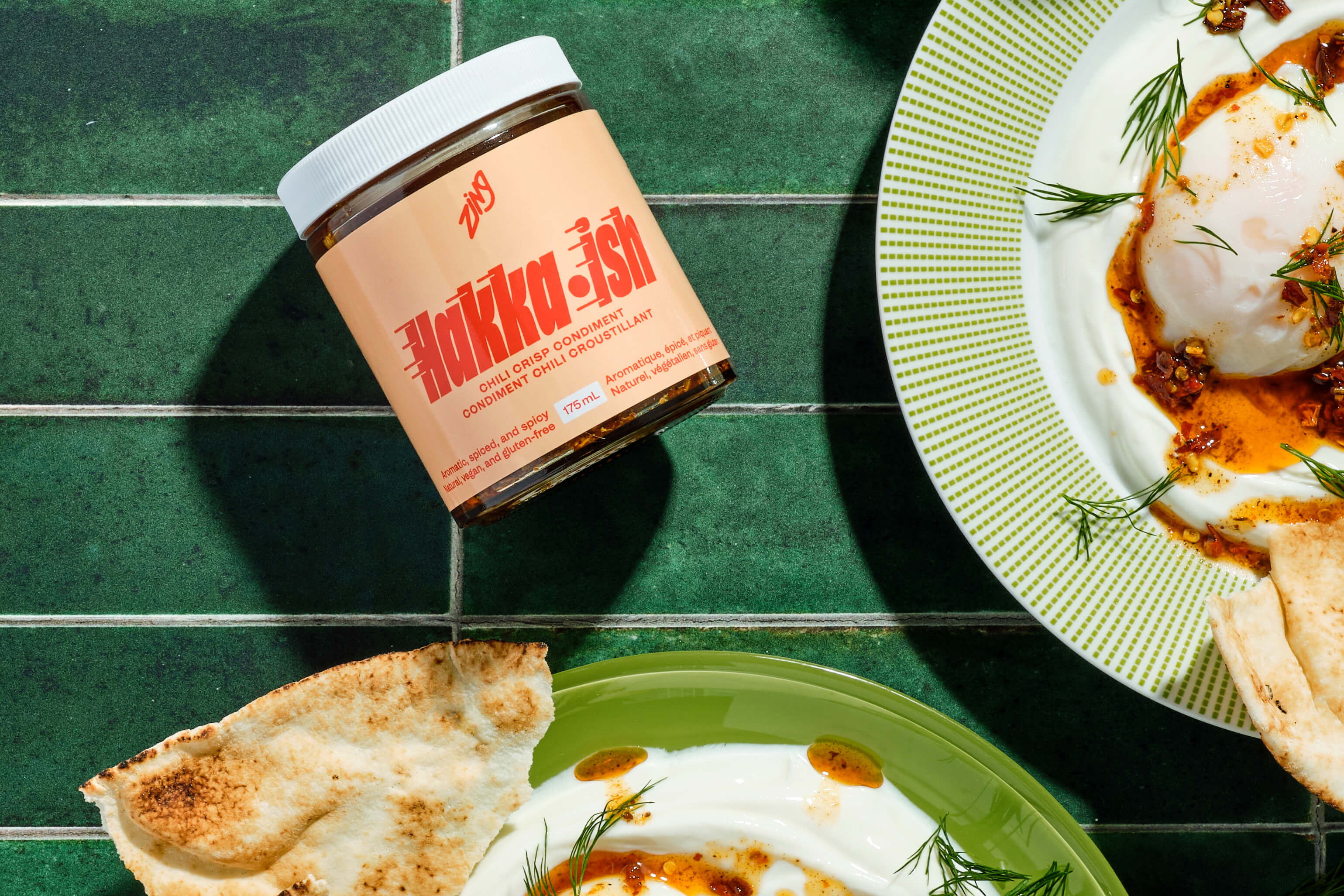
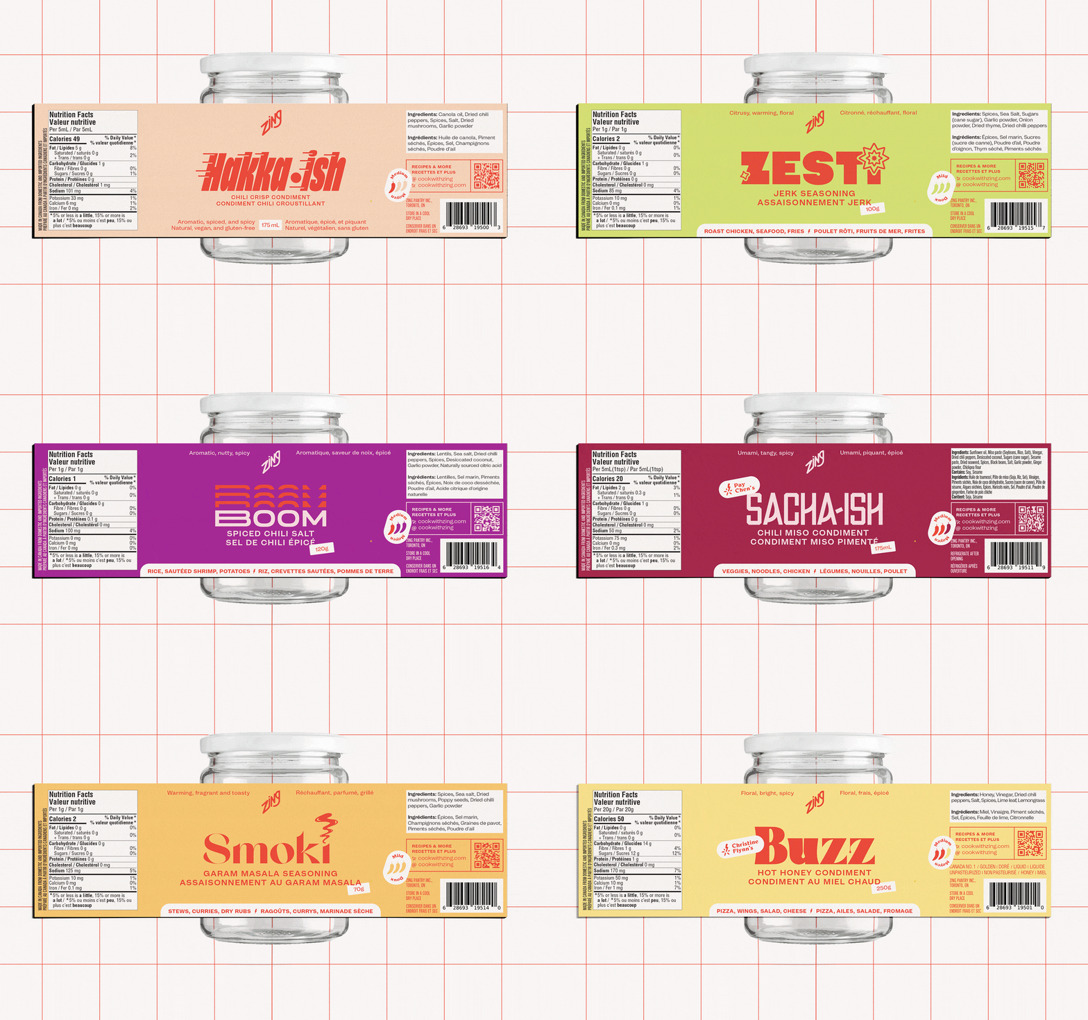
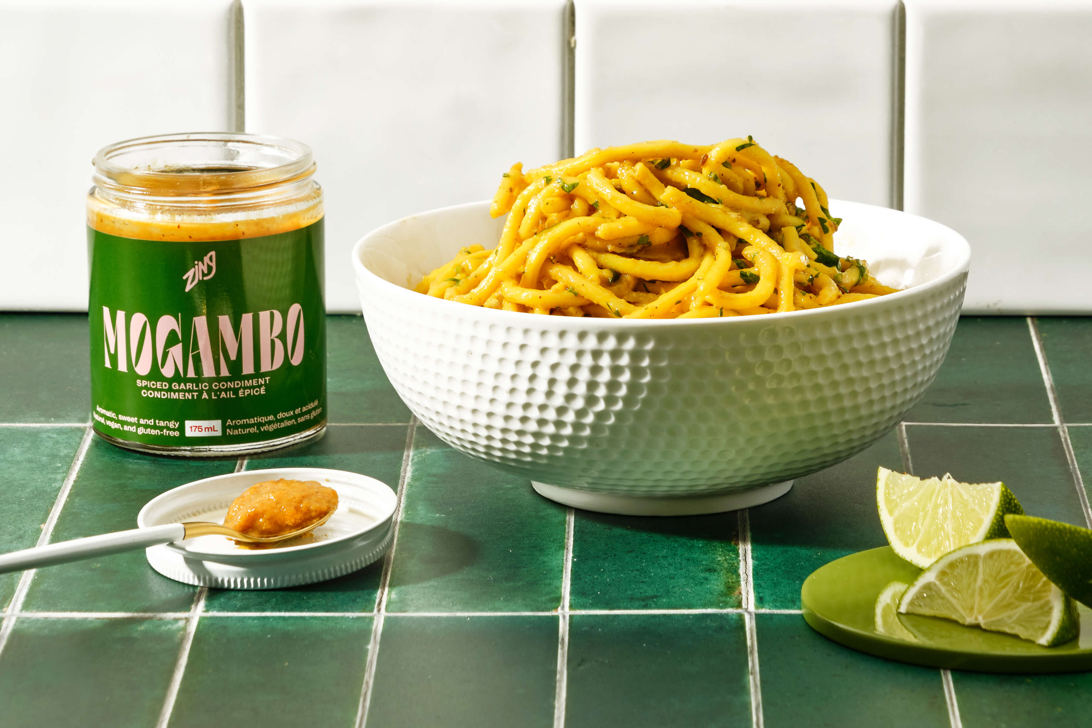
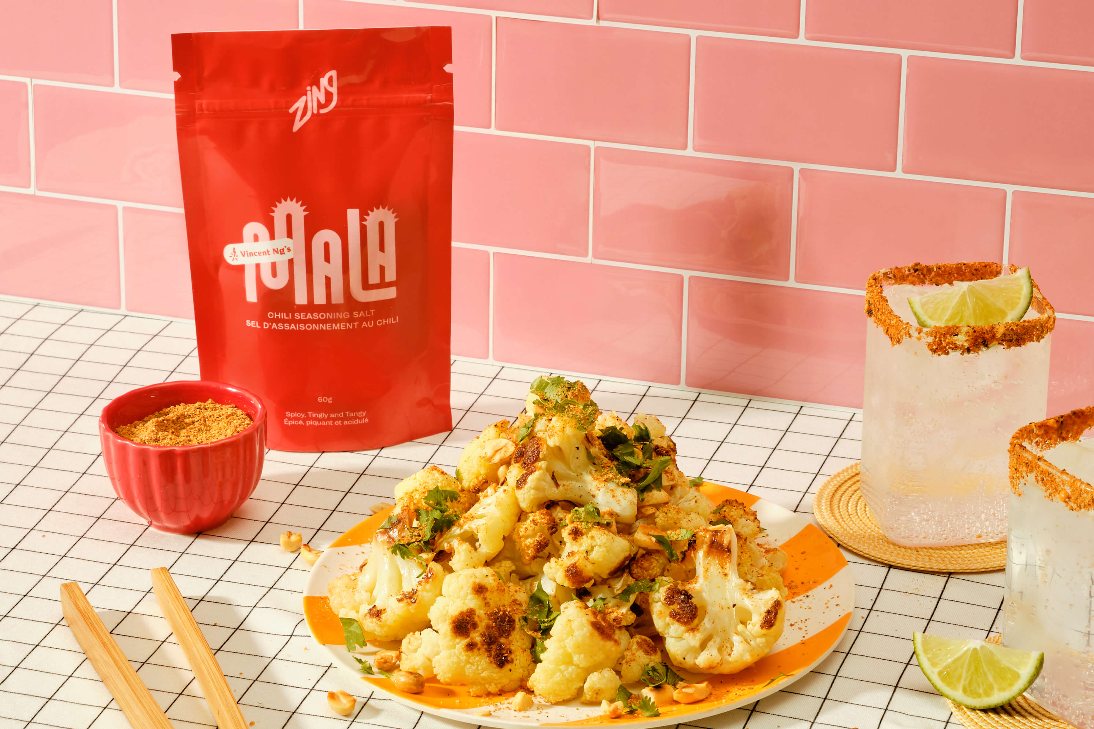
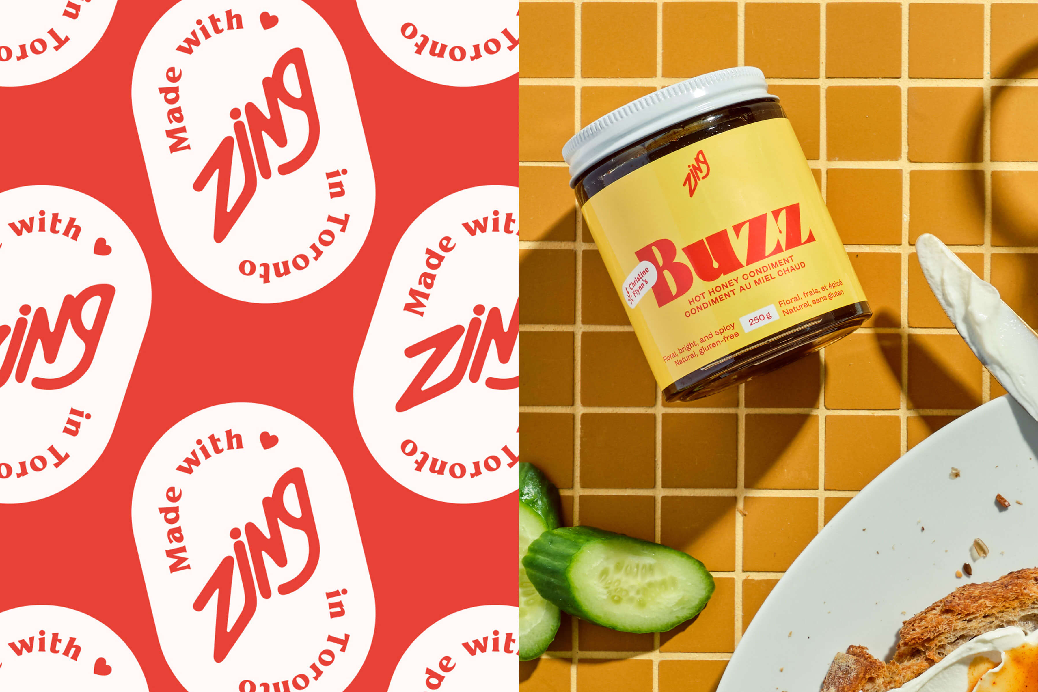
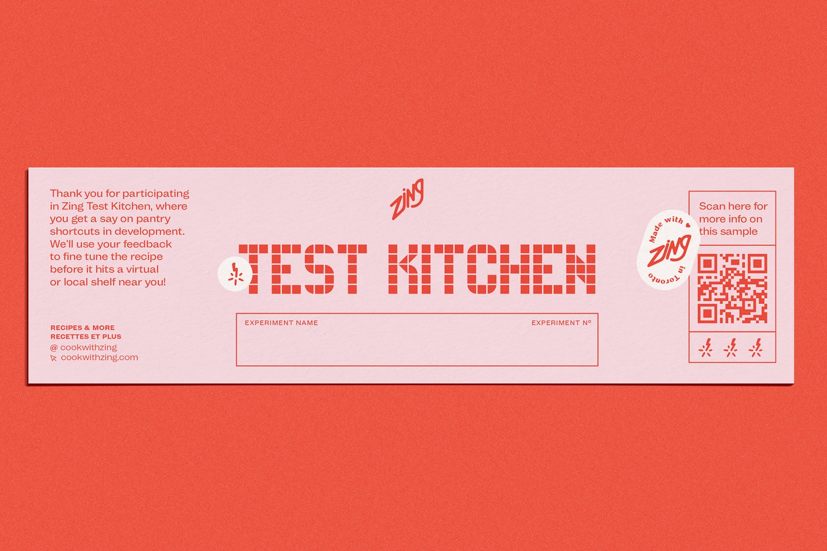
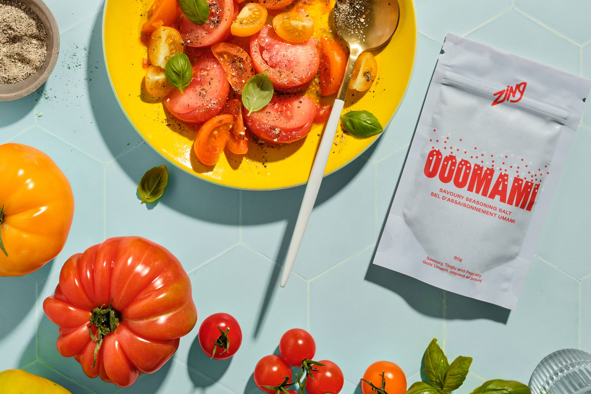
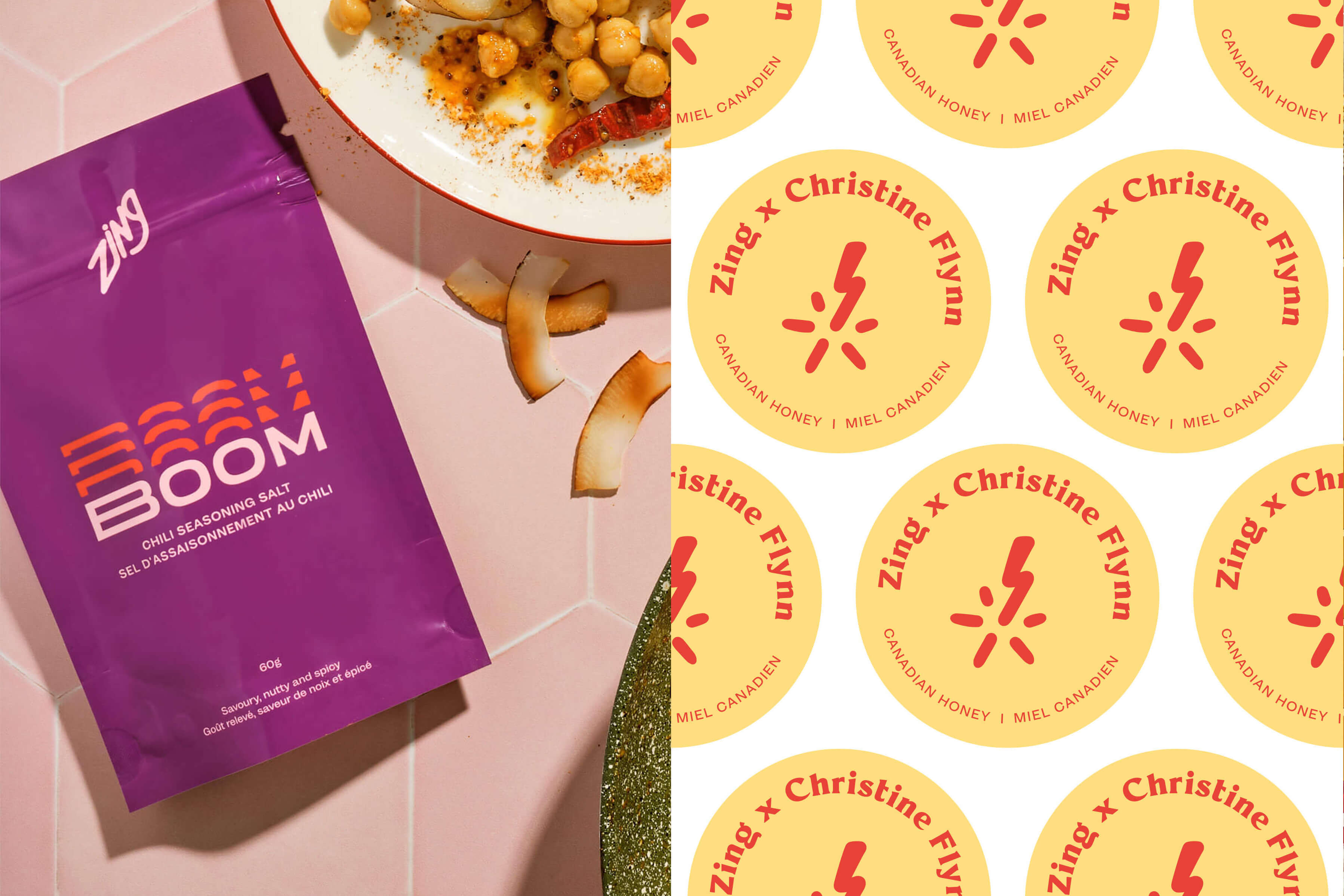
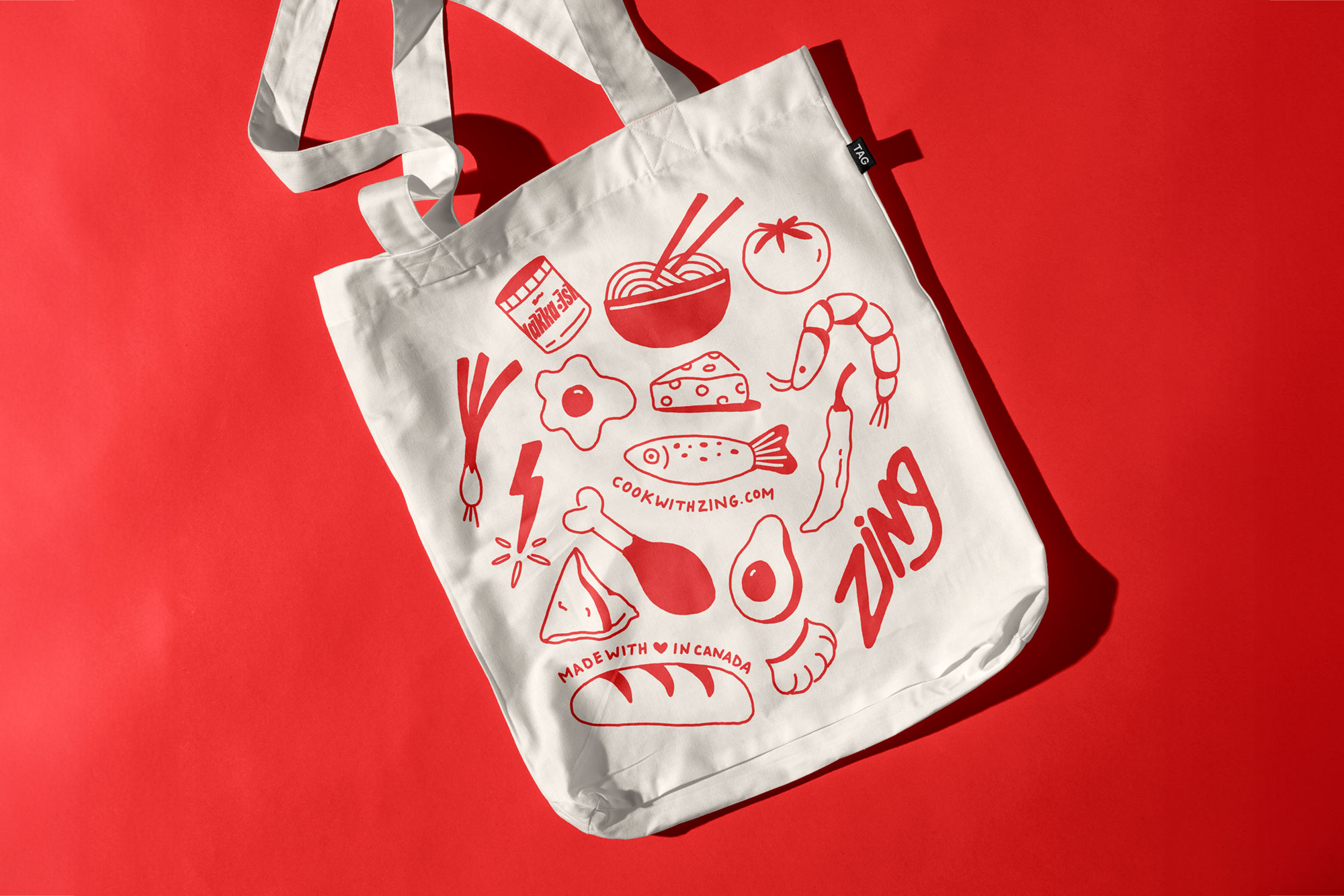
This punchy and vibrant redesign for Zing Pantry Shortcuts by Marissa Korda is full of flavour, capturing the essence of what Zing stands for: energy, joy, and creativity. The packaging is a visual feast, bursting with bright colors and playful, custom typography that expresses the uniqueness of each product in the Zing lineup. The design is carefully crafted to highlight the product’s personality and taste profile, while the eye-catching colors stand out in the retail market. Just as their chef-crafted products add a punch of flavour to any meal, and their vibrant packaging adds a punch of colour to any shelf.
Zing wants to make everyday cooking more fun, approachable, and most importantly, delicious. Their one-of-a-kind sauces and seasonings are designed to be quick and easy pantry shortcuts that take meals to the next level with minimal effort, and maximum flavor.
Just as their products simplify the cooking process by offering convenient, flavorful pantry shortcuts, the packaging redesign streamlines the shopping experience, guiding the consumer’s eye and making it easy to identify the right product for the job. The clean, bold design language offers clarity and visual cues, so customers can quickly connect with the product that best suits their needs, whether they’re looking for a tangy sauce, a savory seasoning, or a zesty marinade.
At its core, the Zing Pantry Shortcuts redesign is more than just a facelift; it’s a visual representation of the brand’s ethos—fun, flavorful, and full of life. The vibrant colors and playful typography tell the story of a brand that is confident, bold, and ready to spice up any kitchen. The redesign isn’t just about packaging—it’s about creating an experience, one that invites customers to infuse their daily cooking routine with joy and excitement.
CREDIT
- Agency/Creative: Marissa Korda
- Article Title: Zing Pantry Shortcuts Gets a Colorful Rebrand by Marissa Korda
- Organisation/Entity: Freelance
- Project Type: Packaging
- Project Status: Published
- Agency/Creative Country: Canada
- Agency/Creative City: Toronto
- Market Region: North America
- Project Deliverables: Brand Design, Brand Identity, Branding, Label Design, Packaging Design, Rebranding, Typography
- Format: Jar, Pouch, Sachet
- Industry: Food/Beverage
- Keywords: typography, sauces, sauce, spice, seasonings, food packaging, label, jar
-
Credits:
Graphic Design: Marissa Korda


