


Ziaho’s journey unites the rich tapestry of India’s indigenous ingredients with the artistry of chocolate.
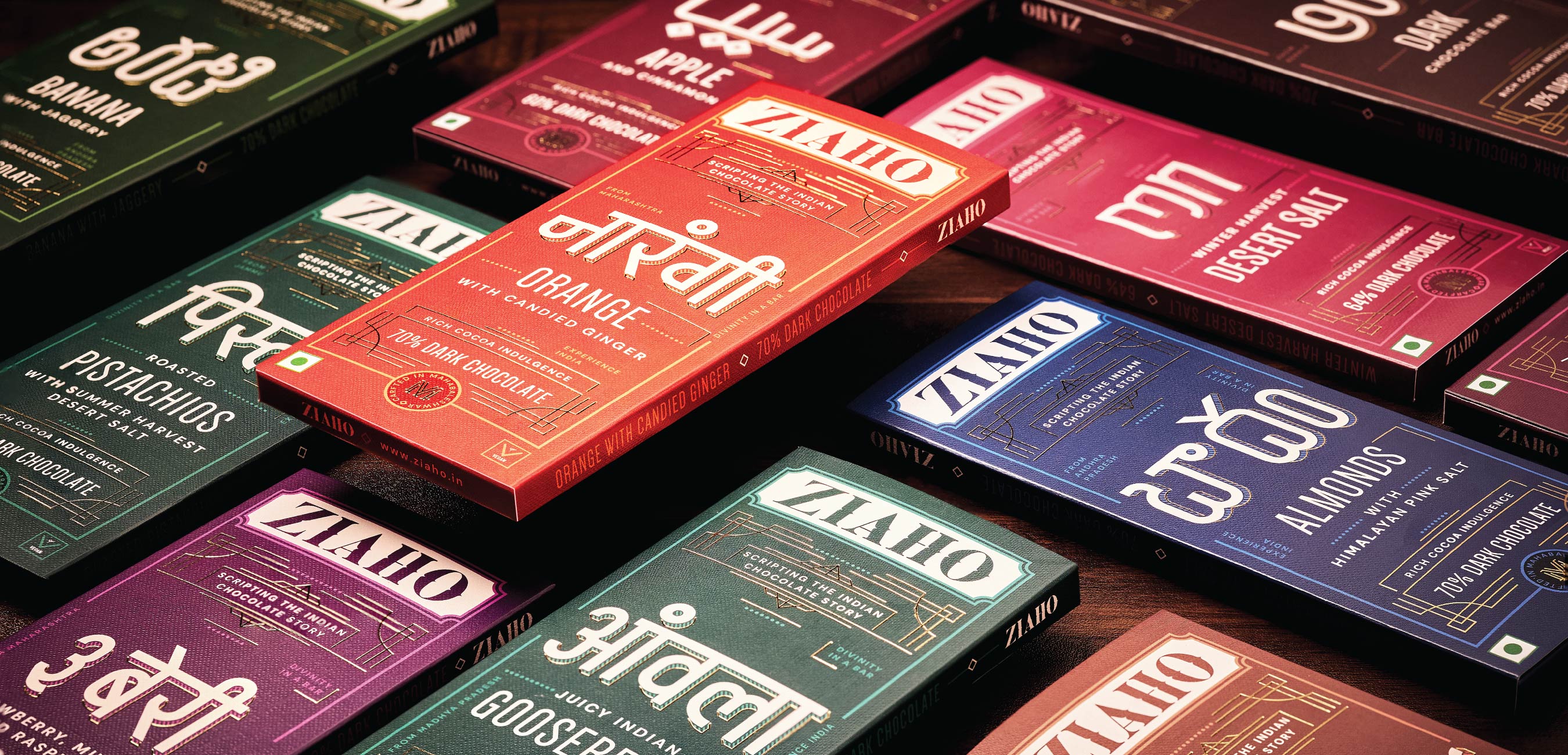
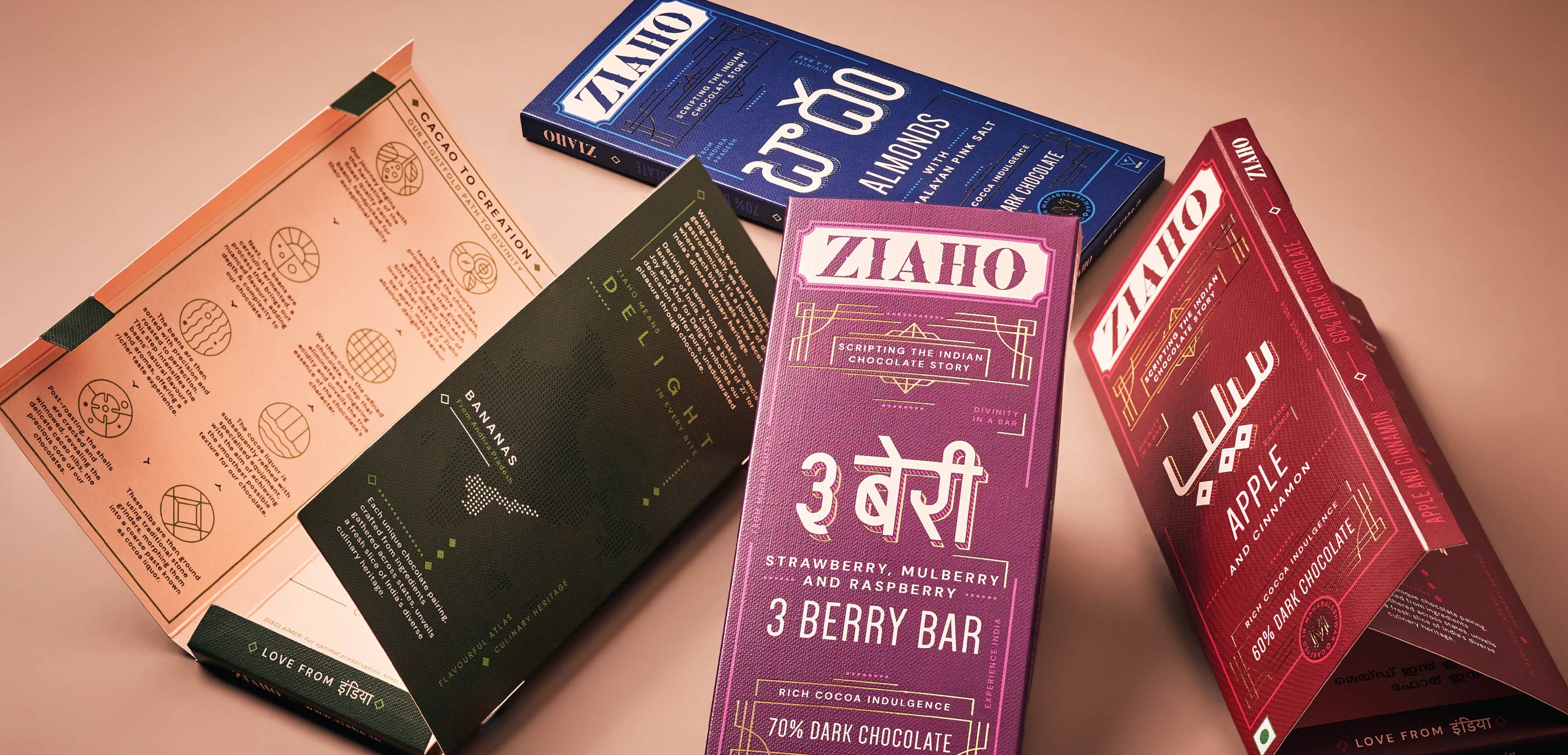
Ziaho’s tells the story of a nation that thrives amidst differences. India has 22 different languages, 14 different written scripts & 19,560 different dialects. Each Indian script showcases distinctive letterforms that reflect its individual structure and visual expression.
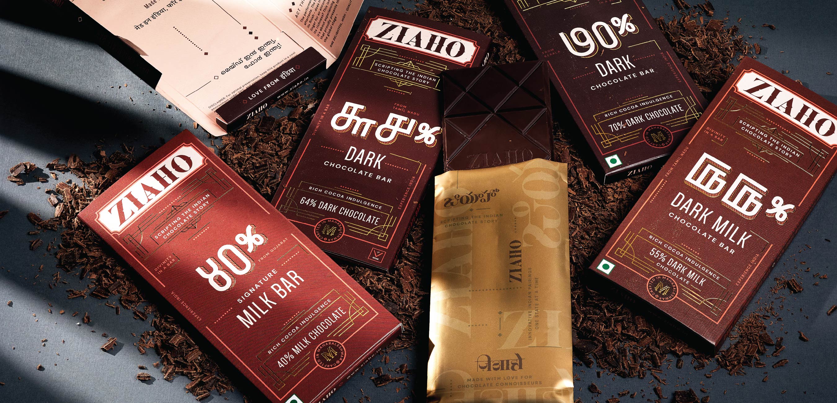
Ziaho is a brand of innovative chocolate pairings – using Indian Cacao paired with ingredients from various Indian states. The brand offers delectable pairings from across the country, ranging from Kashmir to Tamil Nadu.
We crafted the product and brand strategy, and a unified visual language by drawing inspiration from the scripts of the states where our ingredients originate. By recreating and incorporating these diverse letterforms, we’ve created a clutter-breaking, cohesive identity.
The name “Ziaho” was derived from two Sanskrit words meaning “joy” and “delight.” By combining “zi” for joy and “aho” for delight, the name captures the inherent emotion associated with consuming chocolate. The phonetics of Ziaho imbue the name with a sense of gravitas. We believe the word would also be phonetically intuitive for international audiences, while proudly demonstrating it’s Indian roots.
Ziaho encapsulates and celebrates the essence of the modern Indian spirit. It is a testament to the harmonious fusion of global adaptability and the unwavering celebration of our own Indian heritage. It provides a platform for modern Indians to take pride in their identity while championing the incredible potential of Indian cocoa.
In a world where cultures converge and boundaries blur, Ziaho not only satisfies chocolate cravings, but also nourishes our sense of self and belonging.
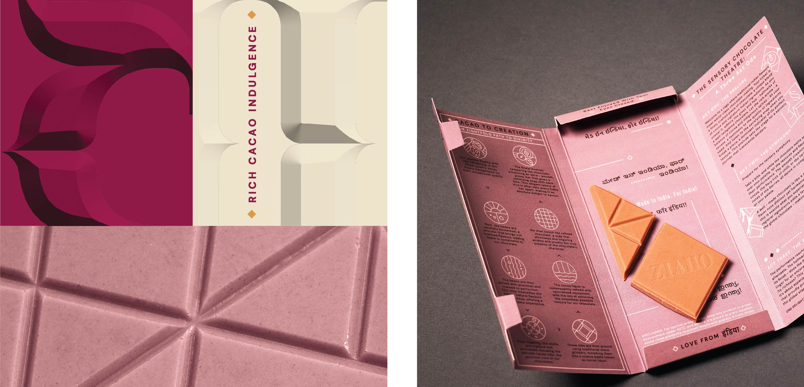
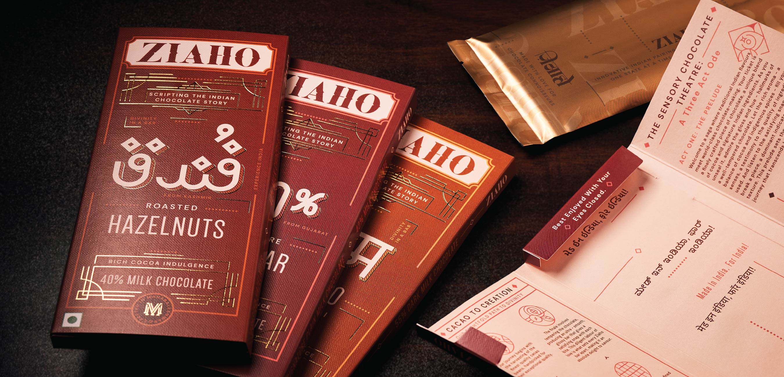
The identity system devised by us creates a multilingual framework that embraces the versatility of India. The logotype is bold and elegant, with high-contrast forms that uniquely position the brand within its category while also establishing its distinct presence.
In developing our product architecture, we took a thoughtful approach to ensuring our different chocolate sub-ranges were seamlessly connected. Rather than treating them as separate variants, we carefully crafted an overarching colour story that unifies the entire range.
Indian scripts possess inherent calligraphic qualities, characterized by fluidity and movement in their letterforms. We have taken inspiration from these forms and reinterpreted them to create a type system that combines the essence of Indian scripts with minimal Nordic influences. Our approach involves using consistent stroke weights, clean neo-geometric shapes, and ample counter spaces.
This harmonious fusion of our diverse culture with reimagined global letterforms serves as a genuine representation of the modern Indian aesthetic. It celebrates the rich heritage of Indian scripts while embracing a contemporary and forward-looking design approach.
CREDIT
- Agency/Creative: Stratedgy
- Article Title: Ziaho Chocolate Branding and Packaging by Stratedgy
- Organisation/Entity: Agency
- Project Type: Packaging
- Project Status: Published
- Agency/Creative Country: India
- Agency/Creative City: Mumbai
- Market Region: Asia
- Project Deliverables: Brand Design, Brand Identity, Brand Naming, Brand Strategy, Branding, Packaging Design, Packaging Guidelines
- Format: Box, Wrap
- Industry: Food/Beverage
- Keywords: Chocolate
-
Credits:
Creative Director: Krupa Sheth Kapadia
Lead Designer: Anuja Mehta


