


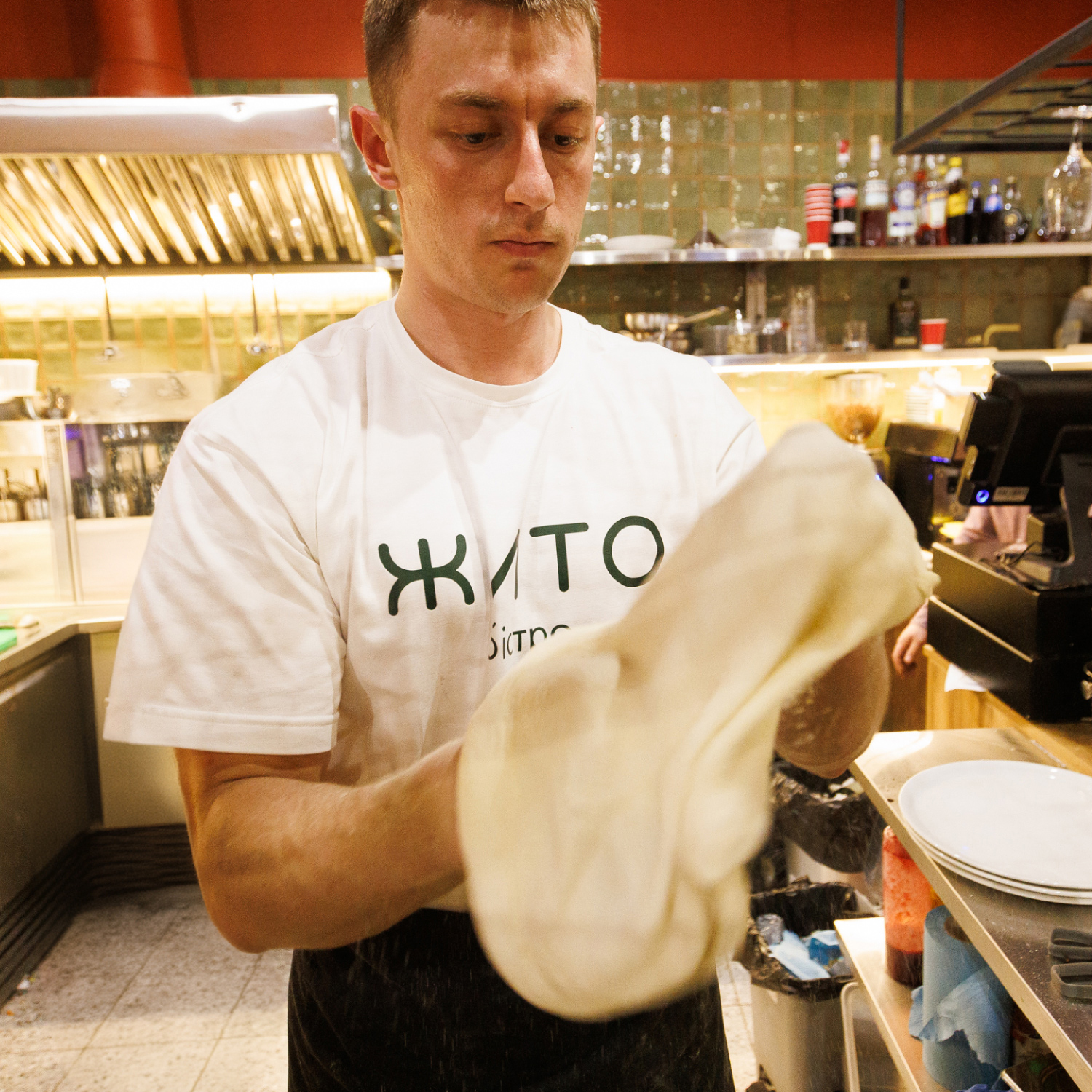
Introducing our latest design project for the bistro, where scalability meets adaptability. This design is crafted to seamlessly fit various formats and sizes, making it perfect for any setting. It’s a unique blend of minimalism and boldness, where simplicity speaks loudly through vibrant and ‘bold’ elements.
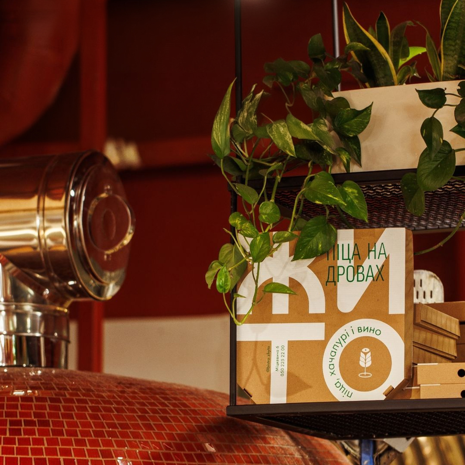
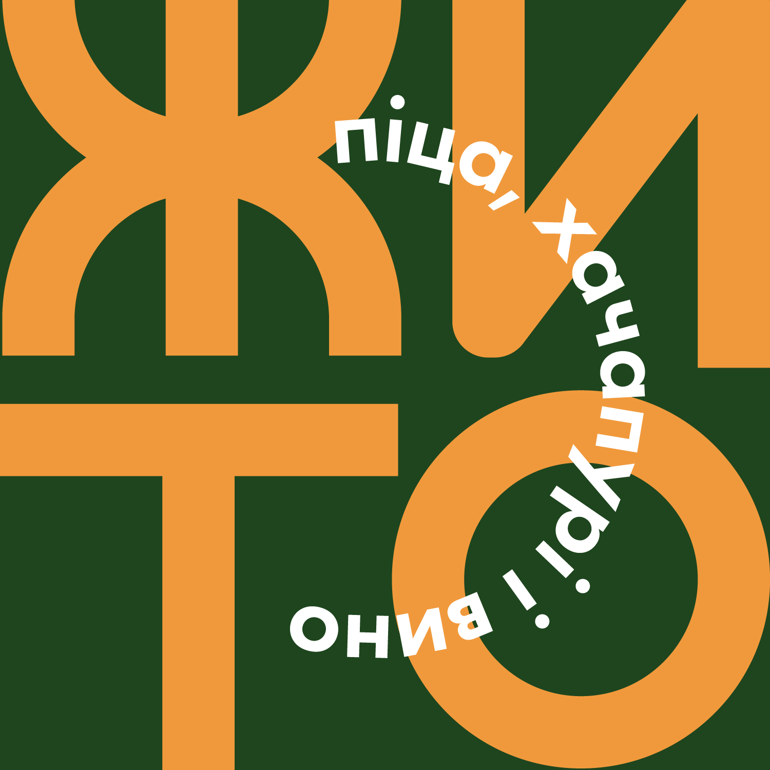
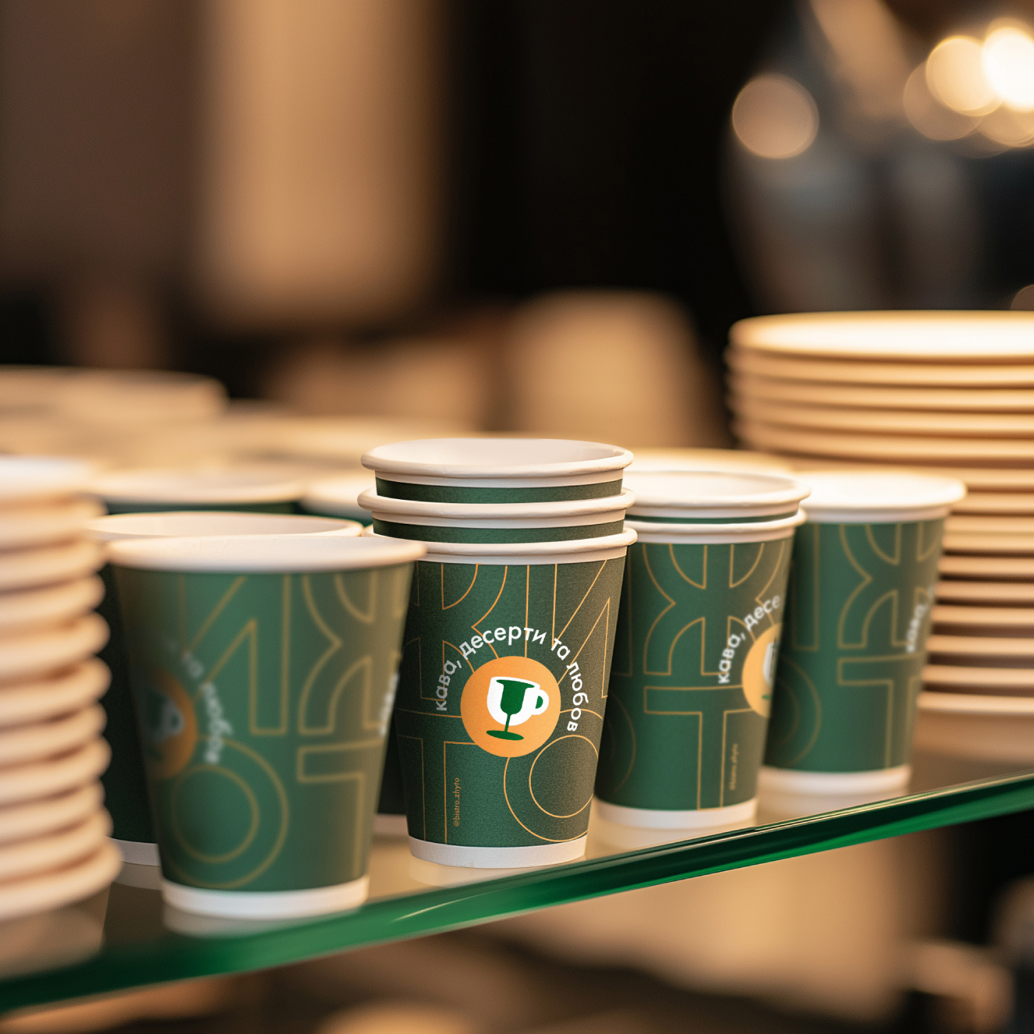
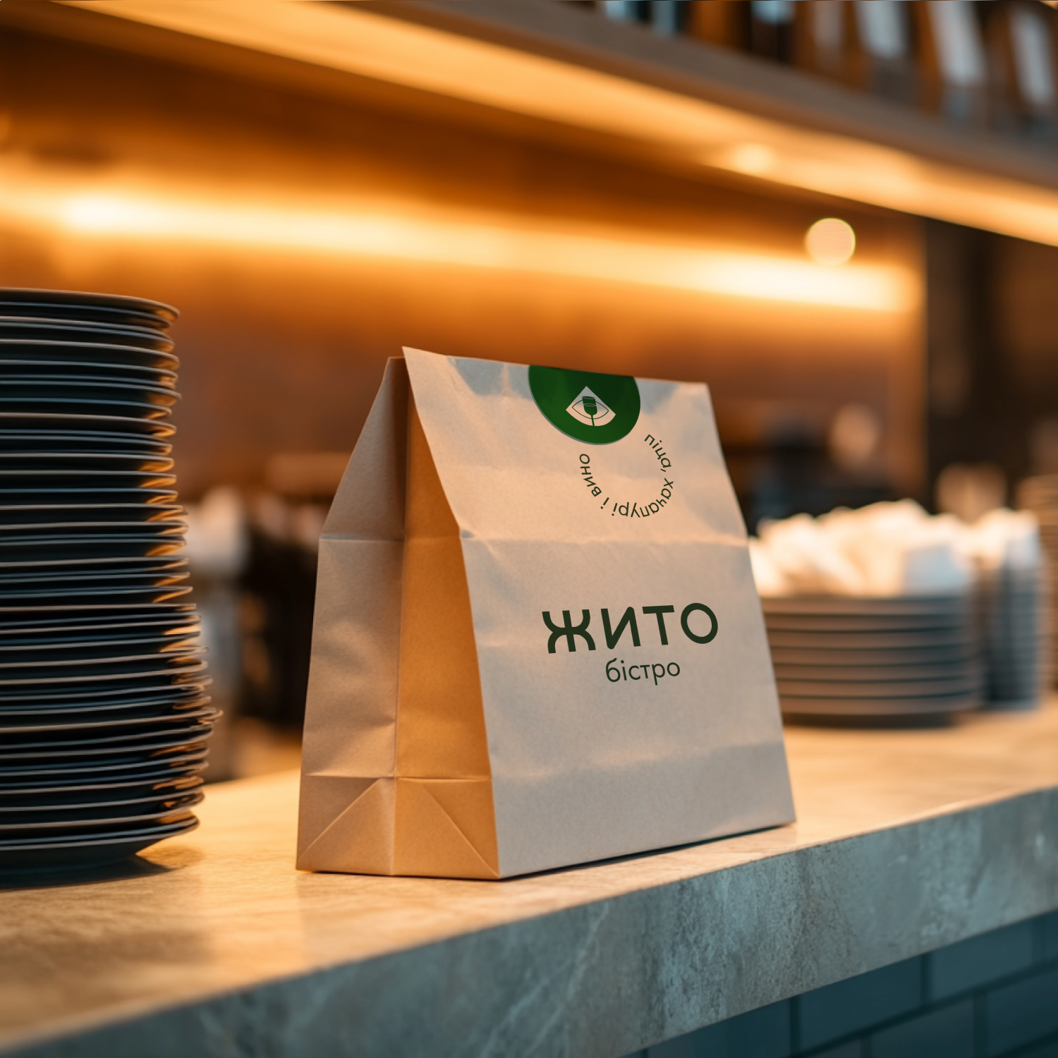
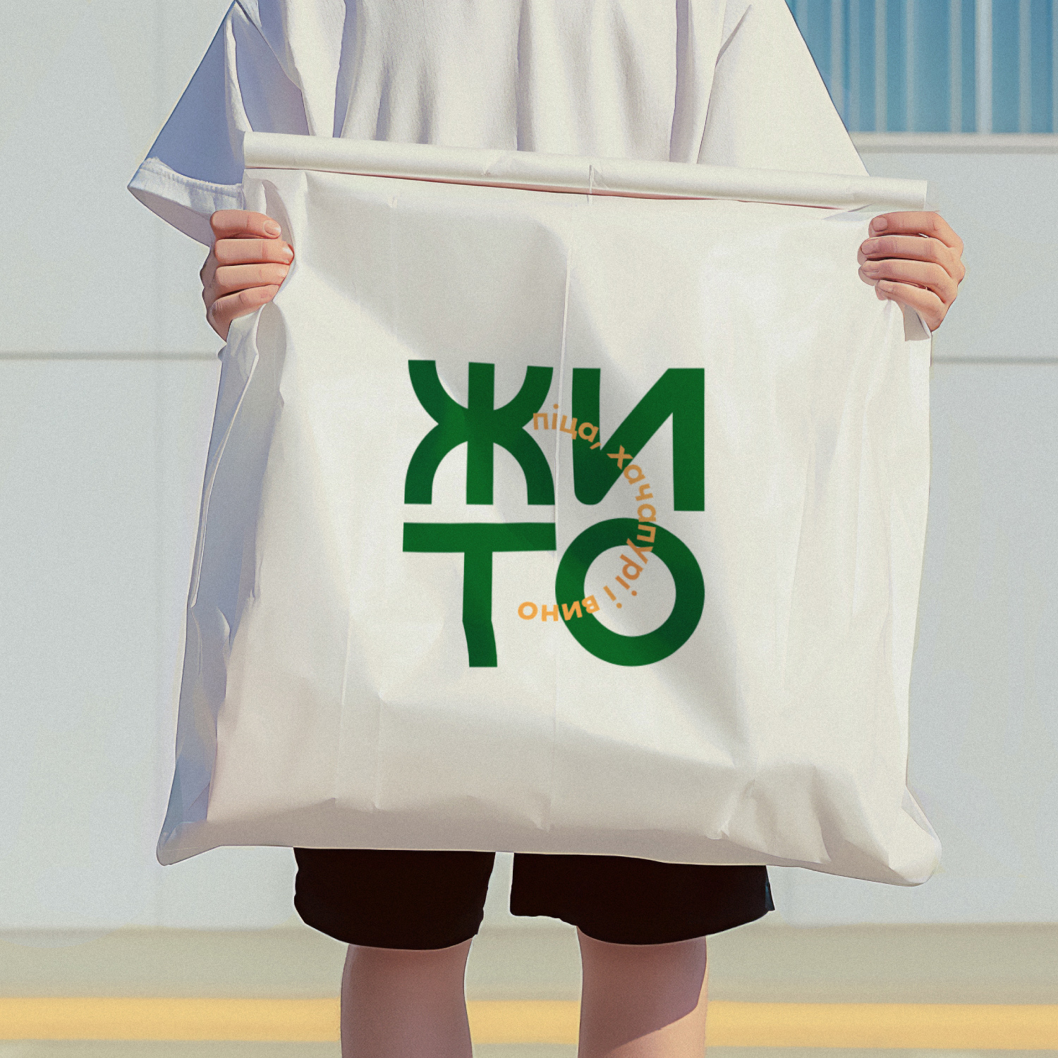
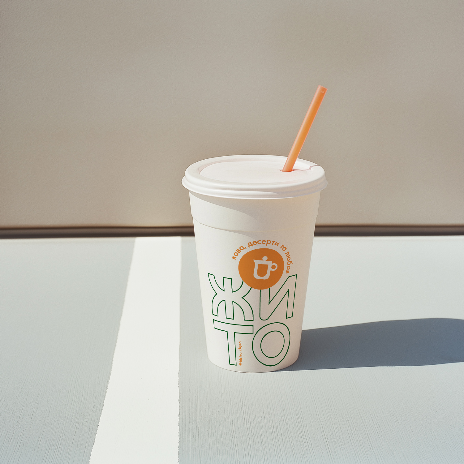
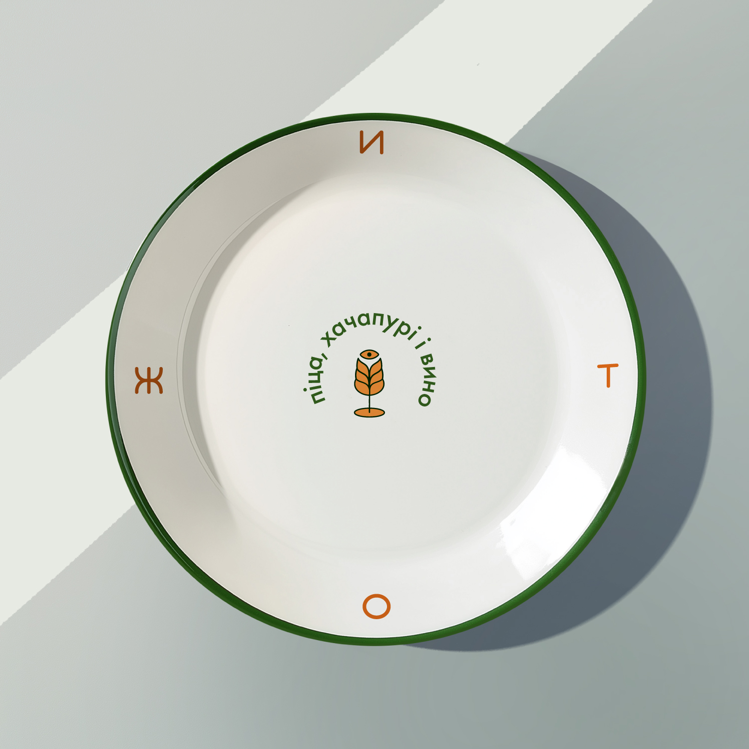
The logo draws its geometry directly from the name “ЖИТО” (which means wheat), a name steeped in symbolism and connection to nature. The harmonious and symmetrical structure of the word was impossible to overlook. Its perfect alignment works beautifully both in a straight line and in a two-row format, forming an ideal square. This flexibility makes it a perfect fit for packaging applications, from pizza boxes to coffee cups and grocery bags. The logo’s geometry, inspired by the clean lines and symmetry of wheat stalks, not only enhances its aesthetic appeal but also reflects the organic and natural essence of the brand.
The color palette is grounded in two key shades: a natural orange that symbolizes the golden wheat fields under the bright sun, and a deep green that complements the orange, adding a touch of elegance to the brand. These colors are not just visually appealing but are also designed to evoke the warmth and richness of nature. The natural orange exudes energy and vibrancy, capturing the essence of a bustling bistro, while the deep green introduces a calming balance, creating a visual harmony that’s both inviting and sophisticated.
To further enhance the brand’s presence, the design incorporates subtle textural elements reminiscent of wheat fields swaying under the summer breeze. These textures are strategically applied across various branding materials, adding depth and tactile appeal to the packaging and interior elements. Whether it’s the rustic feel of the takeaway bags or the refined finish of the menu cards, every touchpoint is crafted to leave a lasting impression.
In essence, this design is not just about aesthetics; it’s about creating an experience that resonates with the brand’s core values of simplicity, warmth, and natural beauty. The careful consideration of every detail ensures that the brand is not only memorable but also stands out in the competitive bistro landscape.
CREDIT
- Agency/Creative: true agency
- Article Title: Zhyto Bistro — Еhe Flavors of Italy and Georgia, Packaged in a Modern and Bold Design!
- Organisation/Entity: Agency
- Project Type: Packaging
- Project Status: Published
- Agency/Creative Country: Moldova
- Agency/Creative City: Chisinau
- Market Region: Europe
- Project Deliverables: Brand Creation, Brand Design, Brand Experience, Brand Identity, Identity System, Packaging Design, Packaging Guidelines
- Format: Bag, Box, Can, Cup, Pouch, Wrap
- Industry: Food/Beverage
- Keywords: pizza, bistro, restaurant, coffee, packaging, identity, design
-
Credits:
creative director, designer: Anta Petrenco


