


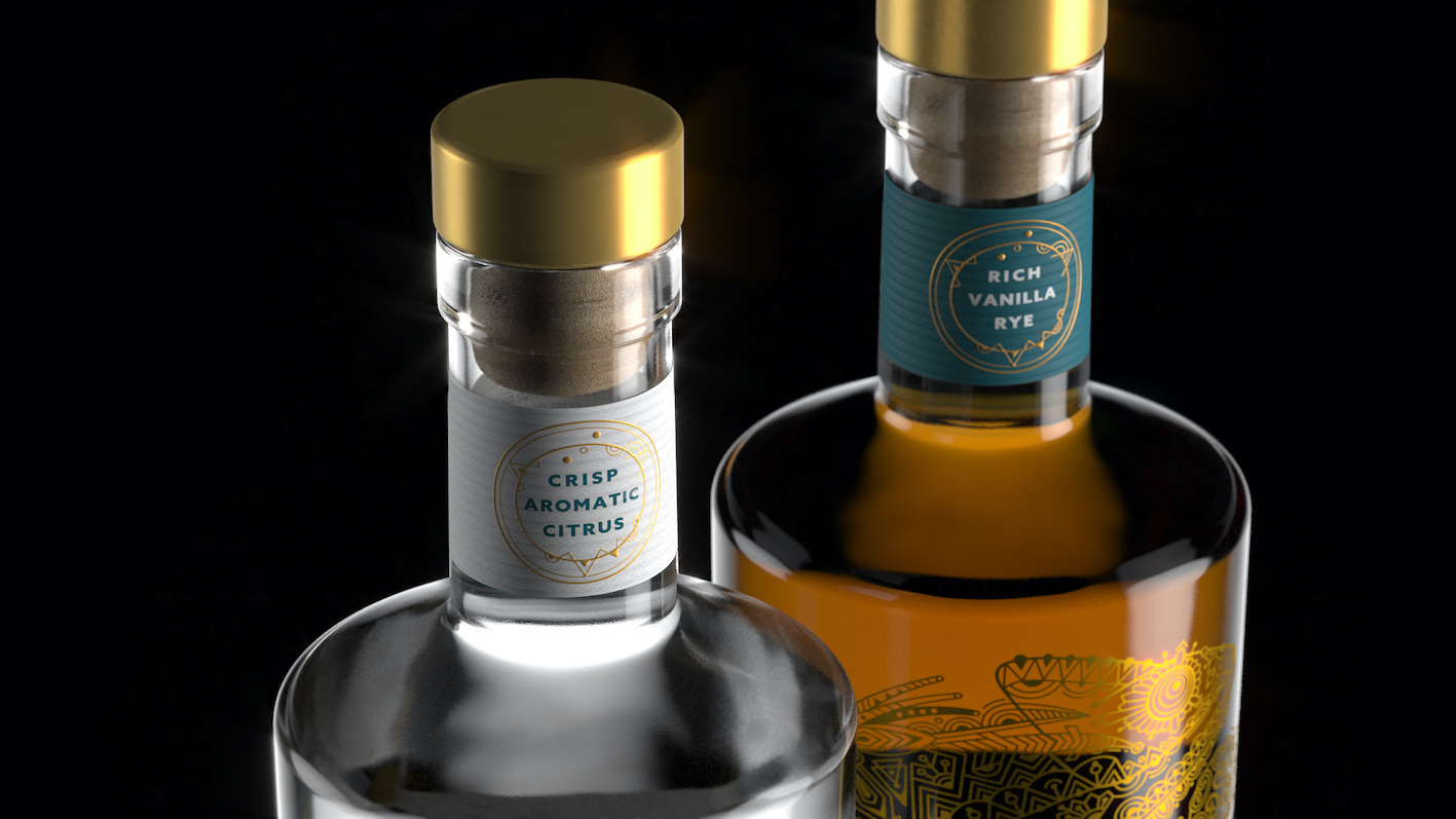
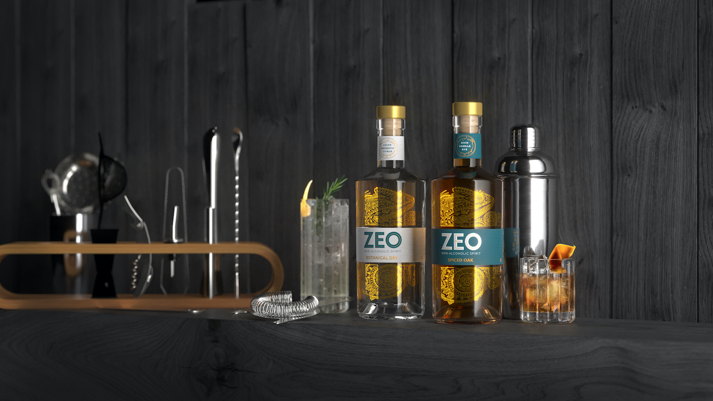
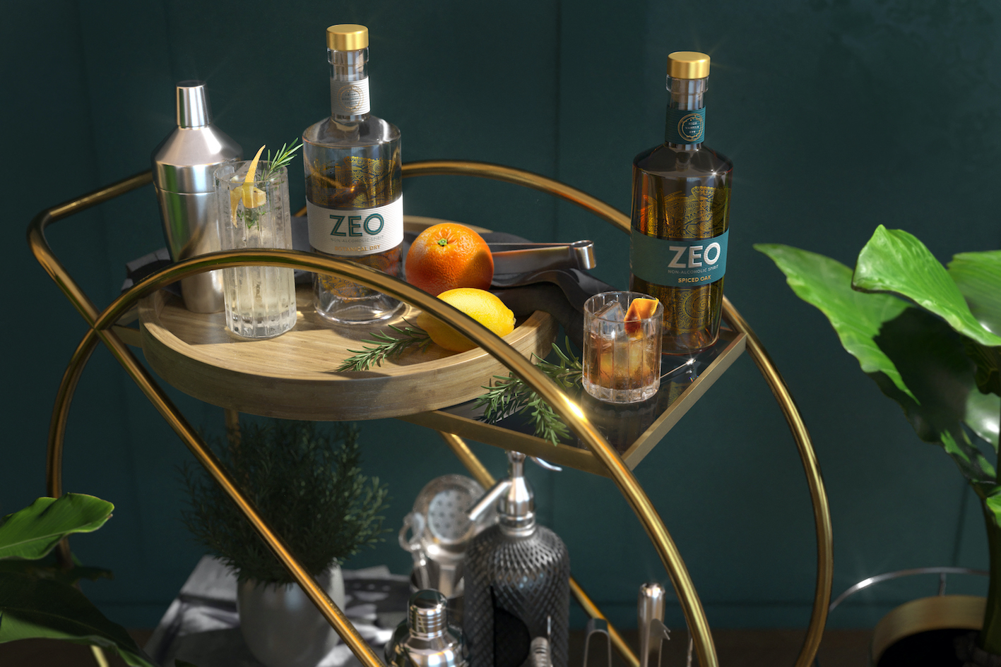
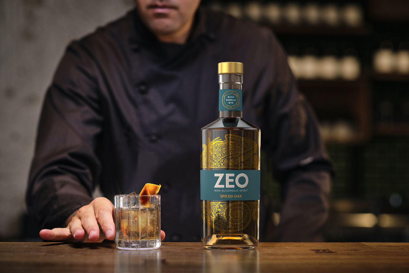
Drinks design specialists at Knockout have created a new identity and bottle design for ZEO, a range of sophisticated, sensorial zero-alcohol spirits. The brand’s first two variants, Botanical Dry and Spiced Oak, arrived in the UK market this November.
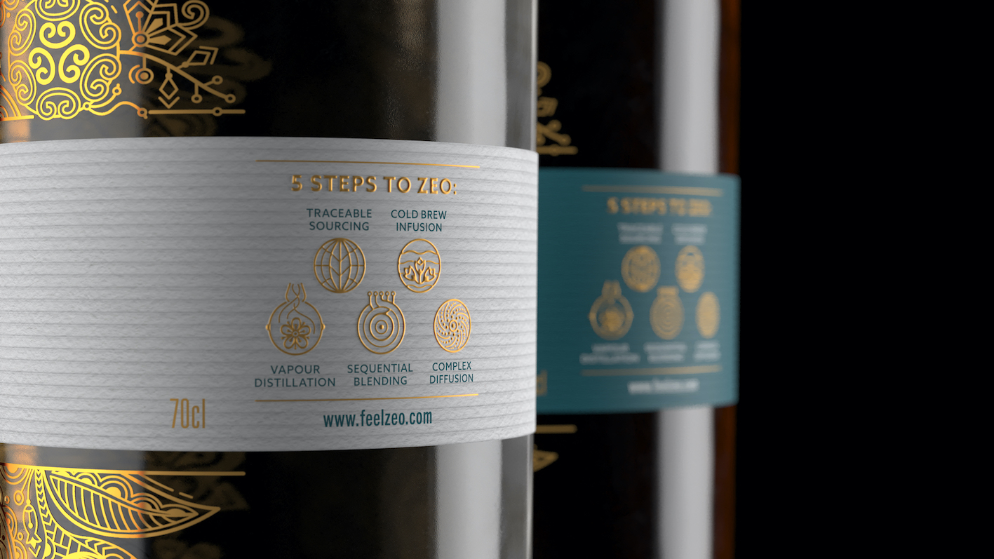
Unlike other non-alcoholic spirits, ZEO possesses a sensorial dimension which mirrors the physiological effect of alcohol. It is made with high-quality, sustainably-sourced botanicals and meticulously crafted through a complex five-step process. It’s distinctive ‘triple layered taste’ makes it a genuine alternative for people who enjoy alcohol but occasionally choose not to drink.
“ZEO isn’t for teetotallers. It’s for sociable urbanites who love to drink, but sometimes feel a bit of alcohol fatigue,” comments Dominic Burke, founder at Knockout. “When this happens, they either want to fly under the radar or enjoy something truly special. The duality of this blend-in/stand-out desire was the insight that set the course for the creative and inspired the genesis of the brand’s symbol: a chameleon.”
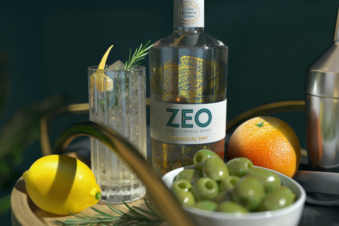
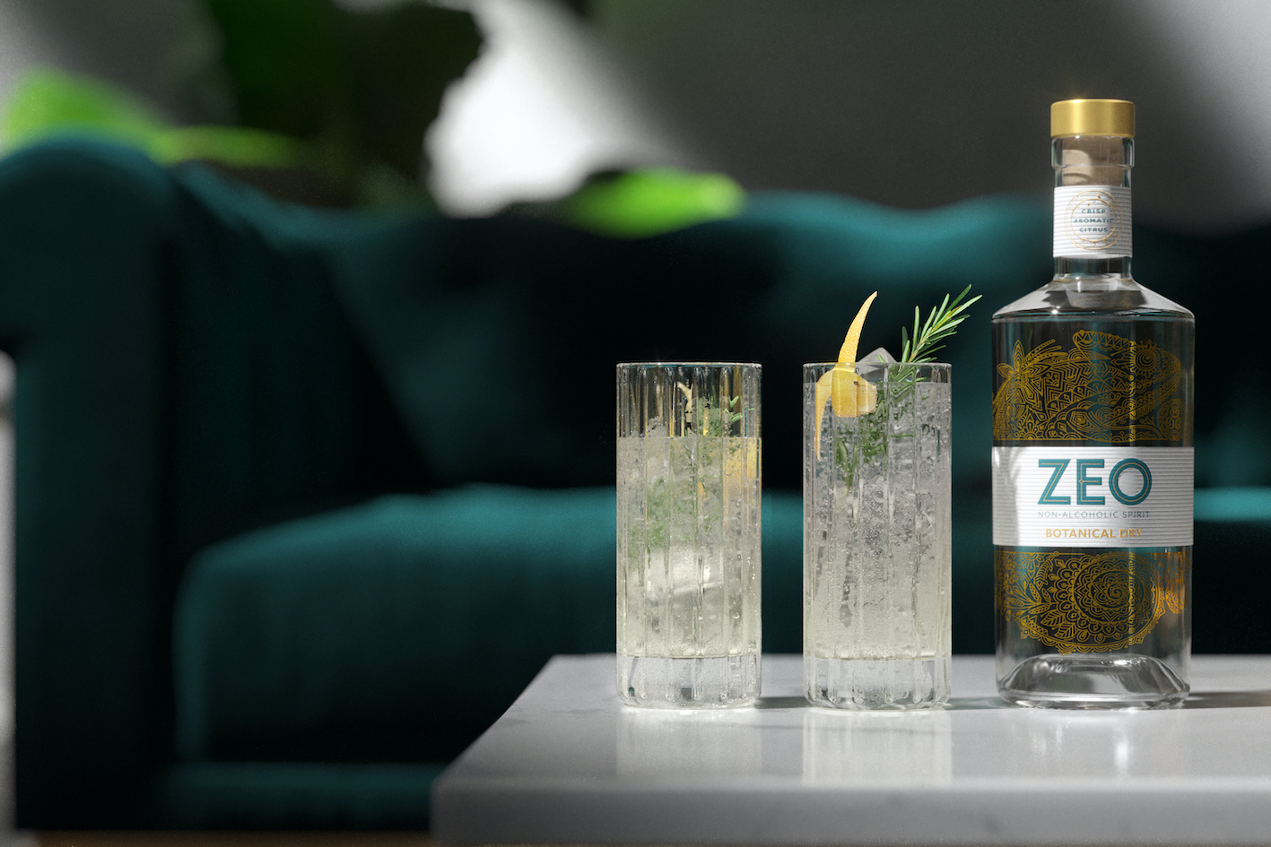
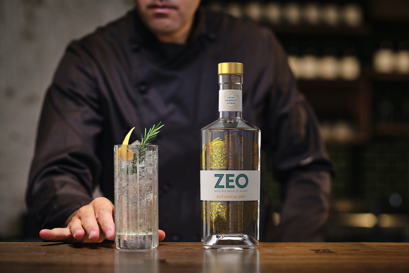
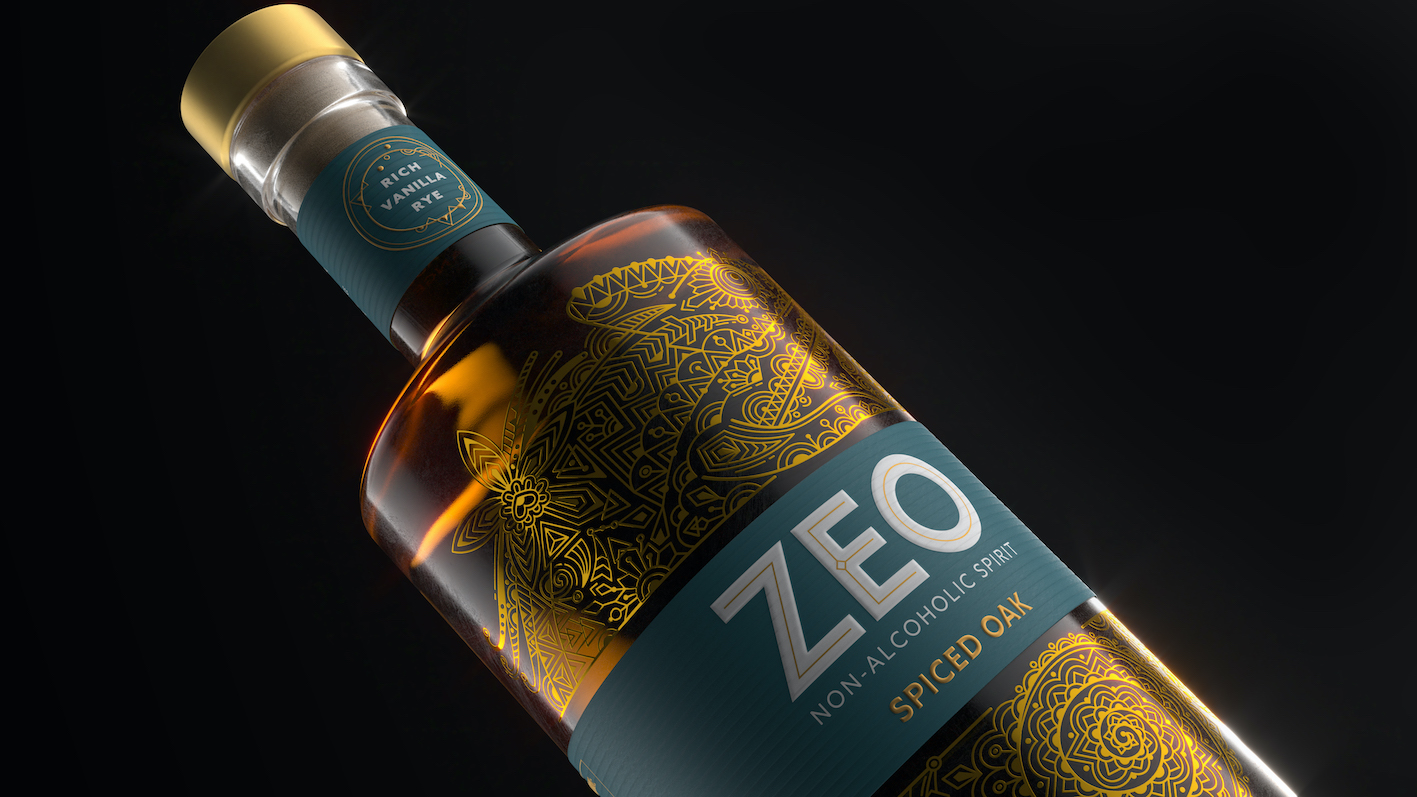
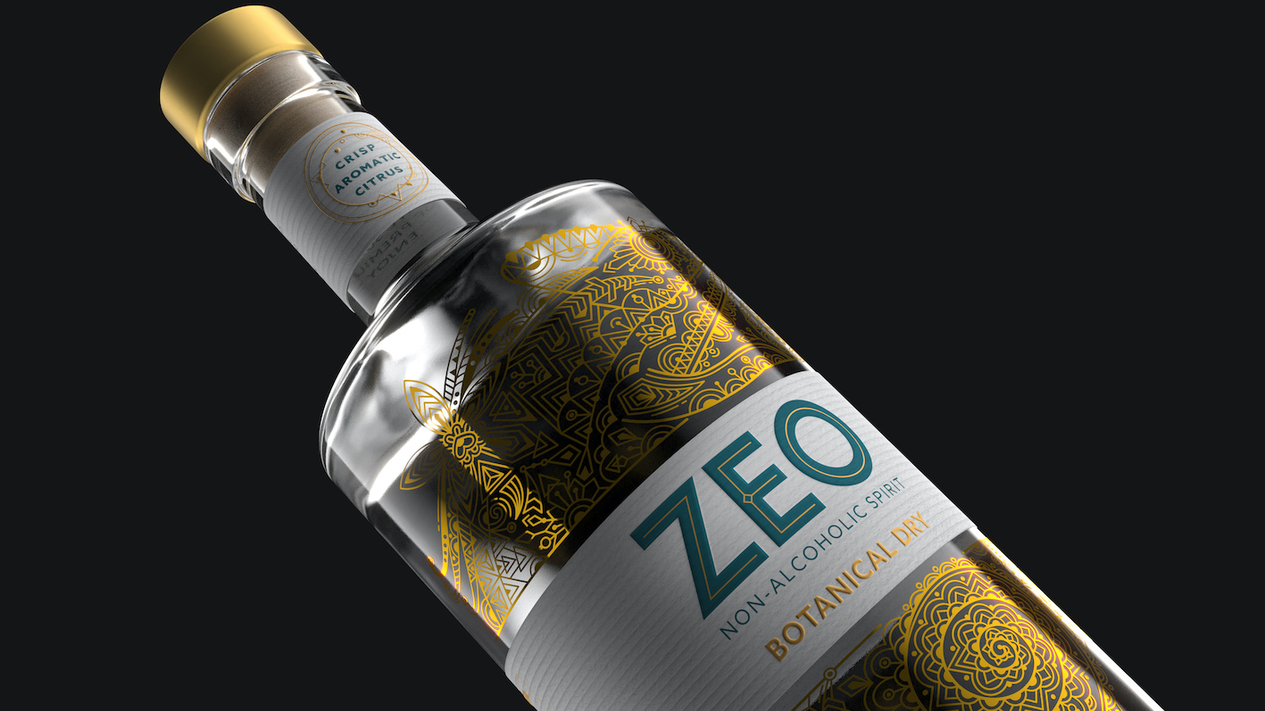
An exquisite embodiment of contemporary craft, ZEO’s bottle design strikes a dynamic balance between complexity and minimalism, underscoring the brand’s proposition as the best non-alcoholic spirit for modern tastes.
An intricate pattern illustration of the chameleon curling around the label conveys the sheer craft, sense of skill and attention to detail that goes into ZEO’s five-step distillation process. Hidden within the linework are depictions of the individual botanicals, which further reinforce the intriguing, multi-layered sensation of ZEO’s drink experience. This highly-detailed expression is then off-set by a clean, uncluttered wordmark, featuring bespoke typography that is bold in its simplicity, giving the brand a contemporary feel whilst supporting standout on the shelf and at the bar.
“As a player in a growing industry, ZEO needed compelling creativity to show that it was more than just flavoured water. The illustration of the chameleon is as delicately complex and versatile as the liquid within. Not only is it beautifully drawn, but as a metaphoric symbol, it emphasises ZEO’s adaptive and transformative powers as a brand ready to evolve and elevate the category.”
CREDIT
- Agency/Creative: Knockout
- Article Title: Zeo Raises the Bar With a Design by Knockout
- Organisation/Entity: Agency, Published Commercial Design
- Project Type: Packaging
- Agency/Creative Country: United Kingdom
- Market Region: Europe
- Project Deliverables: Brand Creation, Brand Guidelines, Brand Identity, Branding, Graphic Design, Identity System, Illustration, Packaging Design, Research
- Format: Bottle
- Substrate: Glass Bottle


