


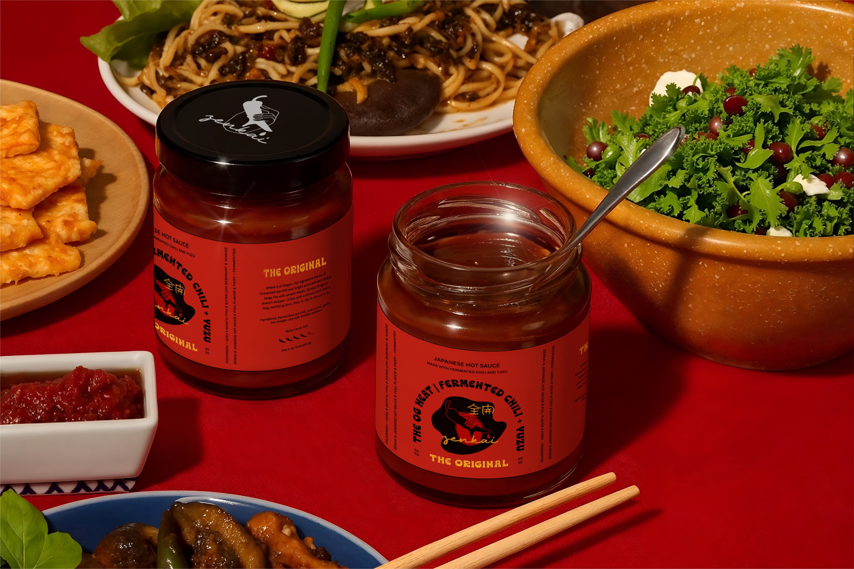
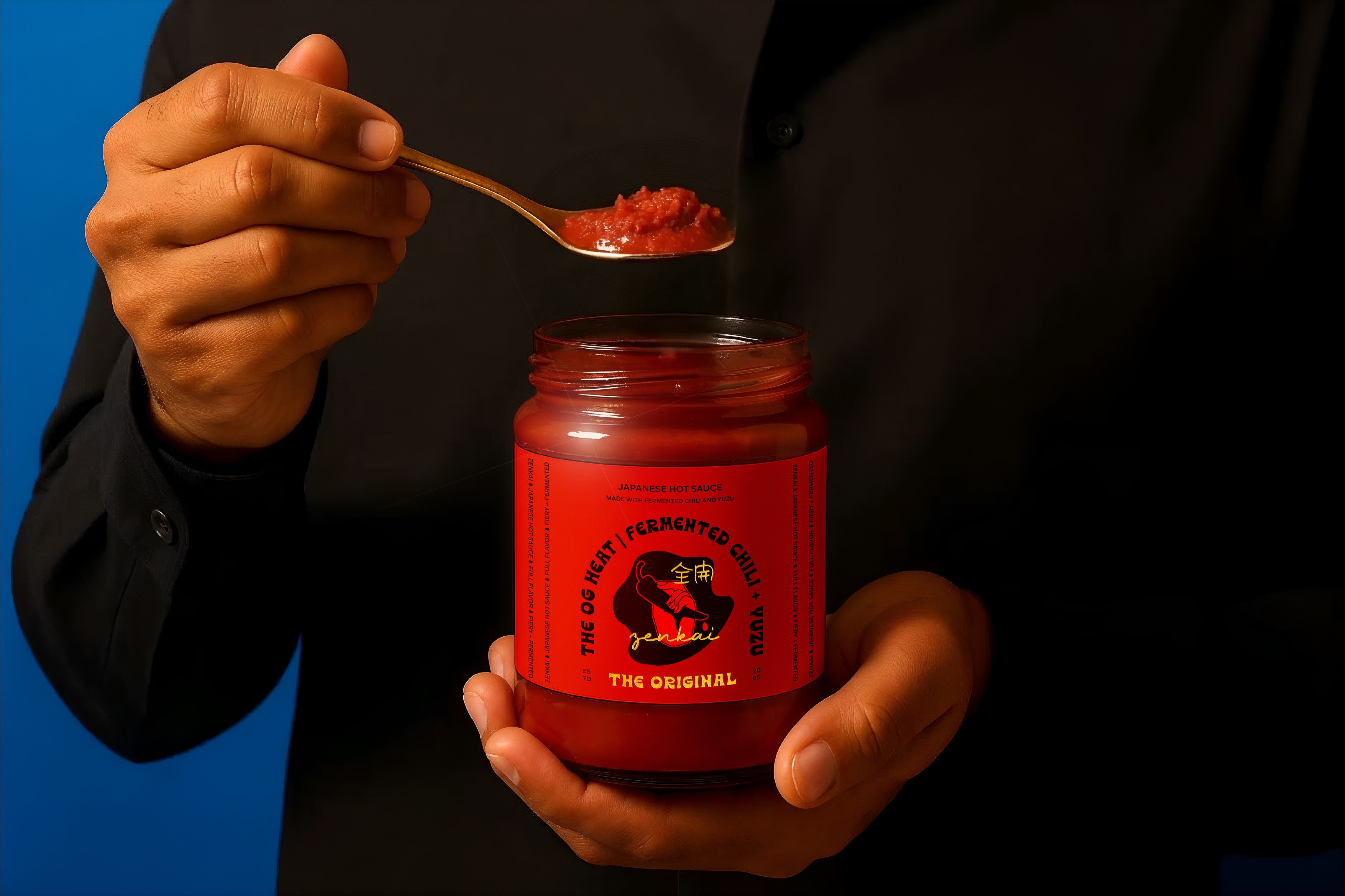
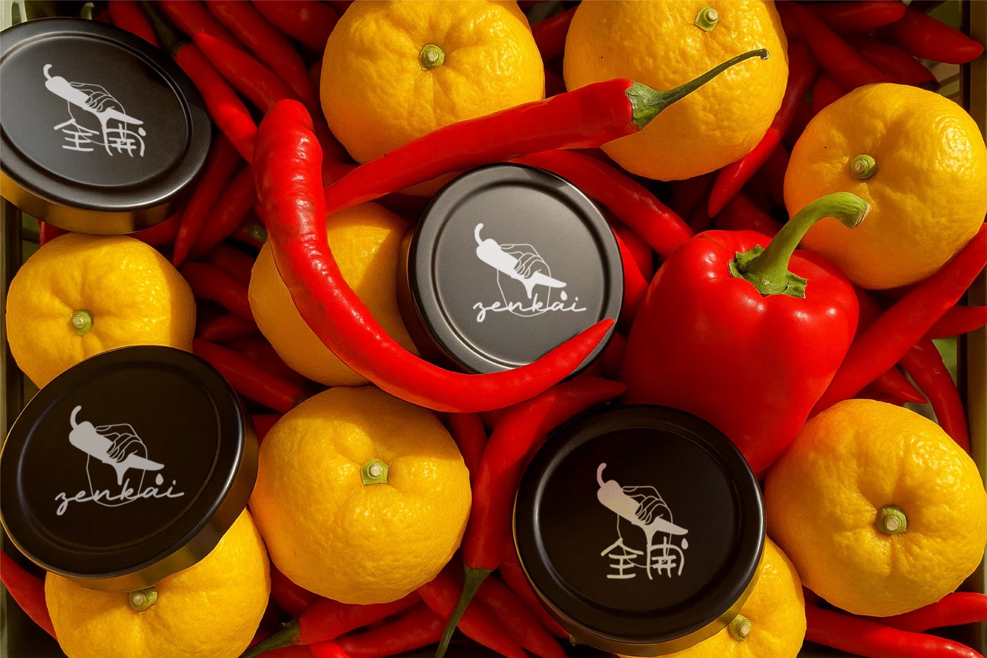
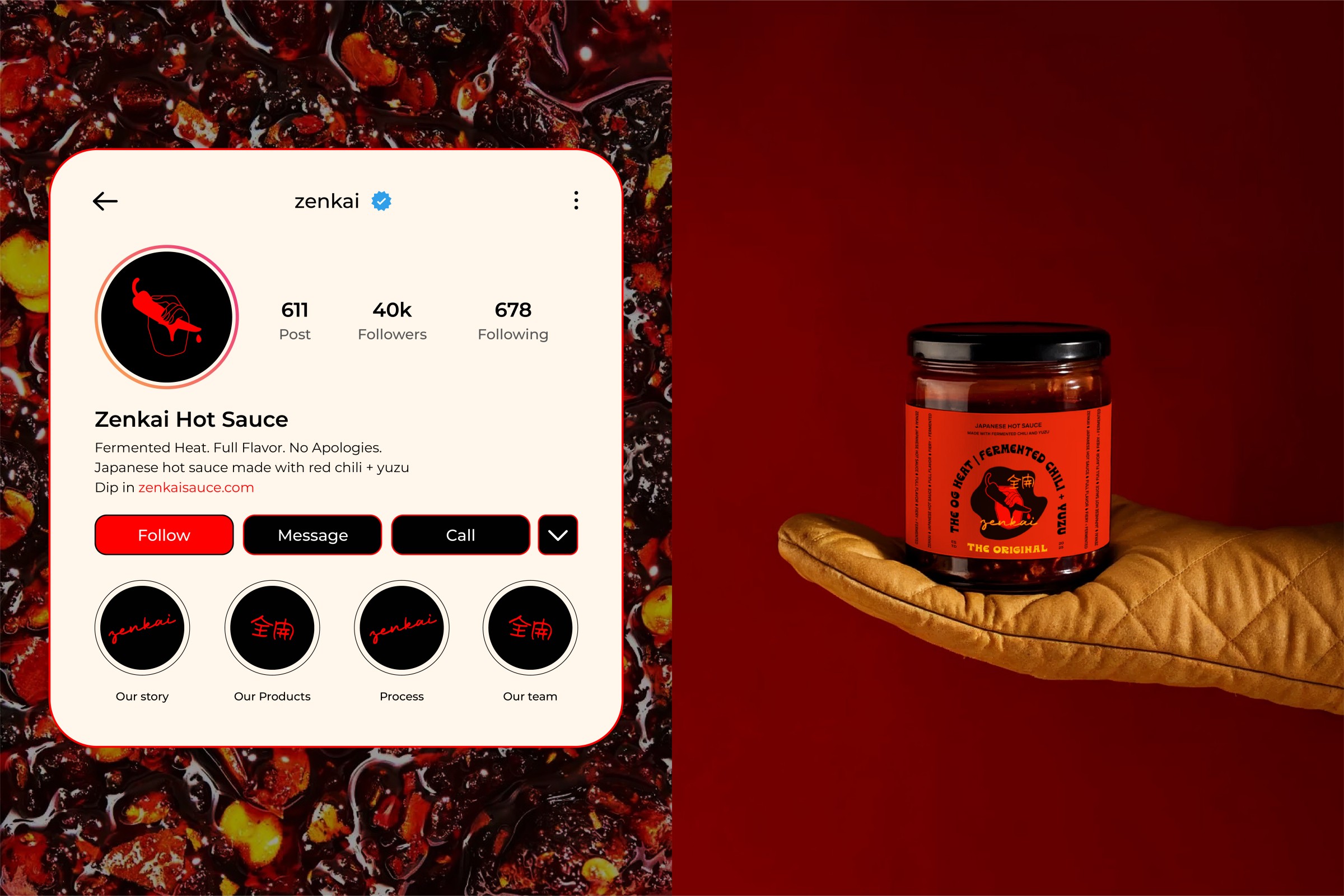
The Brief: The project was to design a bold and culturally resonant identity for a Japanese hot sauce crafted with fermented chili and yuzu. The brand needed to carry a sense of sharpness, freshness, and modern edge while staying deeply rooted in Japanese tradition. The task was not only to create packaging but to build a complete brand world—one that could speak confidently in today’s saturated food and beverage market.
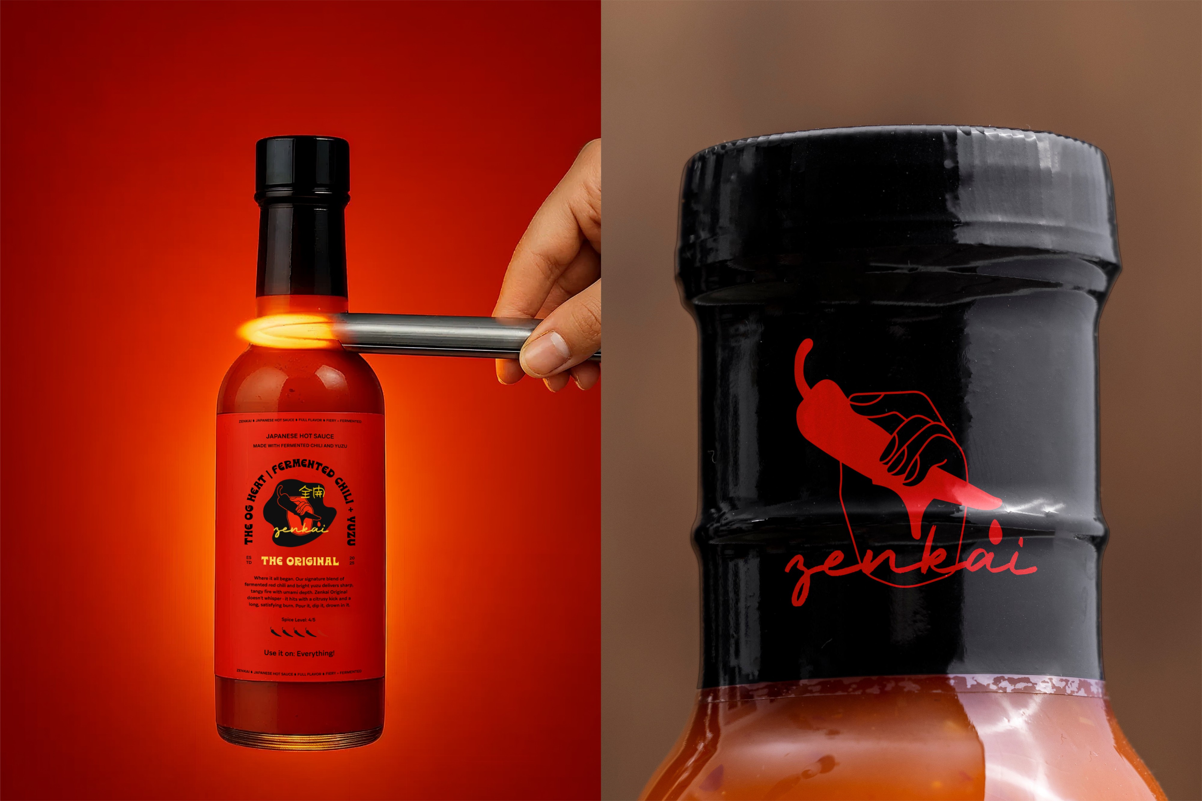
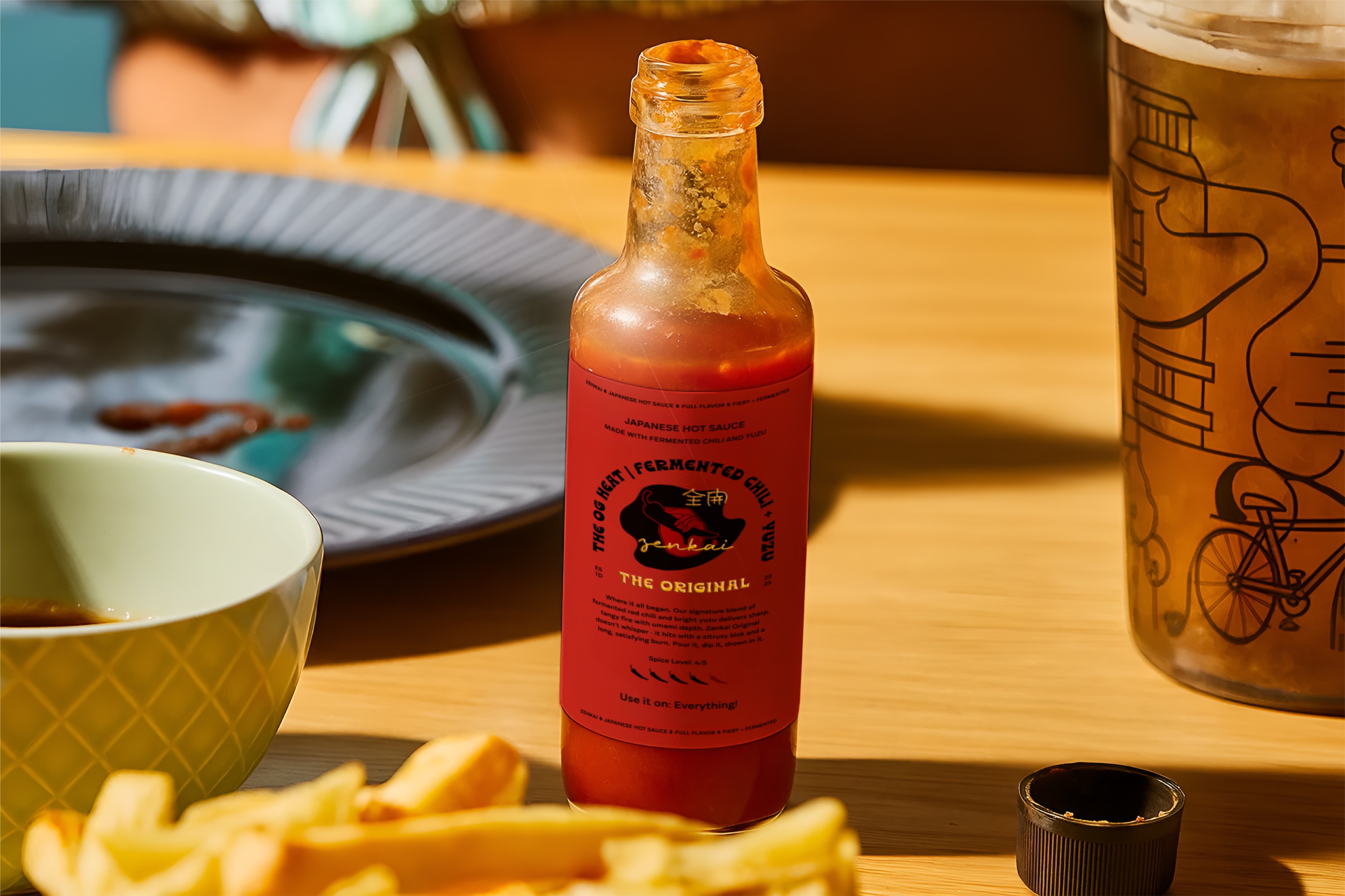
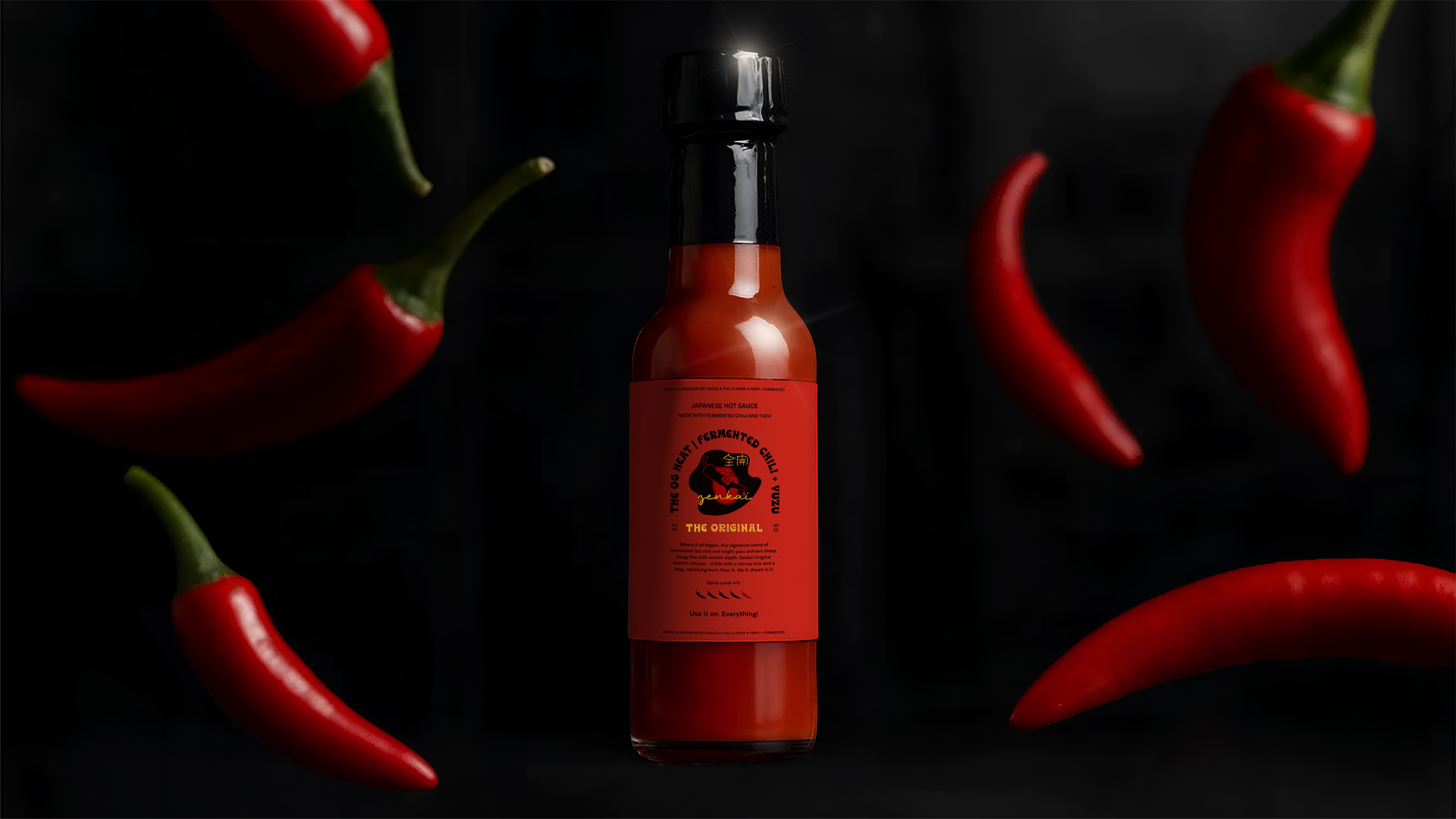
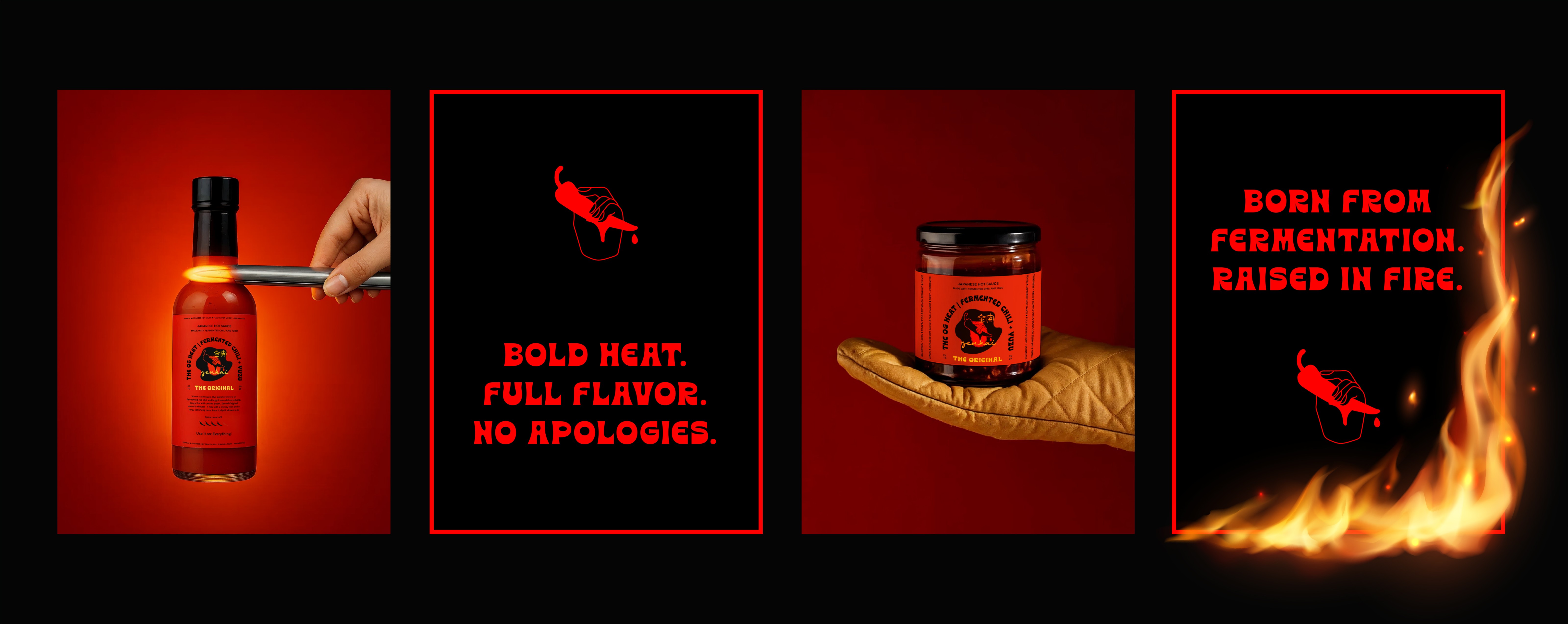
The Challenge: The hot sauce aisle is one of the noisiest spaces in retail design. Most competitors lean heavily into fire motifs, neon flames, skulls, and exaggerated masculinity. With so much shouting for attention, the challenge was: how do you stand out without becoming another cliché? How do you honor the heat and intensity of chili while balancing it with the elegance and brightness of yuzu? Instead of avoiding the familiar energy of red and black, Zenkai embraces it. These colors are iconic in both Japanese visual culture and the global language of spice, but here they’re reimagined with intention—paired with structured typography, bold composition, and cultural nuance.
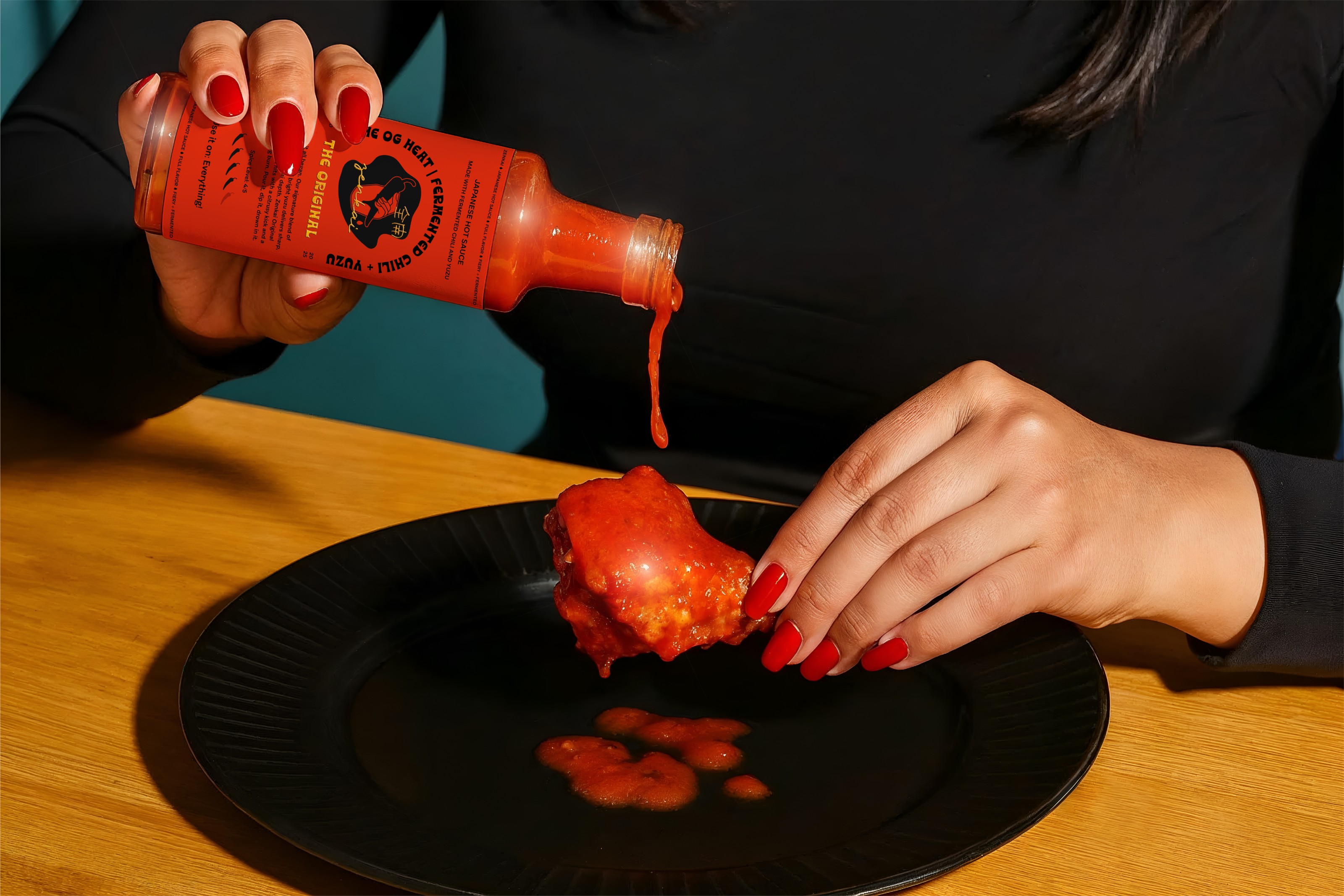
The Goal: The aim was to create an identity that felt fiery but not gimmicky. The product is rich in fermentation, has layers of flavor, and is enhanced by the citrus sharpness of yuzu. The brand needed to mirror that same complexity—a visual system that could be both modern and timeless, sharp and stylish, and traditional yet fashion-forward. The goal was to create a sauce that didn’t just sit in the pantry but demanded to be displayed, photographed, and shared.
The Solution: Zenkai (全開), which translates to “full throttle,” became the driving force behind the design. The packaging system channels intensity in every detail: the powerful red-and-black palette communicates heat and boldness, while the handcrafted illustration and logotype root it in cultural authenticity. Typography plays a leading role, designed to feel unapologetic and overflowing with energy—much like the flavor itself. Together, these elements create a design that is confident, direct, and visually striking.
CREDIT
- Agency/Creative: Aleena Sultana
- Article Title: Zenkai: Turning Up the Heat on Japanese-Inspired Hot Sauce Design
- Organisation/Entity: Freelance
- Project Type: Identity
- Project Status: Published
- Agency/Creative Country: India
- Agency/Creative City: Delhi
- Market Region: Asia, Global
- Project Deliverables: Brand Creation, Brand Design, Brand Identity, Branding, Logo Design, Packaging Design, Packaging Guidelines
- Industry: Food/Beverage
- Keywords: Japanese hot sauce, Food & beverage packaging design, Bold color palette, Spicy sauce branding
-
Credits:
Creative Direction, Design and Packaging: Aleena Sultana


