At 15 years in, Zendesk was fighting for distinction in a sea of competitors within the CX space. Various companies had adopted several aspects of our unique brand language, which diluted its impact over time, and also compromised our brand value. Transformational change within the company and the broader CX industry signaled it was time to refresh our brand positioning, messaging and look and feel. In order to effectively reach our audience and grow the business, a new mature and confident brand expression would decisively increase our brand distinction and demonstrate market leadership.
The design criteria for the brand refresh project involved several considerations. The new brand expression must be distinct—it must stand out within a crowded market and define what CX leadership should look like. The next quality we sought after was timelessness. While the new look and feel needed to feel current, it also needed to be long-lasting and flexible enough to endure continual change. We considered practicality and equity—while we as a creative team are passionate about making beautiful things, beauty has little purpose in a brand system if it can’t easily be executed or extended upon, or if the end results aren’t accessible to all.
The preliminary work on this project began in the form of collaborative cross-functional workshops, which involved nearly the entire Creative Team at Zendesk. The primary objective of these workshops was to focus on individual design elements and narrative ideas, as well as audit where our current branding was falling short and no longer delivering on its intentions. We dove into color psychology, serif vs. sans serif typography, the impact of motion and animation on the brand experience, how various approaches to illustration, blockframes, and photography are interpreted, among so many other facets of branding. These initial workshops succeeded in aligning the entire team on the key objectives and touchpoint requirements of the brand, and also contributed to a wealth of initial inspiration for the upcoming concept and design phases to follow.
During the concept phase we developed multiple unique brand concepts to align with newly defined brand positioning and our updated company mission, vision and values. This work was heavily informed by years of experience in the market, our brand positioning research, and the trajectory of the company. Our process encouraged playful exploration and divergent thinking to open our minds, unlock creativity, and incorporate humor and levity into the process. The team came together both remotely and on-site to develop our concepts. For each concept, we created a brand ethos, manifesto, personality characteristics, and mood boards to represent the visual expression. Three final concepts were presented to marketing leadership for feedback , and put in front of customers and prospects to solicit reactions and identify accessibility and DEI considerations.
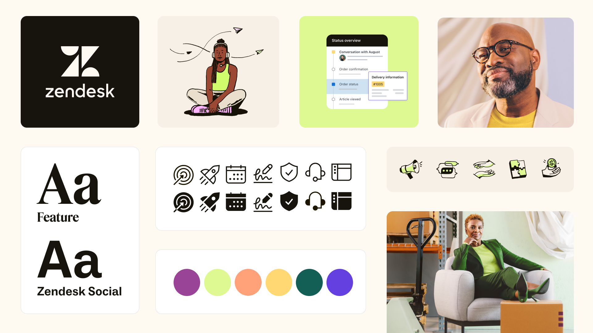
The winning concept was chosen for its longevity and authenticity. It represents who Zendesk is today and will be in the future. To kickstart creative direction, we defined new brand attributes: distilled, confident, generous, and freshhhh. These attributes became the lens in which we judged our work. Our team iterated, shifted, and evolved our design experiments to align with these attributes. The result is an integrated, harmonious brand expression that we feel confident is true to the Zendesk brand. Distilling our color palette made way for vibrant and expressive new imagery, while incorporating a serif typeface into our type stack immediately elevated our newly matured and confident voice and tone. Restraint played an enormous role in our design approach to layout, as well as a concern for representation and inclusion within our imagery system.
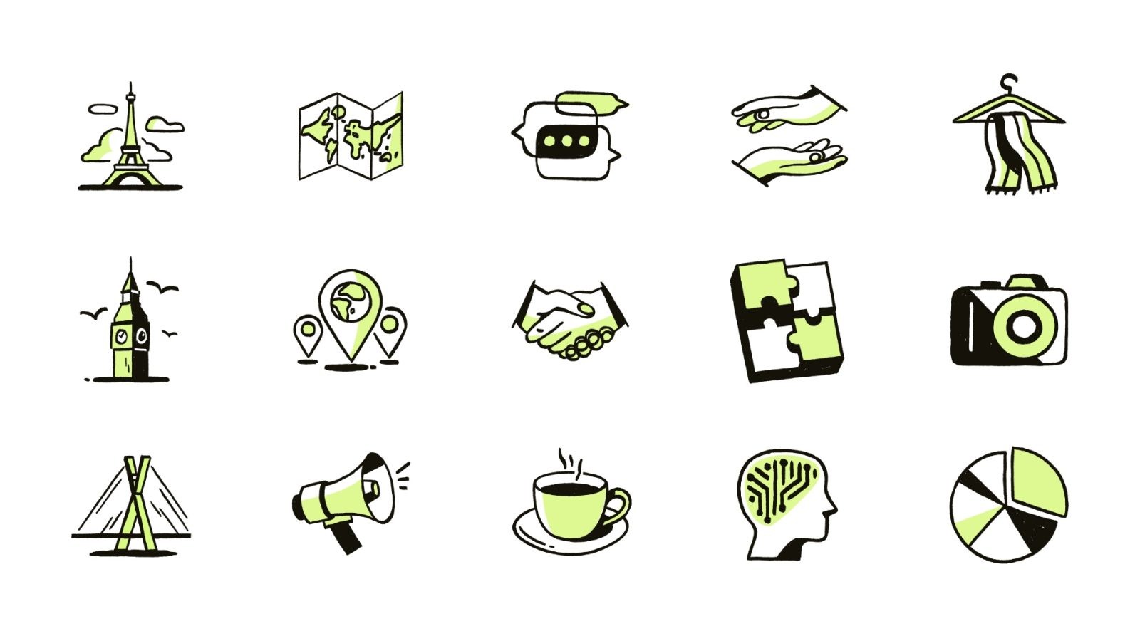
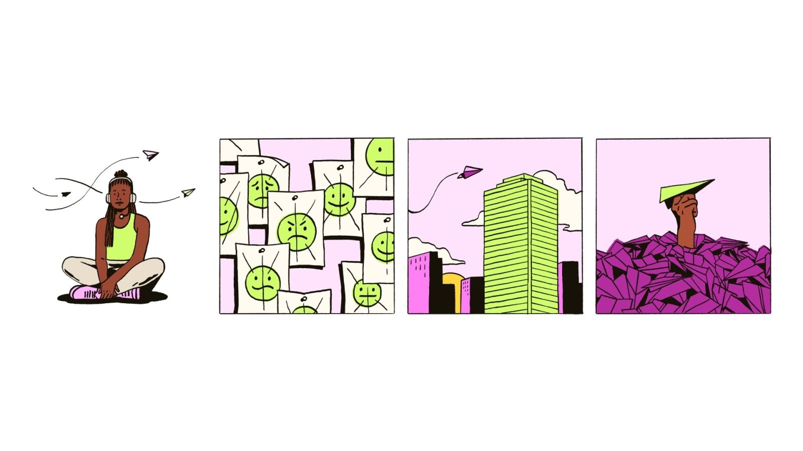
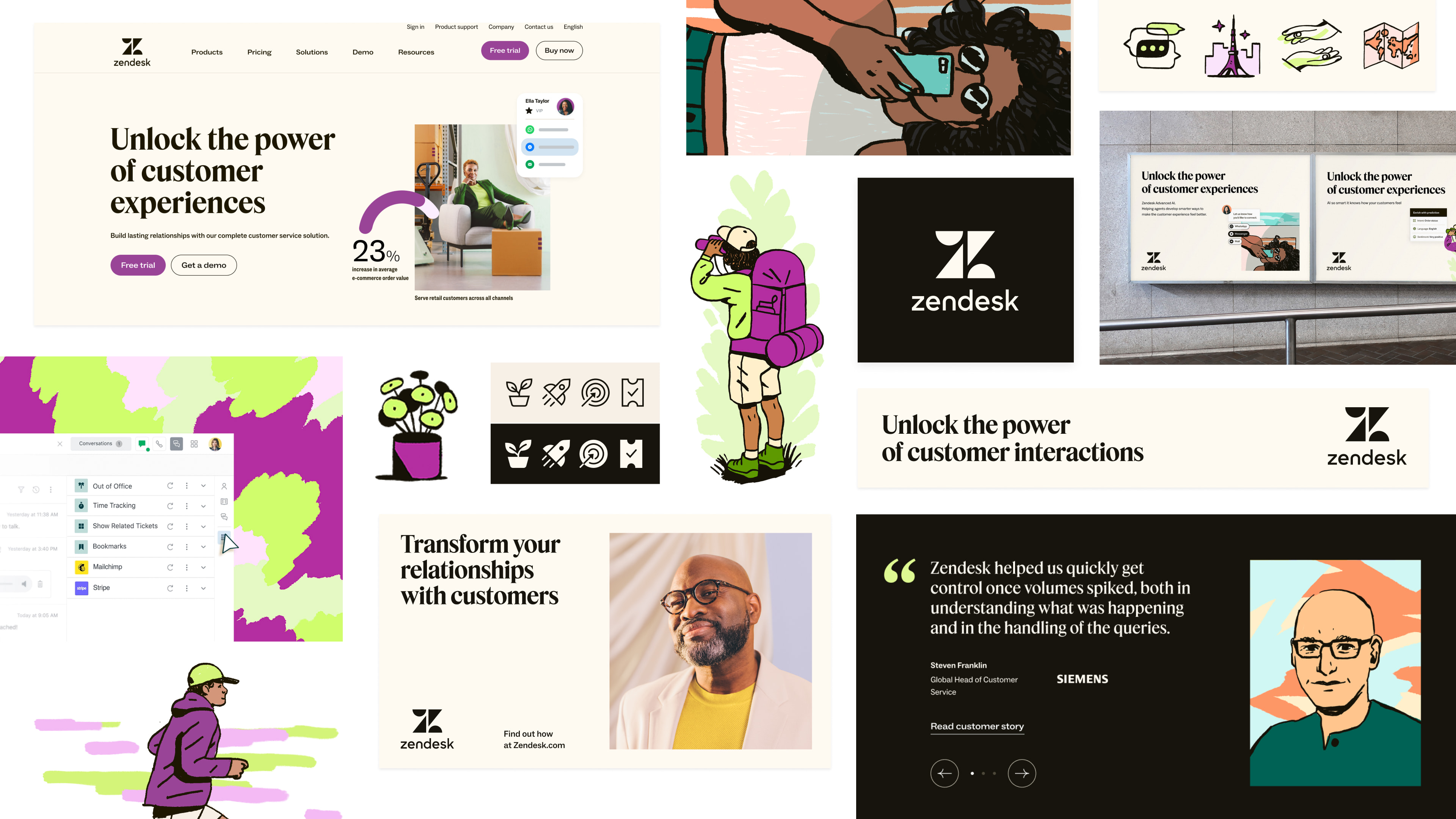
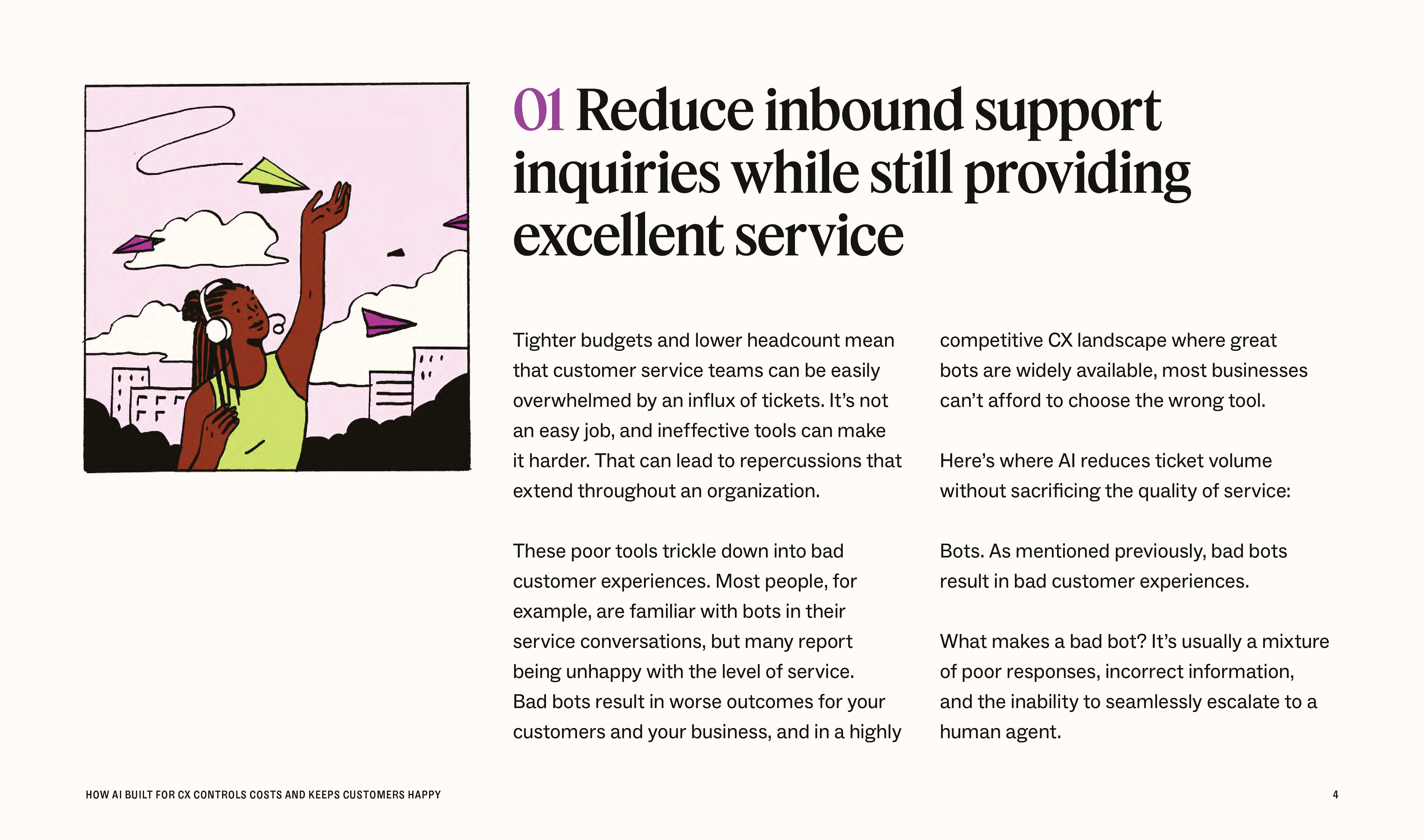
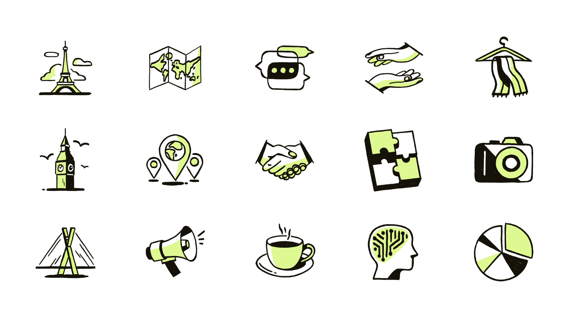
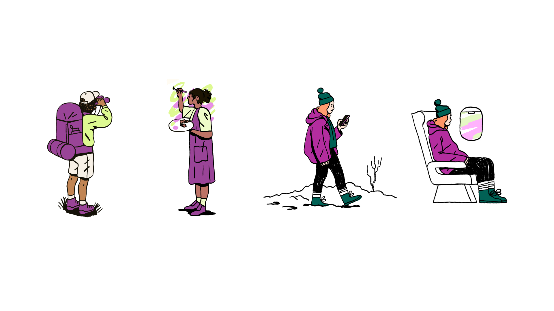
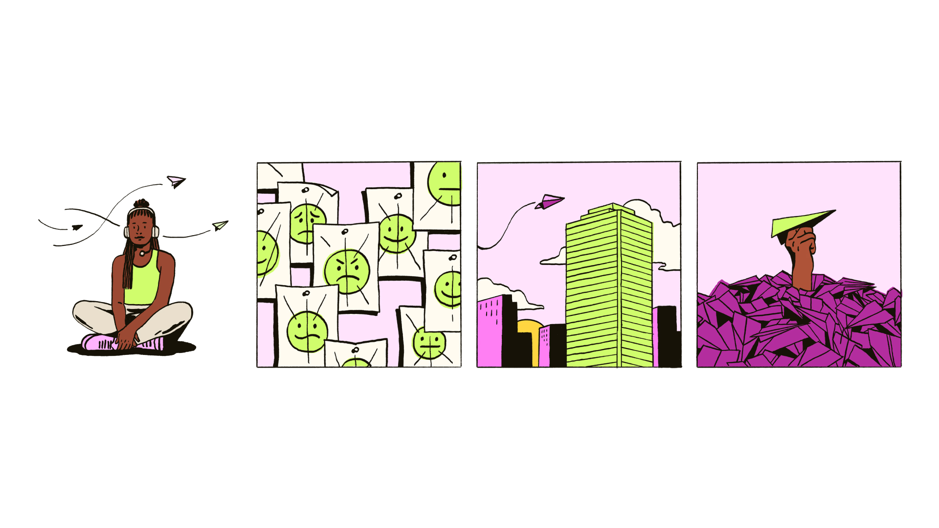
This 18-month initiative resulted in an evocative brand identity foundation that speaks to where we are as a company as well as where we’re headed. Our voice and tone has been refined to prioritize clarity of message, through a caring yet opinionated lens. The resulting visual brand expression draws from the quiet confidence and minimalism of editorial design, portraying a timeless sense of place while elevating stories with simplicity and sophisticated creativity. Our adventurous new color palette harnesses jewel tones that effortlessly differentiate our brand from the typically blue and green-saturated tech world we exist within, and our uniquely handcrafted house illustration style provides an organic warmth for additional distinction within this space. Our photography documents moments that speak directly to our audience by capturing both the ideal and realistic state of CX. Our motion system and approach to video editing enables us to present technical, complex subject matter in a way that is both elegant and easy to understand, delivering on our brand promise to simplify the complex. And even with all of this, we as a team are just getting started. We’ve set the stage for a brand system that will be easy and engaging to extend upon, which sets up our team and company for success moving forward.



CREDIT
- Agency/Creative: Zendesk Creative
- Article Title: Zendesk’s Journey to Refreshed Brand Distinction and Market Leadership
- Organisation/Entity: In-House
- Project Type: Identity
- Project Status: Published
- Agency/Creative Country: United States
- Agency/Creative City: San Francisco
- Market Region: Global
- Project Deliverables: Brand Redesign, Illustration, Rebranding, Typography
- Industry: Technology
- Keywords: WBDS In-House Design Awards 2023/24
- Keywords: Identity, Brand Redesign, Illustration , Typography
-
Credits:
Senior Brand Designer: Rachel Frankel
Associate Creative Director: Tim Lampe
Senior Brand Designer: Faustine Gheno
Senior Systems Designer: Clark Hubert Guy
Executive Creative Director: Betsy Field (Filson)
Principal Copywriter: Diana Wynne
VP of Creative: Erin Pinkley
Executive Creative Director: Olivia Kingsley
Lead Illustrator: Olenka Malarecka
Senior Copywriter: Raven Wright
Brand Imagery Lead: Marta Dymek
Senior Copywriter: Julia Oller
Senior Copywriter: Kendrick Hammond
Brand Identity Systems Manager: Cristina Mendoza Magari
Brand Designer: Arienne Gagui
Creative Producer: Caty Chung
Creative Operations Senior Manager: Renae Vespremi
Digital Design Director: Kristina Alford
Senior Digital Designer: Adam Chung
Lead Digital Designer: Silvana Yaneva
Creative Producer: Jordyn Fields
Creative Production Senior Manager: Kevin Tsukii
Creative Producer: Mackenzie Covington
Creative Production Director: Anna Cirera
Design for Motion Lead: Mary Vertulfo
Associate Creative Director: Tori Cincotta
Senior Motion Designer and Animator: Colin Thomas
Creative Director: Victor Hugo Duran
Senior Video Editor: Monica Yap
Icon Designer: Laura Bohill


