


The Beginning of Zencha
Zencha was born from a simple question: how to bring the experience of drinking matcha into the modern world without losing its soul? In Japan, matcha is more than just a drink. It is part of ritual, tranquility, and the art of living. However, when matcha entered the global market, many brands fell into generic packaging that lost its philosophical meaning.
Zencha saw this gap and turned it into a challenge.
We identified several problems such as cultural value being lost because most matcha packaging does not reflect the Japanese philosophy of simplicity and spirituality. Because it was less relevant to the global audience, traditional design was often considered outdated, while modern design sometimes became too minimal to the point of losing depth. And the perception of quality made it difficult for consumers to distinguish premium matcha from ordinary matcha just from the packaging.
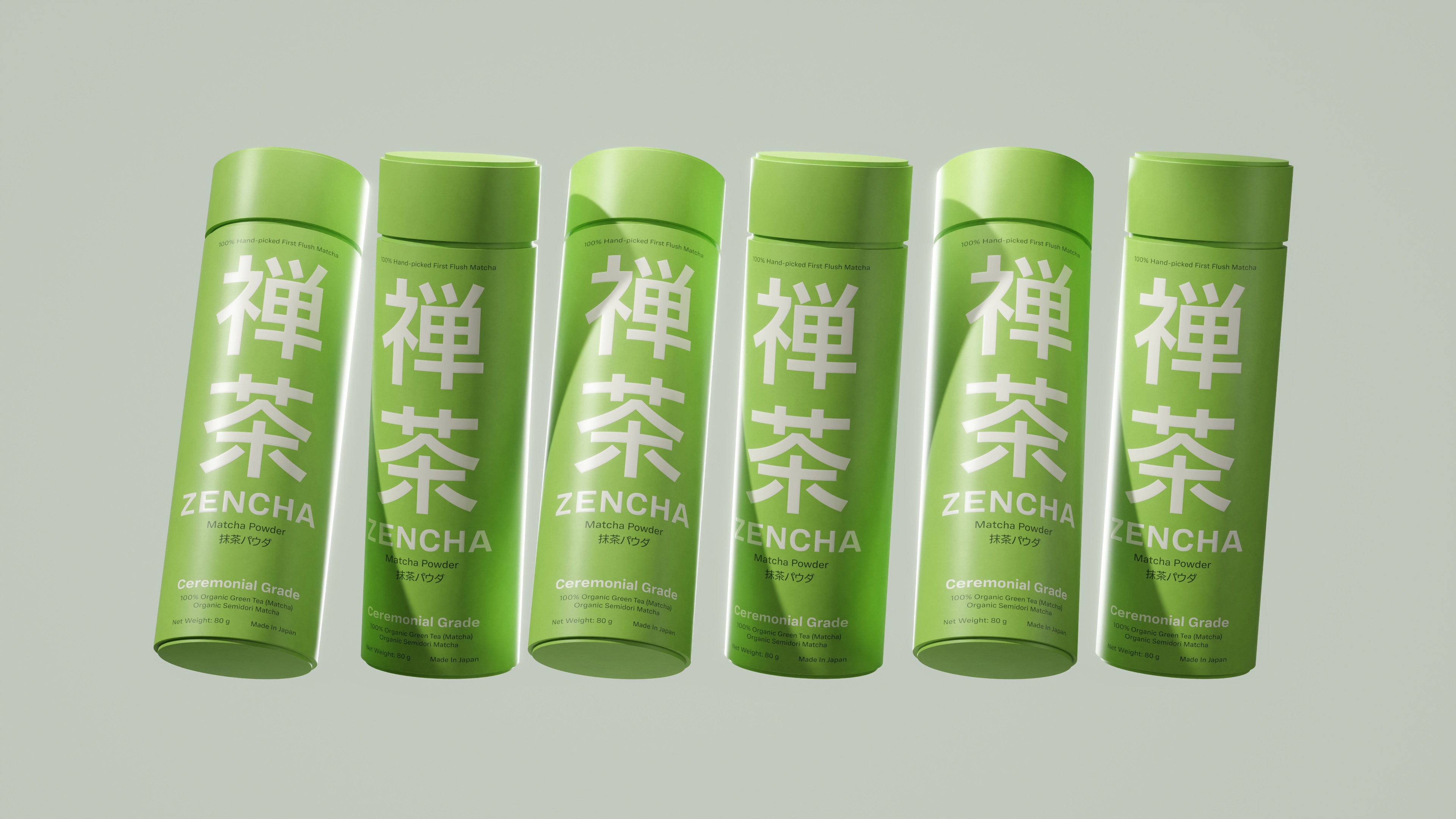
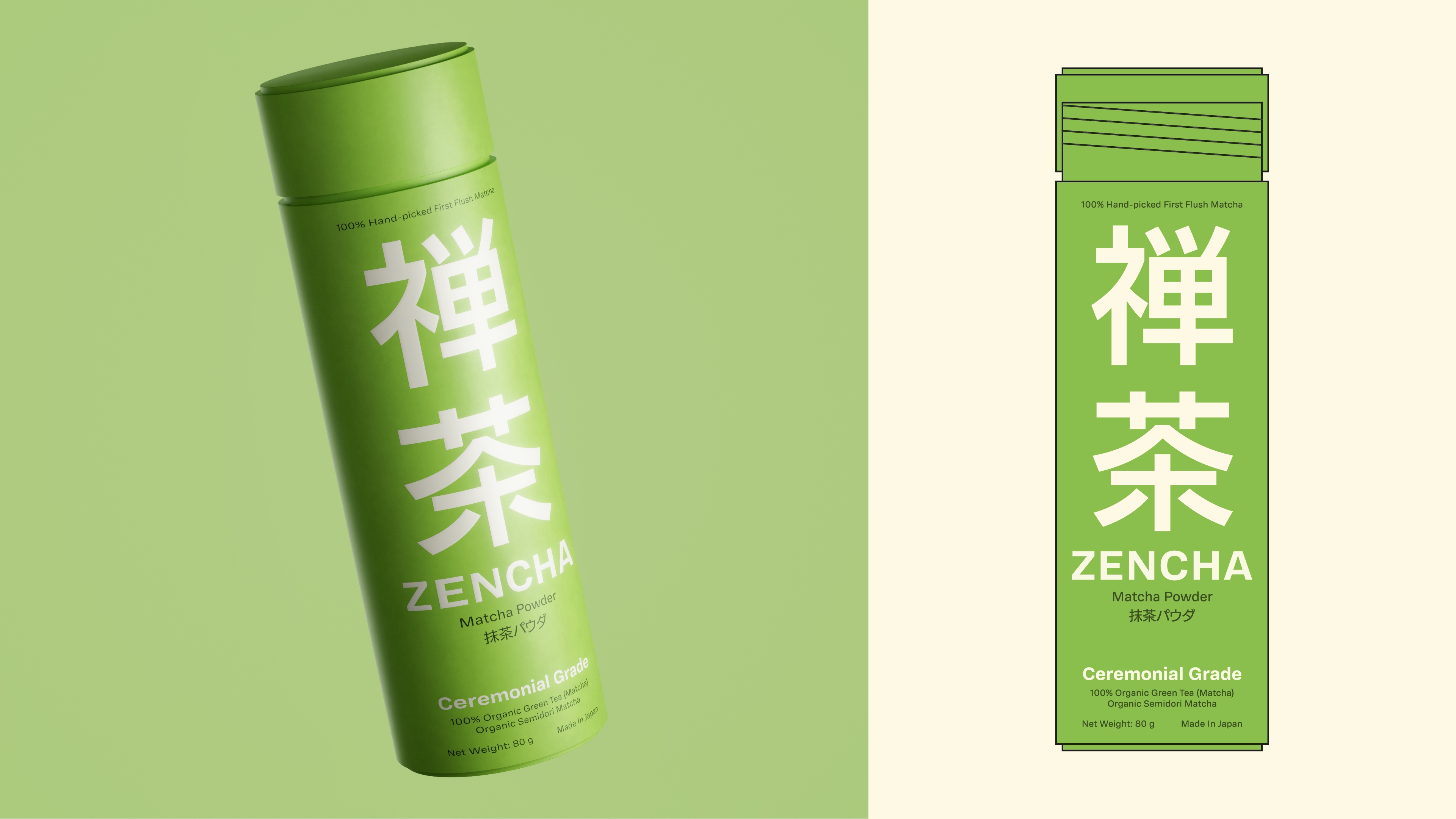
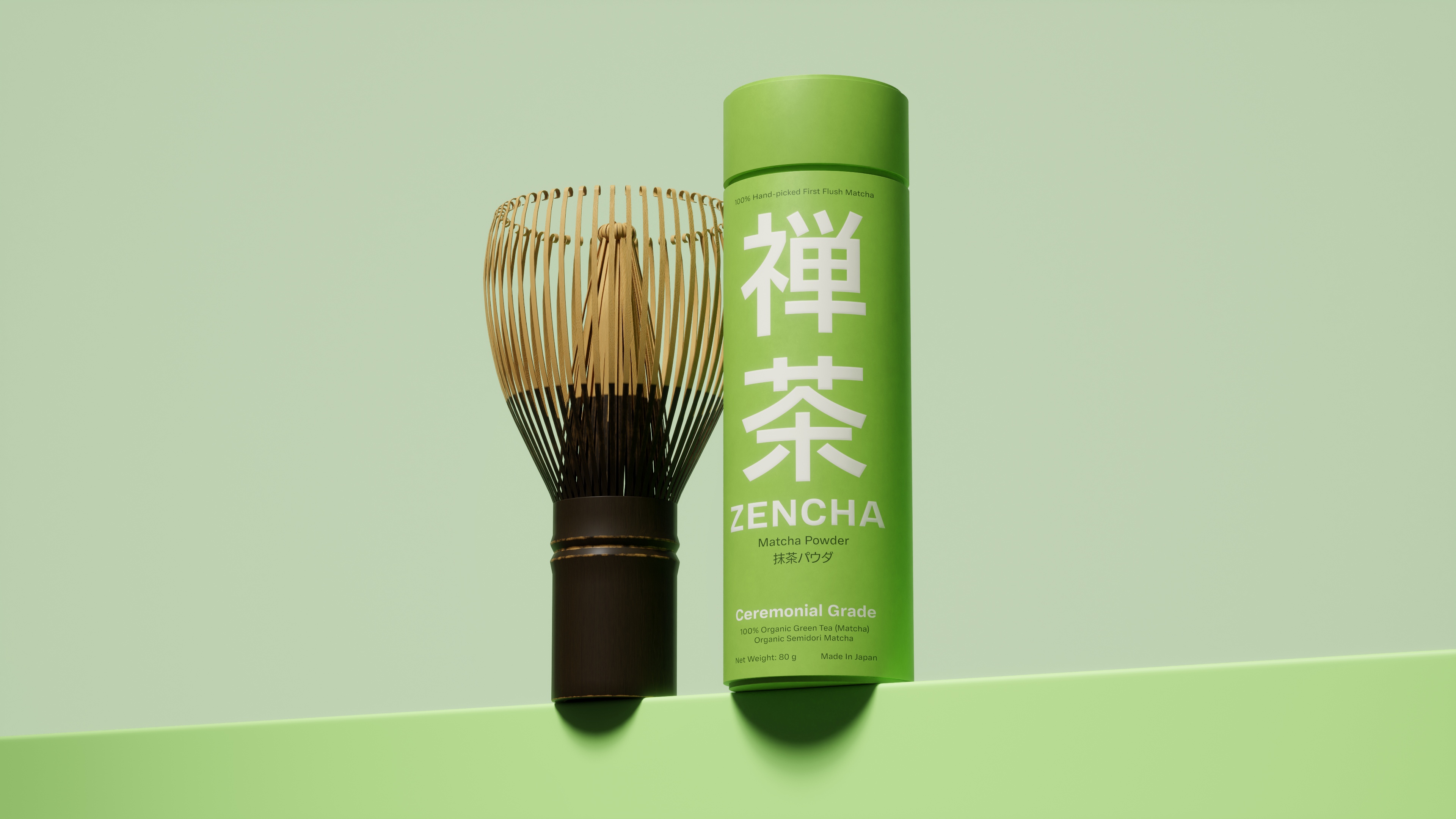
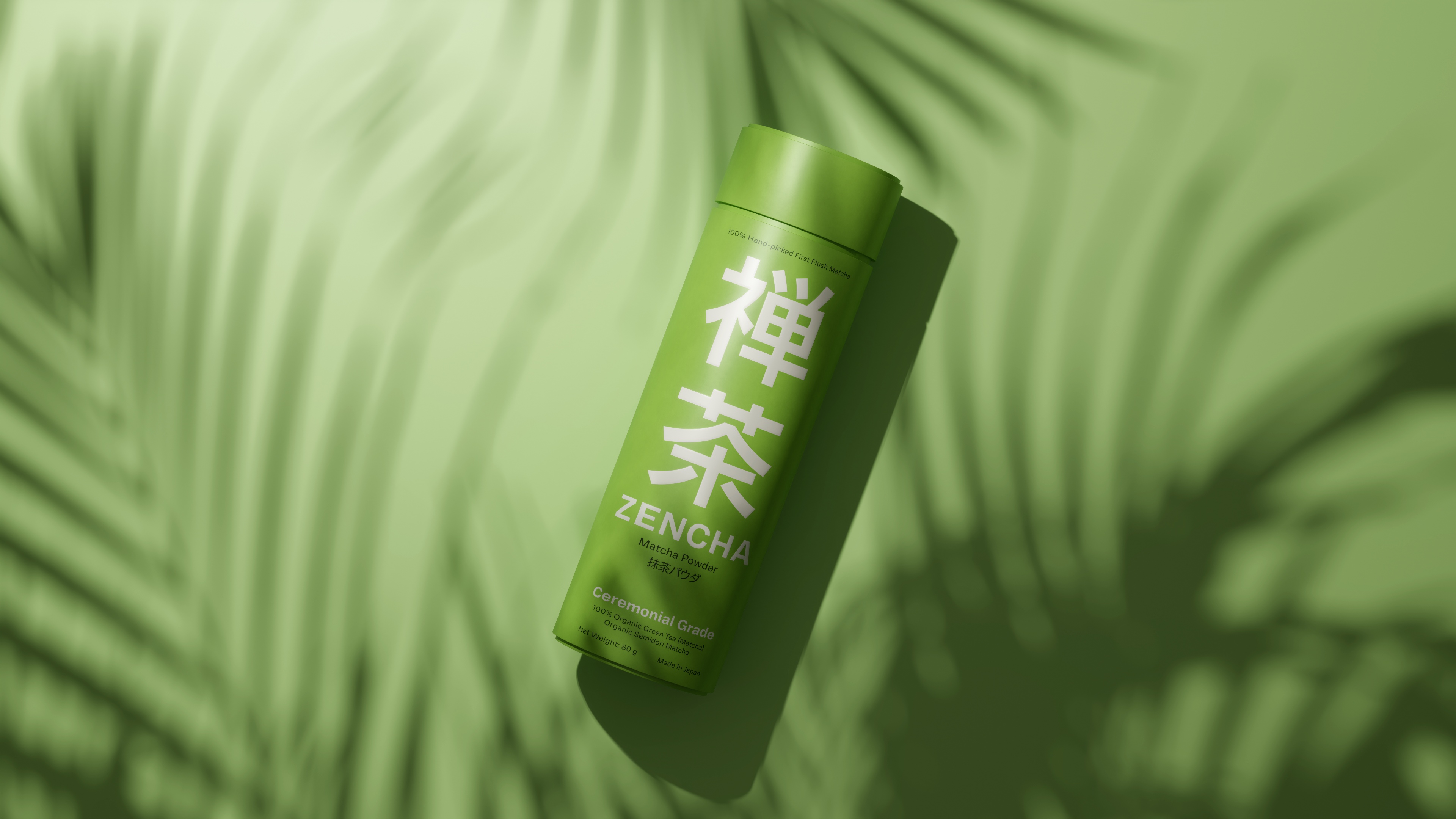
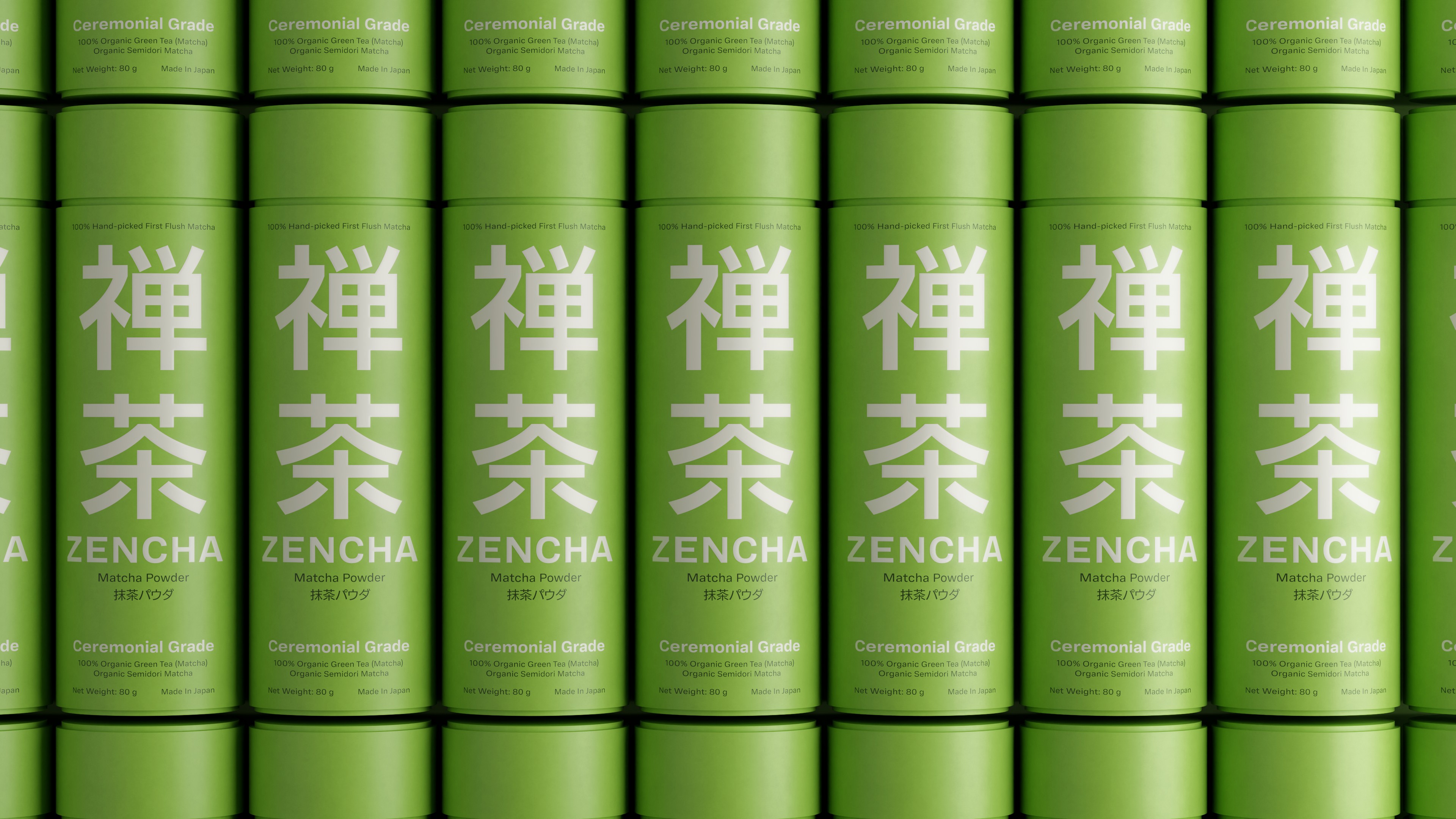
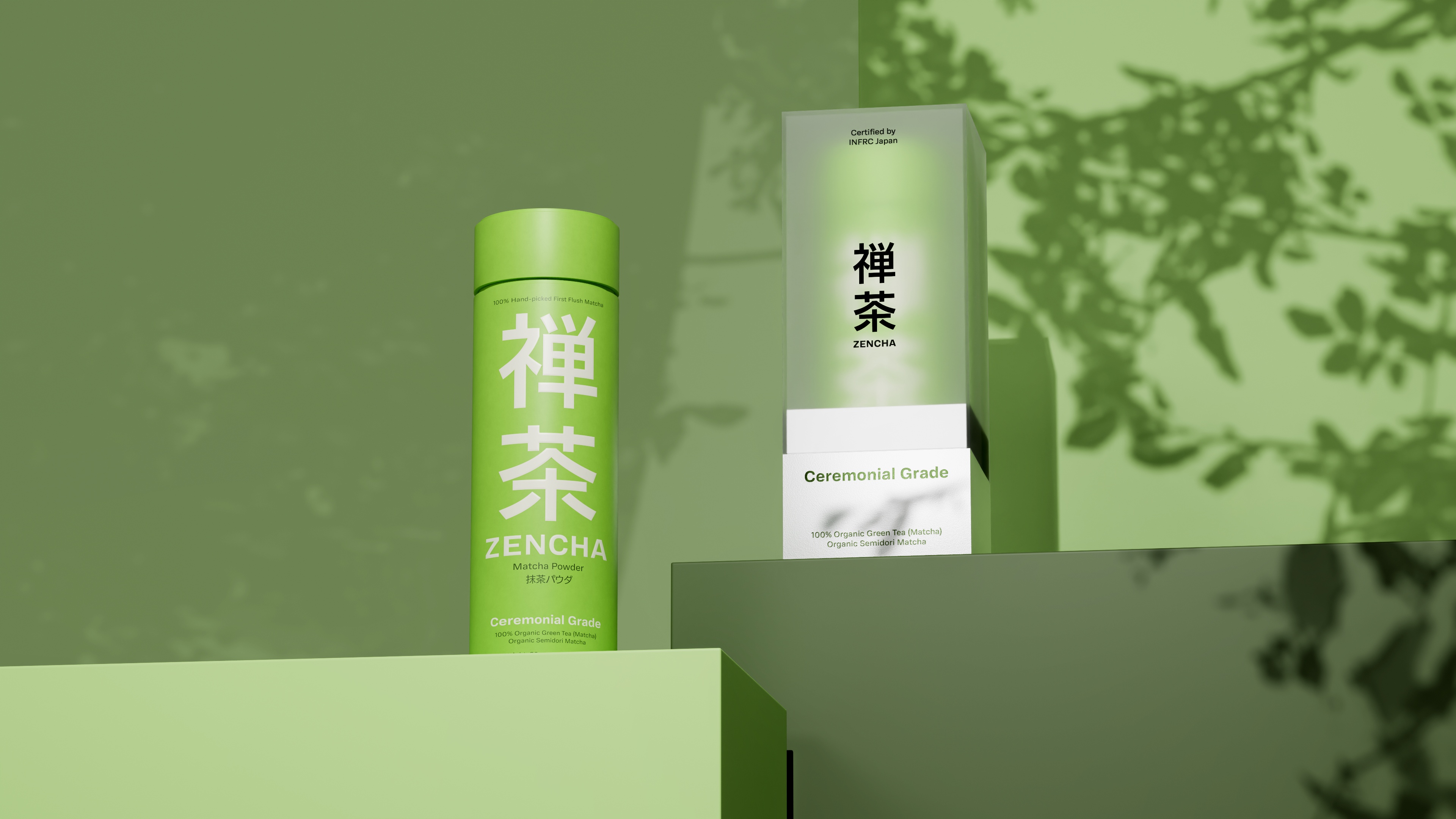
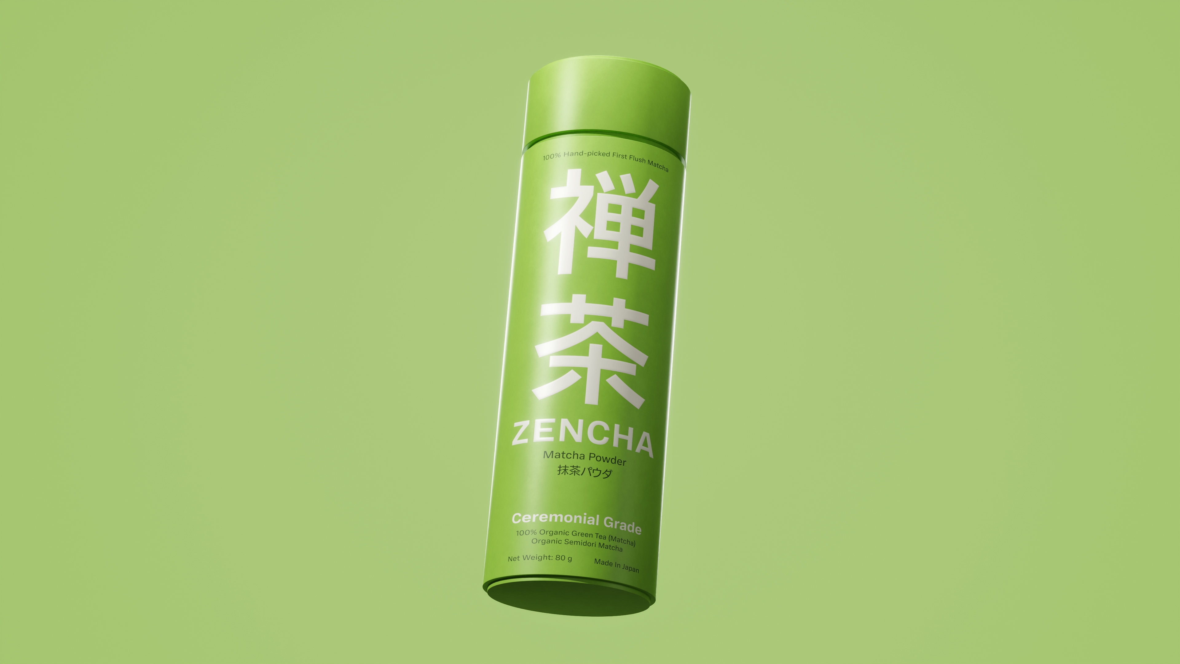
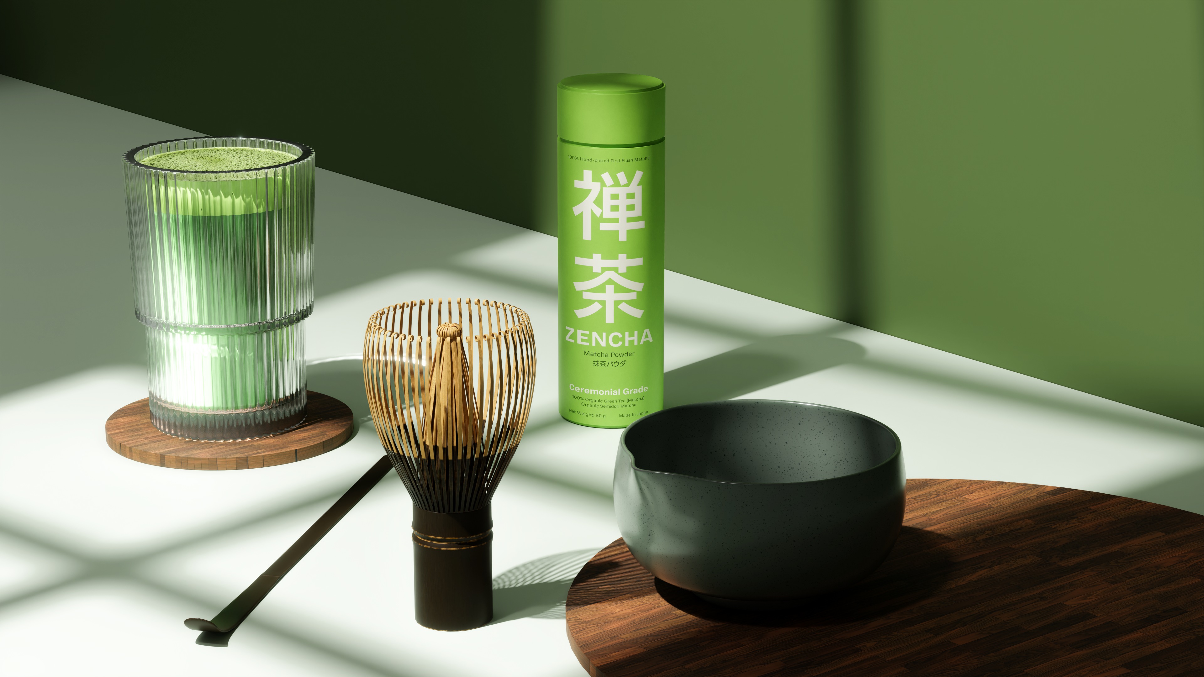
Zencha’s design tries to answer that question with a crossover approach between tradition and modernity. Natural textures on the packaging present the nuances of bamboo and earth, important elements in Japanese tea culture. Minimalist typography borrows the aesthetics of wabi-sabi, simplicity that actually highlights true beauty. Soft green tones were chosen not only because they are identical with matcha, but also as a symbol of balance and tranquility. Subtle details such as embossing and matte finishing emphasize a sense of exclusivity and premium quality.
We want Zencha to be more than just matcha
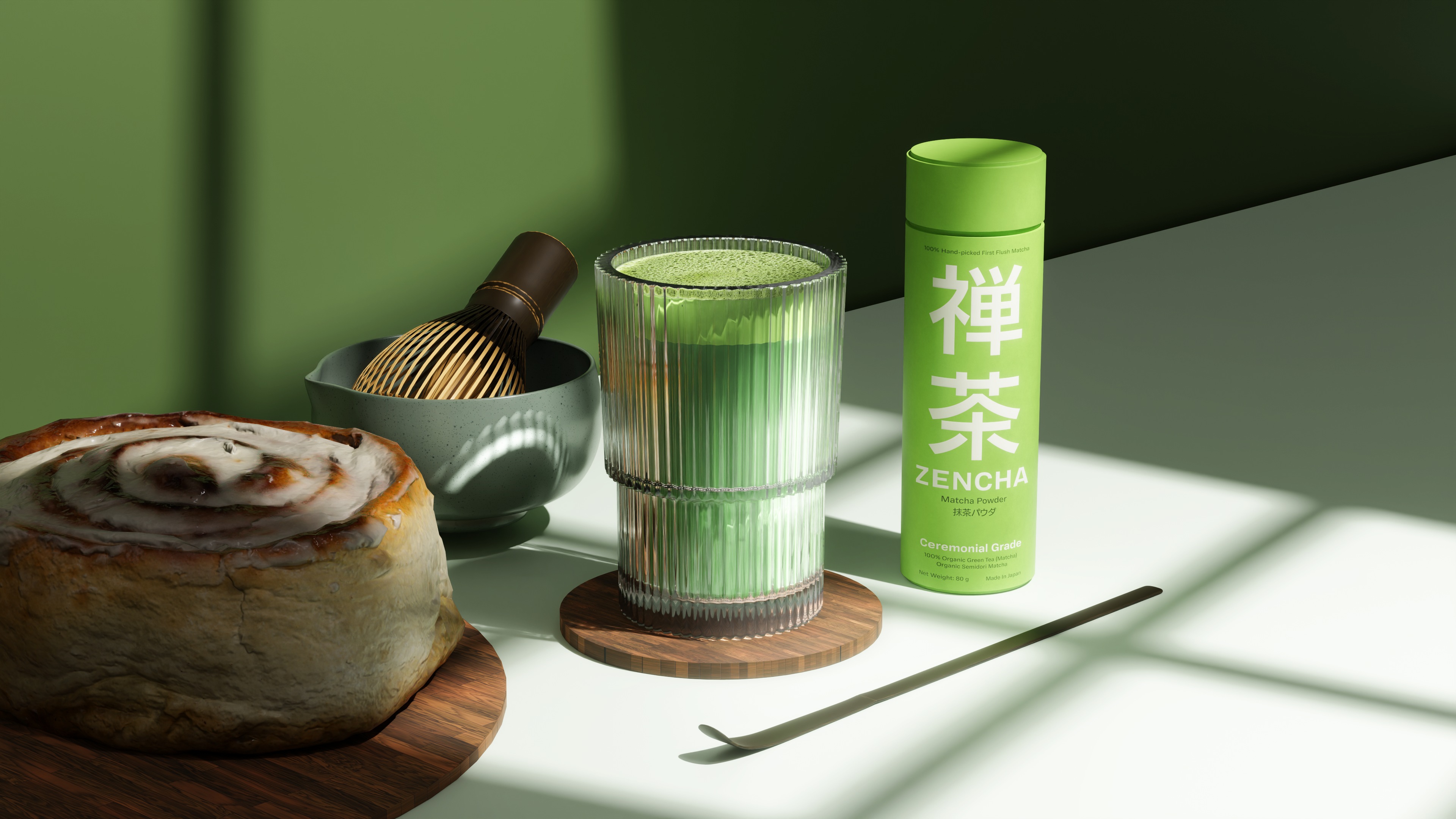
For Zencha, matcha is not just green tea powder. It is a daily ritual that calms the mind. Each cup is a moment to pause, breathe deeper, and find balance in a fast-paced life.
We designed Zencha’s packaging as a medium to deliver that message—that every product that reaches the consumer is not just an item, but a Zen experience that can be felt through visuals, touch, and the very first sip.
Zencha is proof that packaging design can be more than just product protection. It can be a bridge between culture, philosophy, and the global market. Through Zencha, we want to show that strong branding is born from authentic storytelling, not just beautiful visuals.
CREDIT
- Agency/Creative: Besta Brism
- Article Title: Zencha: Bringing Japanese Philosophy into Matcha Packaging Design
- Organisation/Entity: In-House
- Project Type: Packaging
- Project Status: Published
- Agency/Creative Country: Indonesia
- Agency/Creative City: trenggalek
- Market Region: Asia, North America, South America
- Project Deliverables: 3D Design, Art Direction, Brand Creation, Brand Design, Brand Identity, Brand Naming, Brand Strategy, Branding, Concept Art, Design, Packaging Design, Product Design, Product Naming
- Format: Box, Tube
- Industry: Food/Beverage
- Keywords: matcha , packaging design , zen , calm , green , japan , japanese , green tea
-
Credits:
art direction and executor: Besta ramadhan


