


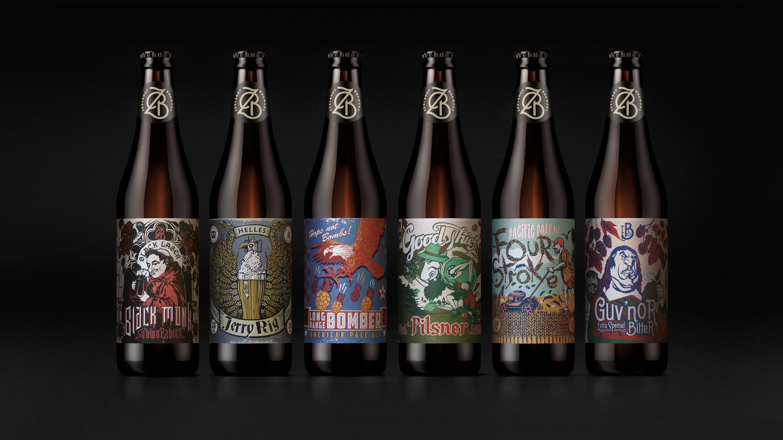
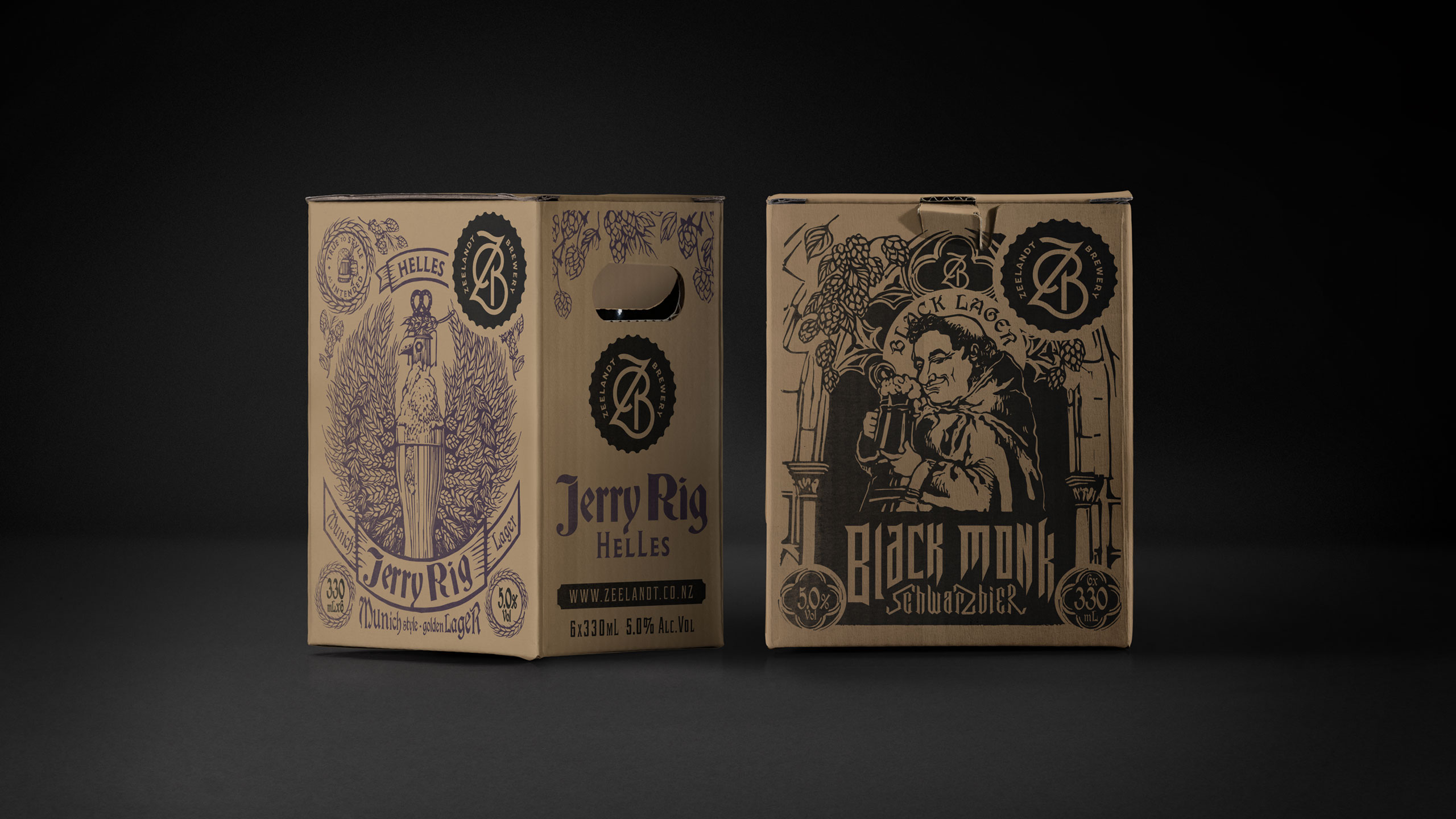
Zeelandt Brewery, nestled in Hawke’s Bay, was already well-regarded for its exceptional craft beer. However, the brewery’s packaging didn’t quite live up to the high standards set by the product itself. It was a classic case of the clothes not matching the man beneath. Chris at Zeelandt approached us with a clear brief: to create packaging that truly reflected the character and craftsmanship of each brew, telling the story of the beer inside and enticing customers to ‘pick me up and buy me’.
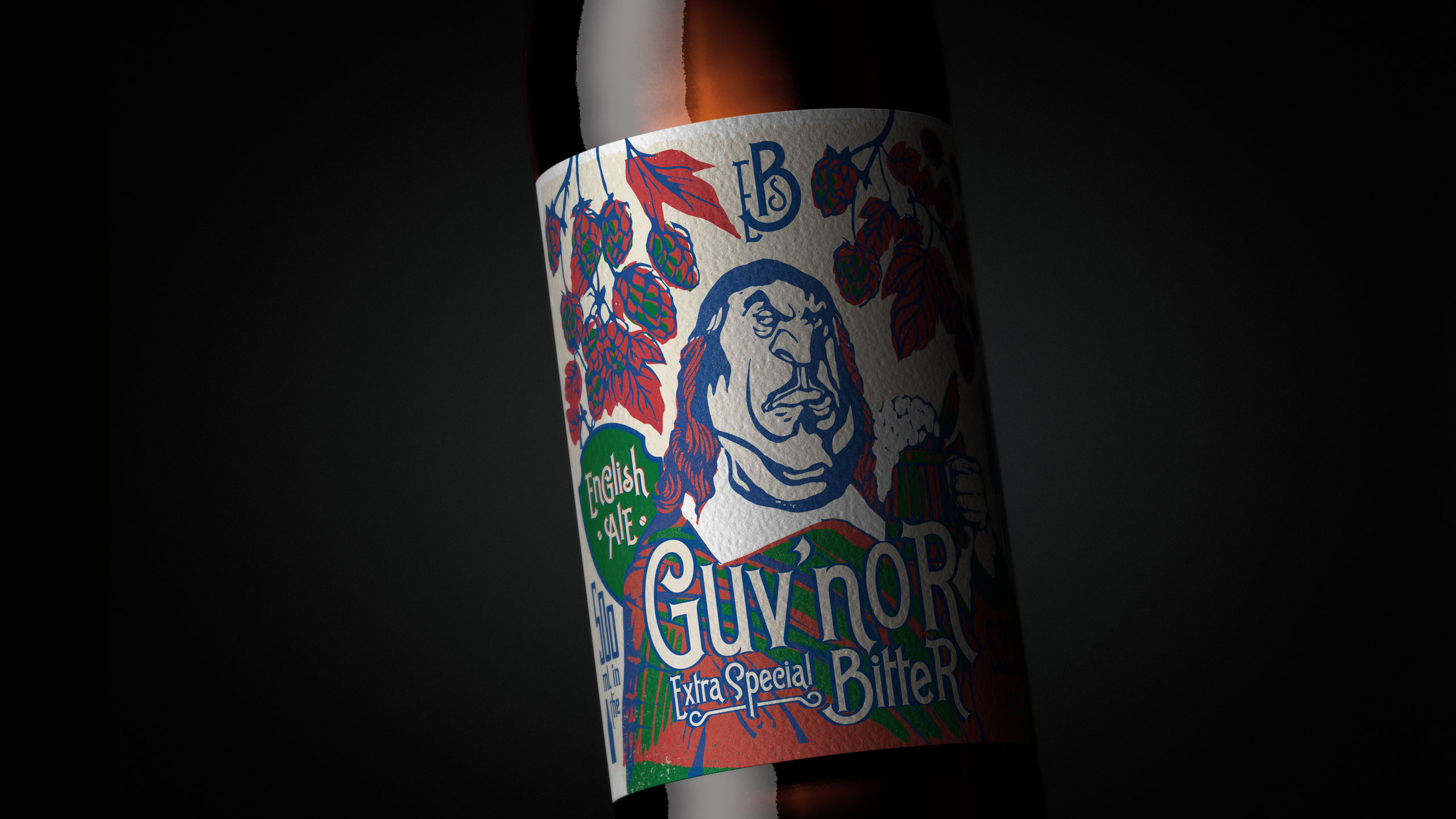
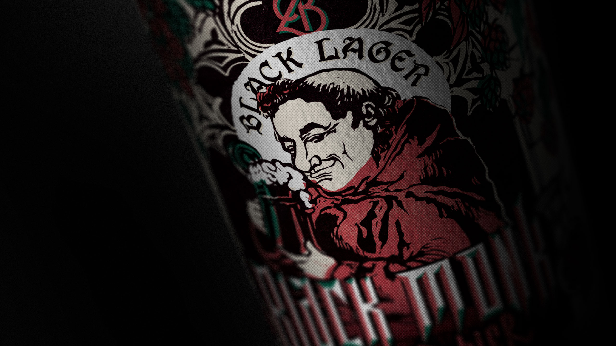
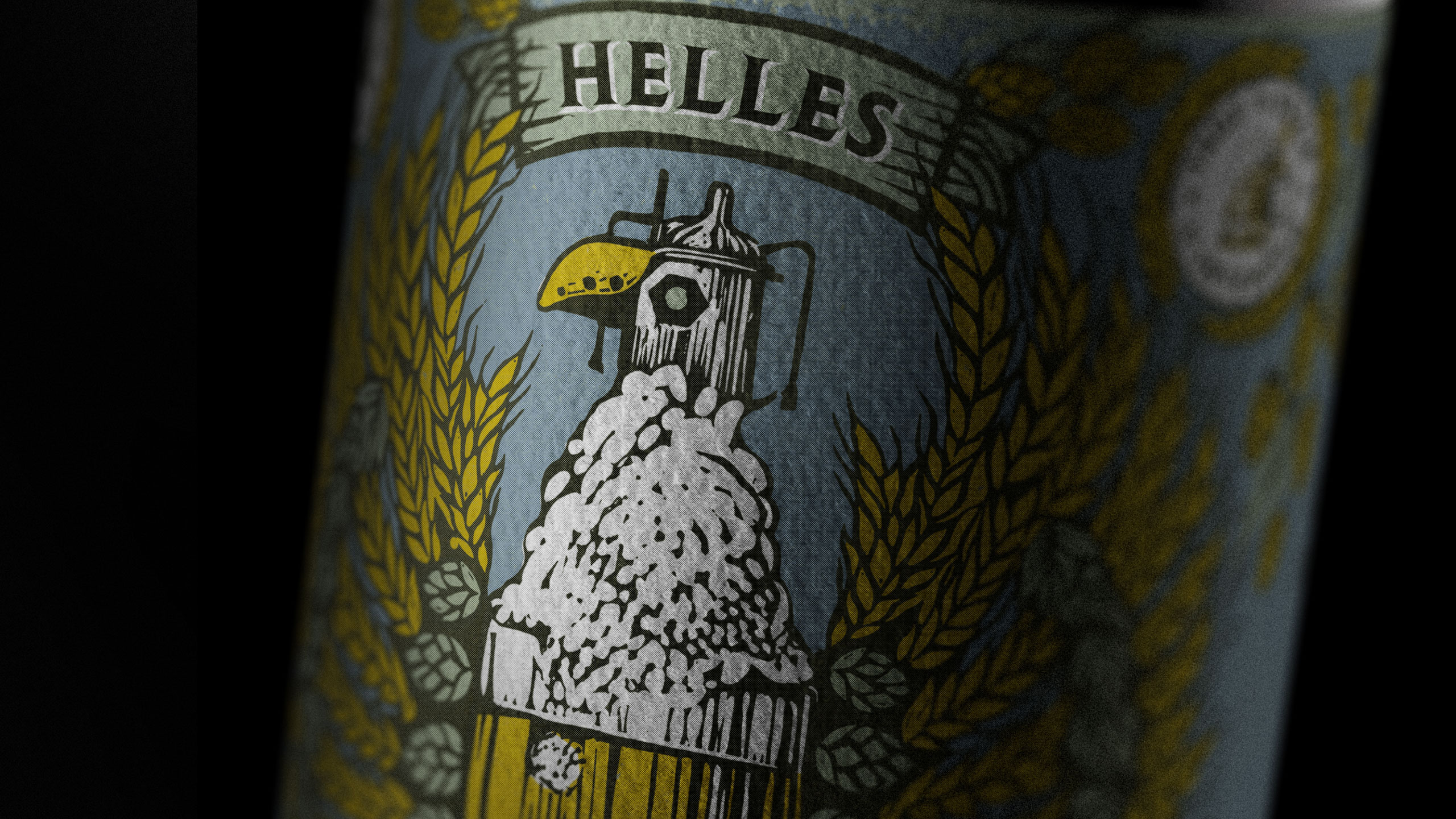
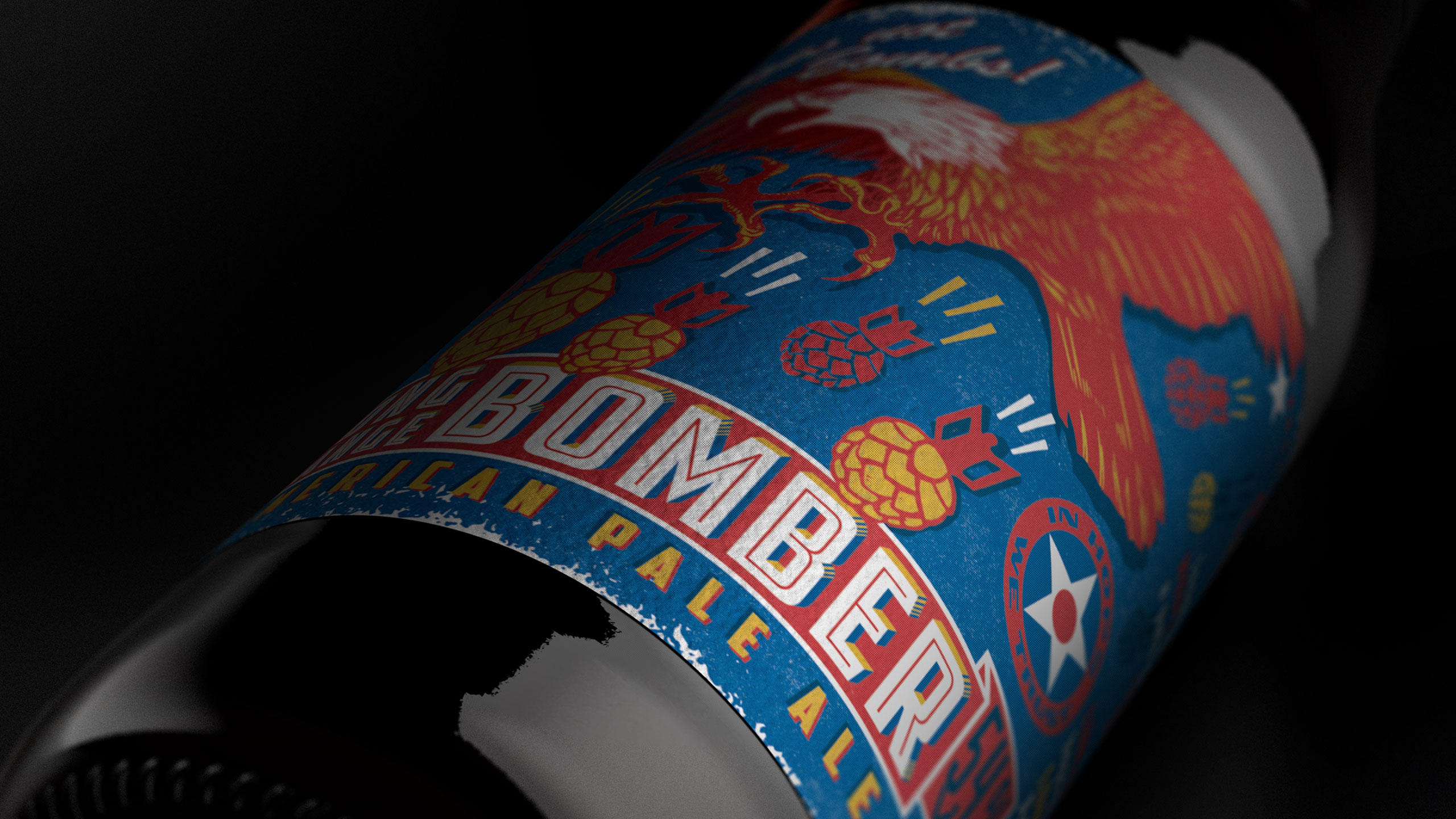
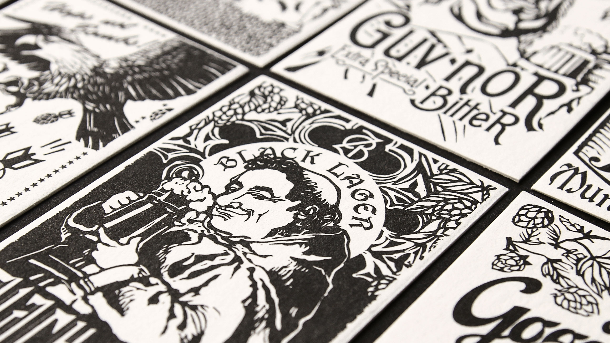
To achieve this, we embarked on developing a unique narrative for each of Zeelandt’s brews. These stories became the backbone of the imagery used in the packaging, infusing each design with a sense of authenticity and personality. We opted for a woodcut style across all the labels, a decision that provided a visual consistency while allowing the diverse range of images to coalesce into a unified brand identity. This approach not only gave each brew its own distinct voice but also ensured that the entire range felt cohesive when viewed together.
Working with a small independent brewery like Zeelandt we were meticulous in finding creative ways to stretch the budget, such as reusing and adapting the illustrative assets across different products. This strategy allowed us to maintain a high standard of design without compromising on quality, ensuring that Zeelandt’s packaging was as true to style as the beer itself. The end result was a range of packaging that not only met Chris’s brief but also elevated Zeelandt Brewery’s brand, ensuring that what was inside the bottle was perfectly matched by what was on the outside.
CREDIT
- Agency/Creative: Tried&True Design
- Article Title: Zeelandt Brewery’s Woodcut Label Design: Unifying Craft Beer with Visual Identity
- Organisation/Entity: Agency
- Project Type: Packaging
- Project Status: Published
- Agency/Creative Country: New Zealand
- Agency/Creative City: Auckland
- Market Region: Oceania
- Project Deliverables: Brand Architecture, Brand Identity, Brand Mark, Branding, Graphic Design, Illustration, Logo Design, Packaging Design, Type Design, Typography
- Format: Bottle, Sleeve
- Industry: Food/Beverage
- Keywords: Beer Packaging
-
Credits:
Creative Team: Tried&True Team


