


Cue – Zebco
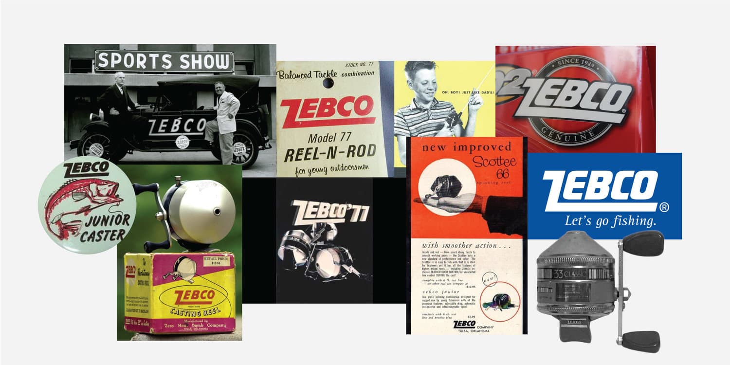
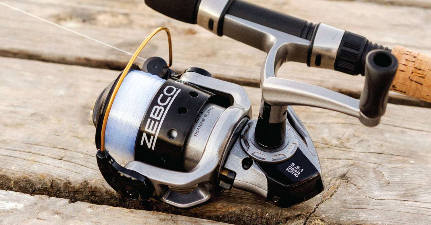
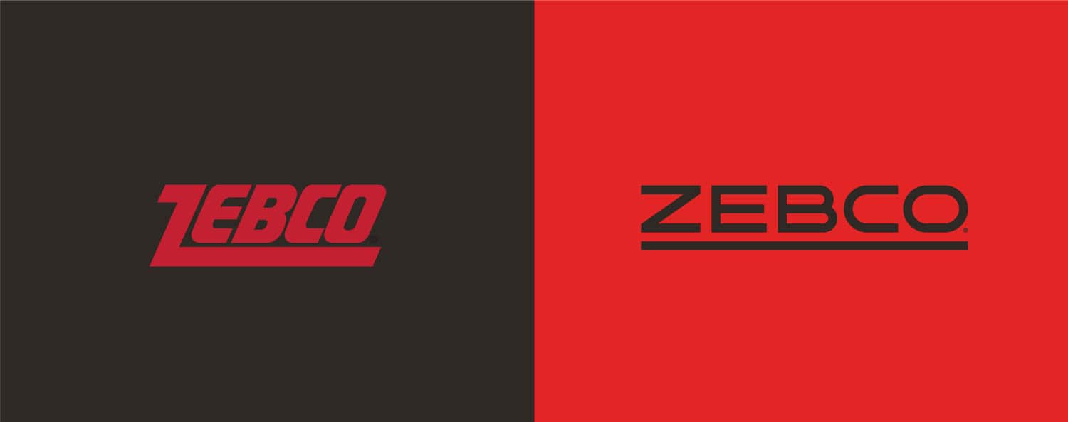
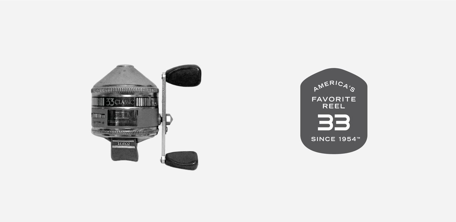
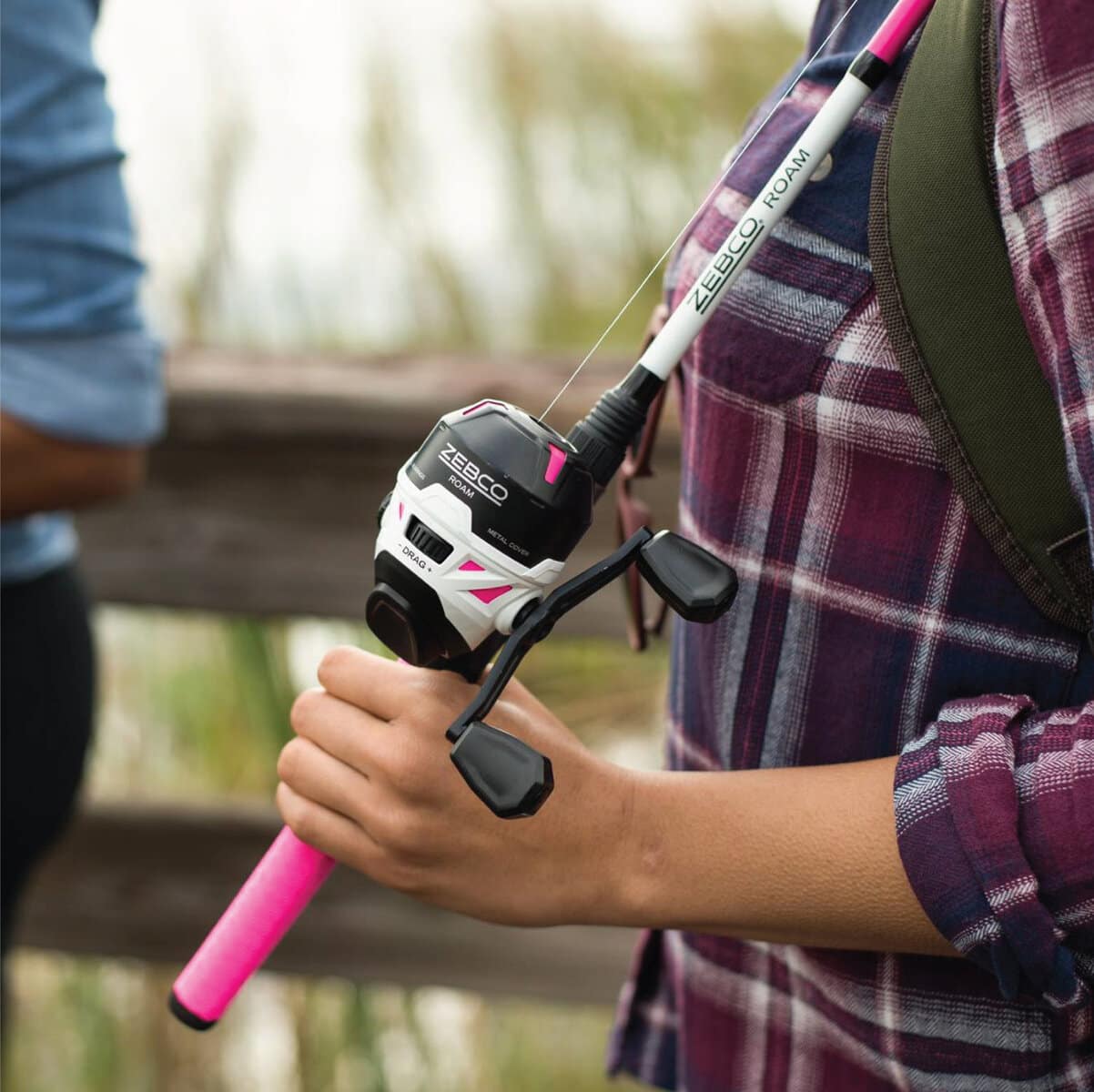
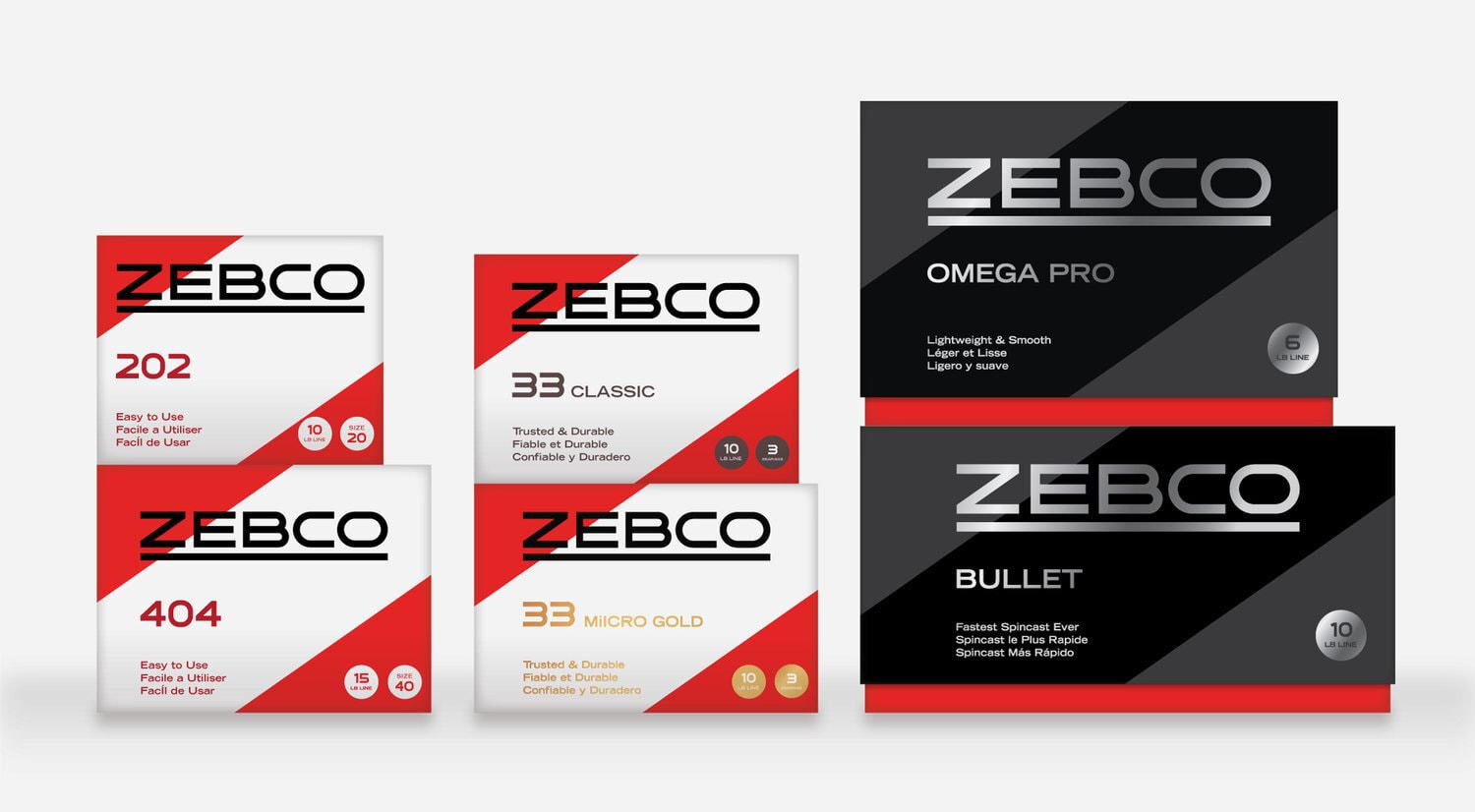
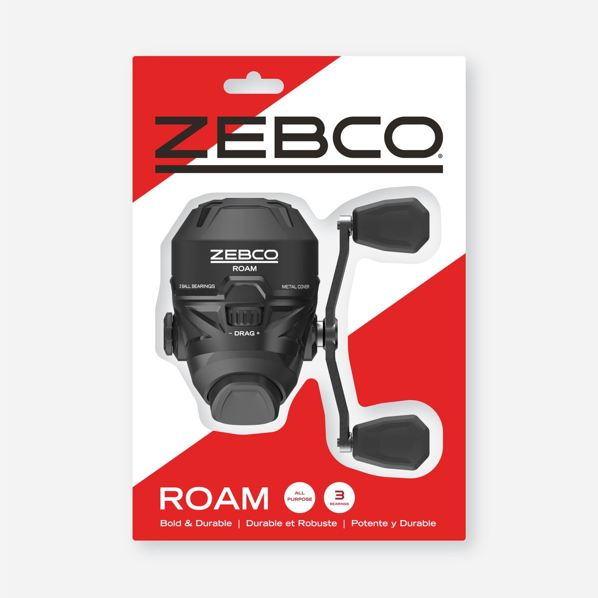
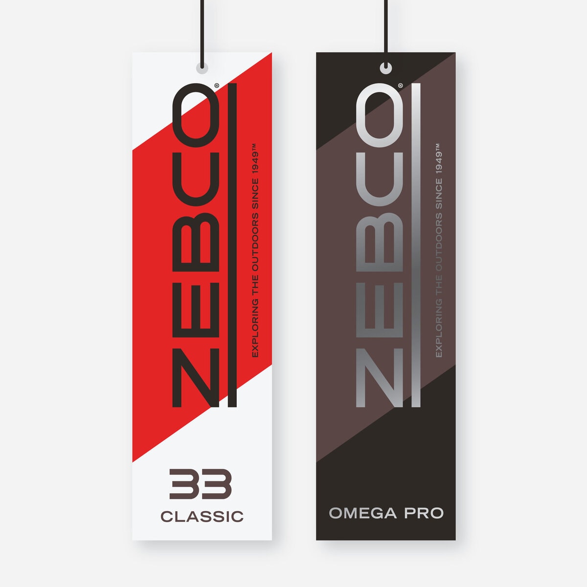
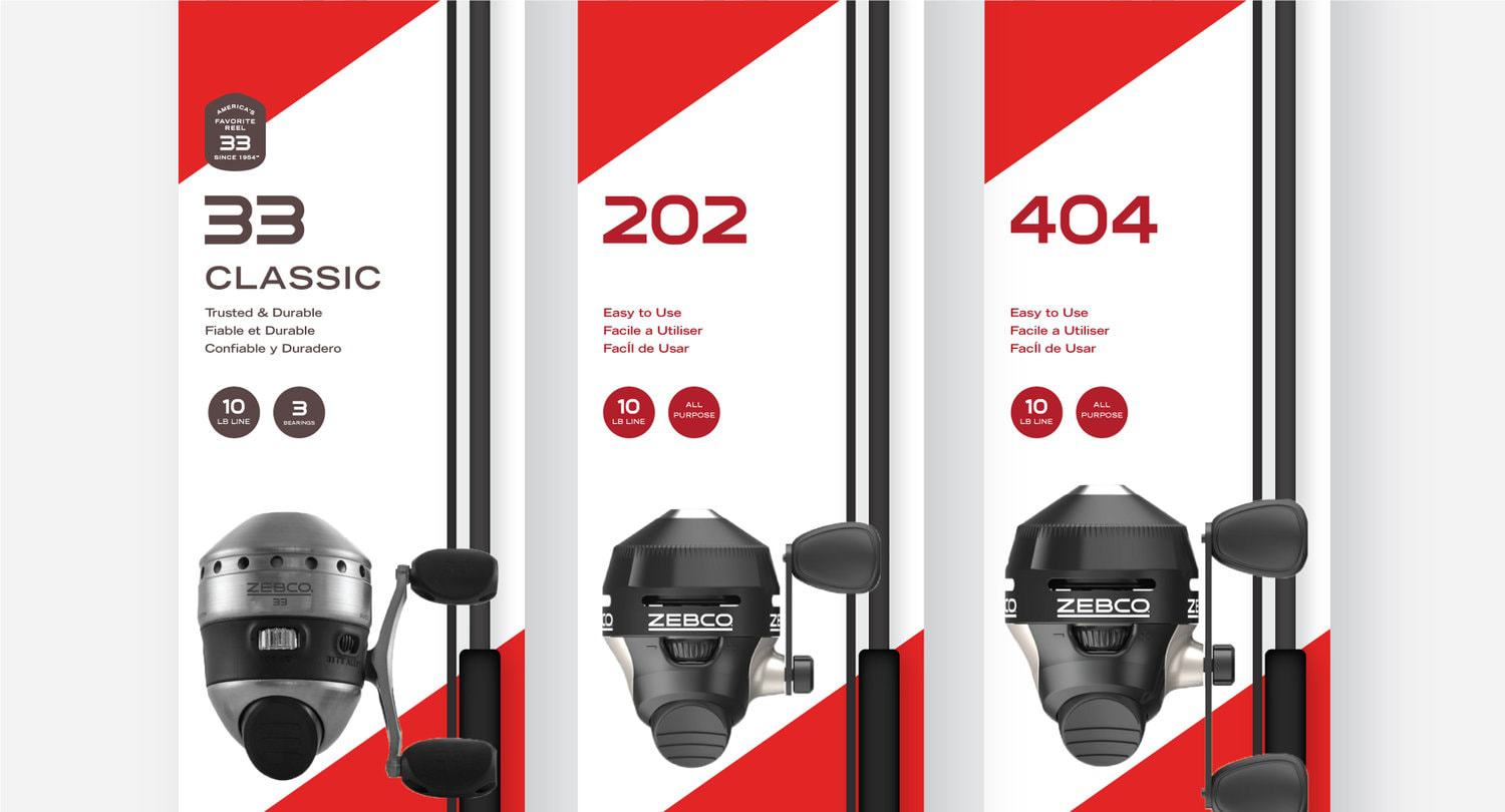
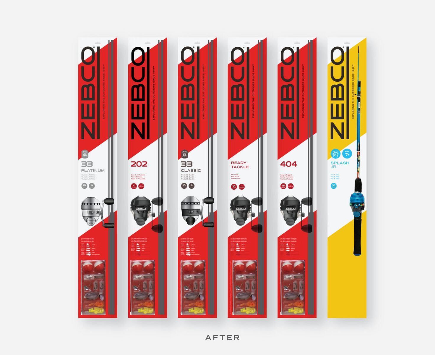
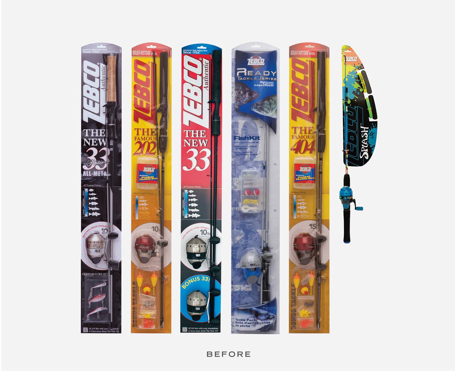
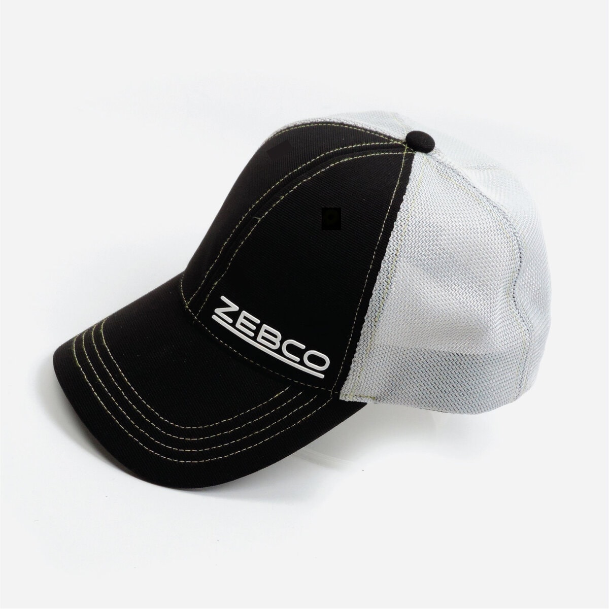
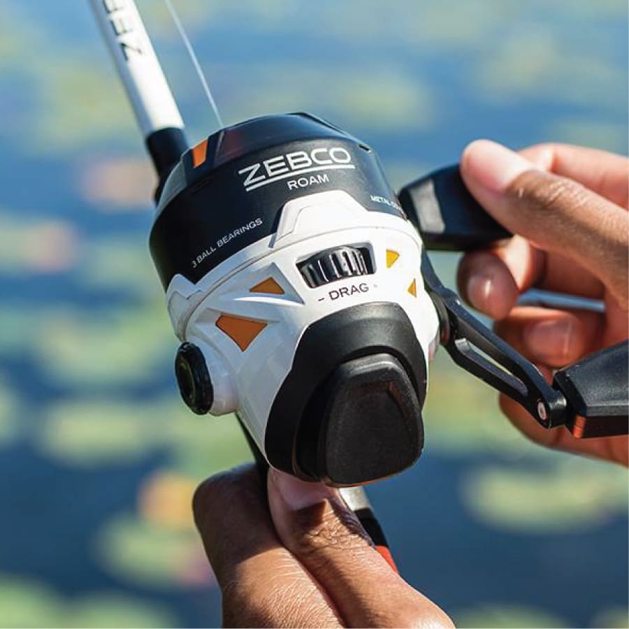
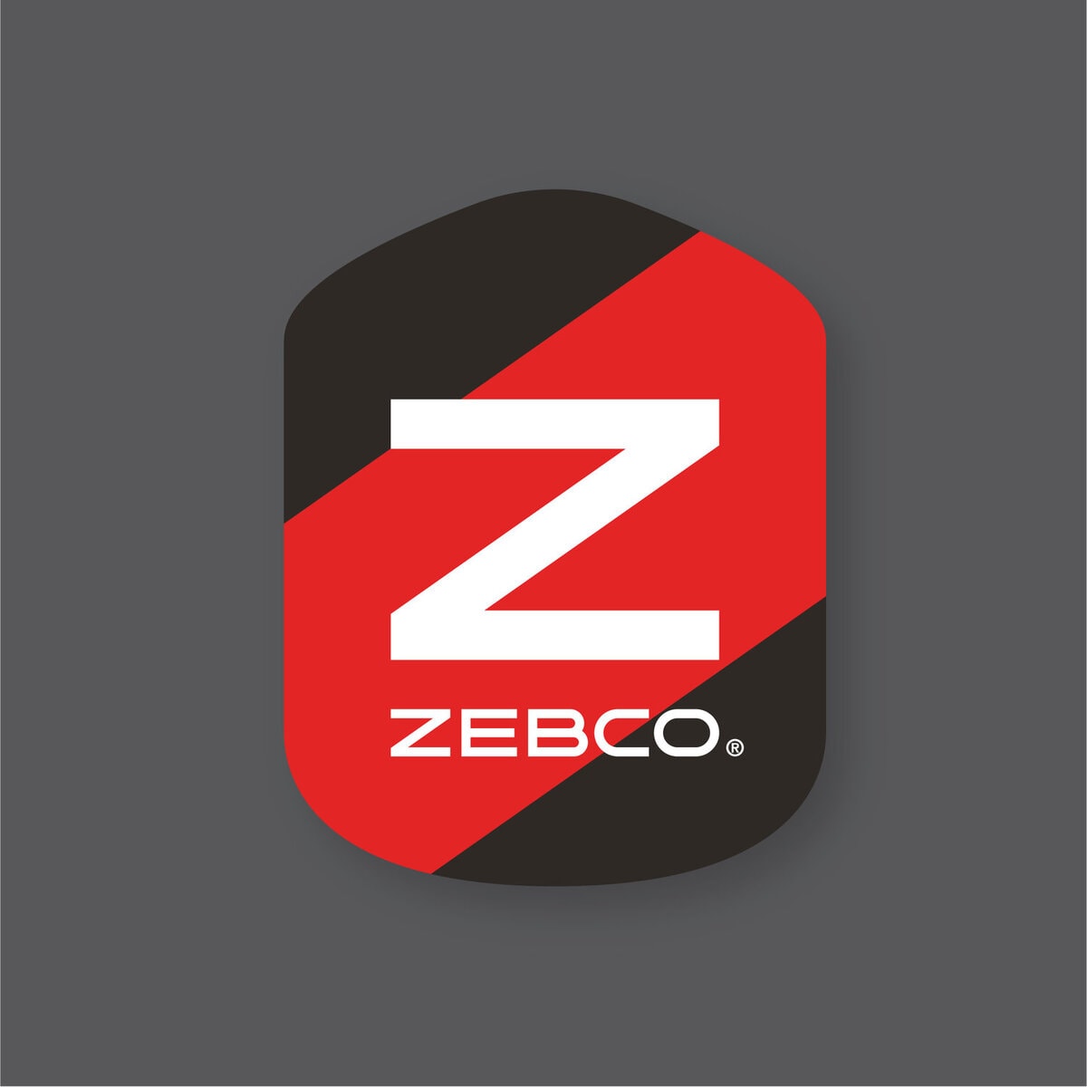
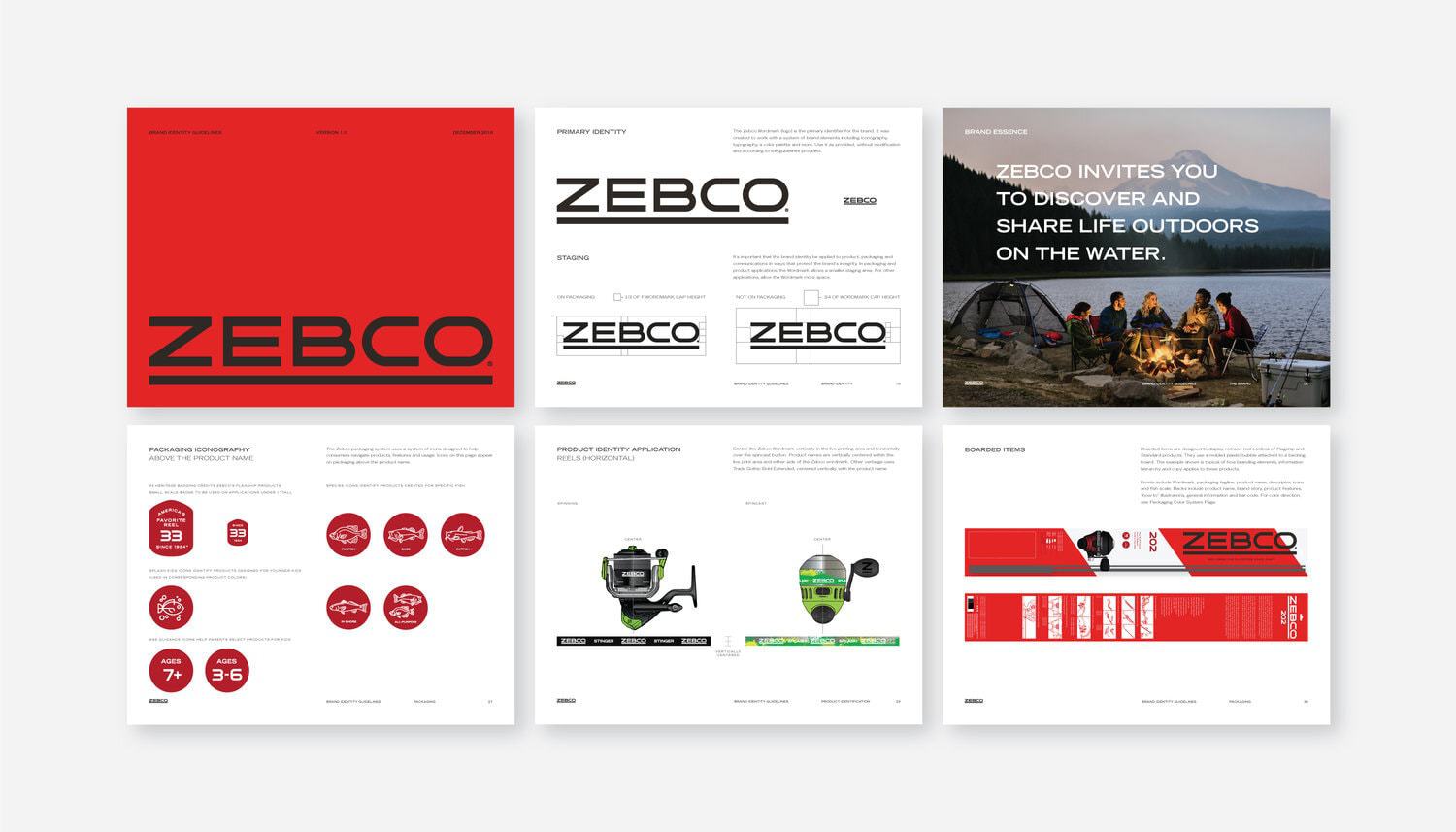
When watchmaker R.D. Hull created a better fishing reel back in 1949, his patented discovery reinvented fishing, making it easier than ever before to explore the outdoors. Today, fishing’s popularity has been challenged by an outdoor category offering an almost unlimited array of activities. Zebco not only needed a way to reposition itself in the category, but also to be more visible, identifiable and competitive with other contemporary outdoor brands.Our work began with an approachable new wordmark, intentionally simple to align the brand with its easy-to-use products; iconic and confident enough to stand out in the retail environment. The wordmark abandons the former logo’s heavy-handed quality, but retains the underline as a nod to the past. The Z icon becomes the simplest brand expression.In 1954, Zebco introduced the 33, destined to become “America’s Favorite Reel.” Borrowing from the classic reel shape, we created a structure for iconography that pays homage to the brand’s most popular product.The packaging system accommodates three tiers of products, product names with variations, and an array of benefits and features. Value, flagship and premium tiers manage layers of information, designed for easy navigation by consumers. Packaging forms include hang tags for open stock, boarded rod and reel combos, and clam packs and boxes to house individual reels.Previous product packaging was cluttered and inconsistent. New packaging makes the brand visible using a prominent wordmark, brand color and “Z” stripe as a visual disruptor. Boarded items act as “billboards” at retail, maximizing the brand’s visibility.New branding and iconography for the brand aims to be simple, iconic and appealing enough to take its rightful place among other iconic outdoor brands.


CREDIT
- Agency/Creative: Cue
- Article Title: Zebco Global Rebrand
- Organisation/Entity: Agency, Published Commercial Design
- Project Type: Packaging
- Agency/Creative Country: United States America
- Market Region: North America
- Format: Blister-Pack, Box, Case, Clamshell, Tag, Wrap
- Substrate: Metal, Plastic, Pulp Board, Pulp Paper


