


Crafting a Legacy Brand’s Narrative as They Venture Into Newer Categories
“Zandu hai toh accha hi hoga.” (“If it is a Zandu product, it must be well made.”)
Across consumer groups, this sentiment was a constant. We witnessed brand loyalty and love closely, all through our journey with Zandu. We spoke to many, many consumers across India, and across products, the trust enjoyed by Zandu is second to none.
Working with this insight, we were tasked to craft the narrative for Zandu’s foray into newer categories. The brand promise of better health through Ayurveda remains unchanged. However, they wanted to communicate the same promise to a newer, younger audience.
Toeing the line between the existing Zandu brand language and carving a niche for the newer ranges has been an exciting journey.
As always, we began with deep consumer study sessions. We spoke at length with existing consumers of brand Zandu, coupled with those using products from new, direct to consumer brands in personal and health care.
Furthering Brand Loyalty Through Packaging
Given the brand aims at improving health, trust plays a huge role in the purchase decisions. Equally important in this endeavour is effectively communicating the product’s value proposition.
Zandu is synonymous to Ayurveda in our country. The brand enjoys immense, almost blind trust.
Our efforts were directed towards giving the brand a refresh without alienating their loyal customers.
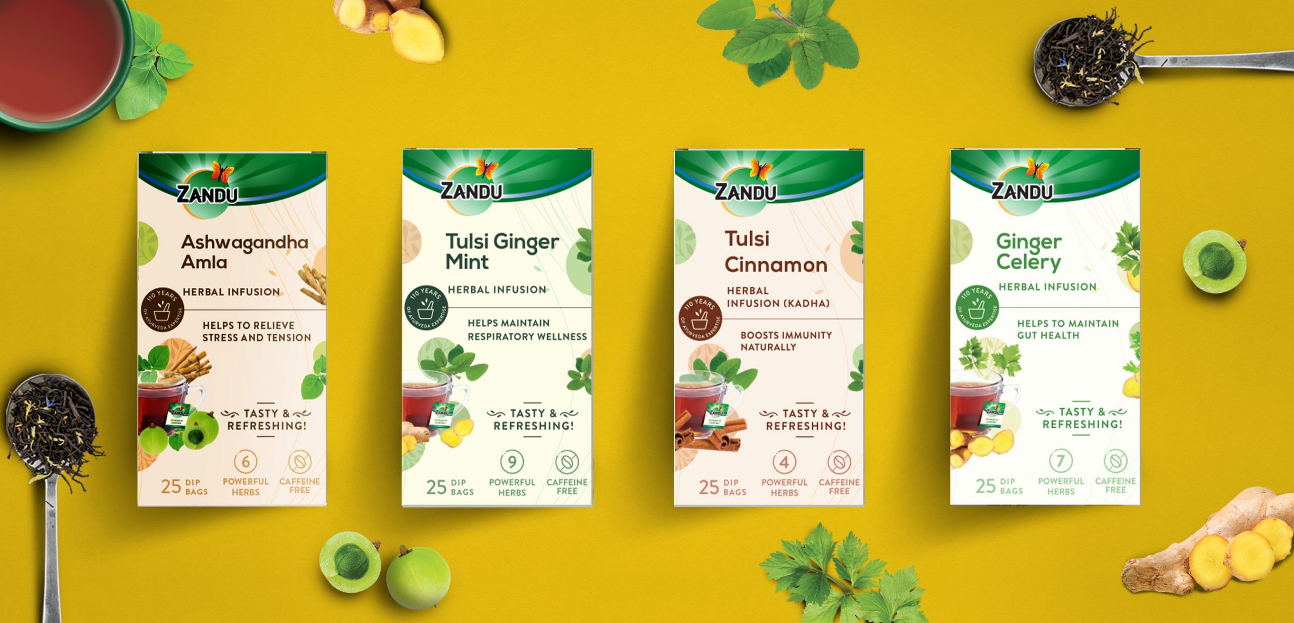
Building and improving upon existing brand cues, our narrative retained the brand masthead, and refined the way the brand interacts with the consumers.
In India, mass market brands seem to be restricted to a certain aesthetic and language.
However, today, refinement in design and communication makes a brand stand out in physical as well as online retail. Armed with consumer insights, we began building a clear information architecture to create consistency and clarity of communication objectives. This architecture has to be one that adapts and works across tens of categories today, and many more tomorrow.
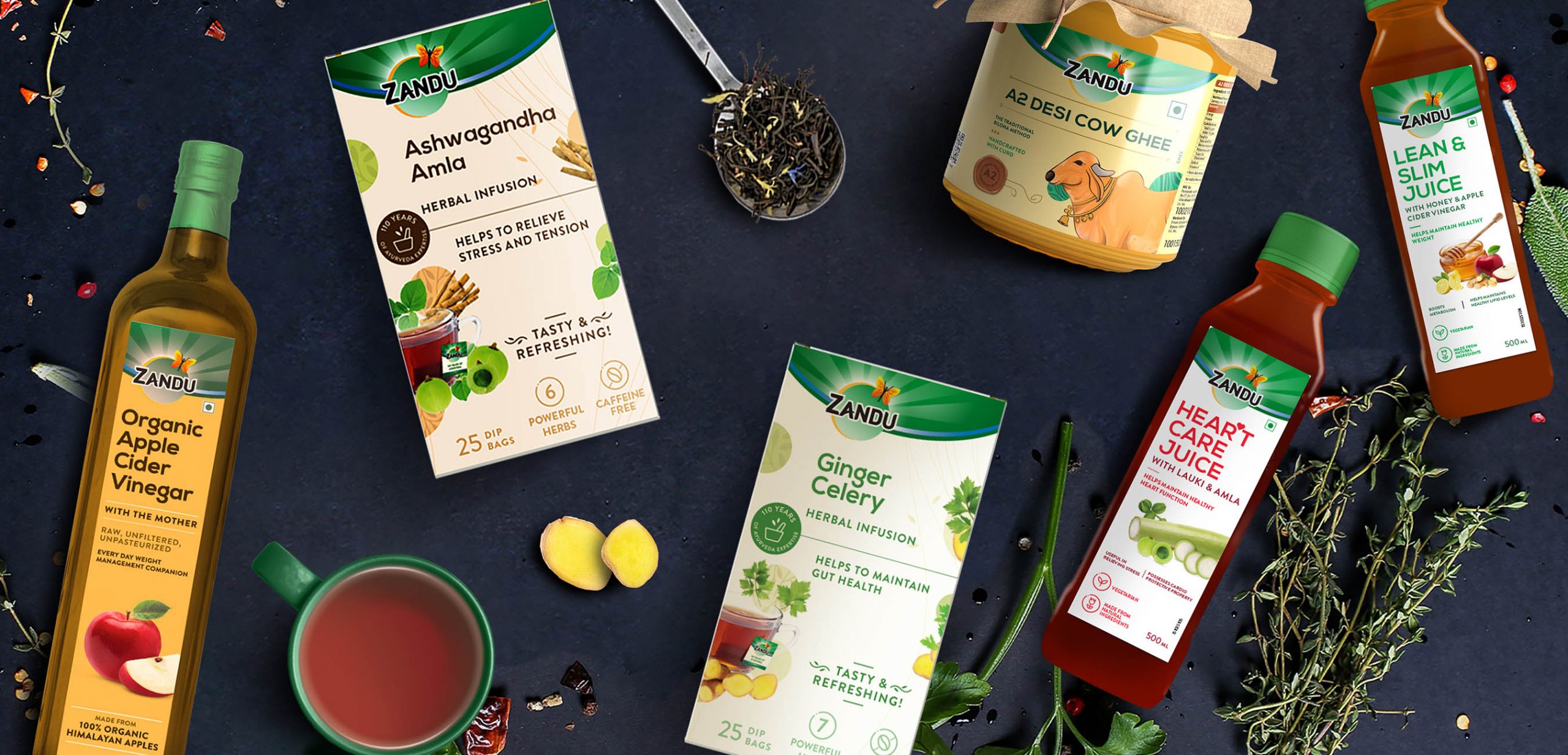
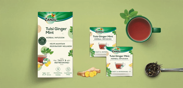
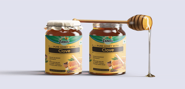
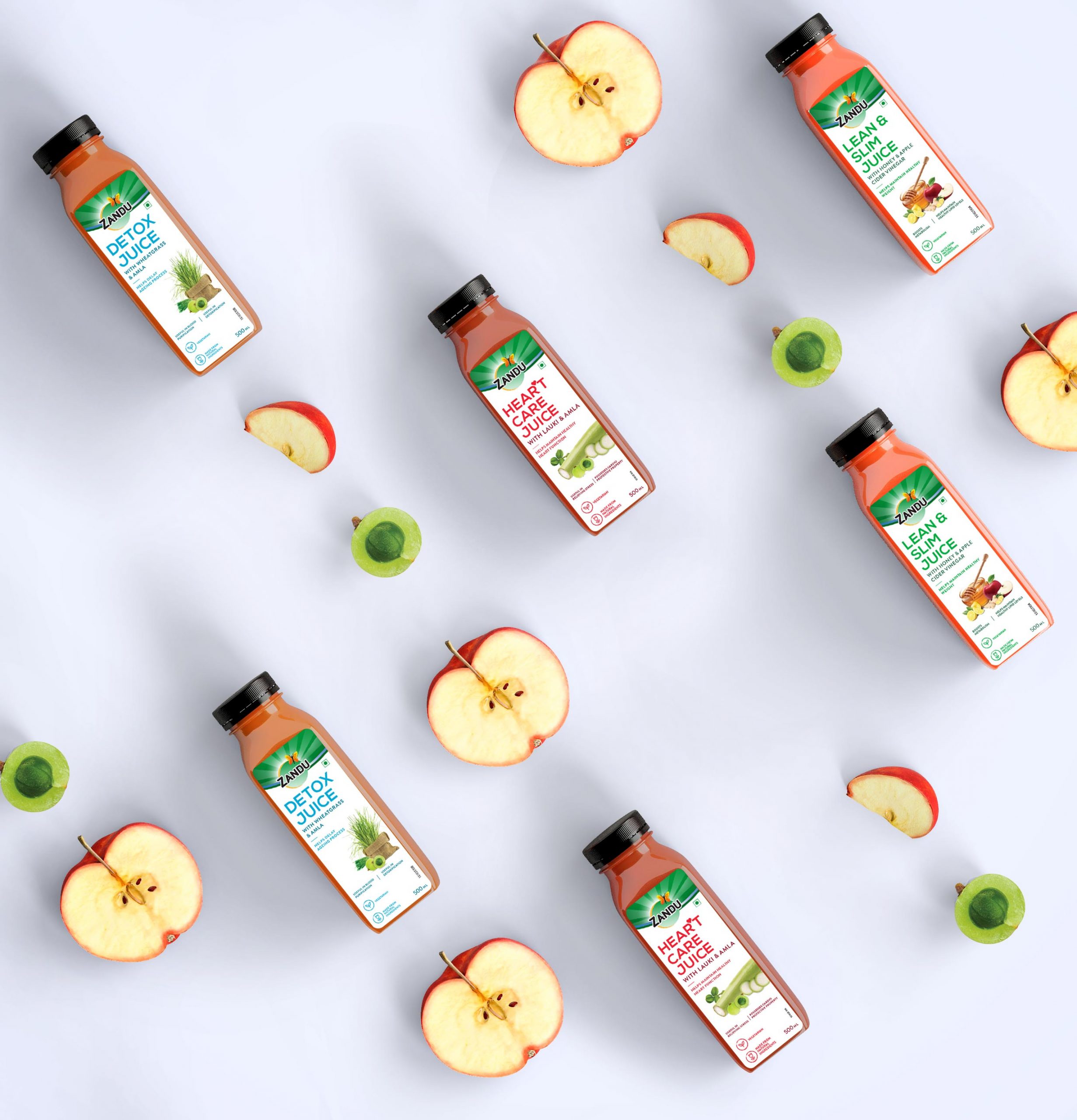
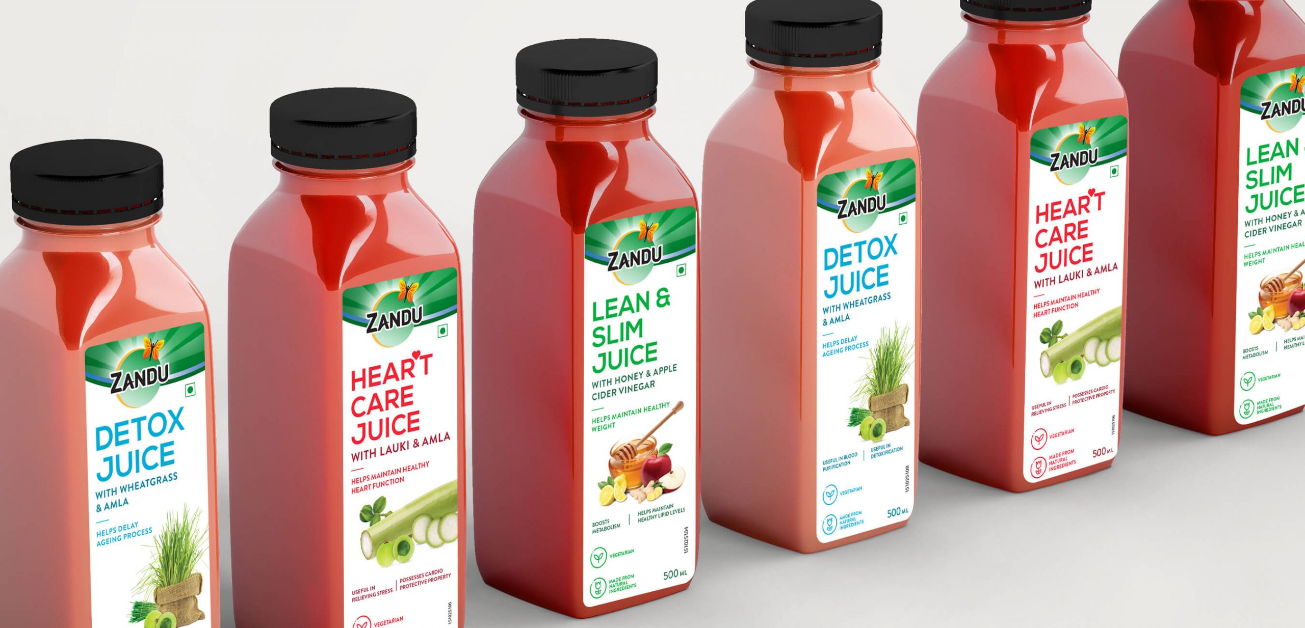
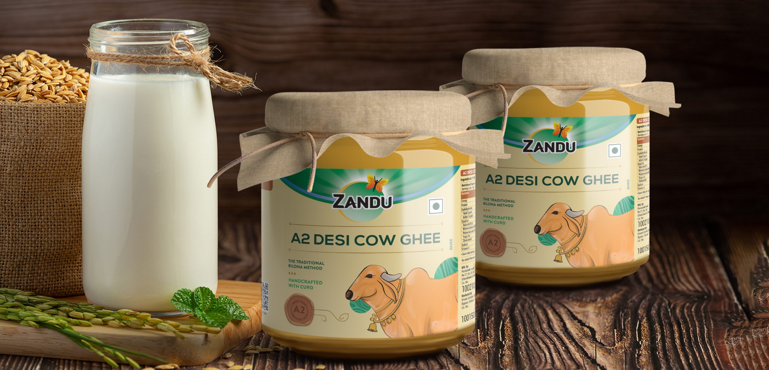
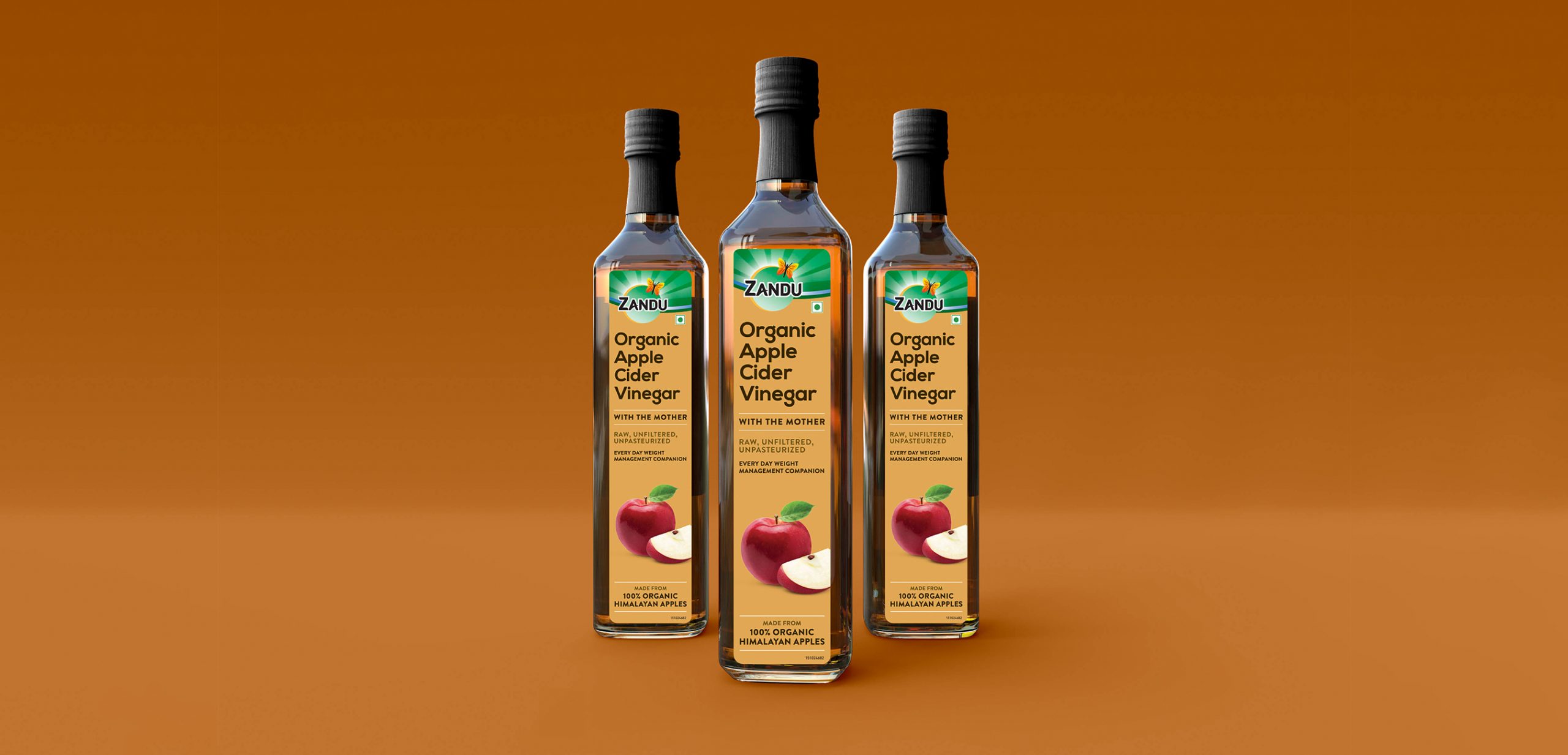
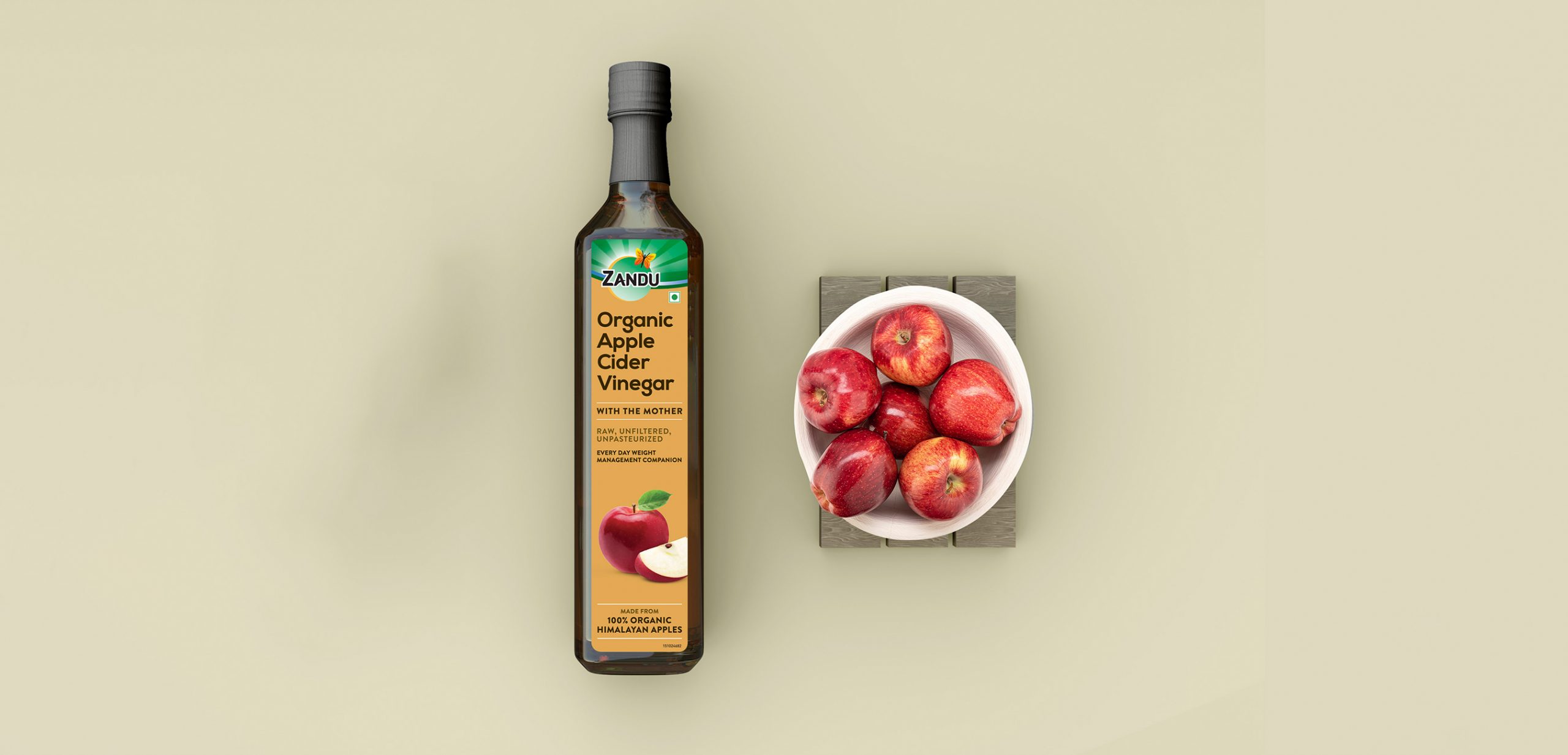
Further, we employed Ayurvedic cues like leaves, and soft colours, and the legacy of Zandu in a stamp to reinforce their legacy. Visual cues of ingredients were added where applicable, to enhance relatability to the purity of the product and formulation.
We believe the new age consumer will relate better to a legacy brand when they are making an effort to appeal to them, and make them feel cared about. Through our efforts with the Zandu packaging revamp, we have aimed to bridge this gap between how brands communicated yesterday and how they connect today.
CREDIT
- Agency/Creative: Stratedgy
- Article Title: Zandu Brand Strategy and Packaging Design
- Organisation/Entity: Agency
- Project Type: Packaging
- Project Status: Published
- Agency/Creative Country: India
- Agency/Creative City: Mumbai
- Market Region: Asia
- Project Deliverables: Packaging Design
- Format: Bottle, Box, Jar
- Substrate: Glass Bottle, Glass Jar
- Industry: Health Care
- Keywords: Packaging Design, Health, Healthy Living
-
Credits:
Creative Director: Krupa Kapadia


