


Luxury is a double-edged sword!
It is not always necessary to drown the product in the pattern and cover it with cardboard and paper.
A real designer sometimes has to encourage the customer to value and make the product full of pride!
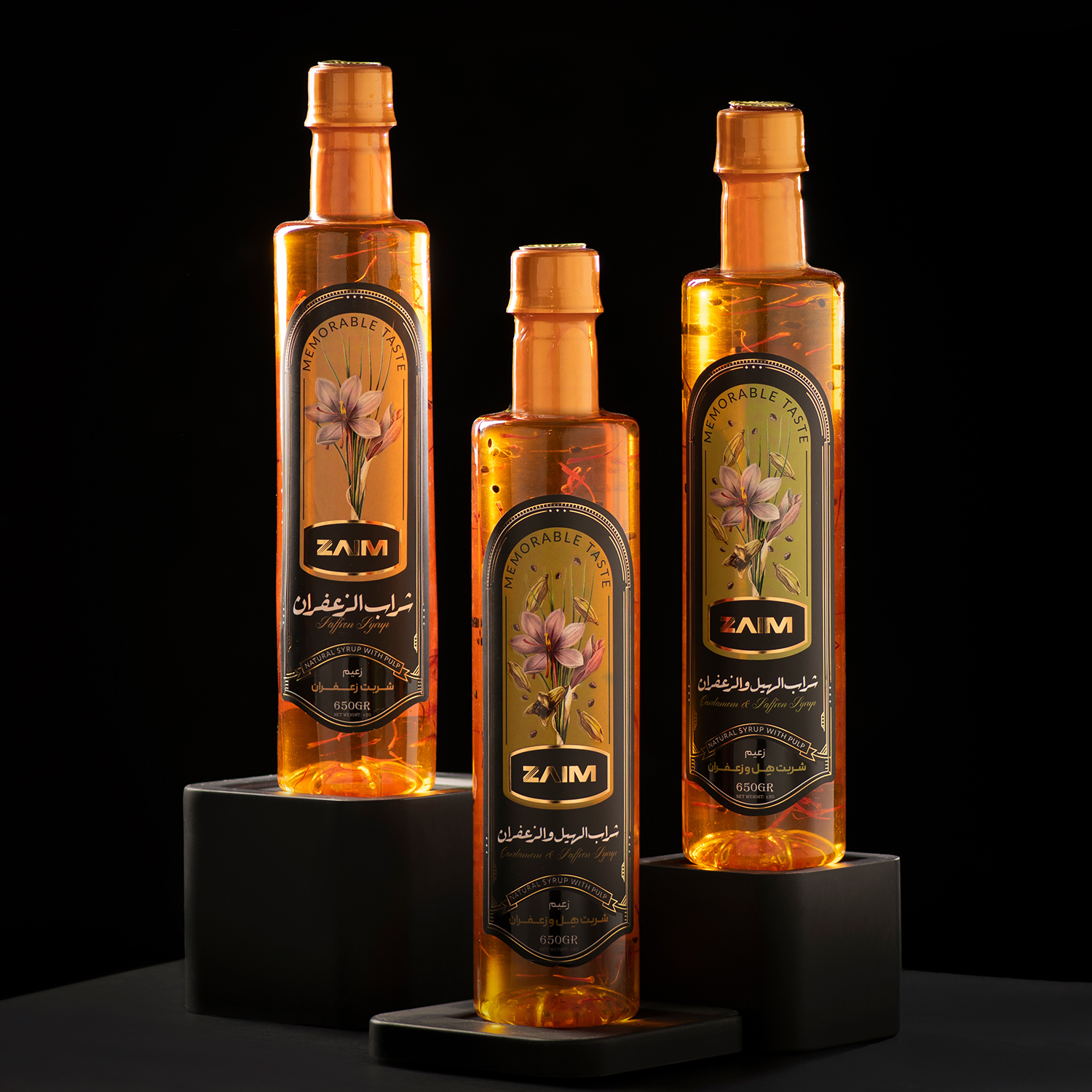
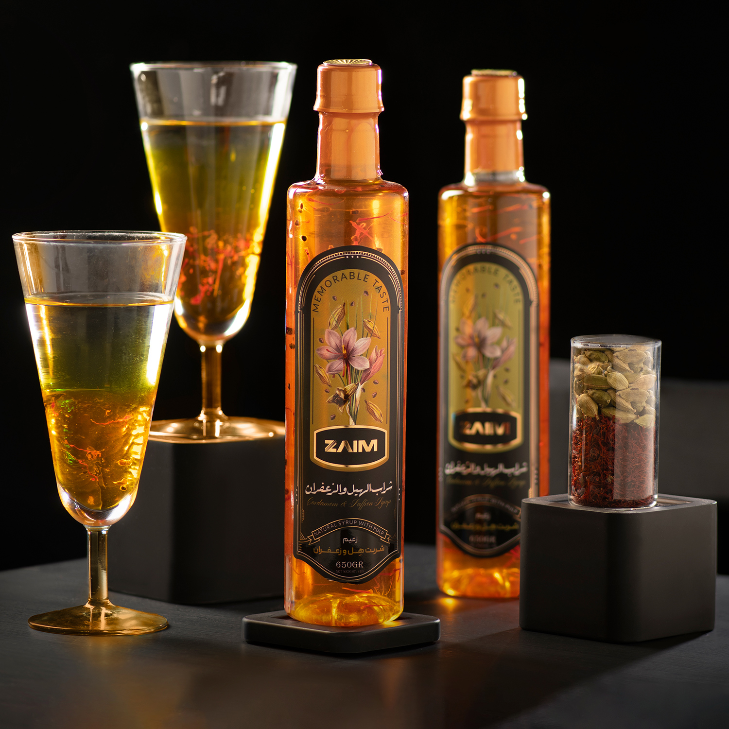
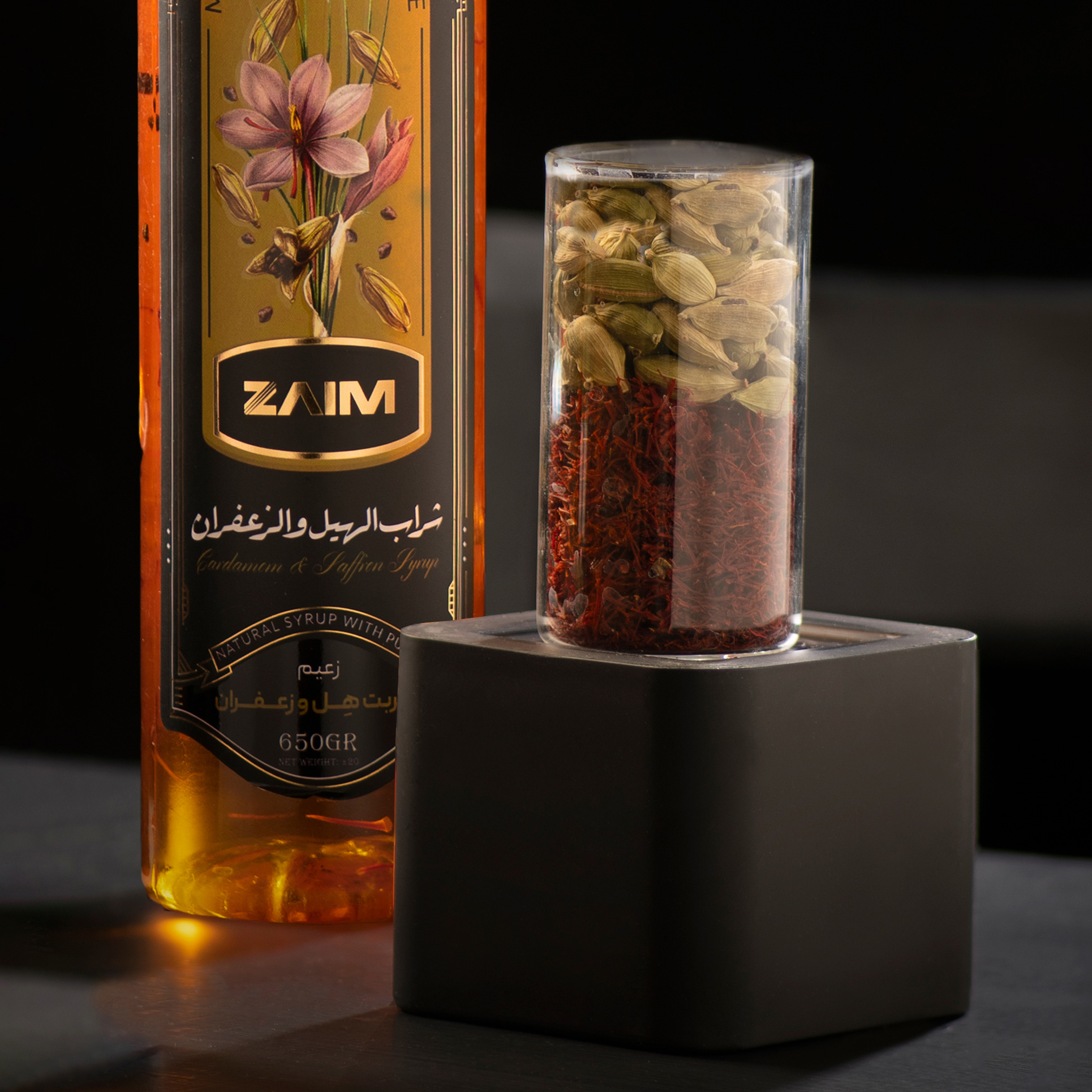
Zaim’s saffron syrup is one of the most delicious and beautiful drinks, and for this reason, the presentation and transparent layering is the only thing that needs targeting and moving forward in the right direction like a razor’s edge, and we are happy that this was possible.
The packaging of Zaim saffron syrup is inspired by Iranian artistic principles in order to show the value and glory of saffron.
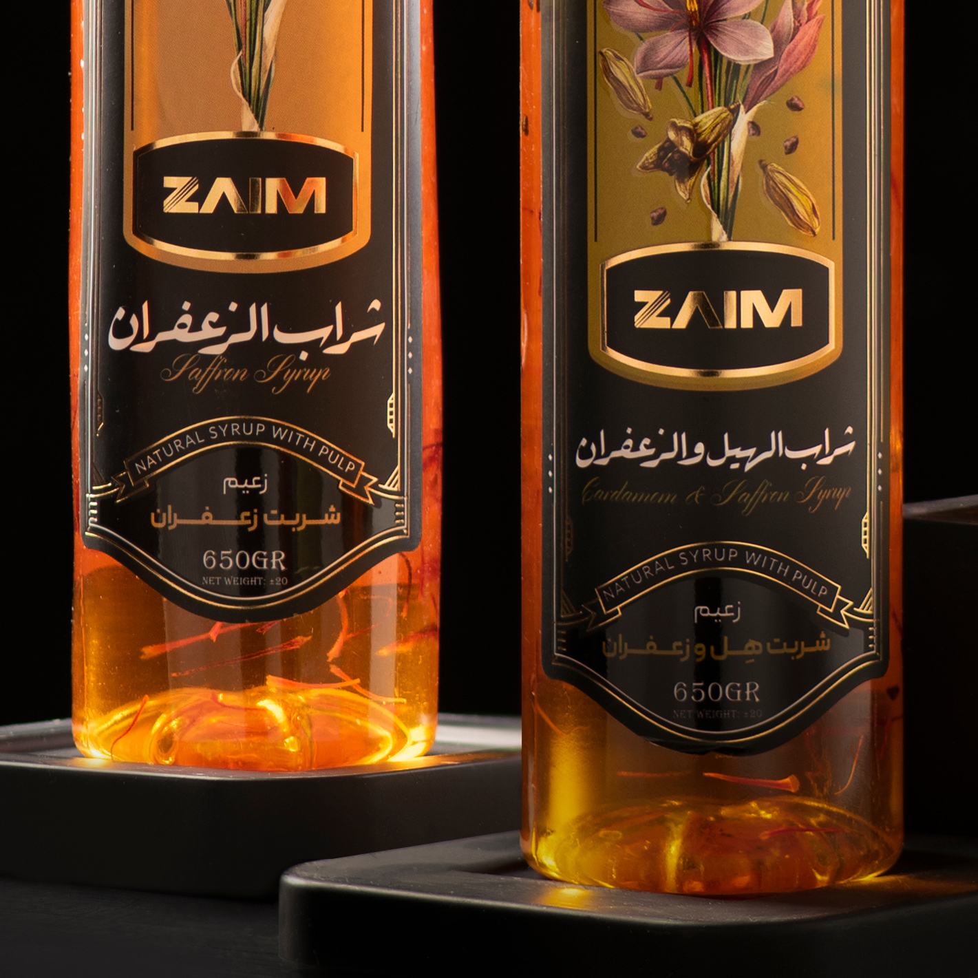
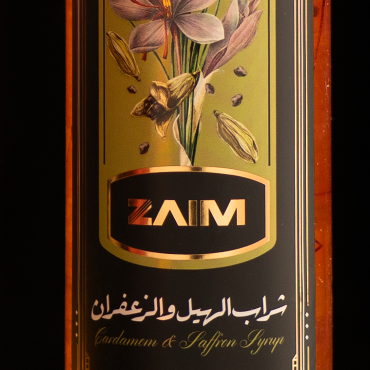
The packaging of saffron syrup is presented with an attractive and different design, in black color and with a purple saffron flower. This combination makes the packaging stand out and look luxurious and conveys the feeling of splendor and value of this product to the customers.
Black packaging brings a sense of curiosity and mystery to customers. Black color emphasizes the prominence and appearance of the product and also induces a state of originality and luxury.
There is a saffron flower on the package. This saffron flower attract the attention of customers with its detailed vivid colors that represent the authenticity and value of saffron. This image symbolizes the glory of saffron and gives customers the feeling of experiencing a unique product.
In addition, the packaging is matte and covered with a soft layer. This feature adds softness to the packaging and conveys a feeling of relaxation to the customers.
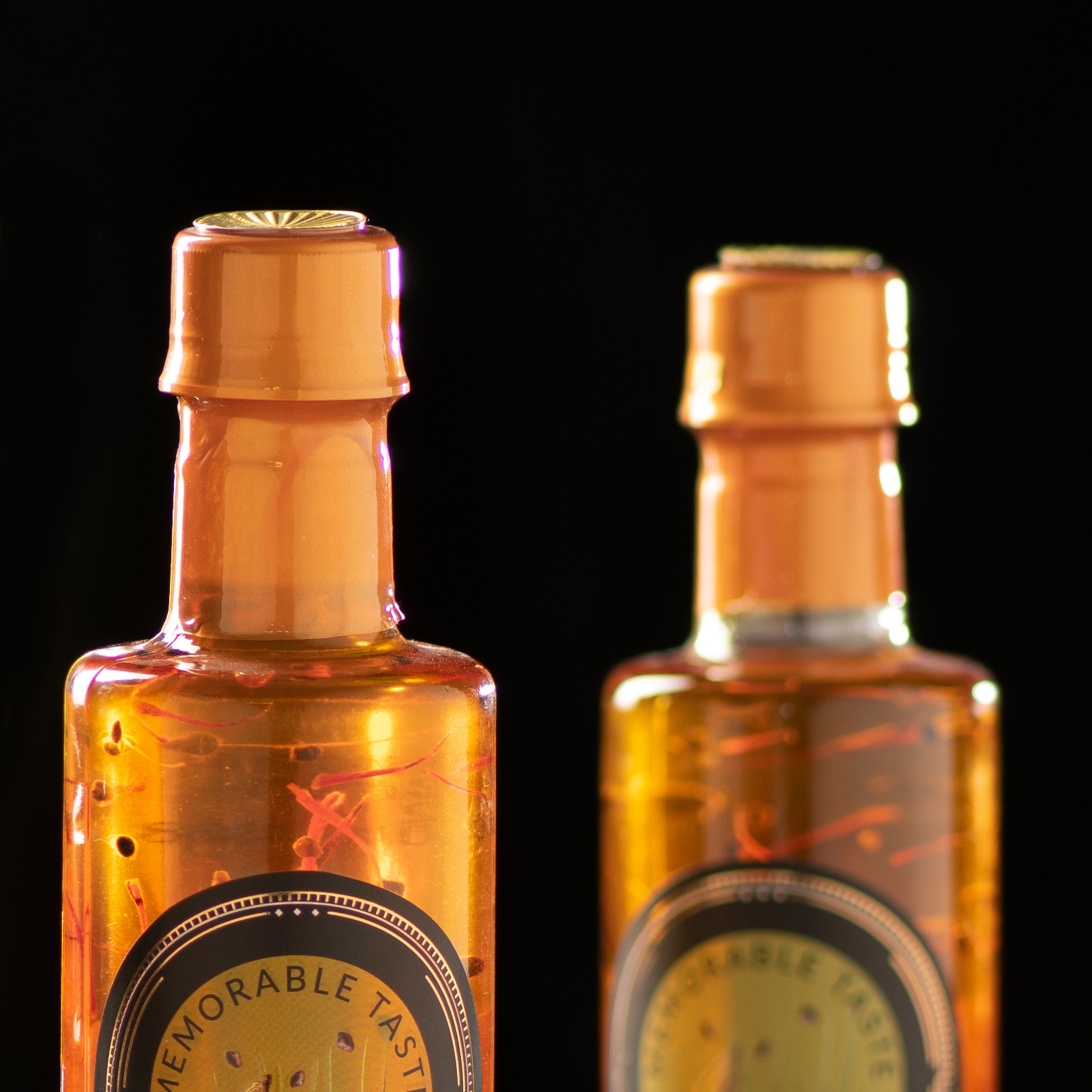
Also, the packaging is completely transparent, which allows customers to see the color and content of the saffron syrup at first glance and experience the pleasant feeling. Also, the packaging is well designed to protect the product from external damage.
Labels and product information are also completely on the packaging. The packaging design of saffron syrup is compatible with the traditional art and culture of Iran, and Persian calligraphy fonts have been used to represent the Iranian product and Iranian saffron. Information about ingredients, content, expiration date, and how to use are clearly placed on the packaging to provide customers with sufficient information about the product.
The Zaim brand name has been interpreted with a prominent golden color and fine lines to make the brand name more prominent in the minds of saffron consumers in addition to adding beauty to its bottle.
In general, Zaim’s saffron syrup packaging design, using the color combination, saffron flower and the elegance of the packaging, has been able to create a beautiful and attractive packaging that conveys the value, authenticity and glory of saffron. This design inspires buyers to experience an exquisite and quality product and turns the packaging into a symbol of trust and safe use.
CREDIT
- Agency/Creative: erfangroup
- Article Title: Zaim Syrup Packaging Design
- Organisation/Entity: Agency
- Project Type: Graphic
- Project Status: Published
- Agency/Creative Country: Iran
- Agency/Creative City: mashhad
- Market Region: Global
- Project Deliverables: Art, Branding, Design, Graphic Design, Packaging Design
- Industry: Food/Beverage
- Keywords: packagingdesign graphicdesign syrup
-
Credits:
graphicdesigner: erfangroup


