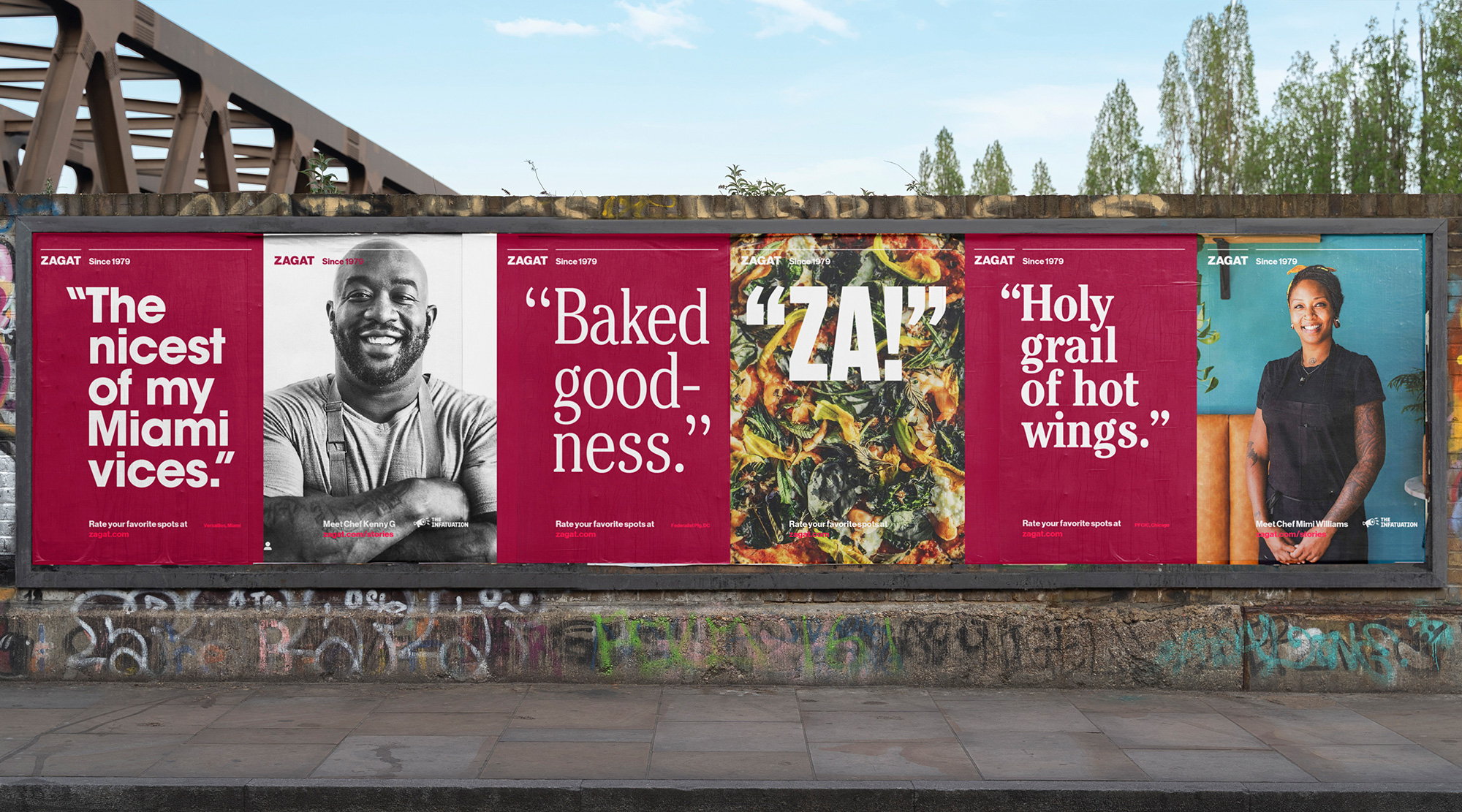
From Zagat: ‘In 1979, two Americans living in Paris found themselves wishing for a restaurant resource that reflected the opinions of their trusted friends rather than those of professional critics or mystery reviewers. So Nina and Tim Zagat created the guide they’d always wanted. The subsequent success of what became the iconic Zagat Restaurant Guide introduced the world to the idea of user-generated content—and democratized restaurant criticism forever.’
From Franklyn: Zagat was the originator of crowd-sourced, user-generated content and reviews, providing a medium for the voice of everyday consumers. But after a decade behind a paywall and acquisition and re-brand overseen by Google in 2015, the focus and the identity had shifted away from what was so important to the platform: the voices of the community.
In March 2018, The Infatuation acquired Zagat with plans to return to the brand’s roots via a new user-generated review platform. Launching this platform in Miami in 2021, Franklyn’s task was to create a brand system and campaign assets that serviced and articulated this return to the form of a great American heritage brand.
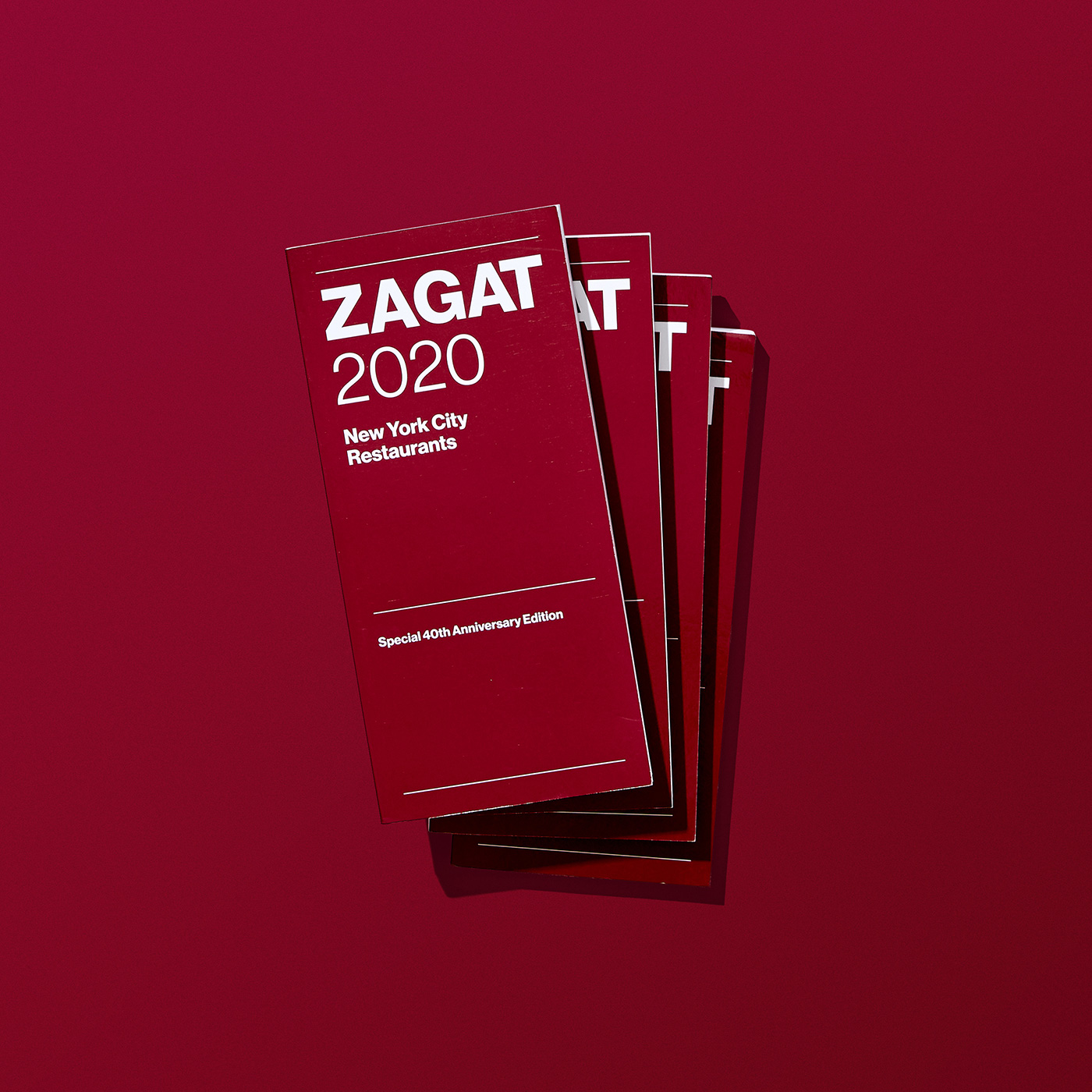
The result is a blend of both the brand’s legacy and the new. For anyone eating out in the last 40 years, the brand’s iconic wordmark will look familiar, receiving a slight typographic polish from its original 1979 appearance – shifting from Helvetica to the more modern and digital-friendly cut of Neue Haas Grotesk, a typeface crafted by the Commercial Type foundry. Similarly, the core brand itself has a modernist sensibility rooted in the late ’70s via strong grids, clear hierarchies and simple compositions.
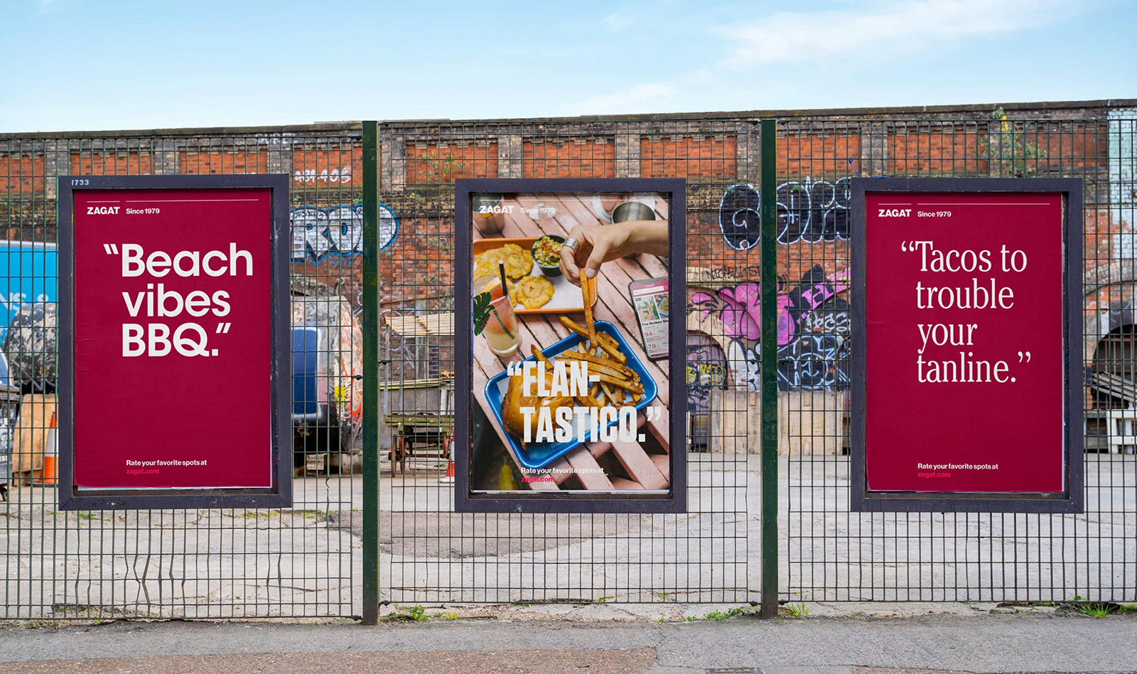
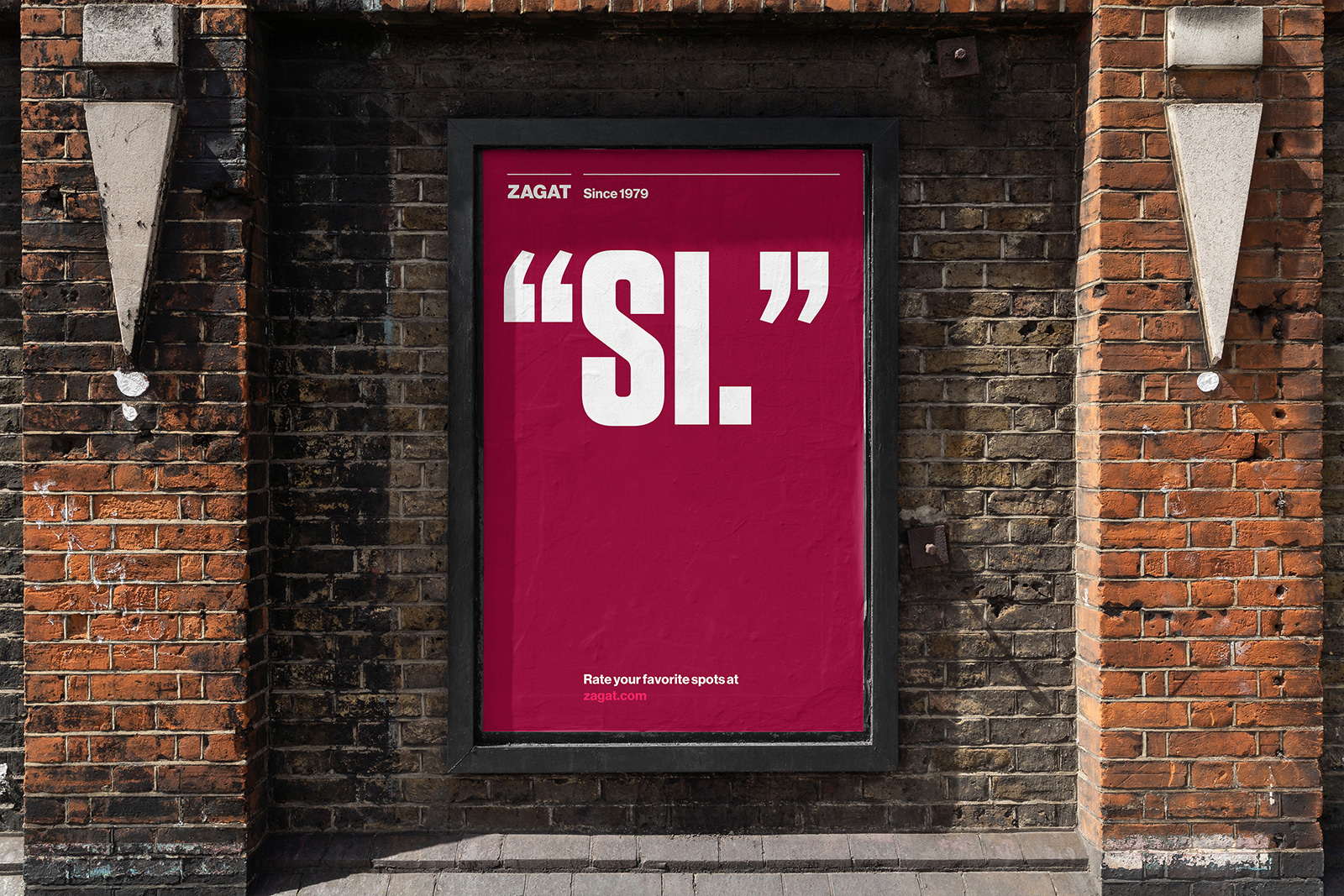
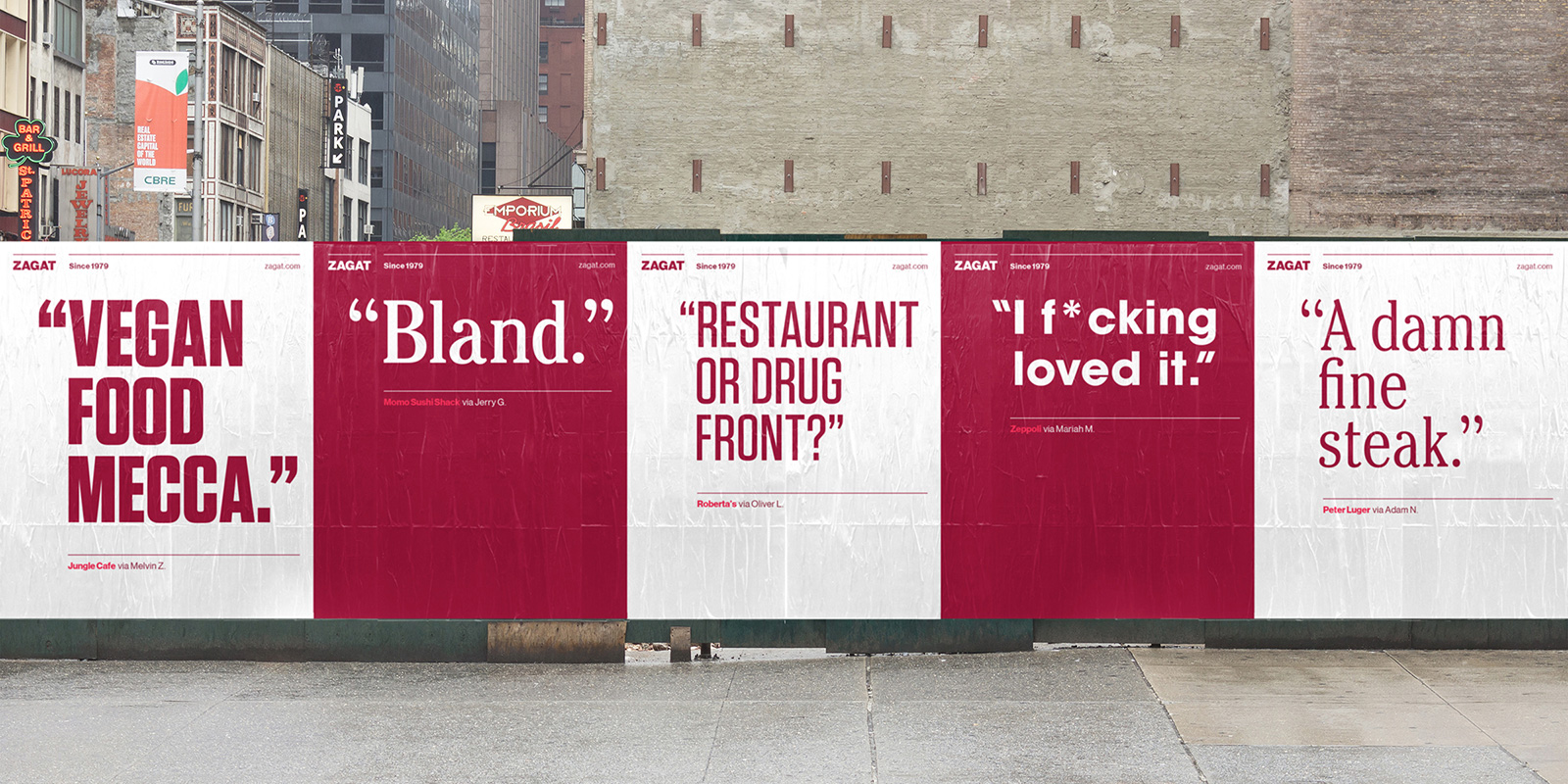
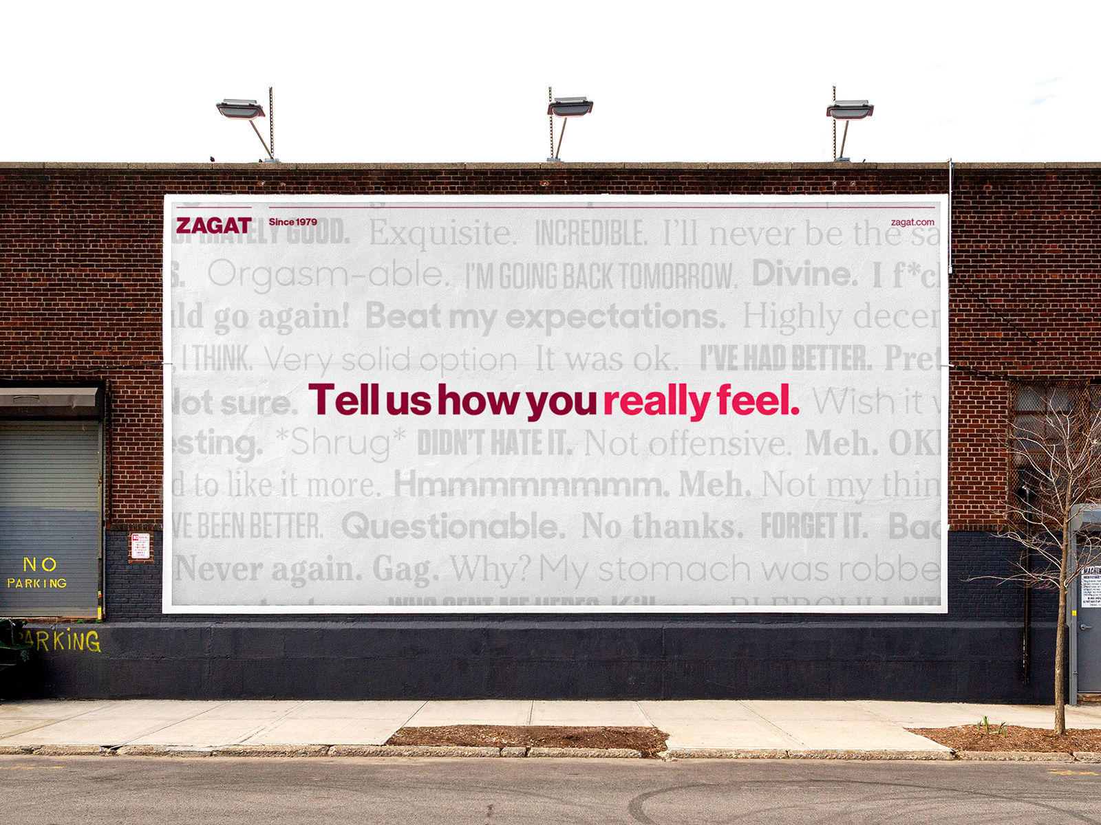
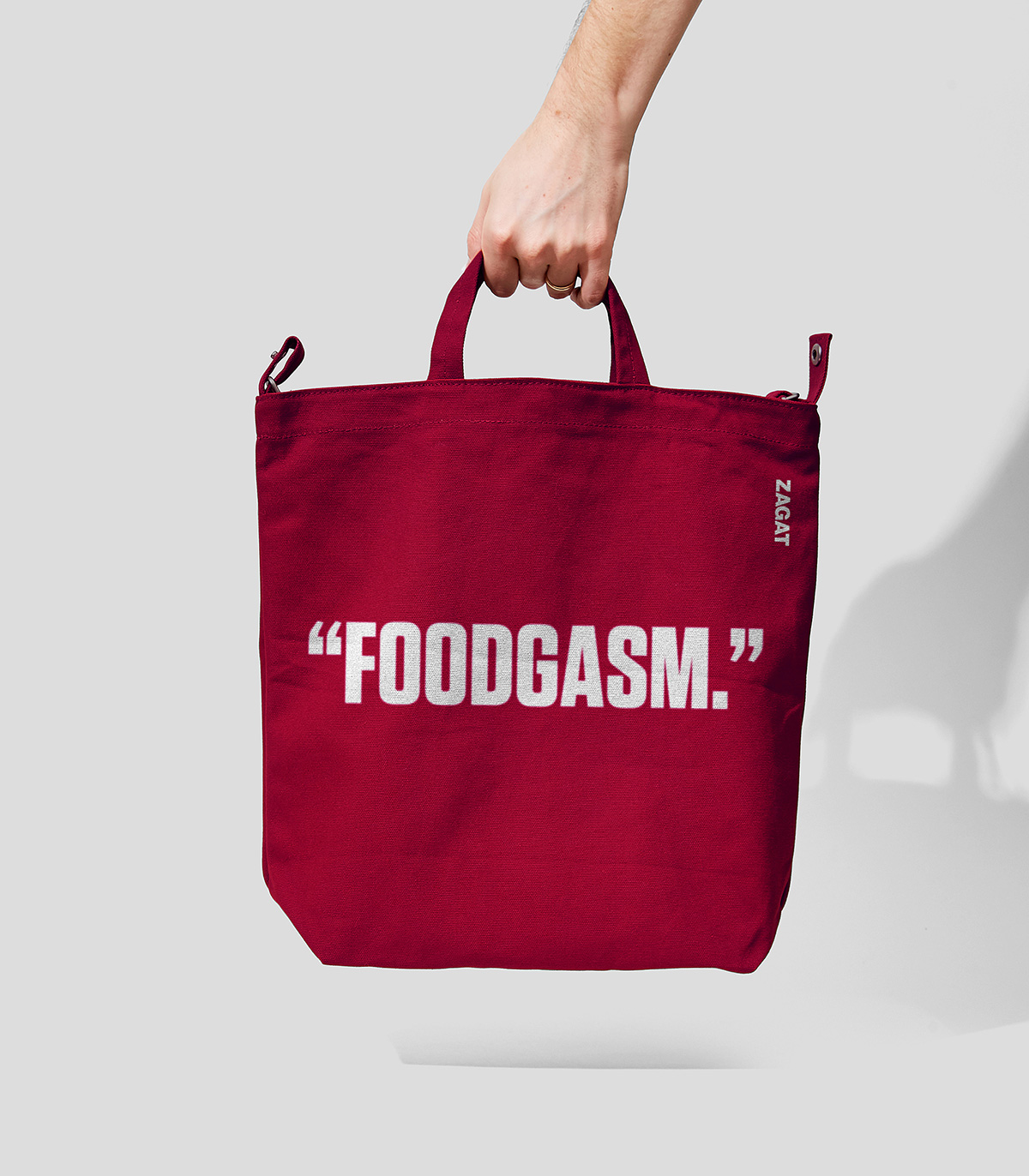
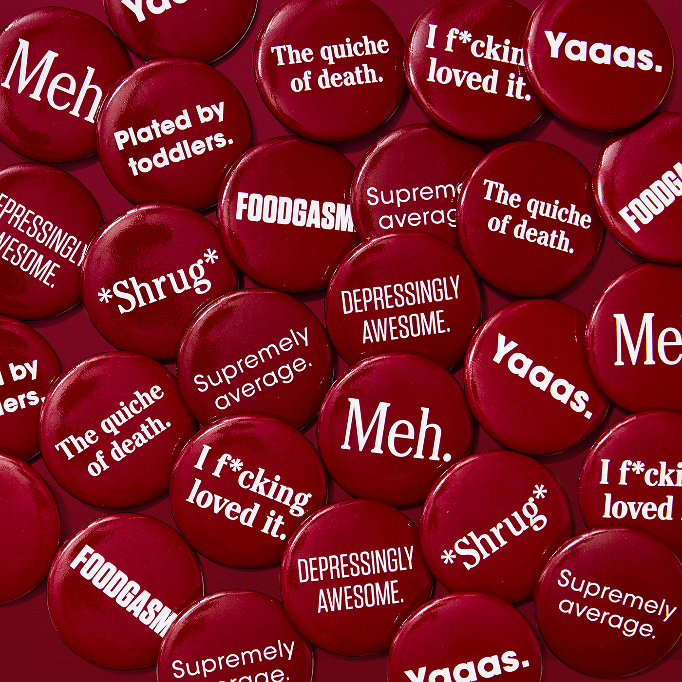
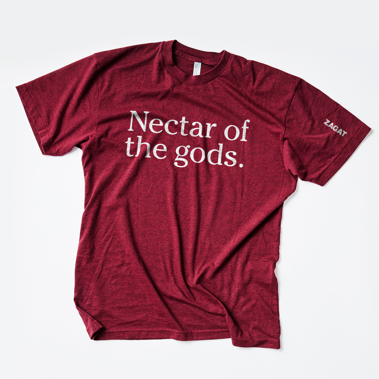
The brand system, on the other hand, is where the novelty, flexibility and funkiness flourishes. From a more digital-forward approach to colour, iconography, hierarchy and animation to a more fluid typographic palette, the brand was rebuilt to be newly expressive as well as function seamlessly across all Zagat media. Beyond the expansive brand toolkit, the stars of the show are the diverse suite of complementary typefaces representing the voices of its user-generated community. From iconic Avant-Garde and charming Cheltenham to a range of weights for the too-loud Tungsten type families, the typographic system allows Zagat and its community to sing praises with a shout, heckle with humour or speak with sarcasm. Dry, terse, practical, insulting or hilarious – there’s always a way to bring reviews, quotes and one-liners to life within the brand.
Ultimately the new Zagat platform is still committed to the same goal as the original printed guidebook: to celebrate the opinions and experiences of restaurant-goers and provide an exceptional level of curation along the way. The refreshed brand system keeps what the community always loved about the brand, but brings their fresh, functional and almost always fun perspectives to life out in the world. Look out for Zagat in your favourite cities in 2022 in the US and beyond…
CREDIT
- Agency/Creative: Franklyn
- Article Title: Zagat Restaurant Rebrand Created by Franklyn
- Organisation/Entity: Agency
- Project Type: Identity
- Project Status: Published
- Agency/Creative Country: United States
- Agency/Creative City: New York City
- Market Region: North America
- Project Deliverables: 2D Design, Advertising, Animation, Brand Creation, Brand Design, Typography
- Industry: Food/Beverage
- Keywords: dining, restaurants, reviews, platform, Food and Beverage
-
Credits:
Creative Director: Michael Freimuth
Design Director: Scott Cress
Account Director: Ashley Van Belle
Designer: Tess Havas


