the Labelmaker – Dogma
The Background
Zaara Estate is a small family owned winery located in Glavan Village in one of the most perspective wine regions of Bulgaria. They produce premium wines created by their ambitious international team of oenologists. Their philosophy is to pay attention even to the smallest details in winemaking and also to seek for an integrity between human and nature in their estate.
The Story
My first meeting with Zaara Estate team was very short but memorable. They came with a strong idea for their wine label and an interesting story.
The name of their first wine range was Dogma. Just like the meaning behind the word they wanted to create wines that are beyond any dispute for their remarkable quality and true character. Trying to find a strong symbol for such meaningful brand name they looked back in Bulgaria’s history and came across a very old sign used by the Bogomils – two ellipses placed one over another creating a cross and symbolizing the unity between man and woman, bound in eternal harmony.
The Project
It is always a great advantage if you have true original story behind your wine labels. Dogma brand and its timeless sign had more than just an ordinary story but a whole book of European history starting from Bulgaria and spanning out thru several centuries – the story of Bogomils and their West European followers – the Cathars.
I was really worried how to place so many historical layers dating back some 10 centuries ago on a single wine label. That wasn’t an easy task at all even for a skilled designer.
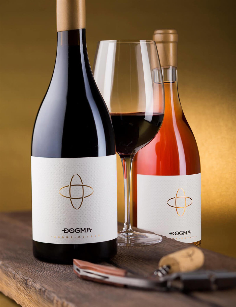
I decided to go for a modern label that showed the Dogma symbol and brand the best way. The symbol is very memorable and in combination with such strong brand name I was deeply convinced that we would be able to seize audience’s attention.
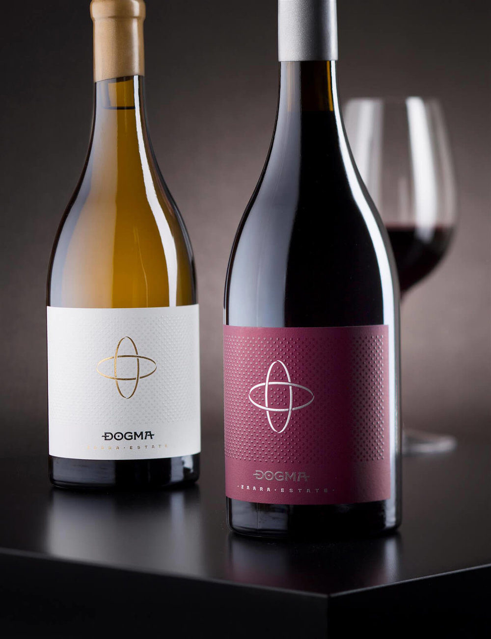
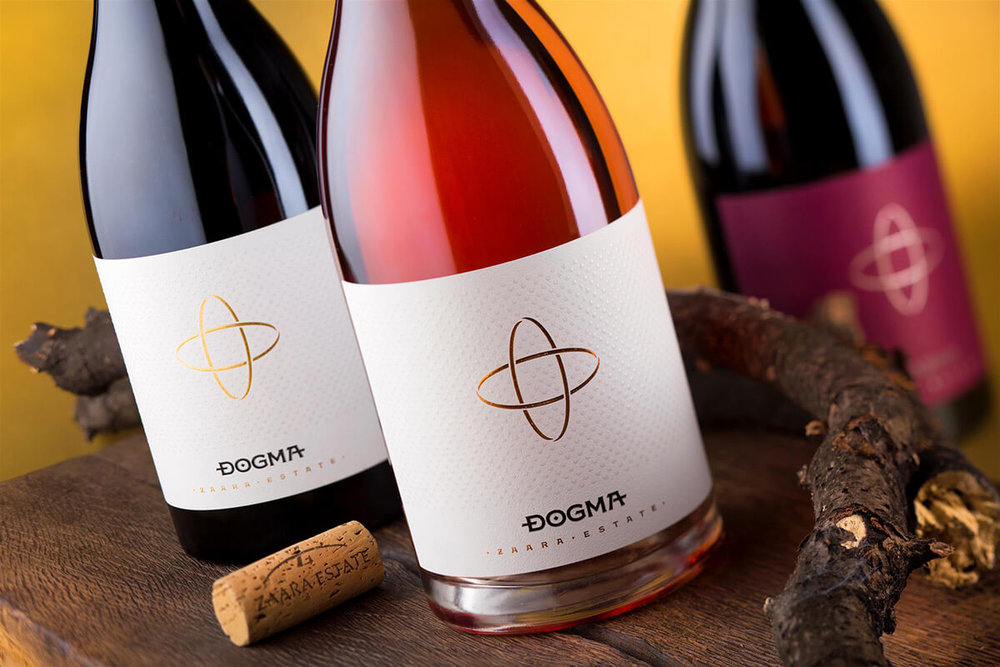
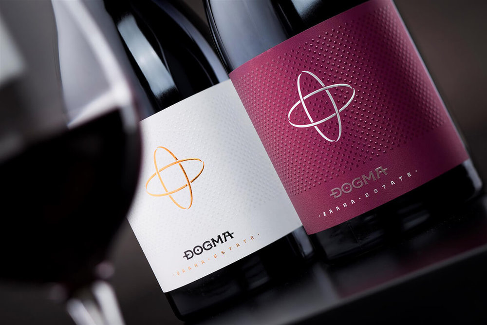
We picked very heavy Burgundy bottle by Saverglass with asymmetrical silhouette resembling hand blown glass the way it was made in the old days. The bottom of the bottle had solid cylindrical part and it was perfect for a large wide wine label. I wanted to have a lot of paper background around the Dogma sign and somehow to isolate it visually from the whole packaging. Then came the idea to try somehow to depict the Bogomils on my artwork. I covered the whole paper surface with pattern made of dots printed with braille varnish. My idea was to use them as an abstract image of human masses while only few of the dots were placed inside the Dogma symbol – these isolated dots were the Bogomils on my wine label. I used them and the crossing ellipses trying to somehow point out the original story behind this brand showing how the incredible power of a small human core could change the way of the world’s history with their bright ideas and enlightenment.
I used different hot-foil colors to stamp the symbol and kept the bottom part of the wine label for Dogma name written in custom made version of my original Bolyar typeface. After a short discussion we decided to write all additional info like varieties, vintage year, etc. on the back label and keep the front one as clean and simple as possible.
Each bottle is sealed with same wax color as the color of the hot-foil on the front wine label and in this range, we had several different combinations featuring gold, silver and copper wax.
Custom carton box for six bottles was made for this exclusive range of premium wines.


CREDIT
- Agency/Creative: the Labelmaker
- Article Title: Zaara Estate Wine Label Design
- Organisation/Entity: Agency Commercial, Published
- Project Type: Packaging
- Agency/Creative Country: Bulgaria
- Market Region: Africa
- Format: Bottle
- Substrate: Glass, Pulp Paper


