


Magna Strategy is a focused, hard-to-imitate approach that prioritizes underserved customer needs and key outcomes. It ensures a shared definition of the customer across the organization, aligning all employees with the same understanding. By integrating innovative solutions with effective business tactics, it naturally shapes the business model. This approach also allows for clear and consistent marketing strategies without relying on external agencies, reducing the risk of misrepresentation.
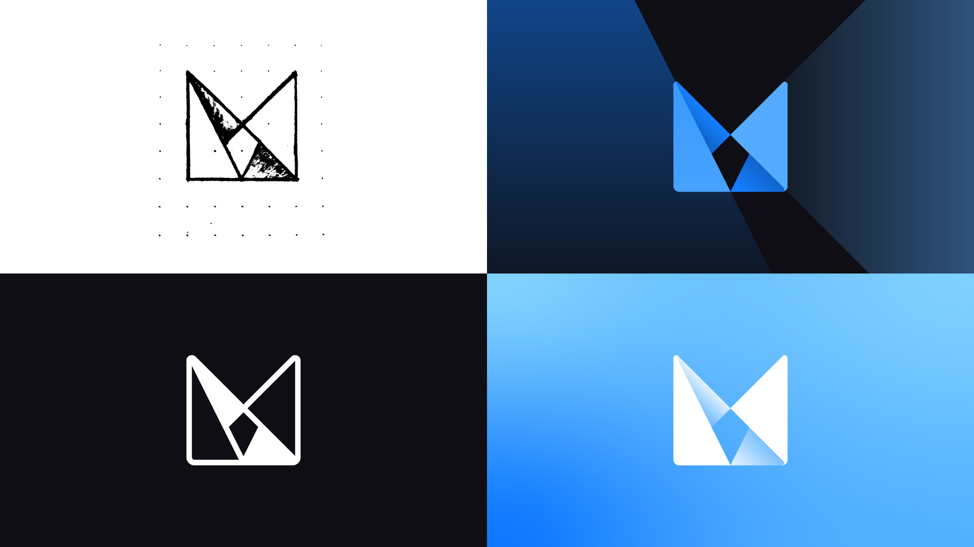
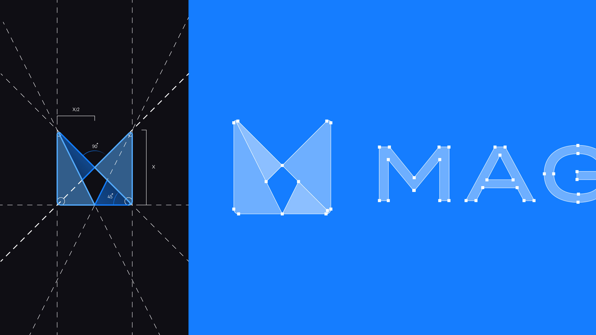
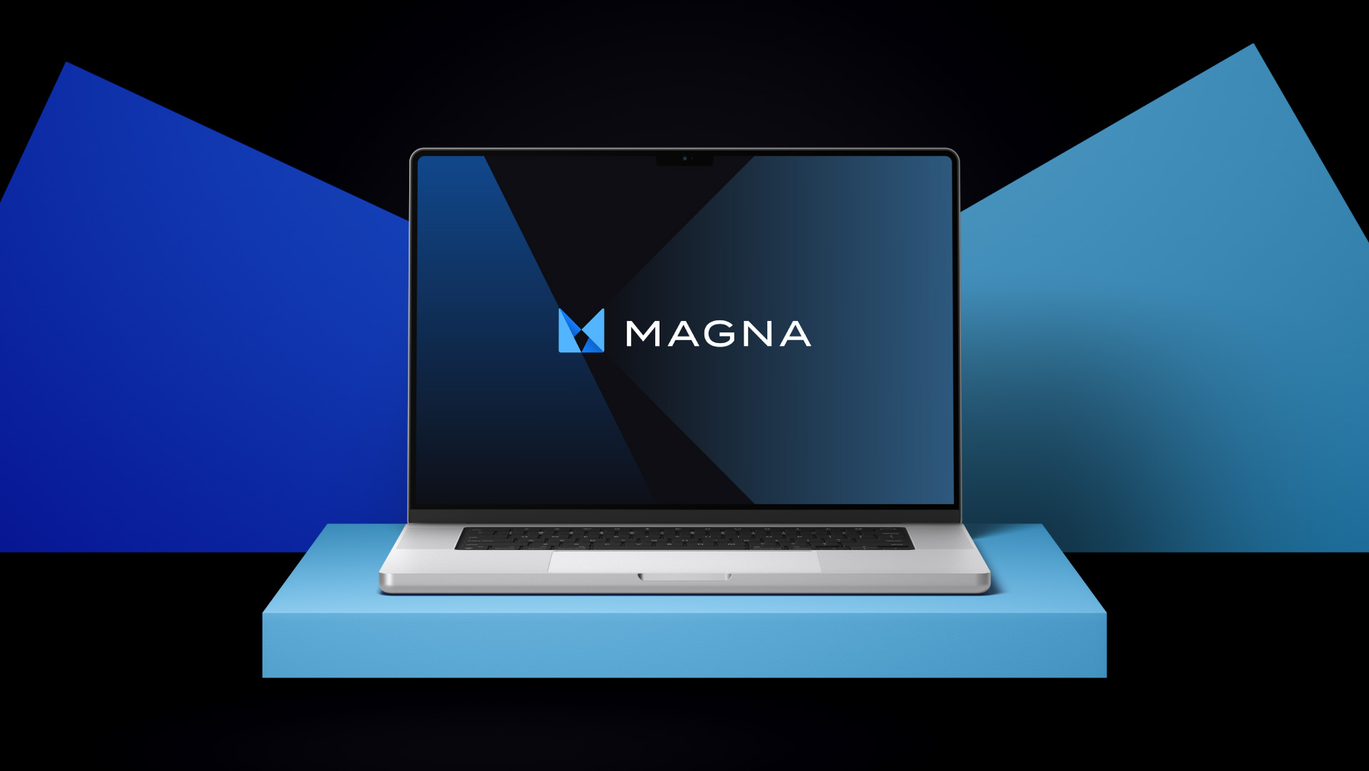
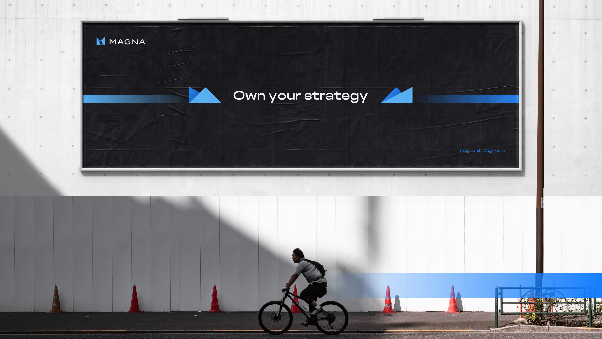
As part of this rebranding project, the goal was to develop a brand identity system that stays true to its original values while introducing a modern visual language. The logo features a stylized letter “M” formed by two paper planes, symbolizing startups and innovation. The negative space subtly incorporates a location pin, representing direction and business goals. This design principle extends across the brand’s visual system, ensuring consistency.
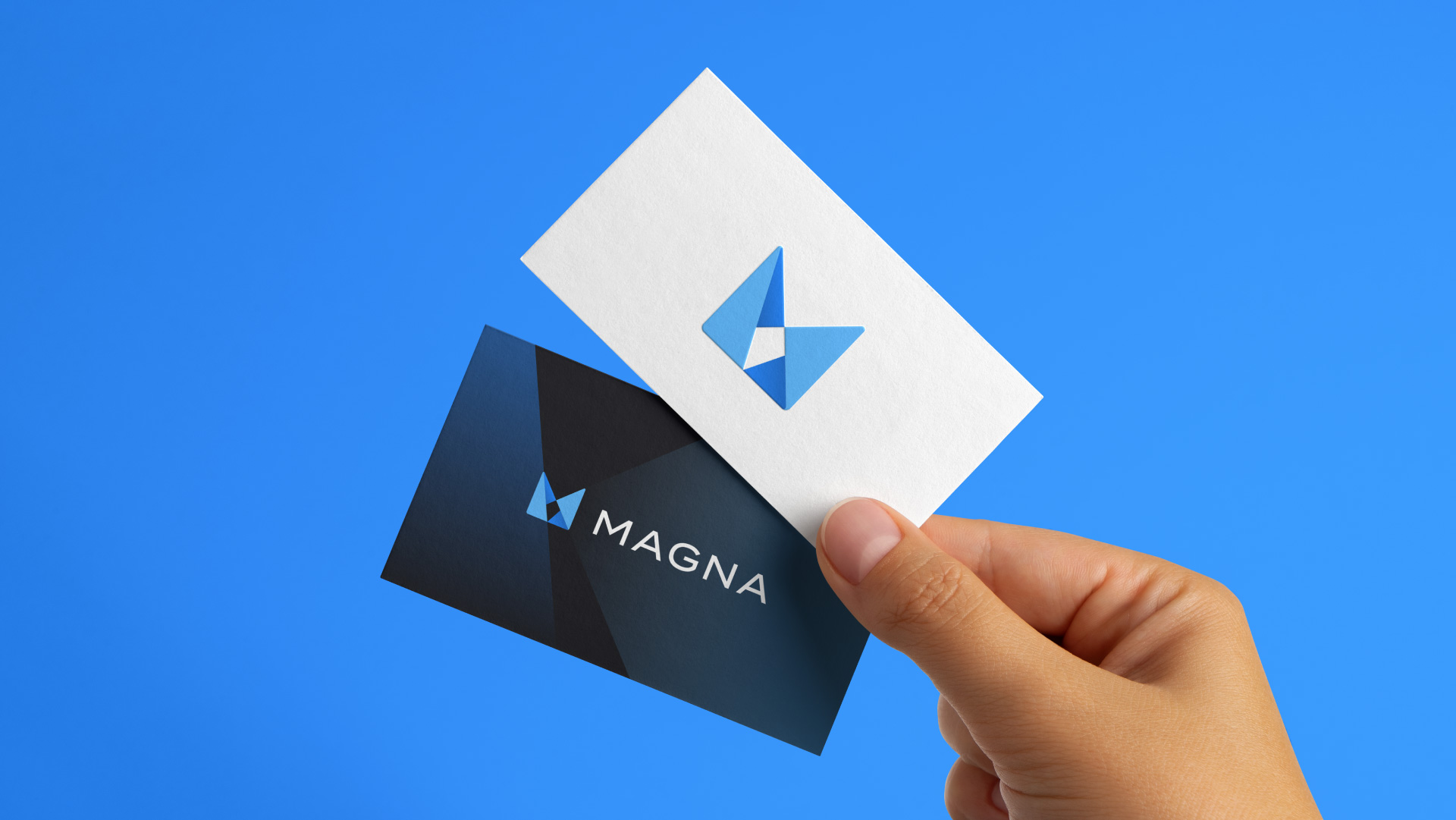
The logomark uses refined shapes and precise angles to create a structured and professional look. A strong blue color reinforces trust, stability, and reliability, qualities that align with Magna’s approach. The name “Magna,” meaning “great” in Latin, conveys strength and ambition. This is reflected in the typography, where uppercase letters create a bold and confident presence.
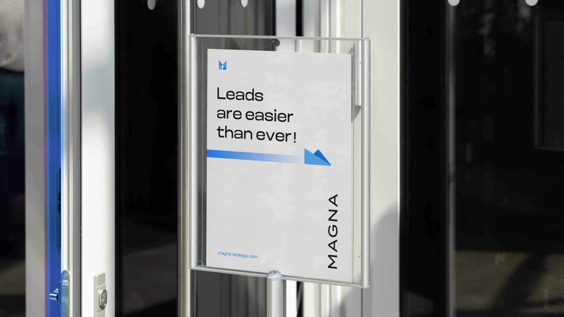
With a clear strategy and a well-defined identity, Magna Strategy communicates direction, purpose, and professionalism. Its cohesive design ensures that every brand element supports its mission and message.


CREDIT
- Agency/Creative: Yuser Kabani
- Article Title: Yuser Kabani’s Approach to Magna Strategy’s Modern Rebrand
- Organisation/Entity: Freelance
- Project Type: Identity
- Project Status: Published
- Agency/Creative Country: United Arab Emirates
- Agency/Creative City: Dubai
- Market Region: Middle East
- Project Deliverables: Brand Design, Brand Guidelines, Brand Identity, Brand Redesign, Logo Design
- Industry: Professional Services
- Keywords: Logomark, Typography, Strategy, Blue, Visual identity, Visual identity, Negative space, , Geometric shapes, Brand identity, Uppercase letters, Paper planes, Startups, Letter M
-
Credits:
Brand Designer: Yuser Kabani


