


Chateau Vartely is a brand known to many both in Moldova and abroad. With a wide range of wines, spanning from the most basic and fresh, to ultra-premium and exquisite, the company has a well-established reputation for its excellent value for money. And as always in the case of a winemaker with an extensive portfolio, over the years, the company has reached the need for an update to the visual component of its products. The decision was to start with the most basic line, consisting of young table wines, which was rather popular in the past, but due to the outdated design, began to lose ground in terms of sales. Thus, our studio was entrusted to develop a new label design for Chateau Vartely, which would revive the consumer’s interest in this product.
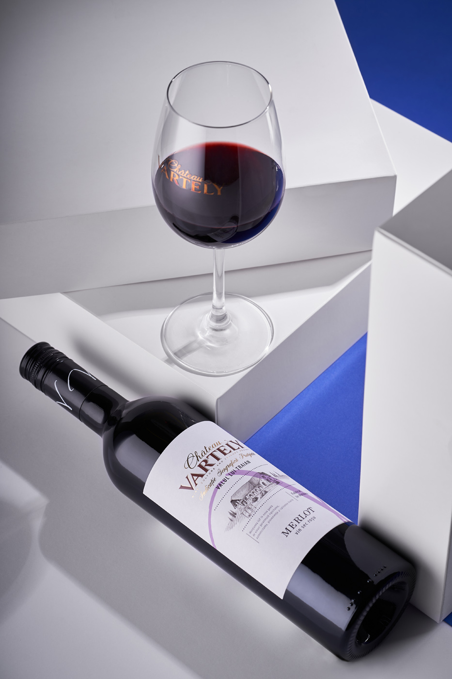
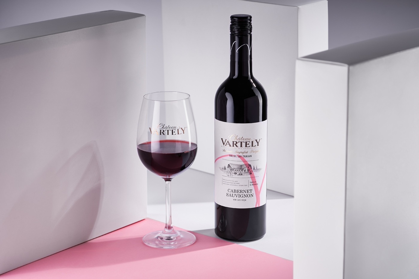
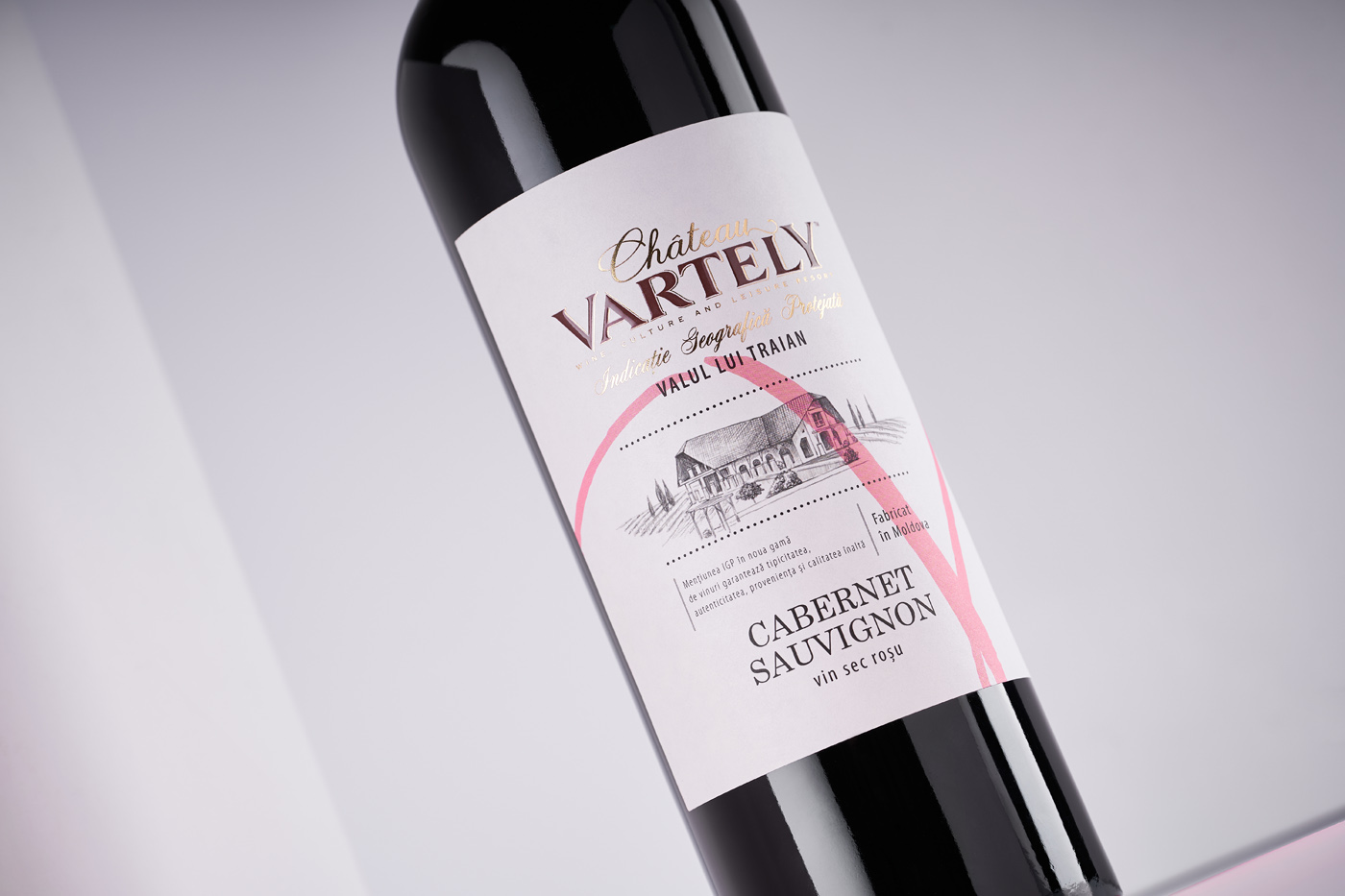
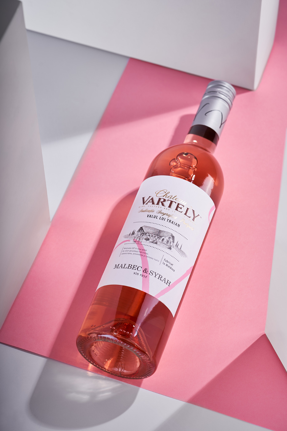
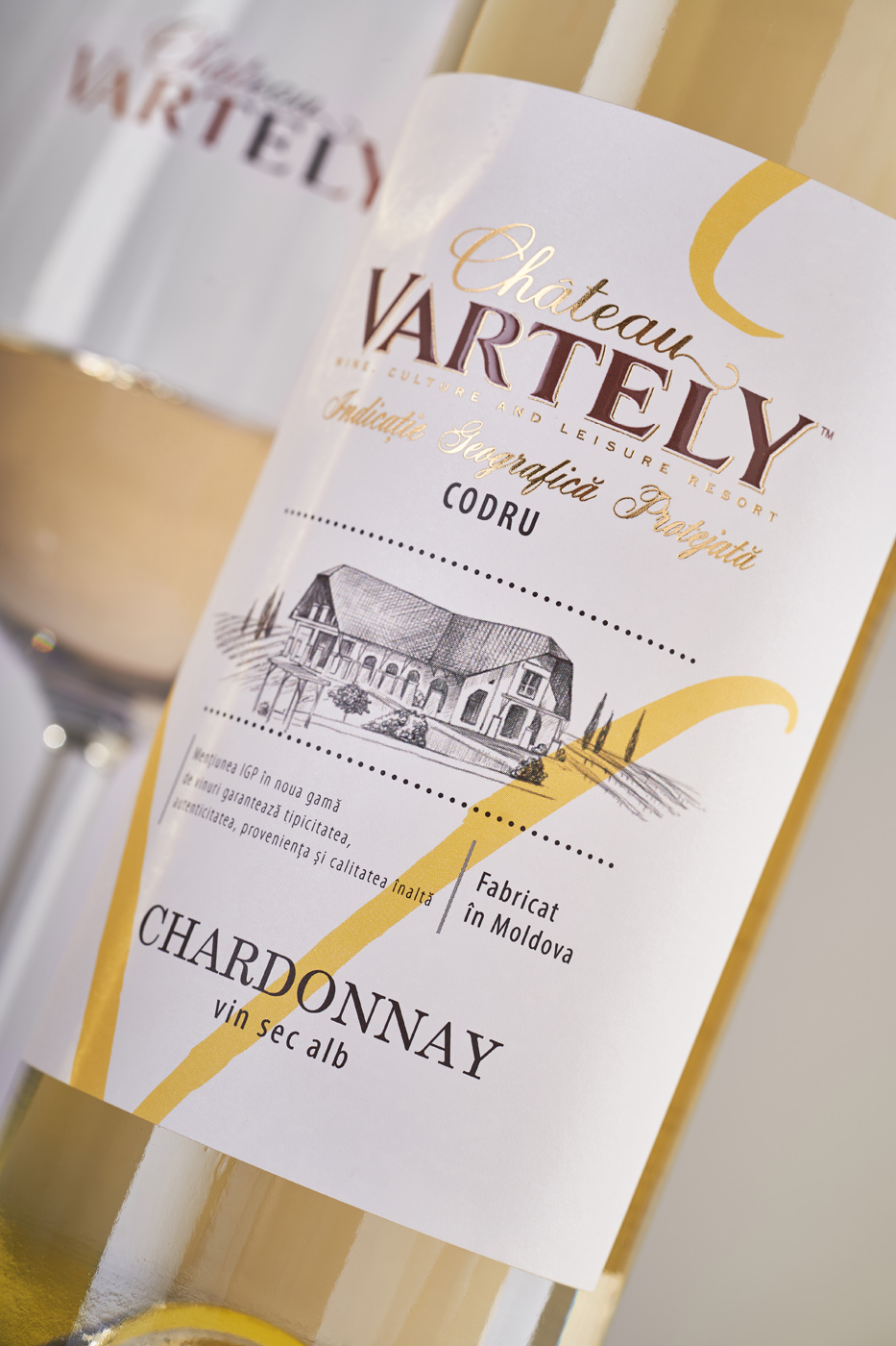
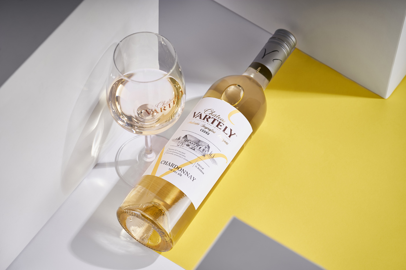
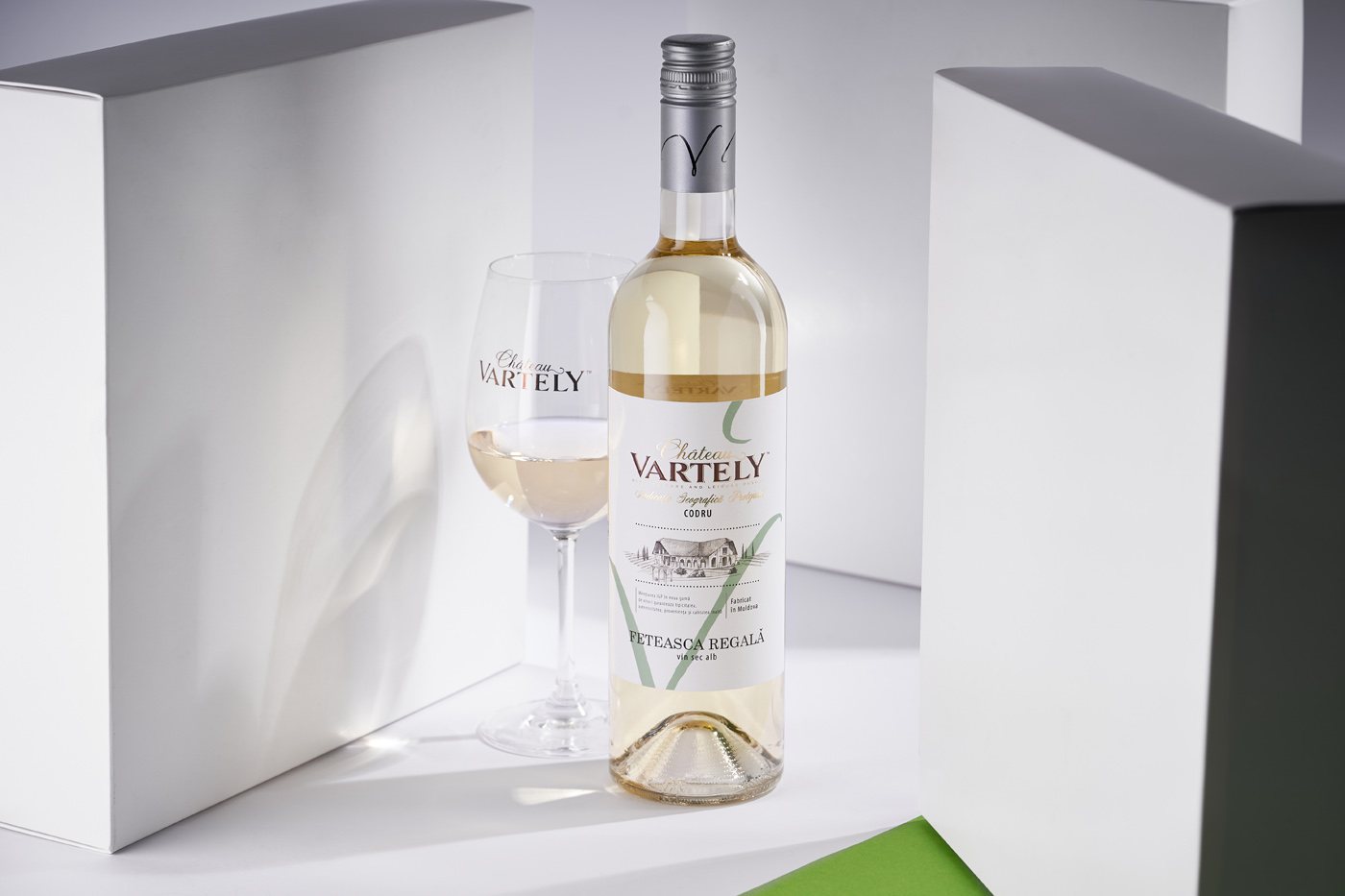
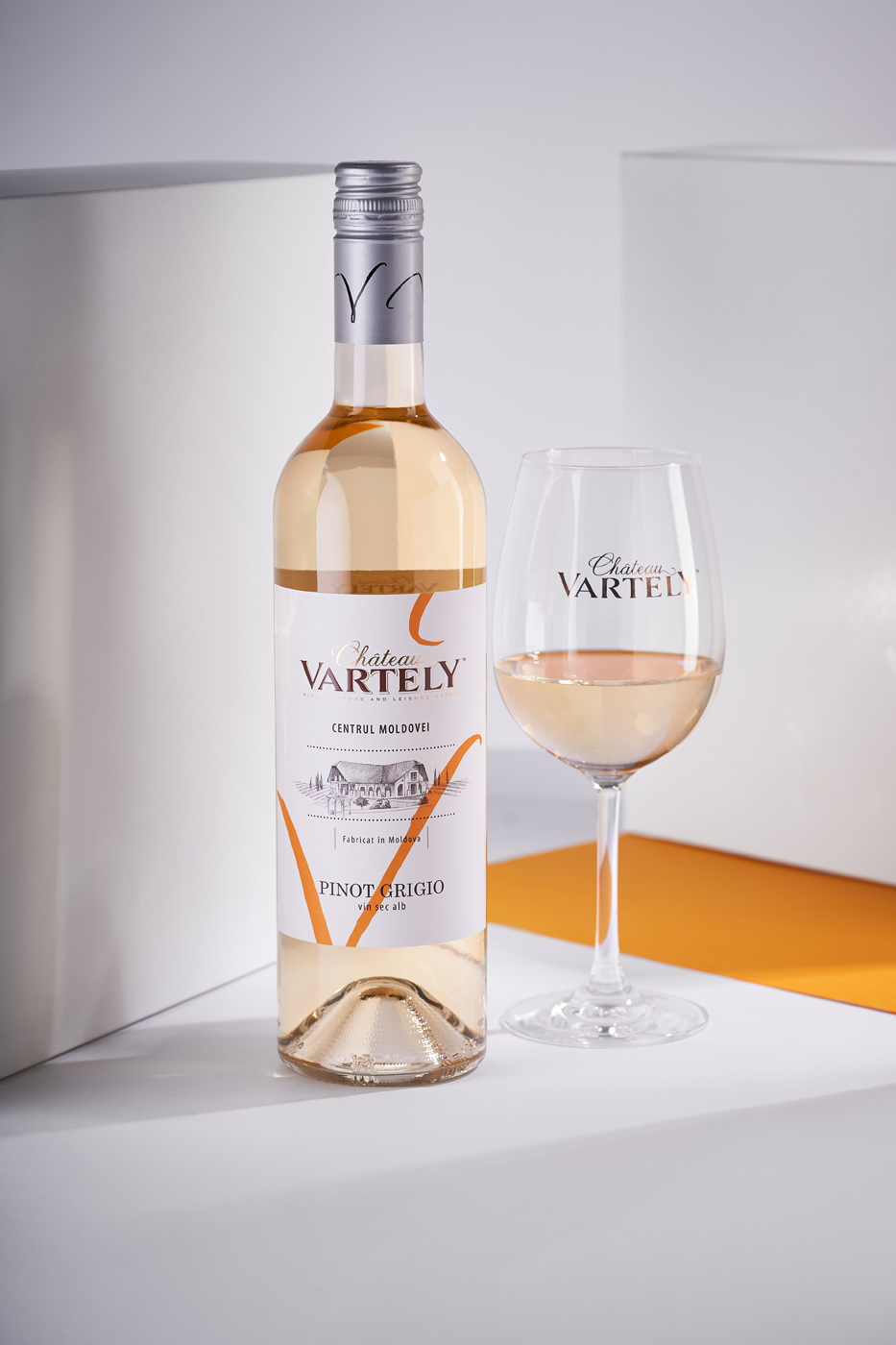
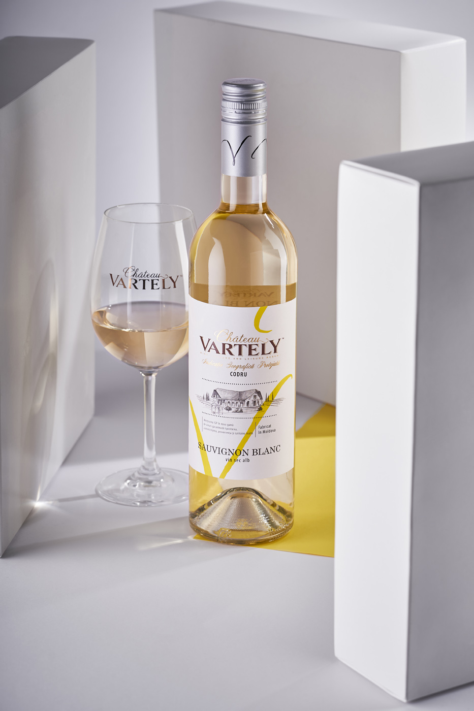
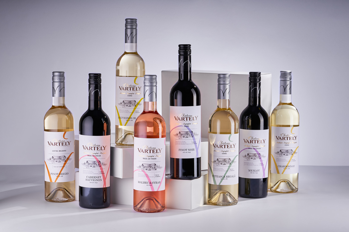
The main distinguishing feature of the Chateau Vartely base wines is lightness, youth and vibrance. Therefore, it was decided to make the packaging design light, airy and fresh. Minimalistic execution of graphic and informational elements on a vast white field accentuates the character of the wines, and preserves the general style of the product well-known to the consumer. A bright colored V-shaped stroke through the entire label brings contrast, hints to the brand name, acts as an eye-stopper, provides color differentiation of the products in the line, and enhances the feeling of lightness and airiness common to these young wines. As a result, the product looks lively and fresh among the competitors, draws attention, and allows you to clearly identify the category of this product.
The contrast between the label design as it was and as is now becomes apartent when you put the bottles next to each other. The light and fresh character of the wines come through thanks to the use of transparent bottle that is emphasized by a light colored and minimalistic label. Furthermore the new wine label design provides continuity to the brand in general, fitting neatly into other product lines, especially when compared to the previous version of the label that looked out of place.
CREDIT
- Agency/Creative: 43oz Design Studio
- Article Title: Young Wine Label Design for Chateau Vartely Created by 43oz Design Studio
- Organisation/Entity: Agency, Published Commercial Design
- Project Type: Packaging
- Agency/Creative Country: Moldova
- Market Region: Europe
- Project Deliverables: Packaging Design, Tone of Voice
- Format: Bottle
- Substrate: Glass Bottle


