As the established tequila brand Rooster Rojo was set to expand with a premium product proposition and move into the mezcal category, there was a need to rethink the existing design system. The main objective was to claim a distinctive spot on the mezcal shelf – fitting in and disrupting at the same time – maintaining clear brand recognition while elevating into a premium expression. The agency’s task included design, structural packaging, and naming aligned with the existing structure.
The strategy was to amplify the iconic Rooster Rojo assets and bring them into the mezcal category – creating a desirable premium experience. And the launch is fulfilling its purpose – not only is it a rare and exclusive mezcal – but its modern and handcrafted look is bringing a glow to the whole Rooster Rojo brand and portfolio.
Young Spirit Goes Old School
We delved deep into the mezcal universe, uncovering generations of passion and expertise in crafting this unique spirit. The mezcal category is defined by its “rough-around-the-edges,” simplistic, and authentic attitude. Many small-scale mezcal brands emphasize handcrafted aesthetics and minimalistic designs. In contrast, Rooster Rojo tequila is renowned for its elaborate details, vibrant layers, and touch of opulence. To resonate within the mezcal category while maintaining brand consistency, we created a stripped-back, bold version of Rooster Rojo – crafted specifically for mezcal enthusiasts.
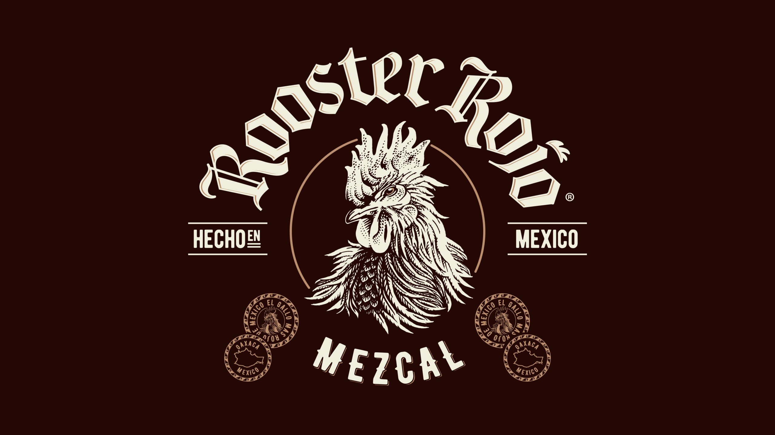
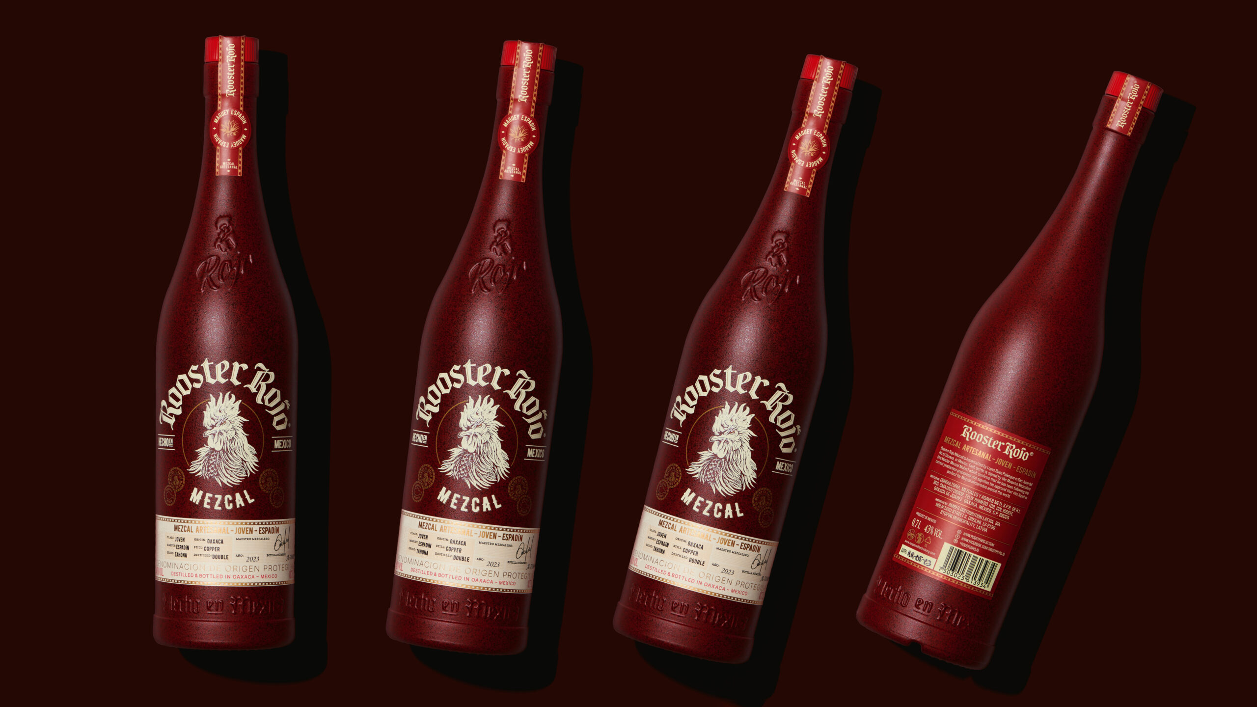
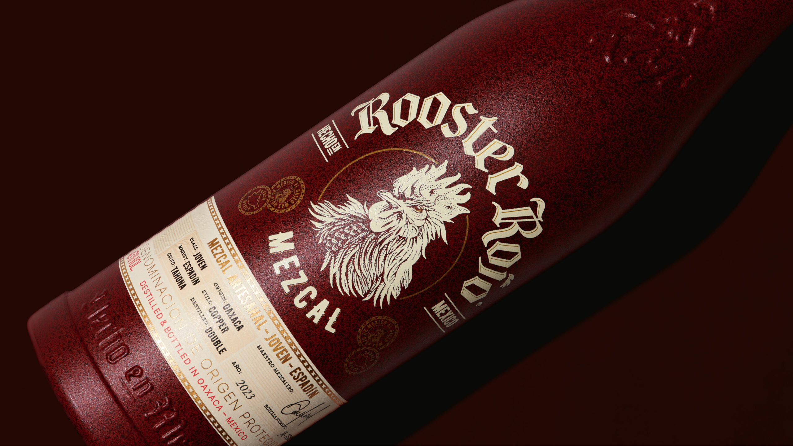
In deconstructing the Rooster Rojo brand, we pared down its intricate design elements, focusing instead on its iconic features: the rooster, the striking red colour, and the distinctive bottle shape. These assets were reimagined within an artisanal mezcal context, creating a design that harmonizes the brand’s vibrant spirit with the authenticity sought by mezcal consumers.
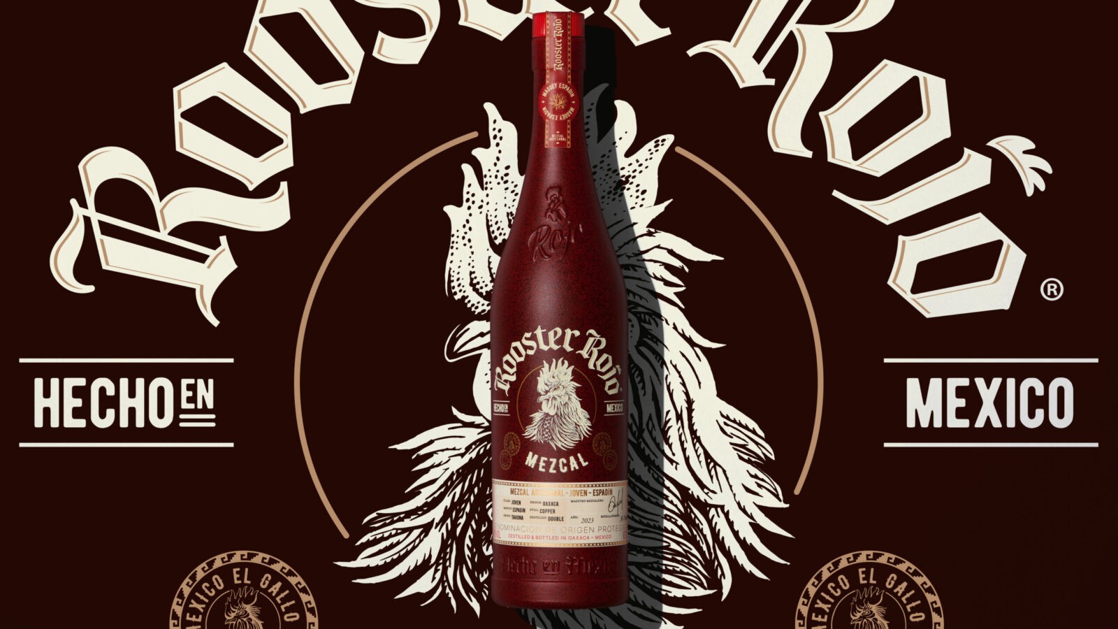
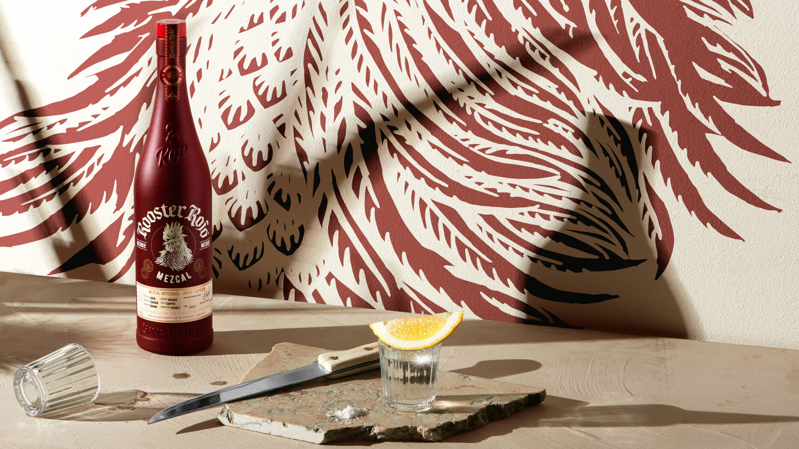
During our exploration, we discovered that red is not only Rooster Rojo’s signature but also a key cue within the mezcal category. By making the bottle deep red and opaque, we amplified the use of red and differentiated it from the transparent bottles typical in tequila. The result is a bold statement piece that bridges traditional mezcal craftsmanship with modern design.
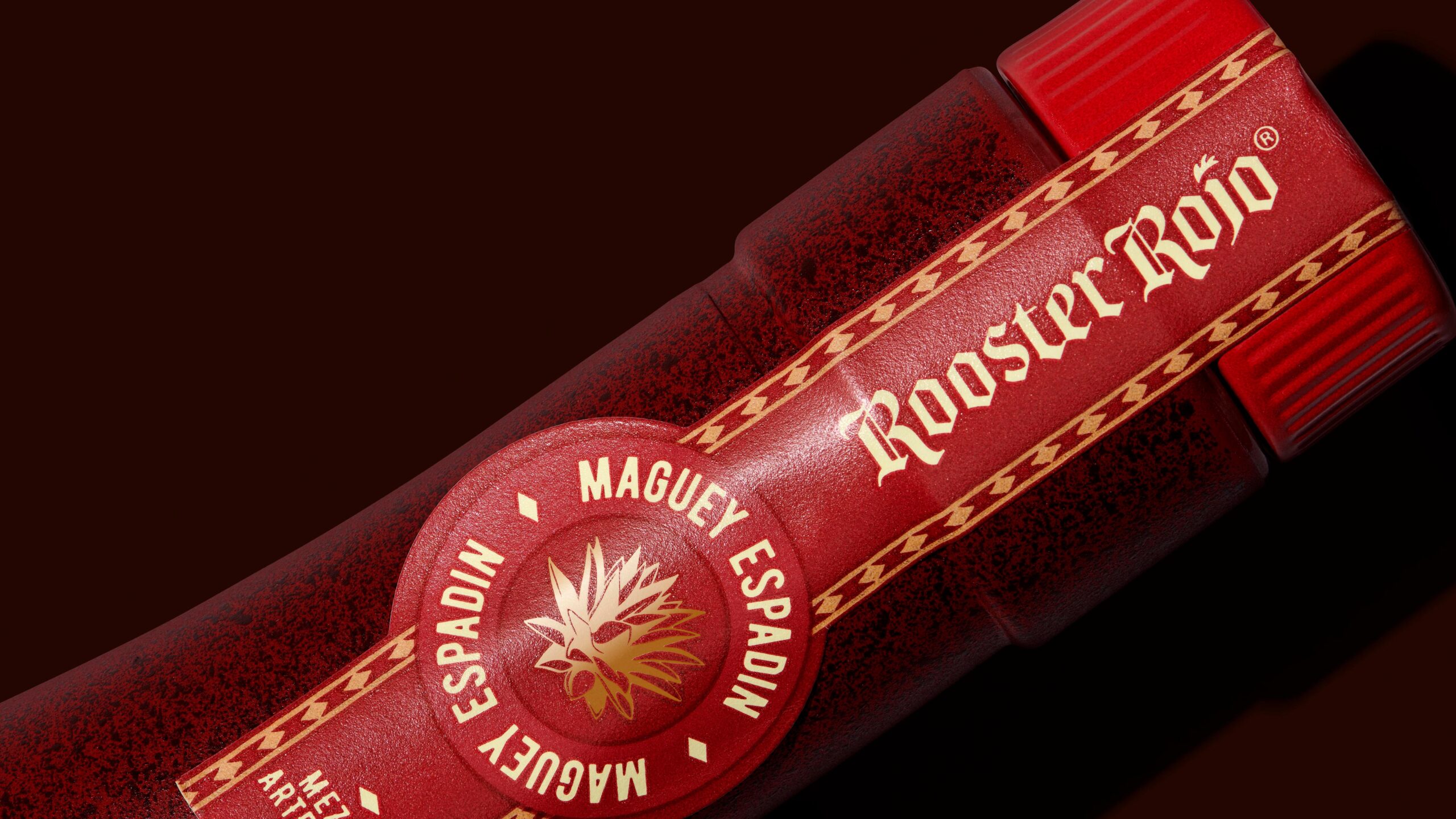
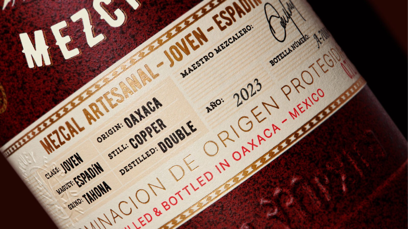
The tactile experience is a cornerstone of this redesign. The clay-like opaque bottle pays homage to traditional Mexican pottery. Silk-screened red, white, and gold elements create a handcrafted and monochromatic aesthetic. A wooden cork stopper, prominently coloured in Rooster Rojo red, ensures strong brand recognition. To emphasize its artisanal nature, a printed label featuring the mezcalero’s signature and the bottle number completes the design.
This new monochromatic mezcal seamlessly unites tradition and modernity. It adds an exclusive and desirable product to the Rooster Rojo portfolio, bridging the gap between mezcal’s raw authenticity and Rooster Rojo’s vibrant identity. The result is a premium mezcal that elevates the brand, bringing fresh energy to both the category and the entire Rooster Rojo range.
CREDIT
- Agency/Creative: Pond Design AB
- Article Title: Young Spirit Gone Old School: Pond Design Bridges Tradition and Innovation in Rooster Rojo’s Mezcal Redesign
- Organisation/Entity: Agency
- Project Status: Published
- Agency/Creative Country: Sweden
- Agency/Creative City: Stockholm
- Industry: Food/Beverage
- Keywords: WBDS Agency Design Awards 2024/25 , Young Spirit Gone Old School
- Keywords: WBDS Agency Design Awards 2024/25 Young Spirit Gone Old School
-
Credits:
Client Director: Fredrik Svalstedt
Production Manager: Niclas Hemlin
Senior Designer: Fredrik Bladh
Senior Designer: Peeter Ots
Final Art: Anki Mac Pherson
Visualiser: Johan Svedelius


