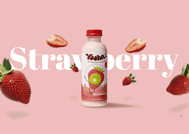
Fuel your kids with delicious shake
Overview
Yooha is a fun, plant-based pea protein shake crafted especially for kids. Beyond merely being a beverage, it functions as a supplementary nutrition source, enhancing a child’s regular dietary intake.
Design and Branding
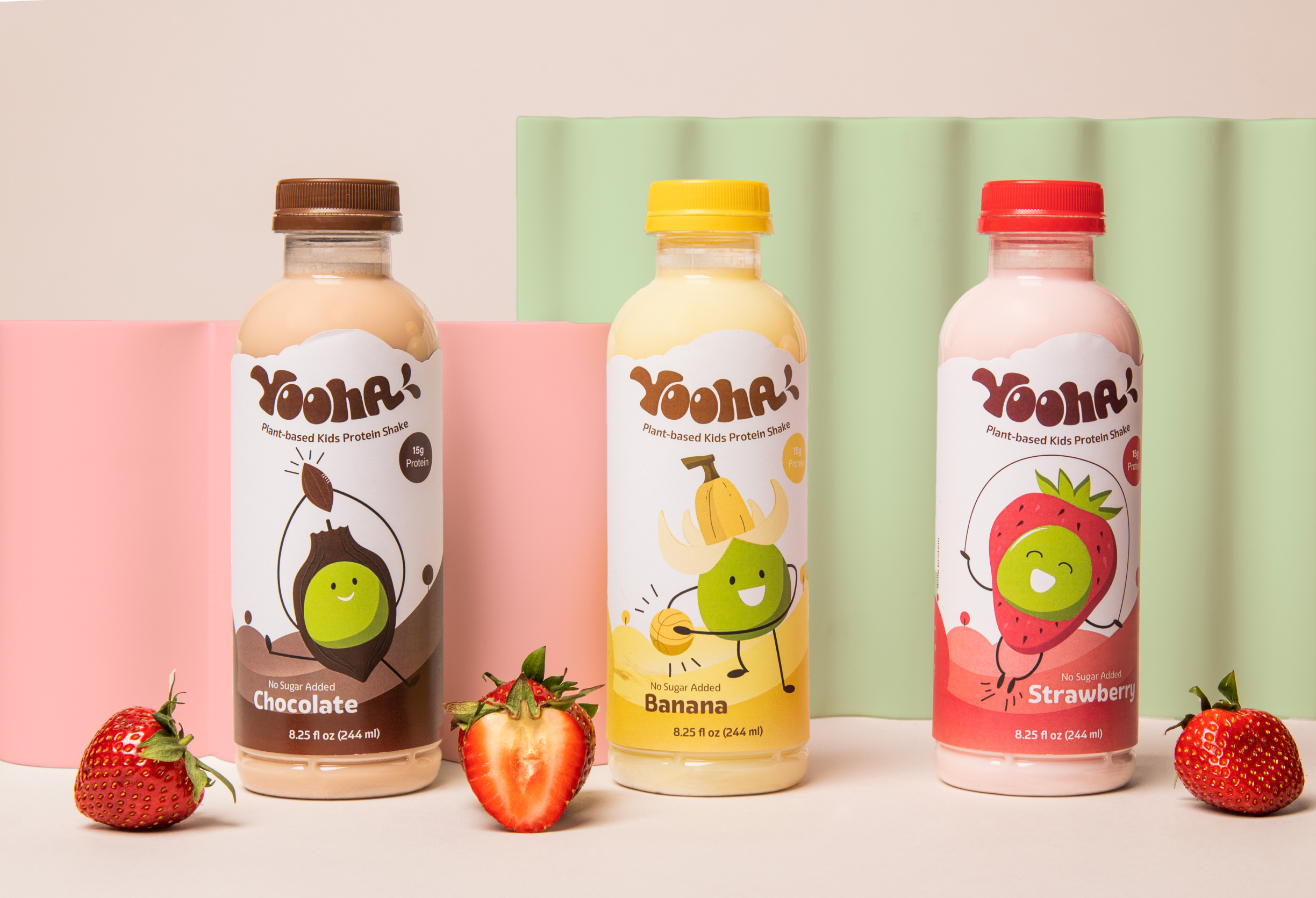
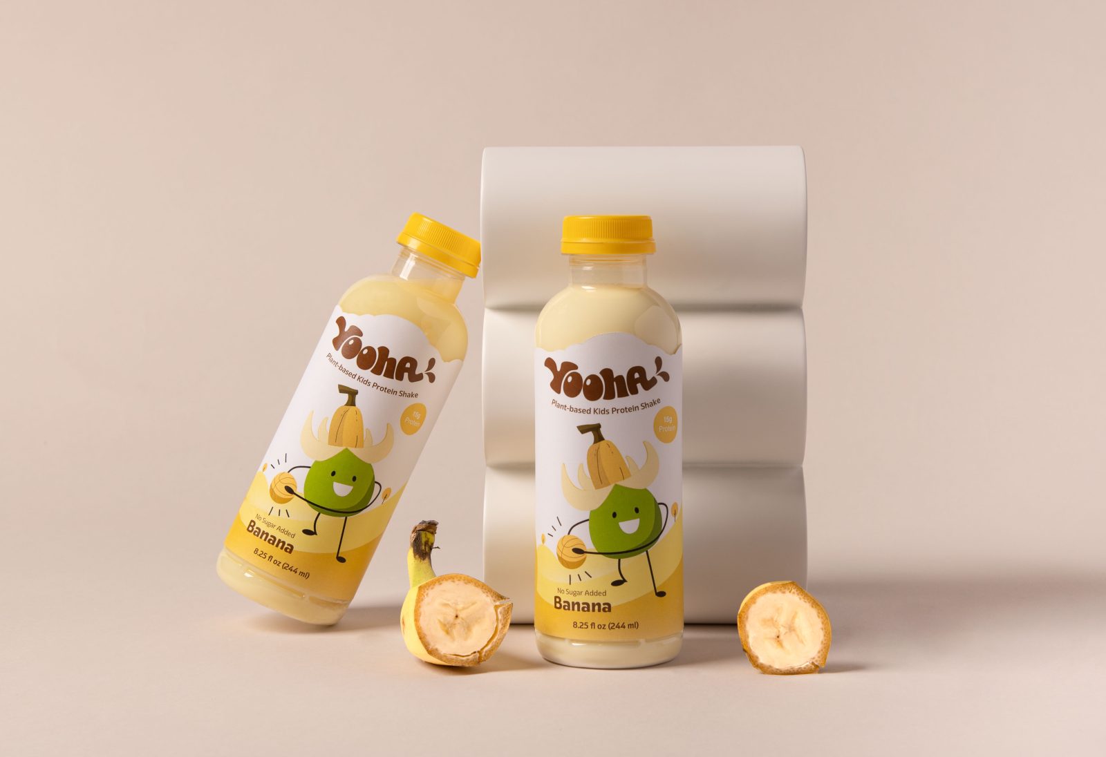
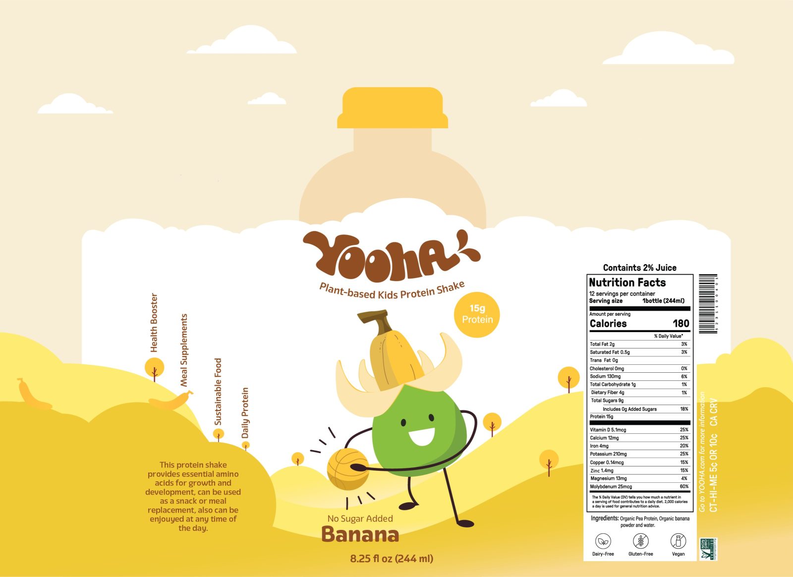
Yooha’s brand character exudes a playful, friendly, and dynamic spirit, mirroring the imagination of its young target audience. The packaging captivates the eye with vibrant colors, each hue embodying the joy of youthful energy. The brand’s primary mascot, a delightful pea character, has different outfits that show the specific flavor in an athletic context. This consistent portrayal subtly yet effectively positions Yooha as a drink that promotes physical activity and wellness.
The product’s wordmark logo draws inspiration from the natural form of a pea-pod. Using a curved baseline with buoyant letters, the logo seamlessly embodies the playful essence of the brand. This playful approach continues with the packaging, where a custom-cut cloud-shaped label adorns the product, offering a distinct, whimsical appearance that stands out on the shelves.
Market Positioning
Having conducted a thorough competitive analysis, it was discerned that many brands in this segment tend to overwhelm the consumer with an overload of information, often bordering on a clinical presentation. Yooha intentionally deviates from this norm. The emphasis is on a more approachable design, where the pea mascot not only provides a friendly face but encapsulates the brand’s promise of health, playfulness, and overall well-being.
Digital Presence
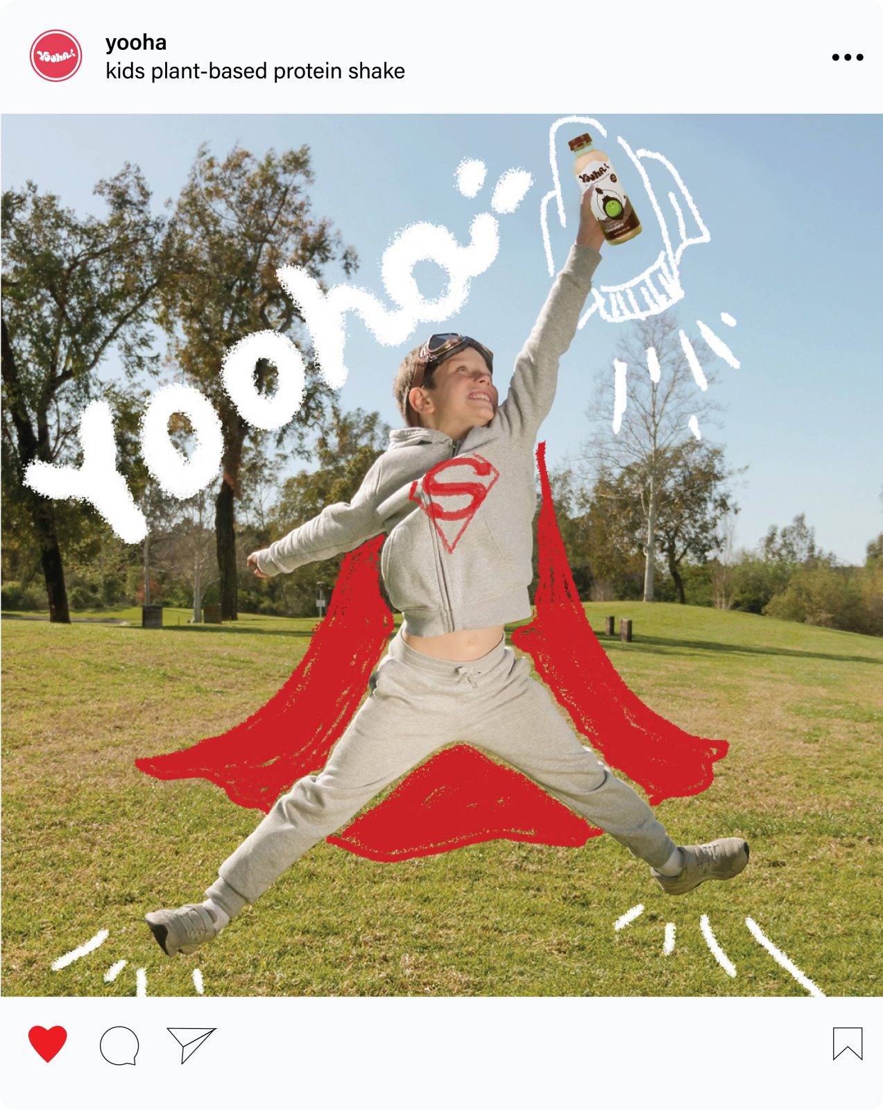
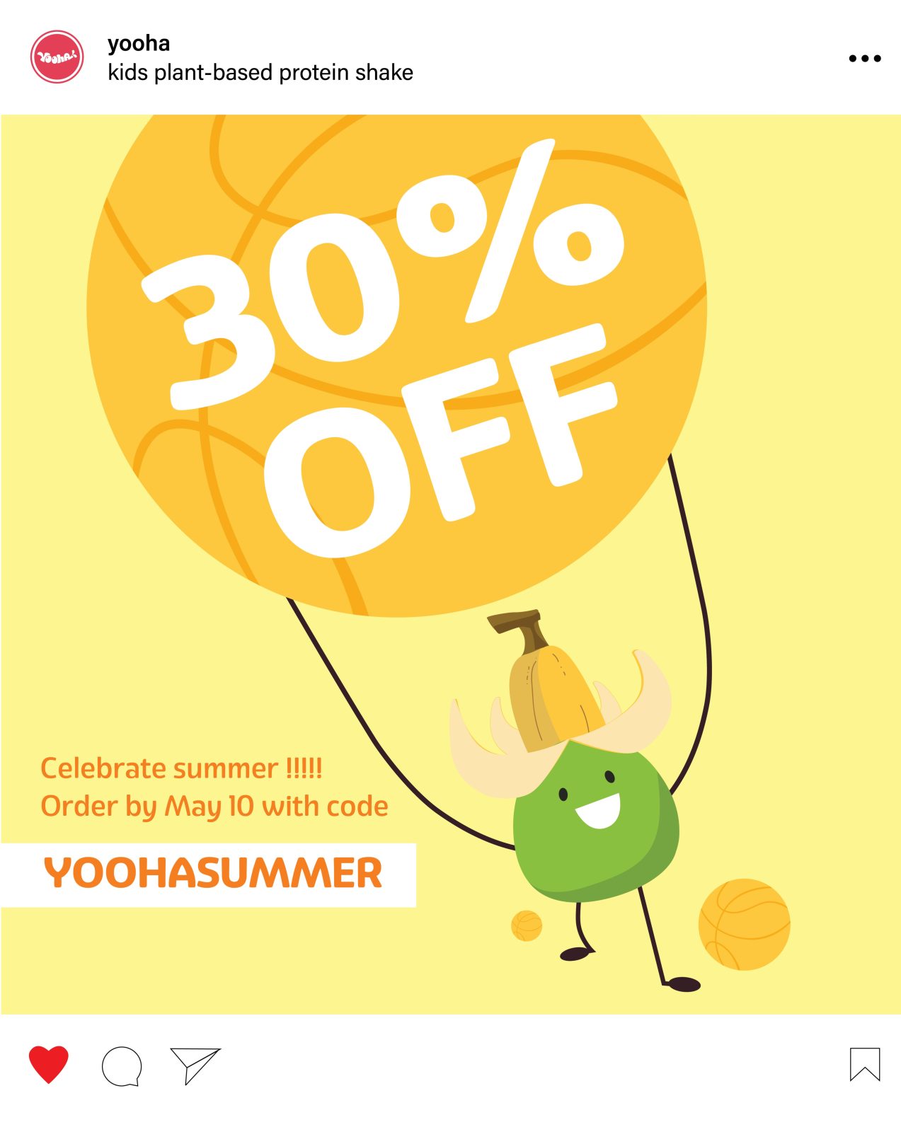
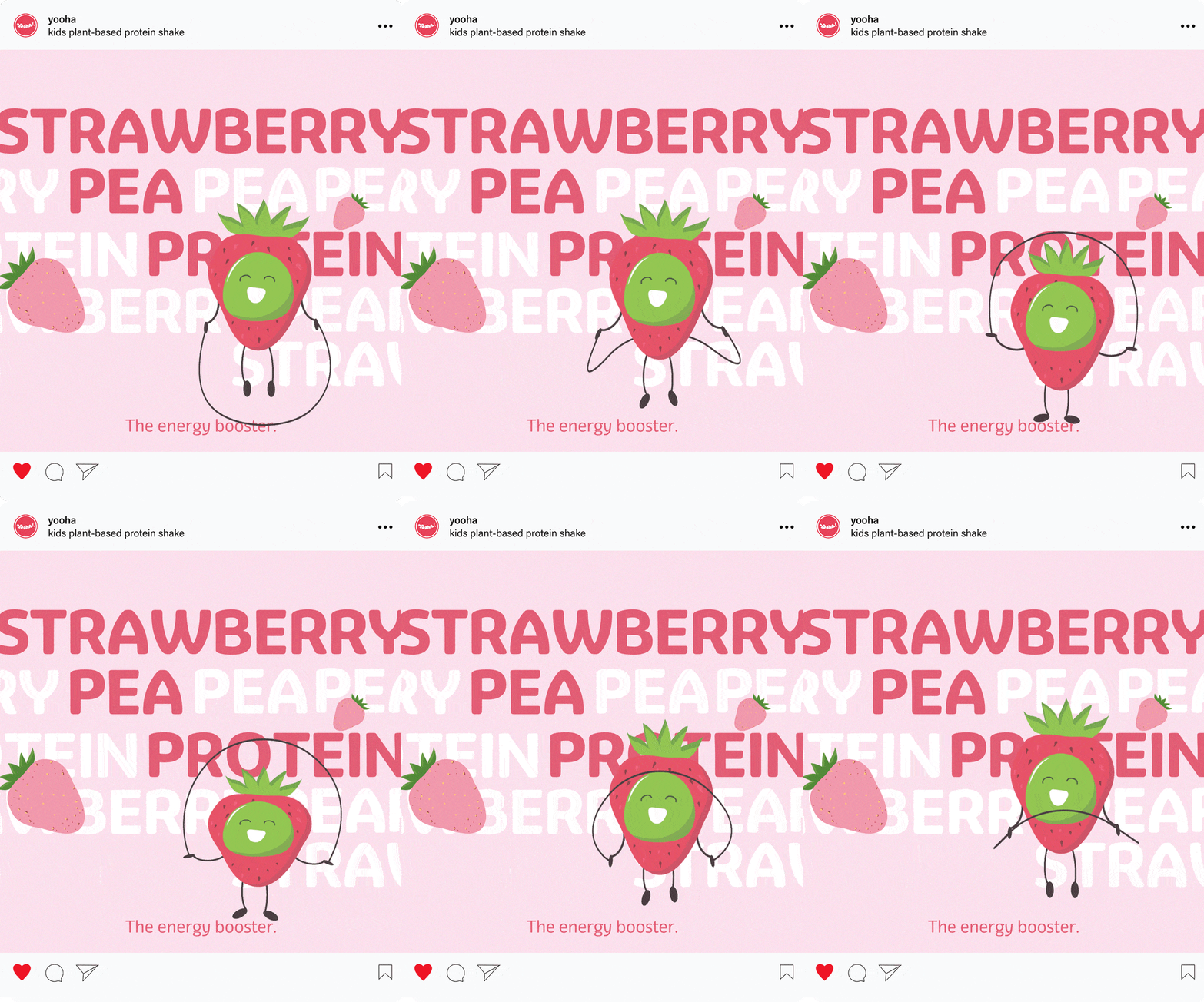
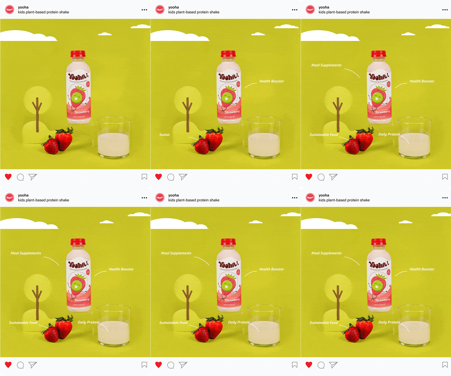
The brand’s website echos the product packaging, incorporating whimsical landscape elements, all the while prioritizing clear product information. The essence of Yooha – a blend of health and active living – is spotlighted throughout the site. For a more holistic brand experience, the social media strategy includes a balanced mix, featuring the animated pea character, engaging with children, promotional campaigns, and continuously emphasizing the product’s core value propositions.

CREDIT
- Agency/Creative: Jinjing Yang
- Article Title: Yooha Shake Packaging Design Concept
- Organisation/Entity: Student
- Project Type: Packaging
- Project Status: Non Published
- Agency/Creative Country: United States
- Agency/Creative City: San Diego
- Market Region: North America
- Project Deliverables: Packaging Design
- Format: Bottle
- Industry: Food/Beverage
- Keywords: WBDS Student Design Awards 2023/24
- Keywords: Packaging Design, Product Creation
-
Credits:
Educational Institution: San Diego City College - Graphic Design
Educator's Name: Sean Bacon and Bradford Prairie


