Objective: The primary objective was to craft a logo that not only captured the core values of Yolk Studio but also resonated with its target audience. Specific goals included expressing creativity, innovation, trust, and professionalism, while simultaneously differentiating Yolk Studio from its competitors.
Design Elements:
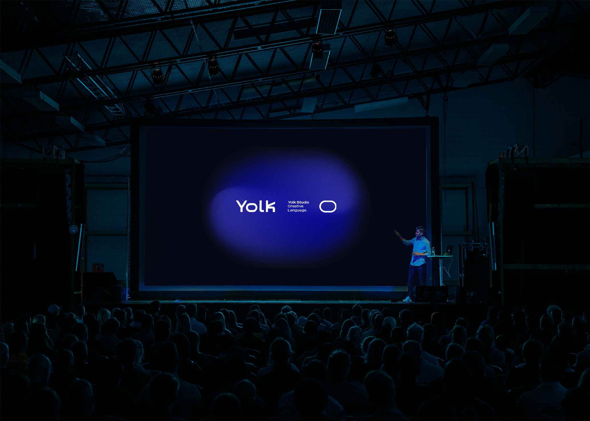
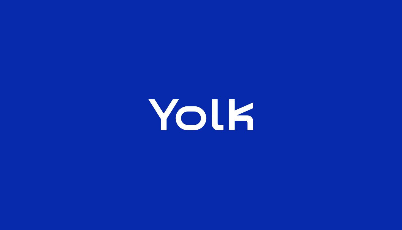
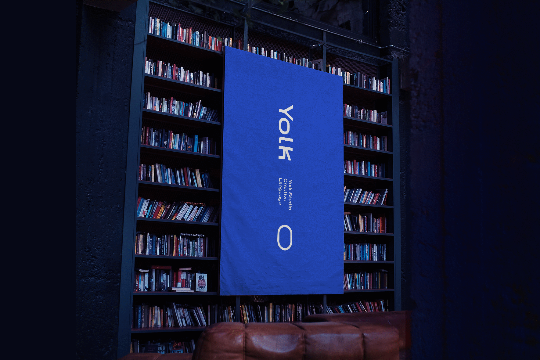
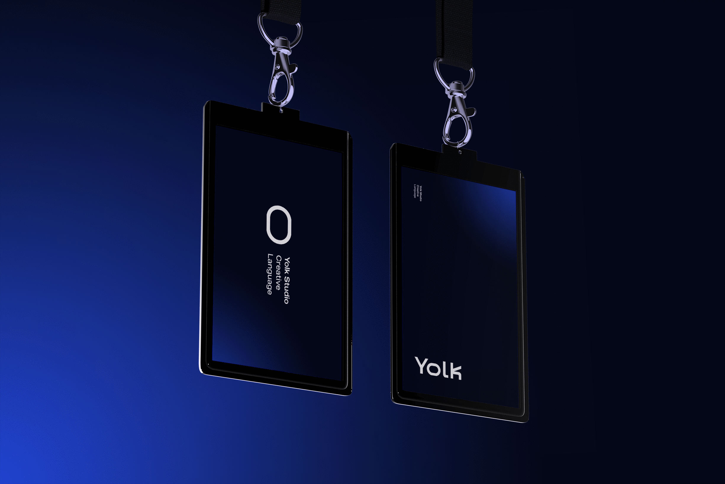
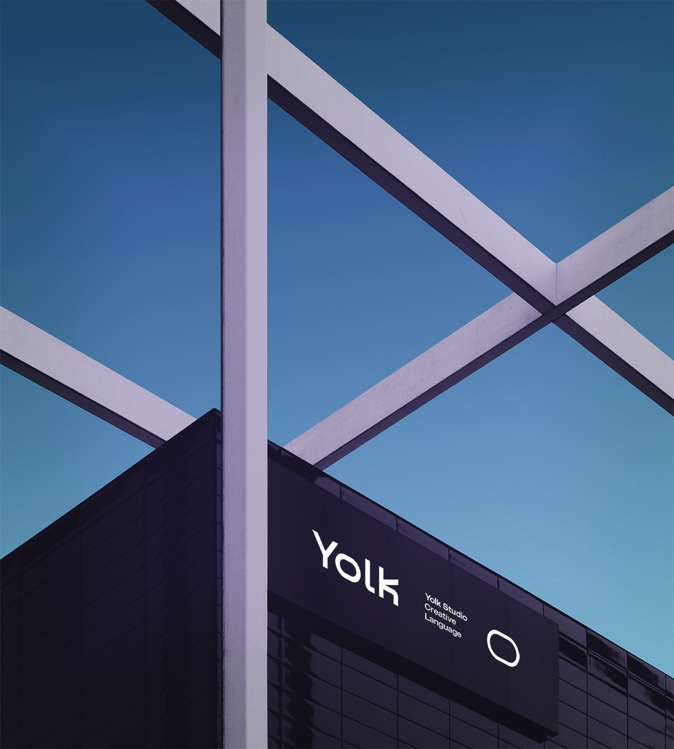
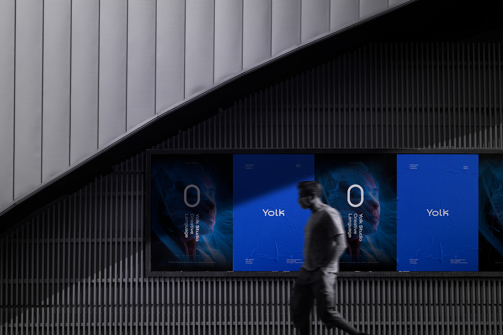
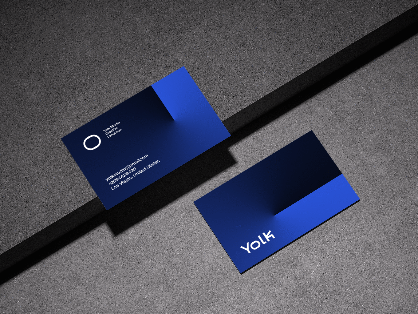
The Logo Word: The logo word was meticulously crafted to embody modernity and technological prowess, aligning with Yolk Studio’s innovative solutions. The letter “k” ingeniously resembles a movie clapper, symbolizing Yolk Studio’s commitment to precision and passion for innovation in its work. The letter “o” takes the shape of an egg, symbolising new beginnings and limitless possibilities, perfectly encapsulating Yolk Studio’s forward-thinking approach.
The Font: The MADE Outer font was chosen for its simplicity, modernity, and ease of readability, complementing the overall design aesthetic. Its clarity enhances brand recognition and makes the logo visually appealing, contributing to Yolk Studio’s professional image.
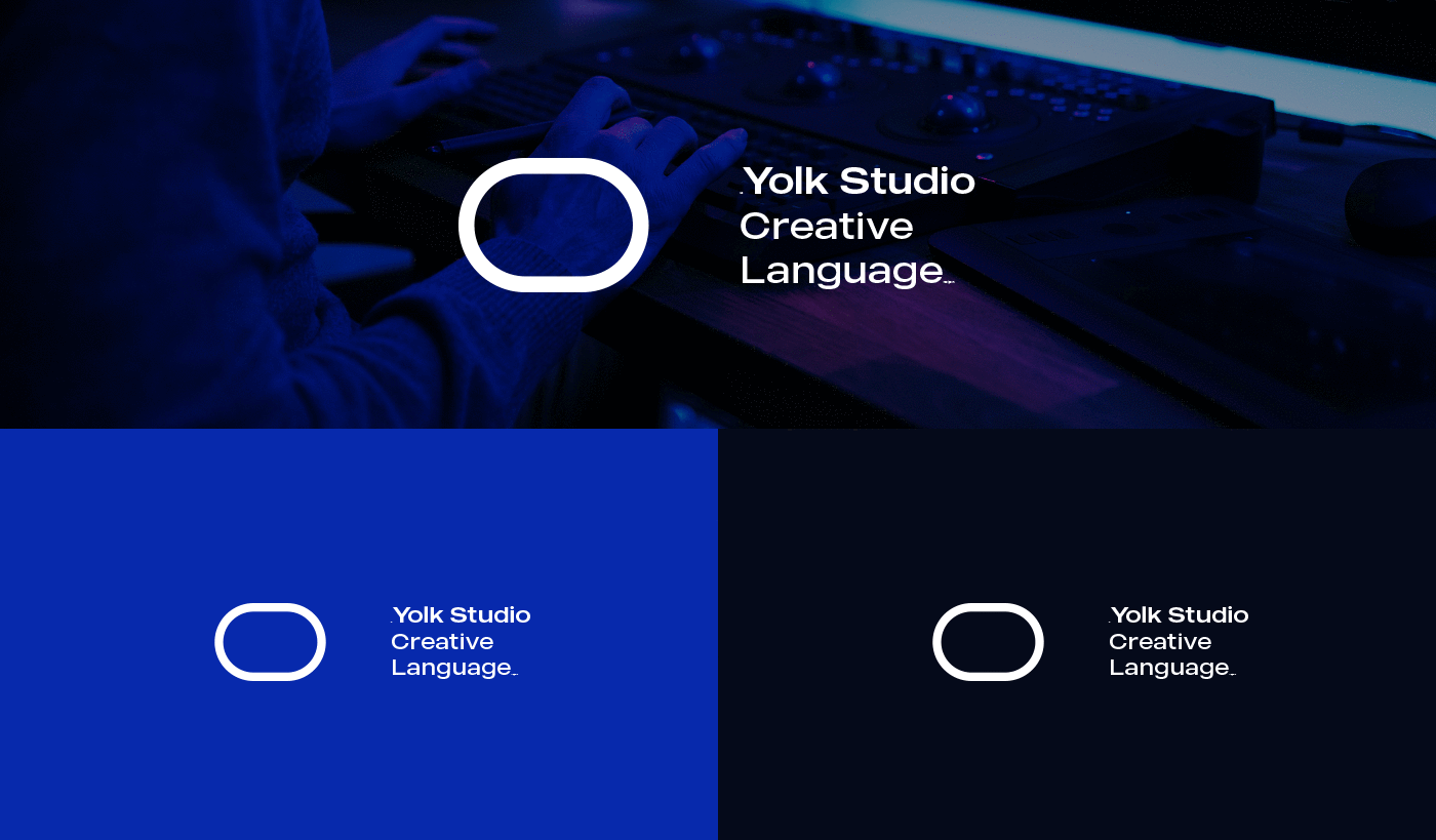
Colours: The strategic use of blue and night black hues adds depth and sophistication to the logo. Blue conveys trust, honesty, and reliability, while night black symbolizes strength, solidity, and innovation, reflecting Yolk Studio’s values. The variation in shades adds dimensionality, evoking a sense of creativity and dynamism.
Objectives Achieved: The redesigned logo successfully communicates Yolk Studio’s identity as a creative technology studio, emphasizing its spirit of innovation and dedication. It instills trust and professionalism, crucial for fostering strong client relationships and attracting new business opportunities. By standing out amidst competitors in the technology sector, the logo strengthens Yolk Studio’s position in the market and reinforces its brand authority.
Conclusion: The reimagined Yolk Studio logo serves as a powerful visual representation of the brand’s ethos and aspirations. It not only reinforces the studio’s identity but also establishes a compelling connection with its audience, driving brand recognition and fostering growth in the competitive technology landscape.
CREDIT
- Agency/Creative: abdeljalil
- Article Title: Yolk Studio Brand Identity: A Blend of Creativity and Professionalism
- Organisation/Entity: Student
- Project Type: Identity
- Project Status: Published
- Agency/Creative Country: Algeria
- Agency/Creative City: abdeljalil
- Market Region: Africa, Middle East, Global
- Project Deliverables: Brand Creation, Brand Design, Brand Guidelines, Brand Identity, Brand Mark, Brand Strategy, Branding
- Industry: Professional Services
- Keywords: Yolk studio | Brand identity
-
Credits:
Strategic brand designer: abdeljalil bouali


