


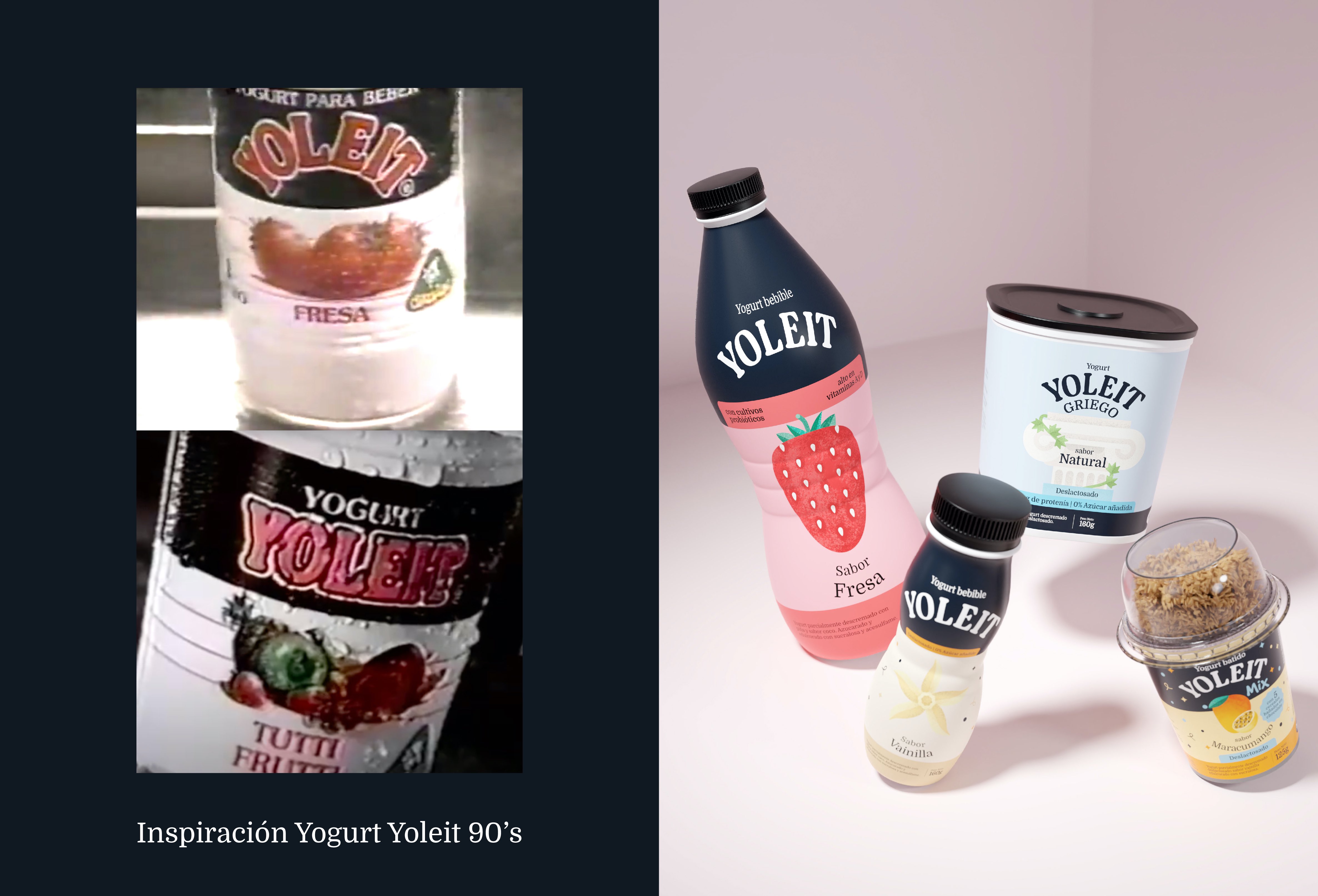
Yoleit has decided to renew itself to recover its position on the shelves and win back customers who used to be loyal in its childhood. The redesign strategy is based on the brand’s classic packaging, fusing nostalgia for the past with a clear vision for the future.
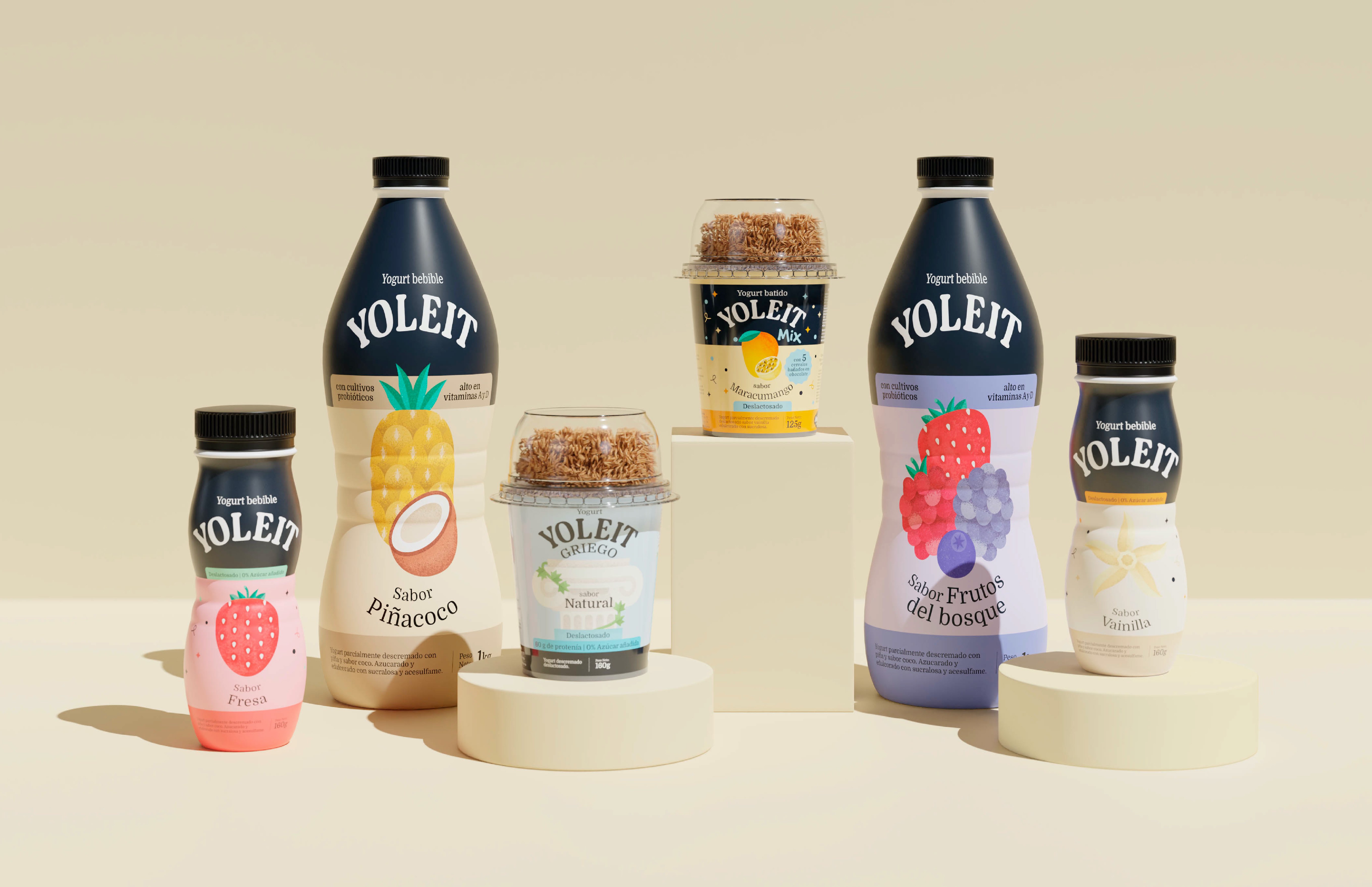
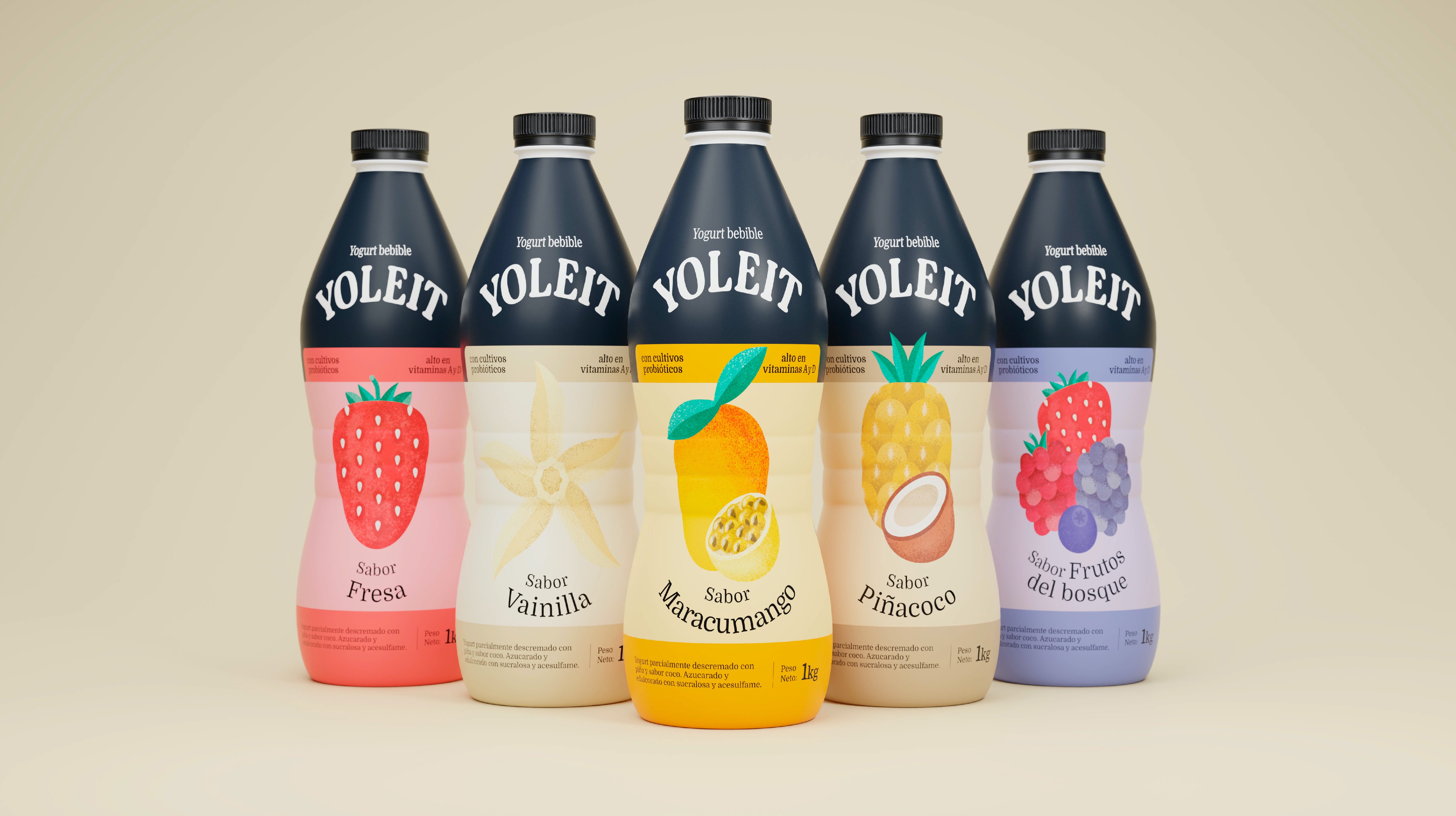
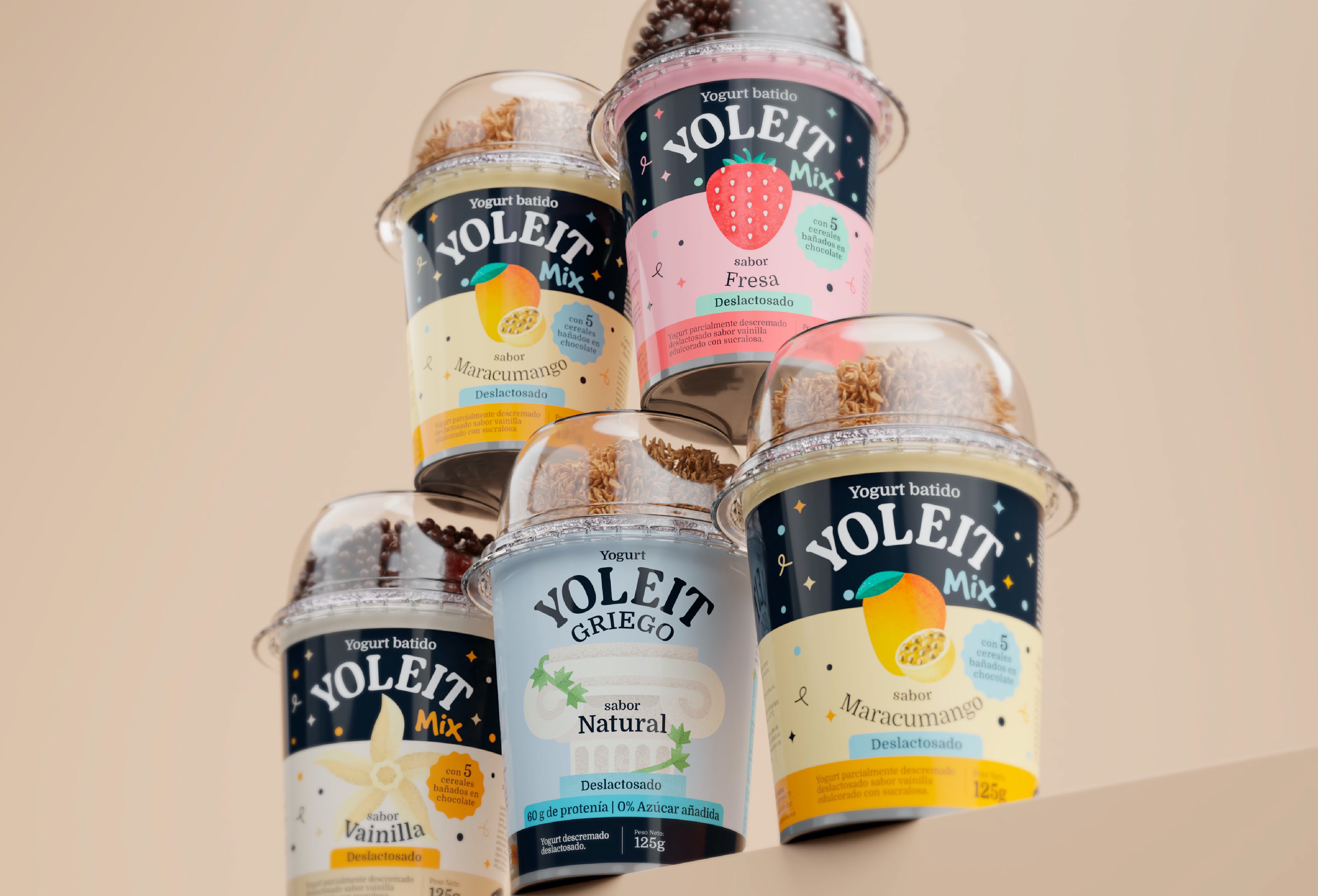
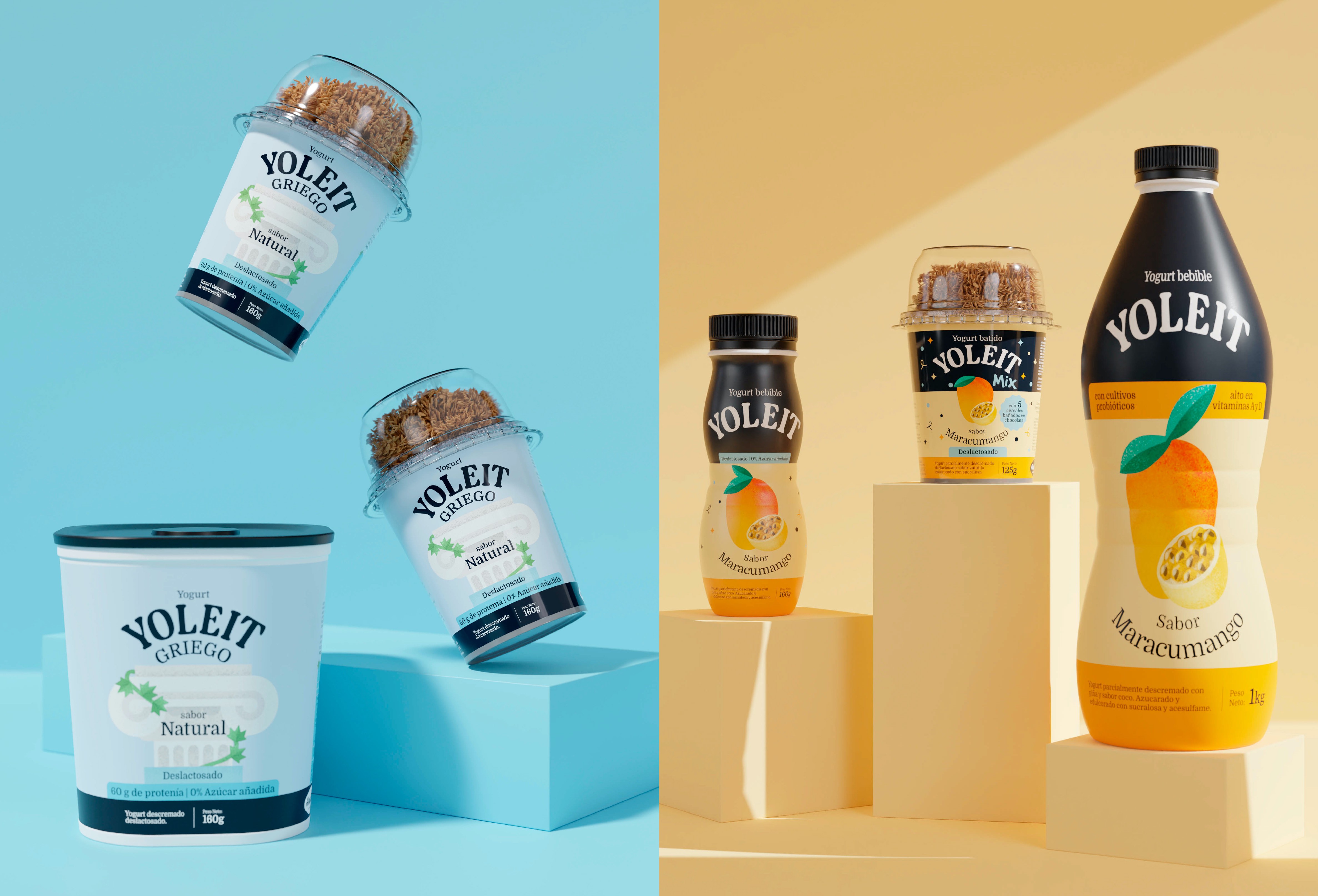
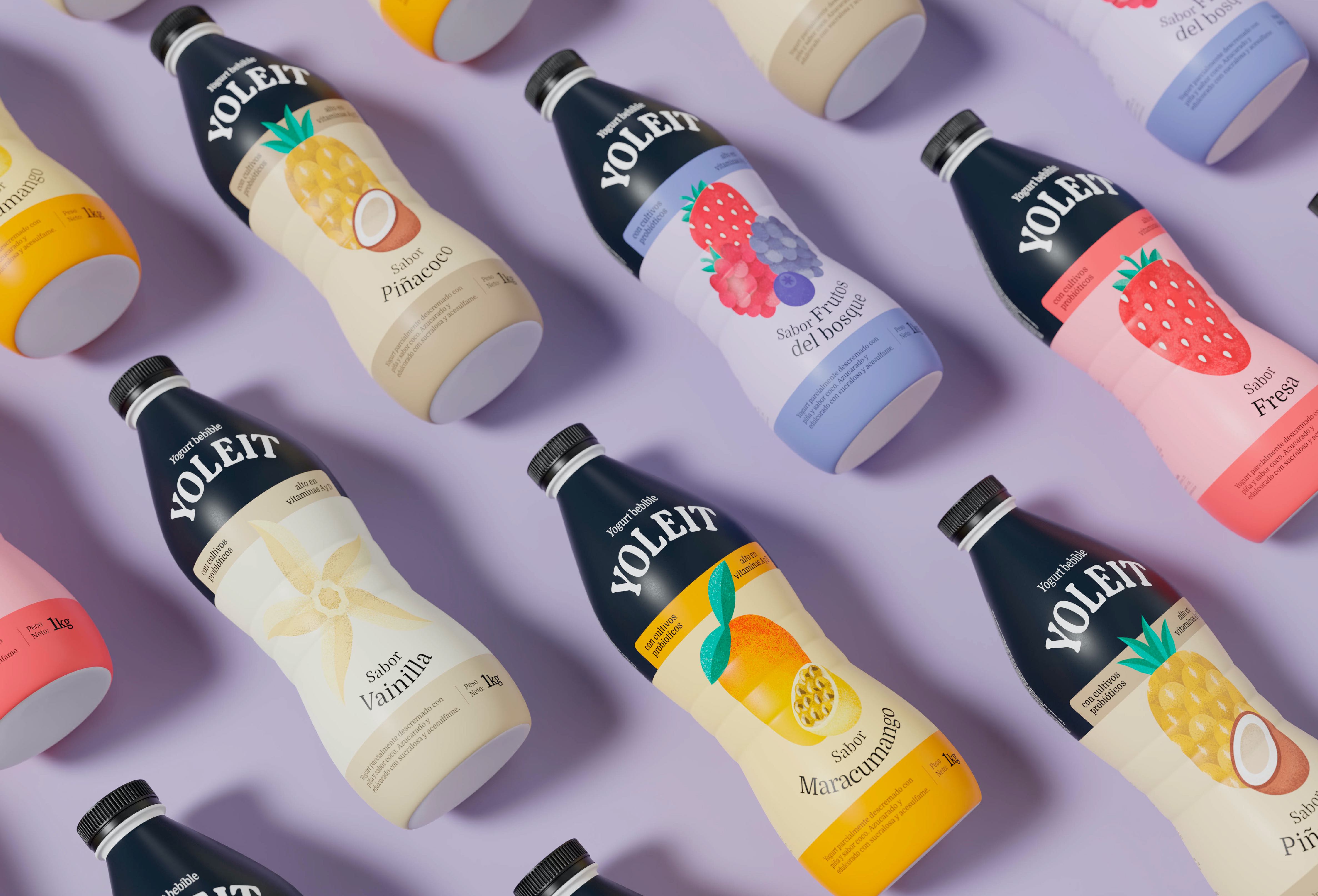
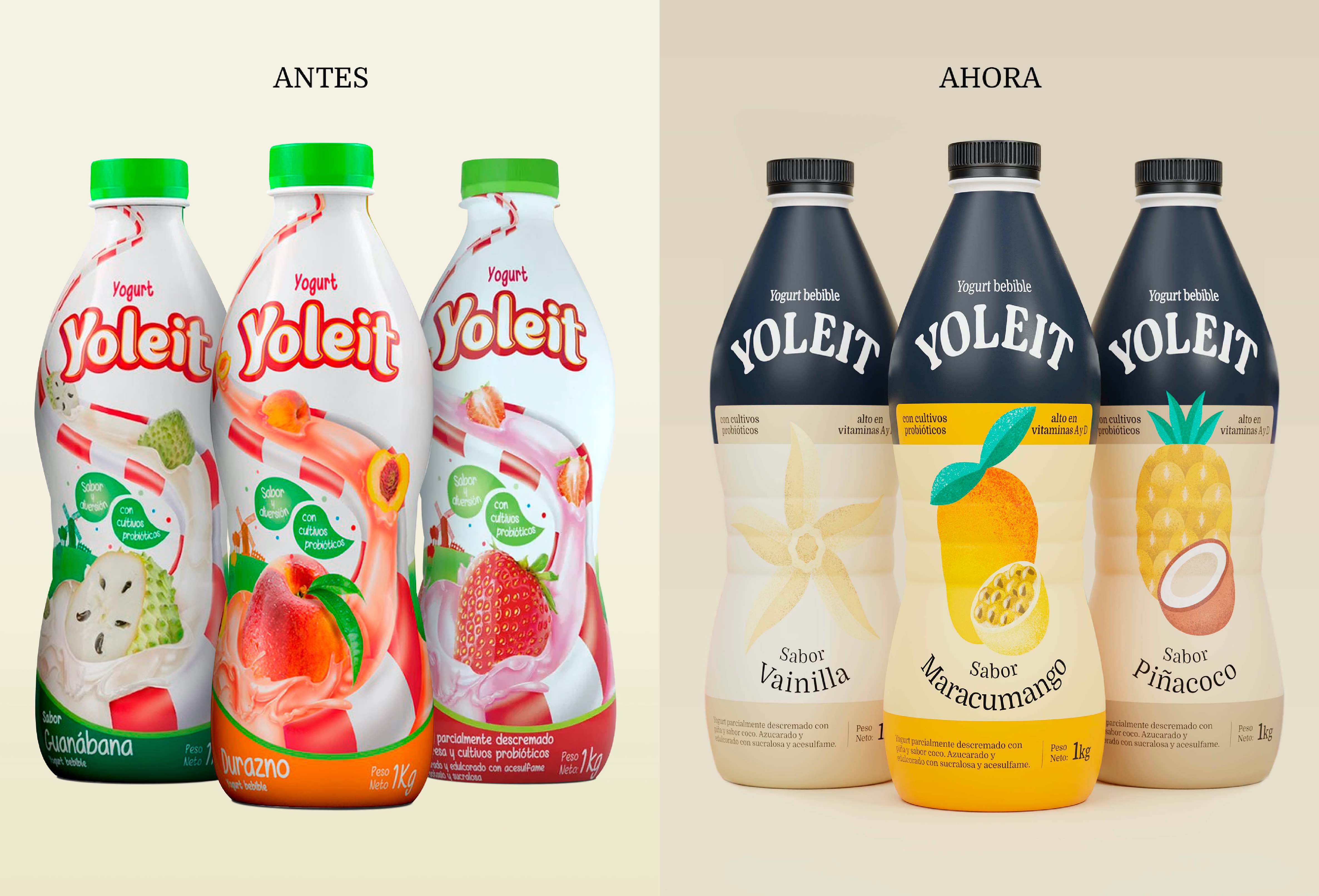
The new proposal is inspired by the iconic Yoleit packaging of yesteryear. We’ve reintroduced the iconic black stripe and classic logo we all know. This decision has allowed us to revive the style of the 90s, but with a contemporary visual touch. The intention is clear: to differentiate ourselves in the market, maintain visual coherence and, at the same time, pay tribute to the rich history of the brand.
This approach is not only about design, but also about emotional connection. By bringing back familiar elements, such as the black stripe and logo, Yoleit seeks to establish an emotional bond with those who used to be its consumers and, in all likelihood, will be again. We believe this strategy will help the brand stand out significantly at the point of sale. The combination of the nostalgia of days gone by and the freshness of modernity allows Yoleit to stand out on shelves and recapture the hearts of those who once enjoyed its products. We are sure that this revamp will not only attract old customers but will also gain new followers who will be attracted to the unique fusion between past and present that Yoleit offers with its new packaging design.
We are committed to differentiation, visual coherence and a nod to the brand’s history for the new family of products. We used the iconic black stripe and its classic logo. We wanted to revive the packaging of the 90s, but with more contemporary visual codes. This allows the brand to stand out noticeably at the point of sale and connect emotionally with those who were, and will surely be again, its consumers.
CREDIT
- Agency/Creative: Sed Estudio
- Article Title: Yoleit’s Brand Revival: Nostalgia Meets Modernity in New Packaging Design
- Organisation/Entity: Agency
- Project Type: Packaging
- Project Status: Published
- Agency/Creative Country: Peru
- Agency/Creative City: Lima
- Market Region: South America
- Project Deliverables: Brand Design, Brand Redesign, Branding, Packaging Design, Packaging Guidelines, Rebranding
- Format: Bottle
- Industry: Food/Beverage
- Keywords: yogurts, dairy, milk, brand, rebranding
-
Credits:
Creative Director: Daniela Nicholson
Design Direction: Jose Bernal
Project Manager: Thiara Cobos
Design: Andrea D'Angelo


