


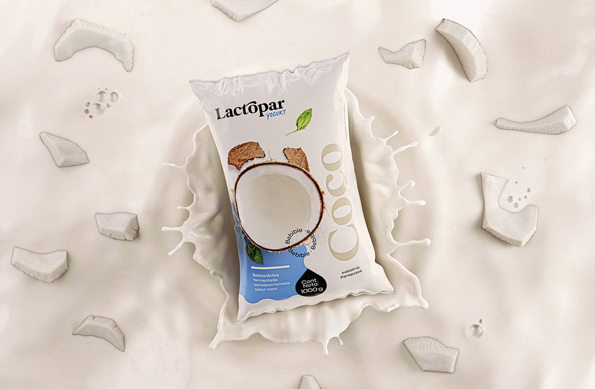
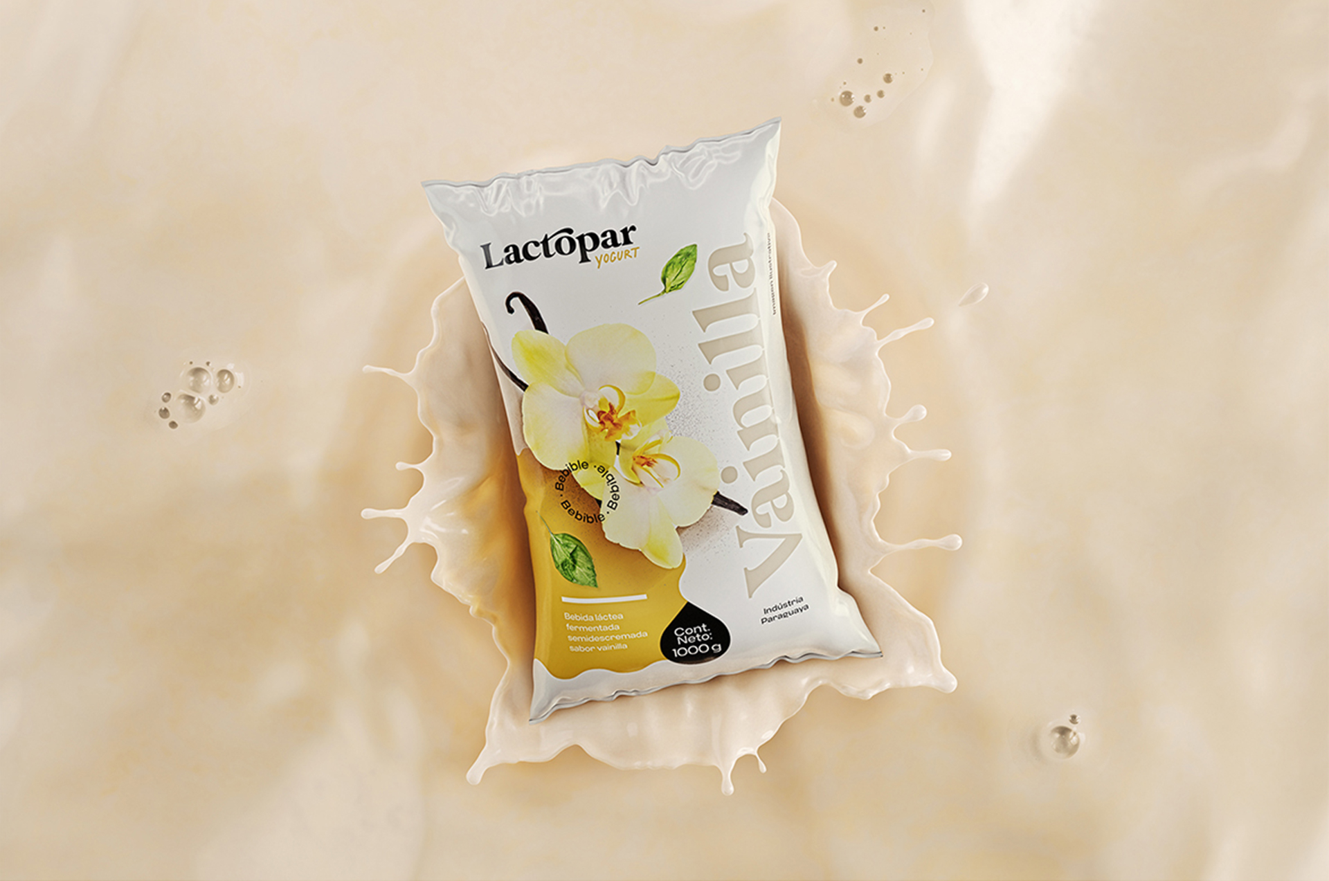
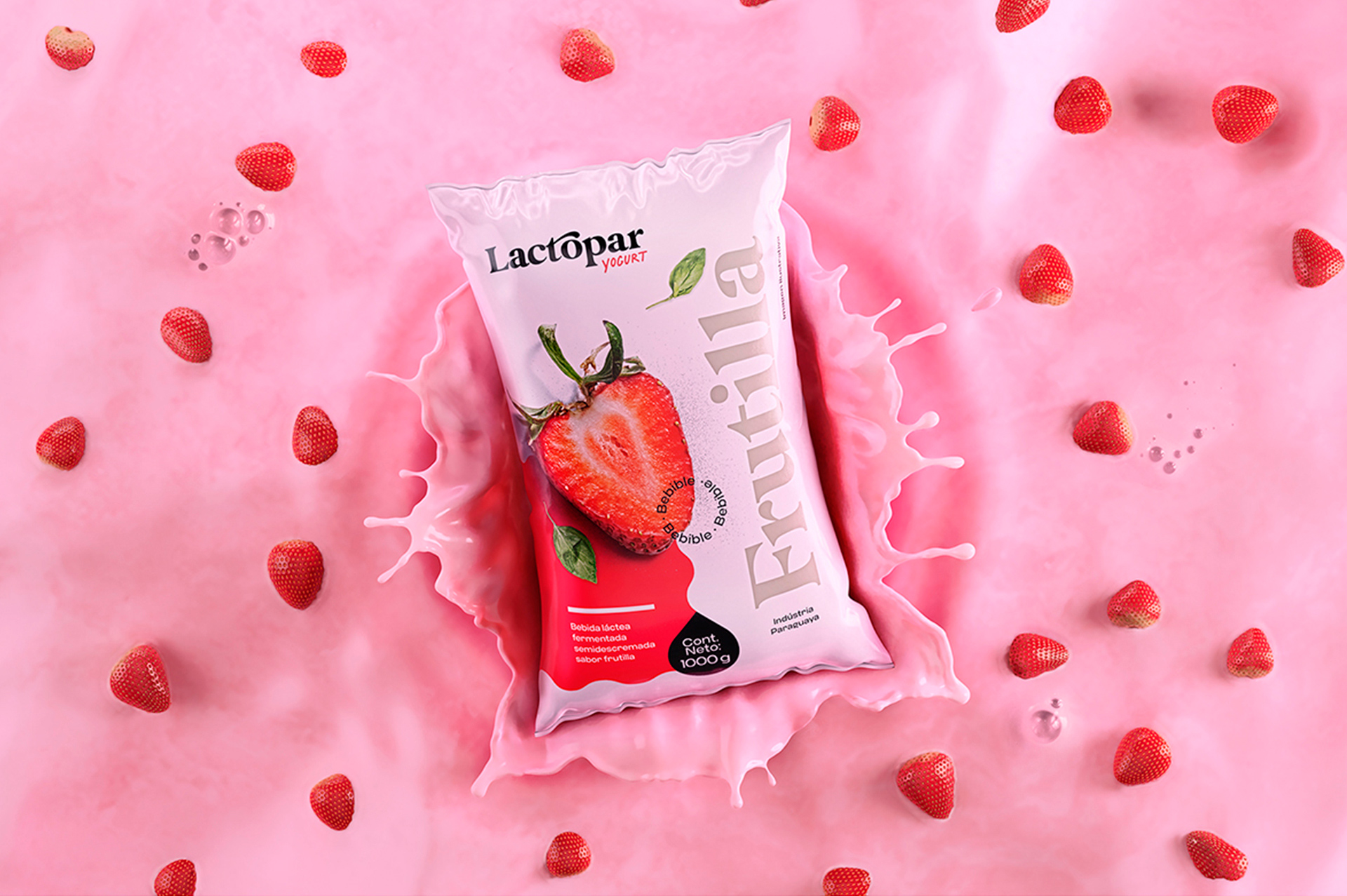
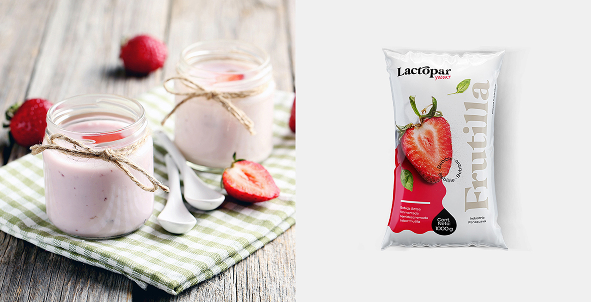
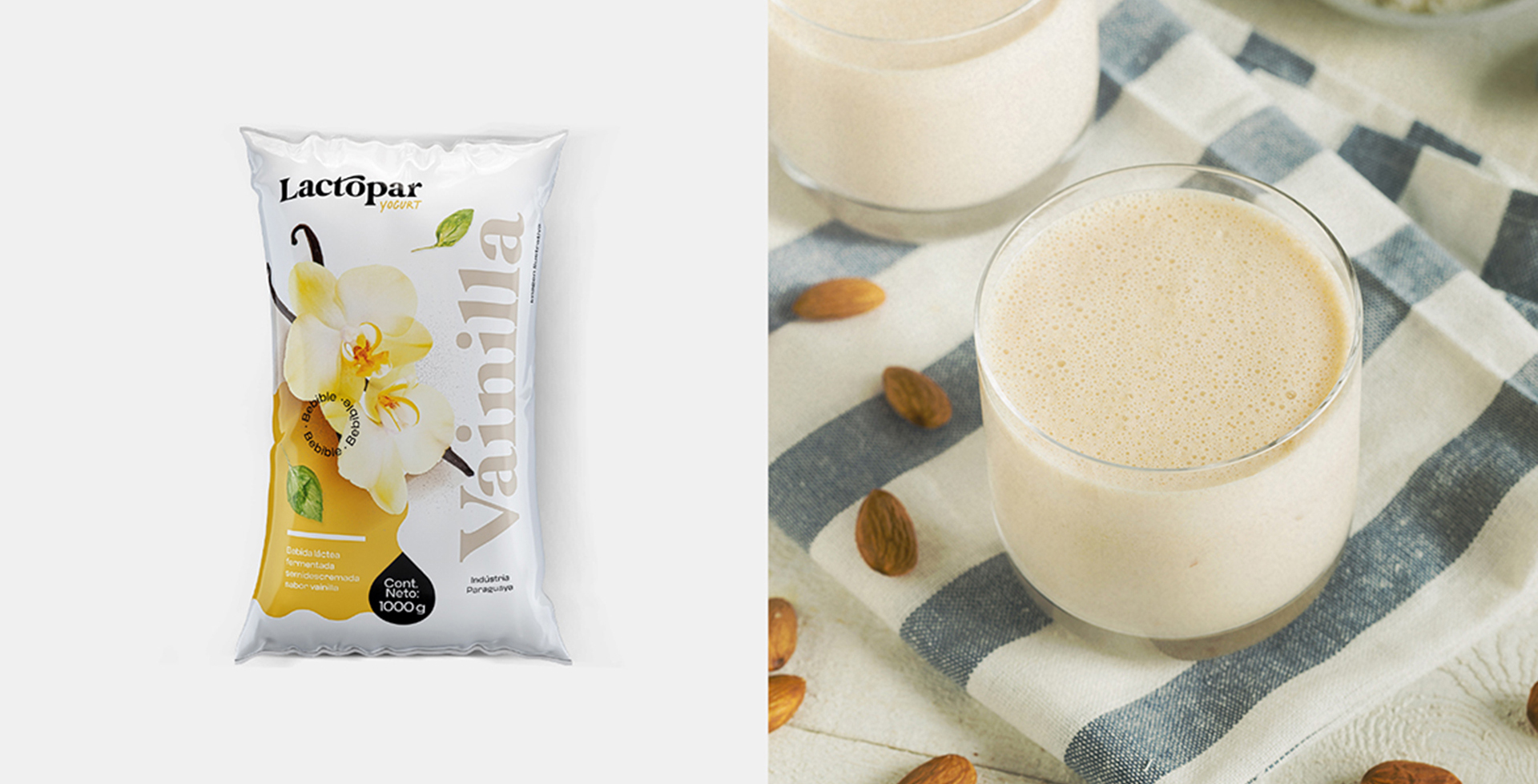
A new design for Lactopar’s yogurt packaging. During the meetings with the client, we were able to get to know the target audience and the region of Paraguay where the packages will be sold. This information defined the strategies for the look of the yogurts and gave way to the definitions and to identify the opportunities for the packaging of the three flavors: vanilla, strawberry and coconut.
The old packaging had a look that did not meet the needs of the company and did not reach the target audience correctly, and therefore the need to completely reformulate both the brand and positioning of the company and with regard to products on the market shelf.
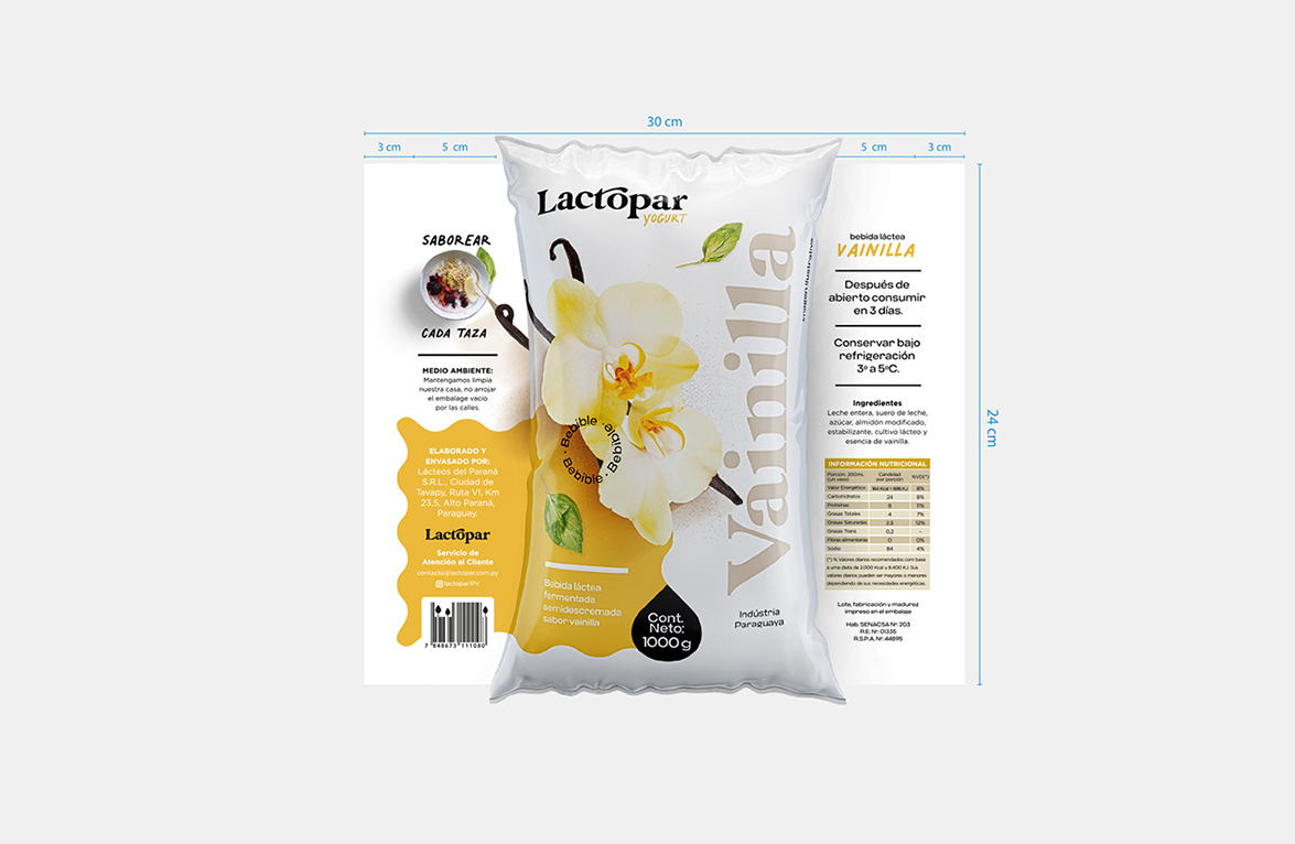
For the Yogurt Lactopar project, in addition to creating the company’s brand and the entire visual identity, I proposed a harmonic and clean layout for the packaging, with emphasis on the product on the shelf.
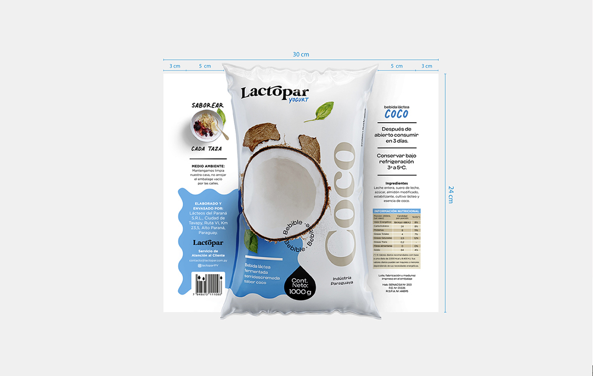
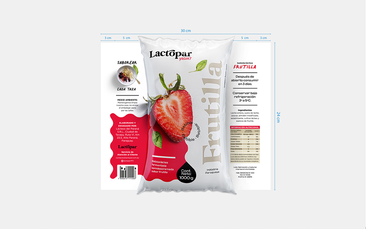
Printing will be done in Paraguay and the production conditions for this product will be reduced, making it impossible to print from end to end of the packaging, from top to bottom. And to avoid highlighting the white border above and below due to lack of printing, I created a clean layout that camouflages the white border naturally, disguising this printing machine limitation.
Each package received a solid-colored stain with smooth waves that make reference to the yogurt liquid, with waves as if it were the yogurt’s pasty liquid. In addition, a drop containing the net weight of the yogurt completes the movement.
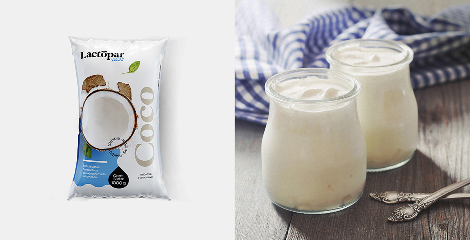
After the packaging is ready, we produce the 3D images of the strawberry, vanilla and coconut flavor for use in branding guidelines and strategy design. The scenarios help to sell the product in all media, both online and offline and generate desire in consumers.
The layout of the information on the back of the packaging also had a delicate touch and even the bar code was personalized, leaving the creation with more personality and striking for the target audience.
We also brought the image of the final product on the back of the packaging, helping the consumer to identify himself by eating the product.
CREDIT
- Agency/Creative: PSNDesign
- Article Title: Yogurt Lactopar Packaging Design by PSNDesign
- Organisation/Entity: Freelance, Published Commercial Design
- Project Type: Packaging
- Agency/Creative Country: Brazil
- Market Region: South America
- Project Deliverables: Brand Guidelines, Brand Identity, Brand Strategy, Packaging Design
- Format: Flow-Pack
- Substrate: Plastic


