


Studio Eon, a leading 3D animation company in Korea, has demonstrated its outstanding capabilities in developing 3D animation content IPs by overseeing the production of various works such as “Iron Kid,” “Kongsuni,” and “Armored Saurus” as the original author, director, and executive producer. Additionally, based on its excellent technical skills in Unreal Engine, which enables real-time design and visualisation, the studio has produced high-quality work in 3D animation, VFX, and CG in a time-efficient manner. Studio Eon leads the market in various areas, surpassing the limitations and boundaries of traditional methods, thanks to its superior creativity and unique technical prowess compared to its competitors.
The goal of renewing Studio Eon’s corporate identity is to develop the identity of a first-generation authentic 3D animation studio in Korea and a next-generation high-tech studio leading the global market. YNL Design aimed to define the core values of Studio Eon, which include its heritage in the animation industry, its proven excellence through global IPs, and its strength in various content businesses with Unreal Engine technology. The vision of the company, which realizes the infinite possibilities of content, is clearly encapsulated in the verbal brand assets and visual identity system.
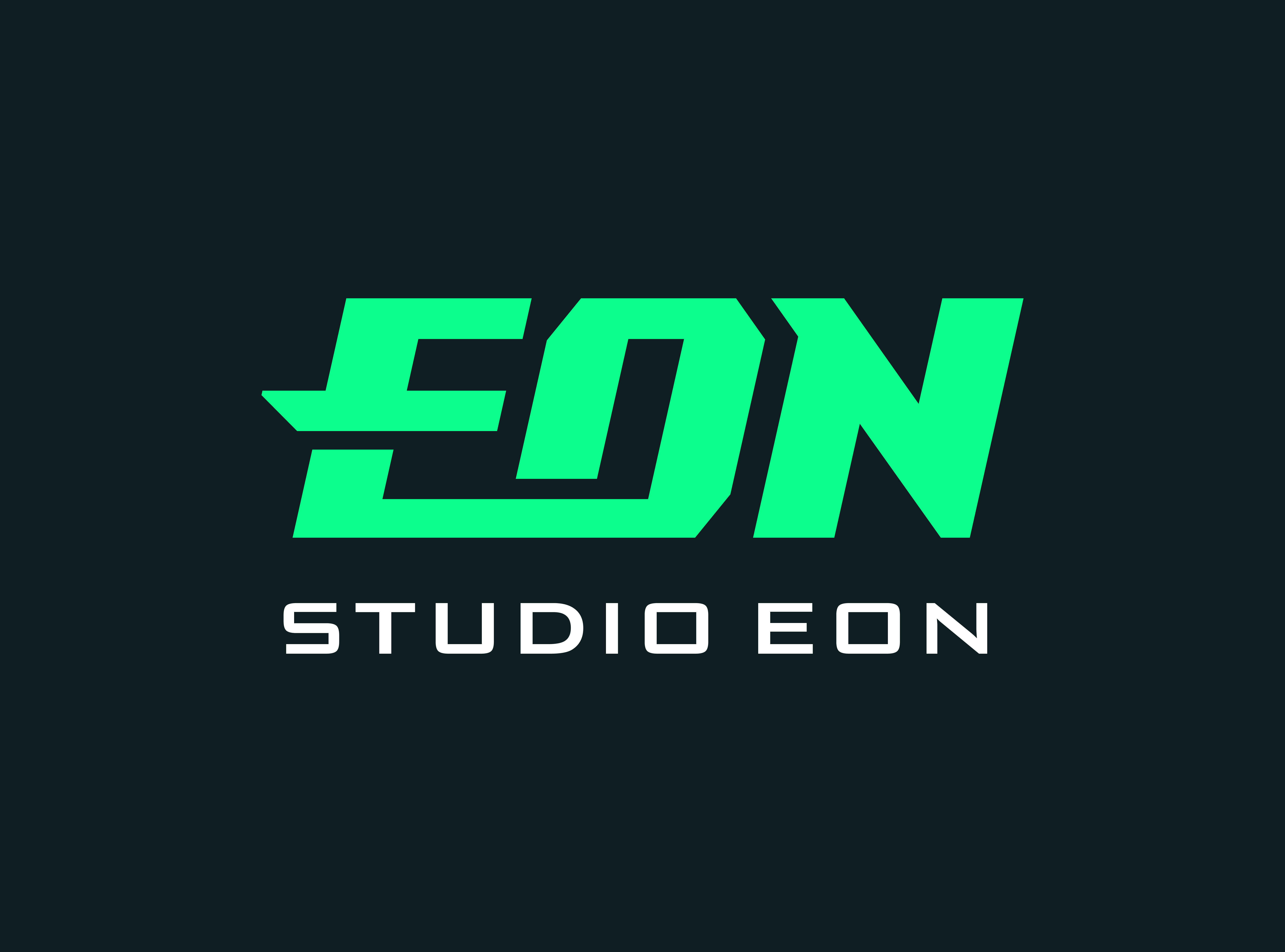
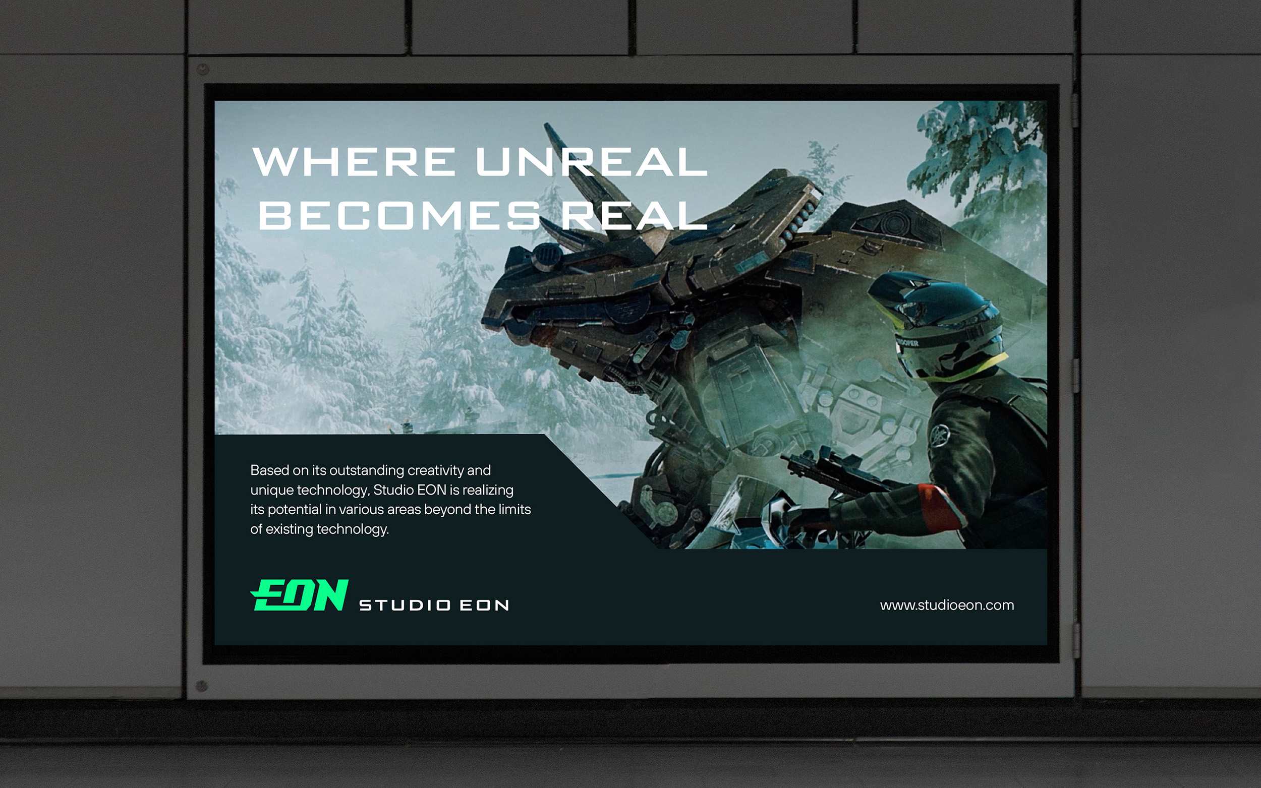
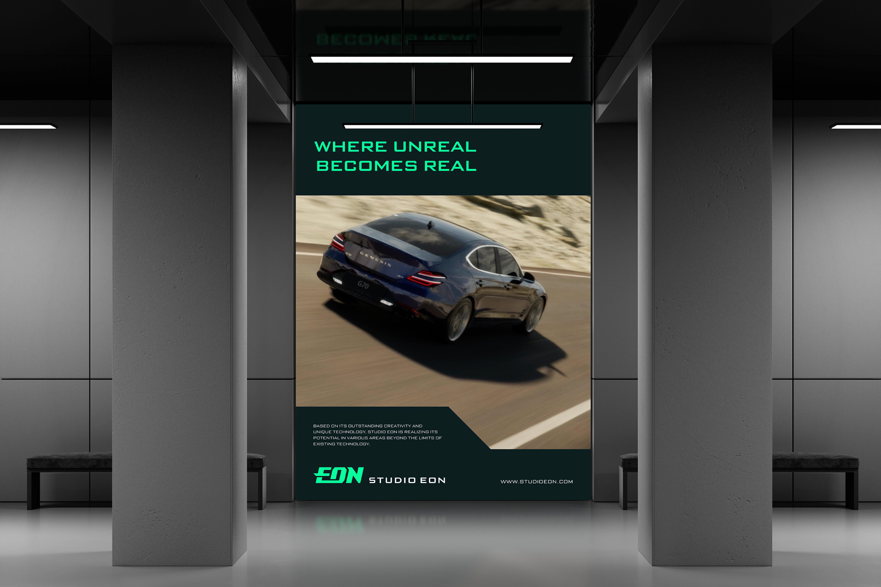
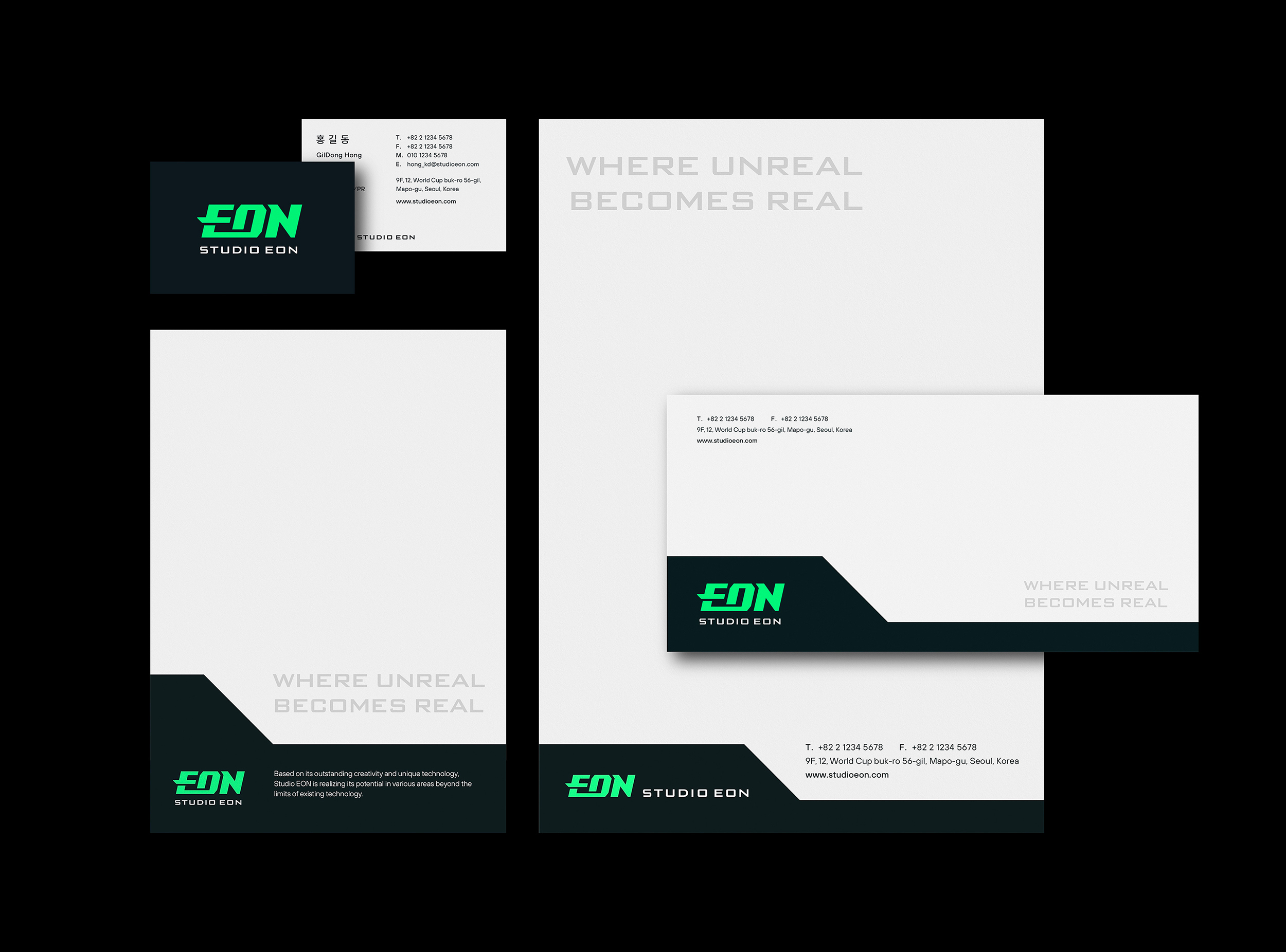
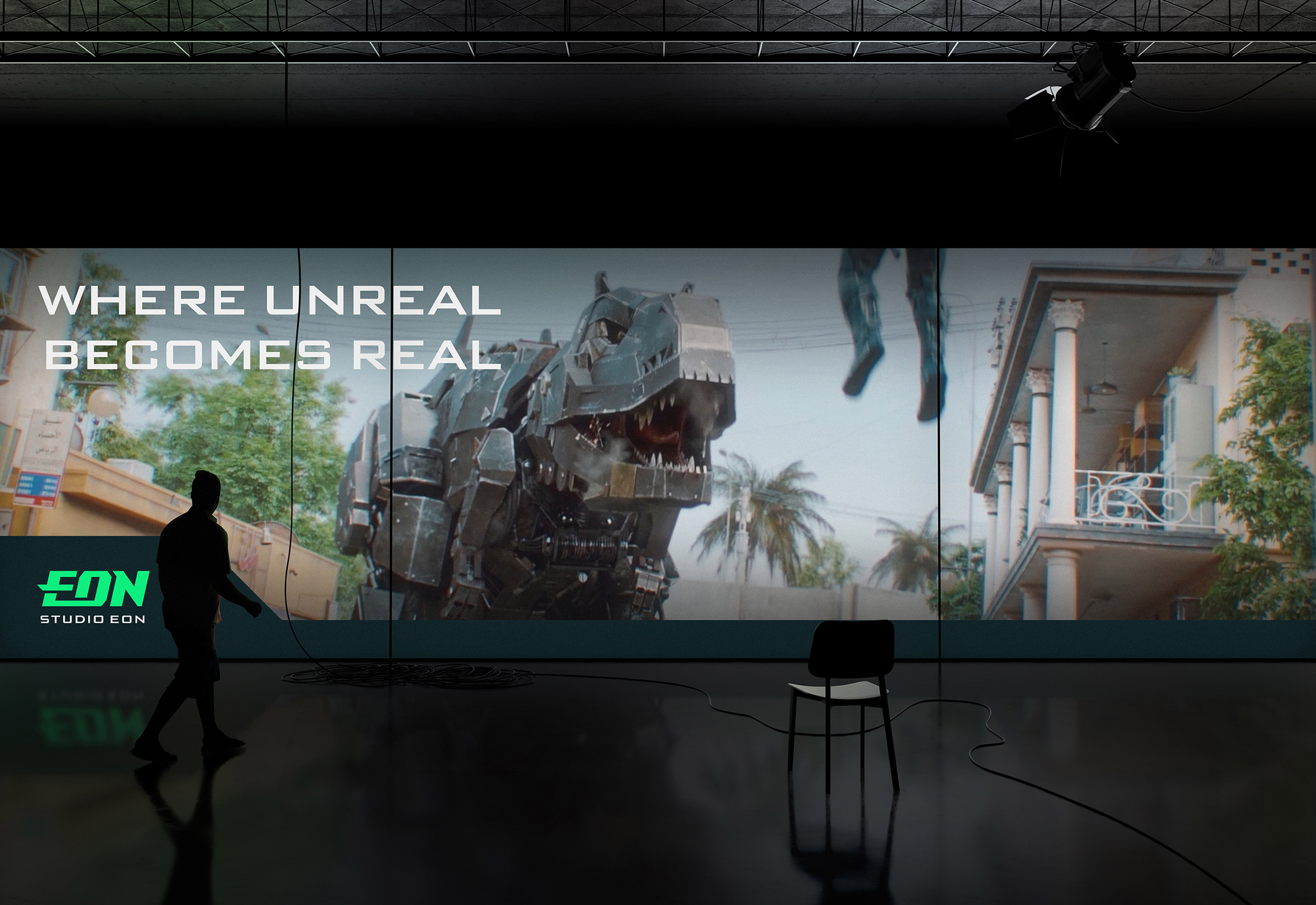
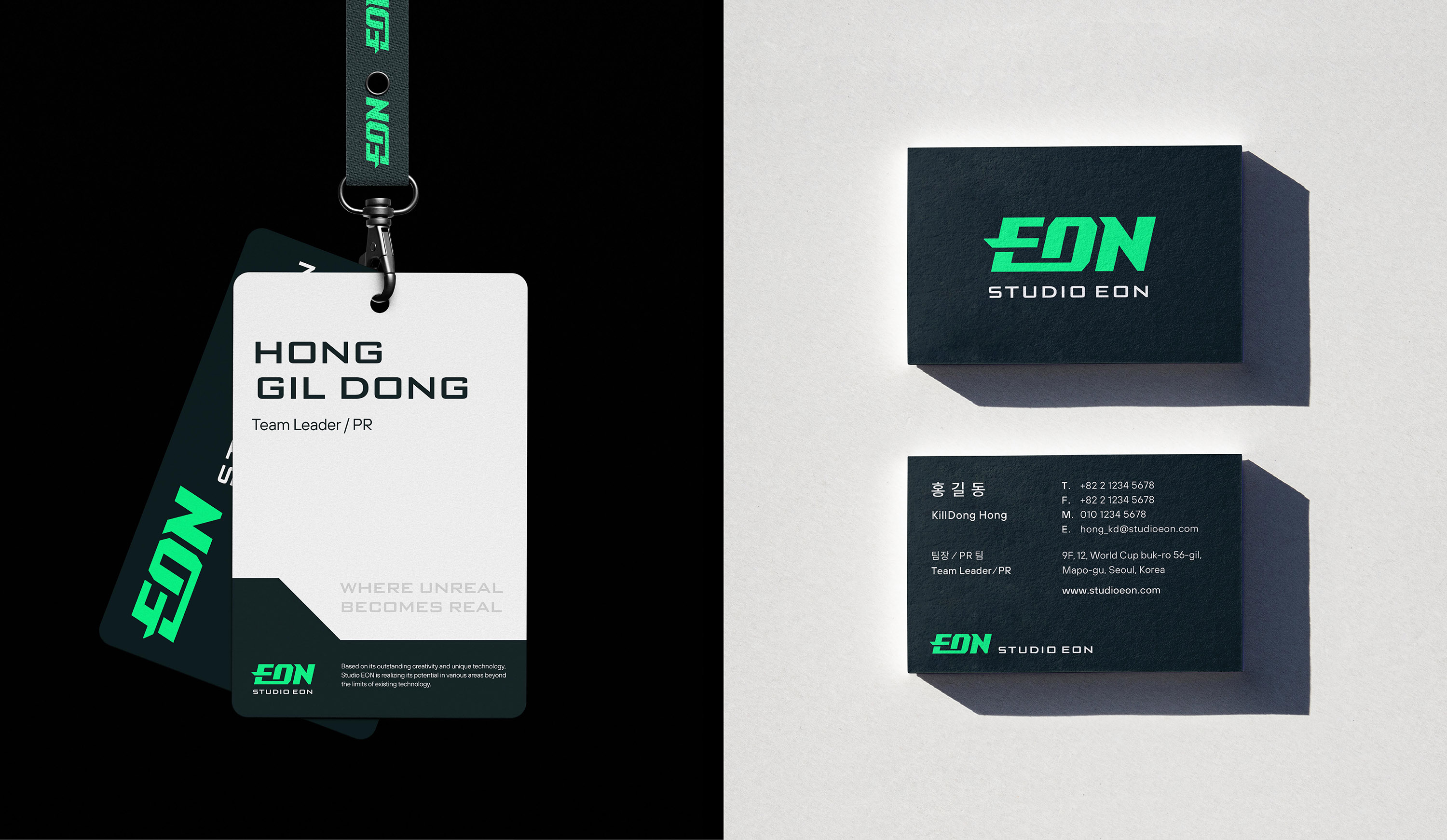
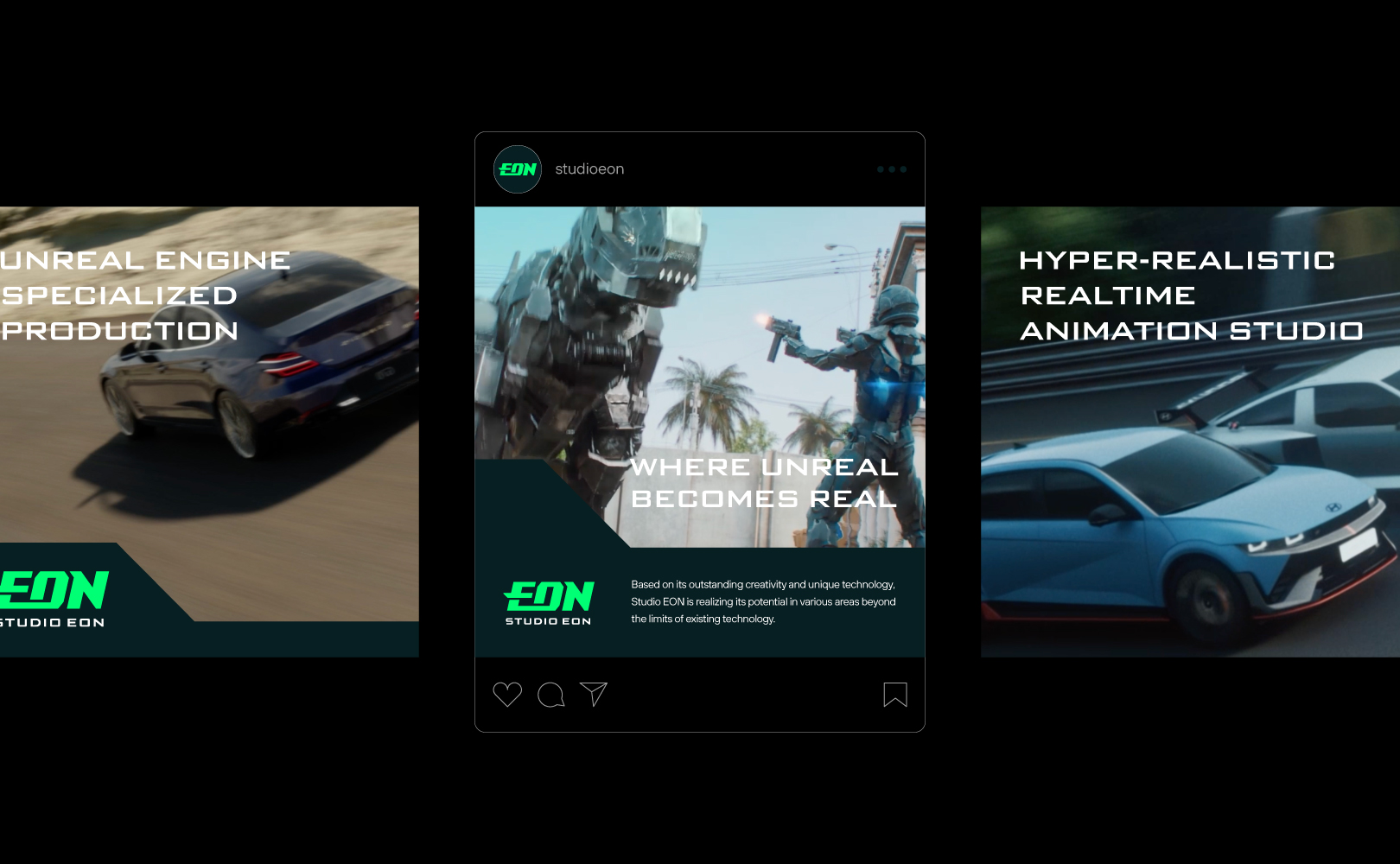
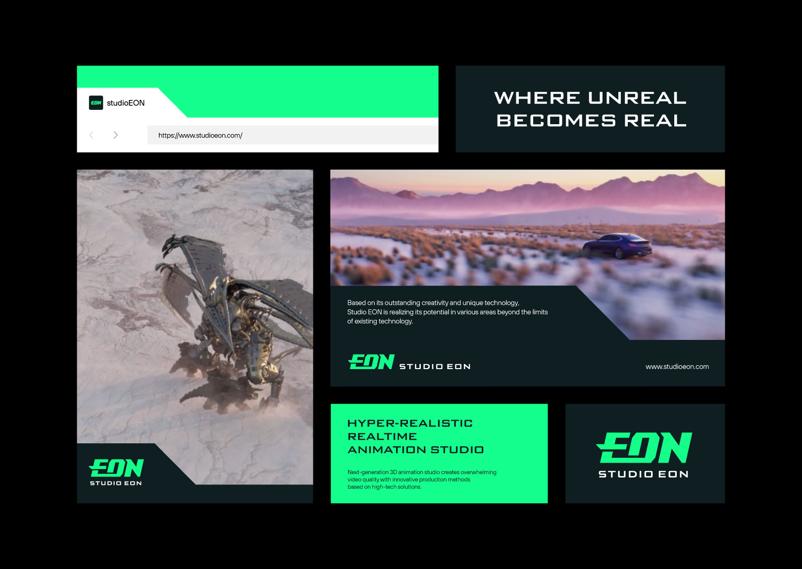
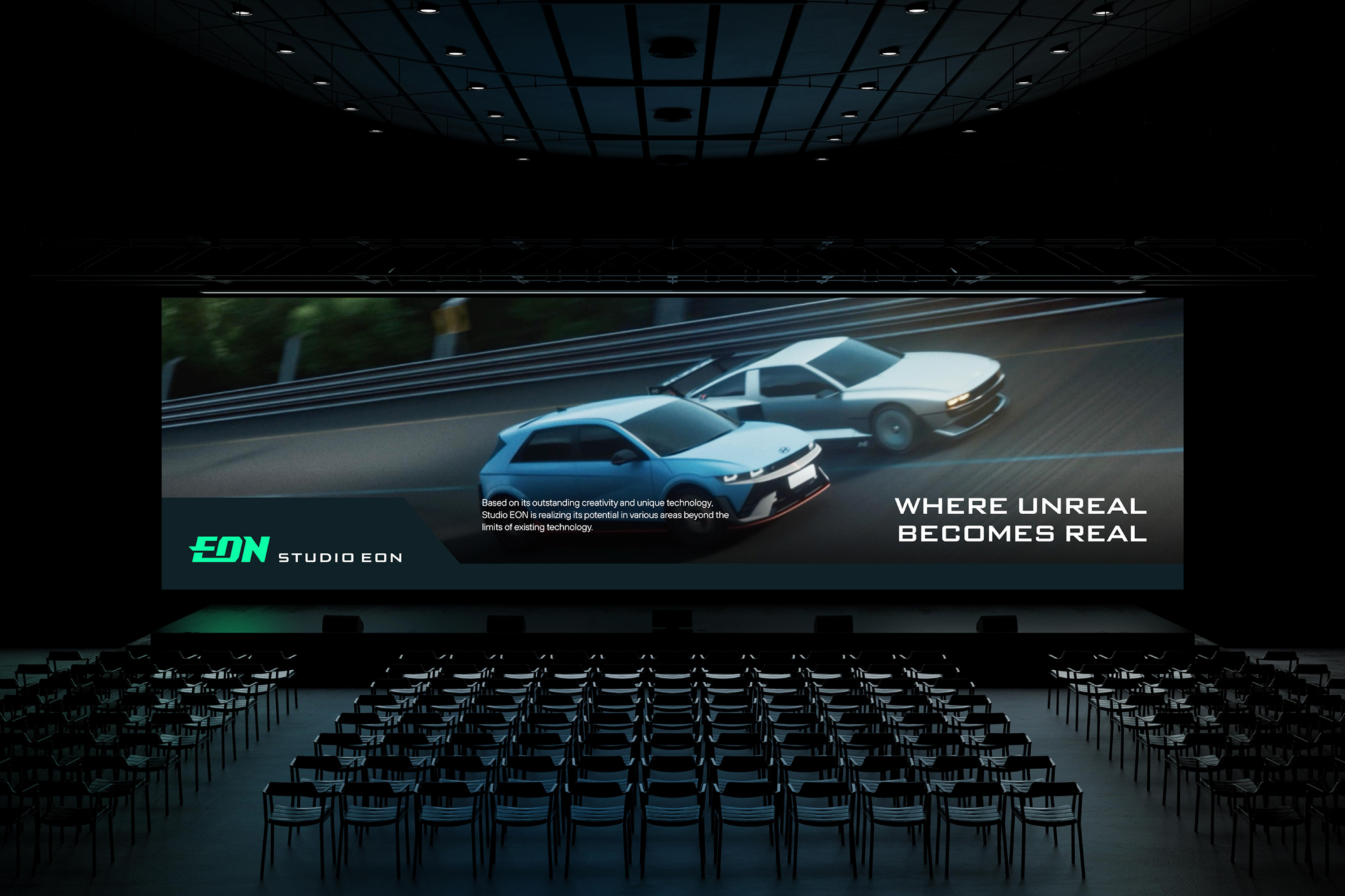
YNL Design renewed Studio Eon’s Corporate Identity with the branding concept of the slogan “WHERE UNREAL BECOMES REAL.” By using the two words “UNREAL” and “REAL” together, which are at extreme ends, it effectively conveys the bold imagination, unique technical prowess, and innovative image of a global content creative studio that realizes the potential of content. The logo of Studio Eon symbolises the company’s solid capabilities and technology that connect its heritage in the 3D animation industry to the next-generation virtual production. The stroke breaking out of the framework of the letter ‘E’ expresses the identity of a creative pioneer that transcends existing limitations to realize new possibilities. The entire logo is tilted diagonally to represent the progressive attitude of constantly moving forward. The robust technical strength and progressive image reflected in the visual identity are utilized as graphic motifs, effectively conveying video content and messages. The main color, green, symbolizes the creativity of a creative studio with bold imagination.
CREDIT
- Agency/Creative: YNL Design
- Article Title: YNL Redesigns Studio Eon’s Corporate Identity: Merging Heritage and Innovation
- Organisation/Entity: Agency
- Project Type: Identity
- Project Status: Published
- Agency/Creative Country: South Korea
- Agency/Creative City: Seoul
- Market Region: Asia
- Project Deliverables: Brand Design, Brand Identity, Brand Redesign, Brand Strategy, Branding, Identity System, Logo Design, Rebranding
- Industry: Entertainment
- Keywords: brand design, brand redesign, brand identity, brand strategy, branding, identity system, logo design, rebranding
-
Credits:
Creative Director: Liz Yoona lee
Brand Design: Kwangsu Shin
Brand Design: Heejae Choi
Brand Design: Dabi Bae


