Located in the most private space of The Ambassador Seoul – A Pullman, The Chef’s Table offers a customised premium omakase course. You can enjoy creative dishes prepared by professional chefs with the highest-quality seasonal ingredients airlifted from all over the country.
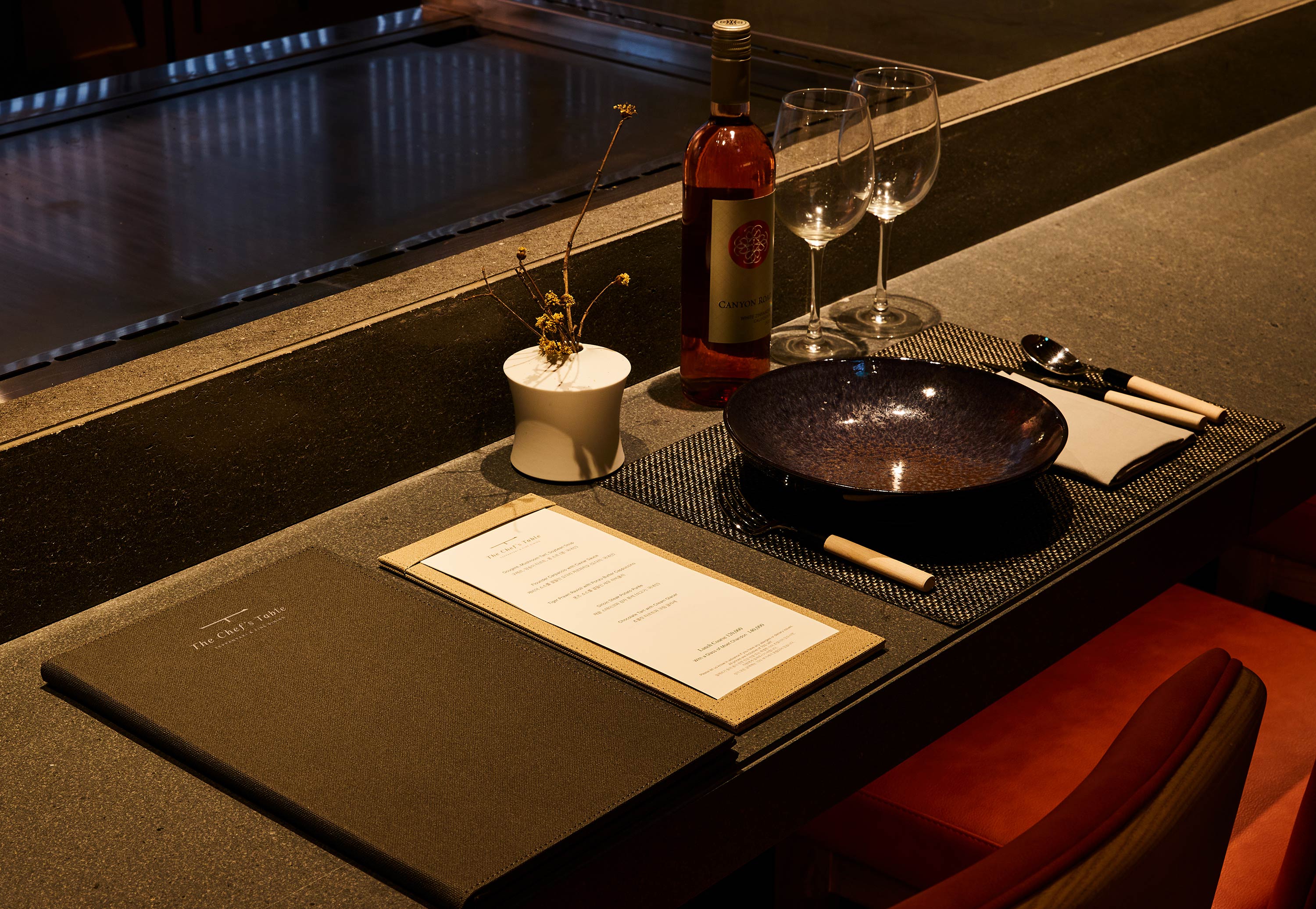
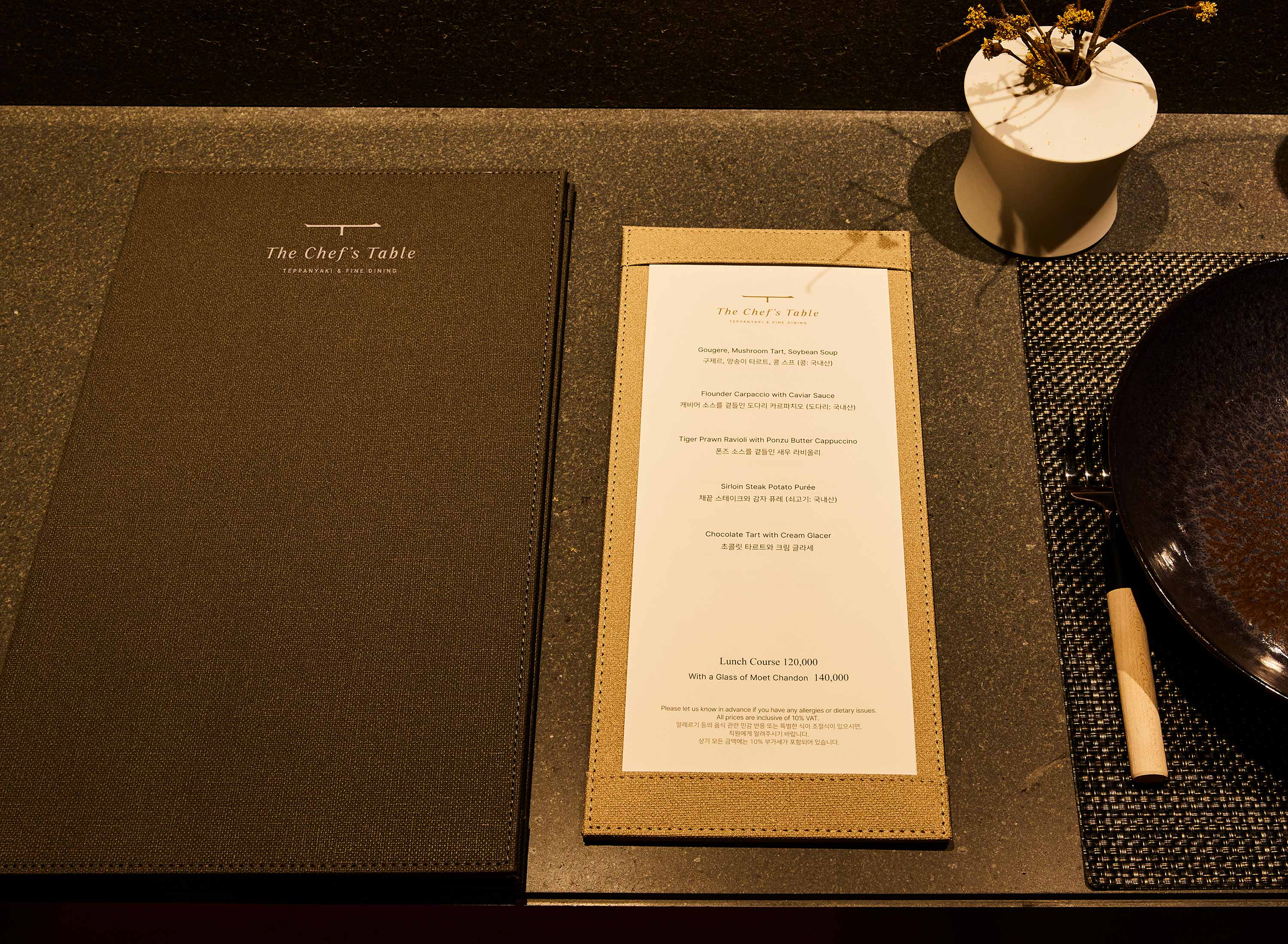
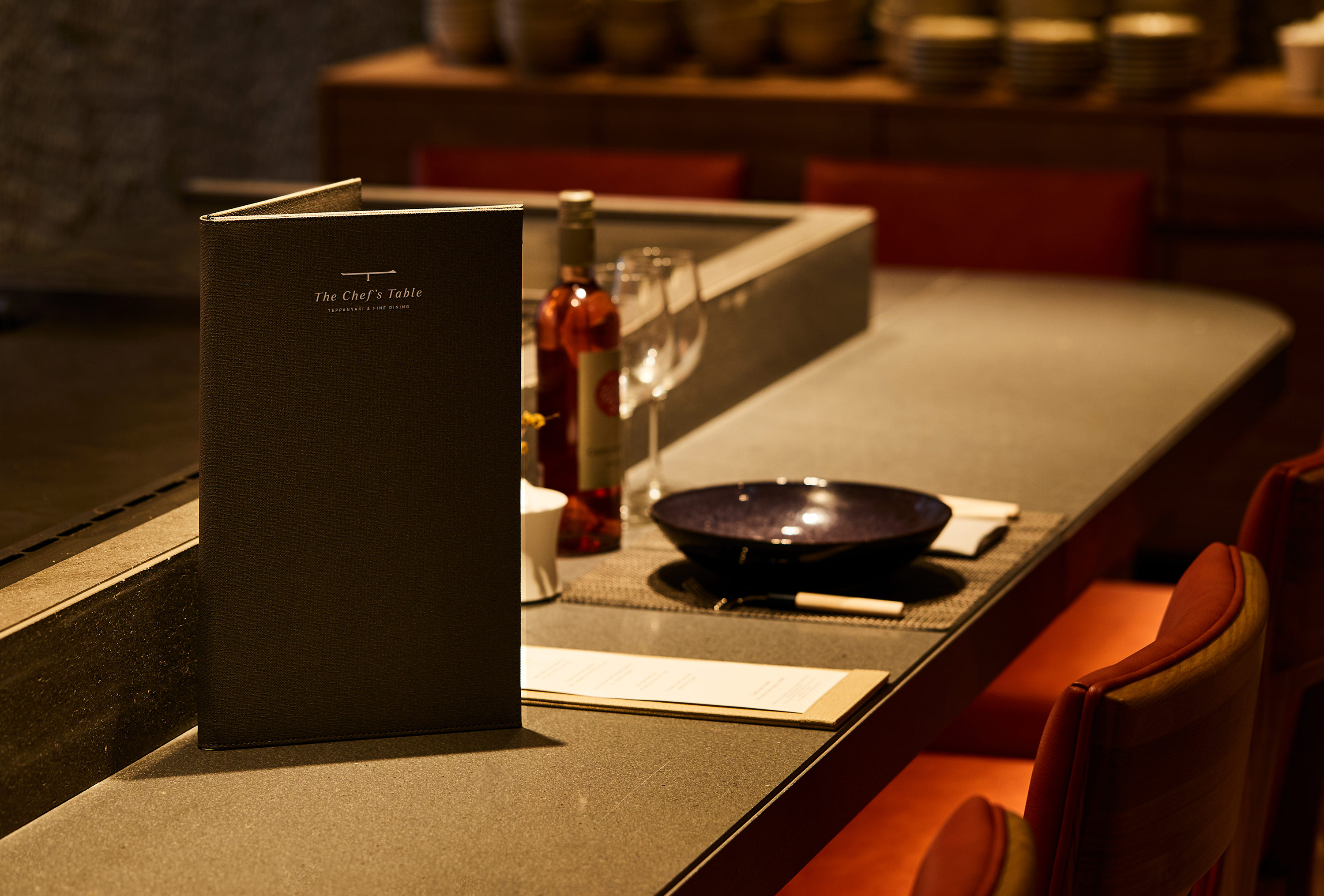
The Chef’s Table’s visual identity contains a brand essence called ‘The Quiet Quality, Private Fine Dining that focuses on the essence of cooking’. The table-shaped logo, reminiscent of one Chinese character, conveys brand authenticity in a carefully refined language that focuses only on the essence of cooking and gives customers a creative gastronomic experience.
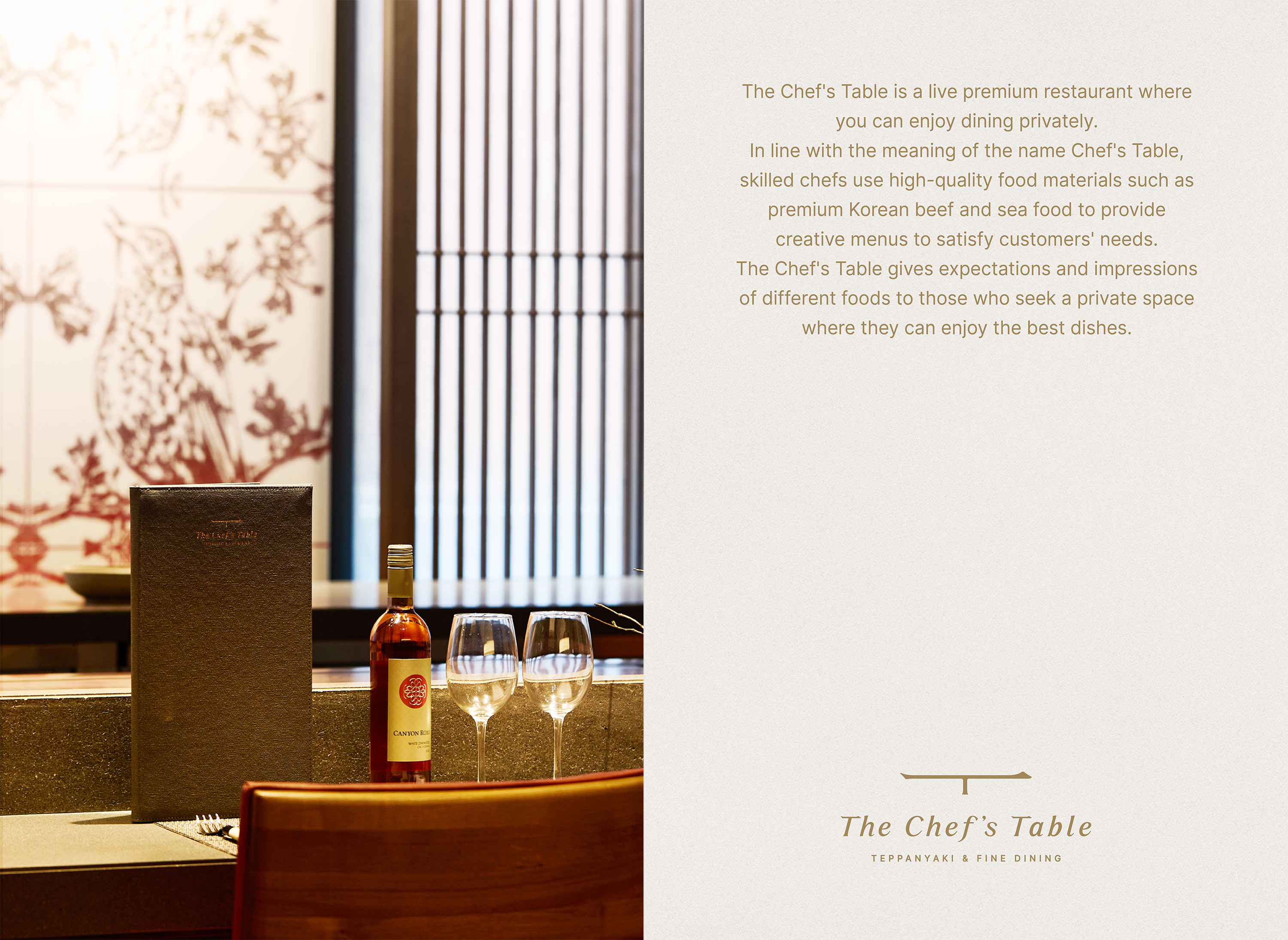
In line with the meaning of the name Chef’s Table, skilled chefs use high-quality seasonal ingredients airlifted from all over the country to provide creative menus that meet the needs of customers. The Chef’s Table gives expectations and impressions of different foods to those who seek a private space where they can enjoy the best dishes.
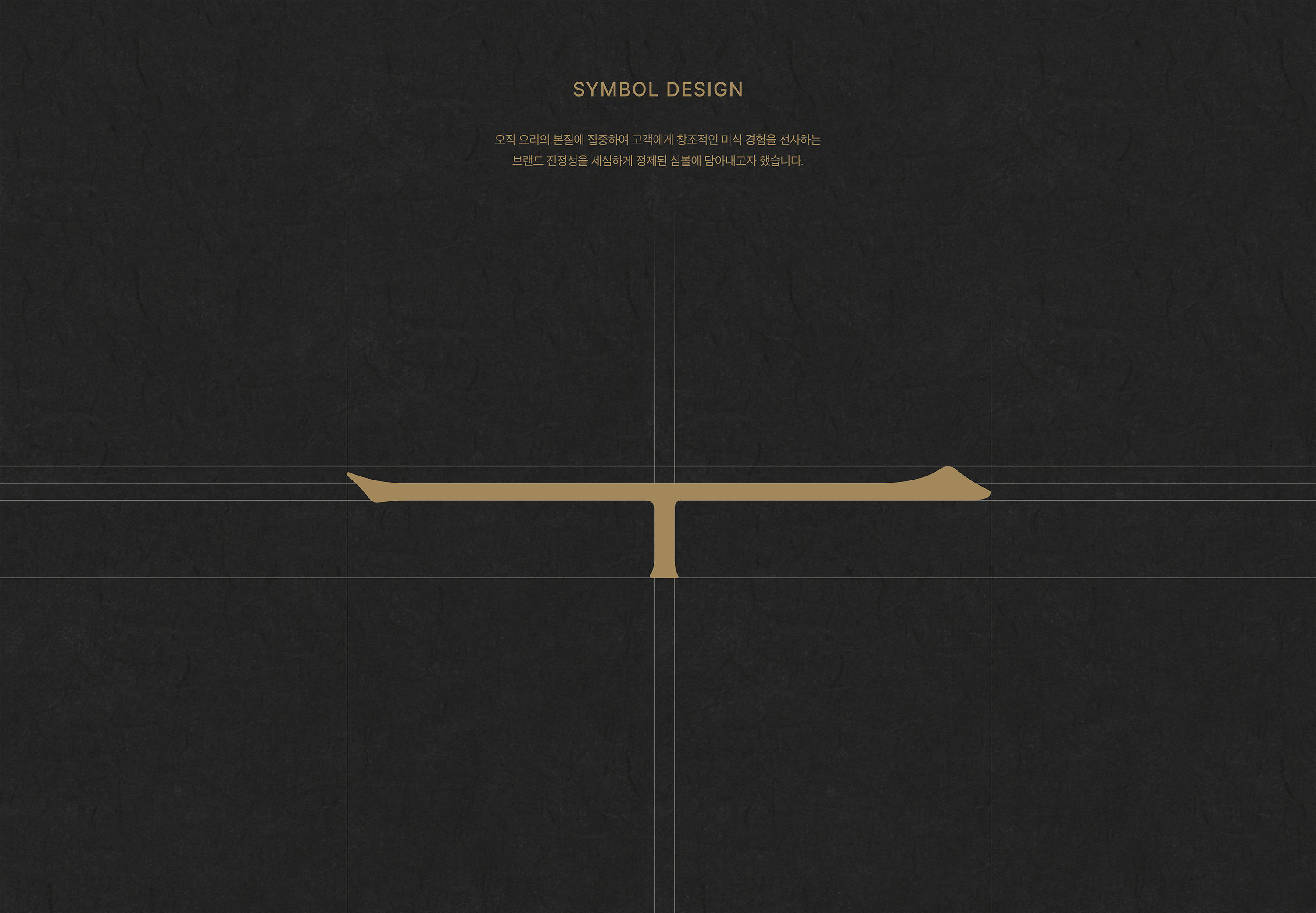
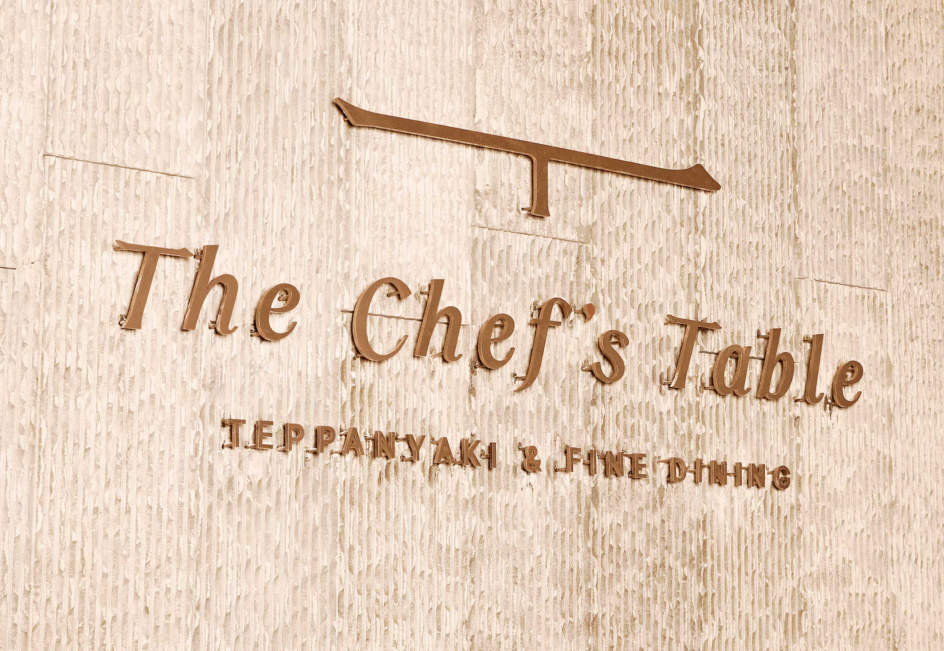
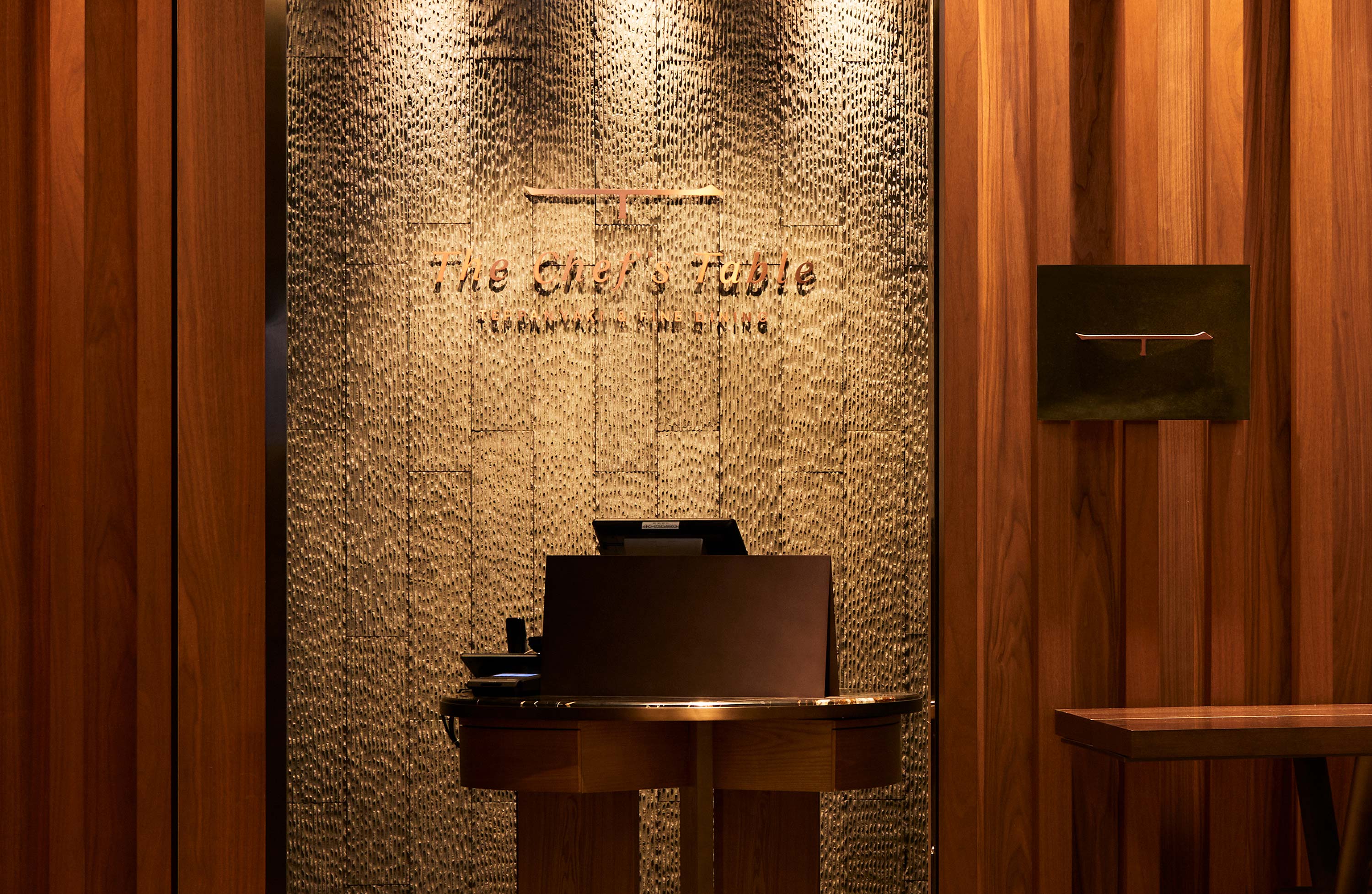
In the form of the Chinese character (一), it symbolizes focusing on the essence of cooking and providing a first-class gastronomic experience. The ‘T’ symbol, created by combining the Chinese character (一), which expresses the touch of a Chinese character stroke, and a modern straight line, represents a table that harmonizes East and West. The logotype, customized with an italic font in the form of a sign that represents the individual’s unique identity, signifies the brand’s private space and expertise.
The copper plate signage, which symbolizes brand identity, contains the authenticity of the dishes the brand seeks. The signage of The Chef’s Table’s is a collaboration with metal craftsmen who capture beautiful colors on copper. Through the Enaming method, which shows unique colors and patterns by applying glaze on copper and heating it at high temperatures, it creates a subtle beauty that does not lose its light over time.

CREDIT
- Agency/Creative: YNL Design
- Article Title: YNL Design Creates Visual Identity for The Chef’s Table
- Organisation/Entity: Agency
- Project Type: Identity
- Project Status: Published
- Agency/Creative Country: South Korea
- Agency/Creative City: Seoul
- Market Region: Asia
- Project Deliverables: Brand Design, Brand Identity, Branding, Creative Direction, Design, Identity System, Logo Design
- Industry: Food/Beverage
- Keywords: YNL Design, Brand Design, Brand Identity, Branding, Creative Direction, Design, Identity System, Logo Design
-
Credits:
Creative Director: Liz Yoona Lee
Brand Design: Kwangsu Shin
Brand Design: Eunhye Lee


