


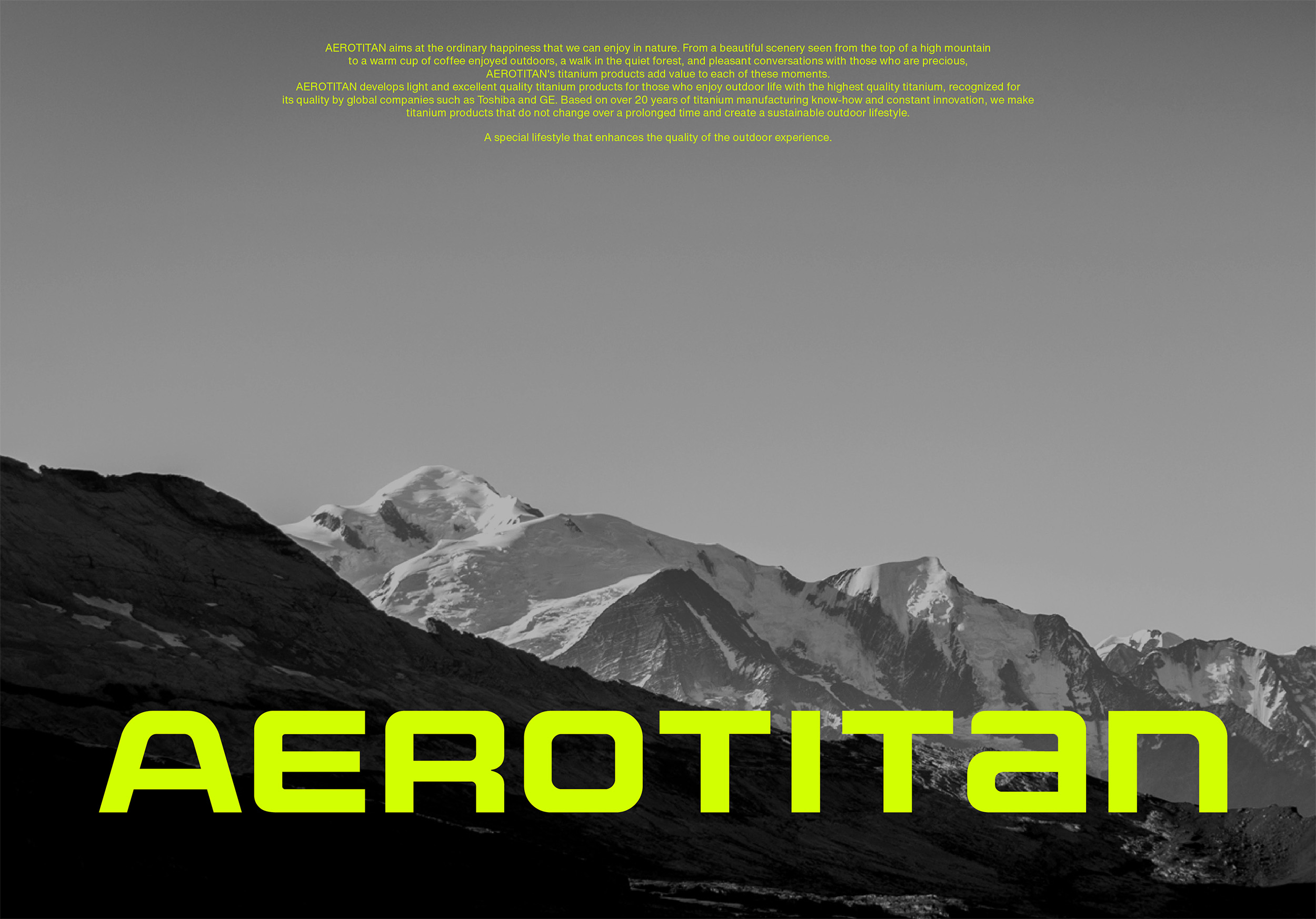
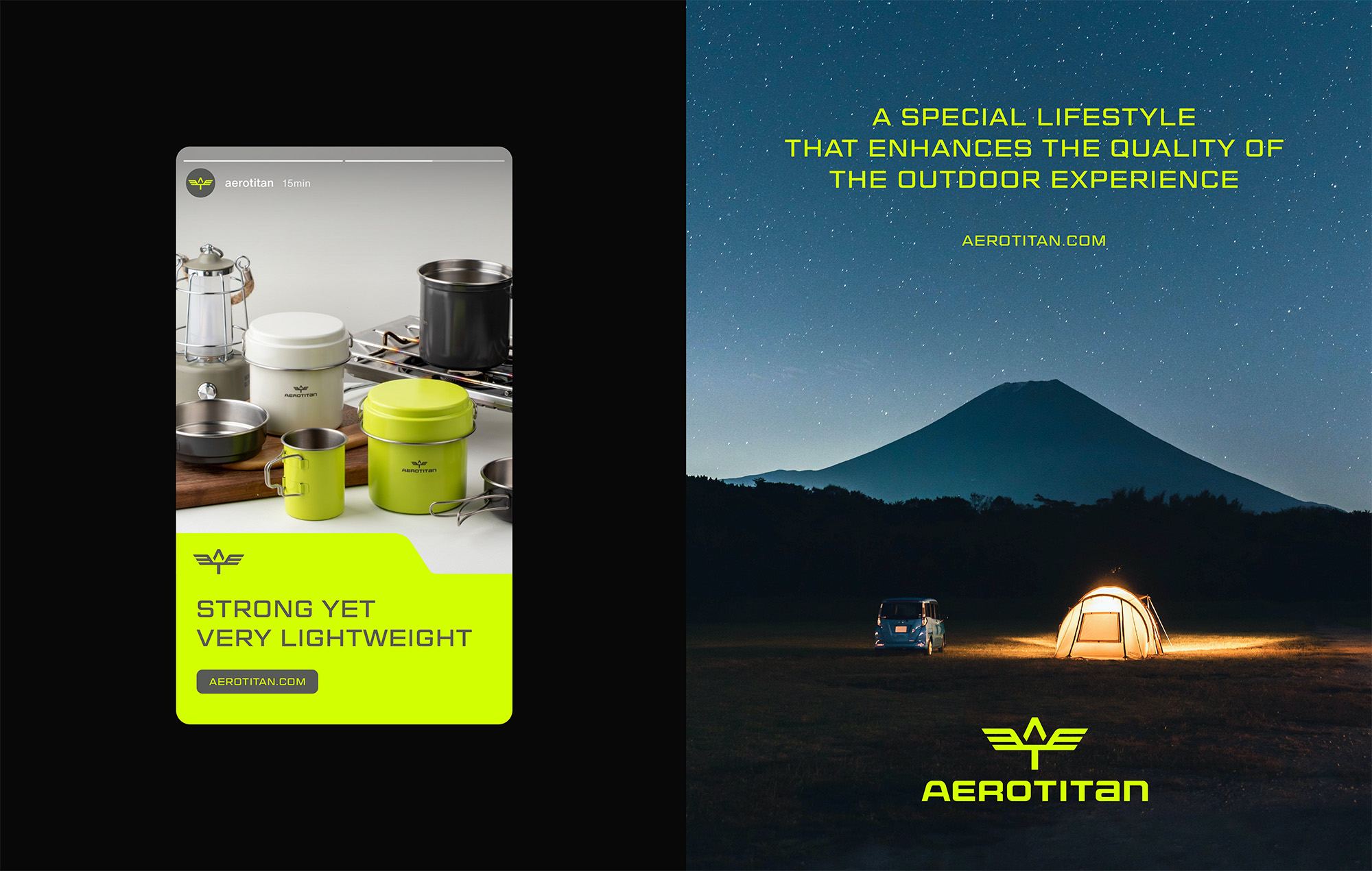
Areotitan is an outdoor lifestyle brand created by KPC, the company that made titanium products for the first time in Korea in 1990 and has contributed to the aerospace and military fields. As a company with more than 20 years of know-how in handling titanium and innovative technologies, Areotitan develops innovative titanium products that add value to life with its expertise and provides a richer outdoor experience to those who enjoy outdoor life.
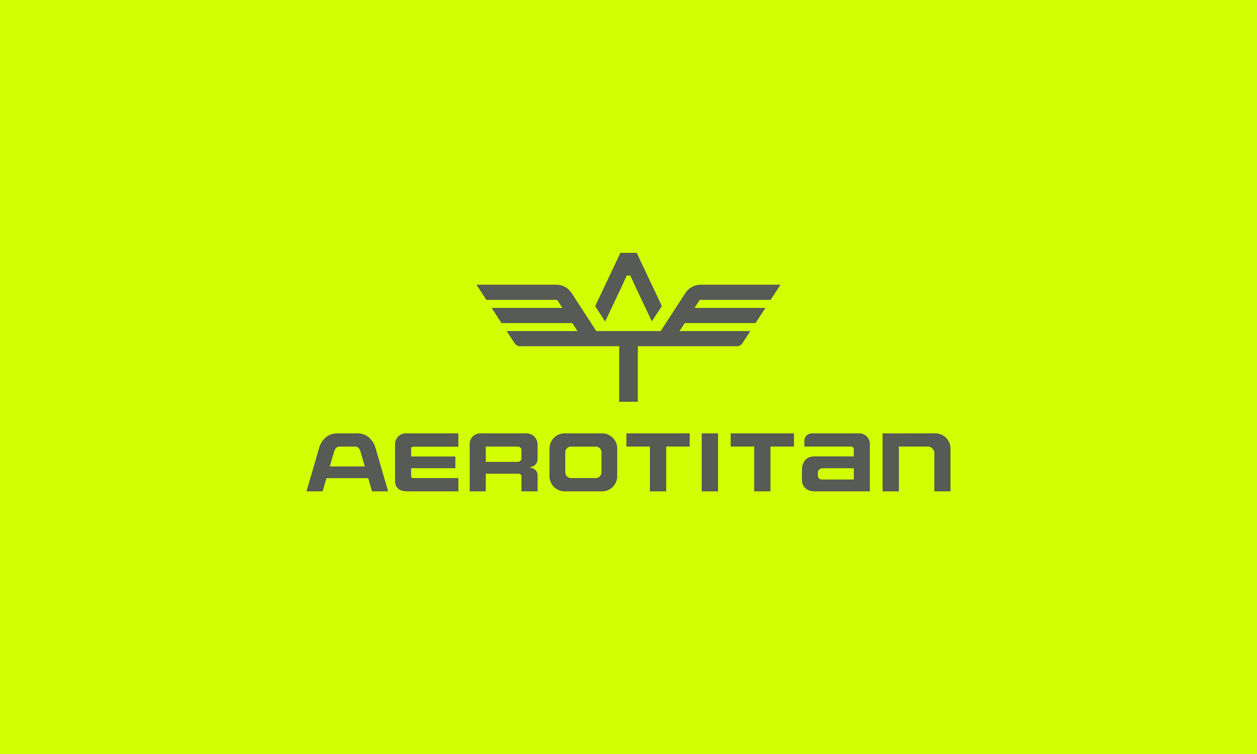
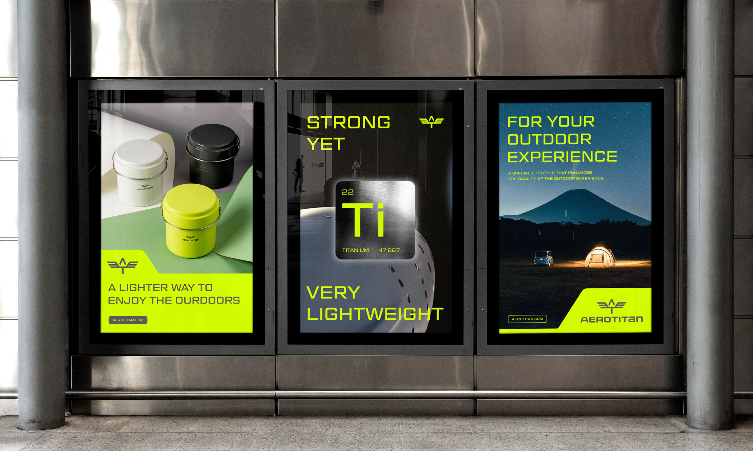
The major challenge of the Areotitan branding project was to develop a brand slogan, story, and differentiated brand identity. The brand name, Areotitan, originated from a pterosaur discovered in 2012 and was coined by combining “Aero,” meaning sky, and “Titan,” representing giant. Just as a pterosaur with enormous wings and a strong but light skeleton could fly in the sky for a long time, Areotitan’s strong but light titanium products will provide a richer experience for those who enjoy outdoor life.
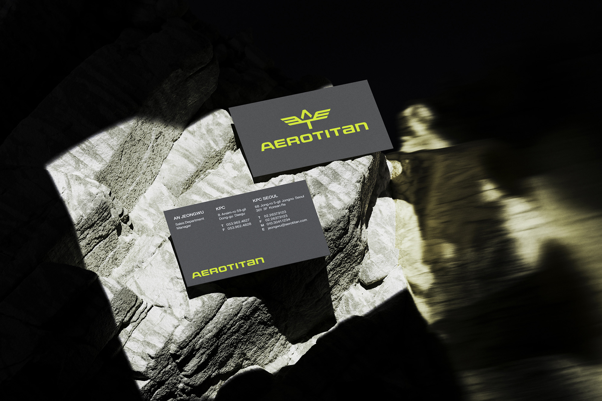
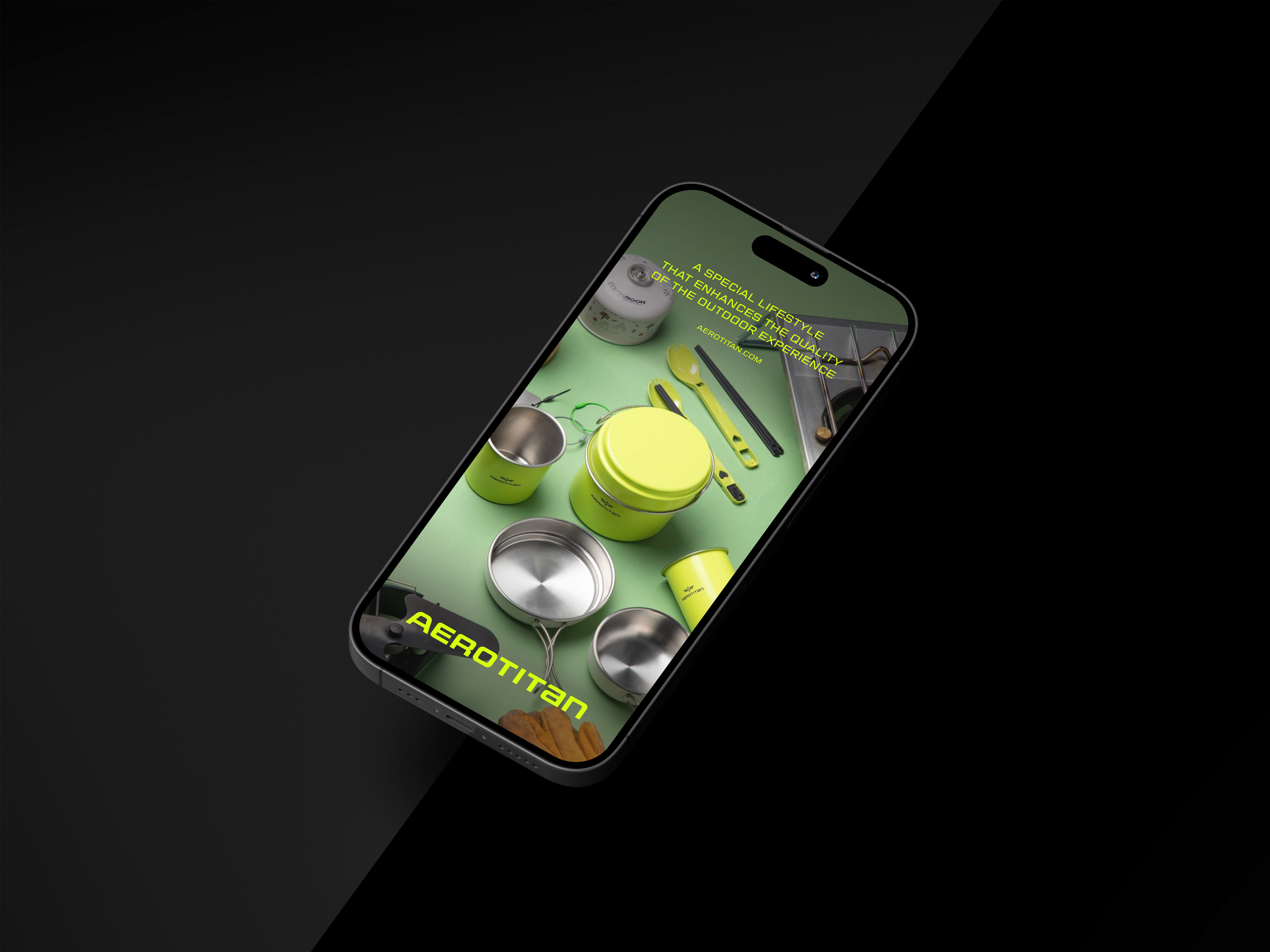
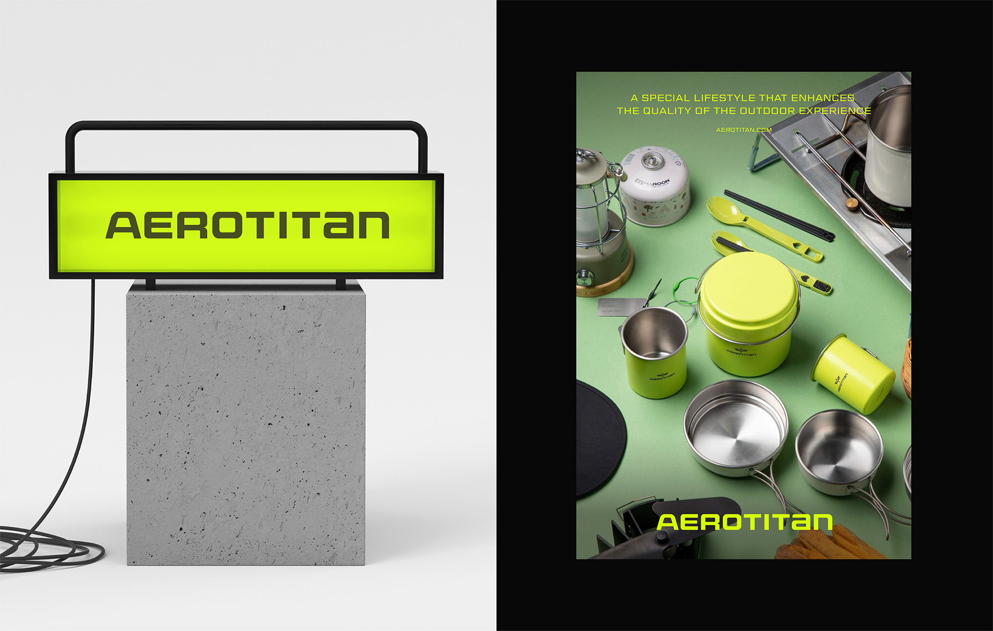
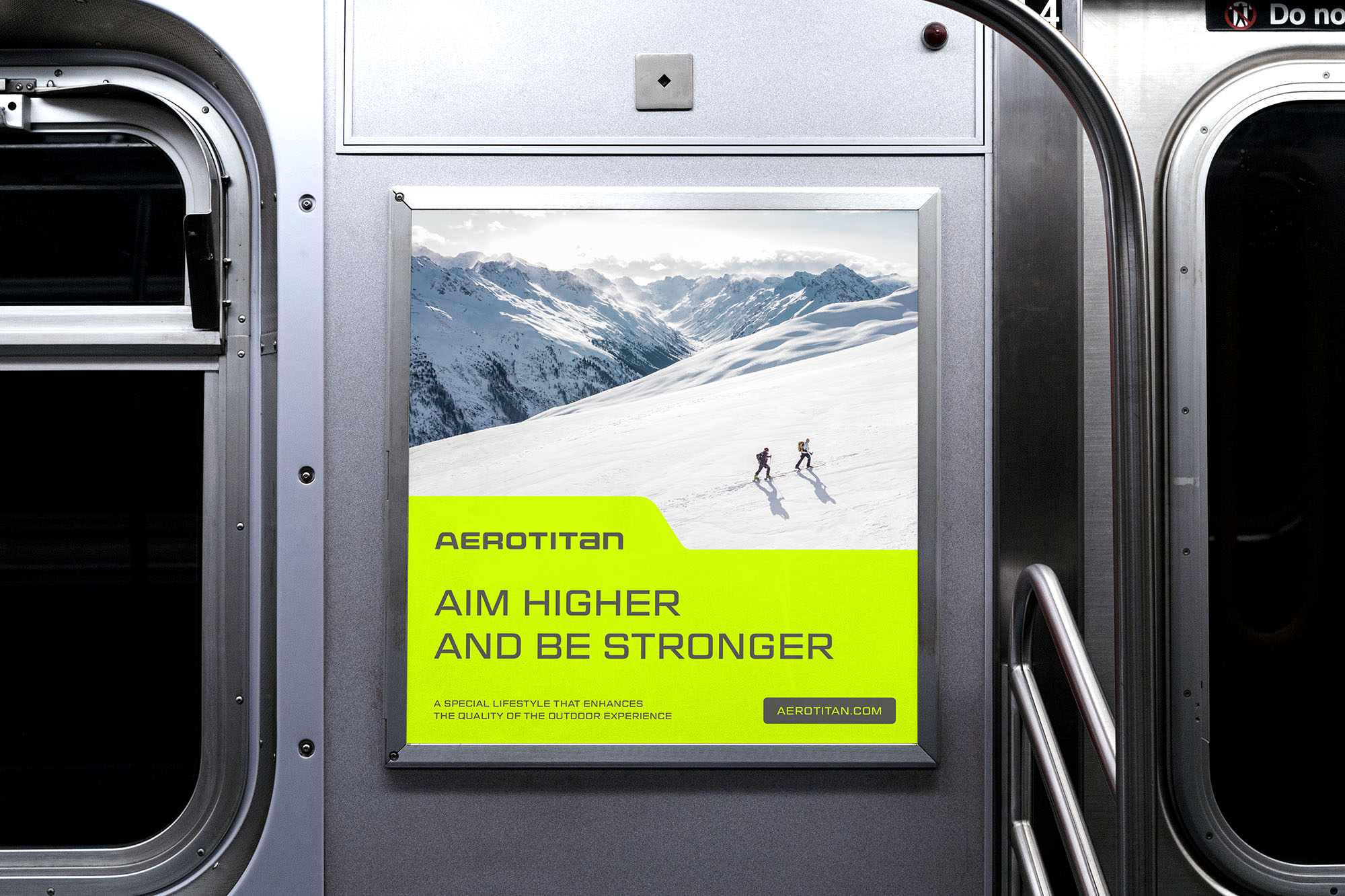
YNL Design developed the brand slogan, story, and visual identity of Areotitan based on the company’s core values: challenge, innovation, professionalism, and sustainability. The brand slogan, ‘Aim Higher and Be Stronger,’ means adding values to customers’ lives with innovative titanium products and endlessly challenging to reach a higher level. The symbol of Areotitan, the pterosaur that symbolizes strong but light titanium with its wide-spread wings, expresses the brand’s challenging spirit, ‘aiming for the best,’ by using the initial ‘A’ from Areotitan and ‘T’ from titanium. The bold logotype developed from a sans serif typeface intuitively conveys the excellent technology and expertise required to manufacture titanium products. We used the gray color that symbolizes titanium and neon green to express the quality of products developed with the highest grade titanium used in the aerospace field with a confident brand image.
CREDIT
- Agency/Creative: YNL Design
- Article Title: YNL Design Creates Visual Identity and Brand Design for Areotitan
- Organisation/Entity: Agency
- Project Type: Identity
- Project Status: Published
- Agency/Creative Country: South Korea
- Agency/Creative City: Seoul
- Market Region: Asia
- Project Deliverables: Brand Design, Brand Identity, Brand Strategy
- Industry: Manufacturing
- Keywords: camping, brand identity, brand design, logo design
-
Credits:
Creative Direction: Liz Yoona Lee
Brand Design: Kwangsu Shin
Brand Design: Yena Park


