


They say that at dawn, when the field is still breathing cool, a woman walks along the path with a basket. She chooses the grain with her palms — patiently, with care and love for every grain. She says, “Delicious and healthy porridge is born not in a pot, but in the heart of someone who cares.” That’s how the “Krupava” brand was born — from the word “krupa” and the name “Lubava”, because the production of truly delicious and healthy food is inseparable from love. “Krupava” is a new brand on the shelf, created with warmth and love. Each pack contains care for loved ones, proven quality and a unique taste that you want to return to.
Task
Our task was to develop an original brand name, trademark and packaging design for a range of basic cereals. The design should reflect the care and love for the product, as well as inspire trust at first glance.
Decision
As a result of painstaking work, it was decided to develop a design with an emphasis on the original brand name and the image of a mother symbolizing love and care.
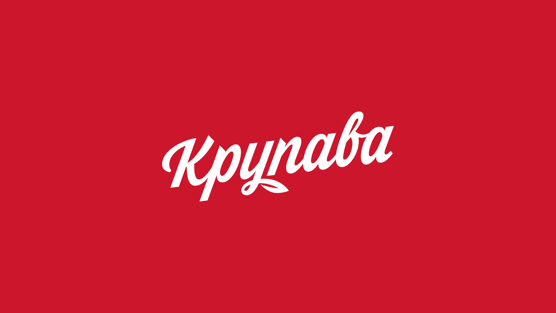
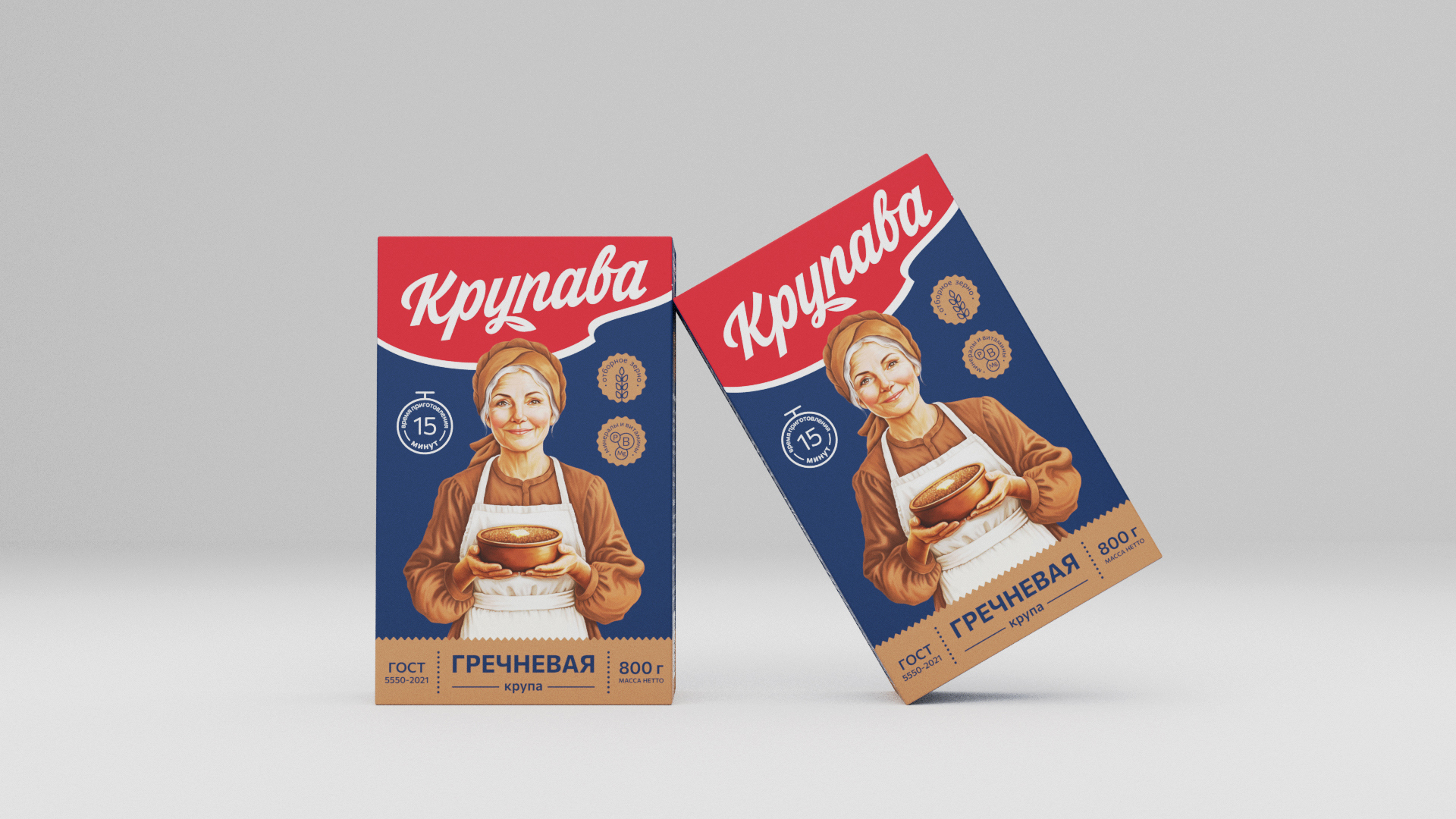
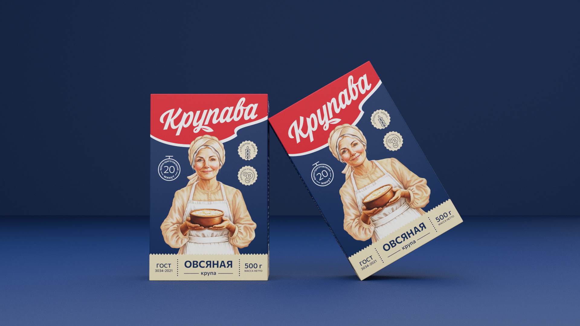
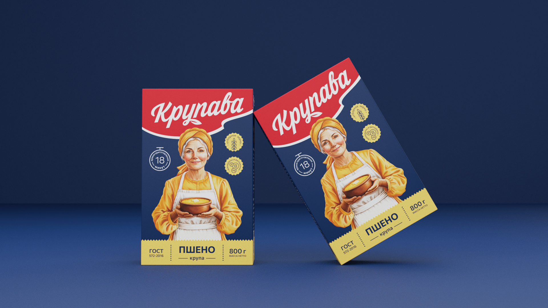
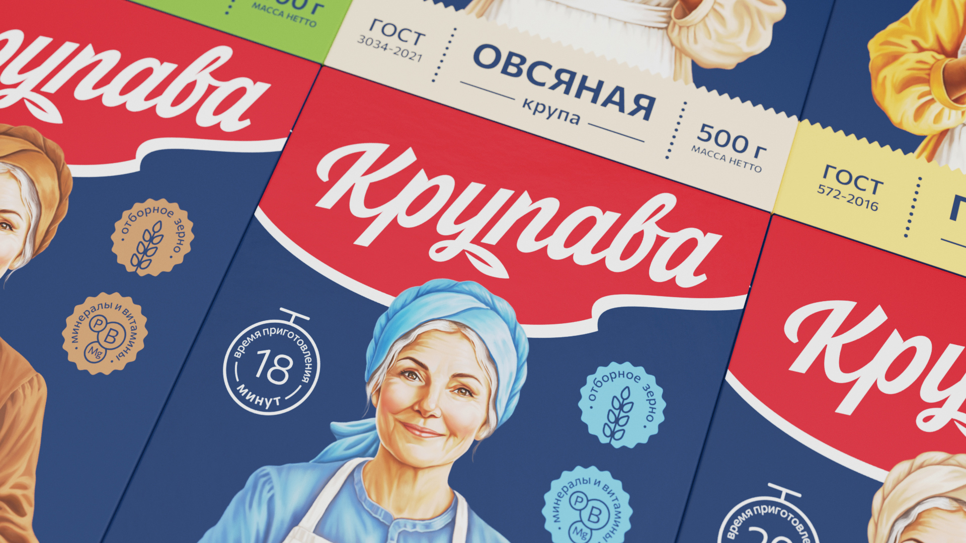
The Krupava logo is based on handwritten lettering. The smooth slope and soft strokes of the letters convey friendliness and care, and a small piece of paper in a bunch of letters adds a motif of naturalness and “homeliness”.
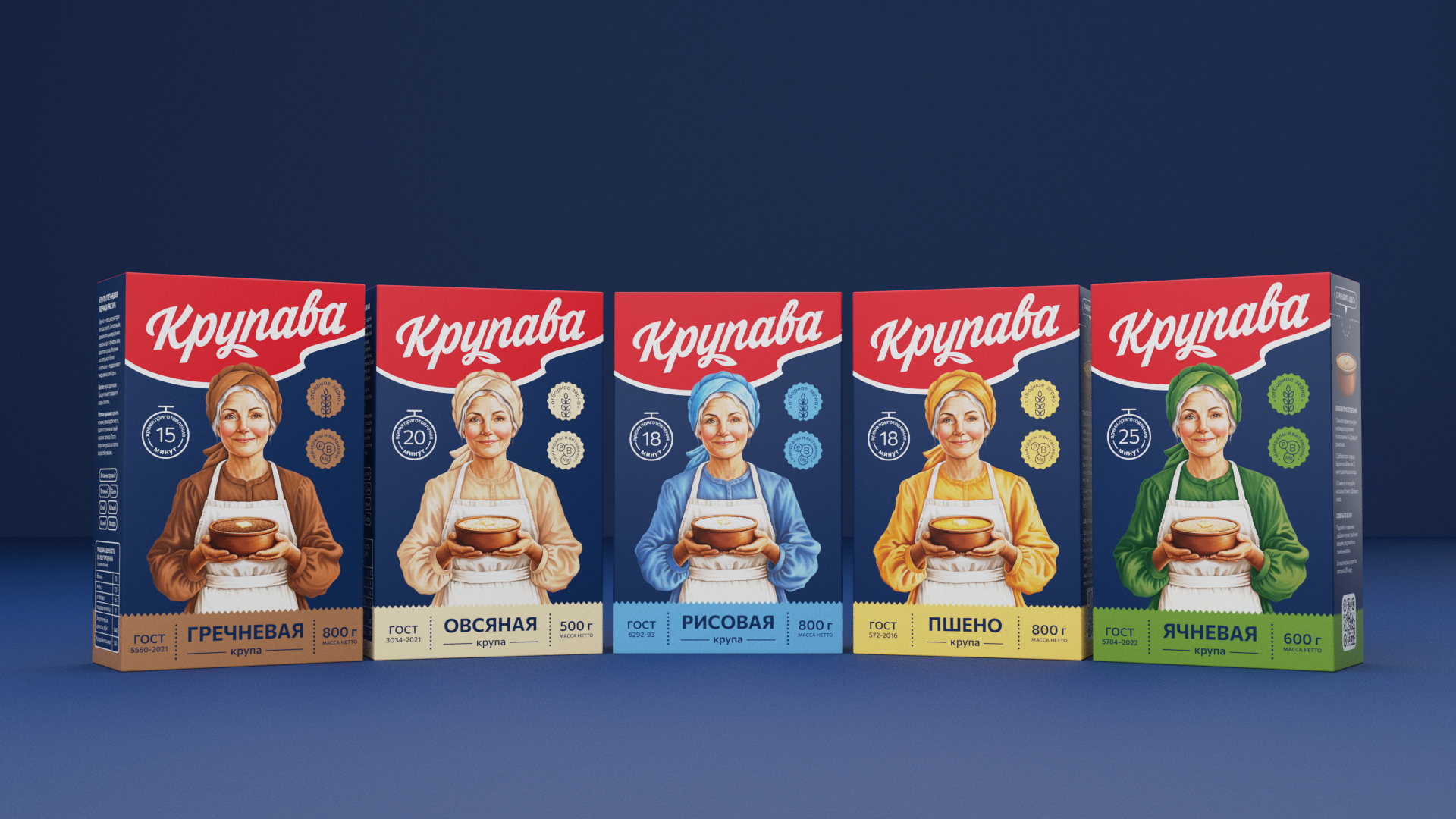
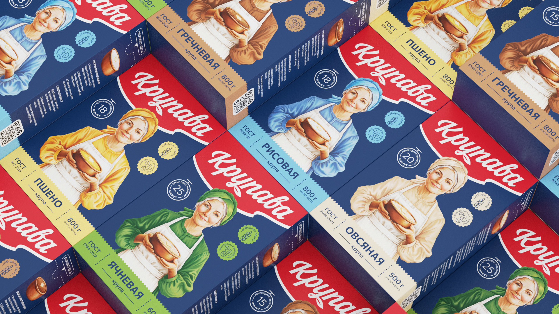
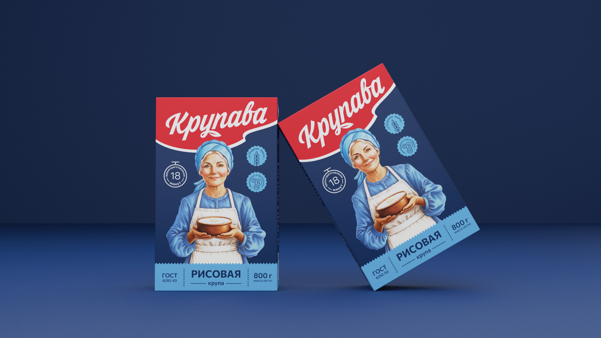
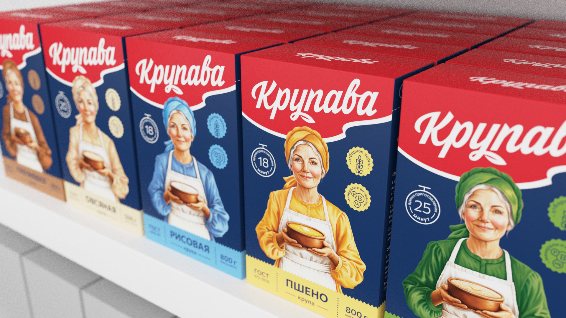
The branded “red wave” with a large logo at the top works like a flag on a shelf — the product is easy to read and visible from afar.
The main focus on the packaging is on the image of a friendly woman in a headscarf and an apron with a bowl of hot porridge, who looks at the customer with maternal love. Her image is a visual metaphor for maternal care and home warmth.
Grain differentiation within the range occurs due to color coding. For example, a cool blue tone was chosen for rice groats, warm brown tones for buckwheat, creamy beige tones for oatmeal, sunny yellow tones for millet, and saturated green tones for barley. This coding helps the buyer to quickly navigate the assortment.
The front of the package is also complemented with cooking time icons and product benefits. The sides contain useful information about the nutritional value of the product, as well as cooking tips.
The dark blue matte background highlights the quality of the product, makes the illustrations and color differentiation more contrasting, and also makes it easy to read information.

CREDIT
- Agency/Creative: Yeti Design Studio
- Article Title: Yeti Design Studio Elevates Krupava Packaging with Friendly and Approachable Design
- Organisation/Entity: Agency
- Project Type: Packaging
- Project Status: Published
- Agency/Creative Country: Russia
- Agency/Creative City: Lipetsk
- Market Region: Asia, Europe
- Project Deliverables: Art Direction, Brand Design, Brand Naming, Branding, Design, Illustration, Label Design, Lettering, Logo Design, Packaging Design
- Format: Box
- Industry: Food/Beverage
- Keywords: cereal, oatmeal, rice, packaging, design, food
-
Credits:
Art director & design: Igor Vetoshkin
Illustration: Kristina Vetoshkina


