In today’s world, where the pace of life is constantly accelerating, we are increasingly forgetting about the simple joys and taking care of our health. The Tea&Berry brand was created with the aim of giving people back the opportunity to enjoy the taste of natural products and take care of their health.
We invite you to plunge into the world of natural juice-containing tea drinks that not only quench thirst, but also benefit the body. Tea&Berry is not just about drinks, it’s about taking care of you and your health.
The founders of the Tea&Berry brand draw inspiration from nature and its gifts. In the production of beverages, only natural ingredients are used to create unique flavors that delight with every sip.
Black tea, which is used in the manufacture of beverages, is known for its beneficial properties. And the addition of berry juices makes each drink unique and unrepeatable.
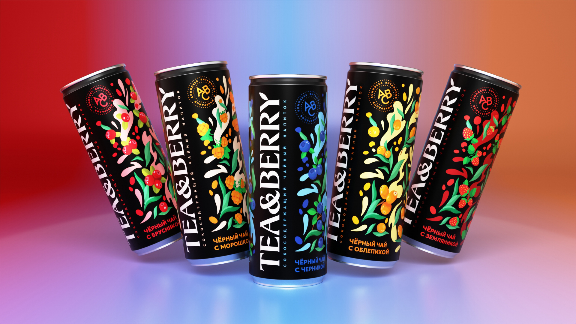
The product line of drinks is represented by five flavours:
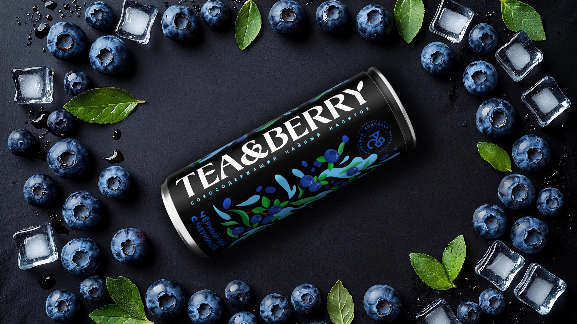
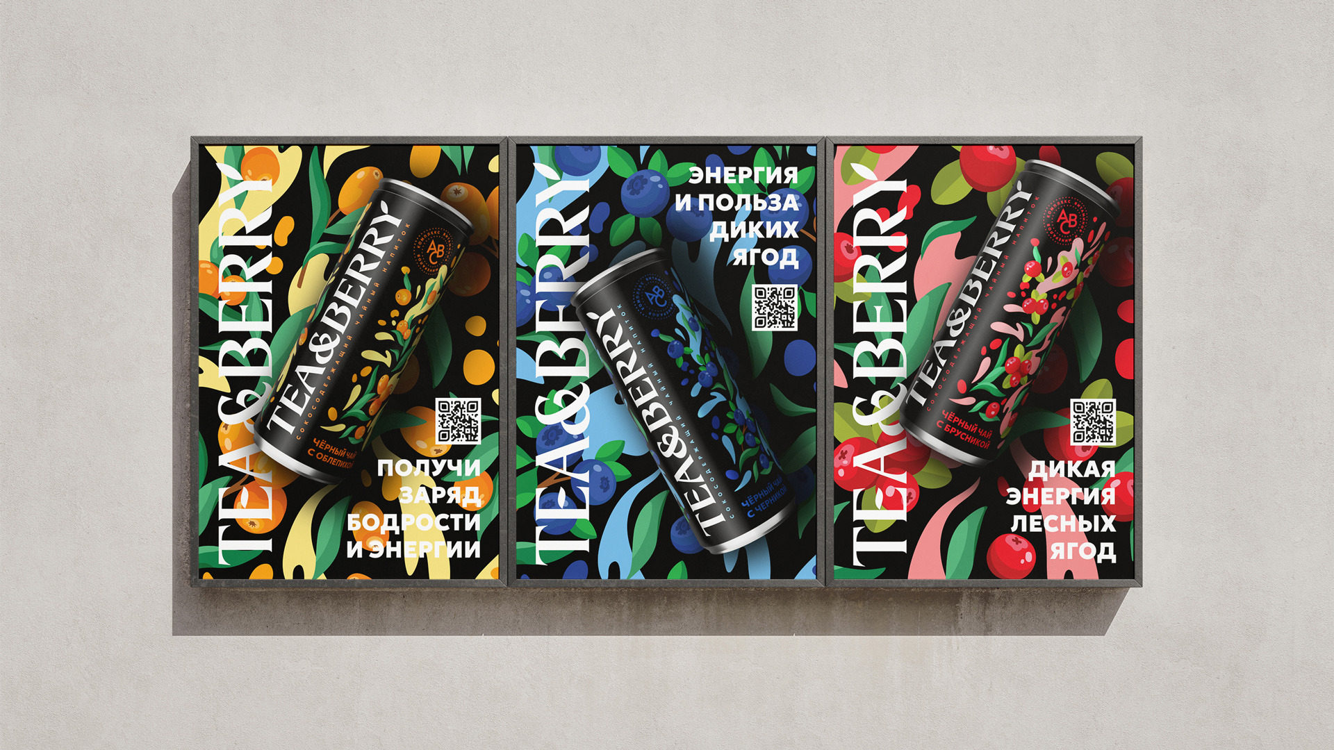
– black tea with blueberries — for lovers of bright and rich flavours;
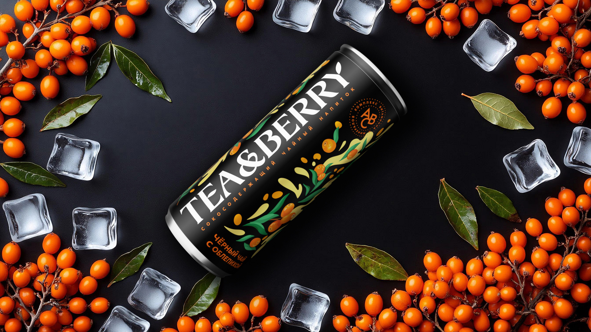
– black tea with sea buckthorn is for those who appreciate the richness of vitamins and nutrients;
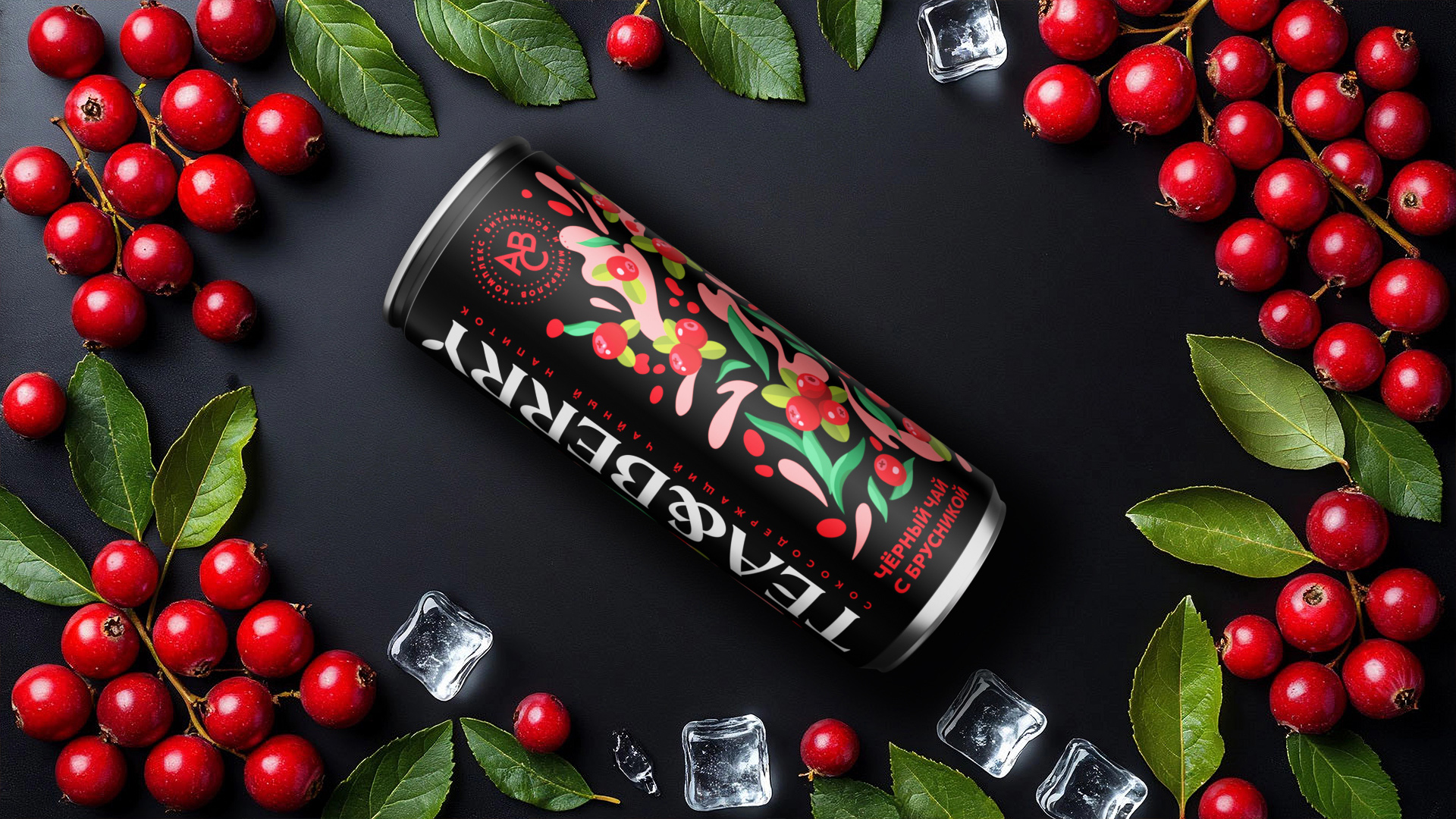
– black tea with lingonberries — for fans of rich and tart flavours;
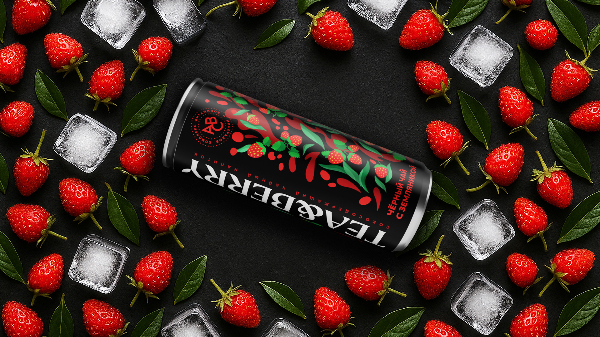
– black tea with strawberries — for lovers of fresh and sweet notes;
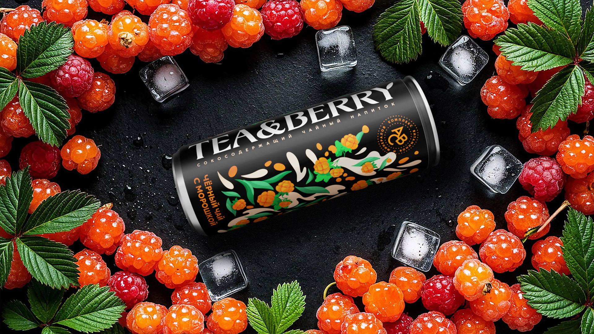
– black tea with cloudberries is for connoisseurs of exquisite and rare flavours.
Task
Our task was to develop a trademark and packaging design for a line of juice-containing tea drinks. The design should be bright and modern and at the same time emphasize the naturalness of the product and its beneficial properties.
Decision
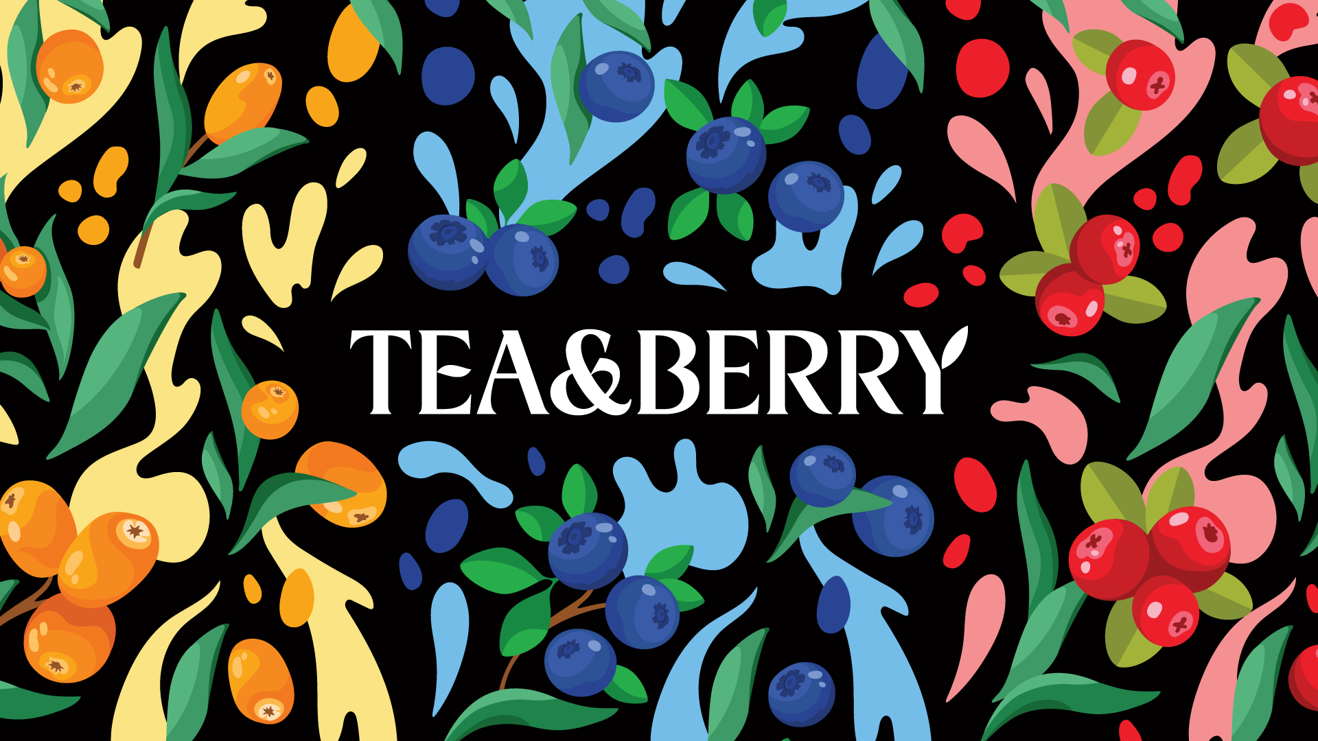
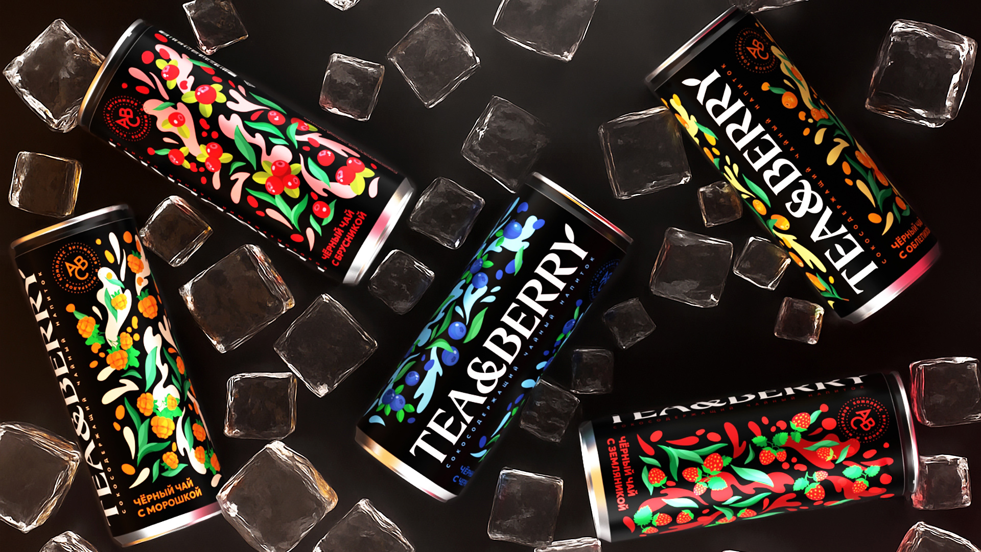
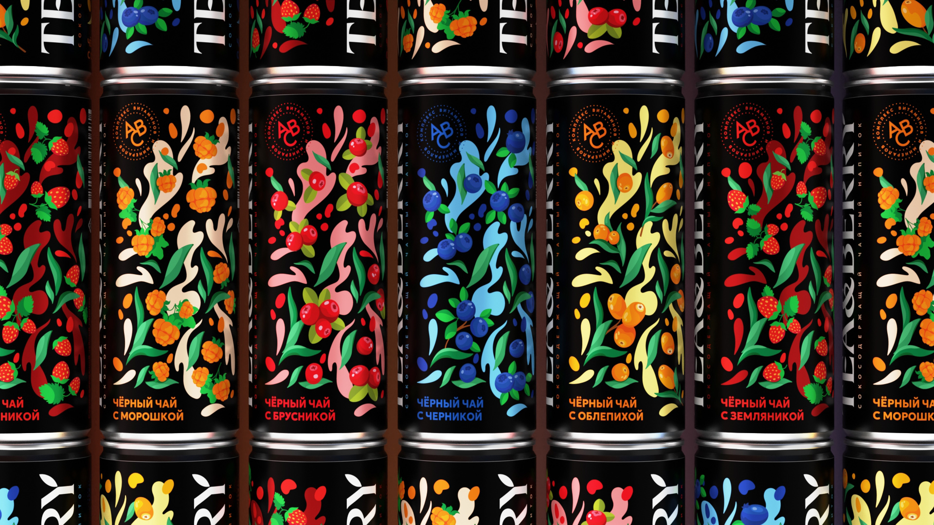
Packaging design, in addition to informational functions, should also perform advertising functions. That is, to attract the attention of consumers. To instantly attract attention on the shelf, drinks should look appetizing, bright and juicy. Therefore, it was necessary to highlight the taste and ingredients in the visual design of the packaging. For these purposes, bright and juicy illustrations have been developed-patterns that attract attention and seem alive, just about to break out of the jar.
At the same time, the brand name should also have been noticeable. To do this, it was decided to place the logo at the full height of the jar, which allows you to read the brand of the product from a distance. The trademark is based on a classic serif font to emphasize the tradition of a product such as tea. At the same time, some elements of the letters are made in the form of a petal, which subtly hints that drinks are useful and of natural origin. On the sides of the trademark there are unique illustrations-patterns that take up most of the packaging, and thus highlight the product on the shelf.
It was decided to use black as the main background for the packaging — it additionally emphasizes the bright and juicy illustrations, and highlights the trademark in contrast. Overall, the packaging design turned out to be bright, modern and attention-grabbing.
CREDIT
- Agency/Creative: Yeti Design Studio
- Article Title: Yeti Design Studio Creates a Vibrant Brand Identity for Tea&berry Natural Tea Drinks
- Organisation/Entity: Agency
- Project Type: Packaging
- Project Status: Published
- Agency/Creative Country: Russia
- Agency/Creative City: Lipetsk
- Market Region: Europe
- Project Deliverables: 3D Modelling, Art Direction, Brand Design, Brand Mark, Illustration, Label Design, Logo Design, Packaging Design, Typography
- Format: Can
- Industry: Food/Beverage
- Keywords: tea, ice tea, packaging, label, drink, beverage, juice, berry,
-
Credits:
Art director & design: Igor Vetoshkin
Illustration: Kristina Vetoshkina


