


The Unblvbl agency has developed branding for the Yanshi trademark, under which the Chinese manufacturer KTT produces its own trucks. One of the objectives of the project was to honestly convey the origin of the company in clear industry language, without flirting with national elements.
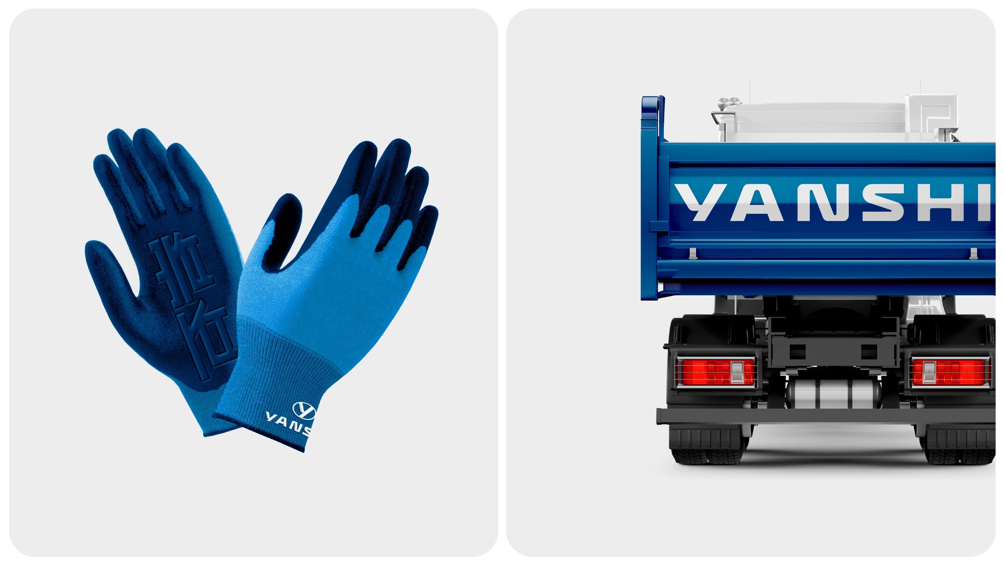
Yanshi trucks are manufactured in China, and this fact is not hidden (moreover, they can serve as a kind of «blank» for the production of special equipment on this platform). Fully sharing the principle of «being, not seeming», professed by the owners of the brand, the Unavailable agency embodies it at different levels in design.
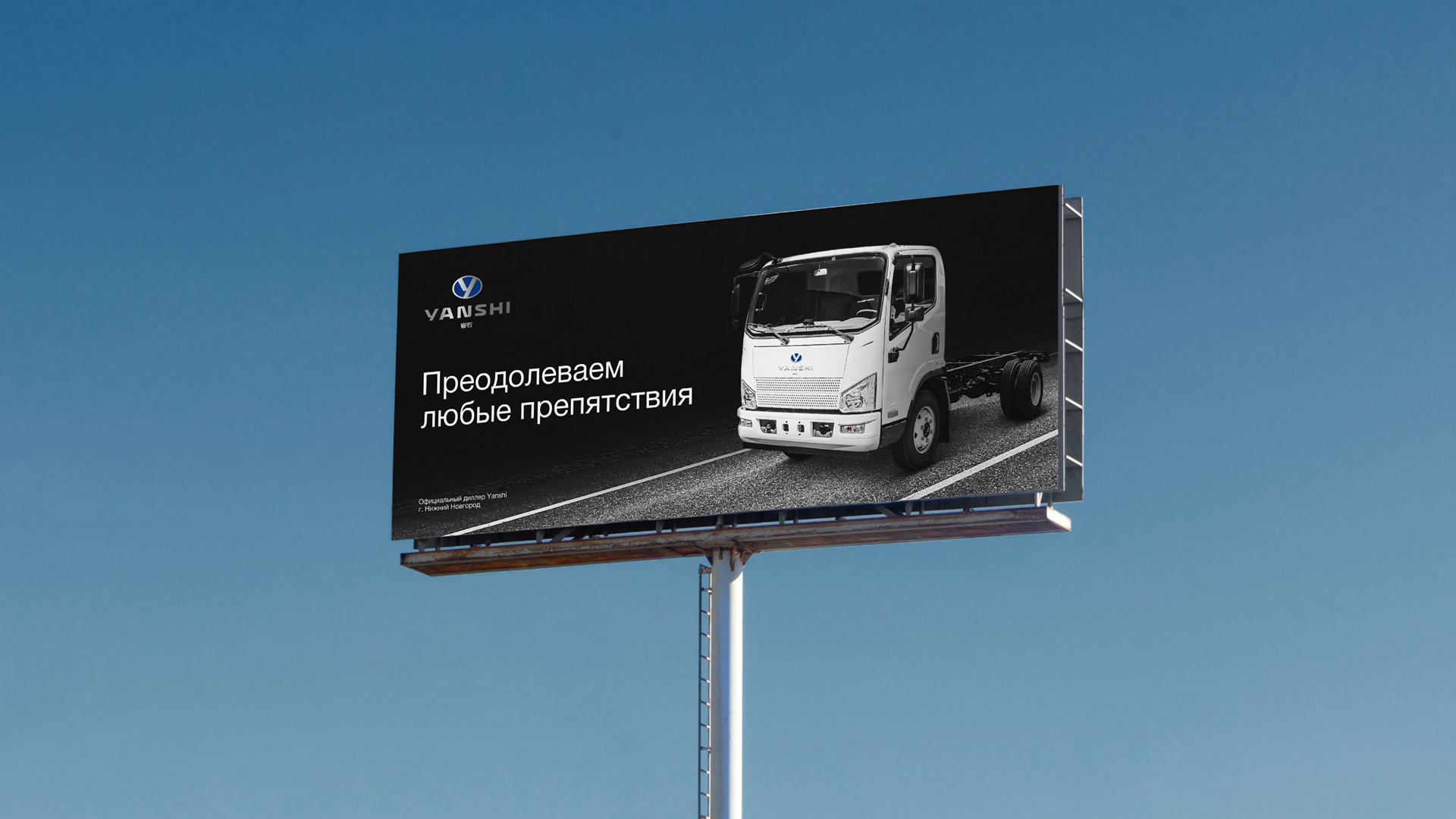
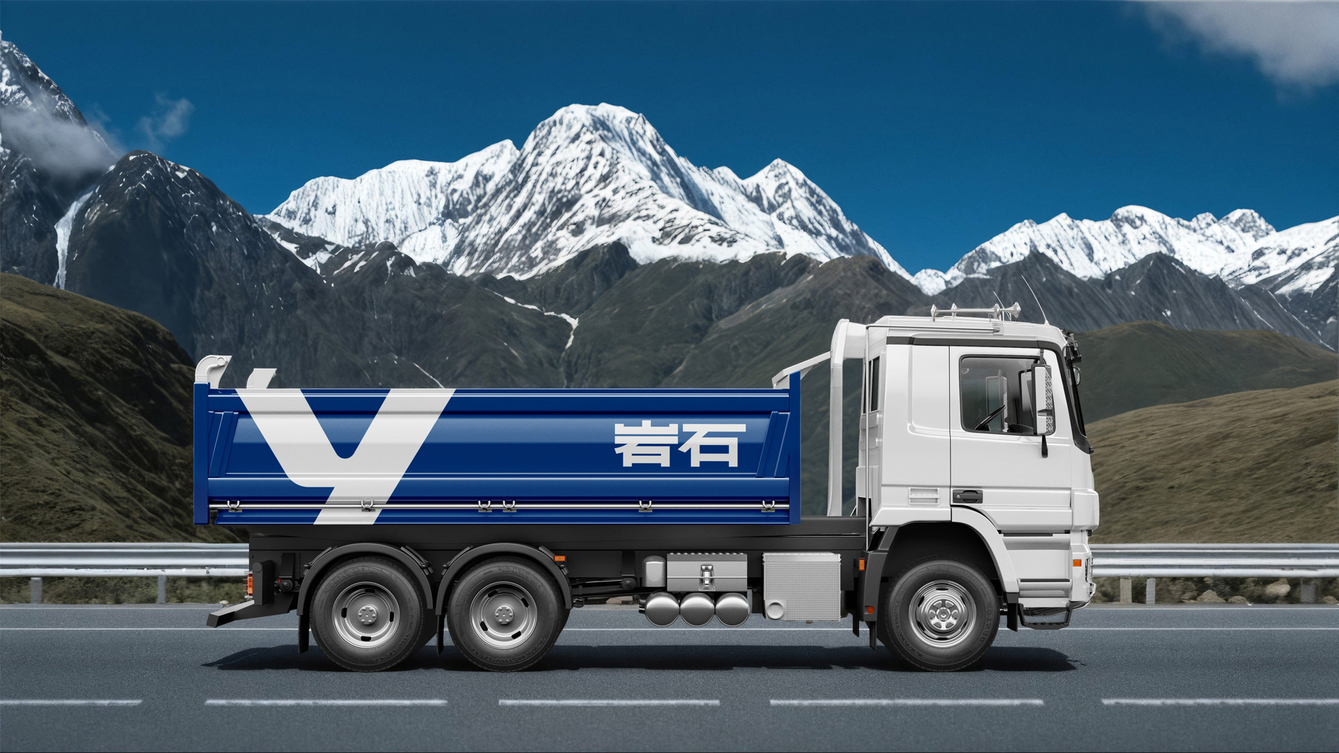
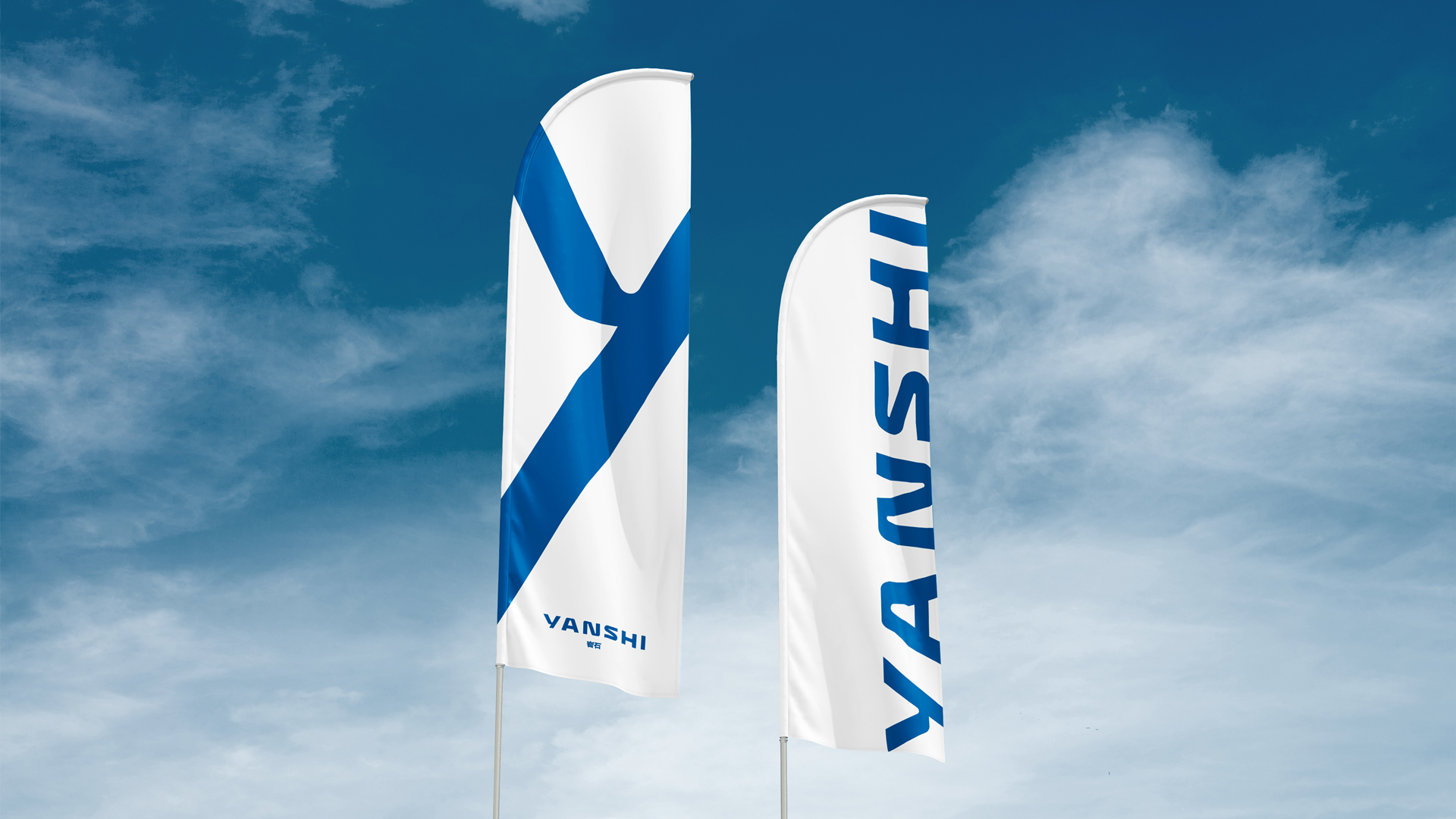
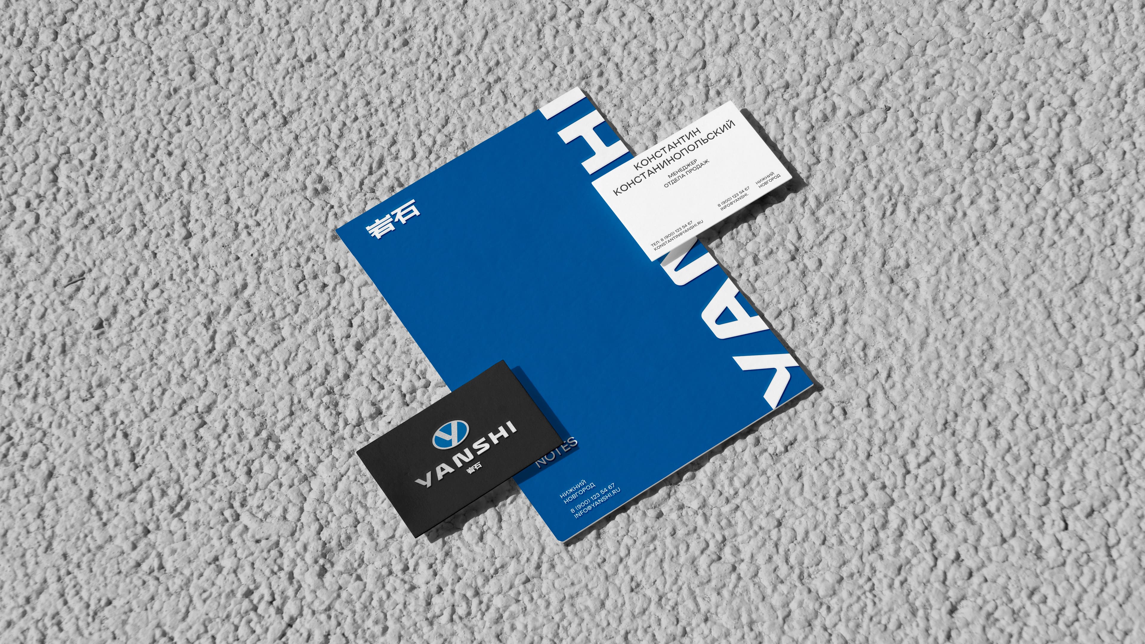
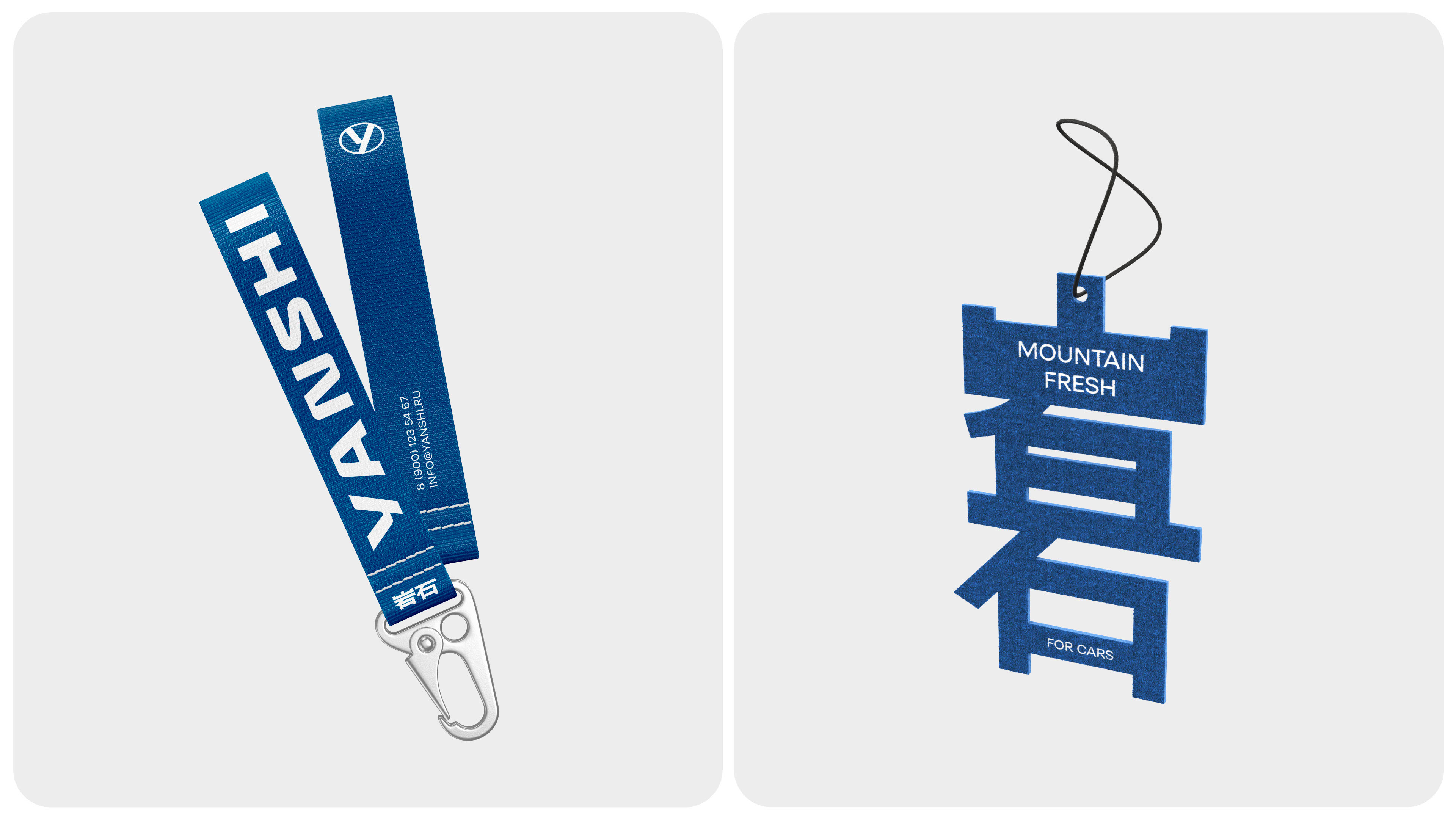
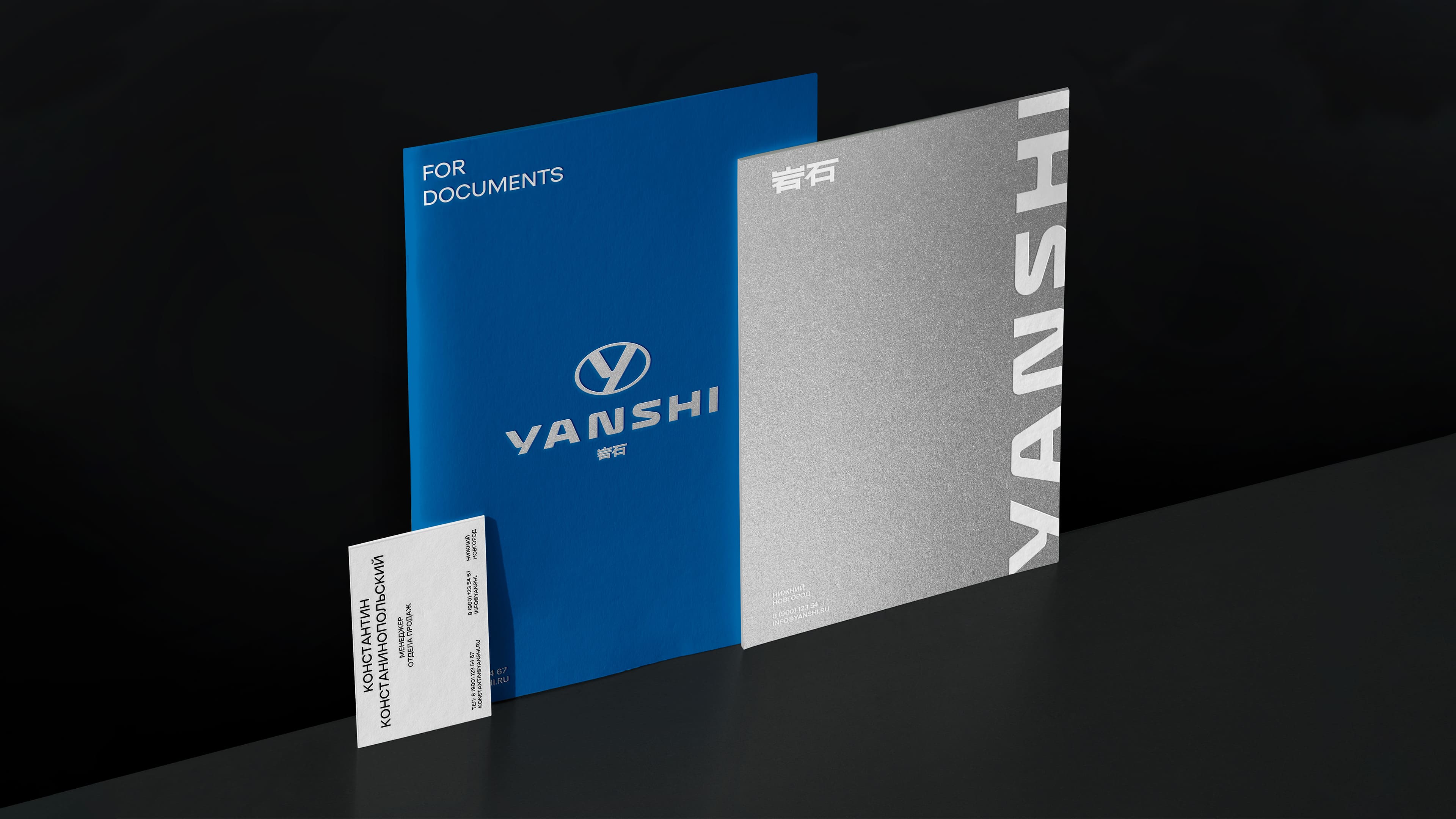
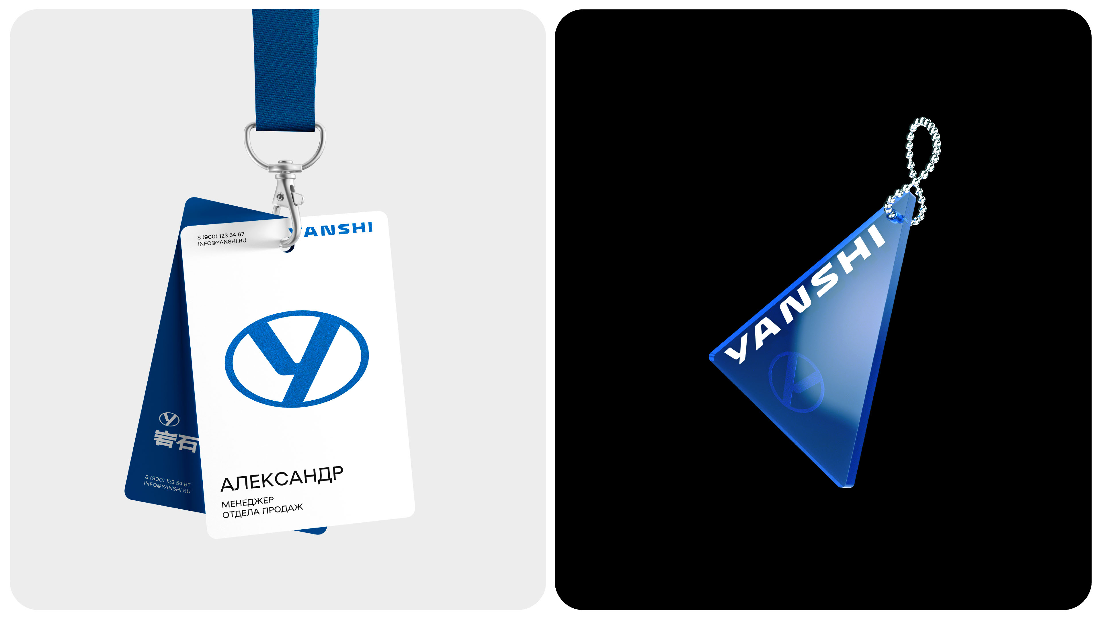
Thus, in branding, it was necessary to convey a sense of reliability, power and cross-country ability inherent in the product. Translated from Chinese, «Yanshi» means «rock», so we used an oval typical for the automotive industry, in which there is the letter Y and two converging mountains, as the central sign, or nameplate.
Embodying the traditions of Chinese eclecticism, when an element seems to resemble everything at once, the logo evokes associations with an already existing and well-known brand. This was the second task of the agency — to make Yanshi appear like a player who has long been known in the market. And this is indeed so: the platform used in these trucks is really very familiar to industry experts. The classic automotive identity further highlights this fact.
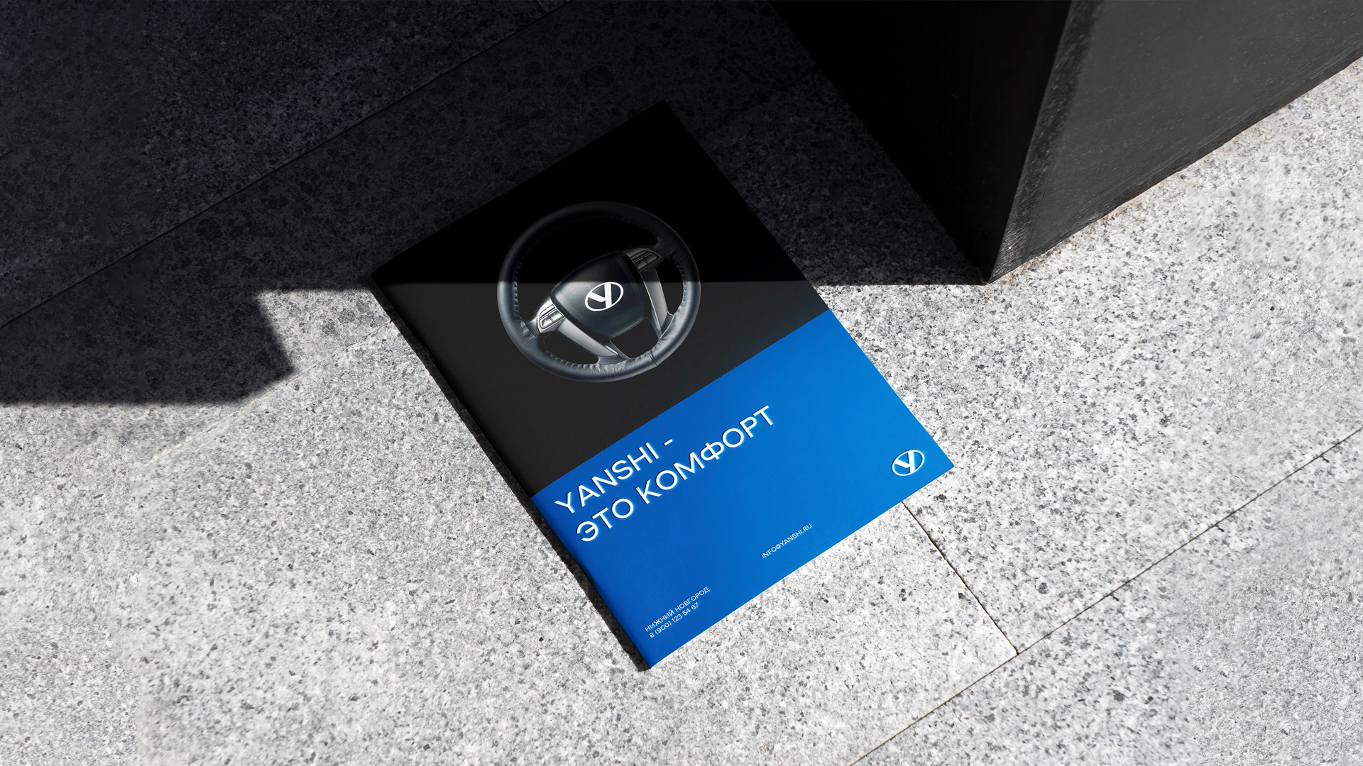
The color scheme of Yanshi’s identity combines deep blue, symbolizing reliability and competence, and metallic, conveying technological sophistication and strength. The color of bare metal is actively used in communications on various media.

CREDIT
- Agency/Creative: Unblvbl Branding Agency
- Article Title: Yanshi Branding for a Chinese Truck Brand, Designed by Unblvbl Branding Agency
- Organisation/Entity: Agency
- Project Type: Identity
- Project Status: Published
- Agency/Creative Country: Russia
- Agency/Creative City: Nizhny Novgorod
- Market Region: Asia
- Project Deliverables: Brand Design
- Industry: Transport
- Keywords: trucks, transport, vehicle, car, industrial
-
Credits:
Art director: Timur Saberov
Designer: Timur Saberov
Designer: Nikita Evlashev
Retouch: Vladimir Zotov
Industrial Design: Max Sharapov


