


The name “Yam” derives from the Hindu mantra related to the heart chakra. Although both the name of the brand and the culture of production and consumption of kombuchas have their origins in the East, the entire visual identity system of the brand, from the logo to the packaging, did not bring these references. Nor did they address the health and body benefits resulting from the consumption of kombuchas. In fact, the logo brought an incorrect visual connotation to the meaning of the name, resembling the onomatopoeia used to refer to something tasty: “yummi”. In addition, the packaging, from the color of the glass to the design of the label, looked more like a craft beer than a functional, non-alcoholic, refreshing, and healthy drink, such as a kombucha.
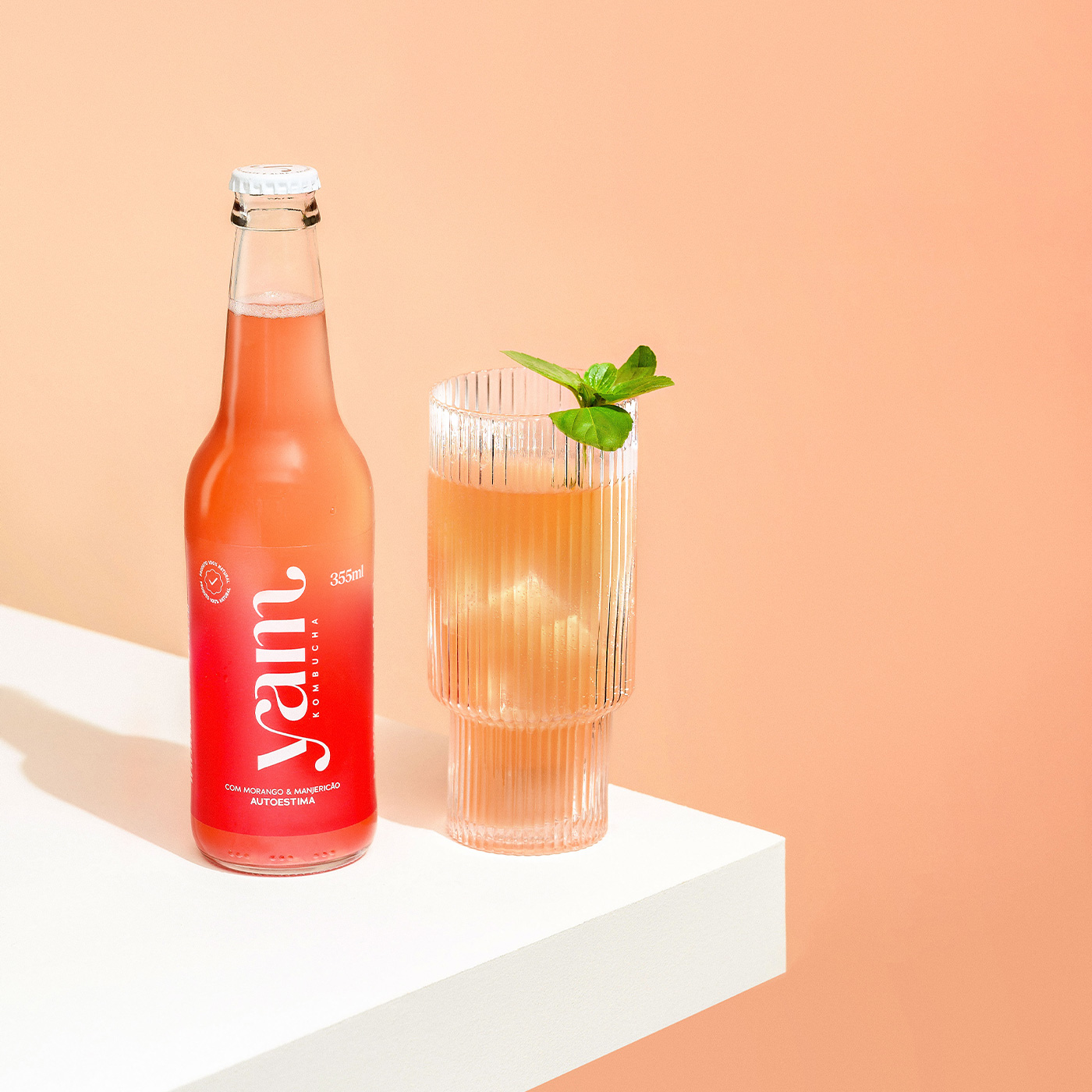
The redesign of Yam Kombucha’s packaging was designed so that the label color of each of its 8 flavors would blend differently with the unique coloring of each liquid. Thus, it was possible to achieve a visual effect that reverberates the characteristics of lightness and balance between body, mind and soul presented in the brand positioning. Under this color gradient, the logo and other information are printed in white silkscreen. On the packaging, the physical and emotional benefits of the ingredients of each flavor are described on the side. This way, the consumer can choose the ideal kombucha for each moment of the day, enjoying a healthy and refreshing drink, which still provides the positive sensations required by the most different routines.
The goal of the project was to rescue the holistic side of the brand, present even in the history of its founders, both holistic therapists. To achieve the project objectives, both commercially and brand-wise, a positioning was developed that presents the healthy characteristics of each flavor of the drink related to specific moments of the day and to the emotional aspects that each of these moments demand: power for a morning of sports; relief for that relaxing hour. This way, Yam is the drink that accompanies you in the small rituals of everyday life, promoting, through its totally organic ingredients, positive sensations that balance body, mind, and soul. A light way to take care for your health, both physical and emotional.
From the new positioning, Yam embraced its holistic side, changing the names of its flavors and also packaging, which were developed soon after the development of the strategy. With clearer positioning, Yam opened its market through new points of sale, which now go beyond natural product stores, currently reaching markets, convenience stores, pharmacies and gyms. In less than six months, the company had a significant increase in sales and orders, including outside the state of Rio Grande do Sul.


CREDIT
- Agency/Creative: Ismo Design
- Article Title: Yam Kombucha Packaging Redesign by Ismo Design
- Organisation/Entity: Agency
- Project Type: Identity
- Project Status: Published
- Agency/Creative Country: Brazil
- Agency/Creative City: Porto Alegre
- Market Region: South America
- Project Deliverables: Art Direction, Brand Design, Brand Redesign, Brand Strategy, Branding, Packaging Design, Product Photography, Rebranding
- Industry: Food/Beverage
- Keywords: Kombucha
-
Credits:
CEO: Caroline Campos


