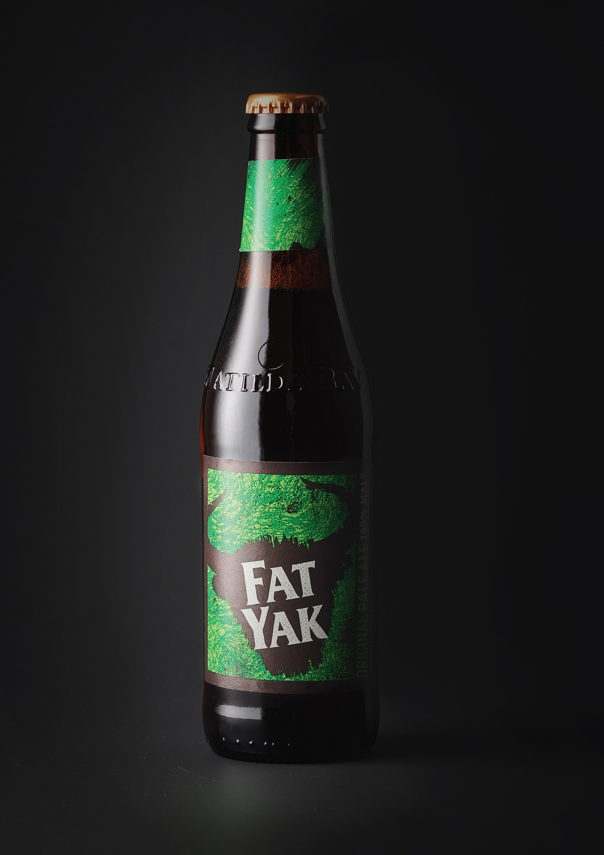
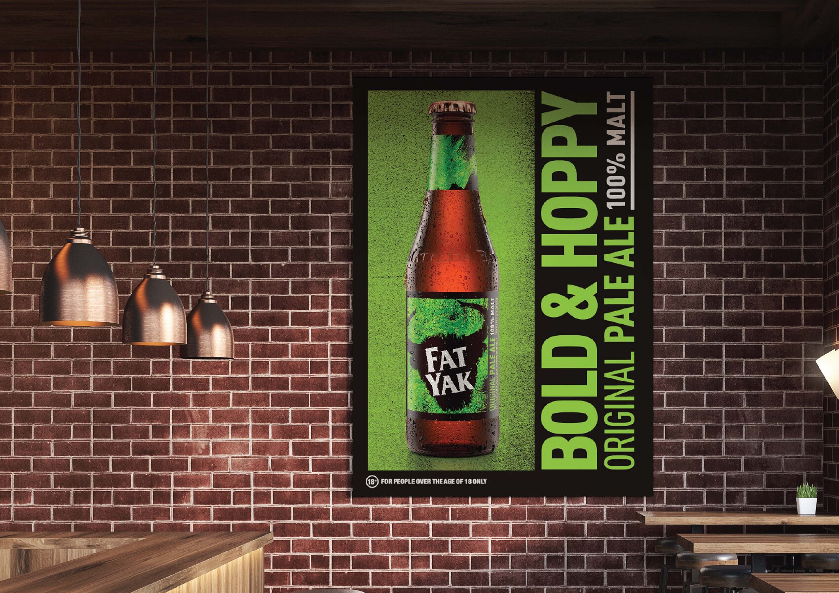
A different breed of craft beer.
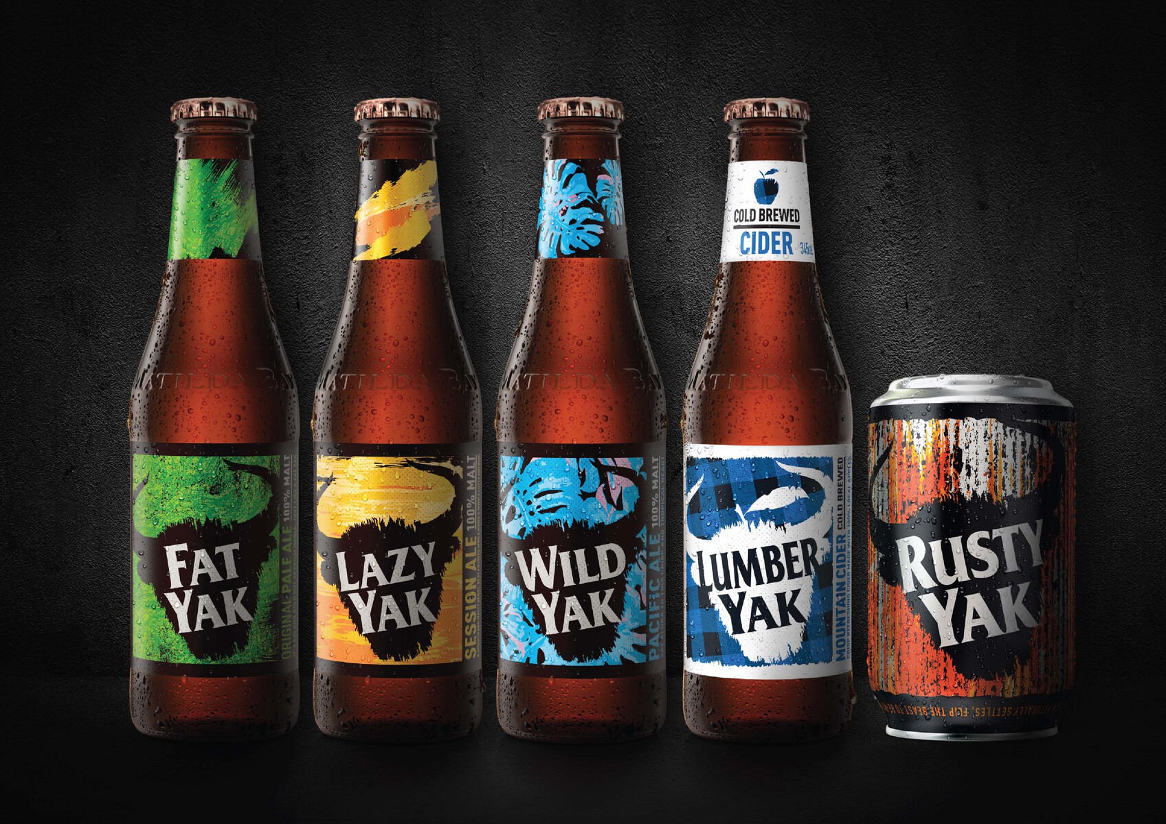
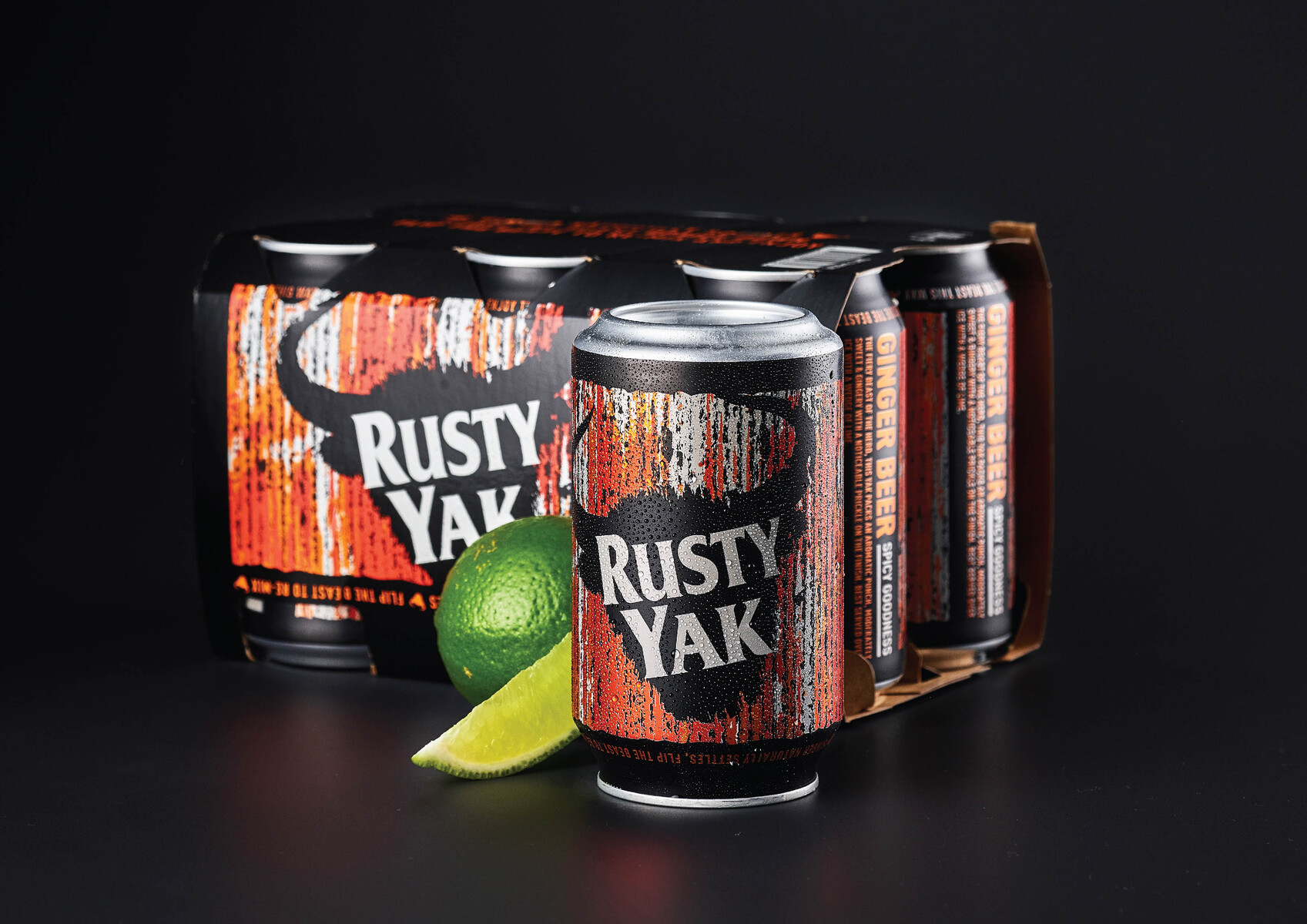
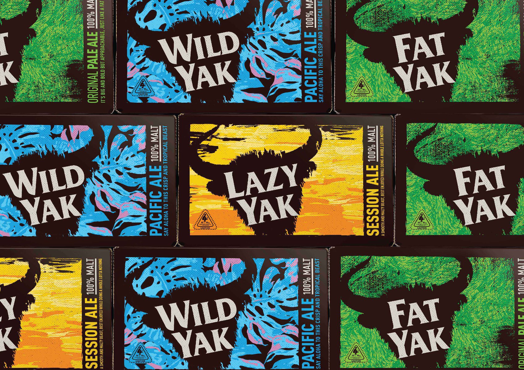
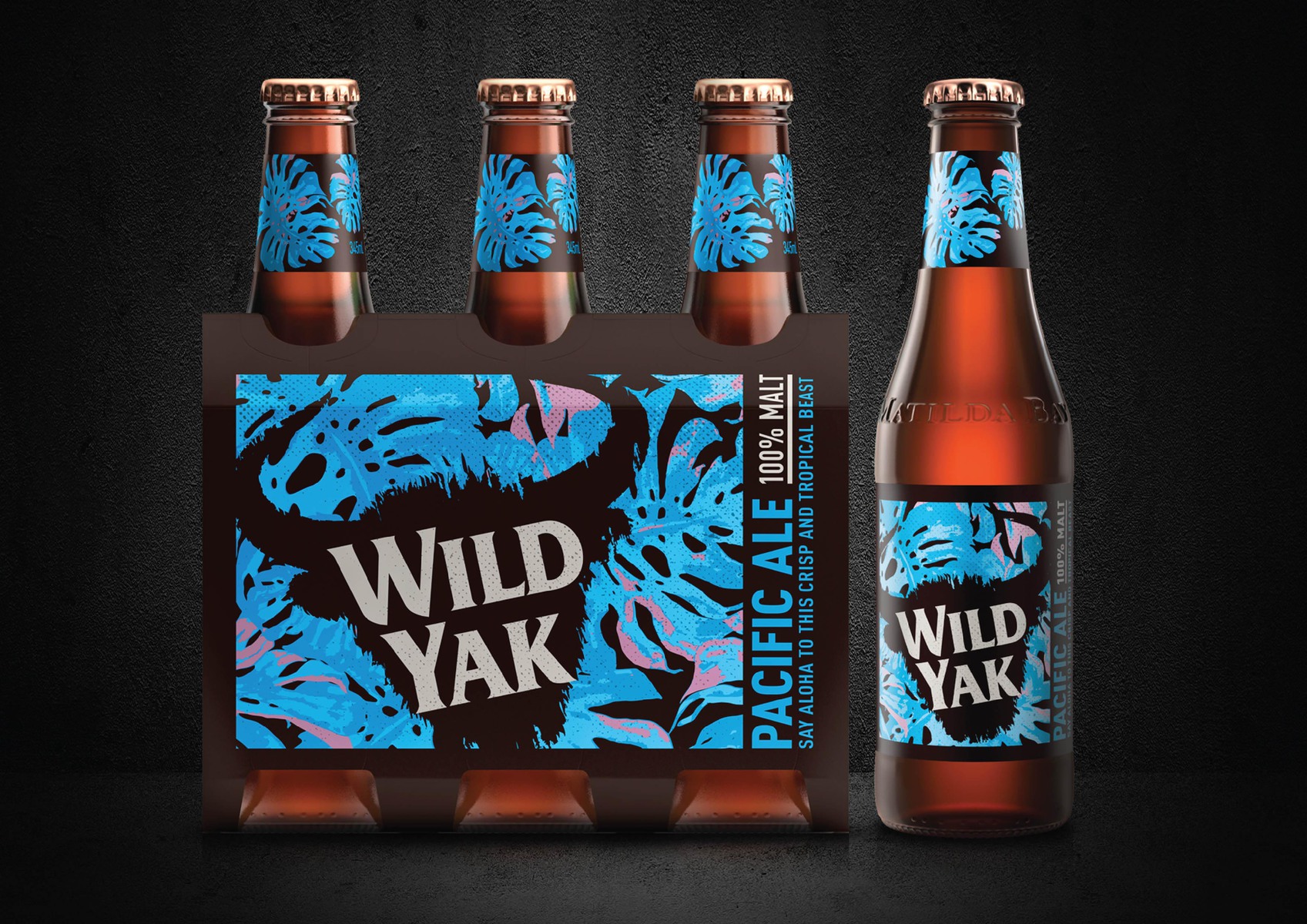
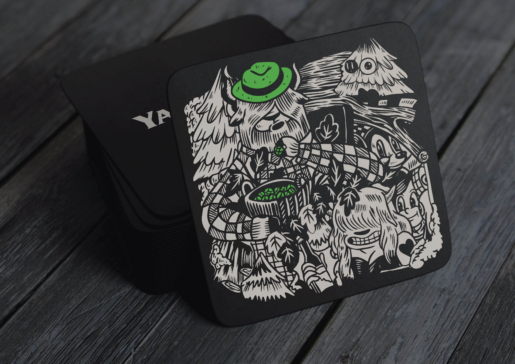
WCN_ led the way, creating ‘a different breed’ of craft beer brand for Australia’s original craft beer brewer, bringing some much needed humour to a category that traditionally had taken itself pretty seriously. Strong visual iconography was designed with the Yak at its heart, allowing it to cut through the noise of the competition giving the brand an unmissable icon that could constantly evolve and continually build interest from within. With an architecture that allows individual brew personalities to come out, the brand can easily create new products and experiences that deliver to the ever changing tastes of consumers within a powerful family feel.
CREDIT
- Agency/Creative: WhatCameNext_
- Article Title: Yak Ales A Different Breed of Craft Beer
- Organisation/Entity: Agency, Published Commercial Design
- Project Type: Packaging
- Agency/Creative Country: Australia
- Market Region: Oceania
- Project Deliverables: Brand Advertising, Brand Architecture, Brand Guidelines, Brand Identity, Brand Redesign, Brand Refinement, Brand Rejuvenation, Brand Strategy, Branding, Graphic Design, Identity System, Illustration, Packaging Design, Product Naming, Rebranding, Tone of Voice
- Format: Bottle, Can, Case, Wrap
- Substrate: Glass Bottle, Metal, Pulp Board, Pulp Carton
FEEDBACK
Relevance: Solution/idea in relation to brand, product or service
Implementation: Attention, detailing and finishing of final solution
Presentation: Text, visualisation and quality of the presentation


