


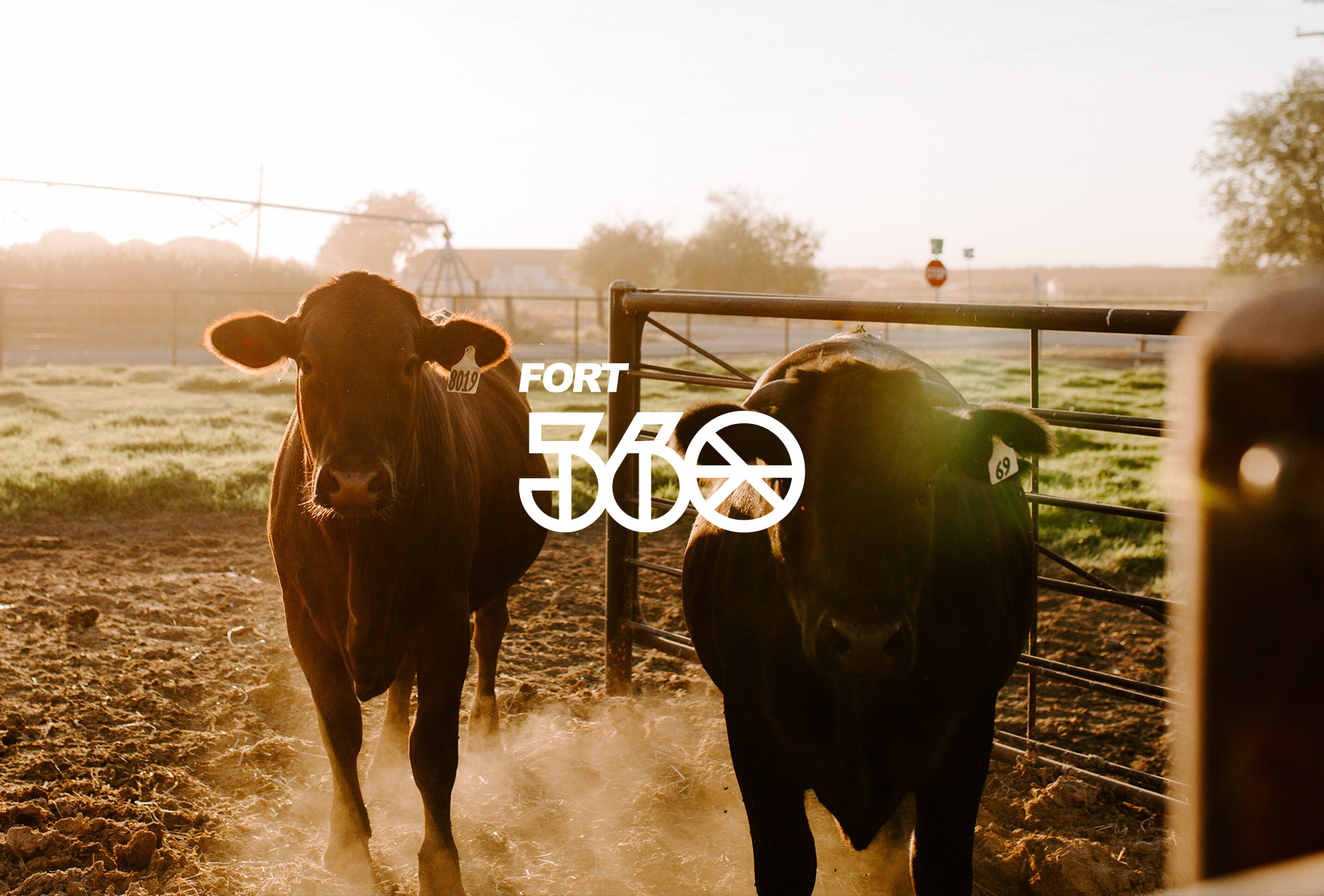
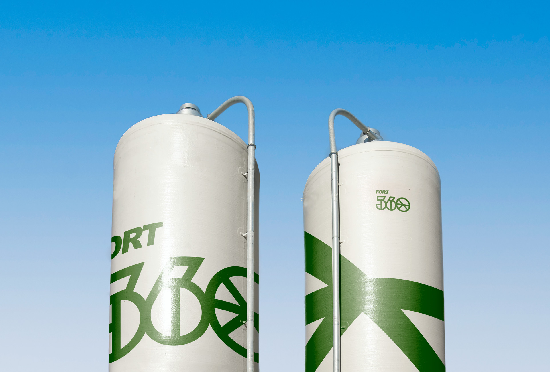
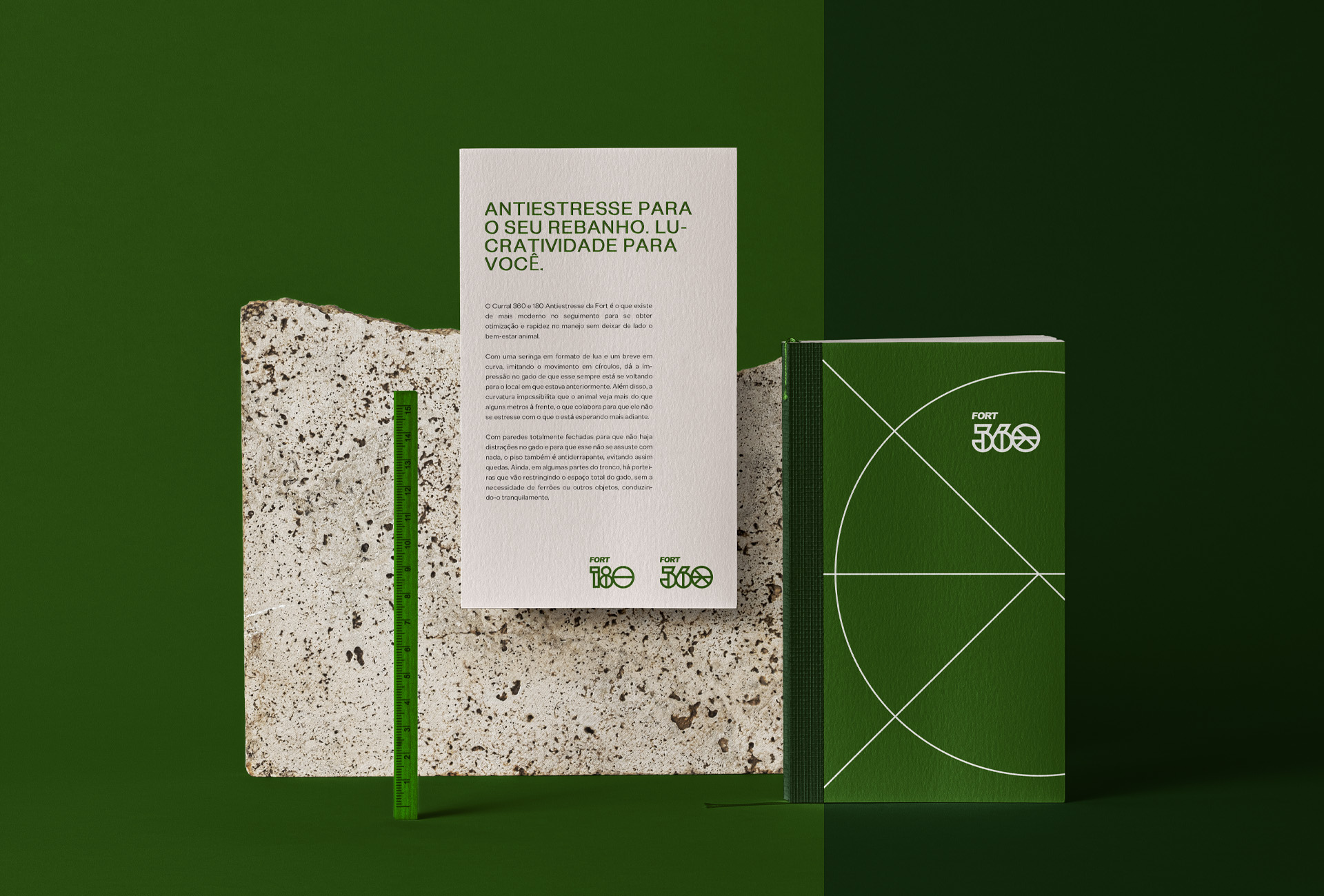
Fort360/Fort180 Branding & Visual Identity. Curral 360 and 180 Anti Stress of Fort is the most modern in the follow up to obtain optimisation and speed in the handling without leaving aside the animal welfare.
With a syringe in the shape of a moon and a short one in a curve, imitating the movement in circles, it gives the impression to the cattle that it is always turning to the place it was previously. In addition, the curvature makes it impossible for the animal to see more than a few meters ahead, which helps it not to stress with what is waiting for it further ahead.
With totally closed walls so that there are no distractions in the cattle and so that they are not scared of anything, the floor is also non-slip, thus avoiding falls. Still, in some parts of the trunk, there are gates that restrict the total space of the cattle, without the need of stings or other objects, driving them calmly.
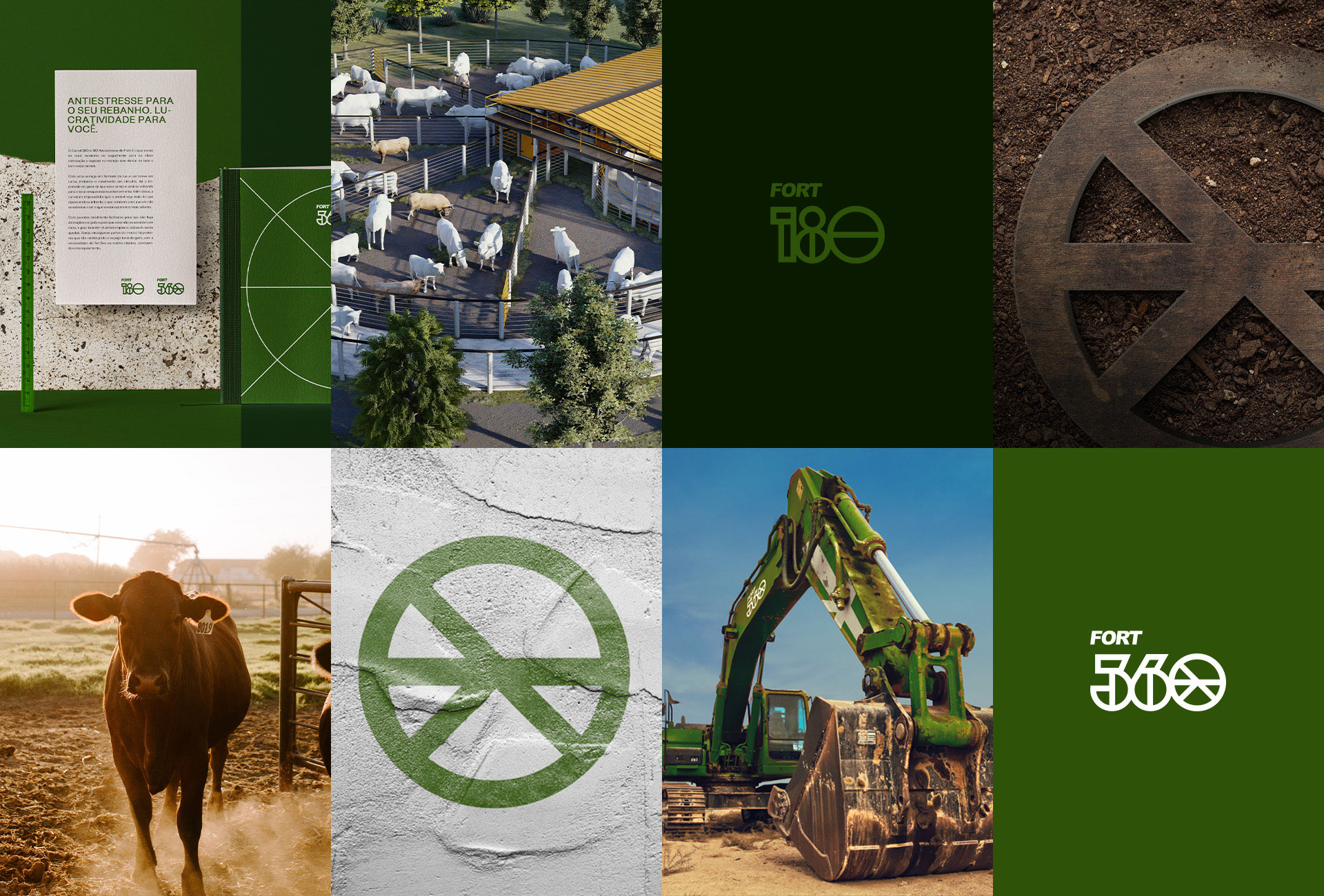
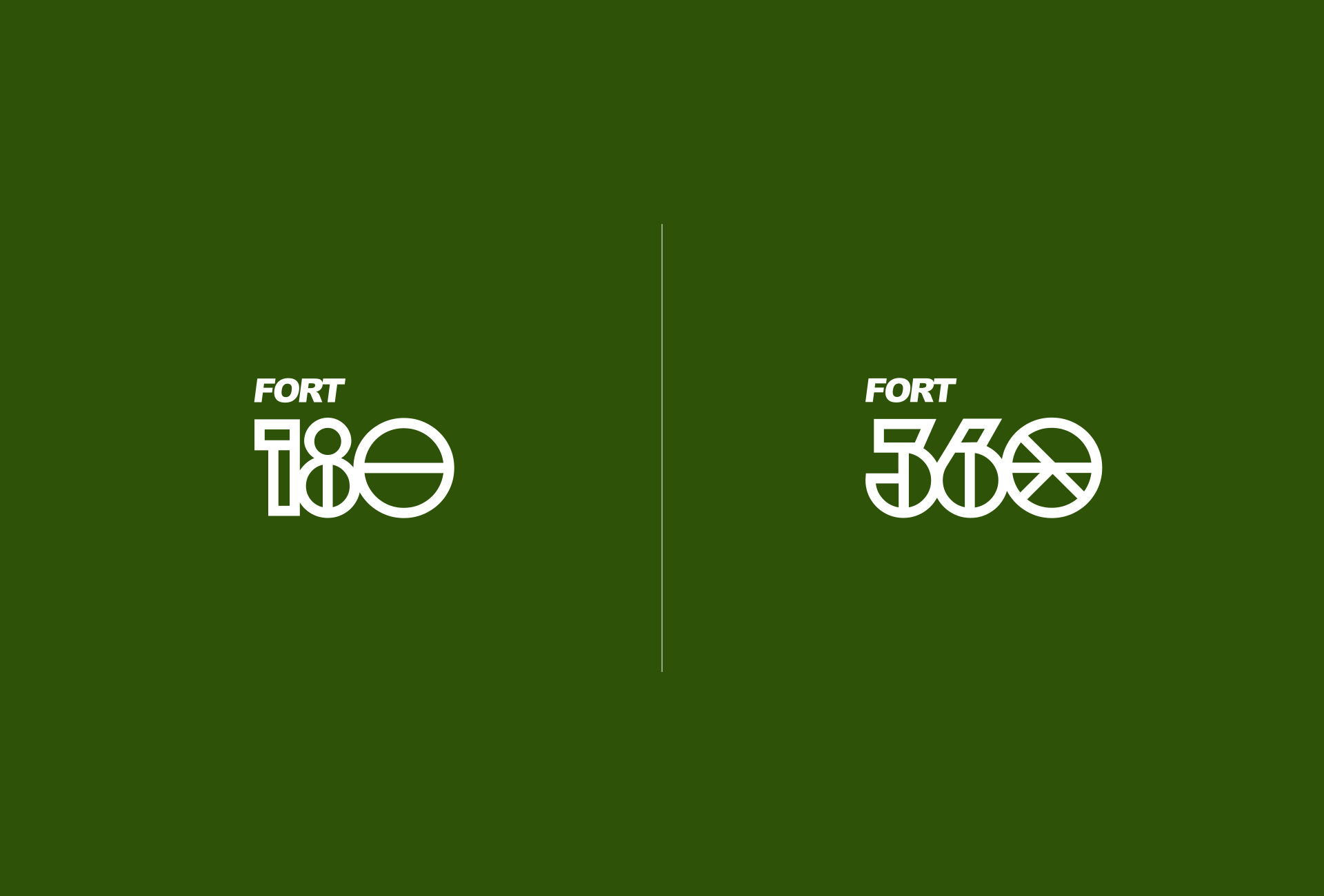
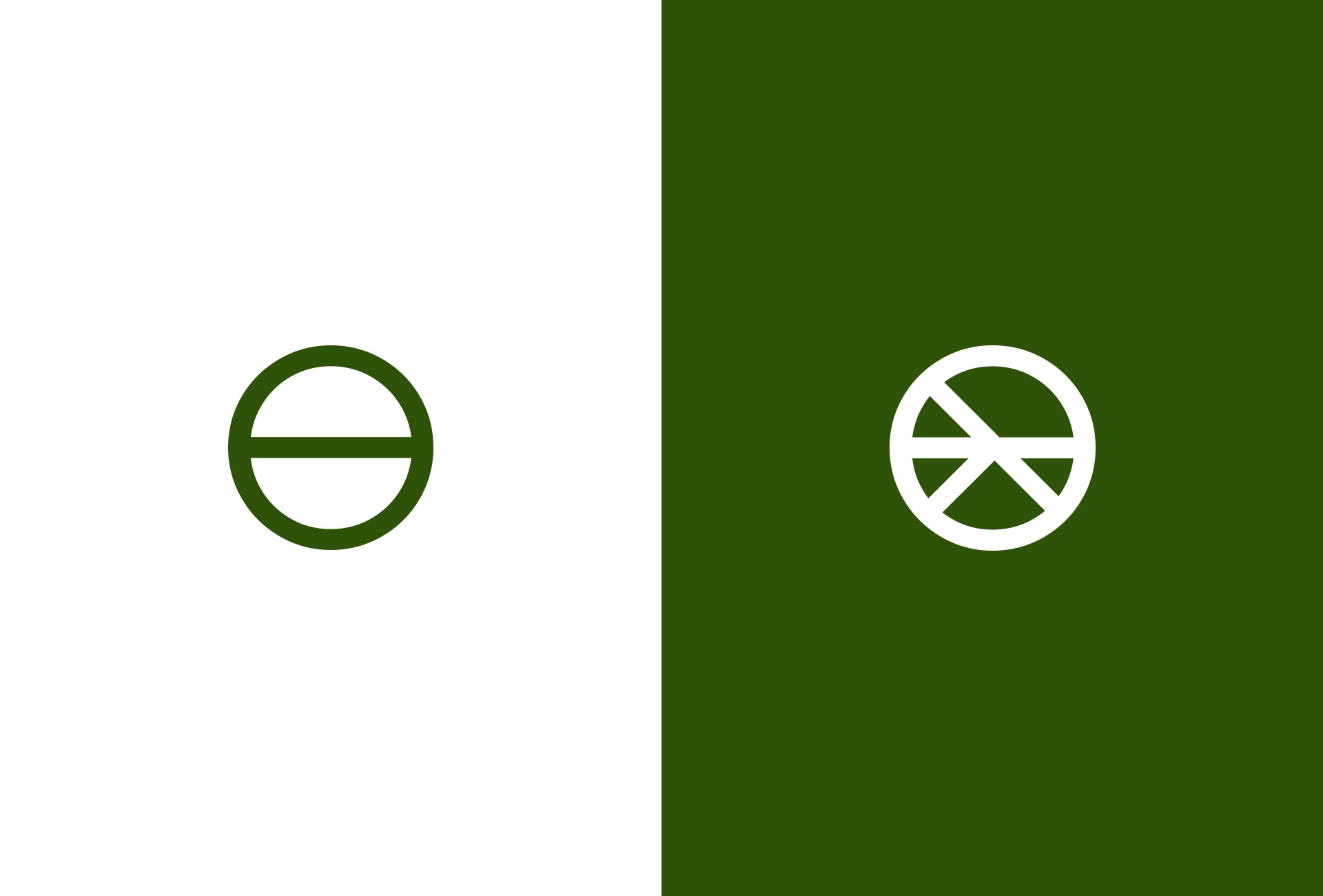
The symbols: Thinking about the easy recognition and aiming to stand out in the market, the idea of ultilising the forms and structure as the main element of identity. Inspired by the architecture and forms as circles, bars and rectangles were born
the symbols “Curral 360” and “Curral1 80”.
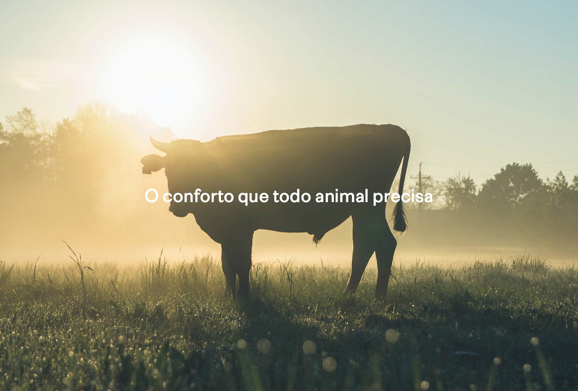
The colour palette: The main inspiration for choosing green were the pasture fields. The green brings sensations such as calm, tranquility, peace, health and life, sensations that go from meeting some central pillars of the brand, such as respect for animals.
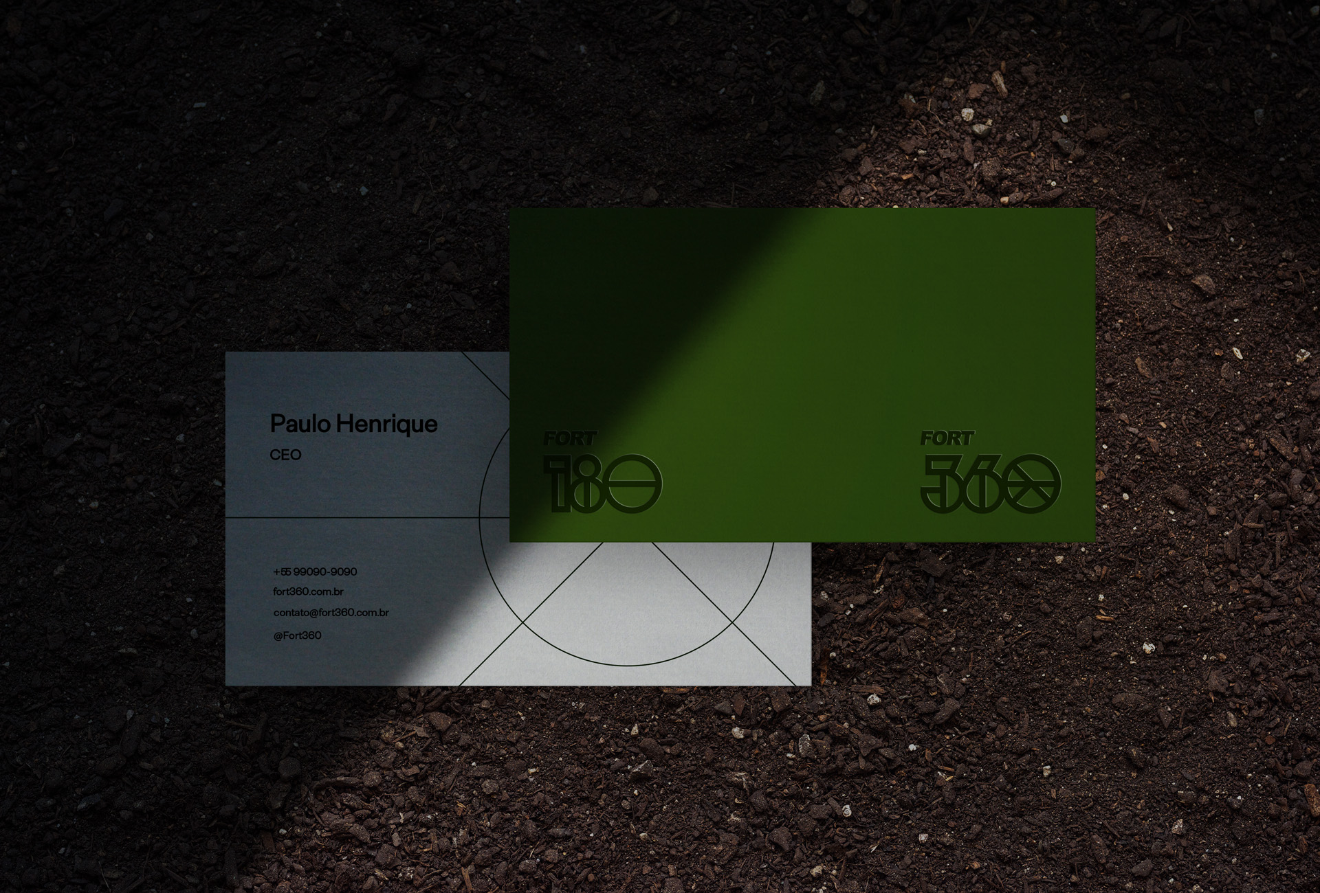
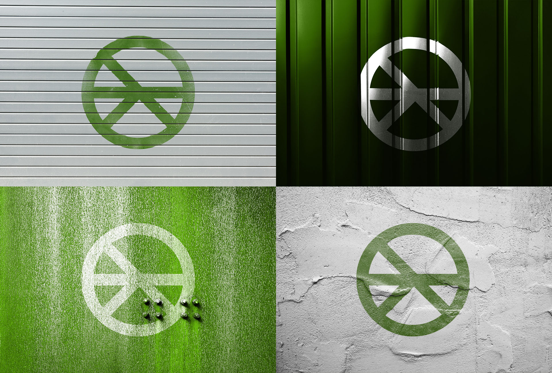
The Graphics: The development of the graphics was thought to support the logo, the idea is to create a wide variety of applications. Besides also making reference to the structure of the corrals.
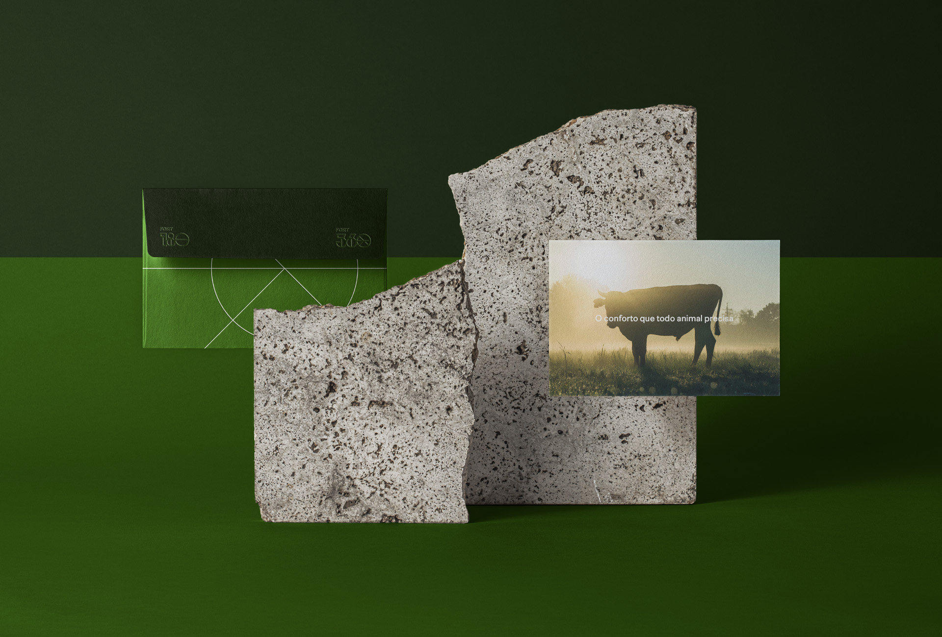
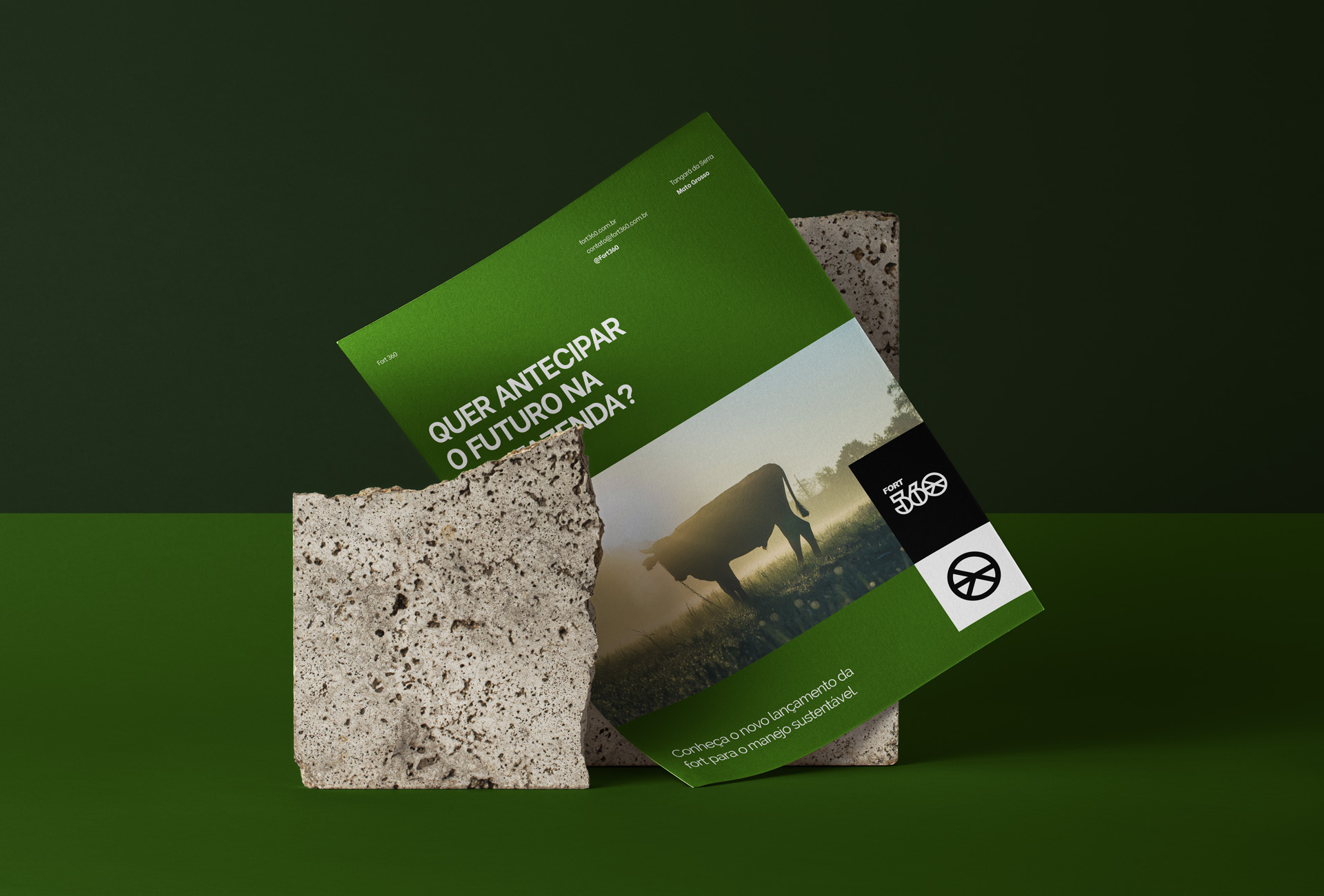
Social Media: As well as support materials such as folder, fleet adhesives and stationery in general. The social network layouts were designed to work “clean” and directly. The pieces are focused on conveying the importance and added value that anti stress corrals bring as an investment.
The Perception of Value through Identity: The joining of all the pieces forms a concise and attractive visual identity, since the choice from typography to images and graphics, everything was thought to generate an easy recognition by direct and indirect consumers of the Fort brand.

CREDIT
- Agency/Creative: Yago Ferreira Design
- Article Title: Yago Ferreira Design Creates Branding for Fort 360
- Organisation/Entity: Freelance, Published Commercial Design
- Project Type: Identity
- Agency/Creative Country: Brazil
- Market Region: South America
- Project Deliverables: Brand Design, Brand Identity, Branding, Graphic Design, Research
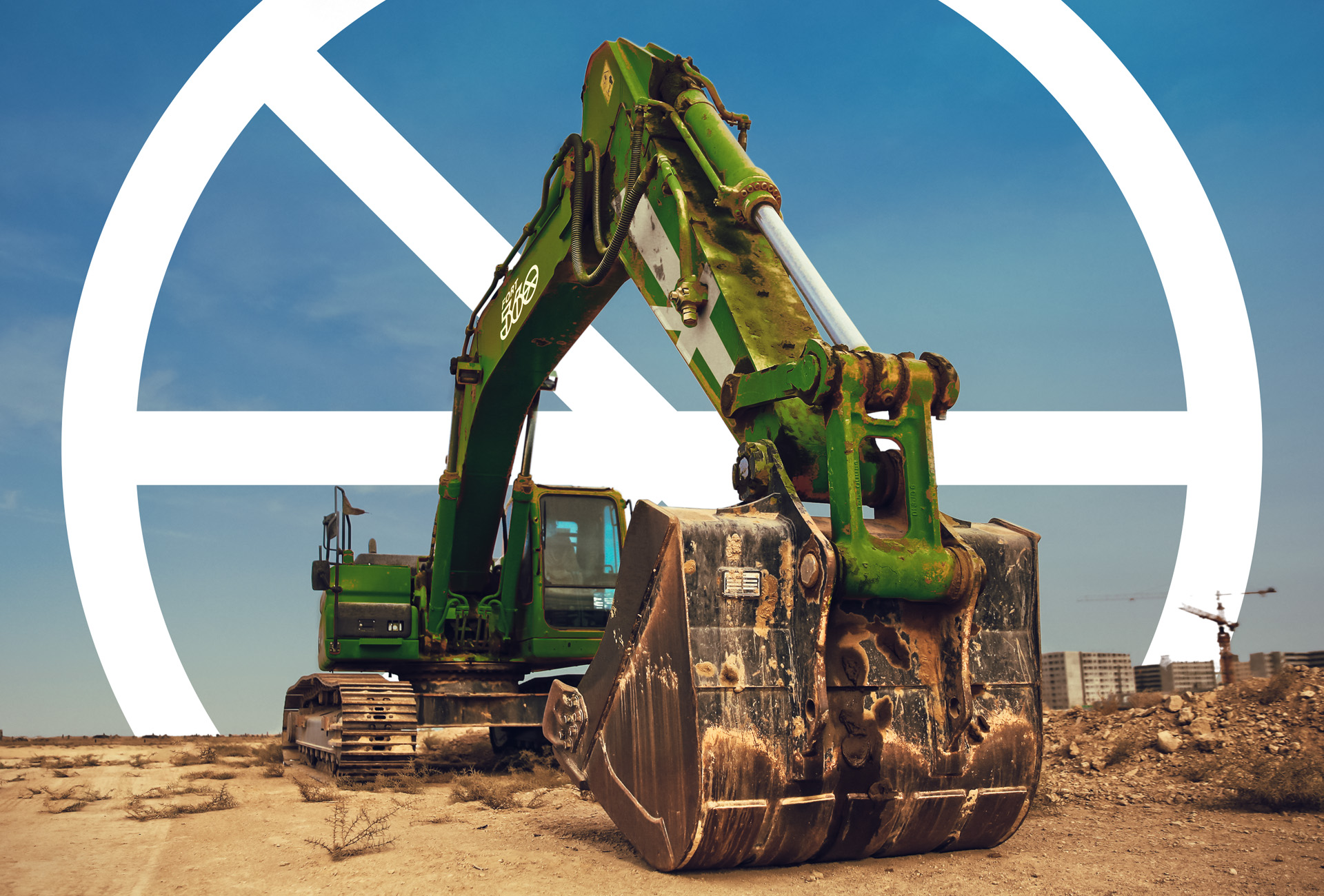
- Industry: Construction
- Keywords: Construction, Visual Id, Agro


