When beverage innovators SIP Ventures came to us to help launch their newest product we were intrigued, to say the least. It was brave. It was bold. It was…milk made from yeast by-product.
Sure, it has an off-beat first impression, but Y Milk is on the frontier of a new age of food products bypassing waste by harnessing by-products. In creating Y Milk, SIP Ventures turned potential waste into something frothable, with a good source of dietary fibre and protein, and perfect to pair with coffee. They were all set to launch a trial into select cafés within the inner north—but first, they needed to figure out their creative strategy and branding.
SIP Ventures knew they wanted to target alt milk drinkers, because they’re fickle. Market research shows alt milk drinkers are most likely to experiment with and switch to new milks. They also wanted to tap into inner north coffee culture, highlighting the milk’s barista approval to communicate its performance and taste. Our branding work needed to appeal to this niche; lucky we have our fair share of Fitzroy-adjacent coffee “connoisseurs” (read: snobs) on the team.
But how to name such a thing? We knew we needed to name both the category and the product in one stroke of the pen. We landed Y Milk—simple, clean, recognisable.
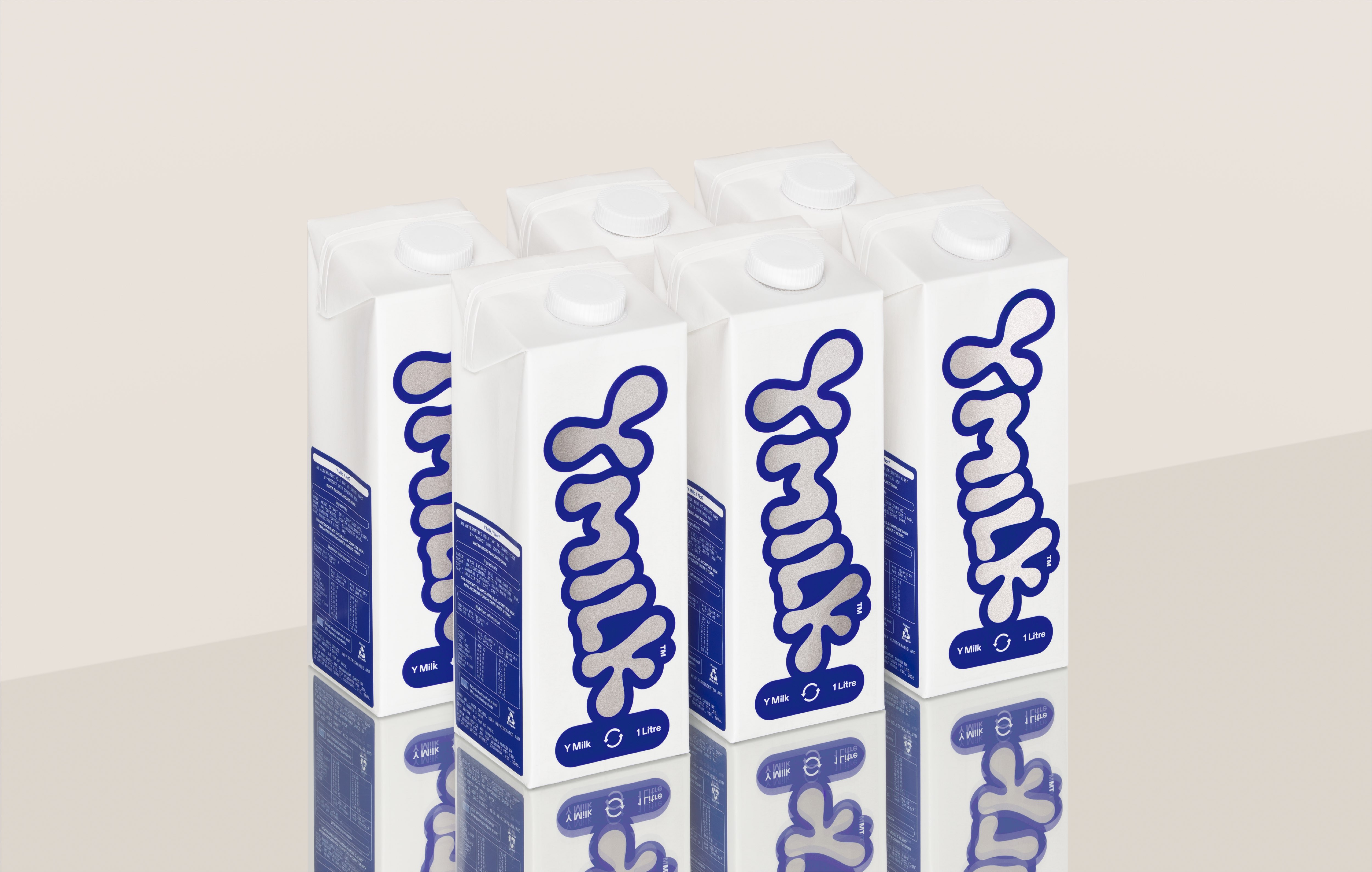
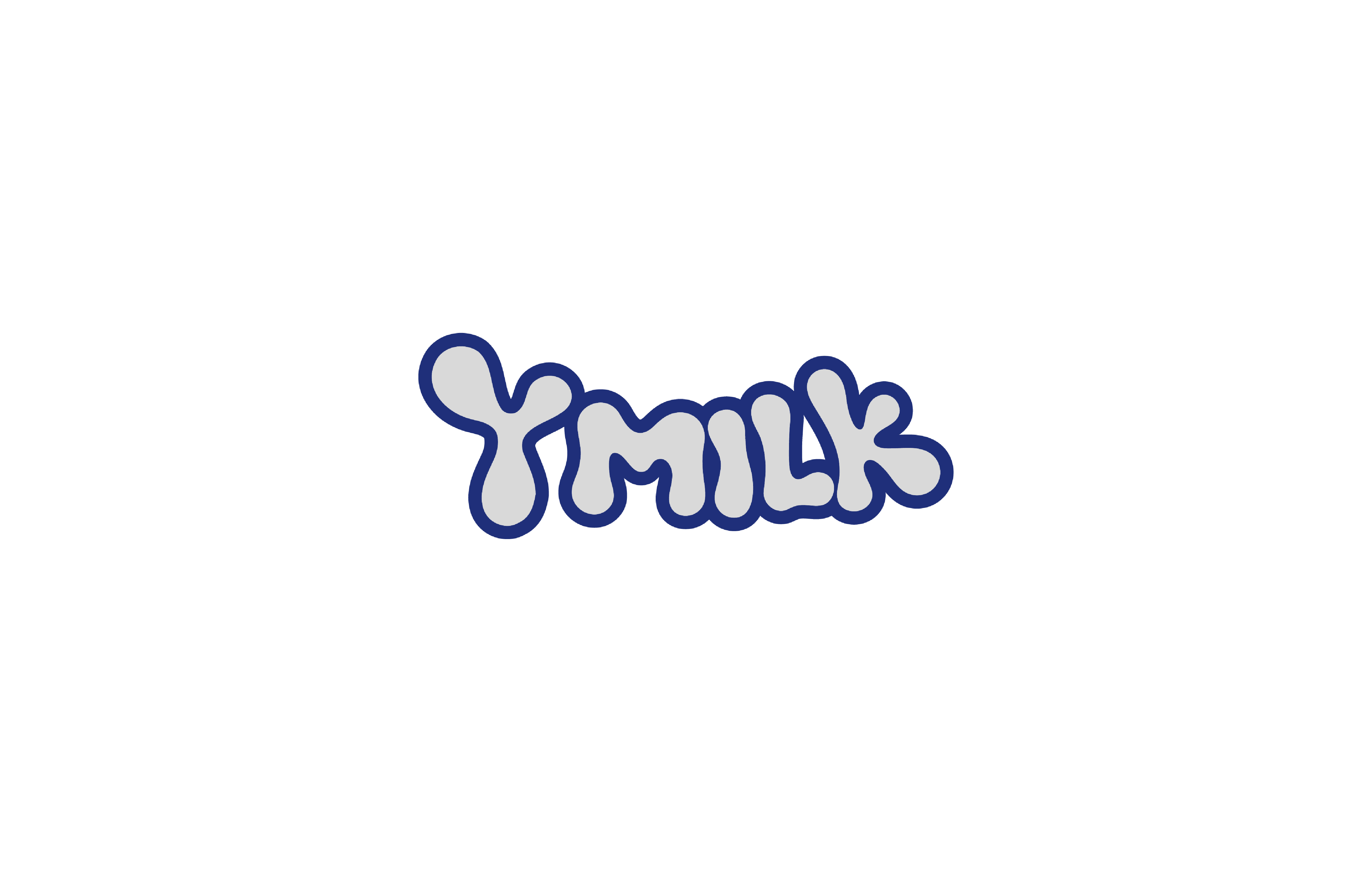
If you’ve got a name, you need a logo. We whipped one up. It employs traditional dairy cues of blue and white, but modernised with touches of chrome and an irregular word mark reminiscent of milky fluid. Most importantly, it makes a bold statement on pack. We designed an oversized logo sticker and branded nutritional information panel that would be stuck on plain tetrapaks. The effect is hand-applied, which reads small scale and endearing, but with the chrome and font cueing futuristic.
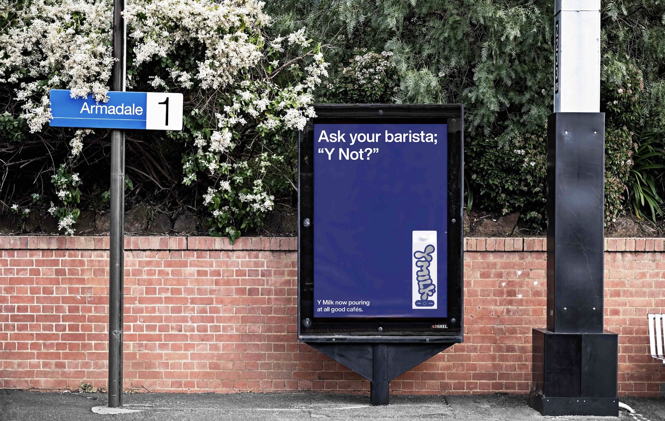
The tagline ‘Y Not?’ is an intentional provocation. It fell intuitively out of the daring product and philosophy and acted as a platform to launch out-of-home executions. A three-phase rock poster campaign needed to launch the brand’s personality as well as communicate key pieces of information; this is an alt milk, made from yeast by-product, available in cafés, and barista approved. A restrained design approach for these posters allows the packaging to take centre stage and lets the staccato tone of voice sing.
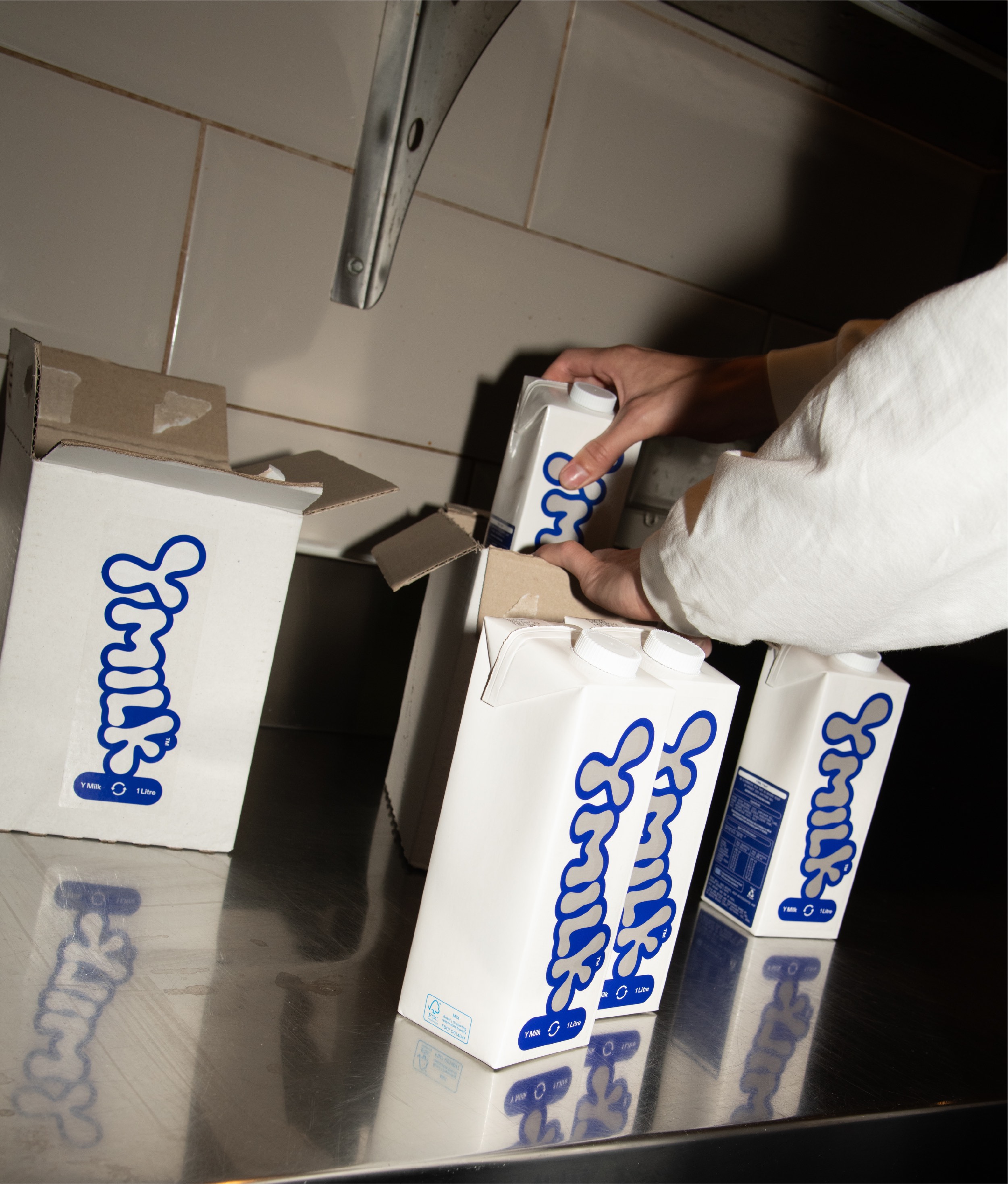
We also art directed both lifestyle and e-commerce shoots. The lifestyle imagery uses high-flash, candid style in a casual café setting to communicate the product’s point of sale with some human warmth. The e-commerce shots use reflective and white surfaces to reinforce Y Milk’s spirit of innovation and future-thinking.
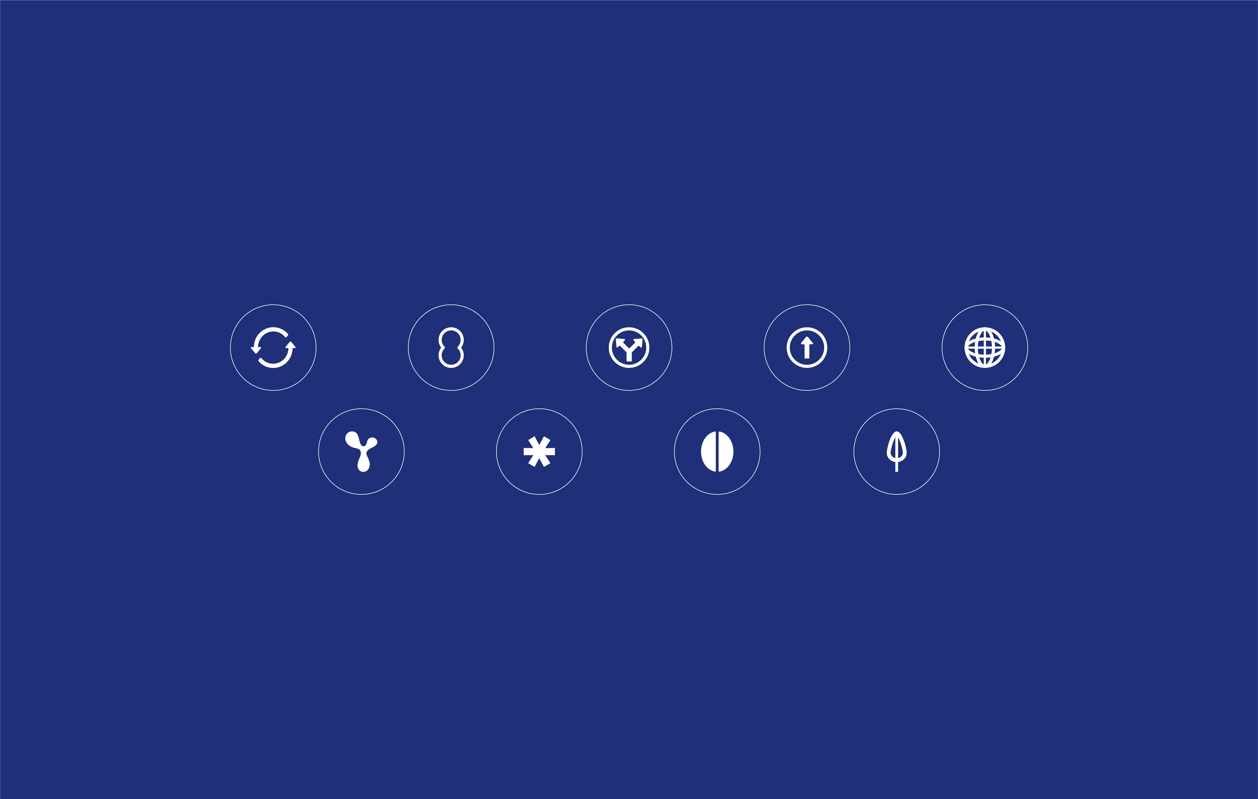
Our social strategy for Y Milk proposed a bespoke mix of current trends and evergreen content to showcase the brand’s mix of wry humour and serious coffee credentials. With educational pieces throughout, and custom-branded icons to communicate the product’s story, the feed is a great landing place for someone whose eye has been caught by the out-of-home materials.
The website was built on Shopify to easily facilitate e-commerce orders, with a cleanly minimalist design to usher the copy and lifestyle images to the forefront.
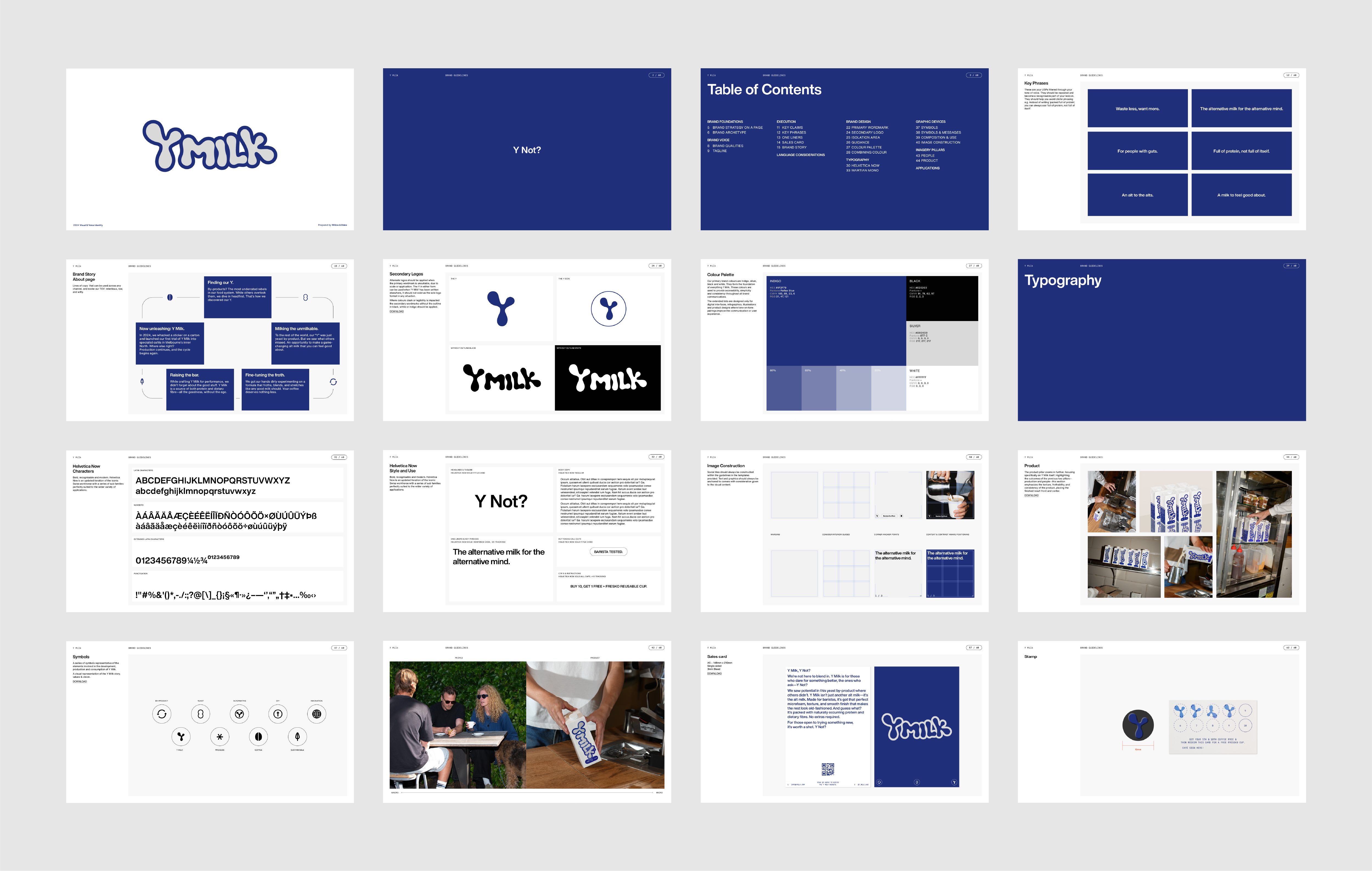
Tying it all up, we created Y Milk’s brand guidelines. A comprehensive document covering the tone of voice, key phrases, icons, colours, photography treatment and more; it’s a brand in 60 pages.
This job was a unique opportunity to oversee a brand from logo to launch campaign. Combining nostalgic dairy cues with a futuristic edge, Y Milk’s identity is set to make a splash (or a spill) on the café scene.
CREDIT
- Agency/Creative: Willow & Blake
- Article Title: Y Milk: Branding a Beverage Innovation with Willow & Blake
- Organisation/Entity: Agency
- Project Type: Identity
- Project Status: Published
- Agency/Creative Country: Australia
- Agency/Creative City: Melbourne
- Market Region: Oceania
- Project Deliverables: Advertising, Brand Guidelines, Brand Strategy, Brand Tone of Voice, Copywriting, Graphic Design, Packaging Design, Photography, Web Design
- Industry: Hospitality
- Keywords: Packaging, brand identity, design, tone of voice, visual identity
-
Credits:
Copywriter: Clare Taylor
Designer: Noah Zawertailo
Account Manager: Maddie Leggo
Account Director: Madeleine Hargreaves
Design Director: Shaun Ponton
Head of Brand Voice: Bri Nixon


