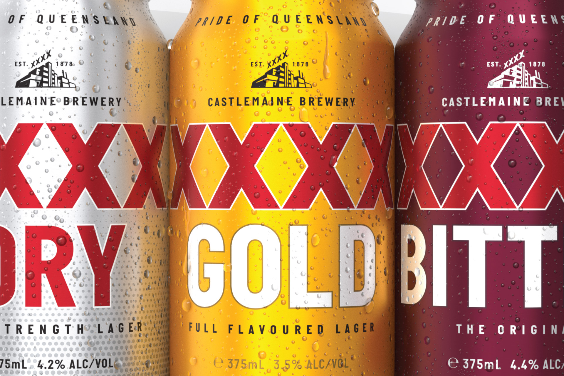
Brief: XXXX is widely acknowledged as Queensland’s most loved brand. Established over 140 years ago, Castlemaine Brewery has become synonymous with Australian beer culture. In 1924, the brewery’s signature drop XXX Sparkling Ale was awarded a fourth ‘X’ for quality, birthing the XXXX brand we know and love today. Ever innovating, the brand has grown and evolved over the years to meet changing consumer needs, while the original recipe for XXXX Bitter has remained consistent since 1924. But as new generations of beer drinkers emerge, how can we refresh the brand identity in a way that respects its rich history while maintaining relevance and appeal to today’s consumer?
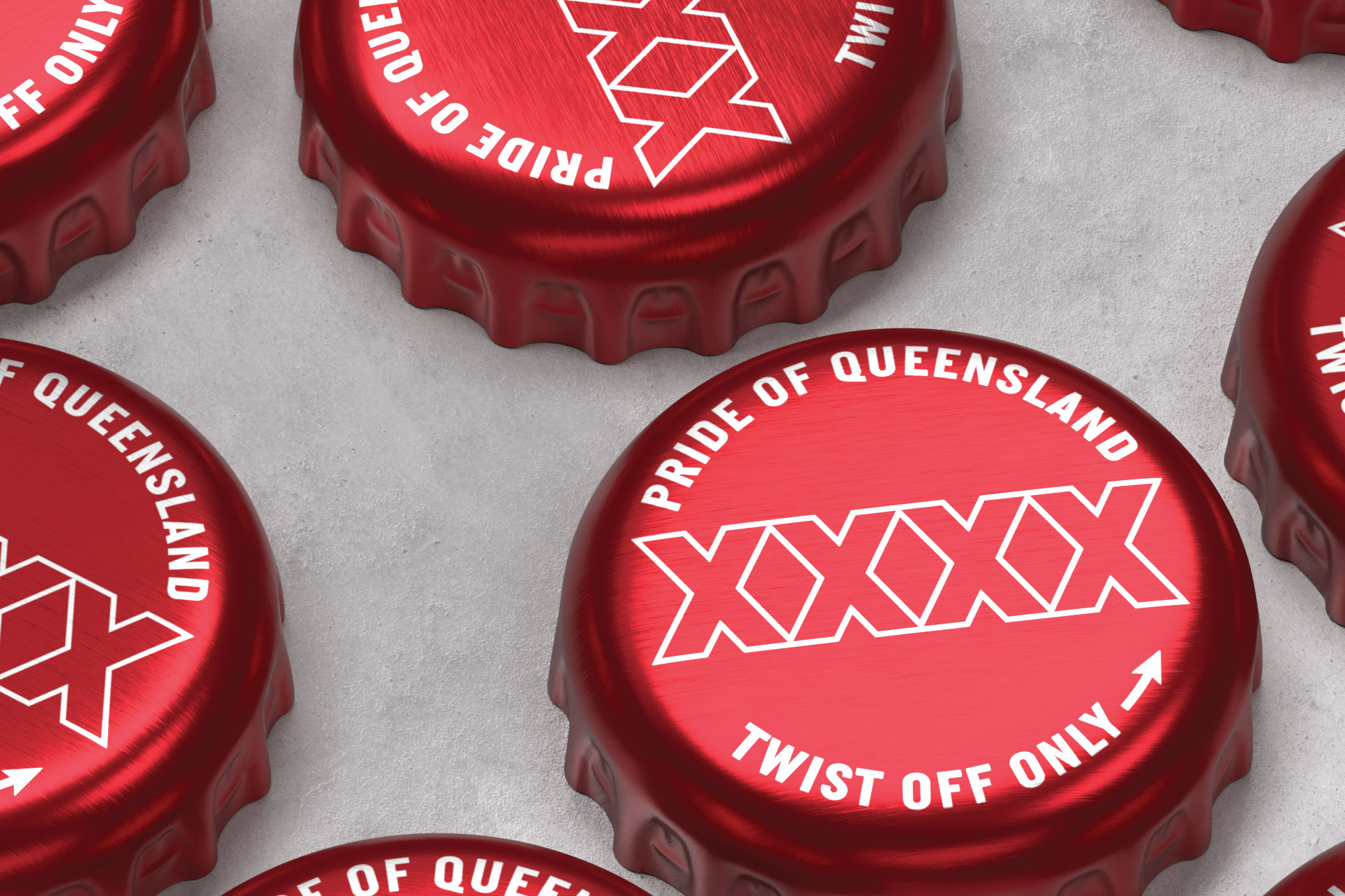
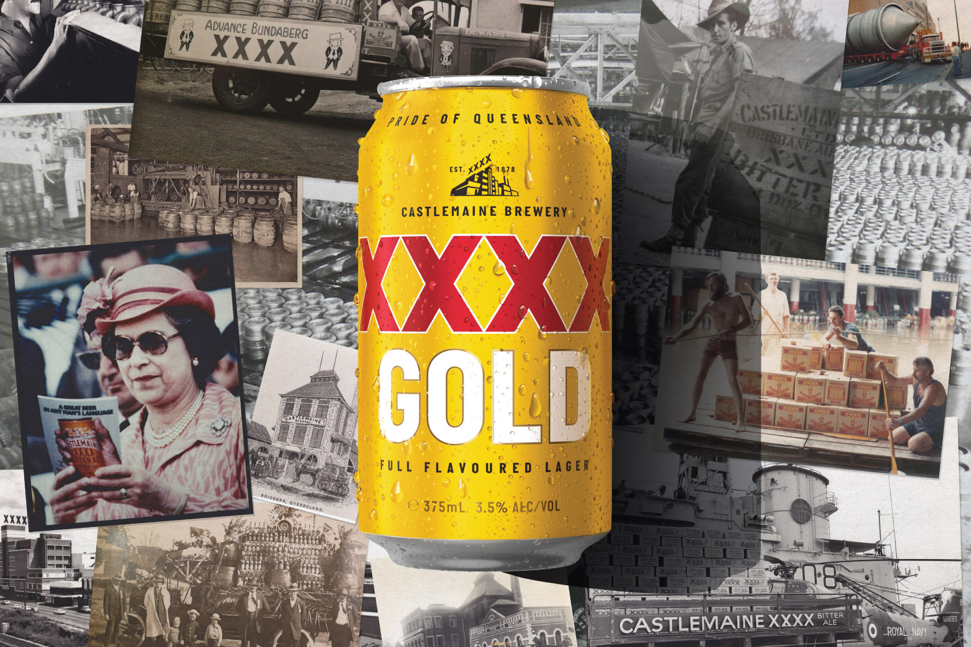
Solution: Through a comprehensive category audit and analysis of the brand, we established a creative territory identified as the best position for the XXXX visual identity to occupy. A simple, modern and fresh take on the rich heritage associated with this beloved Australian brand. We began by decluttering the noise of the existing identity, stripping it right back to allow their most iconic assets to stand proud. A nod to the history, feeling classic but at the same time contemporary. Less colours, less layers, less tricks. More XXXX.
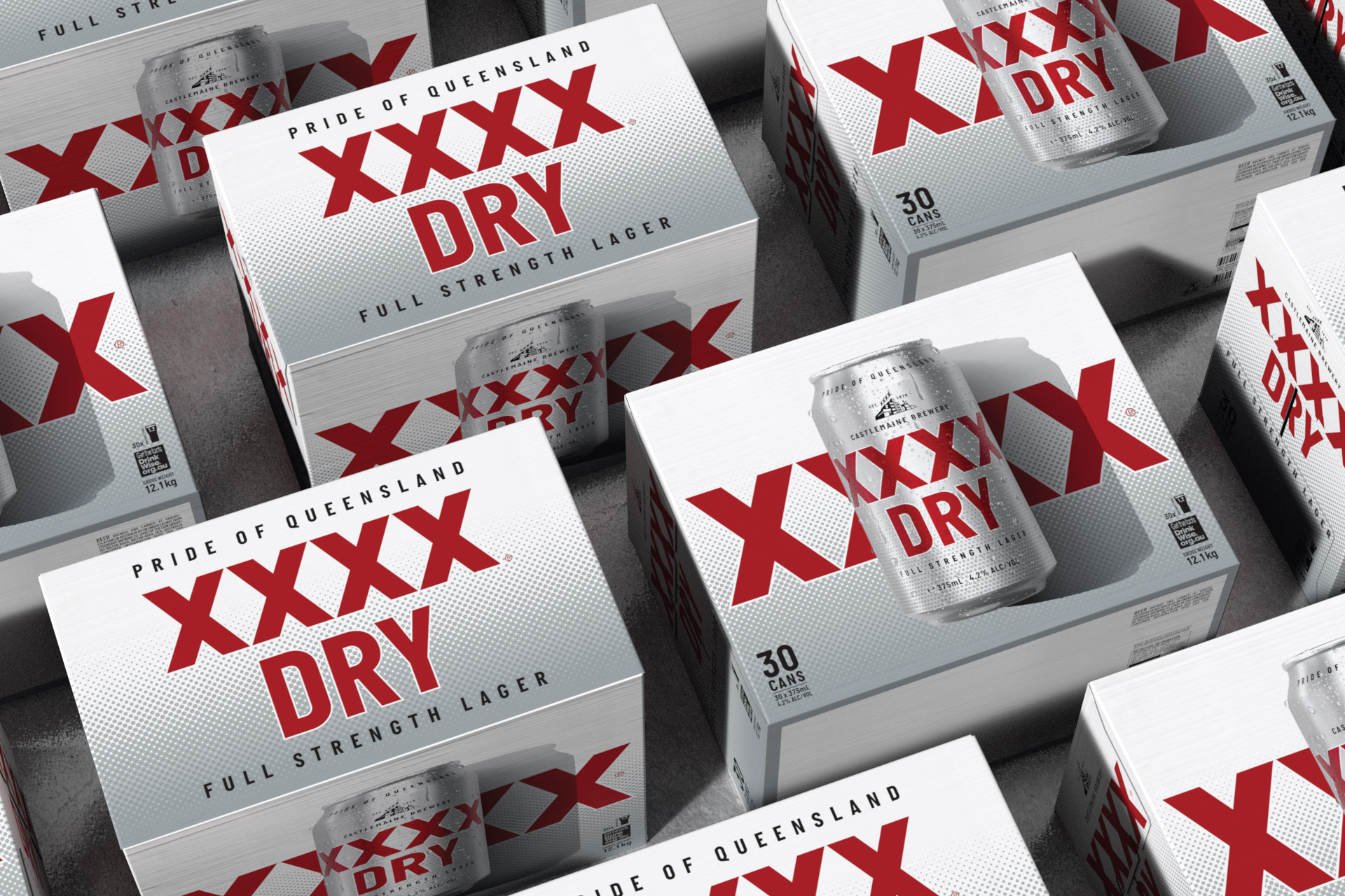
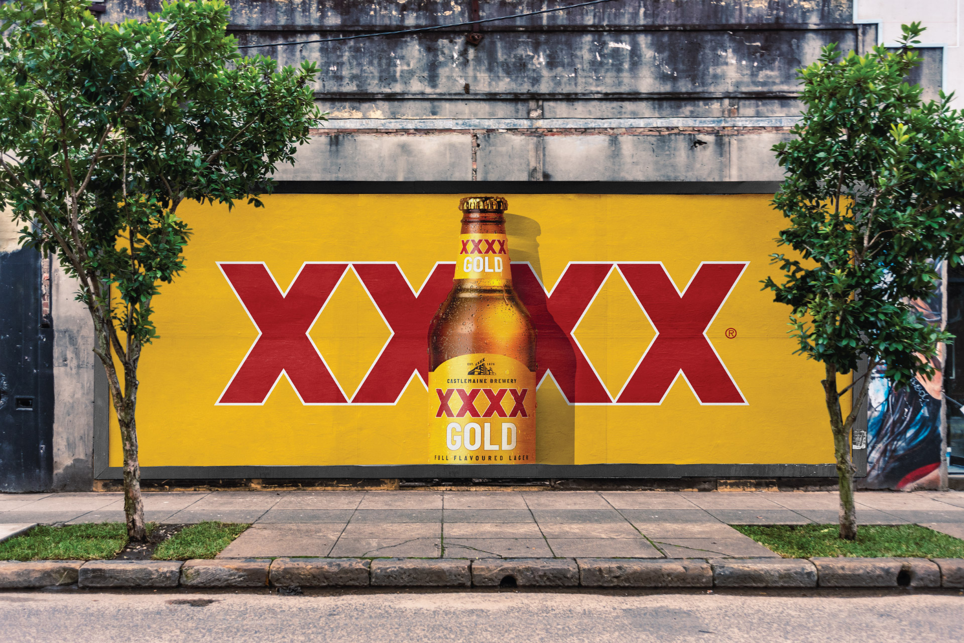
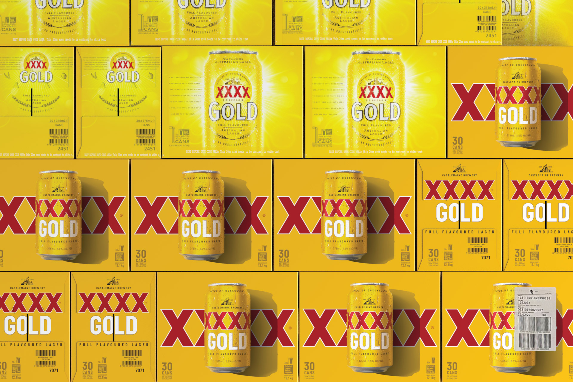
The recrafted XXXX mark holds pride of place on pack, but its scale and position are now bold and unrestrained. Paired with the stripped back palette and single-minded typography; consistency across the range was then the key to optimal distinction of the masterbrand. Inspired by long summer days in the Queensland sun, our distinct shadows and ice cold renders were crafted for the cartons, to cue a sense of place and total refreshment.
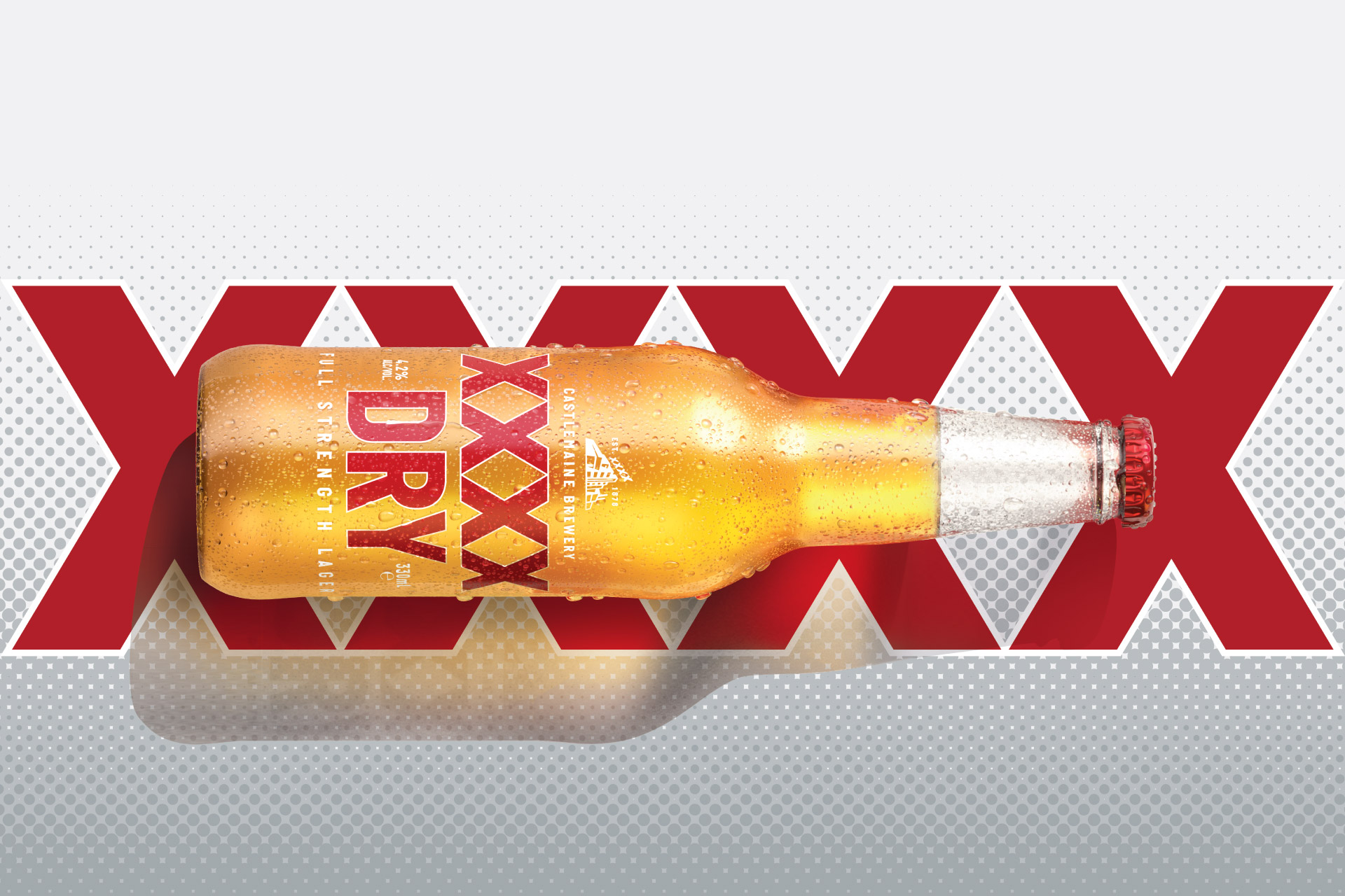
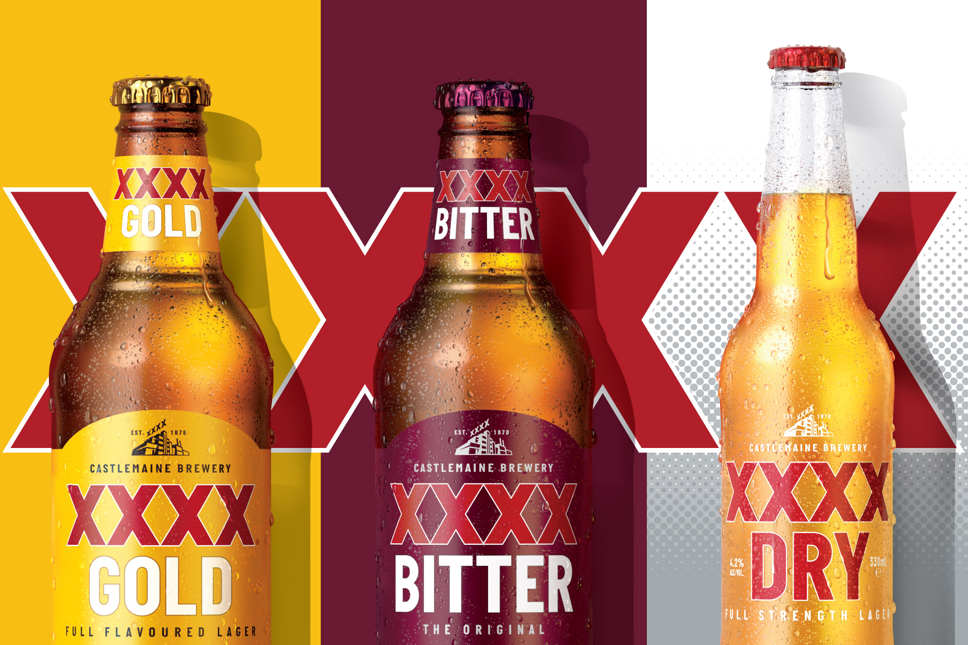
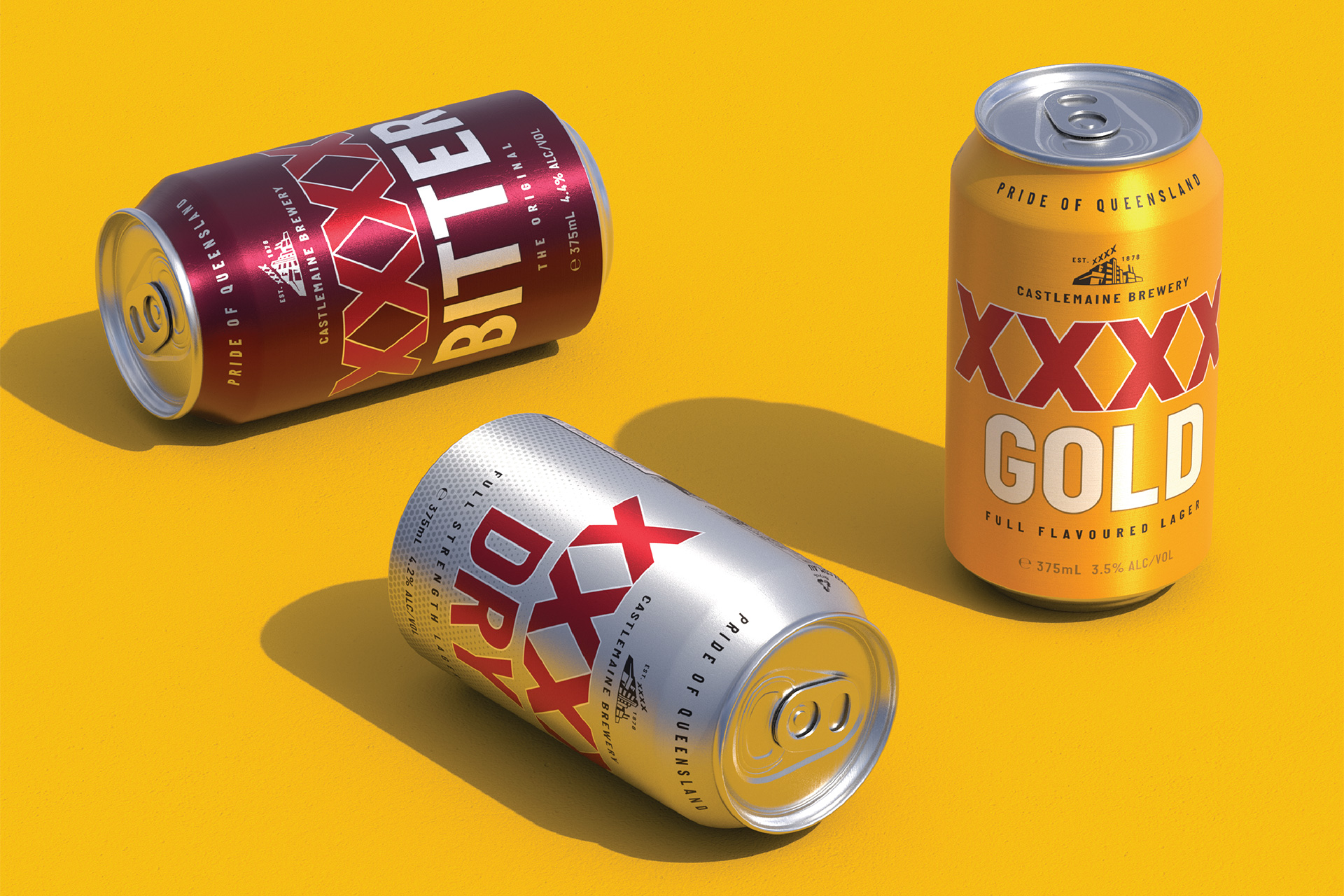
Applying our unique innovation process, we identified a gap in the range for an easy-drinking, refreshing-looking lager that would be more desirable to a new cohort of beer drinkers. Enter XXXX Dry, a full strength yet easy-drinking liquid with a contemporary identity – purposefully aligned to that of the core range. The biggest Australian beer launch in 2020, despite only being available in Queensland and the Northern Territory. Within its first 12 months alone, Dry contributed over $12 million in retail sales to the category, 54% of which came directly from our target audience of 18-34 year-olds.
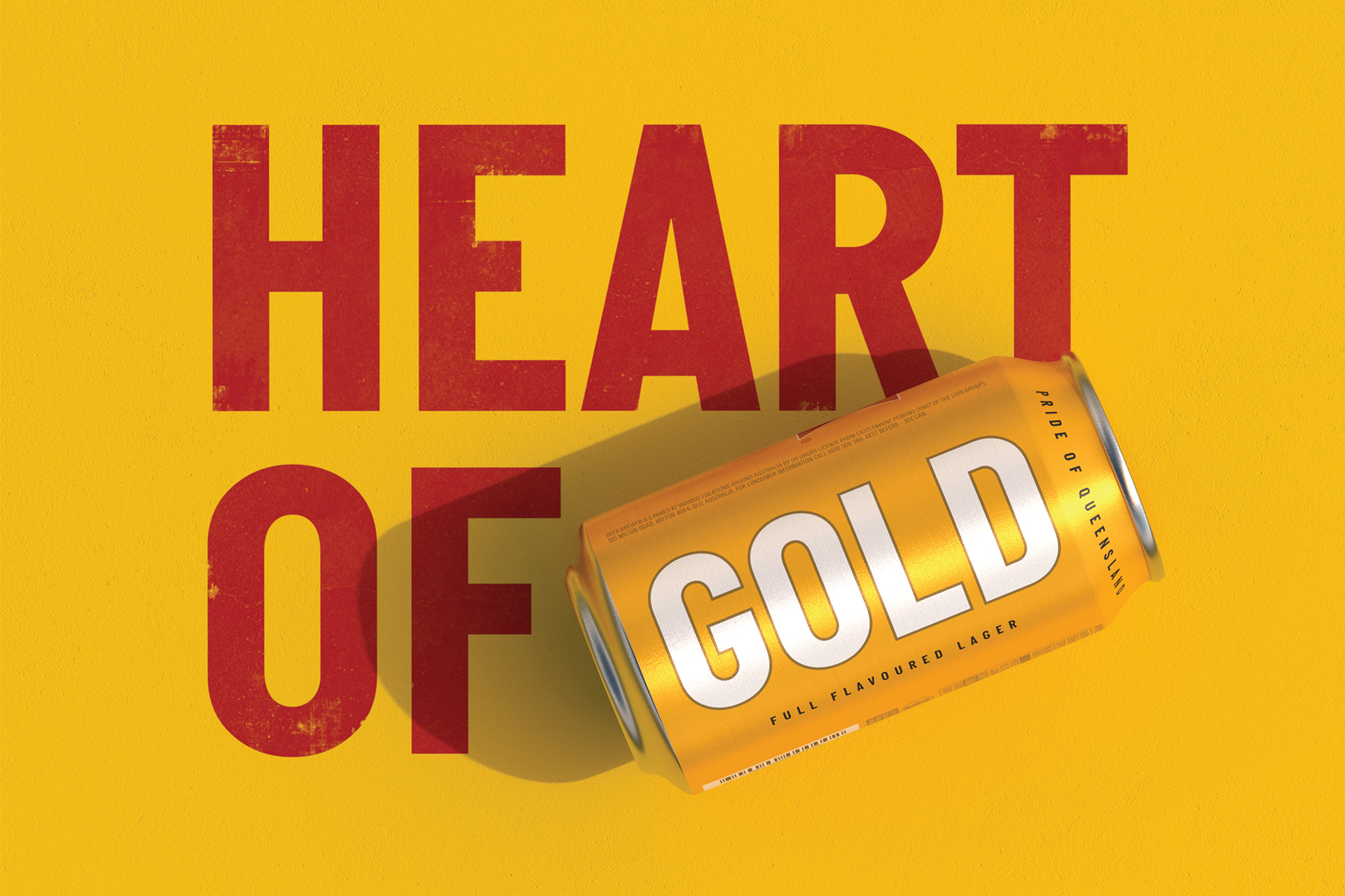
The new XXXX Dry was brought in alongside Gold and Bitter to create an iconic, impactful trio – a XXXX family embodying the ‘Pride of Queensland’.
CREDIT
- Agency/Creative: Landor & Fitch
- Article Title: XXXX Australian Beer Rebranding by Landor & Fitch
- Organisation/Entity: Agency
- Project Type: Packaging
- Project Status: Published
- Agency/Creative Country: Australia
- Agency/Creative City: Sydney
- Market Region: Oceania
- Project Deliverables: 3D Art, Brand Redesign, Design, Identity System, Illustration, Logo Design, Packaging Design, Product Naming, Visualisation
- Format: Bottle, Can, Case
- Substrate: Glass, Metal, Pulp Carton
- Industry: Food/Beverage
- Keywords: beer, australia, rebrand, masterbrand, packaging, can, bottle, innovation
-
Credits:
Executive Creative Director: Giles Day
Design Director: Abi Singmin
Consumer Design Lead: Darren Mulkerrins
Designer: Riley Griffiths
Client Director: Daniel Chambers


