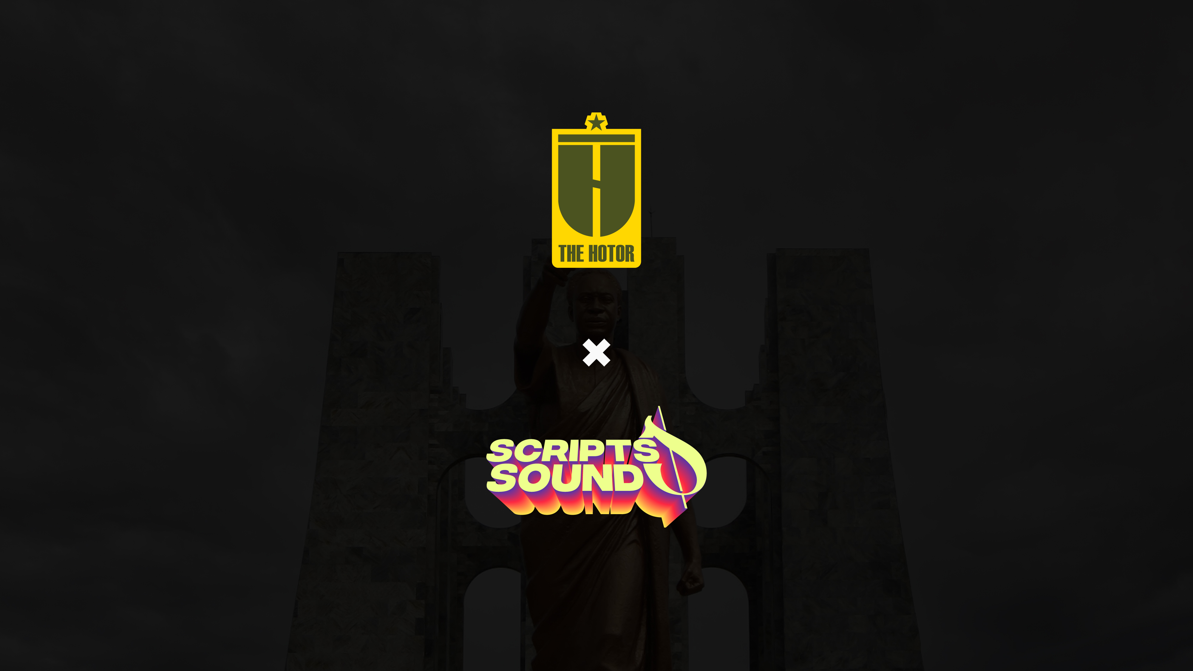
About the Project
The Hotor Entertainments’ core business is producing music concerts and live events. They also provide other services like management, business marketing, and consulting for creatives.
The company was looking to establish itself as an industry leader among its peers by developing an exciting and innovative new identity that fits with its purpose and re-introduces them to its target audience and market.
xtremely Unsual began by establishing a relationship with The Hotor team where we got to know each other better and what they were about as people – this knowledge was key to being able to develop a brand strategy that would resonate with them and their target audience.
After understanding what makes the company tick, we set out to create a new identity system for The Hotor Entertainment that reflected its values while also connecting with its target audience in an engaging way. This new brand positioning allows The Hotor Entertainment stand out from its competitors while still being true to itself as an organization that cares about its clients just as much as it does about creating amazing experiences for them. The new brand identity system is built on the idea that every person has a story to tell and that it’s The Hotor Entertainments’ job to help them tell it in a way that is engaging, memorable, and authentic.
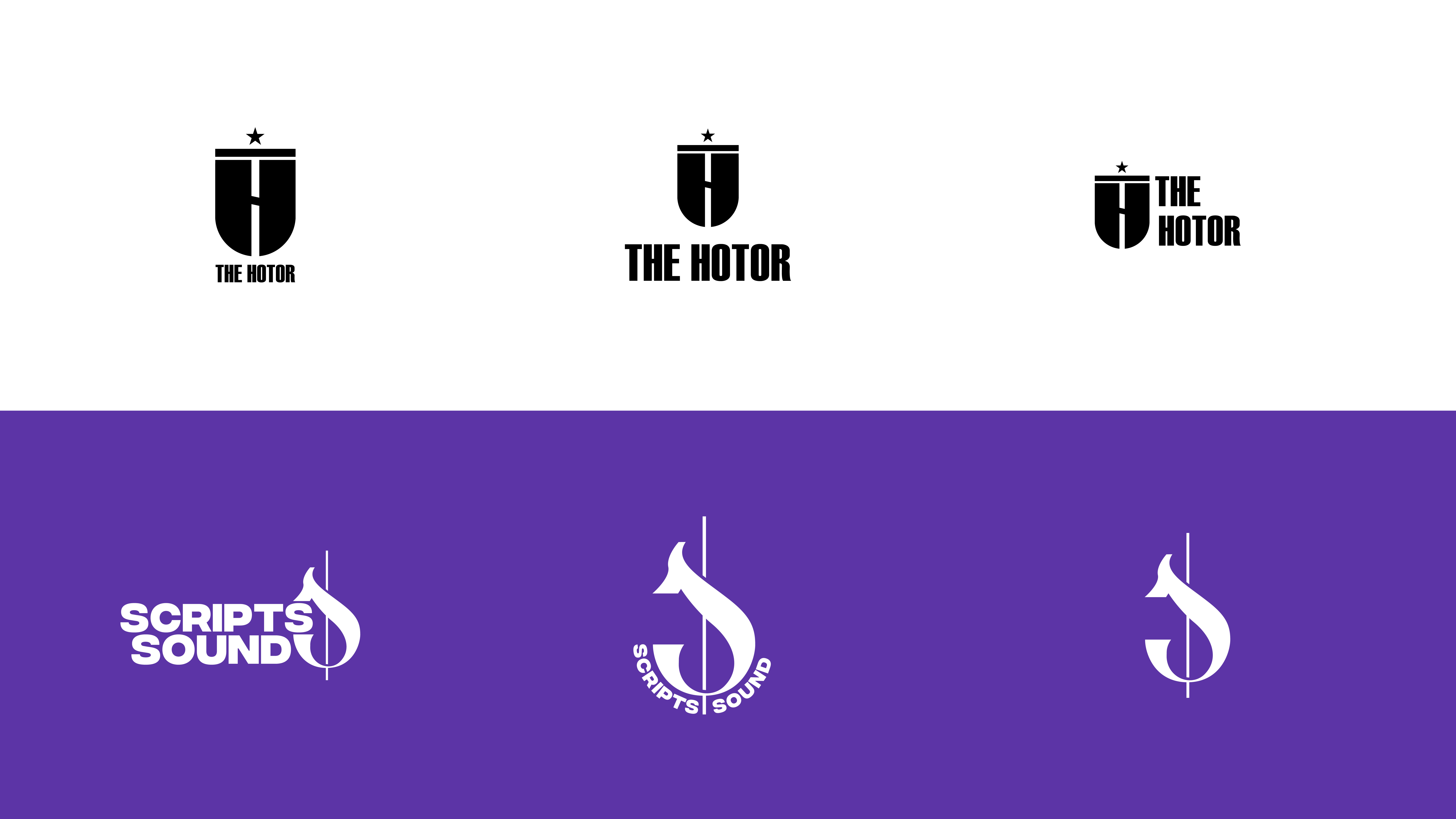
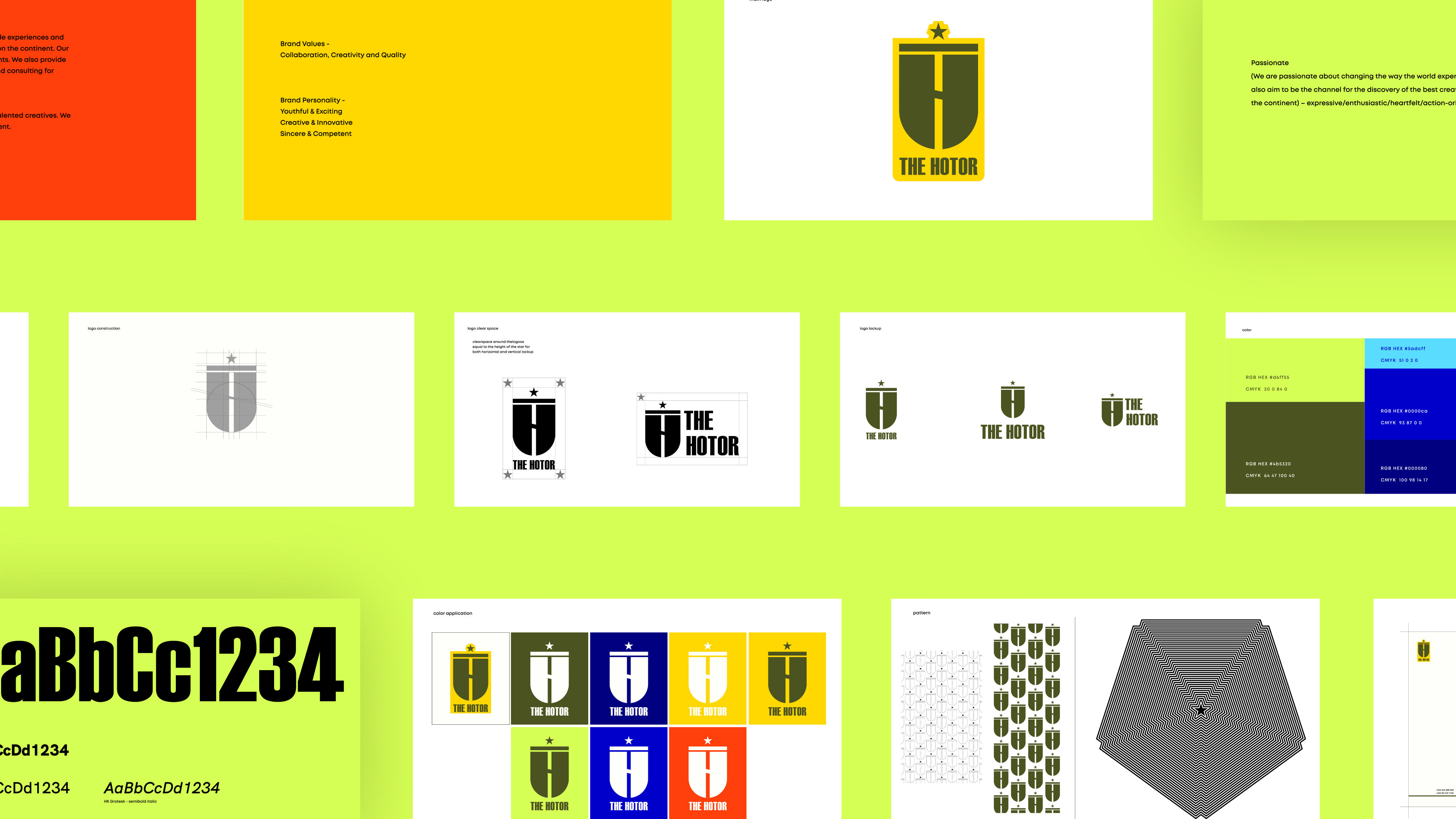
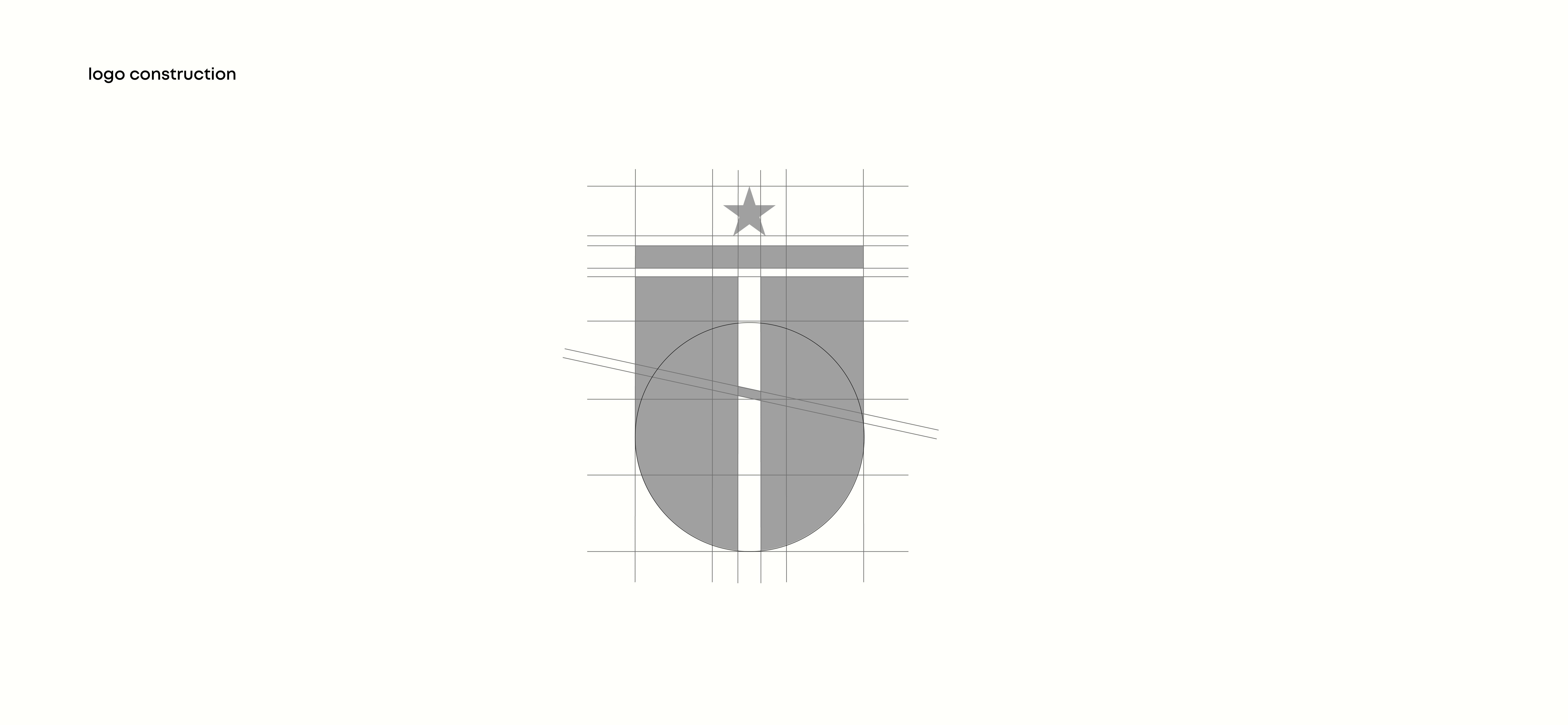
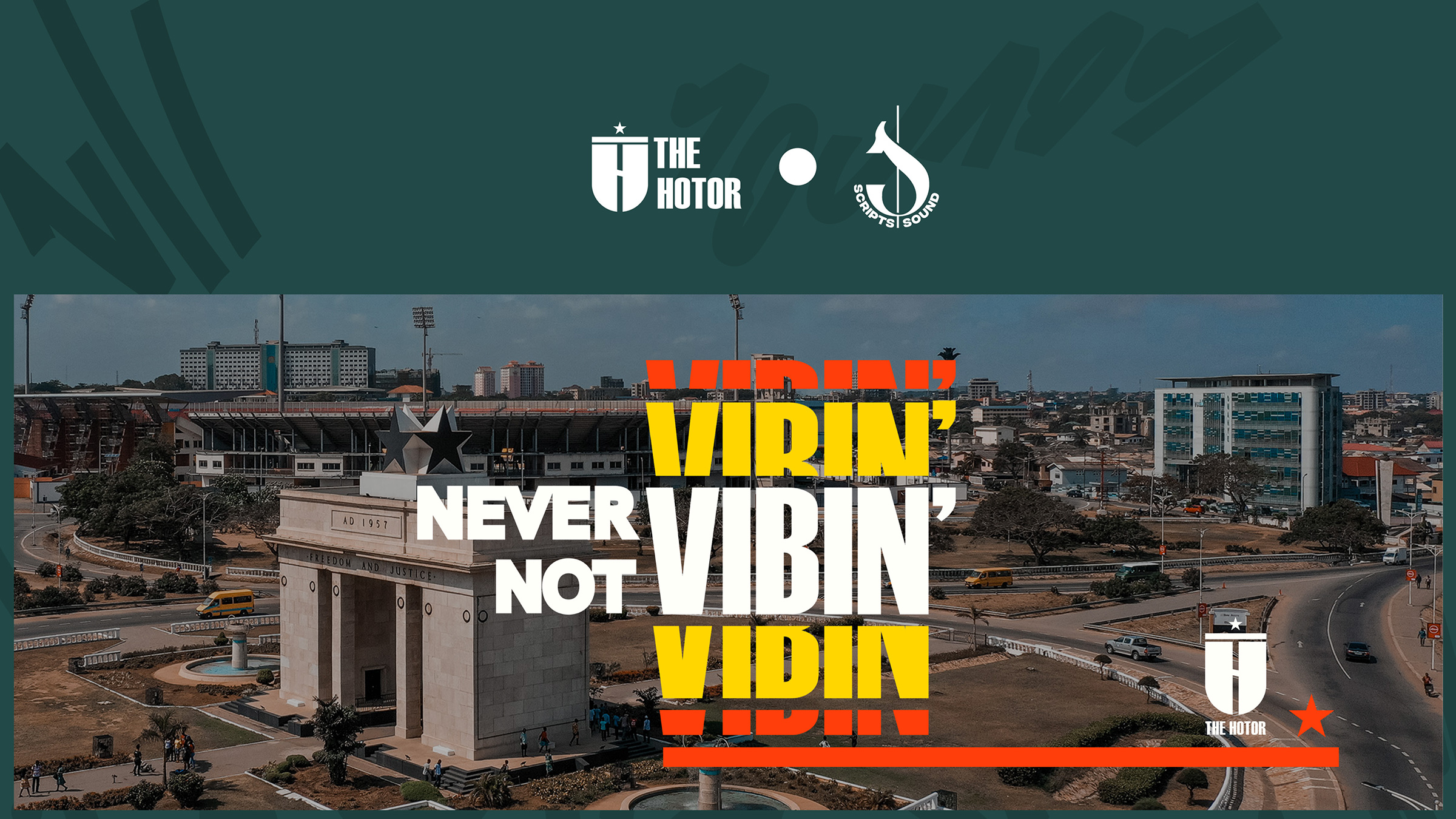
The Hotor logomark was inspired by the welcoming, yet, majestic independence arch of Ghana and the colors of the brand were chosen to represent the emotions we want our clients to feel when they think about The Hotor Entertainments. The new identity system was designed with a bold, geometric sans serif typeface that is easy to read on digital screens while still being strong enough to stand up against more traditional serif typefaces.
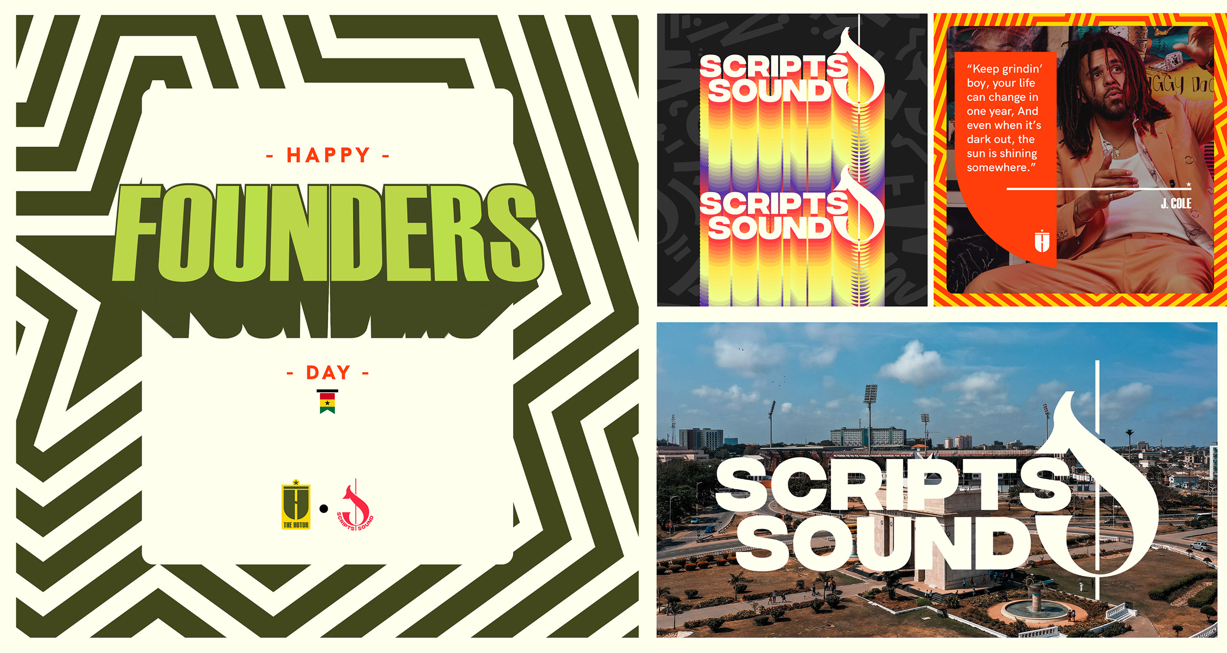
Scripts & Sound is an annual music, art, and culture festival organized by The Hotor Entertainment. This project is designed to highlight and elevate the thriving and thrilling millennial talent from and within Africa through music and social experiences. Its sole commitment is to continuously evolve as a brand, grow its reach, expand its activity, increase its experience, and market the cultural richness of the continent in terms of art and its related activities.
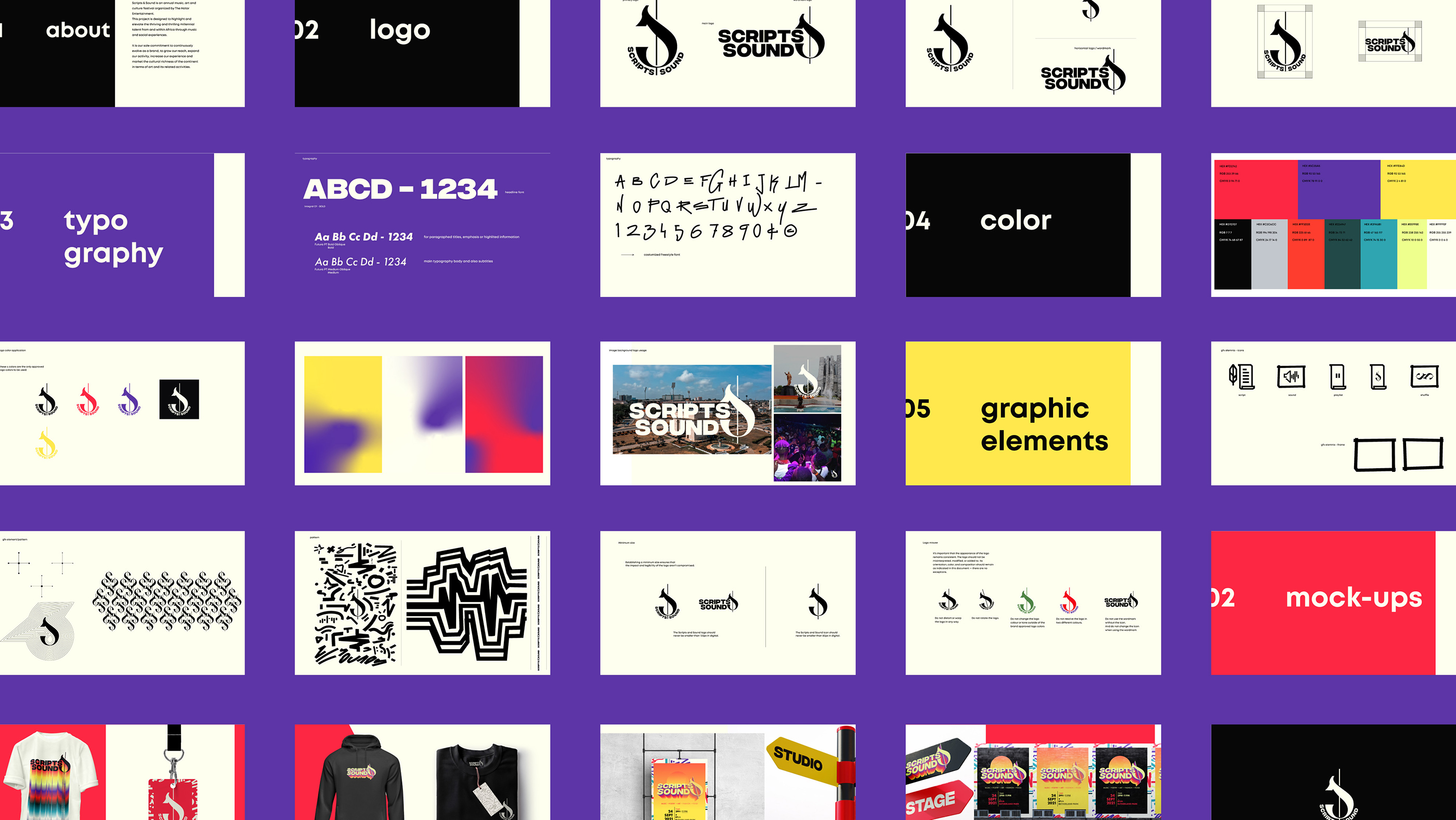
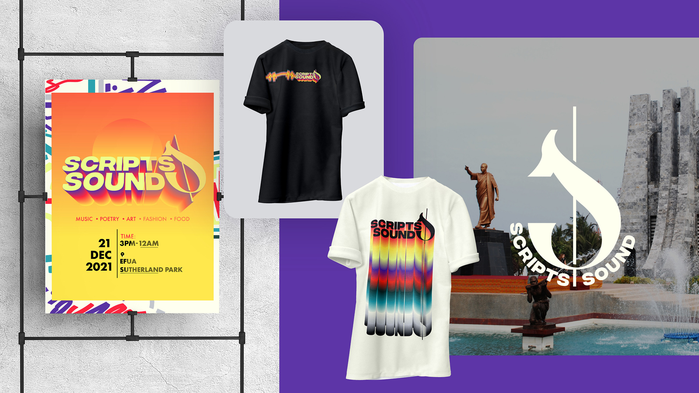
The Scripts and Sound icon/symbol is an abstract treble clef forming and representing an “S”. When used in the wordmark, the symbol/icon takes the form of an “&”, thus bringing together the “Scripts” and “Sound”.
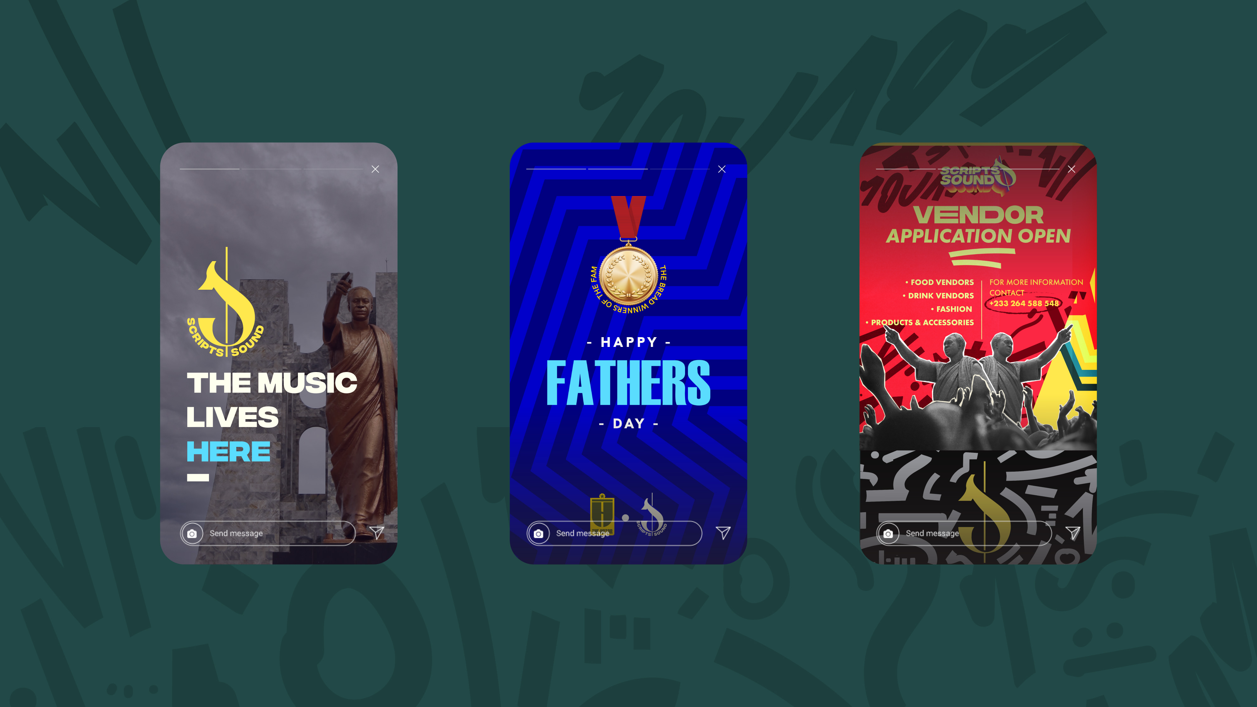
The brand identity is designed to be flexible, adaptable, and scalable.

CREDIT
- Agency/Creative: xtremely Unusual
- Article Title: xtremely Unsual Gives The Hotor x Scripts & Sound a Much Needed Brand Refresh
- Organisation/Entity: Agency
- Project Type: Identity
- Project Status: Published
- Agency/Creative Country: Ghana
- Agency/Creative City: Accra
- Market Region: Africa, Global
- Project Deliverables: Brand Guidelines, Brand Identity, Brand Strategy, Logo Design, Motion Graphics, Poster Design
- Industry: Entertainment
- Keywords: Rebrand, Brand Strategy, Identity Design, Visual Identity
-
Credits:
Brand Strategy + Design and Development: xtremely Unusual
Creative Direction: Richard Dandzo


