Challenge: XITE Energy is the first UK nootropic drink including three active nootropics – natural supplements that have a beneficial effect on brain function in healthy people. Daily demands for health and productivity are forever increasing, yet time does not, so XITE Energy is designed to provide consumers with a healthy energy alternative that doesn’t compromise on taste or function.
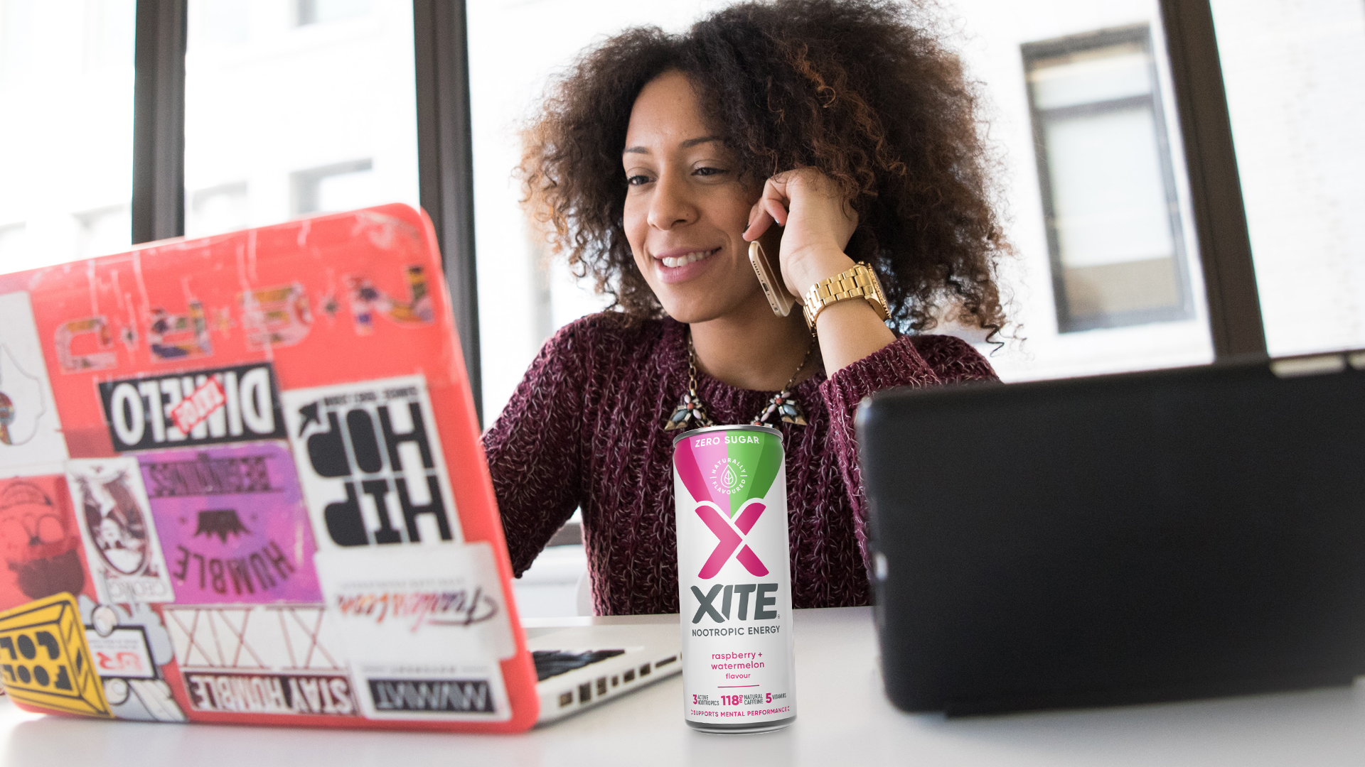
However, despite having a fantastic product, potential consumers were having trouble understanding the product’s benefits from the packaging alone. So XITE asked us to show its consumers how it could be relevant in their lives through a rebrand and pack redesign.
Insight: When it comes to food and drink, we want to make positive choices and energy drinks shouldn’t be an exception. At its core, XITE is a functional drink to help with mood, motivation, concentration and creativity, and although the packaging design had made a step away from ‘extreme energy’ design codes, its design still put it in the realms of enhanced physical performance – albeit with a nod to its zero sugar and natural caffeine claims. So we wanted to dial up the benefits to the consumer straight away.
Unlike traditional energy drinks, the natural caffeine in XITE keeps consumers going for longer without a crash, and the nootropics keeps them focused for longer, too. XITE also has zero sugar, and is vegan, diabetic-friendly and full of ginseng and b-vitamins, making it a great energy drink for everyone.
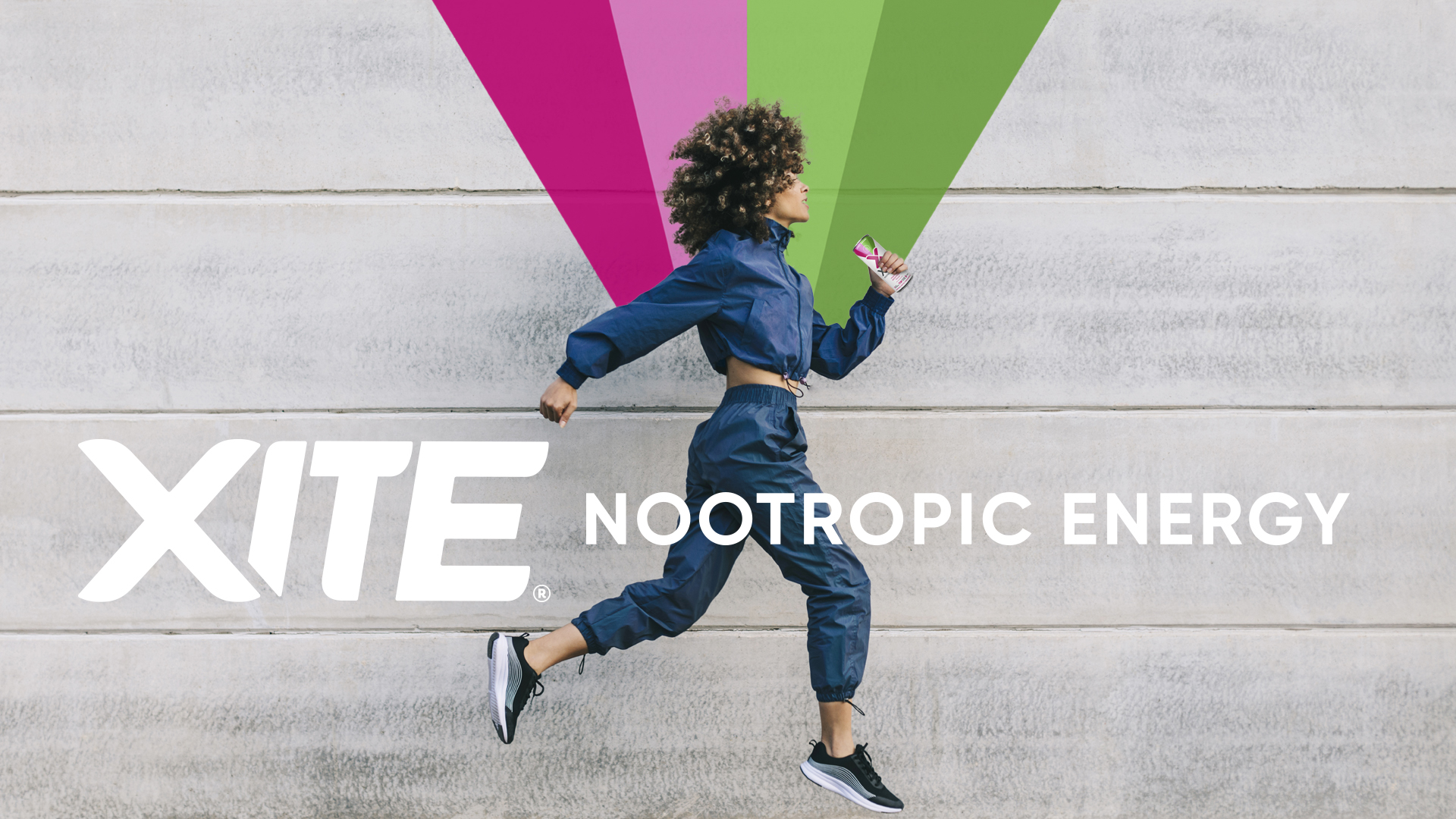
Idea: By focusing on positive energy and ‘enhanced mental performance’ we were able to reposition XITE as something you can rely on to give you a lift within the everyday rather than a drink to keep you going on a long drive. With all the energy drinks on the market, XITE stands out as something exciting and accessible, and offers a sustainable lifestyle choice for consumers.
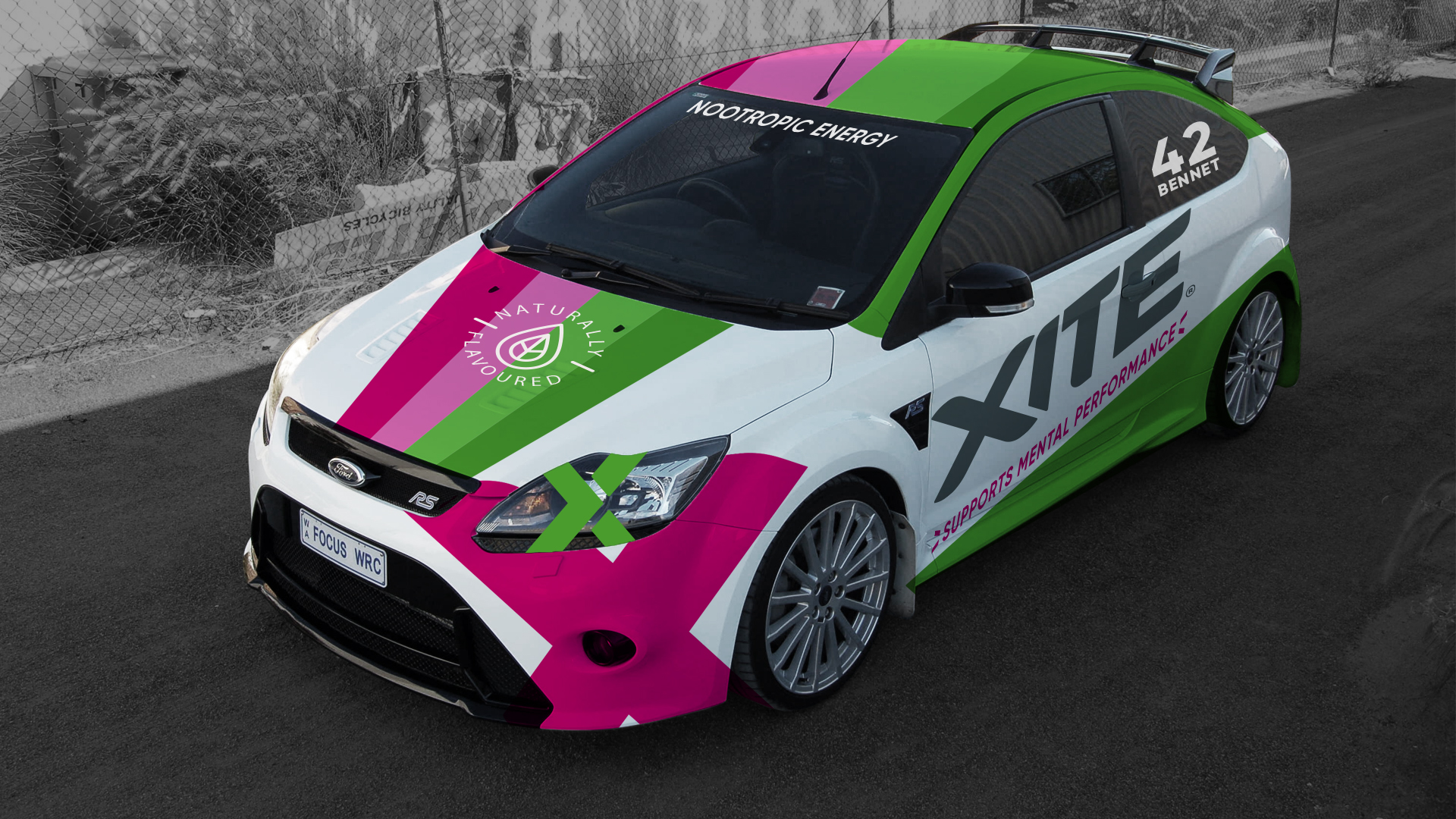
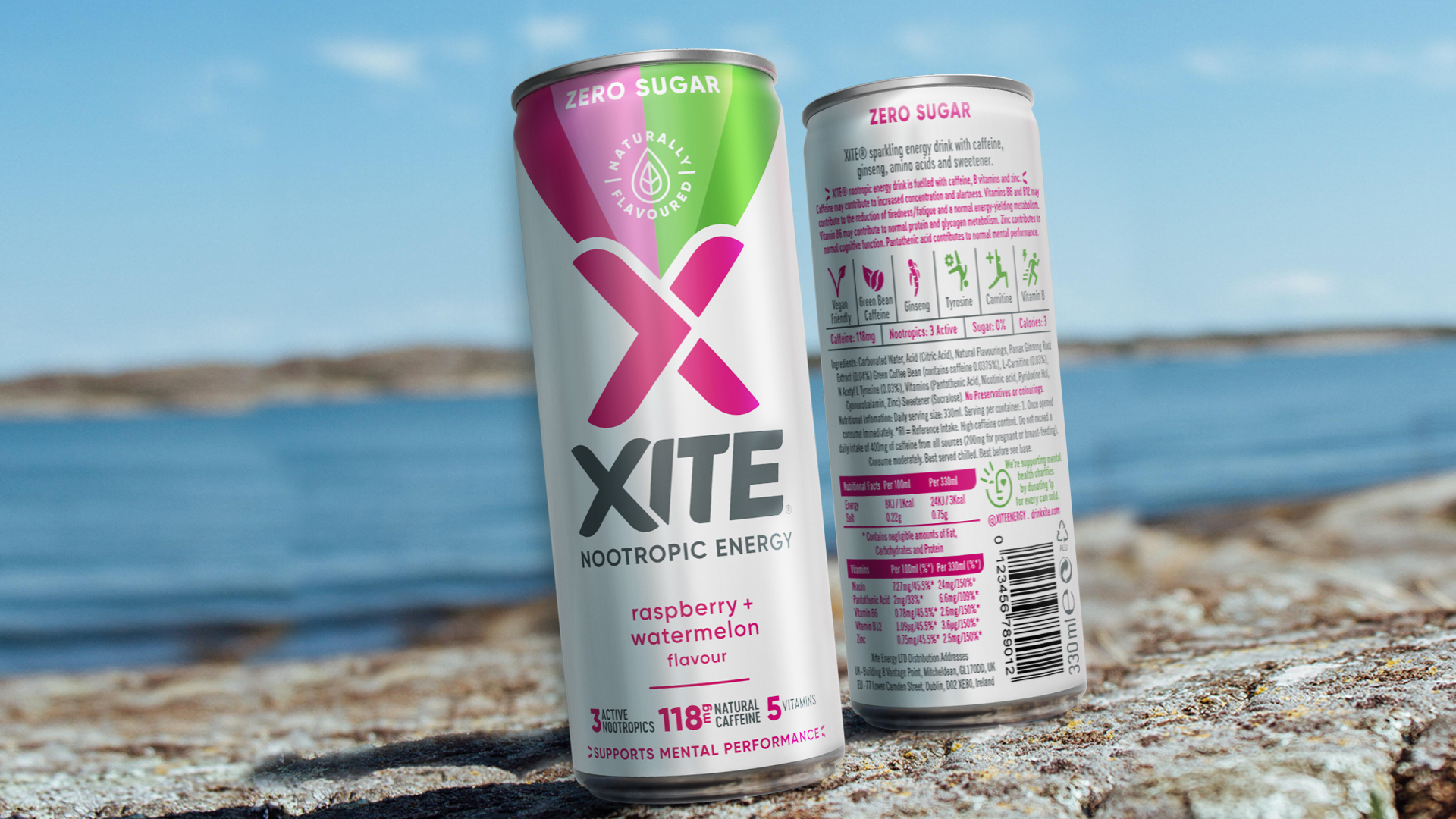
Graphically we have retained the brand’s X identity but have separated it from the brand name (which was moved to the horizontal to aid legibility) to make it a focal point. From that a rainbow of colour emanates positive energy and highlights the naturally flavoured and zero sugar messages.
Underneath the brand name a ‘nootropic energy’ strapline brings the end benefit up front and centre, followed by flavour variant and nutritional claims including ‘supports mental performance’. Additionally, on back of pack a suite of icons for the specific benefits related to the individual ingredients helps to really highlight the brand’s purpose.
Impact: The redesign has brought to the fore the benefits of nootropics, helping to maintain cognitive health, focus, well-being and performance.
“Finally we’ve got our branding right. The new look and feel of our cans really reflects our core values. Not only does it project the healthy image that the quality of the ingredients deserve, but it clearly illustrates the role it can play in improving consumers’ mood and concentration.” – Oliver Bennett, FIA World Rallycross driver and co-founder of XITE Energy


CREDIT
- Agency/Creative: Brandon
- Article Title: XITE-ing Redesign for Nootropics Energy Drink Brand by Brandon
- Keywords: energy drinks, nootropics, vegan, zero-sugar, sugar-free, diabetic-friendly, natural caffeine, branding, brand design, rebrand, packaging design, FMCG packaging


