


XBAY is a platform providing smart solutions for flexible workspaces, addressing users’ location and time needs. Prioritizing convenience and flexibility, XBAY offers private, comfortable, and modern working spaces ideal for professional groups and individuals. It provides a quiet, focused working environment, serving as a meeting place or a temporary office for short-term projects.
XBAY’s design philosophy transcends mere workspace creation; it builds an environment that fosters creativity and efficiency. We believe that a well-designed workspace can inspire, stimulate creative thinking, and enhance productivity.
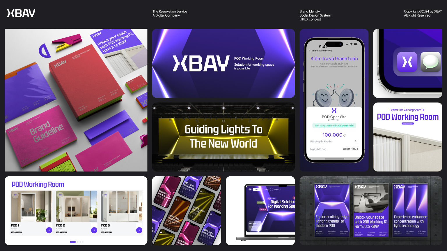
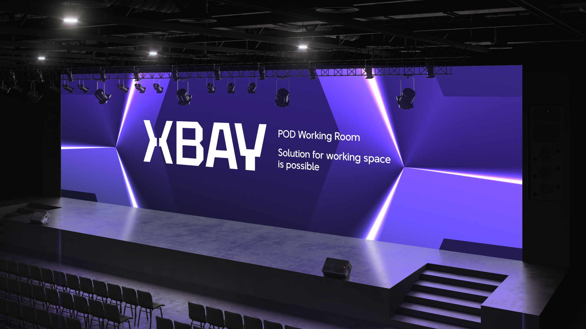
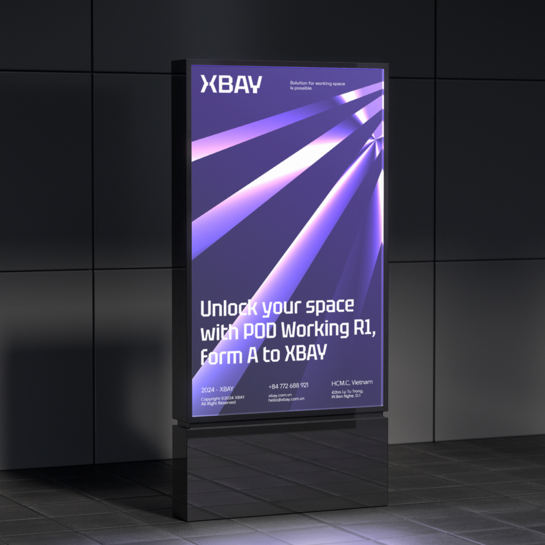
Concept – Guiding Lights to the New World: Immersed in the inviting glow of XBAY’s thoughtfully designed lighting system, the private office space transforms into a sanctuary of inspiration. Once you cross the threshold, a world tailored to your needs opens up. Here, light nurtures creative potential, empowering you to reach new productivity heights and enhancing the value you contribute.
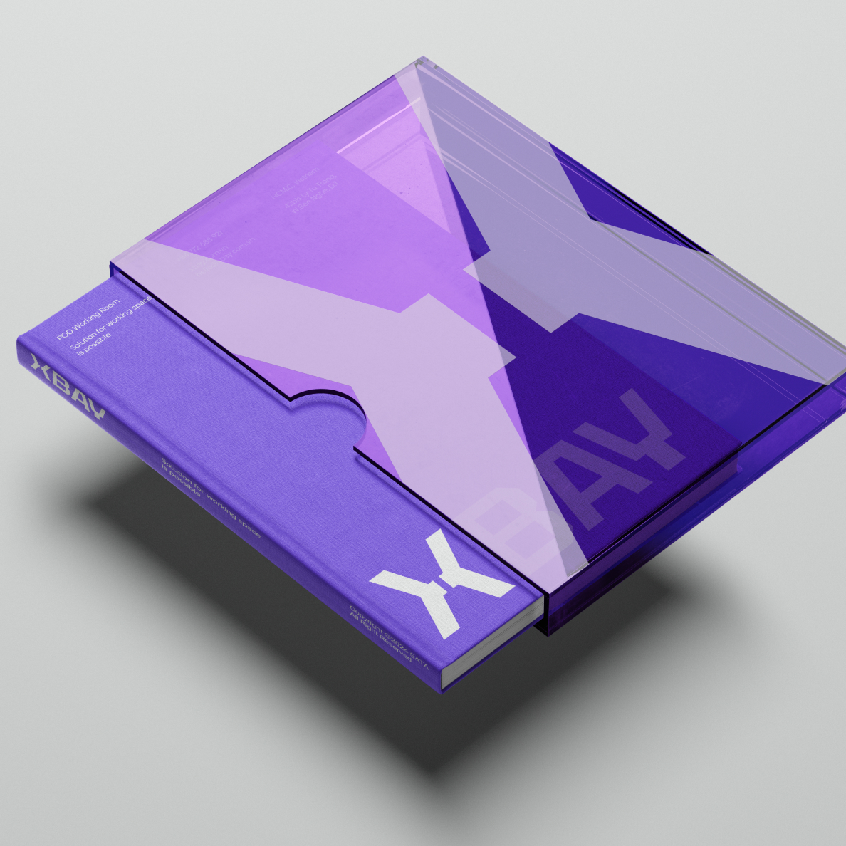
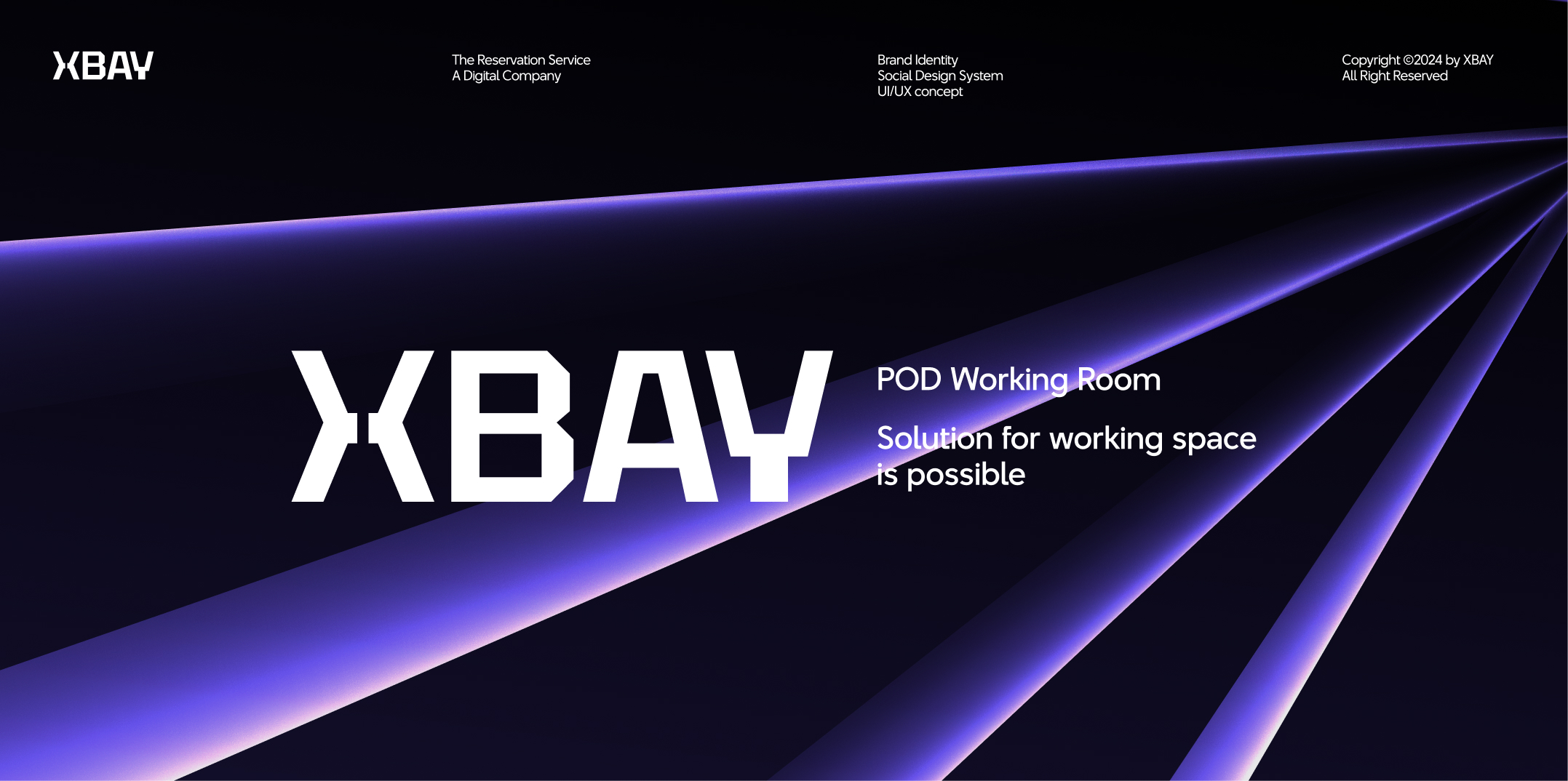
Logo: XBAY’s logo features a modern, simple, and sophisticated style. The stylized “X” with sharp lines symbolizes the separation between two worlds, with the gap representing a light inviting users to our products and services.
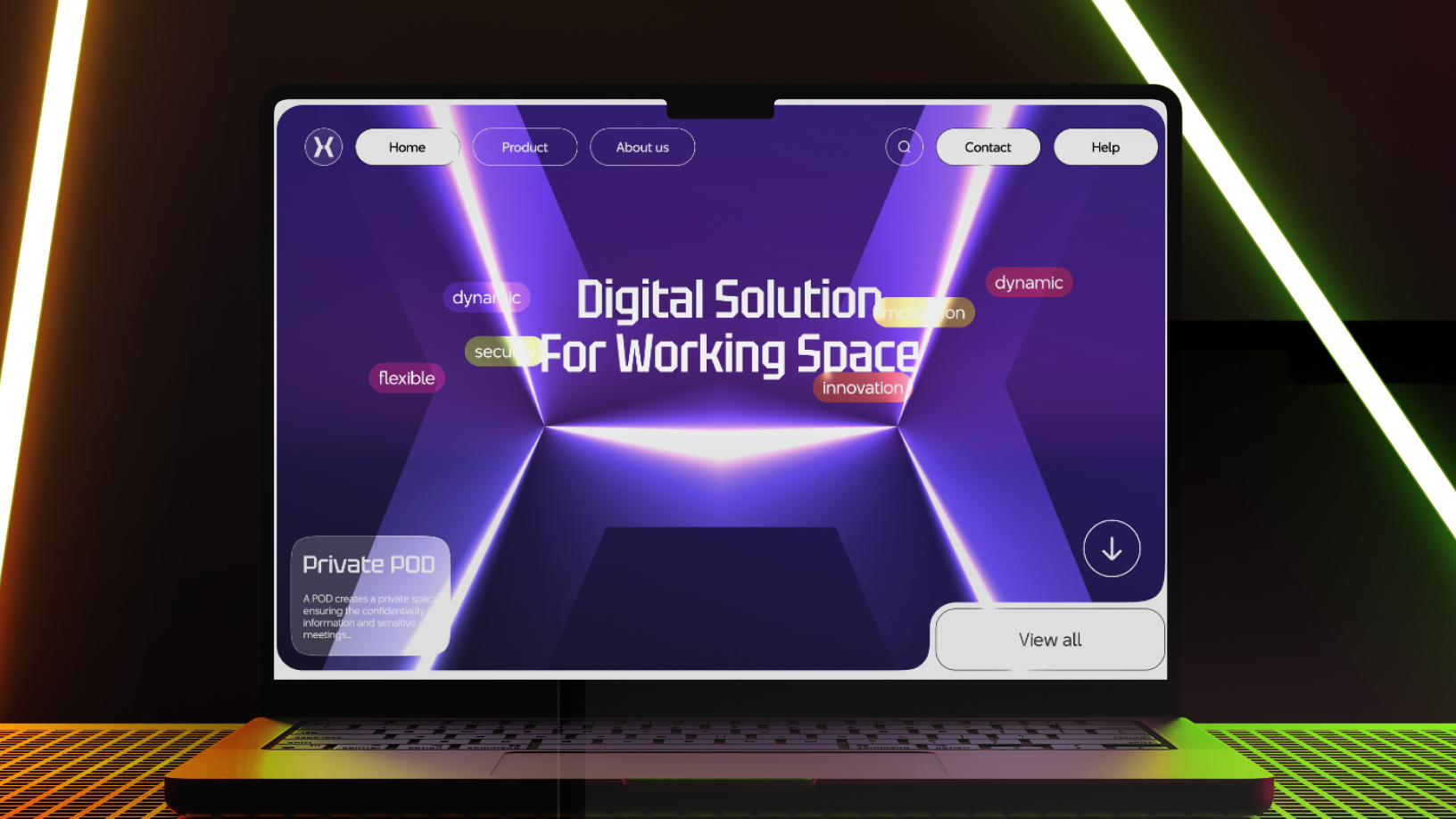
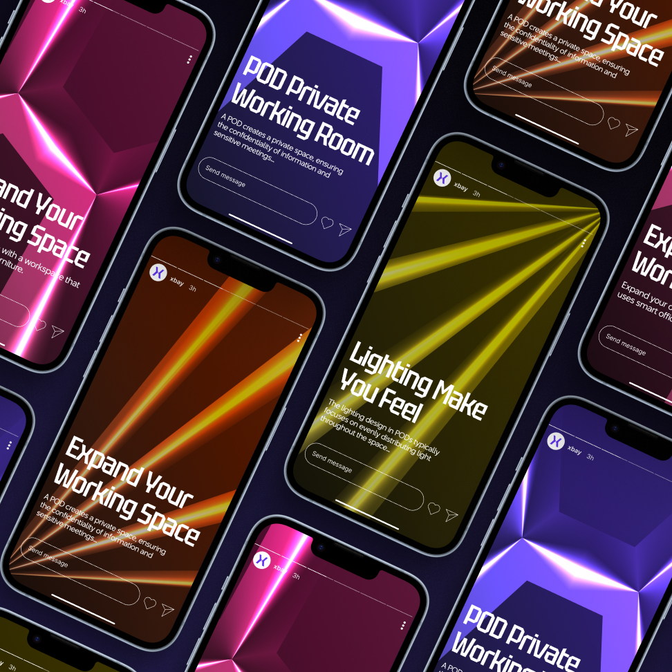
Key Visual: Inspired by the technological lights of office PODs, the visual elements symbolize modernity and technology, bringing convenience and intelligence to XBAY’s offerings.
Design System: XBAY’s design aims to be modern, flexible, and optimize user experience. We focus on creating spaces that are not only beautiful but also convenient, meeting the needs of both individuals and businesses. This is achieved through light visual elements present in XBAY products.
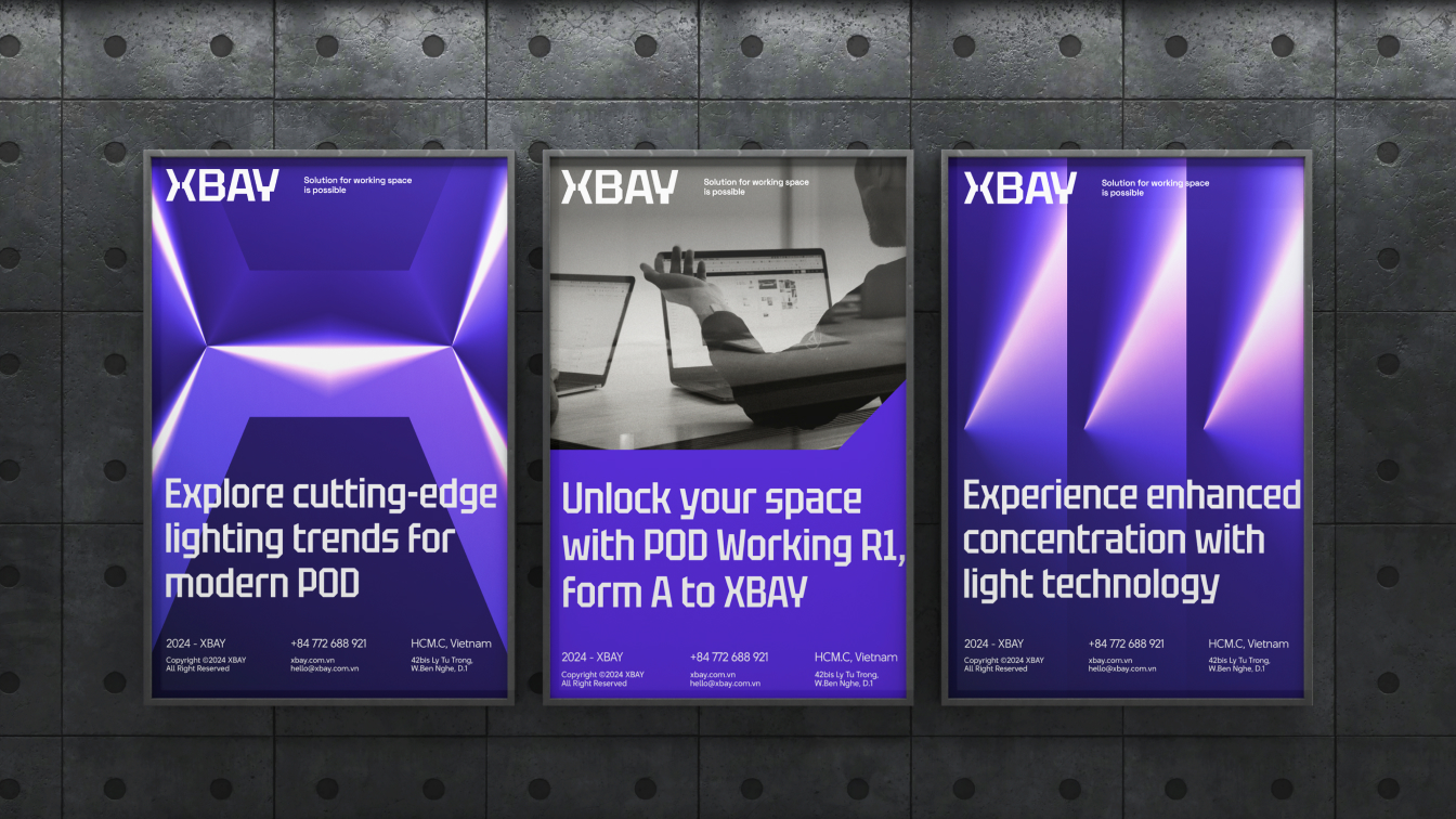
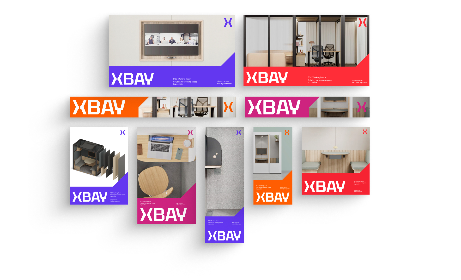
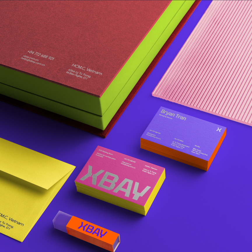
Color Scheme: The colors in XBAY’s design are meticulously chosen to balance professionalism and creativity. Bright colors, suitable for our youthful target audience, create an elegant space, complemented by vibrant accents to stimulate creativity and dynamism.
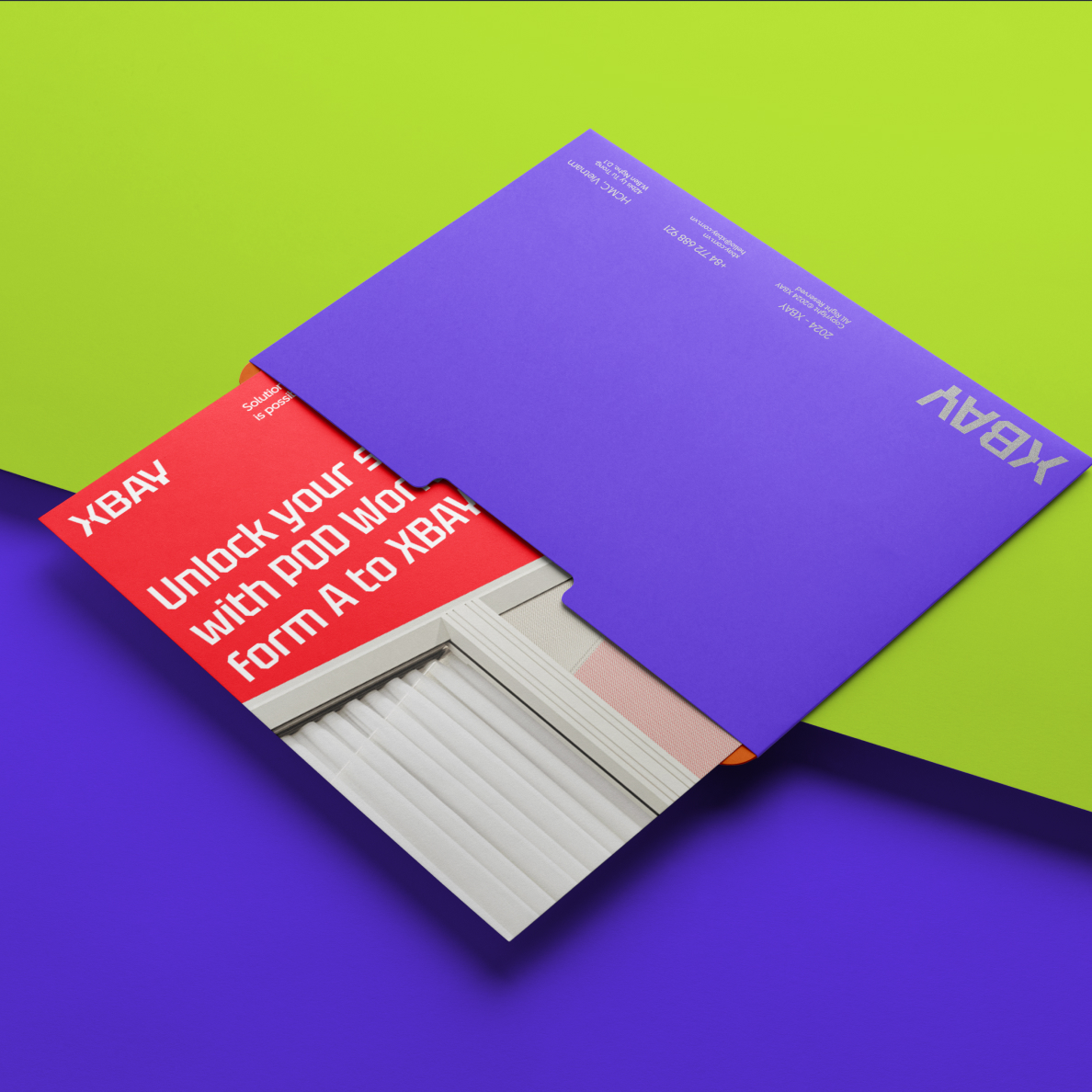
Layout System: Implementing corporate design principles, our publication system ensures consistency in identity and effective information conveyance through the strategic positioning and proportion of design elements.
Font System: Based on the structure of POD fonts, our fonts are harmoniously combined to ensure that the displayed information effectively represents XBAY’s products and is clear across multiple platforms.
One of the greatest strengths of XBAY’s brand identity design system is its consistency. Across all platforms whether office publications, websites, mobile applications, or social media channels branding elements such as the logo, color scheme, typography, and imagery are uniformly applied. This ensures that XBAY is easily recognizable and memorable in the minds of customers.
CREDIT
- Agency/Creative: Thanh Bi
- Article Title: XBAY Pod Working Space Branding and Visual Identity Student Concept by Thanh Bi
- Organisation/Entity: Student
- Project Type: Identity
- Project Status: Published
- Agency/Creative Country: Vietnam
- Agency/Creative City: ho chi minh
- Market Region: Global
- Project Deliverables: 2D Design
- Industry: Professional Services
- Keywords: POD Working Space, Working Room, Experience Brand
-
Credits:
Designer: Tru1ea7n Nguyu1ec5n Thanh Bi


