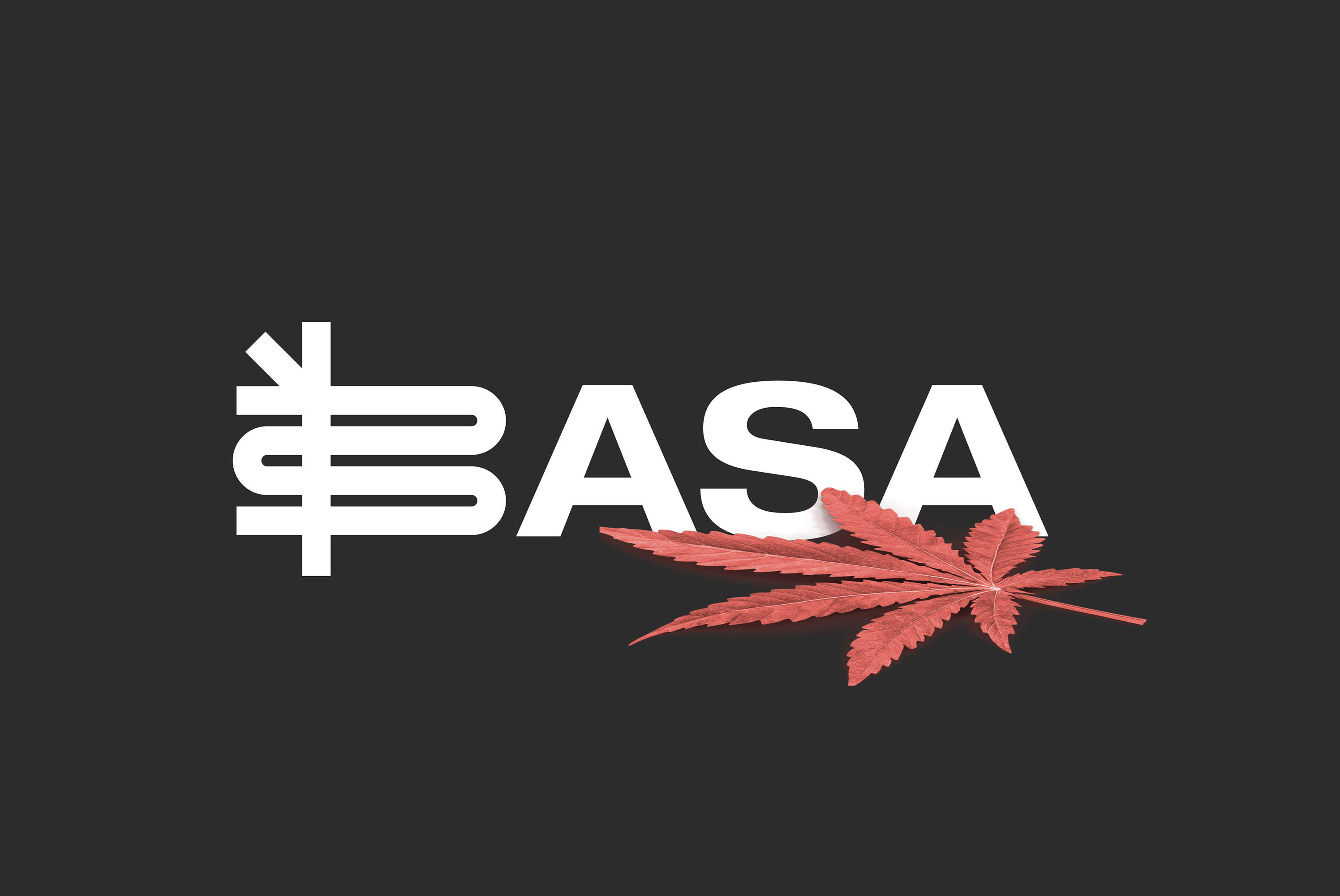
Cannabis marketing is increasingly dominated by big money interests with flashy stores and mega ad campaigns.
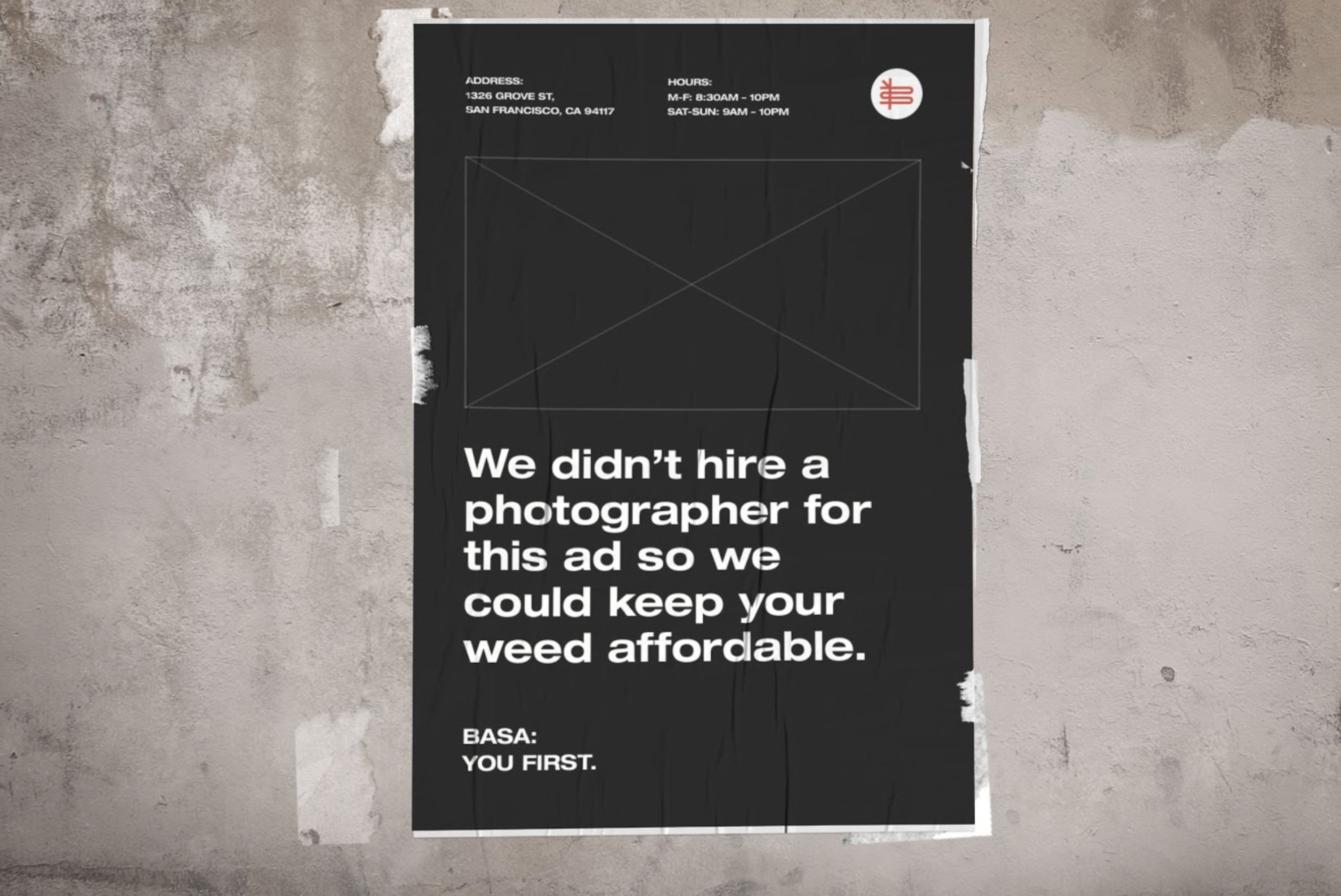
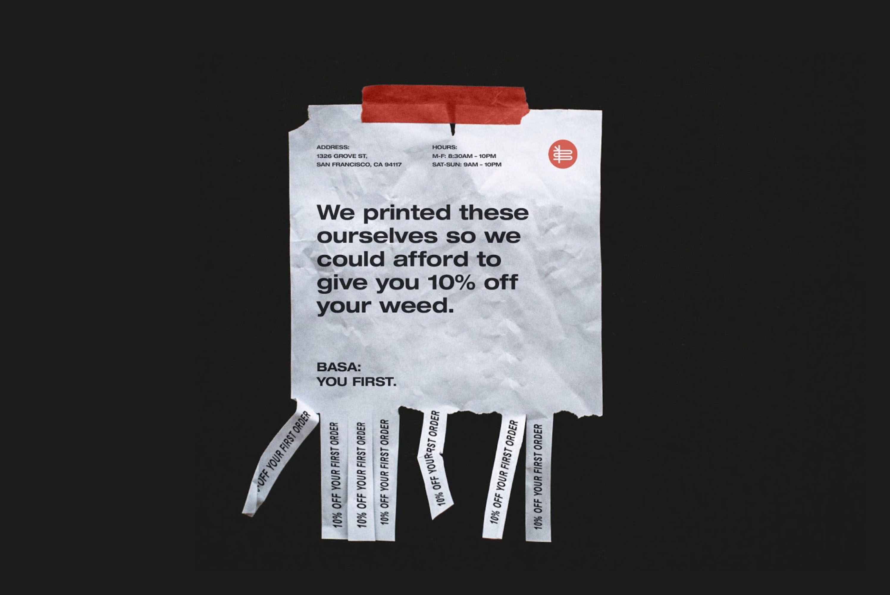
We positioned BASA as an alternative to that promotional frenzy and flipped BASA’s more limited resources into a strength with messaging that’s intentionally minimalist, direct, and self-aware.
No bullshit. BASA stands for cannabis’ accessibility and original purpose. It’s an empowering brand that does not need decoration to bring across its message.
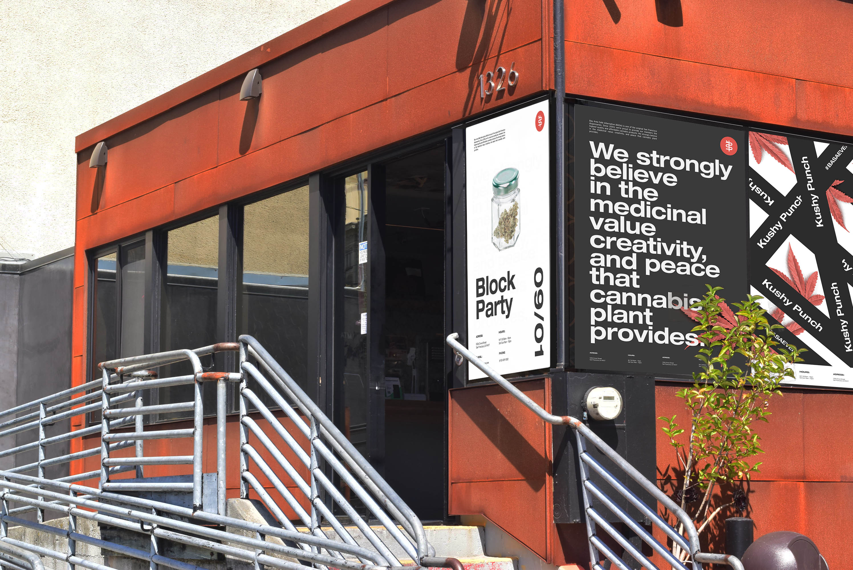
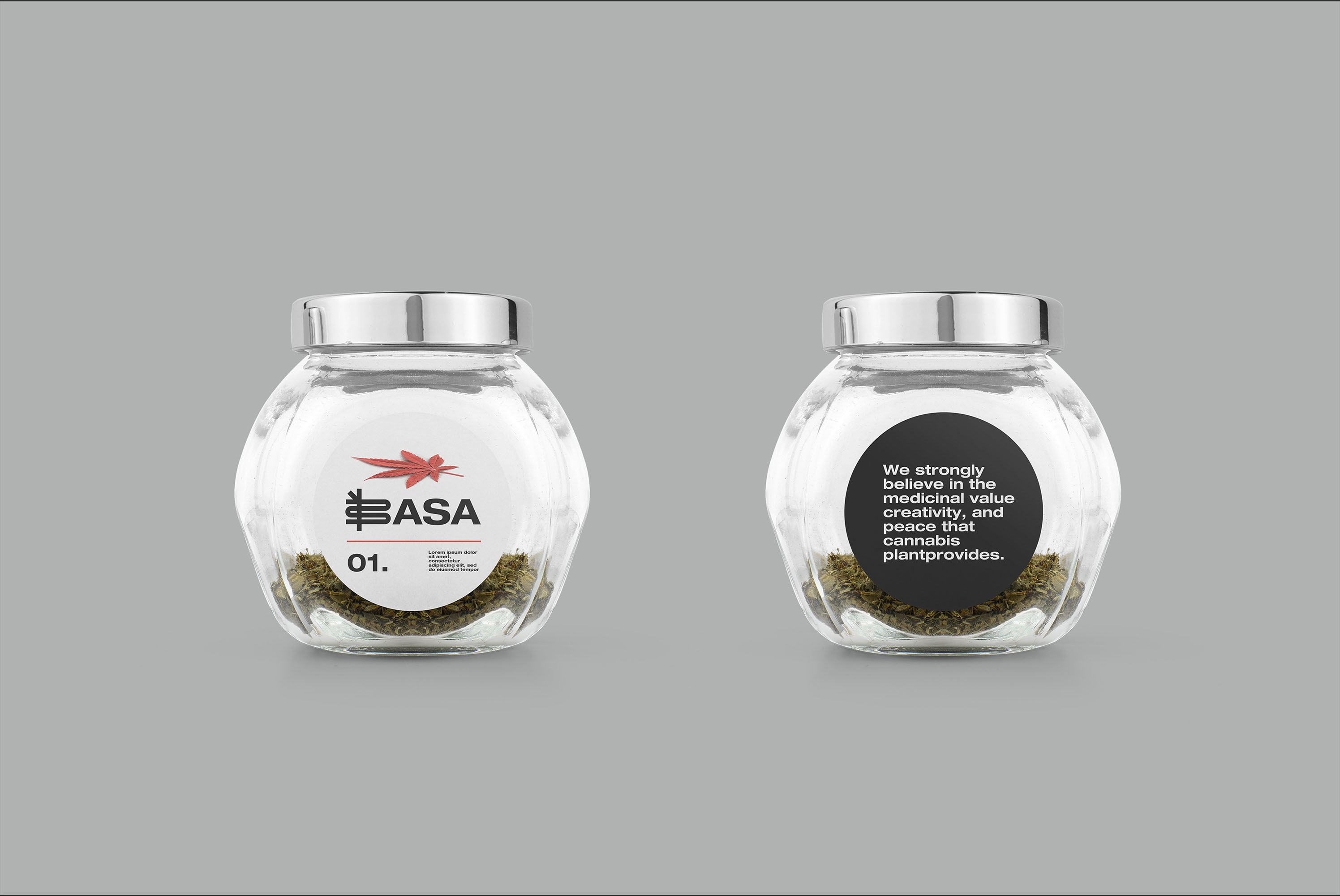
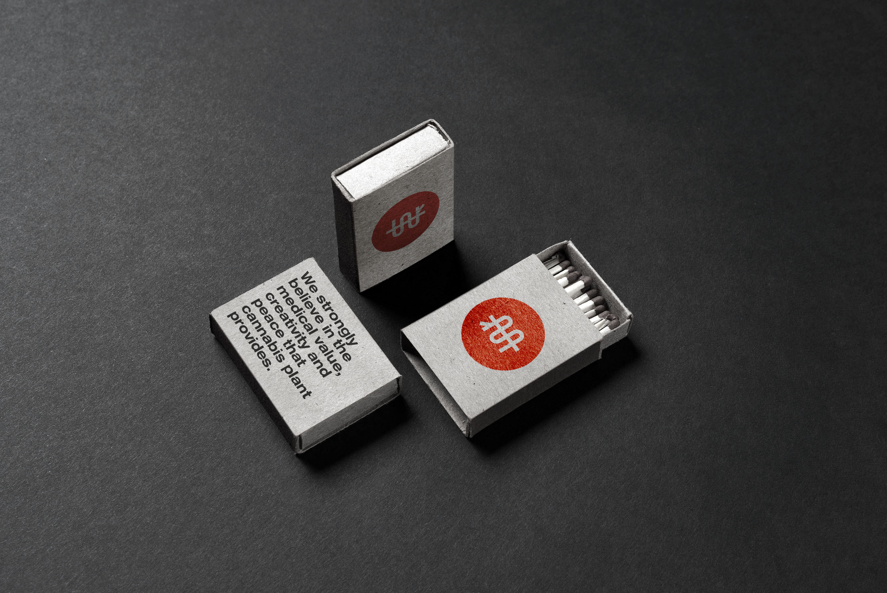
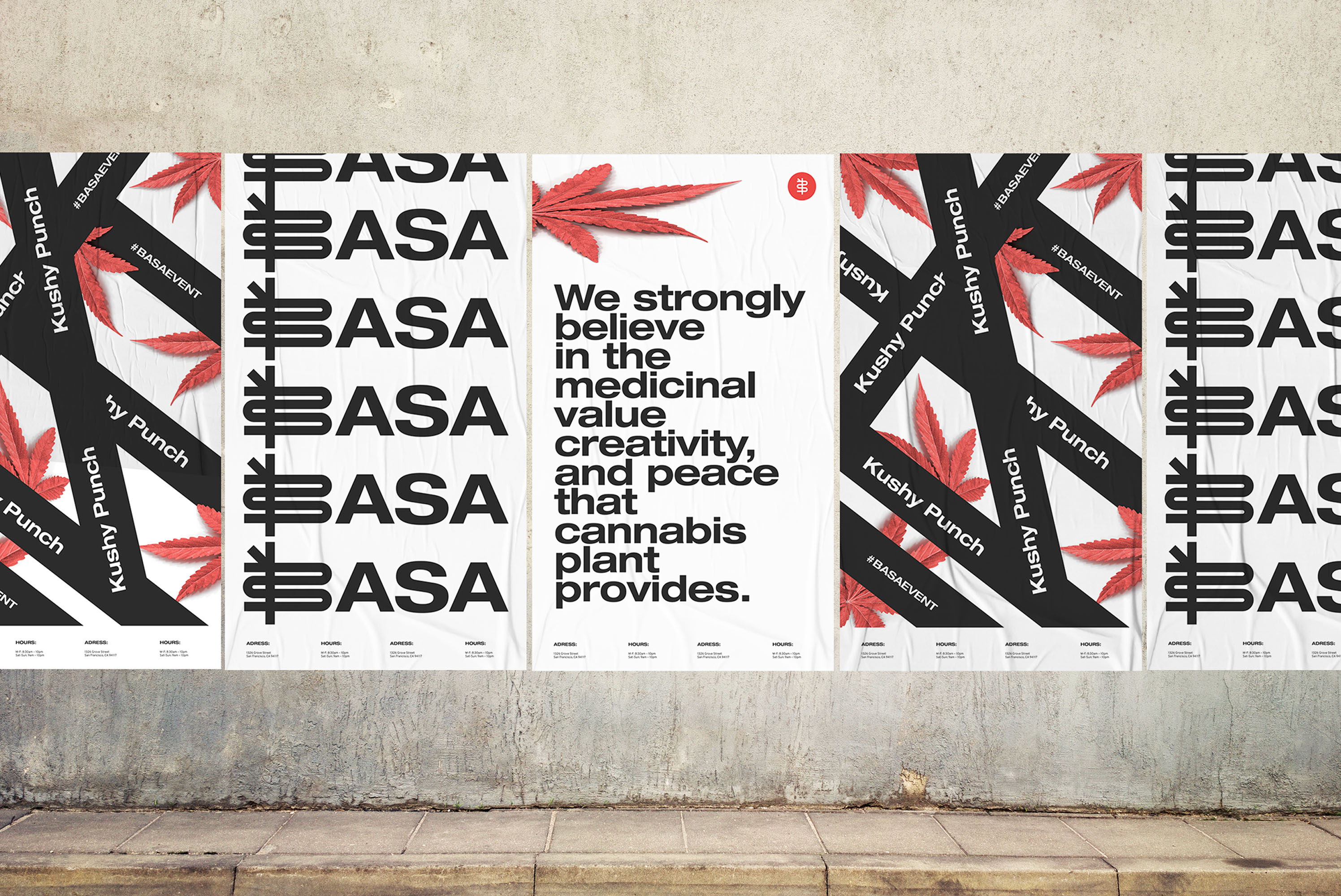
The identity is transparent and based on bold typography that can easily be combined with any imagery and color.
By using the three main colors and an extended bold font, Basa’s identity brings associations to the 90’s aesthetics which supports the brand’s straight-forwardness and brutality.
BASA’s only decorative bit is its key visual, the red cannabis leaf. It can be used as a separate BASA’s symbol as well as a part of the composition in digital and printed use cases. However, BASA’s posters can use additional graphics that may vary from month to month depending on a poster’s purpose and context. Any additional graphic elements should nevertheless be in-line with BASA’s brand messaging and support the idea of simplicity and accessibility.
CREDIT
- Agency/Creative: Wunderdogs
- Article Title: Wunderdogs Creates Brand Identity for Basa: San Francisco’s Oldest Cannabis Dispensary
- Organisation/Entity: Agency, Published Commercial Design
- Project Type: Identity
- Agency/Creative Country: United States
- Market Region: North America
- Project Deliverables: Brand Guidelines, Brand Identity, Brand Strategy, Branding, Graphic Design, Research, Retail Brand Design, Tone of Voice
- Industry: Retail
- Keywords: Cannabis, CBD, Hemp, retail, branding, website, ecommerce, guidelines, basa, basa collective, wunderdogs, creative agency, creative, san francisco


