


Project Background
As an established herbal throat care product distinguished by its refreshing sweetness and therapeutic efficacy, Wrigley’s Doublemint Throat Lozenge has initiated a strategic packaging redesign to strengthen connections with urban millennials. This transformation seeks to contemporize brand perception while preserving its authentic Chinese herbal legacy, addressing the growing demand for wellness products that balance cultural resonance with modern lifestyle aspirations among 25-34-year-old metropolitan consumers.
Design Considerations & Solutions
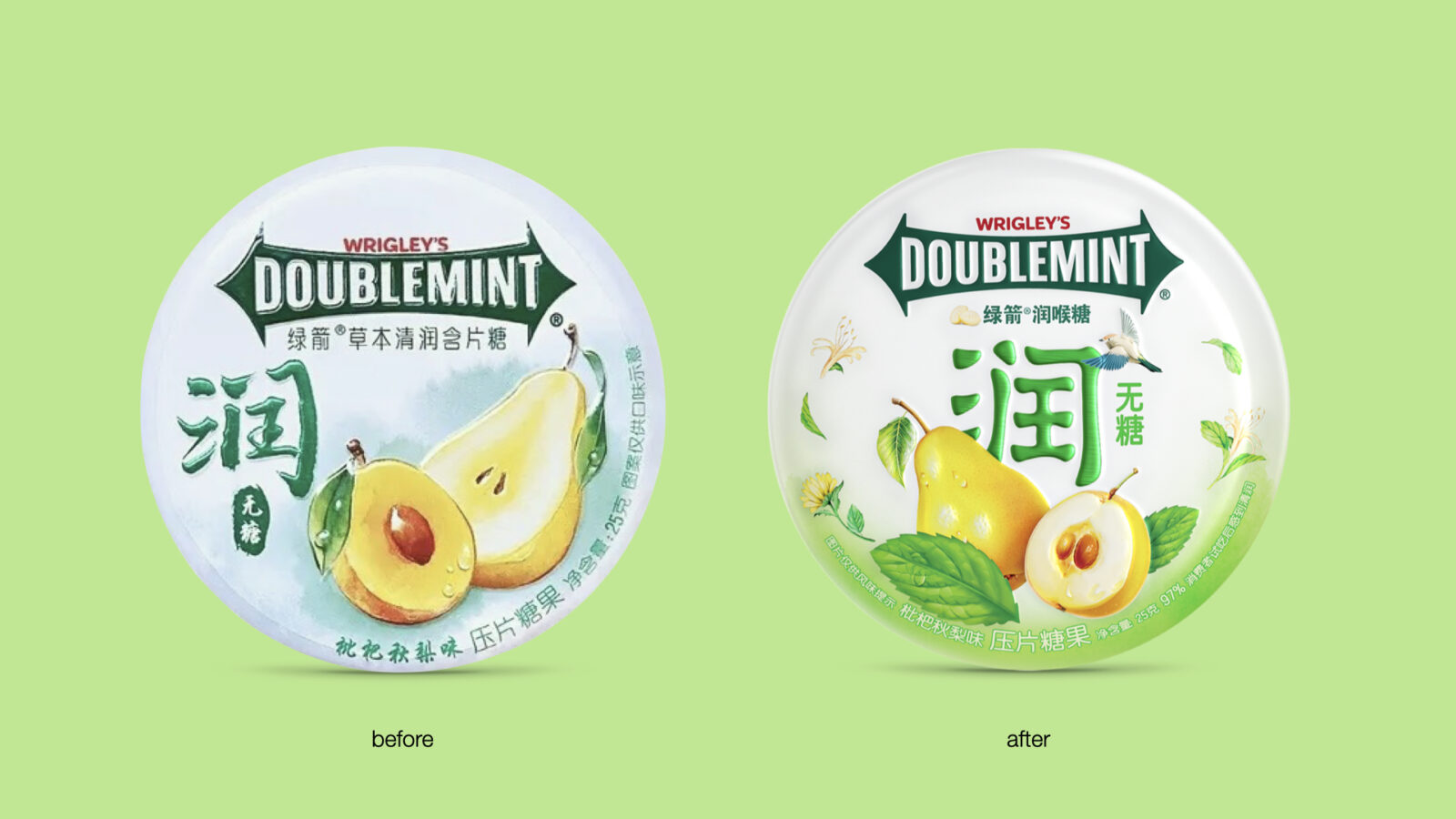
The redesign process confronted two critical imperatives: addressing the tension between functional packaging requirements and modern visual communication, reconciling traditional herbal medicine associations with youth-oriented aesthetics.
To answer that, our team created a Poetic Neo-Chinese design philosophy that reinterprets traditional botanical graphic through contemporary minimalist principles.
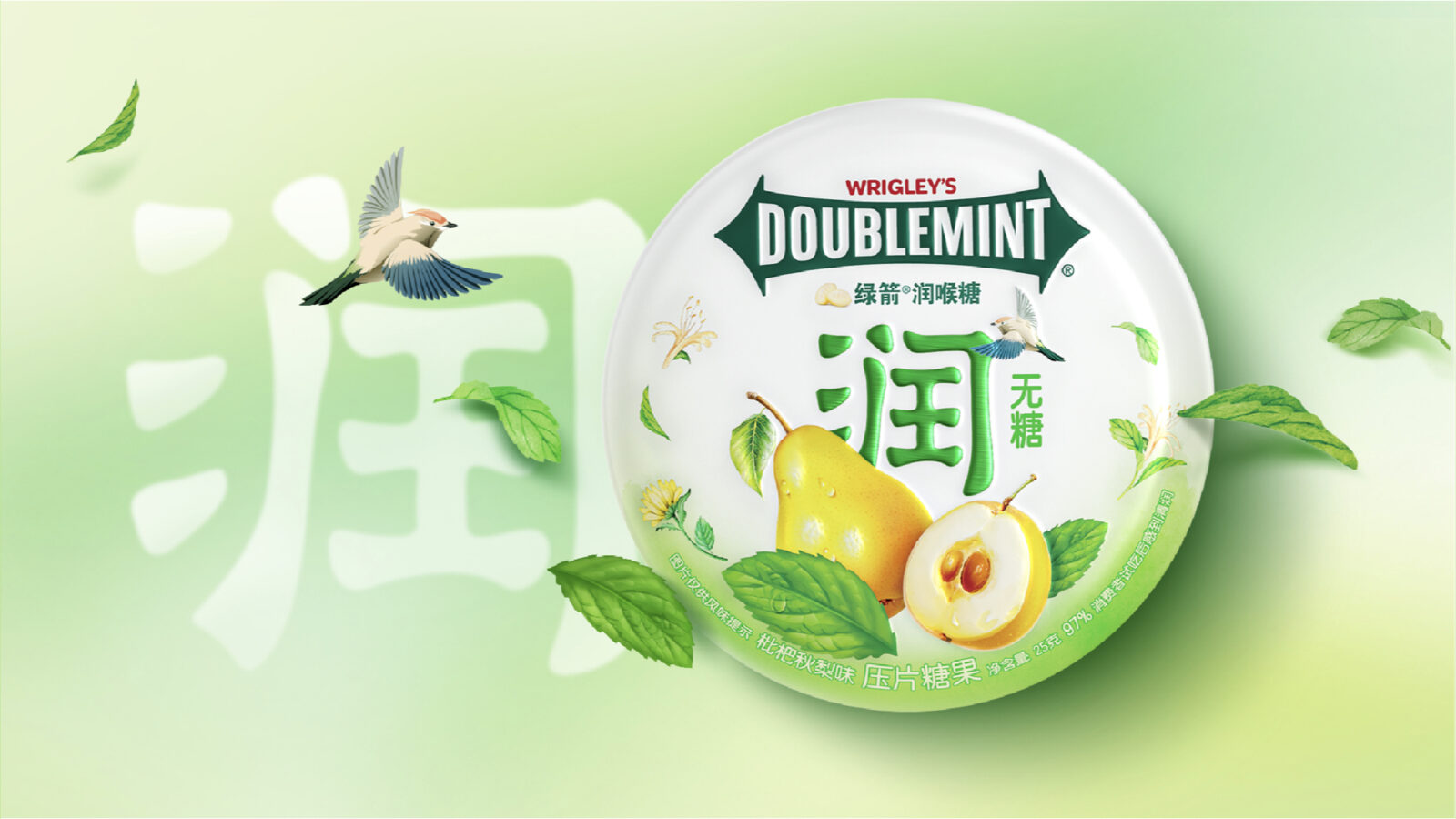
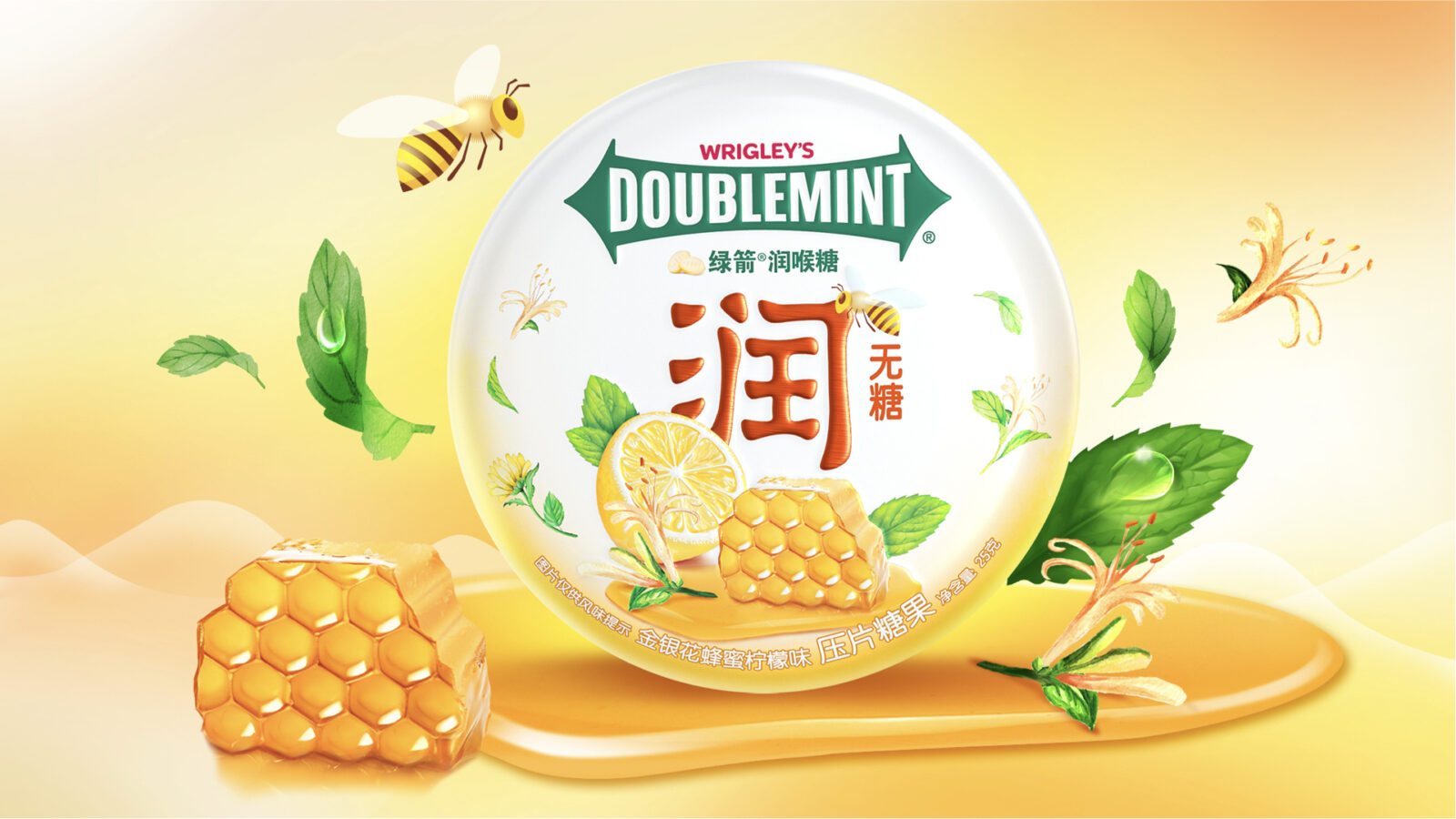
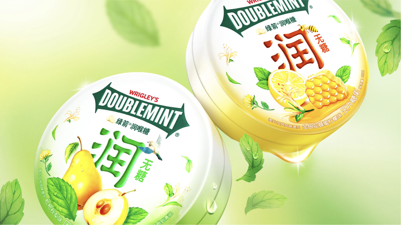
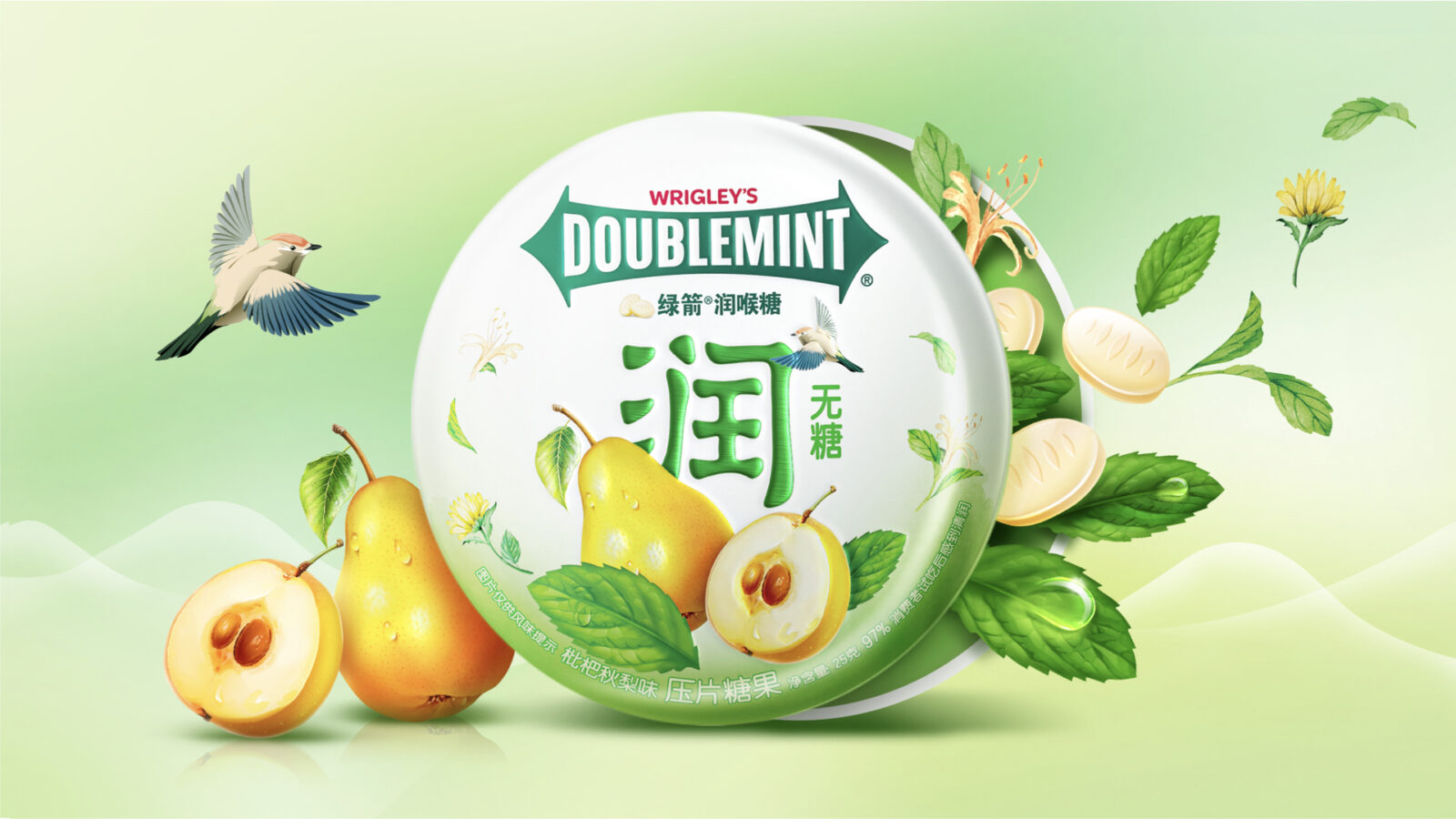
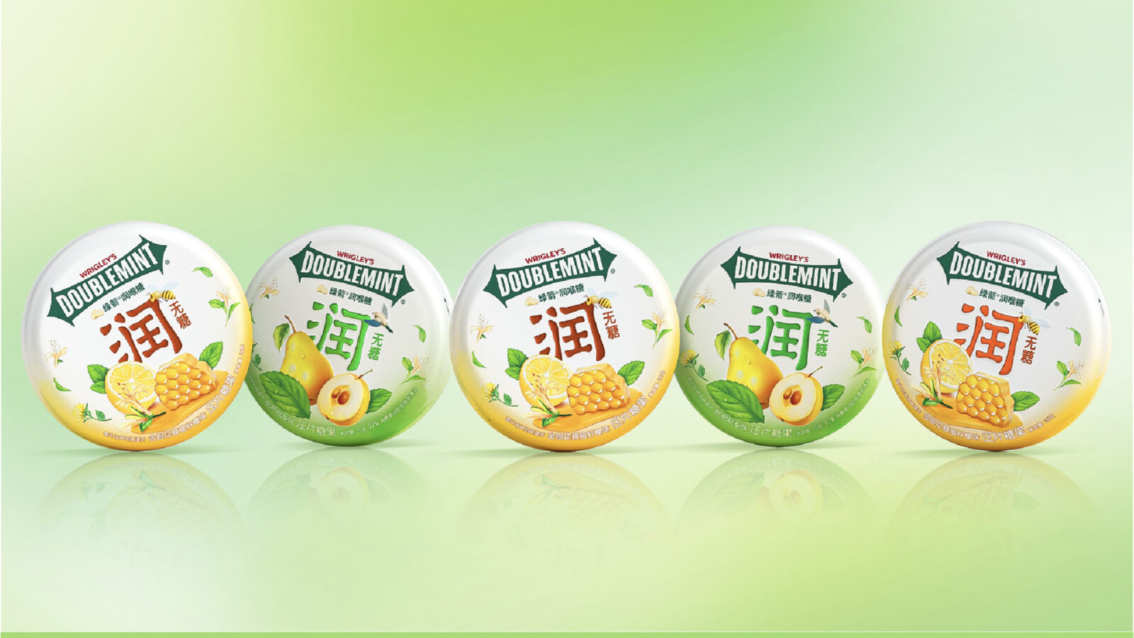
Central to this approach was that watercolor-rendered ingredient illustrations were well developed to maintain the herbal formula’s perceived authenticity through hyperrealistic fruit textures, while simultaneously evoking multi-sensory freshness.
A defining innovation lies in the integration of a stylized lark motif, which transcends mere ornamentation to embody layered symbolism. The lark’s dynamic form injects playful vitality into the composition, transforming static visuals into a whimsical poetic space teeming with life and imaginative resonance. By weaving avian elements into the narrative, the design metaphorically mirrors the product’s core promise: just as the lark symbolizes unconstrained song and airborne freedom, the lozenge empowers vocal liberation—nourishing throats to break free from discomfort and embrace effortless self-expression.
Last but not least, the typographic system underwent systematic modernization, particularly in rendering the “Soothing” descriptor through geometric sans-serif forms that enhance legibility while projecting scientific credibility.
Project Results
The new packaging design effectively bring the Poetic Neo-Chinese style into life and underscore the product’s traditional inspiration and herbal essence. Overall, the upgraded packaging enhanced visual appeal, strengthened brand trust, and reinforced the brand’s professionalism, achieving a cohesive and modern expression that aligns seamlessly with the brand’s identity.
CREDIT
- Agency/Creative: ShinyBay Design
- Article Title: Wrigley’s Doublemint Throat Lozenge Packaging Design by ShinyBay Design
- Organisation/Entity: Agency
- Project Status: Published
- Agency/Creative Country: China
- Agency/Creative City: Shanghai
- Market Region: China
- Project Deliverables: 2D Design, Brand Refinement, Design, Graphic Design, Label Design, Packaging Design, Retail Design
- Industry: Food/Beverage
- Keywords: WBDS Agency Design Awards 2025/26


