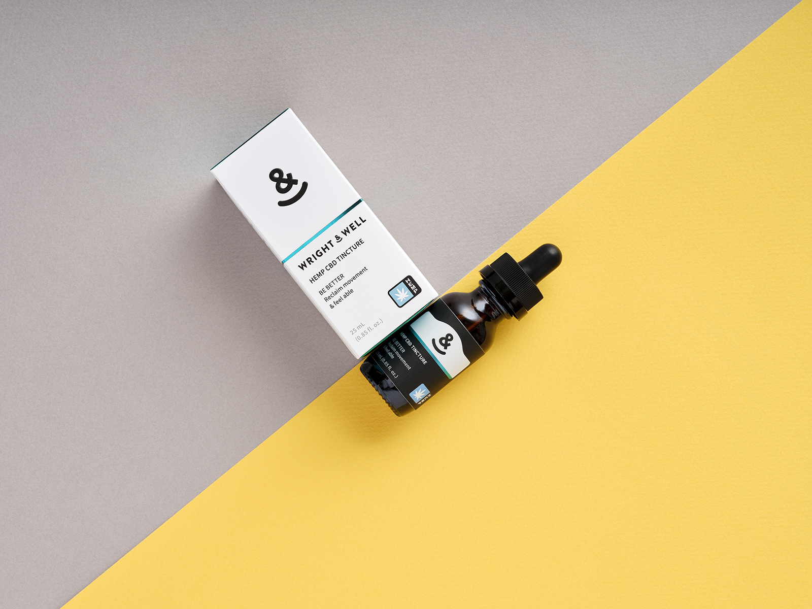
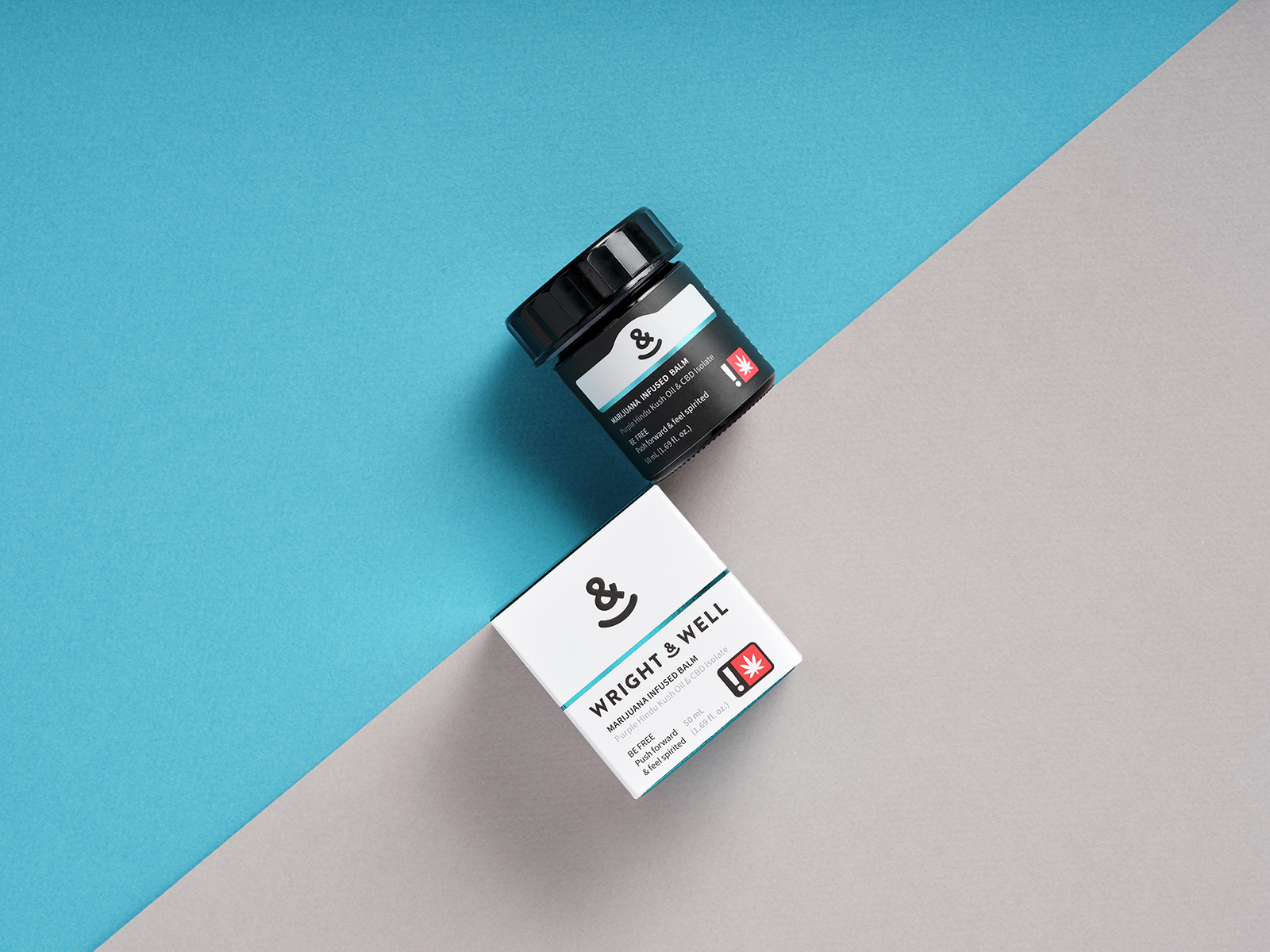
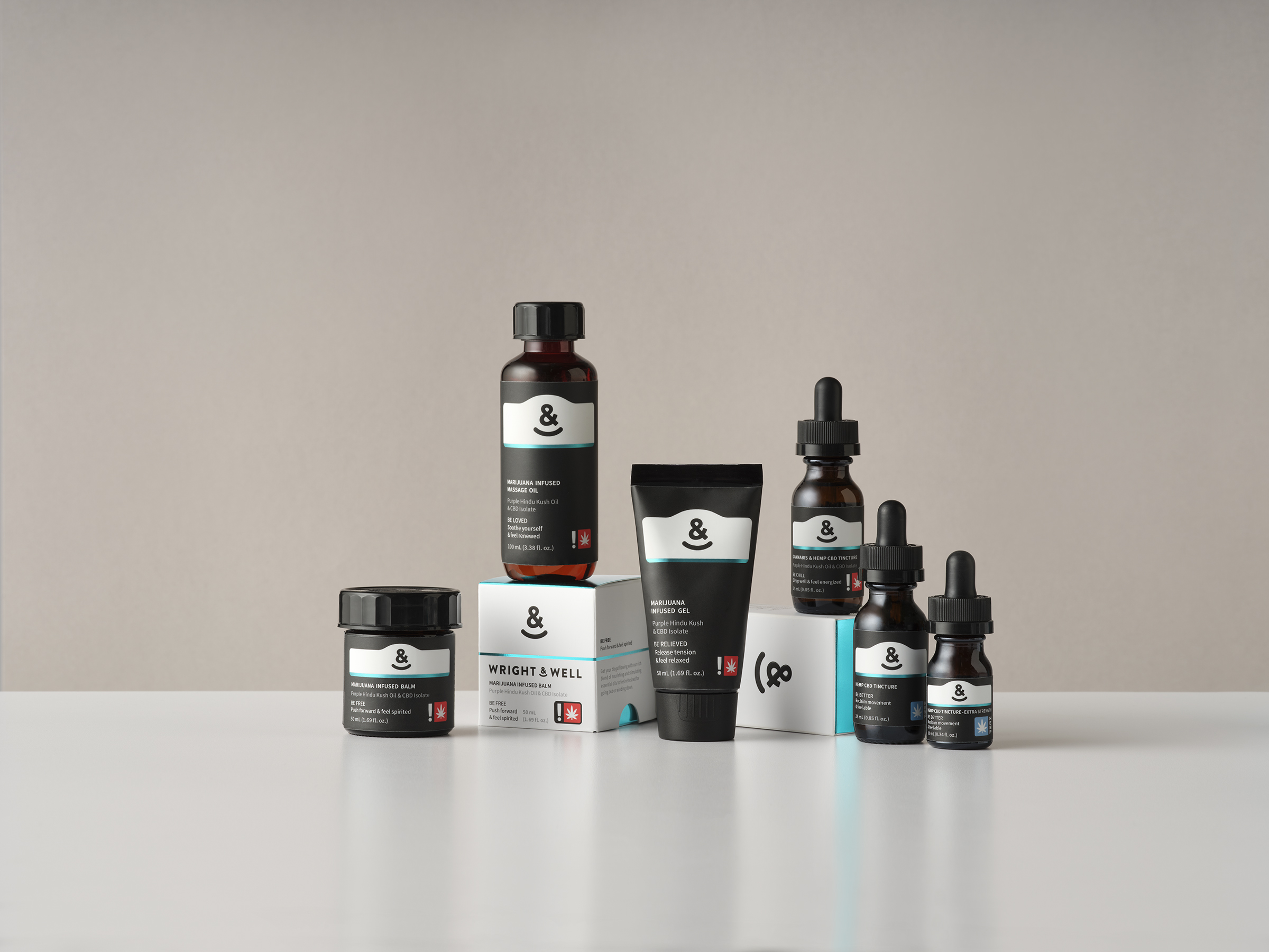
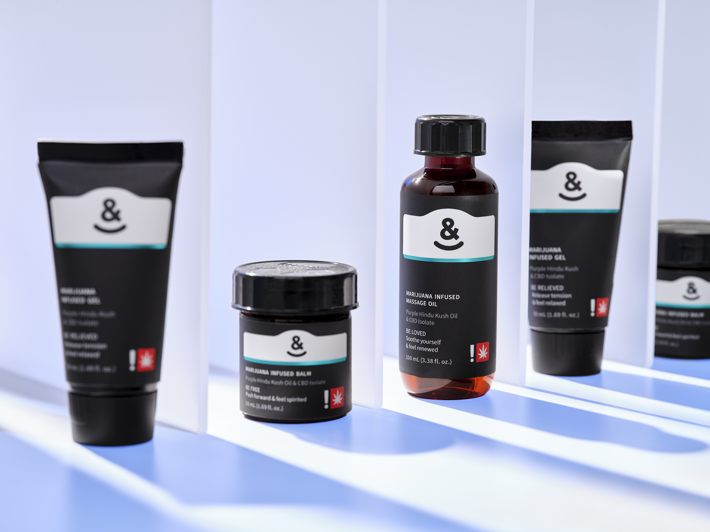
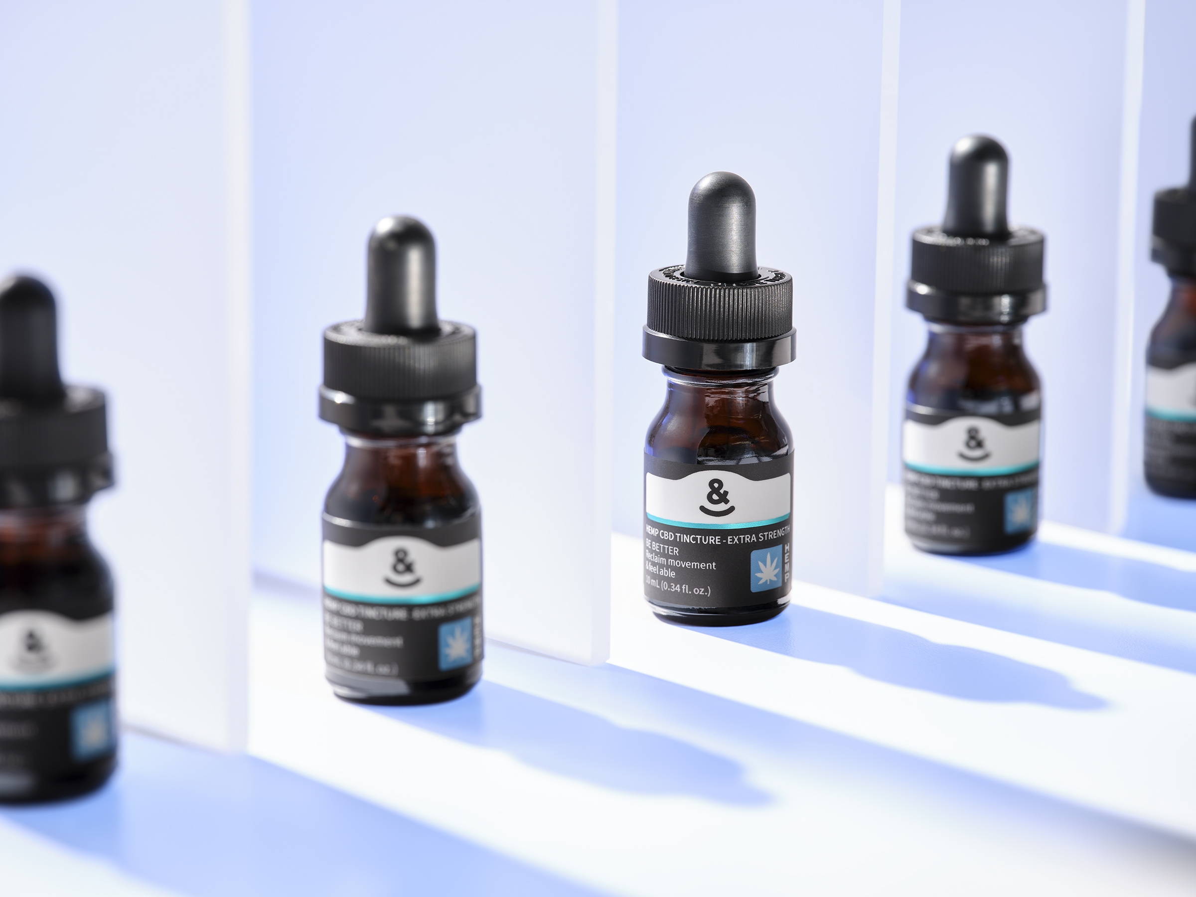
Wright & Well creates THC-infused topicals and tinctures for health-conscious customers seeking alternative ways to improve their wellbeing. Wright means “a maker of”. Wright & Well means “a maker of wellness.” Positioned as a high-end CBD/THC brand, the packaging needed to convey elegance while maintaining a strong wellness feel.
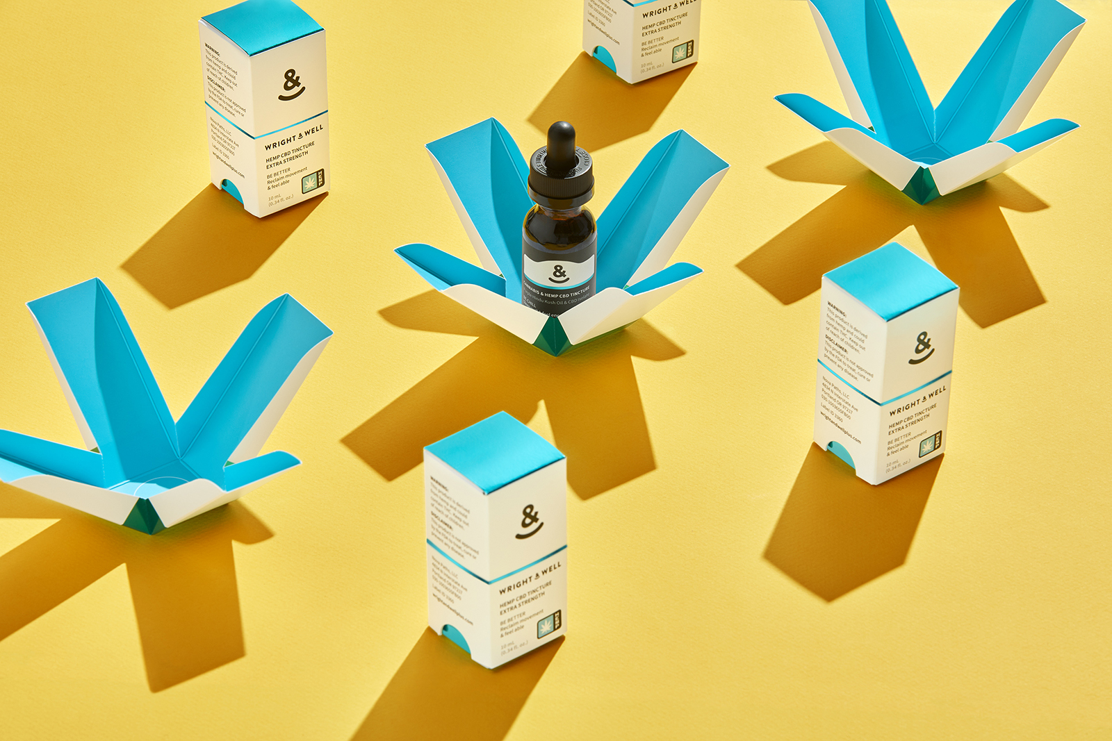
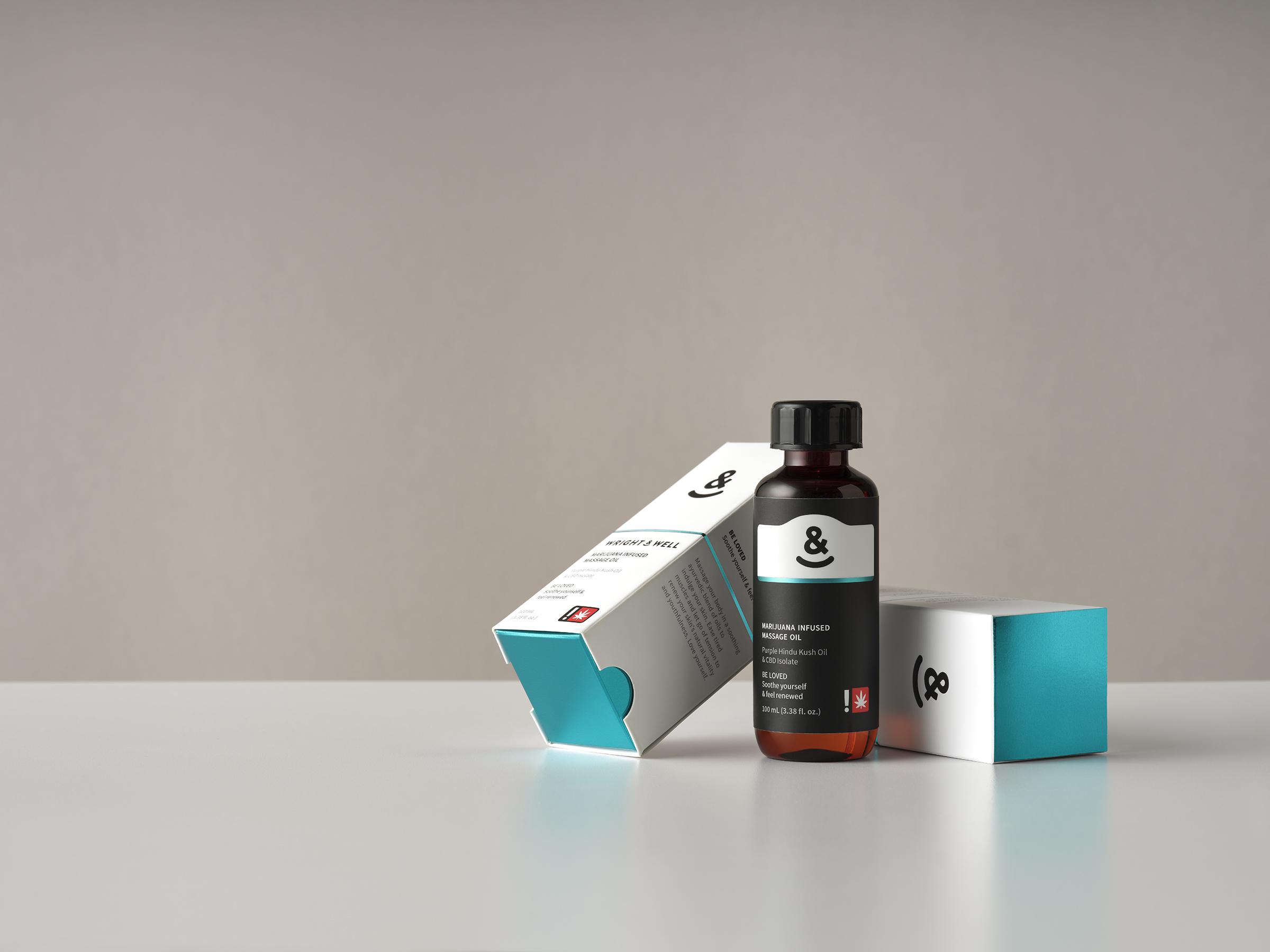
A high contrast colour palette was chosen to suggest a clean, no-nonsense approach. The embossing and metallic blue foil, used sparingly, adds a sense of prestige to the packaging design. The black logo and text elements match the black lids (child-resistant lids were only available in black at the time). Special attention was brought to the structure of the box itself. Precision die-cutting was required to ensure a snug fit. When the box top is lifted, the box bottom reveals the product in a blooming form. The Wright & Well Ampersand logo incorporates an inclusive and friendly smile. It also resembles an anchor, which represents stability, strength and safety. Wright & Well formulations can be found in dispensaries across the Oregon state.
CREDIT
- Agency/Creative: Better Plant Sciences
- Article Title: Wright & Well In-House Brand and Packaging Design of Alternative Wellbeing Products
- Organisation/Entity: In-house, Published Commercial Design
- Project Type: Packaging
- Agency/Creative Country: Canada
- Market Region: North America
- Project Deliverables: Brand Creation, Brand Experience, Brand Identity, Brand Naming, Brand Strategy, Branding, Graphic Design, Identity System, Packaging Design, Photography, Product Naming, Research, Structural Design, Tone of Voice
- Format: Bottle, Box, Jar, Tube
- Substrate: Glass, Glass Bottle, Glass Jar, Plastic


