


This is our third year of celebrating commercial and conceptual outstanding work by agencies, individual professionals and students. Again this year we are recognising the glocally big and the glocally small, all with one thing in common… super talent! Our team have narrowed the down this years selection to just 10 pieces of exceptional work. Work that makes a commercial difference, inspires all of us and takes the industry forward.
Remember it’s not over until the fat lady sings… to truly present the best work of 2017 you have to wait until the last day of 2017. That’s why we are only posting on 31st December 2017 for students and midnight (GMT) in London, United Kingdom for agencies. Hopefully this will give us all something else to celebrate. Happy New Year to all.
1. JKRZ WINNING HEARTZ, MINDZ & MEALZ – The 50th Anniversary Edition.
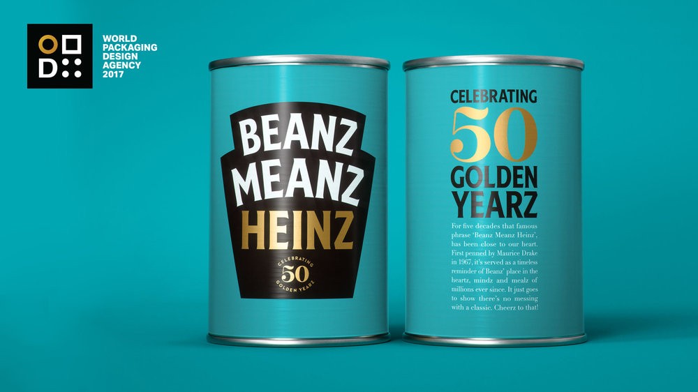
”Beans beans are good for your heart, the more you eat the more you fart.” We couldn’t resist it.. alright… this is never going to fly on a tin of cans or even be on a poster, but it does put a smile on our faces and show how close to peoples hearts this product and brand has become. The fact that children on both sides of the Atlantic sing this cheeky little chant, shows that it’s a part of our history. It’s a staple diet for many back in the day and a quick snack for many still to this today. Find out more how JKR’s awesome work helped mark the 50th year anniversary of the famous slogan ”Beanz Meanz Heinz”.
2. IdeaS that Make Squirrels Lose their Shit – Backbone Branding – Pchak
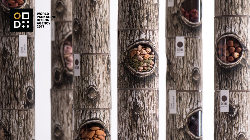
It’s one of those ideas any design team wished they came up with, so simple and so obvious it’s not been done before. Backbone Branding design goes beyond the idea of just strong shelf impact, by transporting us to a new environment and whole new world. Very powerful indeed!
3. The Dough that Dreams are Made Of – mousegraphics – St. George’s mills
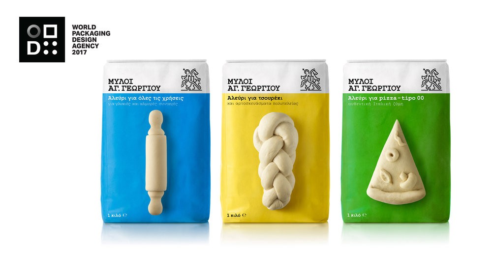
As Leonardo said “simplicity is the ultimate sophistication.” Don’t let anyone convince you that creating something simple is easy, yet time and time again Mousegraphics make it look easy. A lovely big idea and simply implemented to perfection.
4. SUPER Lusciously Illustratively Beautiful – B&B – Superfly
Superfly brand, super-design agency B&B and supermixologist Mr Lyan have created a product oozing with super confidence. The identity free front face is intriguing and makes you want to pick this exotic looking beverage up. Elegant, striking and very charming.
5. REfreshINGLY rebellious – Robot food – Vocation Craft Lager
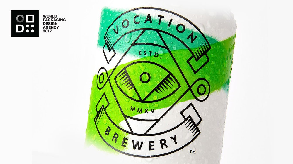
There are not many designs that stop you in your tracks and say ”what the the hell is that”, but Vocational Craft Lager / Pilsner by Robot Food does exactly that. Lager isn’t suppose to look like this! It irritates the eye and you automatically ignore it until… well until you have to have a second look to make sure the product in the right shopping isle and then that leads to picking it up. ”Rebellious, rude and irreverent… how dare they, who do they think they are?” …yet it totally works! It’s totally refreshing to see bravery and boldness coming back to the forefront of design, which we believe needs to be celebrated and encouraged. We applauded you Robot Food and Vocation Brewery.
6. Well and Truely Remembered – Midday – Well & Truly

Well & Truly different looking snack brand. Midday Studio have revitalised and rejuvenated this category through a playful tone of voice and a honest graphic approach. You know it’s a snack but it you feel the difference immediately, the communication has room to breathe and it’s not trying to say too much. A stunning example of a healthy snacking brand.
7. DESIGN Danish-centric – Taxi Studio – Carlsberg Limited Edition København Collection
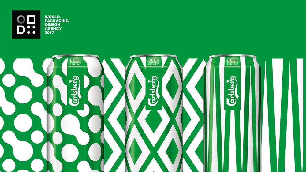
Taxi Studio Carlsberg København Collection design, has an essence of effortless and playfulness, yet the abstracted interpretations of Carlsberg’s most iconic beer ingredients is captivating visually and allows the brand to integrate its presence into a festival environment with ease and without being too overbearing. The design was also untilised across many other touch points successfully. A great example of a Limited Edition range.
8. Inka empire VODKA – IS Creative Studio – 14 INKAS
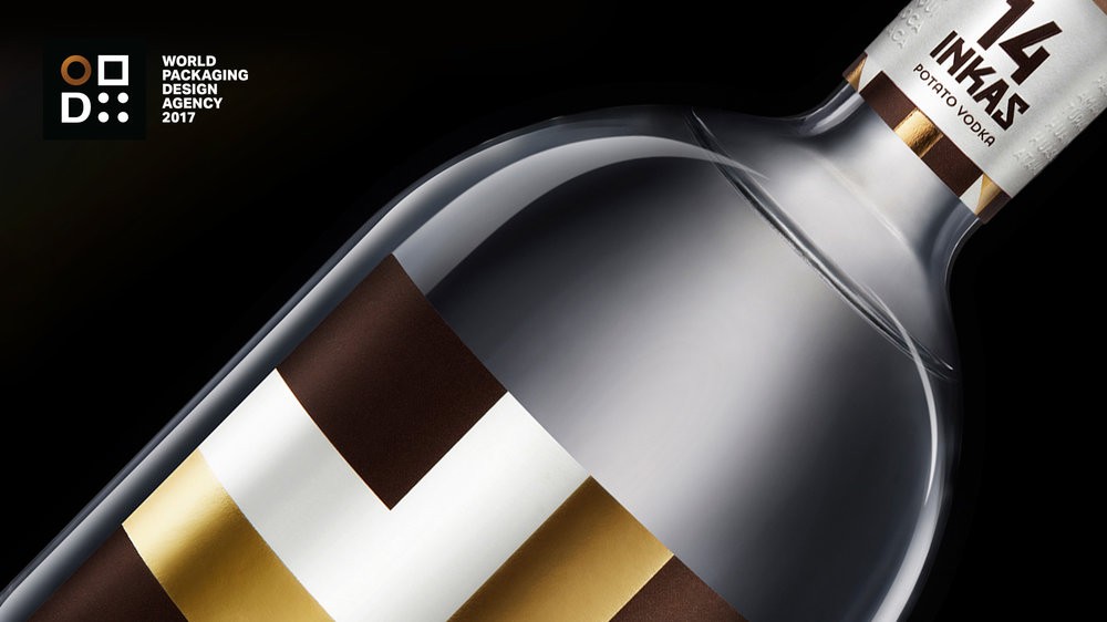
Pre-hispanic graphic system or heraldry belonging to the Inca nobility, this 14 Inkas is an impressive graphic packaging collection which is the first Peruvian Potato Vodka of it’s kind. We would all love to see the whole collection on a shelf. Alluring work by IS Creative Studio
9. THE Chocolatier, THE CraftsmanSHIP AND THE creativity – Lavernia & Cienfuegos – Utopick Chocolate
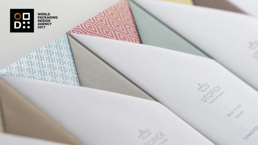
Lavernia & Cienfuegos has done justice to a Master Chocolatier and ingenious Craftsman, representing invention and creativity through the packaging, branding and to the chocolate product itself. Engaging from symbolism of an origami boat brand that entwines into the narrative of world discovery and gives birth to a unique rich rewrapping consuming experience. Stunning!
10. COUNTING DOWN THE DAYS – Stranger & Stranger – The prisoner
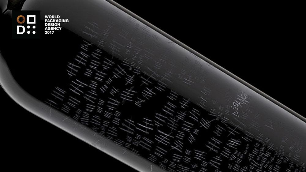
The prisoner doesn’t say much apart from ”Dérangéd is the $100 Prisoner reserve and it’s already sold out.” Another one of Stranger and Strangers own Limited Editions that is provocative, disturbing and a little different. The kind of product you would have to pick up from the shelves. Subtle, yet power use of detailing.
Concluding notesThis years work suggest we are going into 2018 with bigger ideas, clarity and stronger opinions. There is also an air of brands becoming more brave and understanding opinions are just as important as design, aesthetics and detailing. The last few years has seen the emergence of all things hand craft, yet there is still a lot of evidence that it still with us, yet consumer are still desiring more clarity rather than clutter. Brands (old and new) are more pressed to have a clearer message and an opinion, this can be challenging and hard to navigate during these turbulent times of digital and social media.The biggest news, potential threat and maybe biggest question of 2017 is the beast they call Amazon. Is differentiation the foundation carpet that is going to be ripped from underneath our feet? Will products no longer need to differentiate if they are no longer on a physical shelf and are sold online? Have we lost primary packaging as we know it forever? Well don’t hold your breath, but at the same time don’t put your head in the sand either. As always we would like to take this opportunity to say a big thank you to all the agencies, designers, contributors, advertisers, judges, editors and of course you the readers. Wishing you all a prosperous year ahead, best wishes from the World Packaging Design Society team.
CREDIT
- Article Title: World Packaging Design Agencies 2017
- Project Type: Packaging


