


When Rachel Allen first approached me about evolving her brand ecosystem, I was immediately intrigued by the challenge. Here was someone who had built an impressive career crafting strategic messaging for complex industries, yet her own brand architecture had evolved organically without the same strategic consideration she brought to client work.
Rachel operates under two distinct but related brands: Bolt, her strategic consultancy focused on client work, and her personal brand for independent writing projects. Over time, these had diverged visually, creating a fragmented ecosystem with five different typefaces and no clear relationship between the identities. Neither brand fully conveyed the sophisticated nature of her work or the unique blend of strategic rigour and creative flair that sets her apart. As Rachel’s practice evolved from copywriting into sophisticated strategic consulting, her brand presentation failed to keep pace. The Bolt brand had become too conservative, while her personal brand operated with an inconsistent visual language. I knew I needed to create a cohesive system that would reflect her premium market position while allowing each brand to maintain its distinct purpose.
My approach wasn’t to force these brands into identical twins, but rather to create what I called a “family relationship” — distinct individuals with clear shared DNA. The strategy focused on creating deliberate connections through shared elements while allowing each brand to maintain its unique personality.
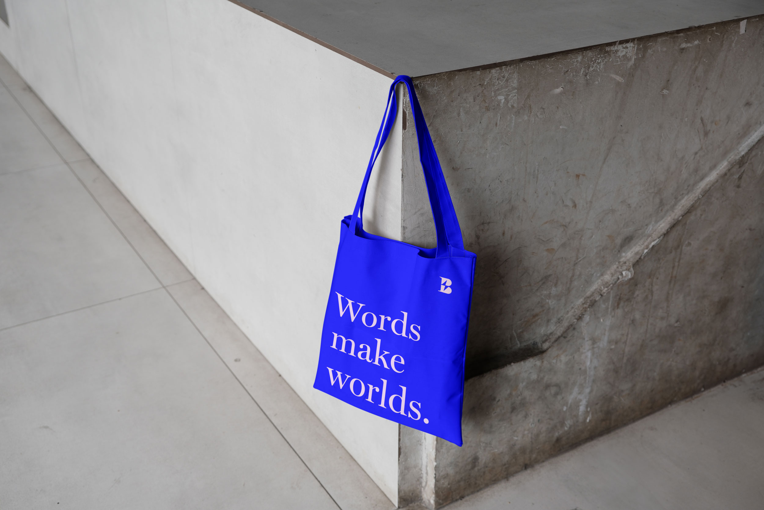
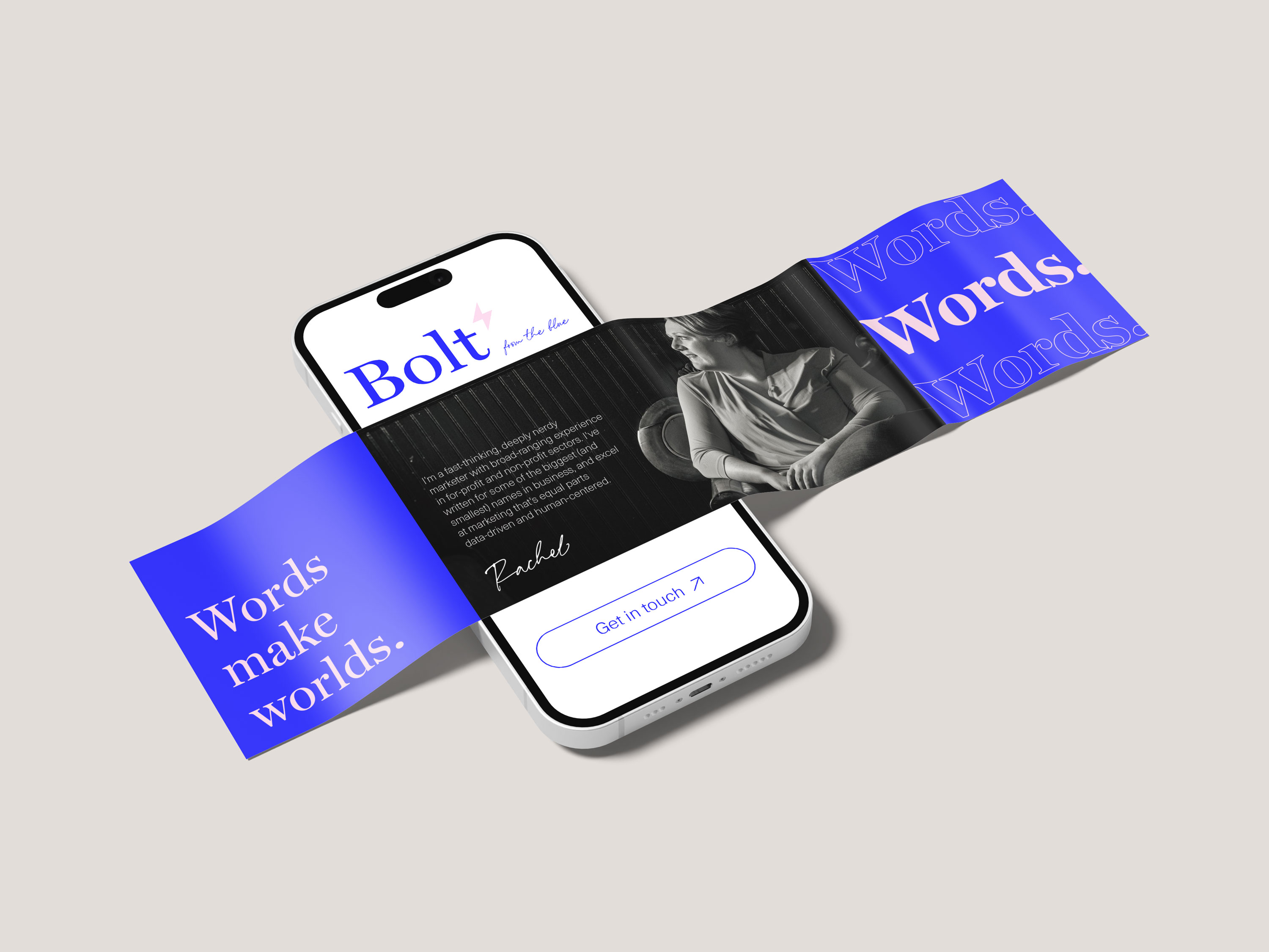
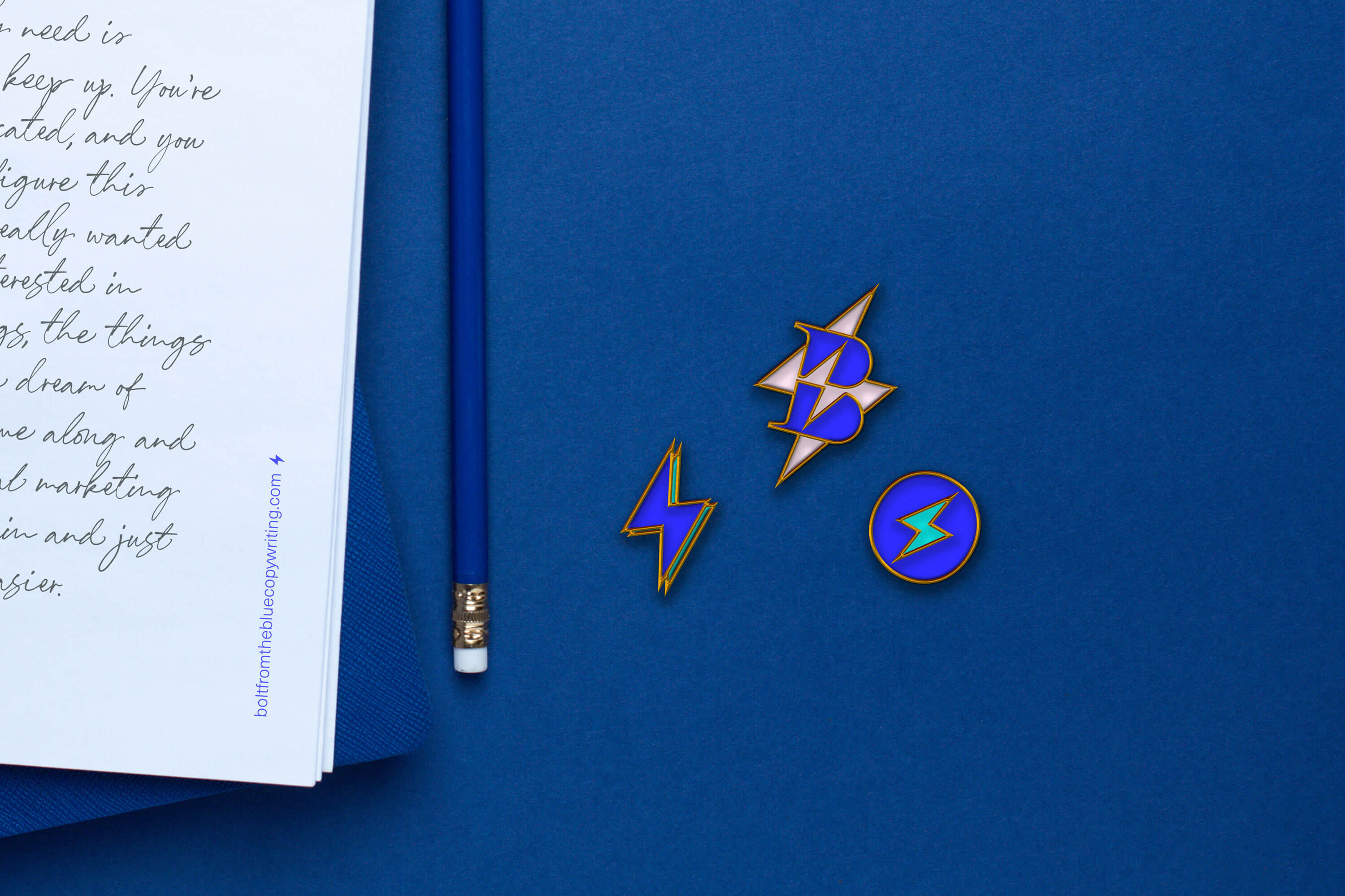
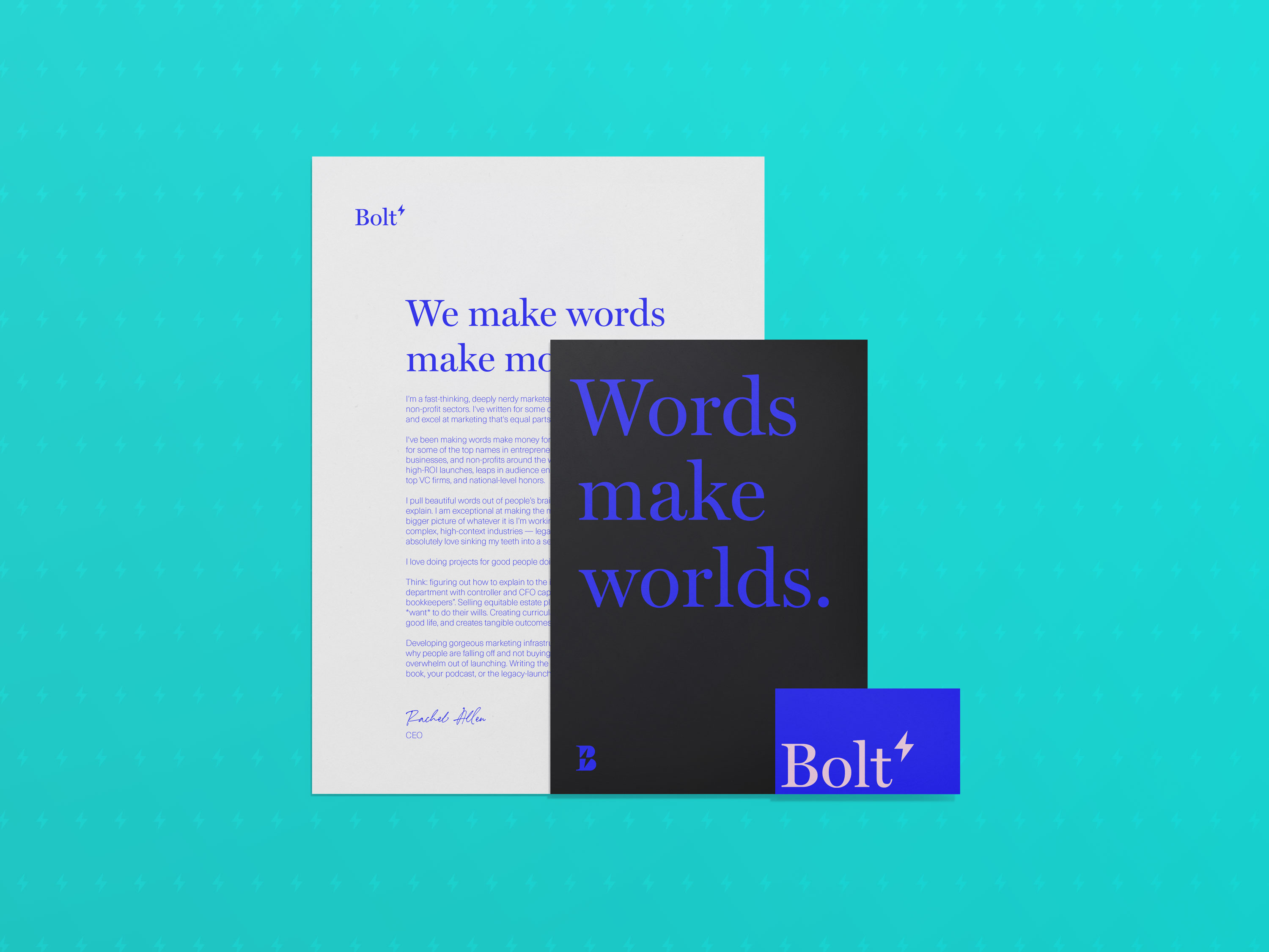
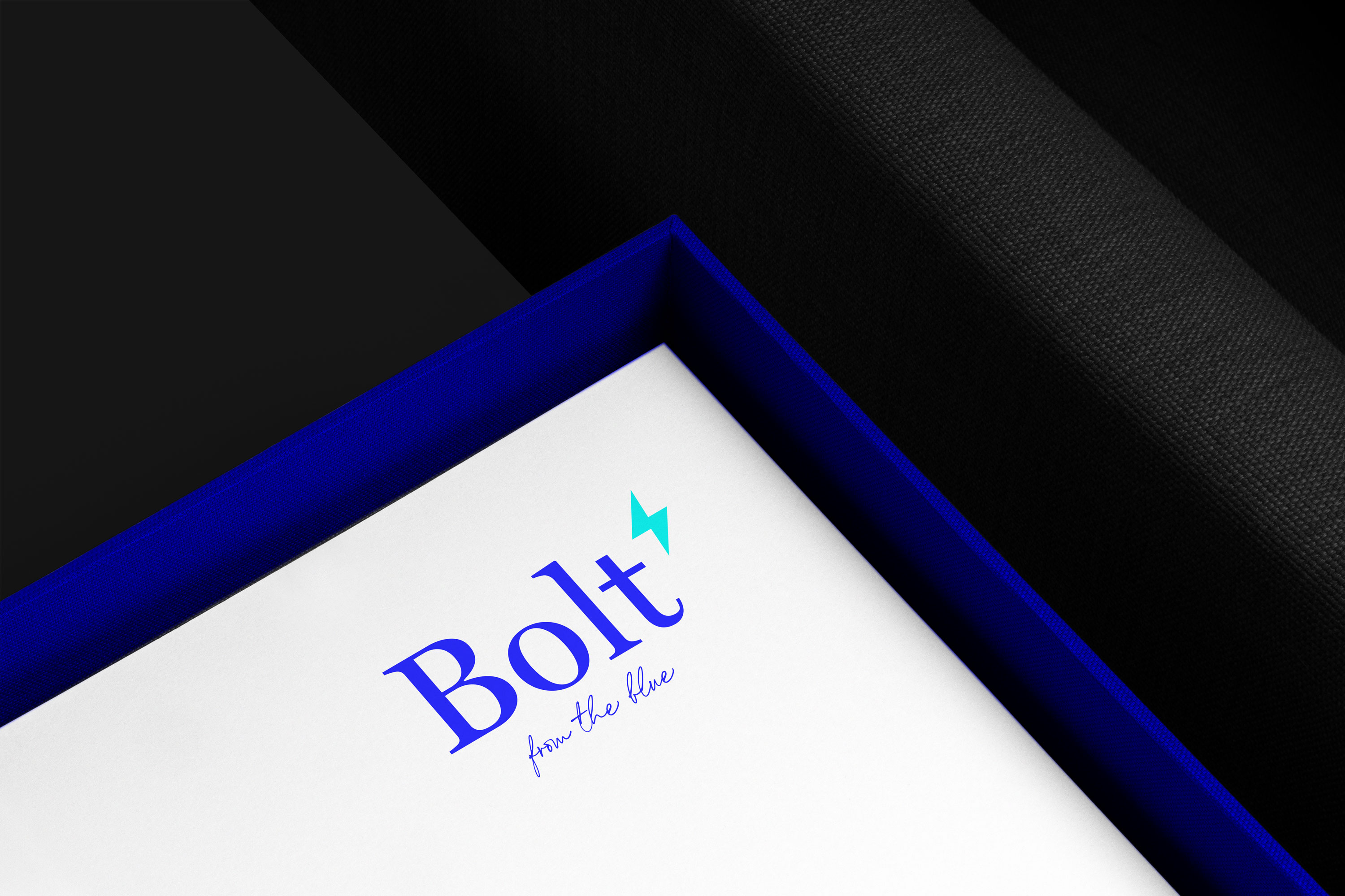
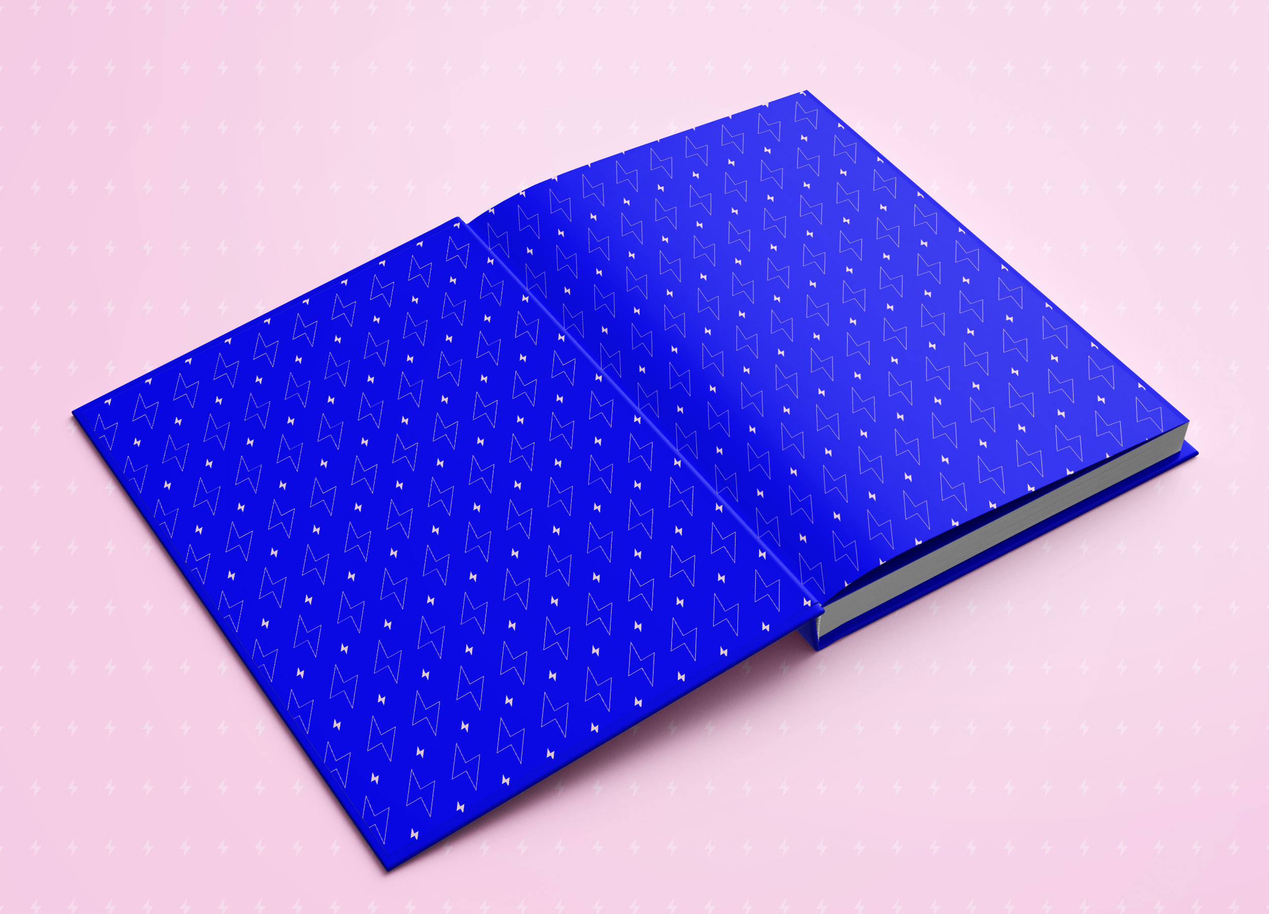
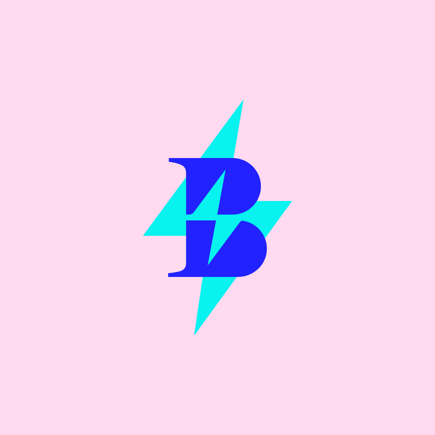
For Bolt, this meant liberating the lightning bolt from its confined position within the letter “O”. The bolt had been trapped, which I found ironic for a consultancy that helps clients release potential and create energy. The new logotype, set in Miller Display, brought distinctive character with its subtle quirks and refinement.
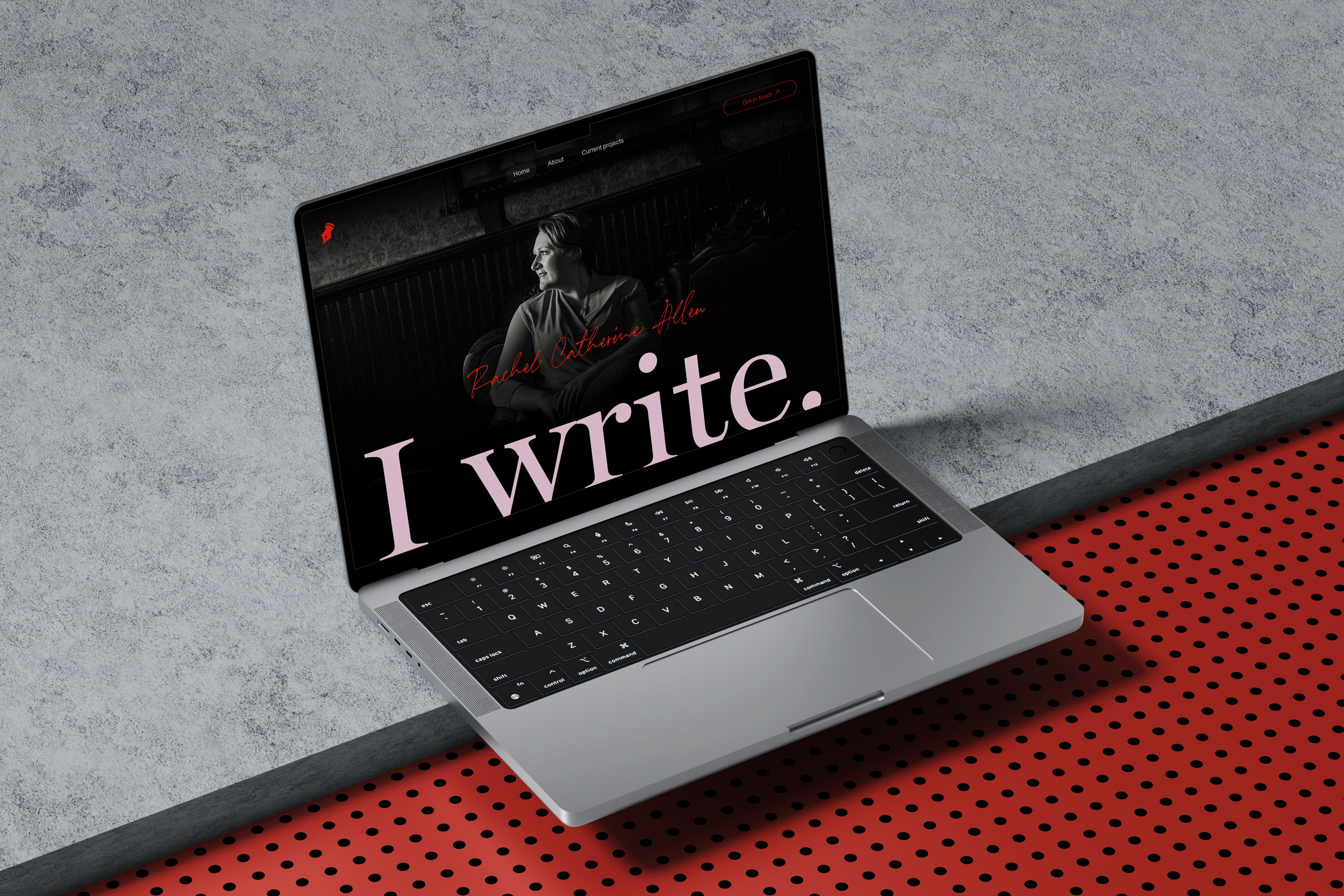
Rachel’s personal brand underwent similar refinement. While maintaining a script logotype to reflect her writing focus, we redrew it using Breathing, a more sophisticated typeface that created a subtle connection to the Bolt brand through shared typography. The personal brand’s pen icon was distilled to its essential form — a nib — creating a cleaner, more versatile symbol.
Perhaps the most distinctive aspect of this evolution was the colour refinement. Rather than forcing a monolithic palette across both brands, I established connections through shared base colours (soft black and warm grey) and an unexpected connecting accent: baby pink. This touch of sophisticated surprise perfectly reflected Rachel’s approach—serious and rigorous, but with an element of delight.
Each brand maintained its signature colour: a bold blue for Bolt reflecting strategic strength, and a confident red for Rachel’s personal brand. Bolt received an additional turquoise accent for added dynamism, ensuring the system balanced professional authority with creative energy.
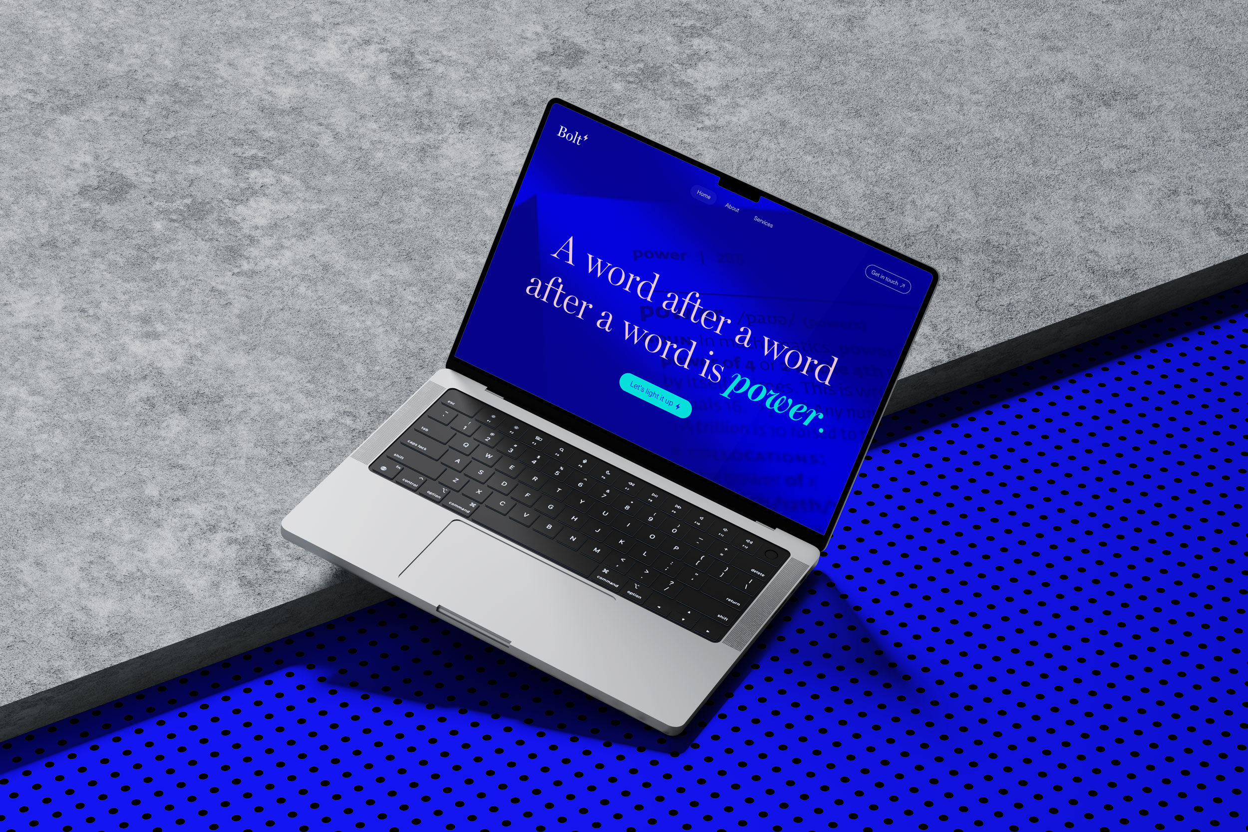
The typography presented its own challenge. I streamlined the system to three purposeful typefaces working in concert: Miller Display for sophisticated headings and the Bolt logotype; Breathing for expressive accents and the personal brand logotype; and Neue Haas for clarity in body copy and sub-headings.
This typographic system gives both brands a cohesive voice while allowing for different accents depending on context. It’s sophisticated yet approachable, mirroring Rachel’s ability to make complex ideas accessible. As a designer, I’ve always believed that typography is the voice of a brand, and this system creates a voice that can whisper or declare as needed.
What makes this project particularly satisfying is how the brand evolution has influenced how Rachel articulates her value. She’s mentioned that the clearer visual system has helped her communicate more confidently about her work. That’s the power of thoughtful design — it doesn’t just represent; it clarifies and amplifies.
We didn’t discard the equity Rachel had built; we refined and focused it. The result is a system that feels both fresh and inevitable — as though this is what the brands were always meant to be. By creating deliberate connections while preserving distinct identities, the system achieves that rare balance of strategic rigour and creative expression, mirroring exactly what Rachel offers her clients.
It’s a perfect embodiment of Rachel’s own tagline: a word after a word after a word is power. Through this brand evolution, that power is now visible at first glance.

CREDIT
- Agency/Creative: Petchy
- Article Title: Words Made Visible: Bolt’s Brand Transformation by Petchy
- Organisation/Entity: Freelance
- Project Type: Identity
- Project Status: Published
- Agency/Creative Country: Norway
- Agency/Creative City: FREI
- Market Region: North America, Global
- Project Deliverables: Brand Design, Brand Guidelines, Brand Identity, Brand Refinement, Brand Strategy, Branding, Identity System, Logo Design, Rebranding
- Industry: Professional Services
- Keywords: branding, brand identity, brand strategy, founder, copywriting, marketing, business
-
Credits:
Strategic Brand Consultant & Creative Director: Solveig Petch
Client: Rachel Allen


