


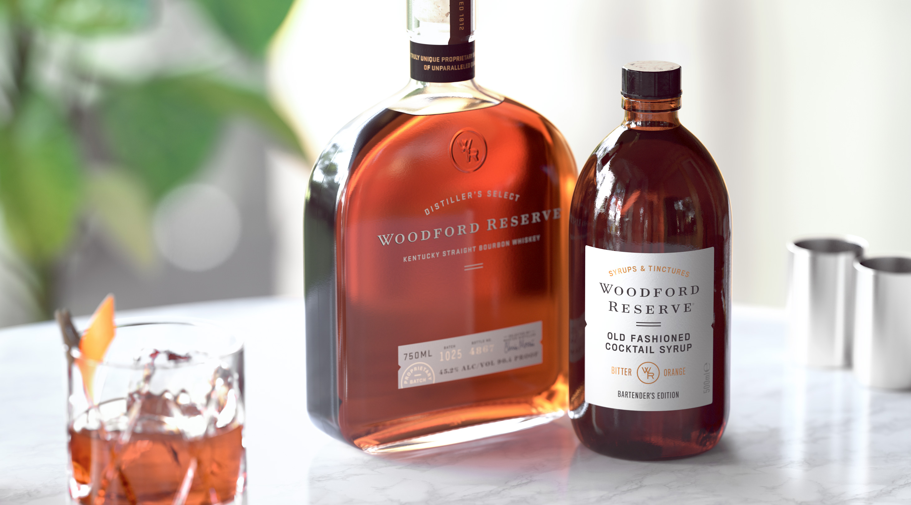
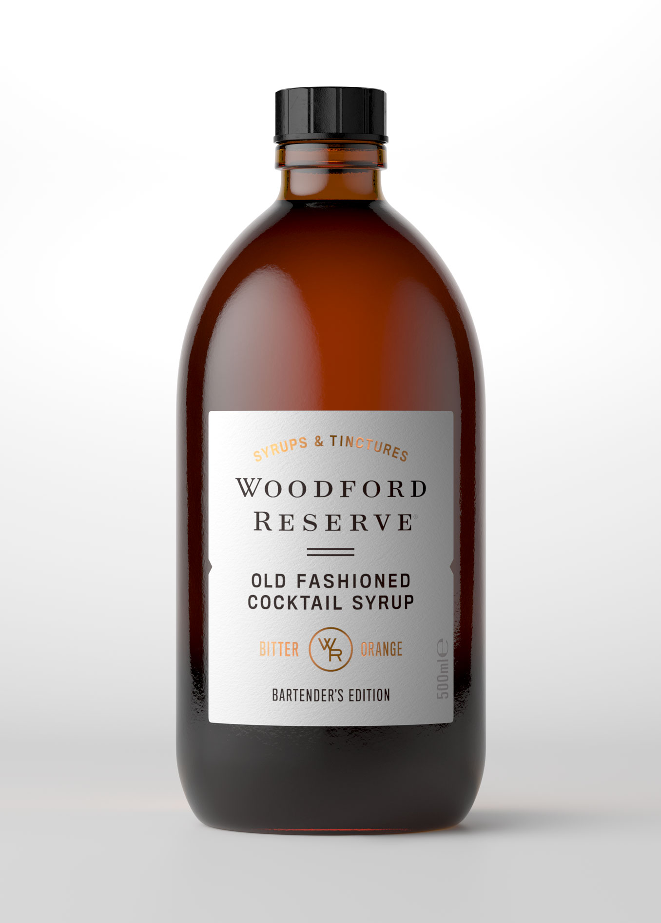
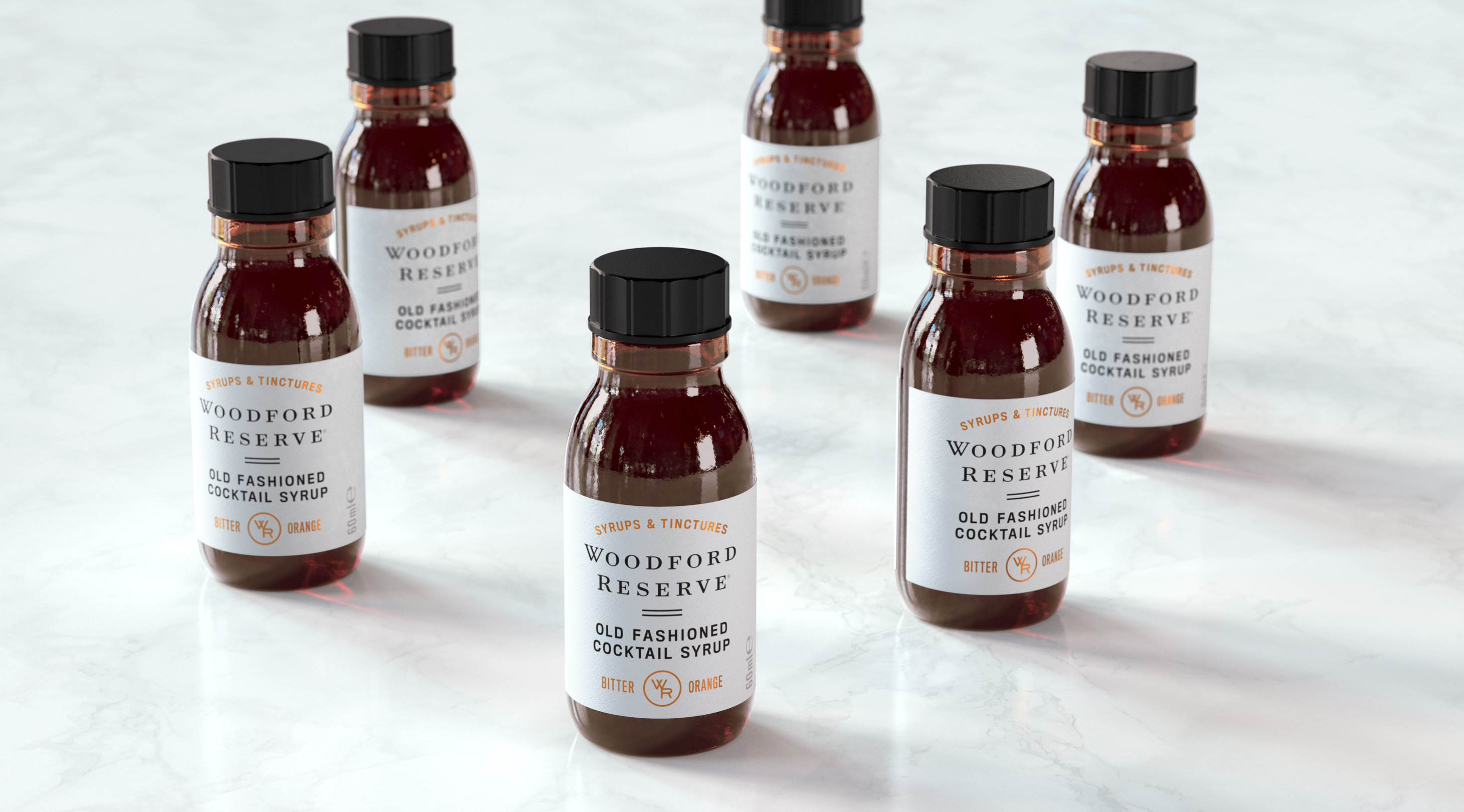
As the official spirit of Old Fashioned week, Woodford Reserve launch a range of Old Fashioned simple syrups. Our task was to name the new product range and create the packaging and visual identity to accompany this new innovation. The design had to be premium, authentic and undeniably Woodford. Initially launching with the Bartenders Edition, our design needed to translate seamlessly across multiple sizes and future flavours.
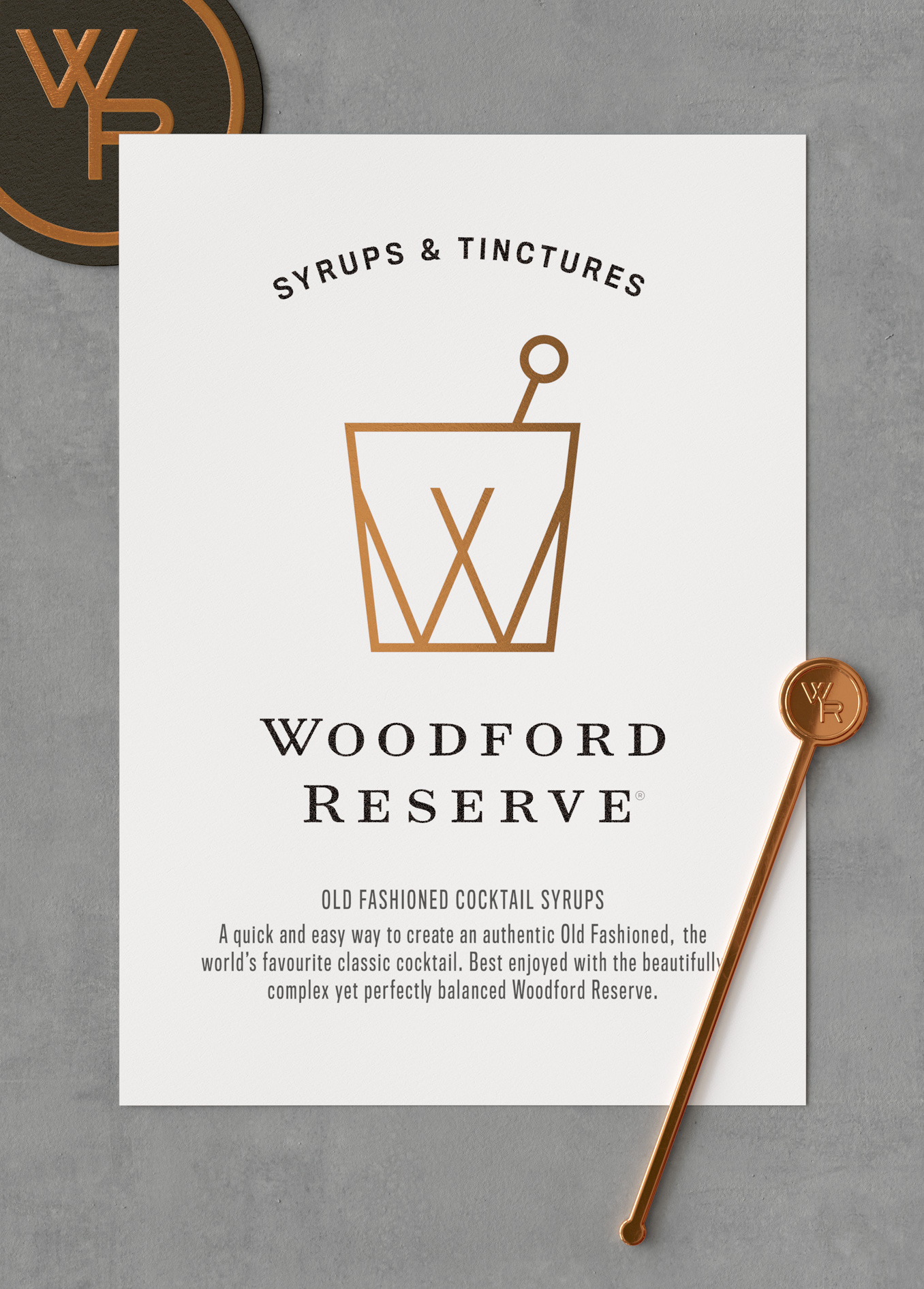
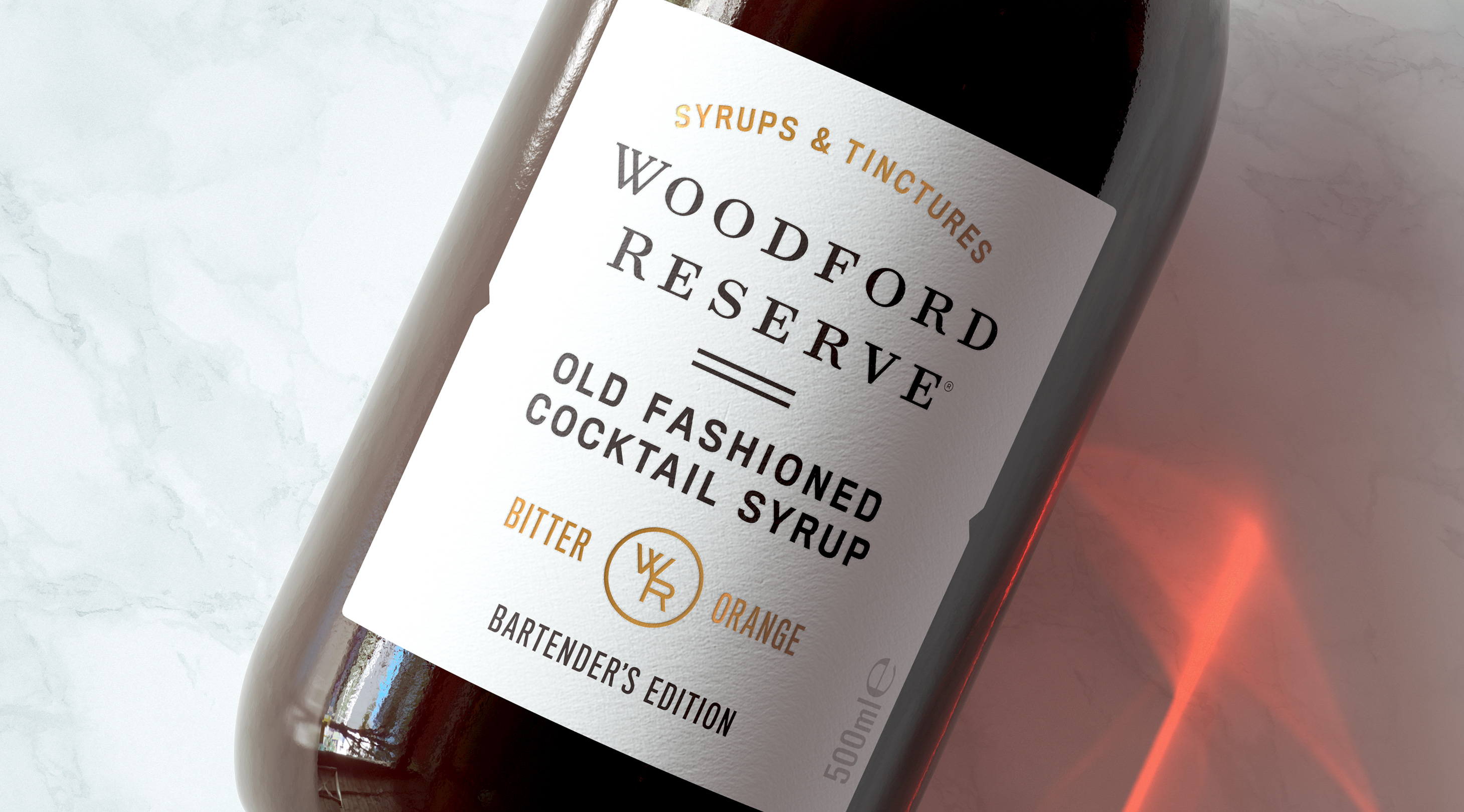
We created the perfect partner to the bartender’s favourite bourbon. The design takes its lead from the sophisticated brand architecture of Woodford, adding touches of tactility and texture with choice paper stocks and foils. We created new iconography which now sits within the Woodford Reserve global brand tool-kit. Authenticity is key for Woodford Reserve, so creating a new range that immediately felt part of the family was a must. Initially launched as an innovation for Old Fashioned week, Woodford Reserve Syrups and Tinctures received immediate acclaim and have now been made a part of the brand’s global offer.

CREDIT
- Agency/Creative: Middday
- Article Title: Woodford Reserve Simple Syrup Packaging Design Middday Studio
- Organisation/Entity: Agency, Published Commercial Design
- Project Type: Packaging
- Agency/Creative Country: United Kingdom
- Market Region: Asia
- Project Deliverables: Brand Identity, Brand Naming, Packaging Design, Product Architecture
- Format: Bottle
- Substrate: Glass Bottle


