WMH&I has reimagined thebrand identity of Redbreast, the world’s most-awarded singlepot still whiskey, refining its visual identity to match the prestige it has long held among whiskey aficionados.
As Redbreast continues to grow globally, the opportunity arose to elevate its brand world further, ensuring its visual identity fully reflects its ultra-premium credentials.
The challenge was clear: to enhance Redbreast’s iconic Robin and create a distinctive, premium expression of the brand that sets it apart in a category rich with heritage symbols.
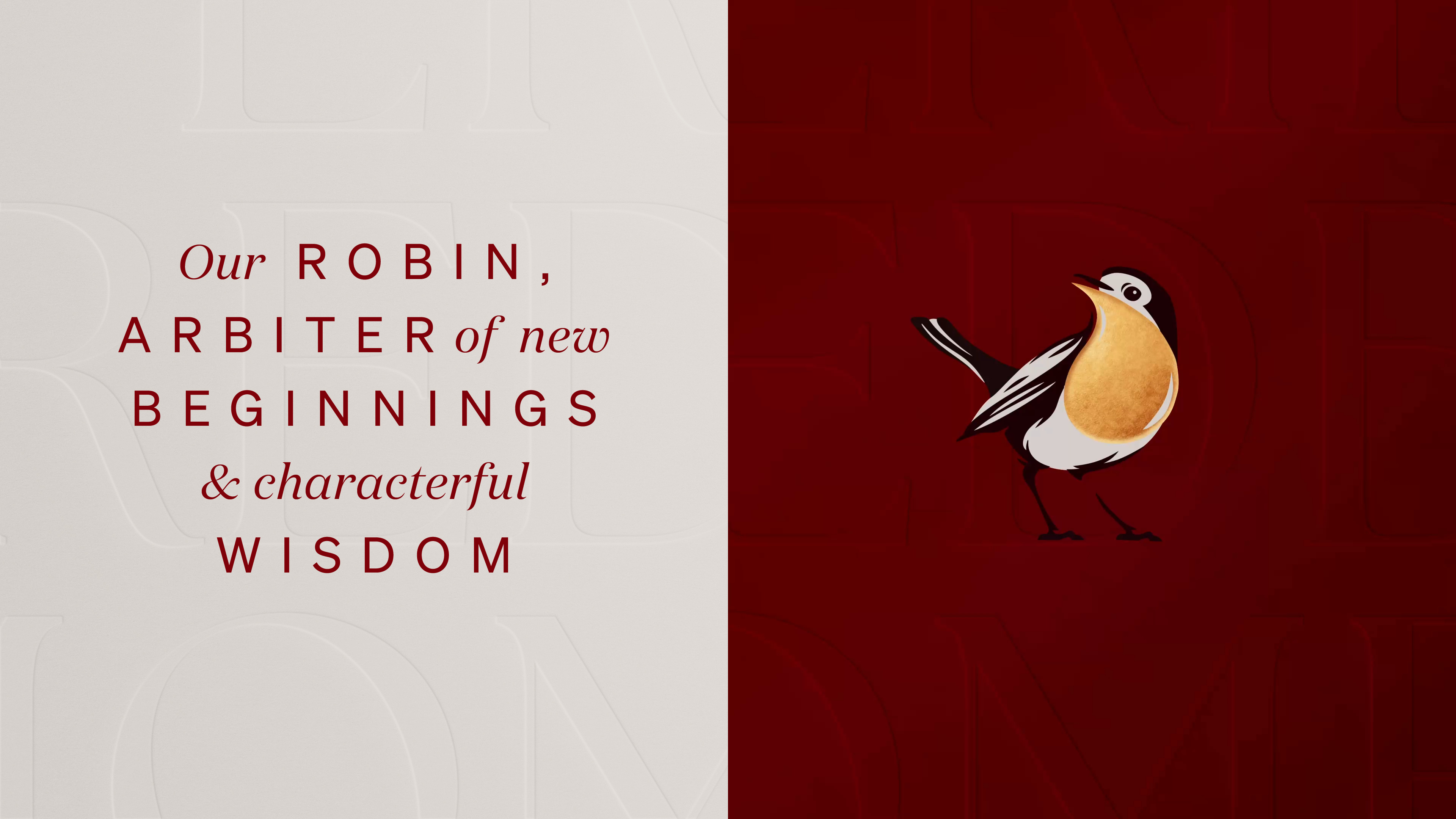
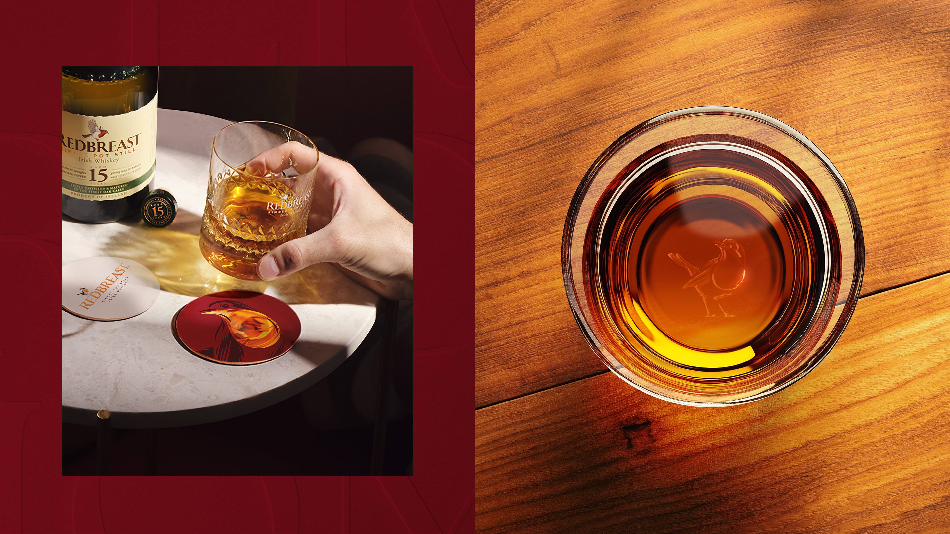
WMH&I’s approach was inspired by the very essence of Redbreast – the copper-hued feathers of its namesake bird, glimpsed in the half-light of winter. This insight led to a simple yet powerful creative idea: visualising the link between the robin’s breast and the liquid copper tones of the whiskey itself.
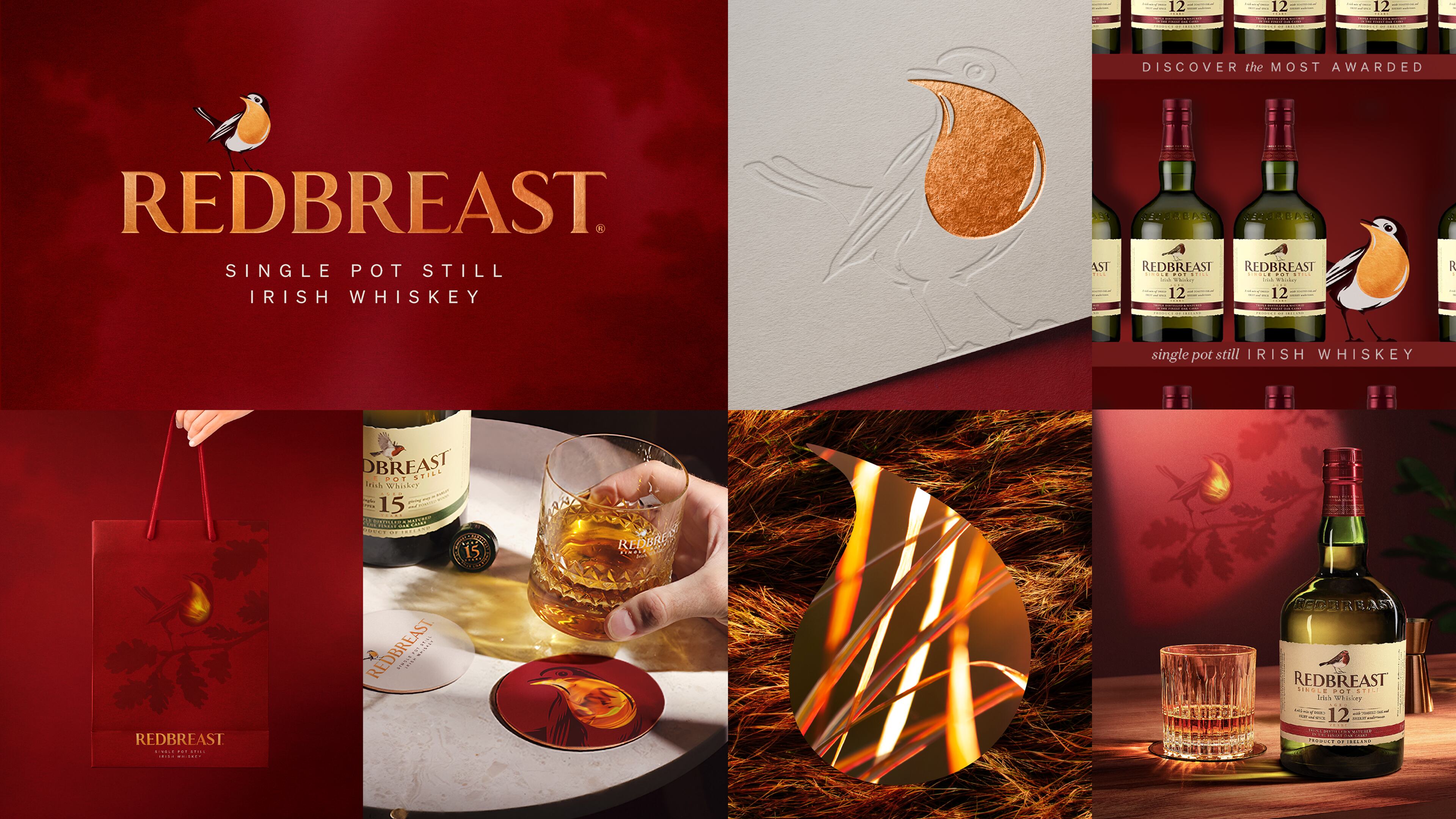
The new Robin icon exudes premium craftsmanship, capturing the bird’s inquisitive nature and elevating its distinctive red breast into an emblem of Redbreast whiskey. The refined identity brings depth and elegance, with a brand colour palette of rich coppers and burgundies, embossing, foiling, and refined typography that enhances balance and finesse.
The new brand world ensures seamless application across digital, in-store, on-trade, and advertising. TheRobin’s red breast has been transformed into a versatile, ownable design element, reinforcing brand recognition at every touchpoint.
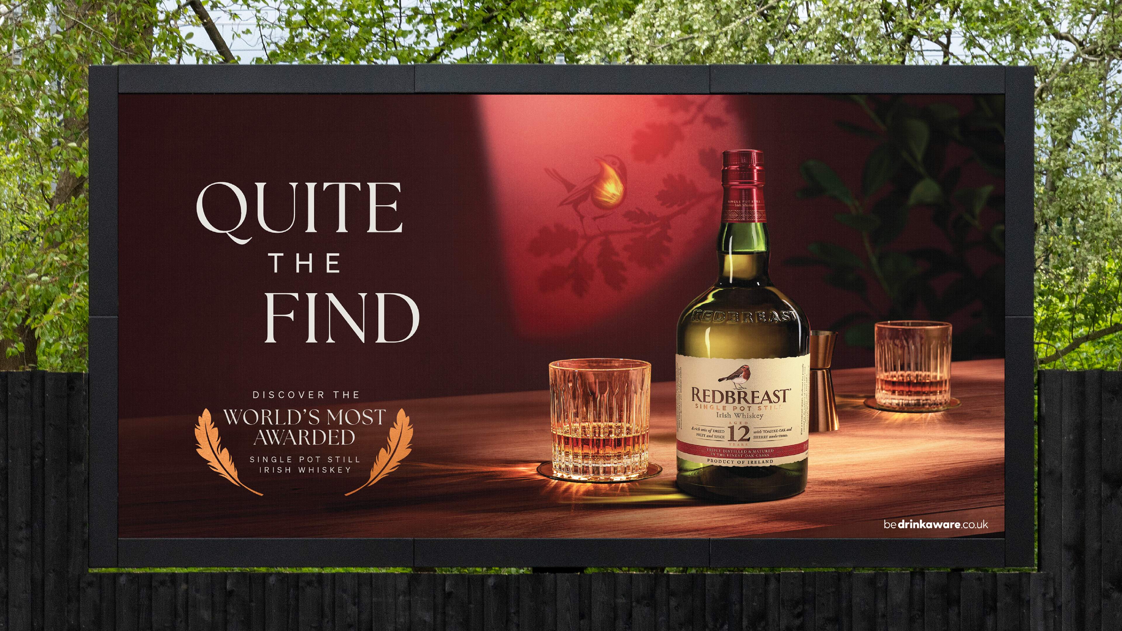
The new identity has been enthusiastically embraced by Redbreast’s local markets, achieving immediate implementation—a rare feat in the organisation. It has inspired an unexpected OOH campaign in Ireland, demonstrating the impact of the revitalised brand.
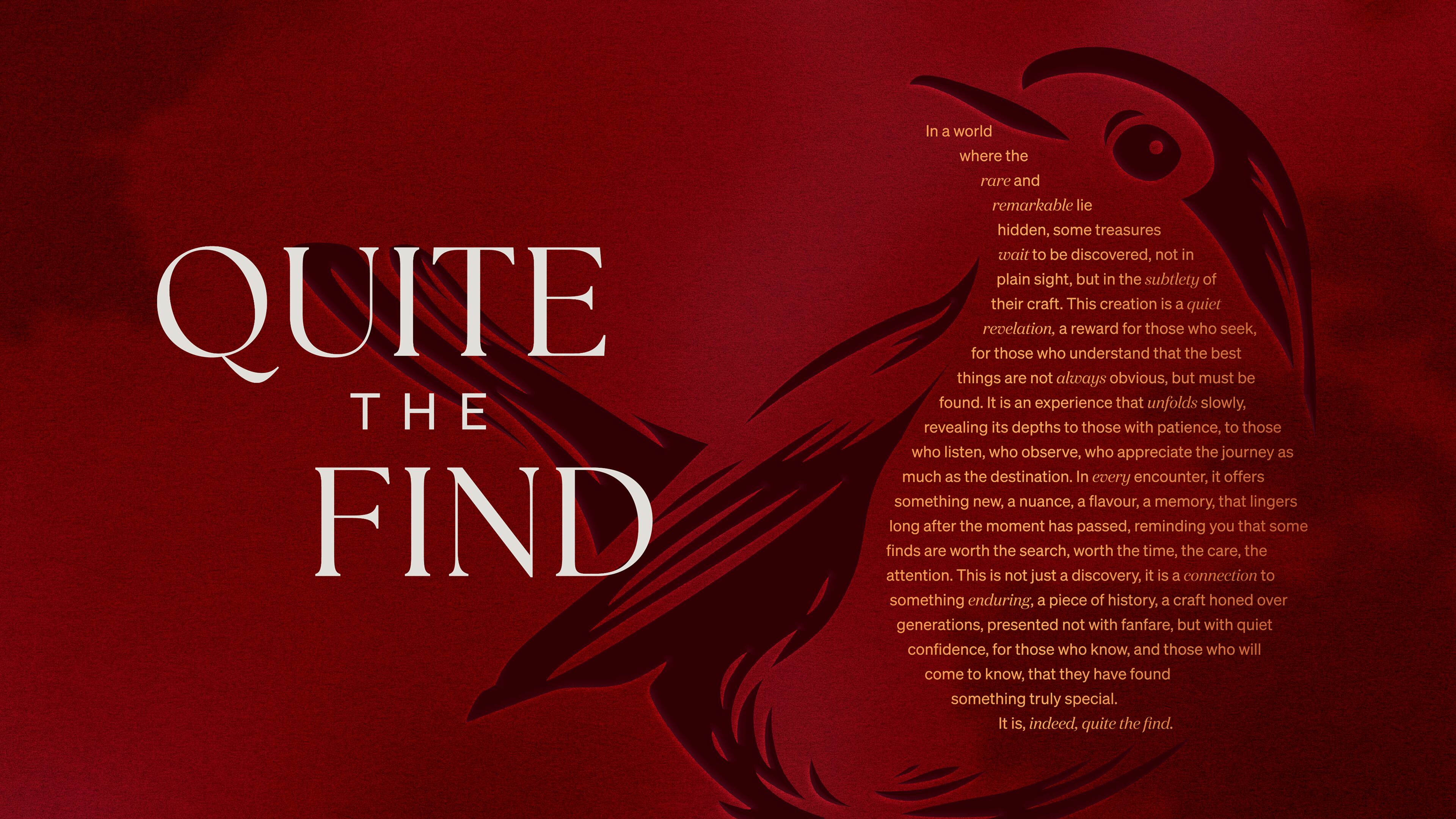
With this rebrand, Redbreast now boasts an identity as rich and refined as the whiskey itself. Quite the find, indeed.
CREDIT
- Agency/Creative: WMH&I
- Article Title: WMH&I Elevates Redbreast’s Iconic Robin Into a Premium Whiskey Brand World
- Organisation/Entity: Agency
- Project Type: Identity
- Project Status: Published
- Agency/Creative Country: United Kingdom
- Agency/Creative City: London
- Market Region: Europe
- Project Deliverables: Brand Identity
- Industry: Food/Beverage
- Keywords: Brand identity, branding
-
Credits:
Creative Director: Mark Nichols
Director of Growth: Wybe Magermans
Strategy Director: Ben Stewart
Design Director: James Flint
Senior Designer: Dan Coleman
Senior Designer: Roz Fraser
Account Manager: Eloise Percy- Davis
Production Manager: Val McCrum
Copywriter: Dylan Glover
Image Retoucher: Regan Ross
Motion Designer: Matt Richings
Illustration: Gary Redford
Logo Typography: West One Arts
Bottle Photography: Rob Lawson
Head of Prestige & Speciality at Pernod Ricard – Irish Distillers: Laura Hanratty
Marketing Manager Redbreast & Powers at Pernod Ricard – Irish Distillers: Kate McCarthy -
Account Director: Emmanuelle Hilson


