Earthling Studio rebuilds the brand identity of beverage category disruptor, JUBEL, with a focus on distinctiveness, flexibility, and branded experiences.
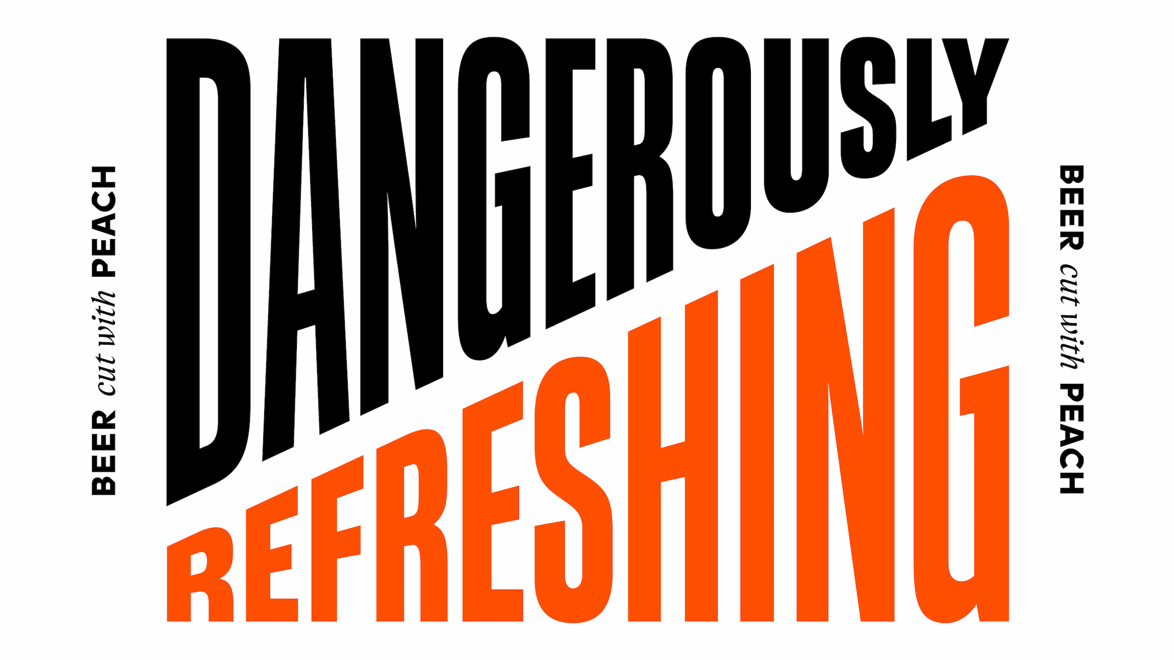
JUBEL listen to their consumers, whether it be at the pub or when getting cans into people’s hands at events. Drinkers talk about how “dangerously refreshing” the product is, this is the biggest reason people consume the brand. It’s an amazing beer, brewed like no-one else, bringing together the crisp refreshment of a cider and the sessionability of a lager.
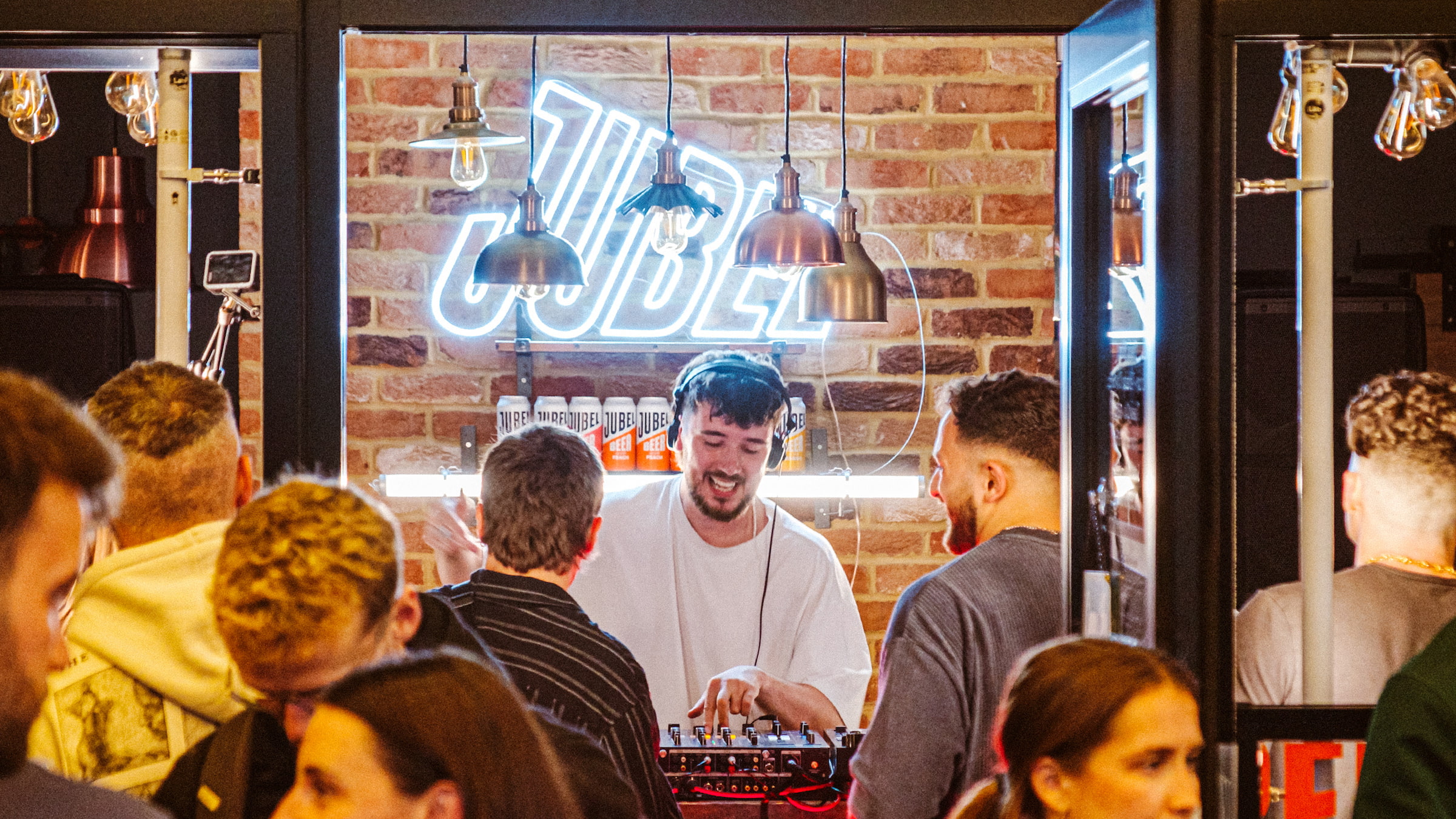
The current brand identity was not delivering against this idea of ‘Dangerous Refreshment’, nor did it provide the flexibility needed to brand JUBEL’s pop-up experiences or festival activations.
Distinctive Flexibility
With the brand growing at triple digits in the on and off-trade, focus was placed on improving distinctiveness, building on and upgrading JUBEL’s existing brand assets, ensuring that the identity delivered a crafted kit of parts that could be seamlessly applied.
With this is mind the Earthling team began unpacking the brands personality and the product truths that would underpin the ‘Dangerously Refreshing’ idea. JUBEL is a brand rich in inspiration. A product with an inherent lightness, perfect for group occasions. A brand born in the Après, that is about dopamine, not adrenaline, feel good factor, not fear factor, but that is bold, spontaneous and unafraid to push boundaries or think differently. This manifests strongly in the social experiences the brand hosts and the camaraderie within the team.
“There is an intensity and a freshness to everything the JUBEL team do, it’s uplifting, not intimidating. It’s what makes them special. Everyone is welcome on the ride. We wanted to imbue this spirit into the work”. – Tom Bruce, Managing Partner, Earthling Studio.
Dialling Up the Cut
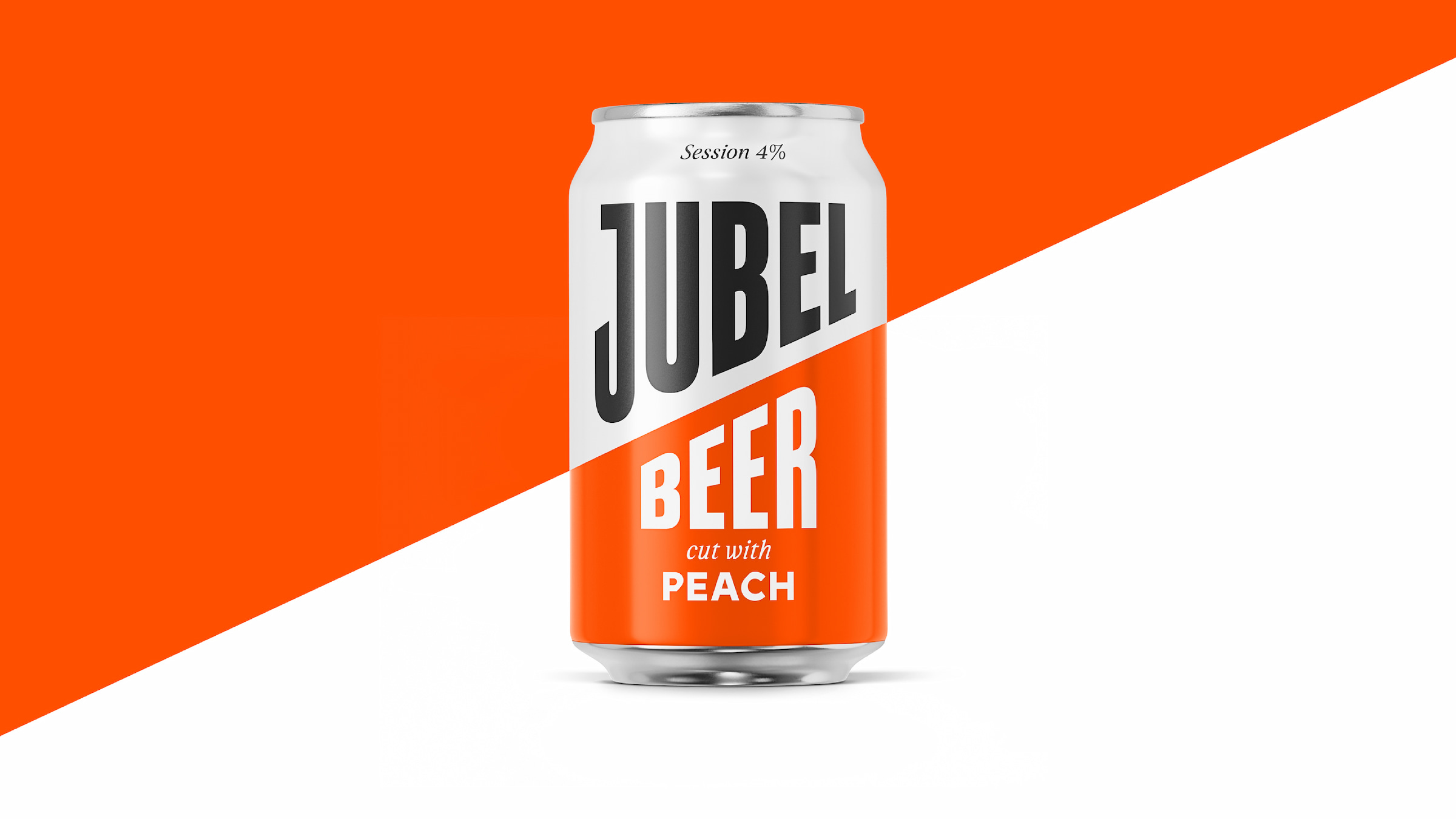
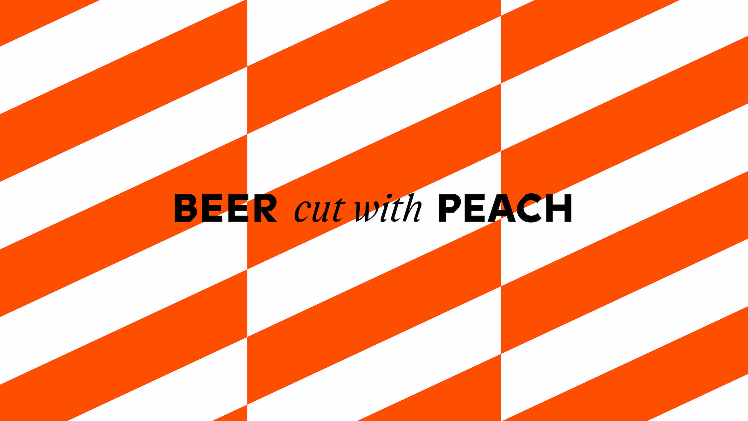
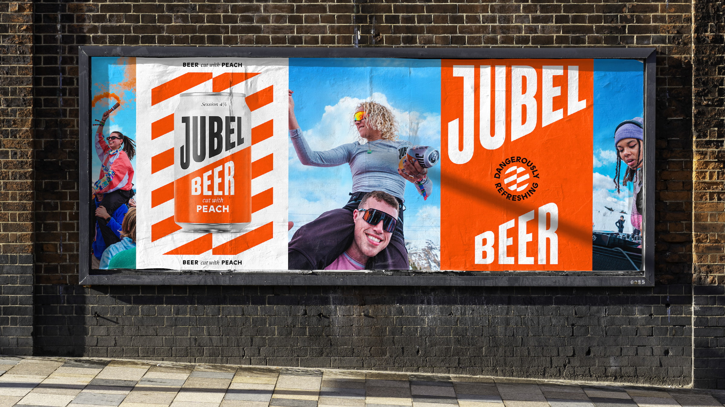
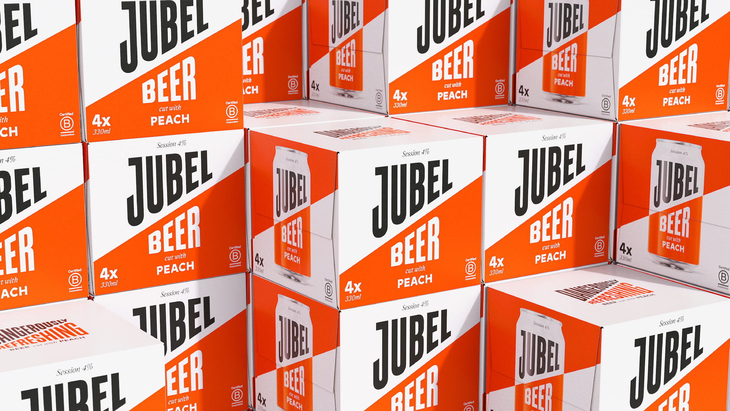
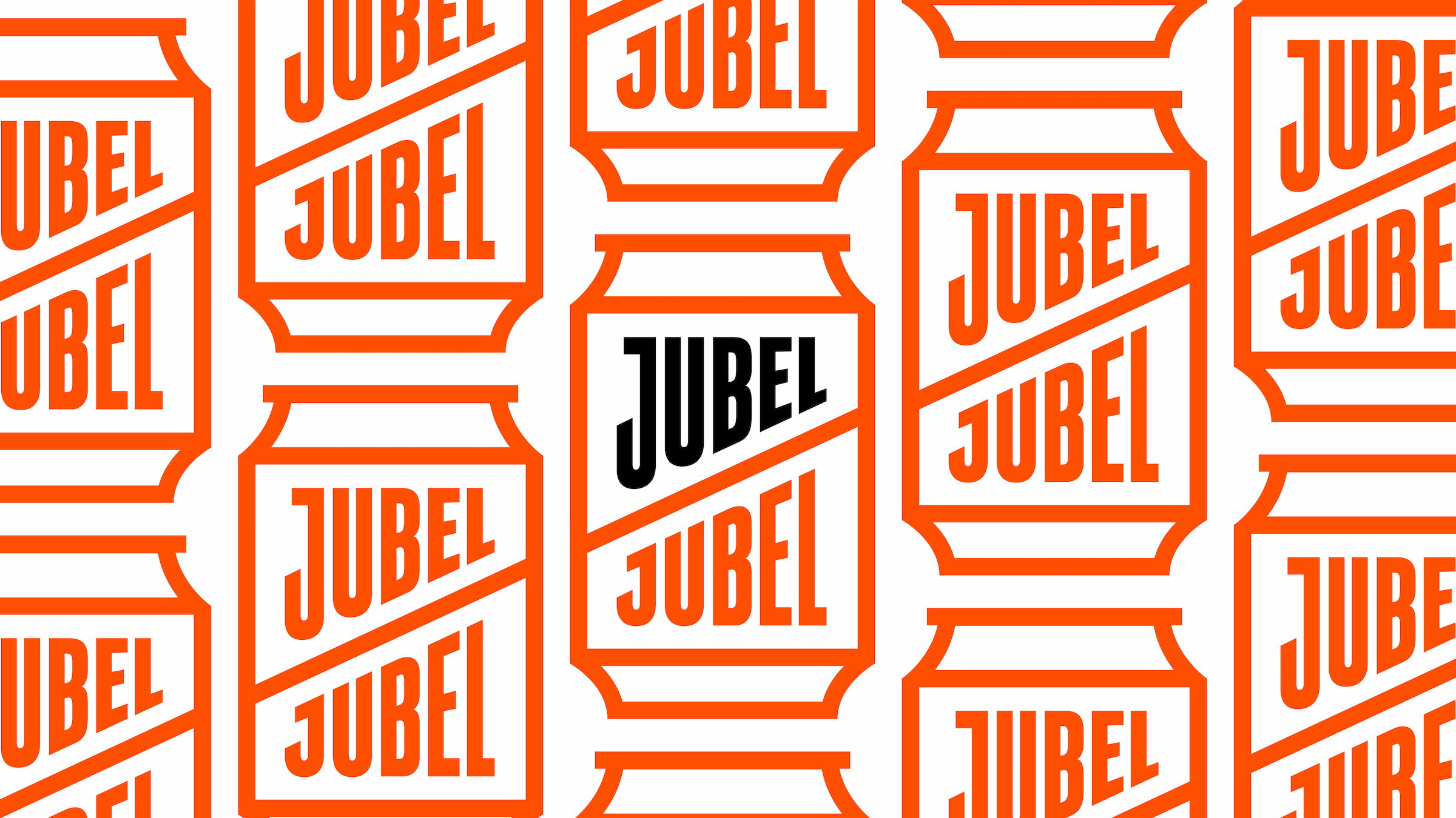
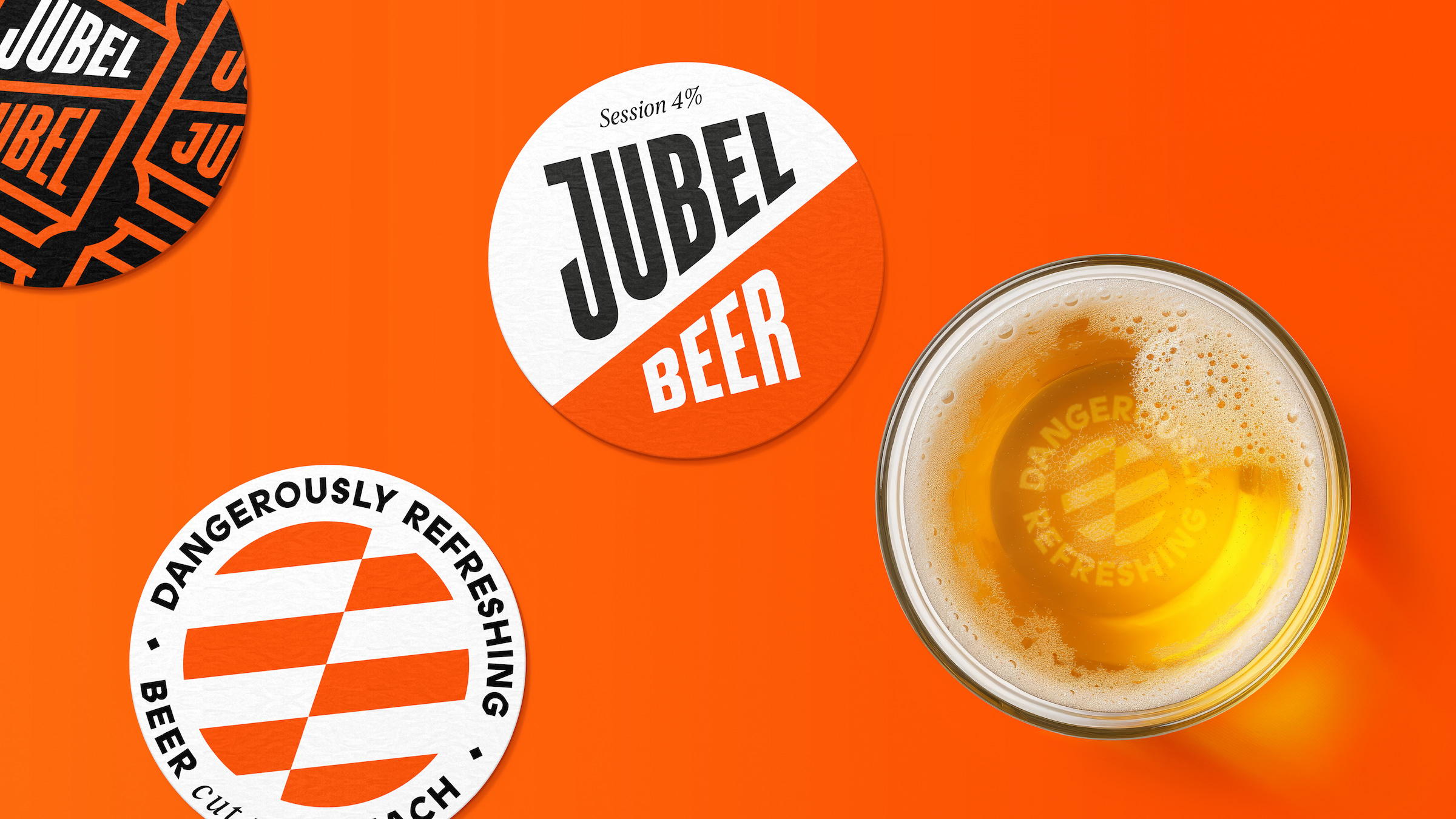
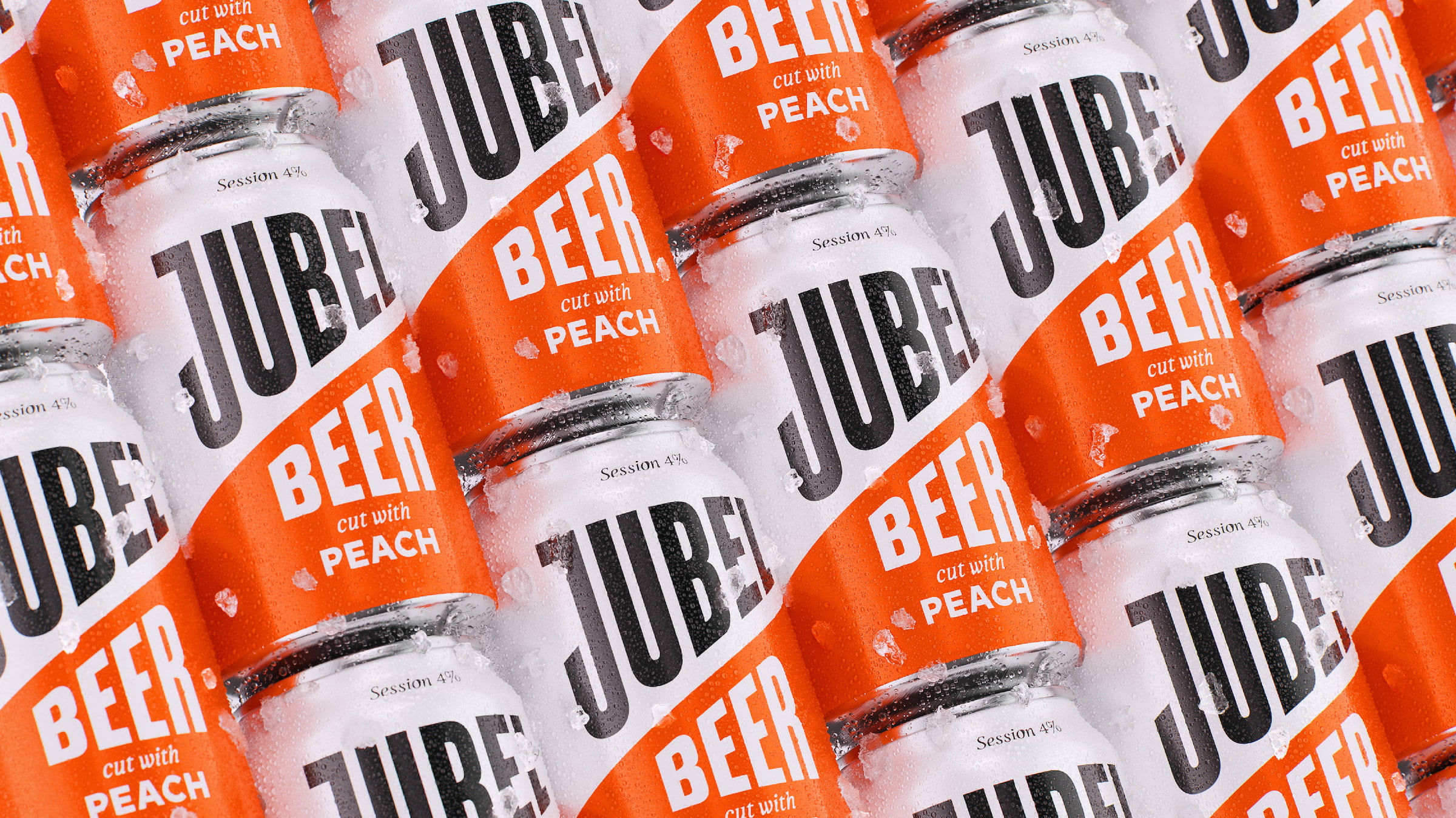
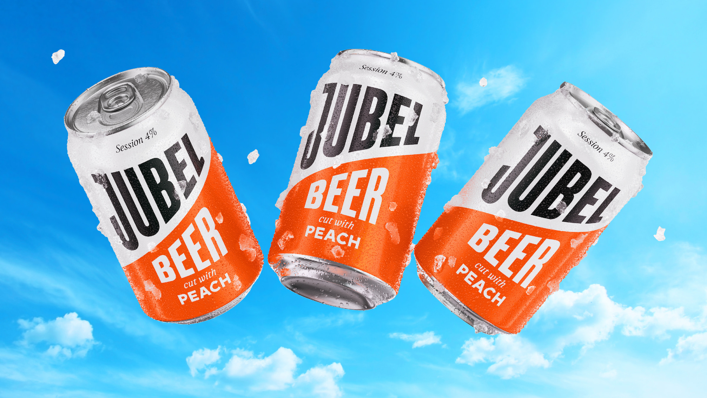
Earthling looked to move an explicit expression of ‘Dangerously Refreshing’ by subverting the language of danger, subtly drawing on the codes of hazard and warning signs. This started with elevating the role of the cut, JUBEL’s most distinctive asset. A diagonal cut that makes the viewer subliminally stop and take notice when paired with the impactful palette of orange, white and black. Typography choices bought a mix of freshness and dynamism, importantly underpinned by touches of craft, to talk to liquid quality. This paired with a simple illustration style and chevron pattern, created a flexible kit of parts to inform packaging, website, social, merchandise, pop-up activations, on-trade collateral, campaign and more.
“Our focus was to deliver the most dangerously refreshing expression of JUBEL possible, crafting every single brand asset and creating new ones where required. We rebuilt the brand world from the ground up, delivering a flexible identity that can show up to any occasion (on trade, off trade & activations) but also deliver a consistent expression for JUBEL. The packaging focused on creating the most iconic version of the brand in the hand possible, clearing away the clutter and sharpening up the assets to create the best version of the brand people know and love, that would be instantly recognizable from a distance.” – Stephen McDavid, Creative Partner, Earthling Studio.
From the Founder
Jesse Wilson, JUBEL Founder comments – “We’ve always had very positive feedback about our packaging, which was designed to cut through the clutter in craft, but I felt our brand identity never flexed beyond the can and lacked a distinctive brand world. Earthling have leaned into “the cut” and created a beautiful kit of parts for us to be able to maintain our distinctiveness, whilst also building flexibility into our brand. This comes at a critical time as we are tripling our investment in festivals this summer and are growing at triple-digits in both the on-trade and off-trade, so it’s time for our brand to ‘grow up’ and start looking like a brand that belongs on the national level.”
CREDIT
- Agency/Creative: Earthling Studio
- Article Title: With the Help of Earthling Studio Jubel Drops Dangerously Refreshing Rebrand that’s a Cut Above
- Organisation/Entity: Agency
- Project Type: Packaging
- Project Status: Published
- Agency/Creative Country: United Kingdom
- Agency/Creative City: London
- Market Region: Europe
- Project Deliverables: 3D Design, Art Direction, Brand Design, Brand Identity, Brand Redesign, Brand Strategy, Branding, CGI, Logo Design, Packaging Design, Packaging Guidelines, Typography
- Format: Can
- Industry: Food/Beverage
- Keywords: JUBEL, Brand Identity, Brand Redesign, Typography, Animation, 3D, CGI, Packaging
-
Credits:
Creative Partner: Stephen McDavid
Managing Partner: Tom Bruce
Senior Designer: Tom Mitchell
Designer: Zita Nagy
Typographer: Rob Clarke


