


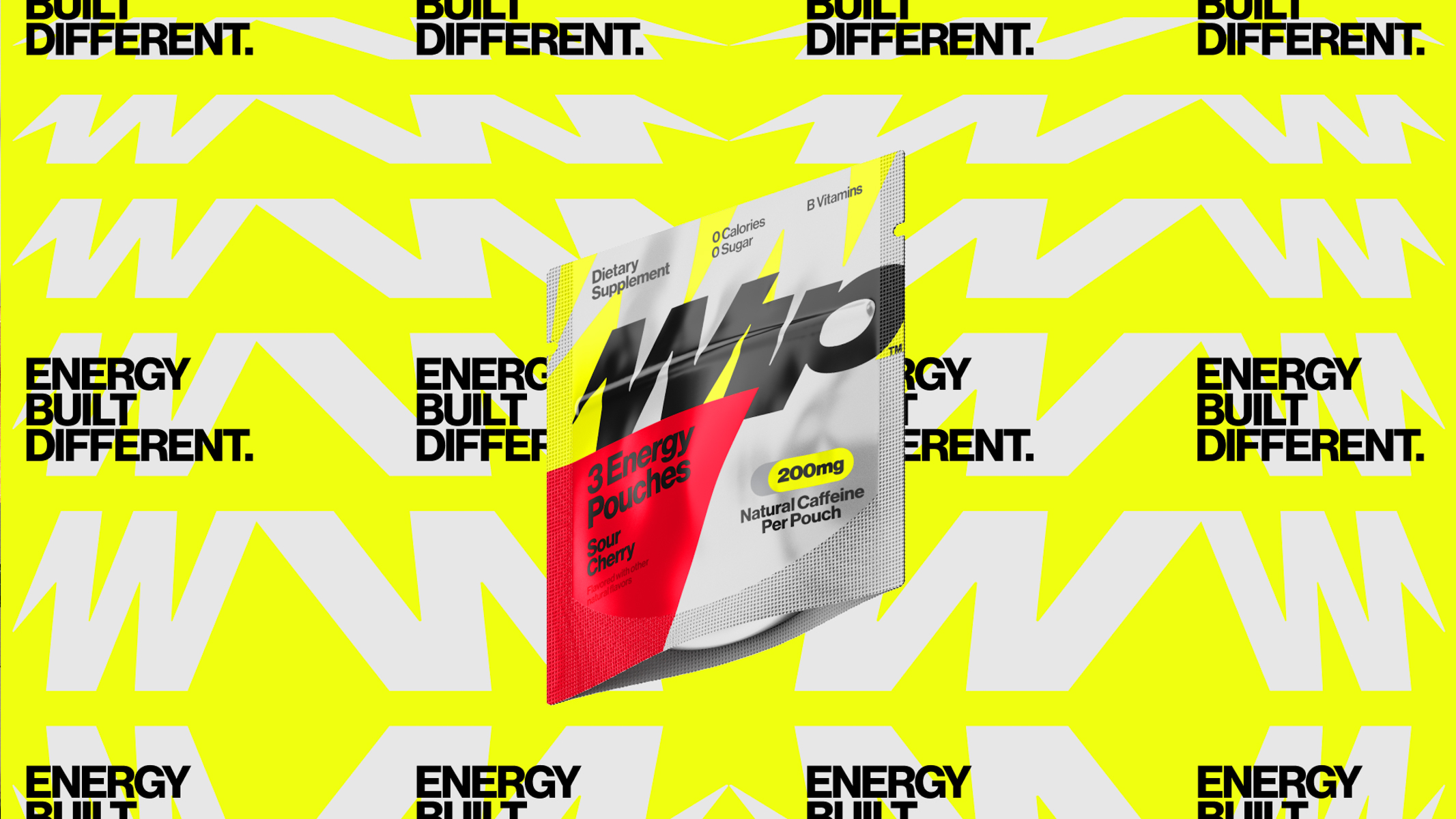
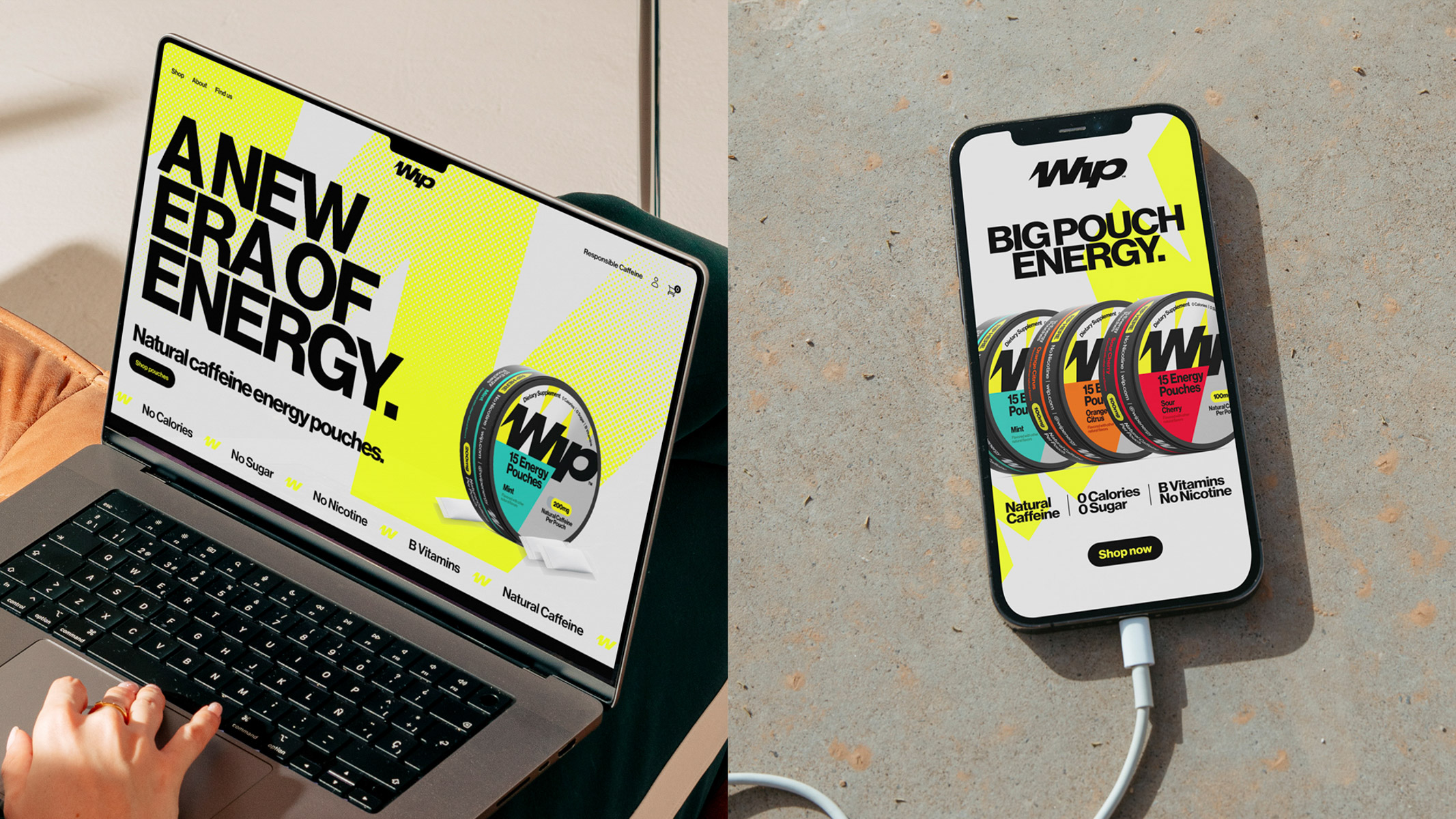
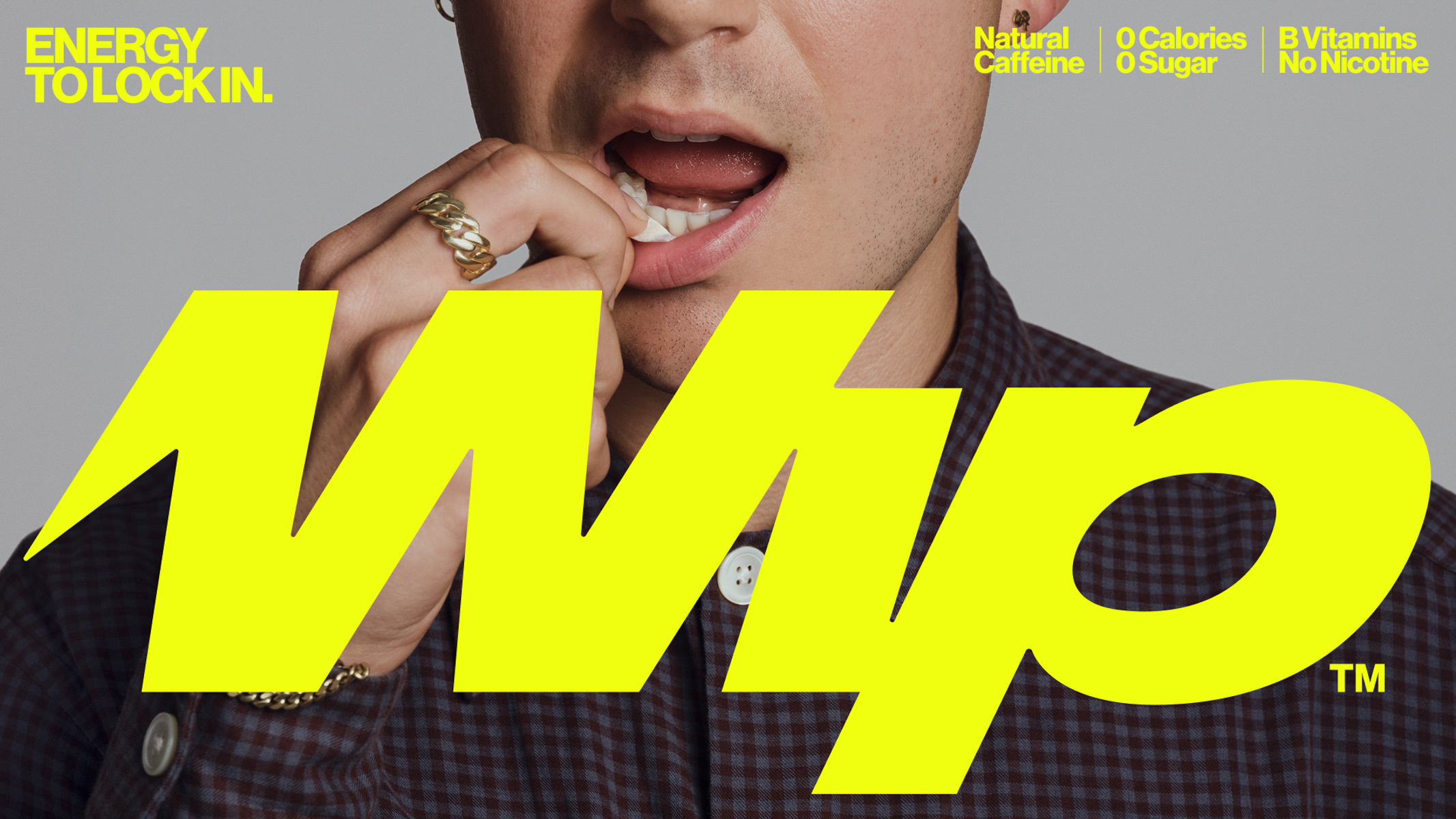
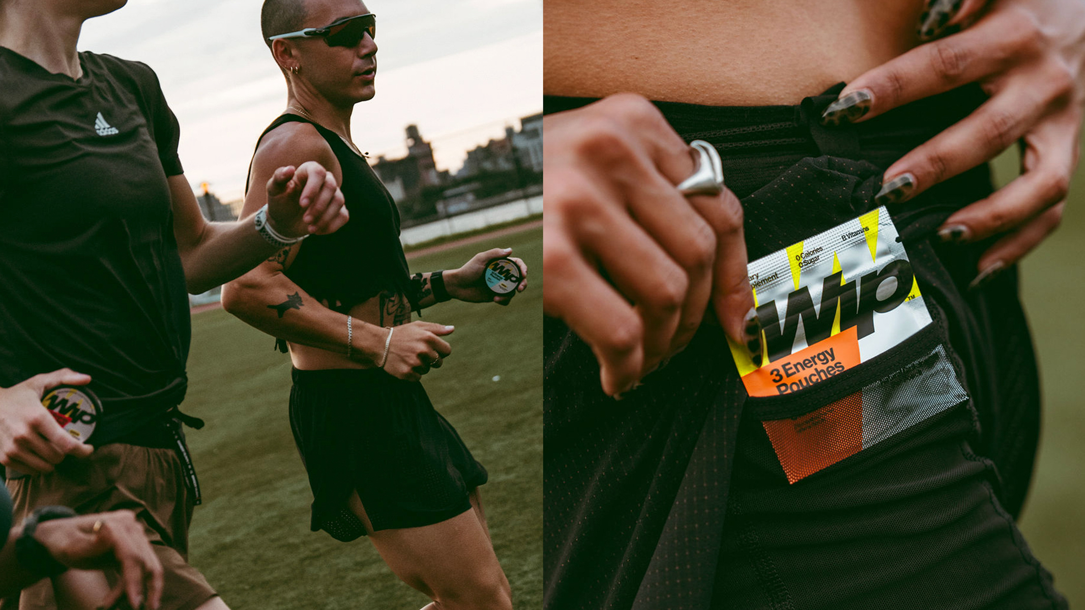
Wip is a modern energy brand rethinking how energy fits into everyday life. Designed for moments of movement, focus, and performance, Wip delivers clean, portable energy through zero-sugar caffeine pouches that offer a fast, intuitive alternative to traditional energy drinks. Built for people who want energy without interruption, Wip meets consumers exactly where they are, whether on the move, mid-workout, or pushing through their busy day.
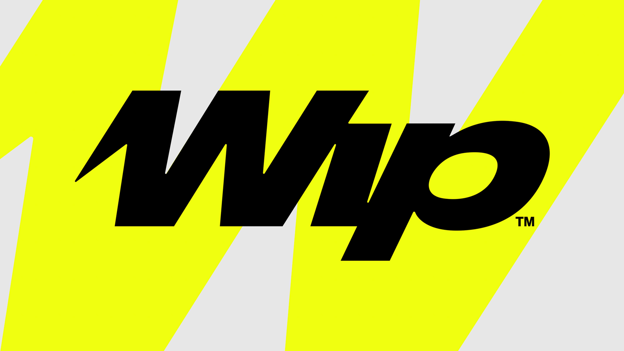
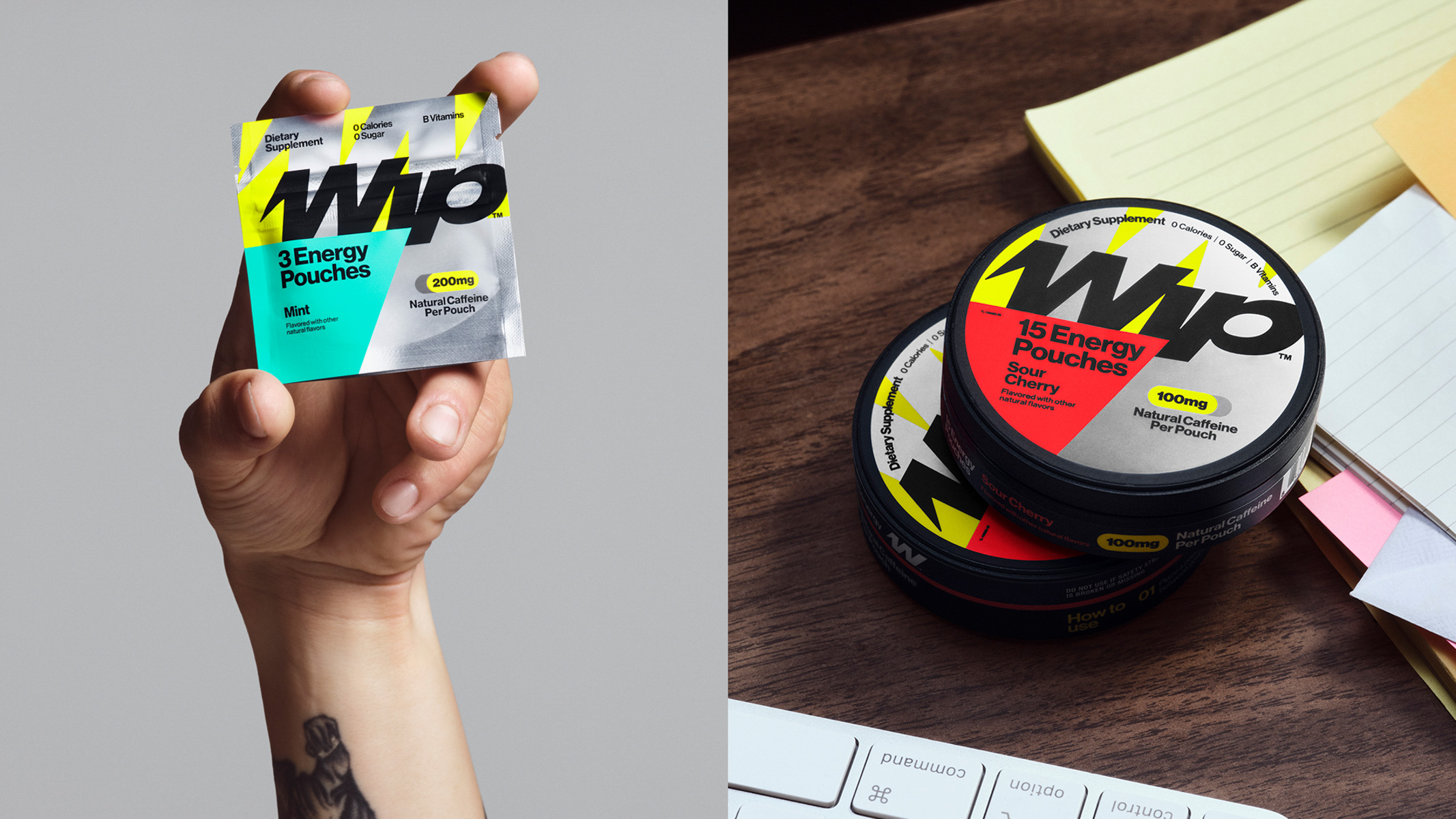
George partnered with Wip (formerly LF*GO!) to create a high-velocity energy brand built to scale as fast as its product. The project encompassed naming, brand strategy, identity design, packaging design and mechanicals, prototyping, and print production. The name Wip reflects energy in motion, progress, and playfulness; concepts that shaped the brand’s visual language. The Wip wordmark visualizes dynamic forward movement inspired by a whip, fused solid and sharp to embody badge-like strength. Metallic elements add a premium finish and strong shelf impact, while the bold system extends beyond retail, creating packaging consumers are excited to take out of their pocket and place on the table.
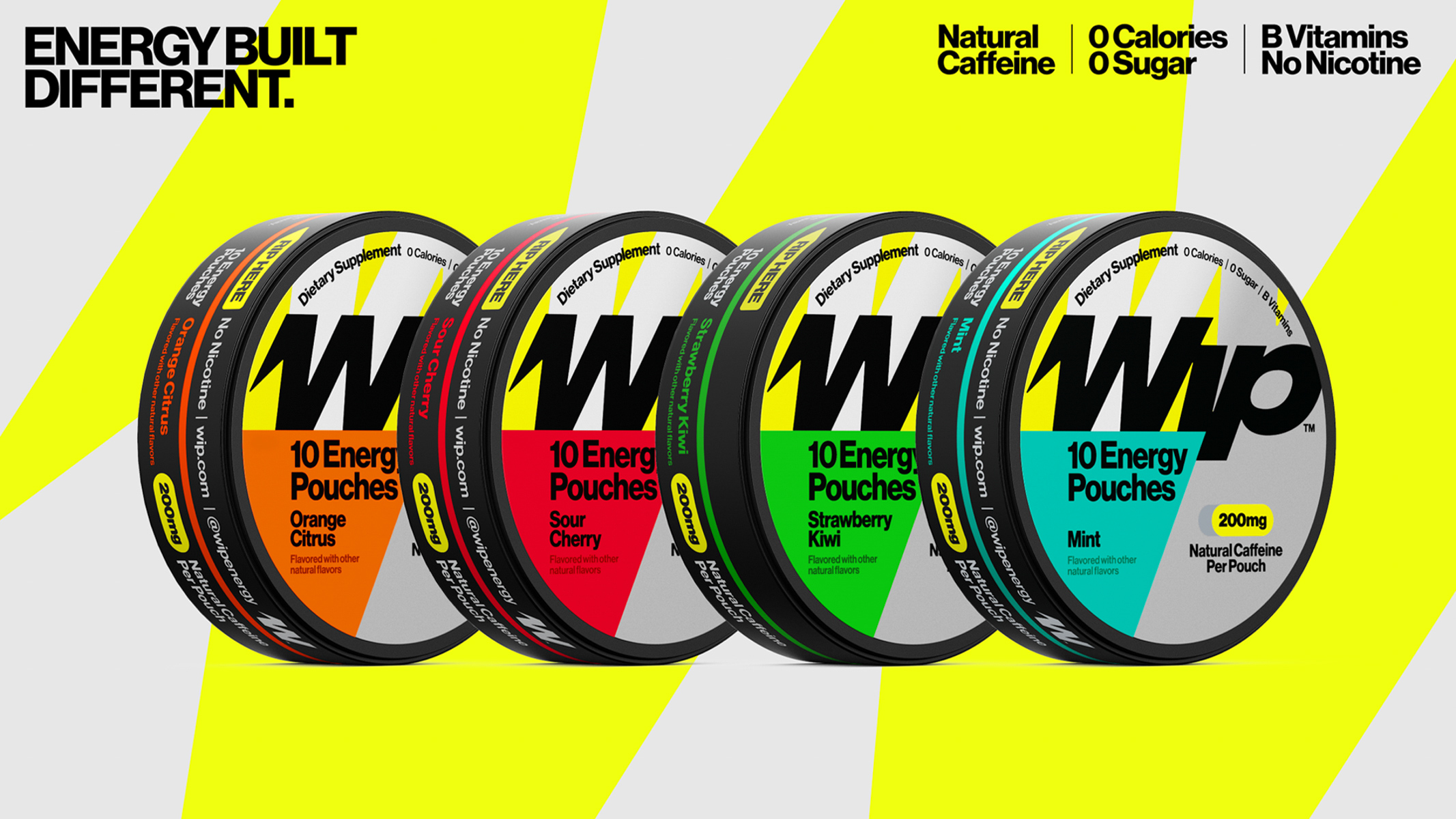
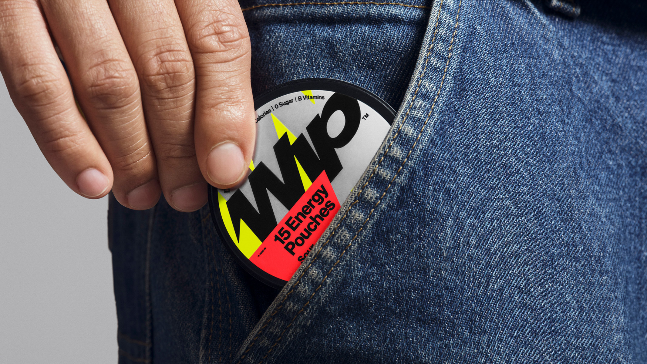
The packaging system launched across multiple strengths and flavors, anchored by a high-voltage yellow and balanced with neutral flavor cues for instant recognition and scalability. For a product focused on energy and clarity, a clear and bold visual hierarchy ensures fast and intuitive navigation in high-velocity retail environments. At the shelf, consumers can immediately identify their preferred flavor and grab confirm and go. Compact and tactile, the pocket-sized format taps into familiar pouch rituals, reimagined for a more intentional, health-forward energy experience.
The brand balances big personality with legibility, the system flexes seamlessly across cans, pouches, retail, and digital touchpoints. Within six weeks of launch, Wip earned Amazon’s Choice, became the #1 energy pouch in America, and ranked top 10 in the energy category at leading convenience outlets. Wip demonstrates how integrated branding and packaging design can transform a functional product into a distinctive, scalable brand with immediate shelf impact and long-term growth potential.

CREDIT
- Agency/Creative: George
- Article Title: Wip – A Modern Energy Brand Rethinking How Energy Fits Into Everyday Life
- Organisation/Entity: Agency
- Project Type: Identity
- Project Status: Published
- Agency/Creative Country: United States
- Agency/Creative City: New York
- Market Region: North America
- Project Deliverables: Brand Creation, Brand Design, Brand Guidelines, Brand Identity, Brand Naming, Brand Tone of Voice, Copywriting, Packaging Design, Web Design
- Industry: Food/Beverage
- Keywords: Brand, Brand Identity, Brand Naming, Packaging, Founder-Led Brand, CPG, FMCG
-
Credits:
Co-Founder & Creative Director: Dave Clark
Co-Founder & Creative Director: Andrew Guirguis
Brand Designer: Dominic Liu
Brand Designer: Max Olson
Brand Designer: Greer Mosher
Brand Designer: Rhea Alberastine
Packaging Designer: Esther Mun
Illustrator: Nate Cepis
Writer: Erin Miller
Account Director: Ashley Brandt
Account Director: Jasmin Shim
Photographer: Corey Olsen
3D Artist: Tyler Anderson
Business Dev & Marketing: Amory Wooden


