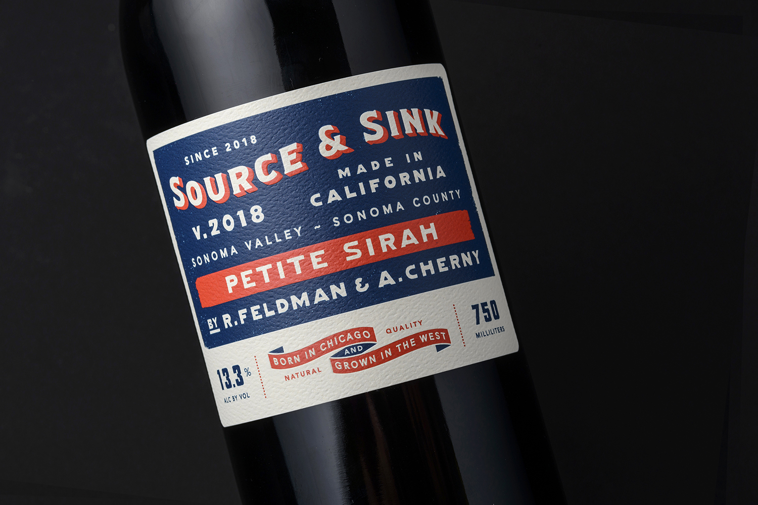
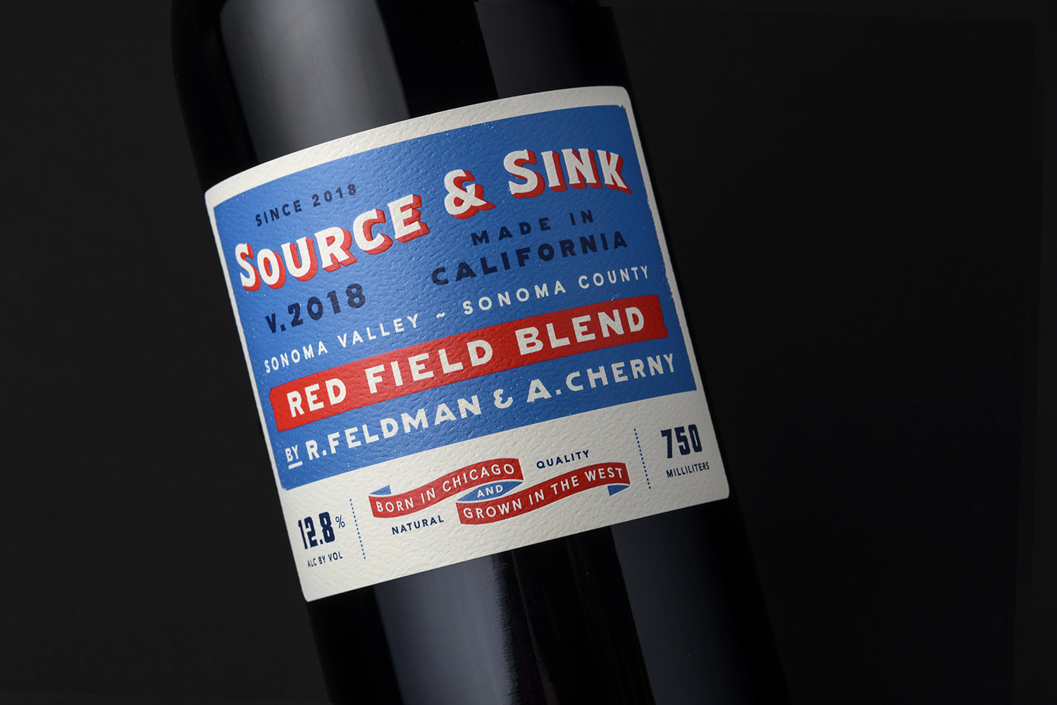
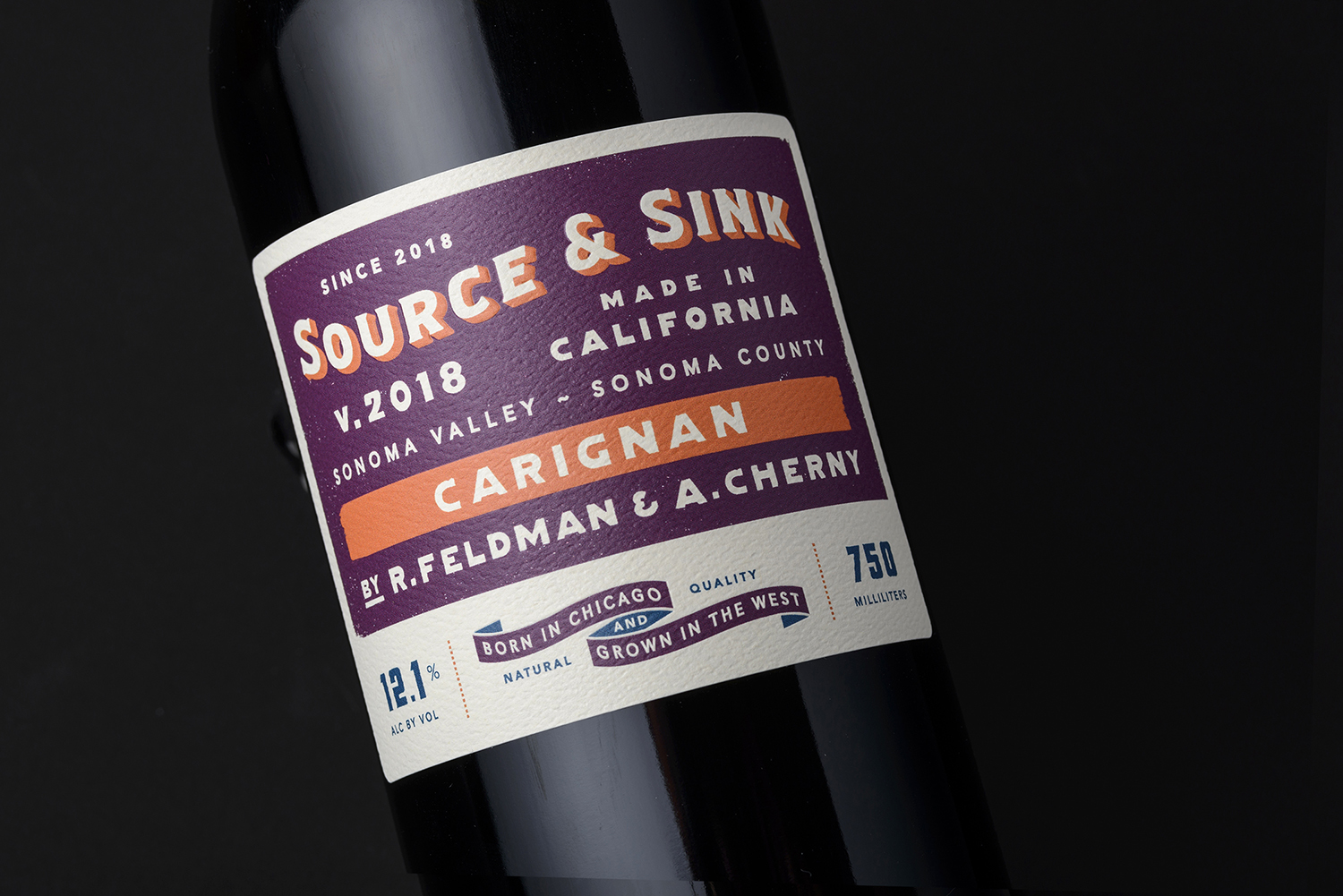
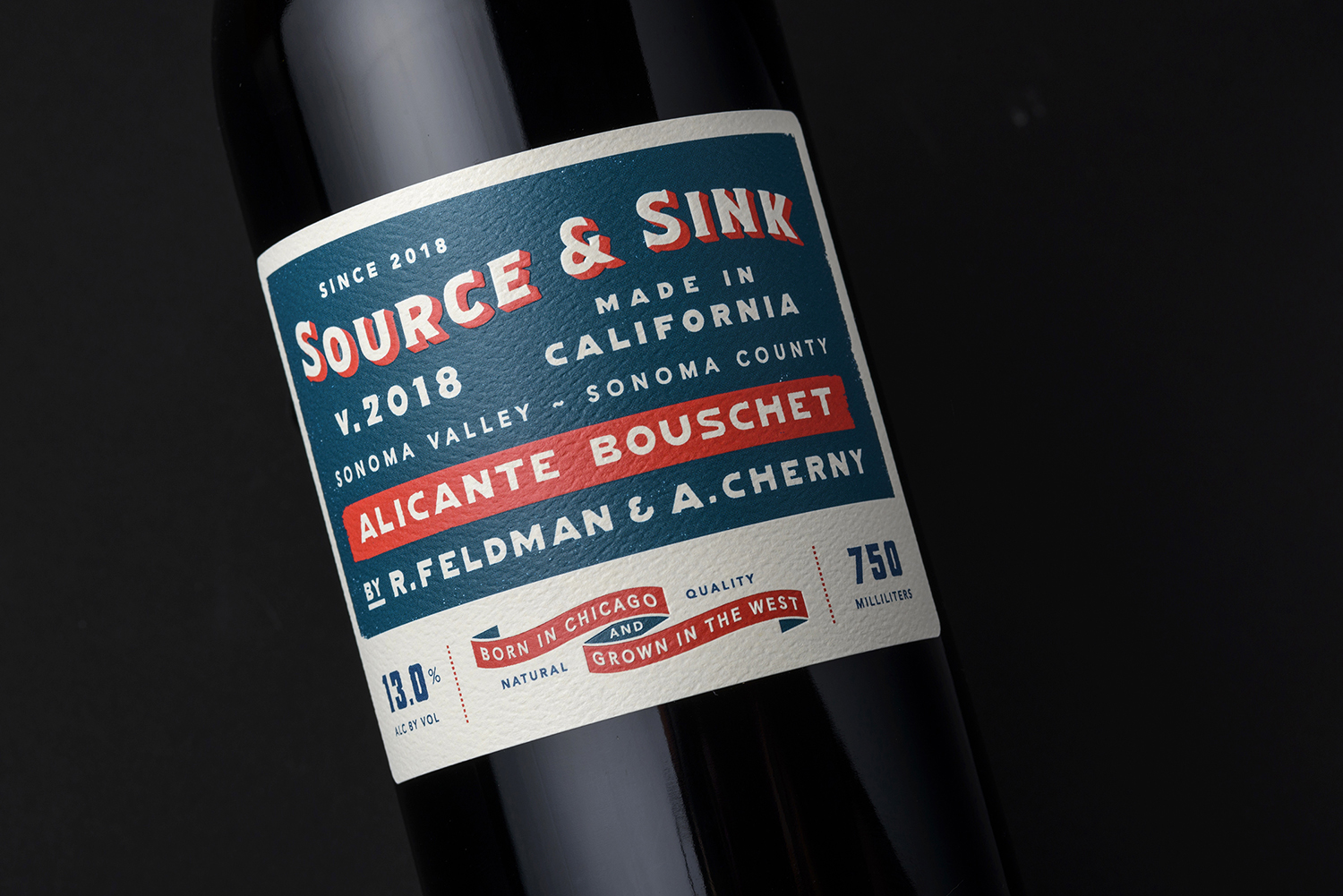
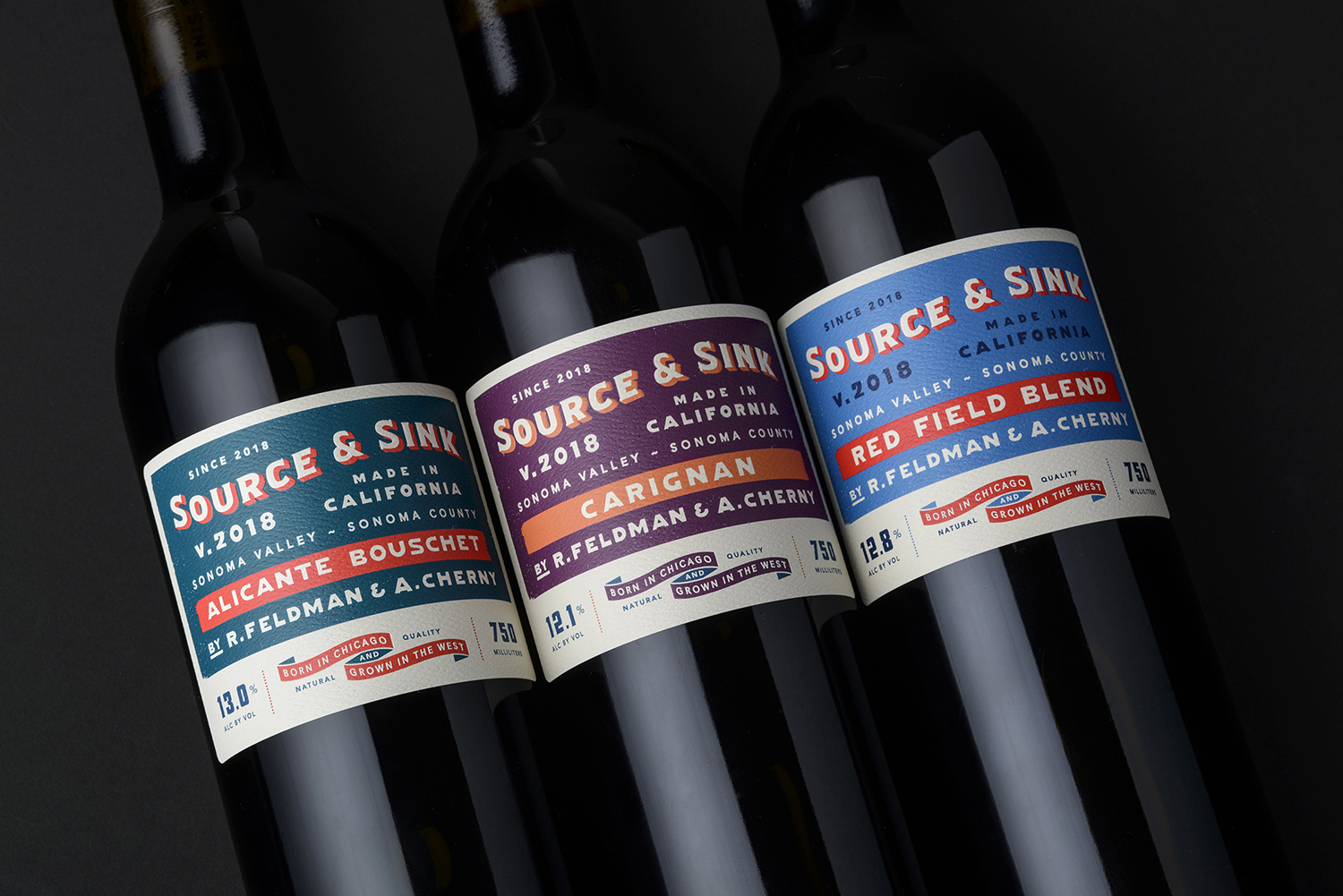
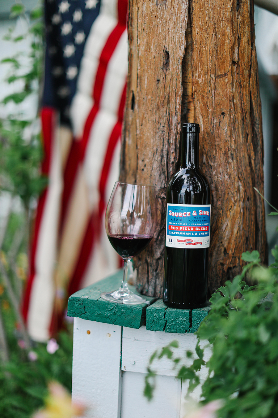
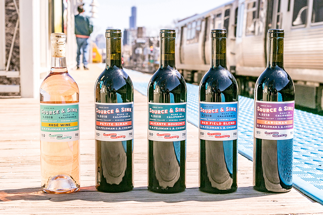
Blending iconic Chicago color schemes with vintage California fruit crate packaging, Napa, California based Gatto Design created a type-focused label system, yielding vivid color-ways and dynamic typography for the Source & Sink wine brand.
Source & Sink founders, Rande Feldman and Aaron Cherny, headed west after growing up in the Windy City and met serendipitously during the 2017 Sonoma grape harvest. Their desire was to develop a new brand to bring their love of Sonoma wines back to their hometown of Chicago.
Charged with creating a unique image and voice for the Sonoma Valley-based wine brand, Gatto Design wanted to produce an easily recognizable label that would resonate with wine drinkers everywhere. The design had to reflect Source & Sink’s farming-focused style of winemaking and communicate the product’s quality.
The result is a memorable label conveying the spirit of Source & Sink’s independent and progressive brand.


CREDIT
- Agency/Creative: Gatto Design
- Article Title: Wines by Source and Sink Get Back to Farming Roots
- Organisation/Entity: Agency, Published Commercial Design
- Project Type: Identity
- Agency/Creative Country: United States
- Market Region: North America
- Project Deliverables: Brand Identity, Brand Strategy, Branding, Graphic Design, Identity System, Packaging Design
- Industry: Food/Beverage
- Keywords: Wine, Packaging, Colorways, Chicago, Sonoma


