The Project
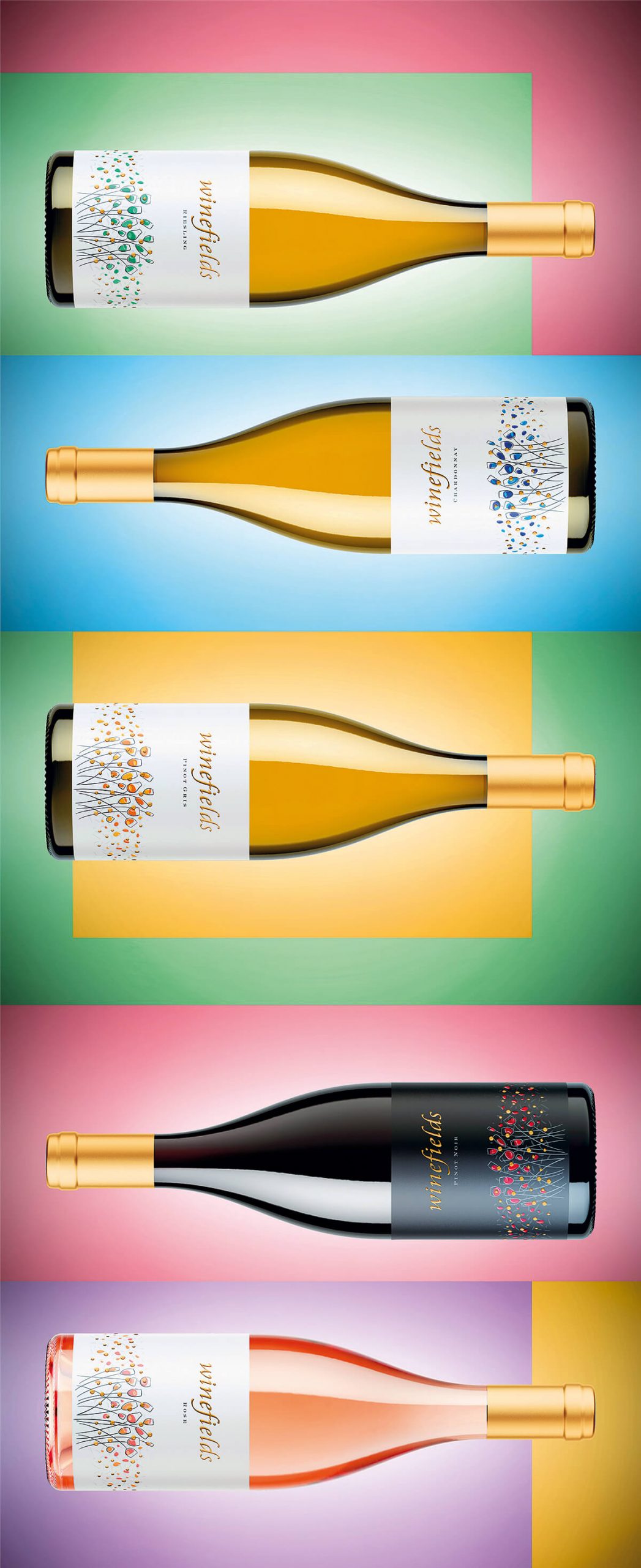
Winefields is an emotional and romantic wine brand that I created for Chateau Sungurlare. The inspiration for the whole project came from a single painting made by my daughter Boryana when she was only 8. It was so colorful, naive and charming that I decided to use its idea for this new wine range.
The Challenge
Brand creation is always very interesting, difficult and challenging project. The good thing is that you start from the scratch and you have countless options and ideas to work on.
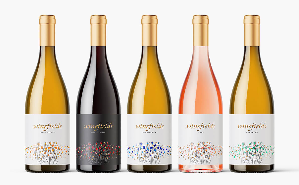
When I started this project I created two more other brands and designs for them but Winefields really stood out. I used my daughter painting because I was deeply impressed how colorful and live it was yet I found it very bold and meaningful though it came out from the hands of 8-years-old kid. I grabbed these color flower spots and transformed them into wine glass blossoms. Then I decided to use different color scheme for each of the wines in the range and this is how I finally got 5 different labels.
The Execution
Bottle – I was looking for classy burgundy bottle. Like many other times I picked one of my favorite Saverglass bottle, the Agape. This bottle is so nice and classy that it often gives answer to all my design questions and needs.
Sealing – We used classic cork sealing with tin capsules all printed in light gold color with embossed Chateau Sungurlare logo on the top.
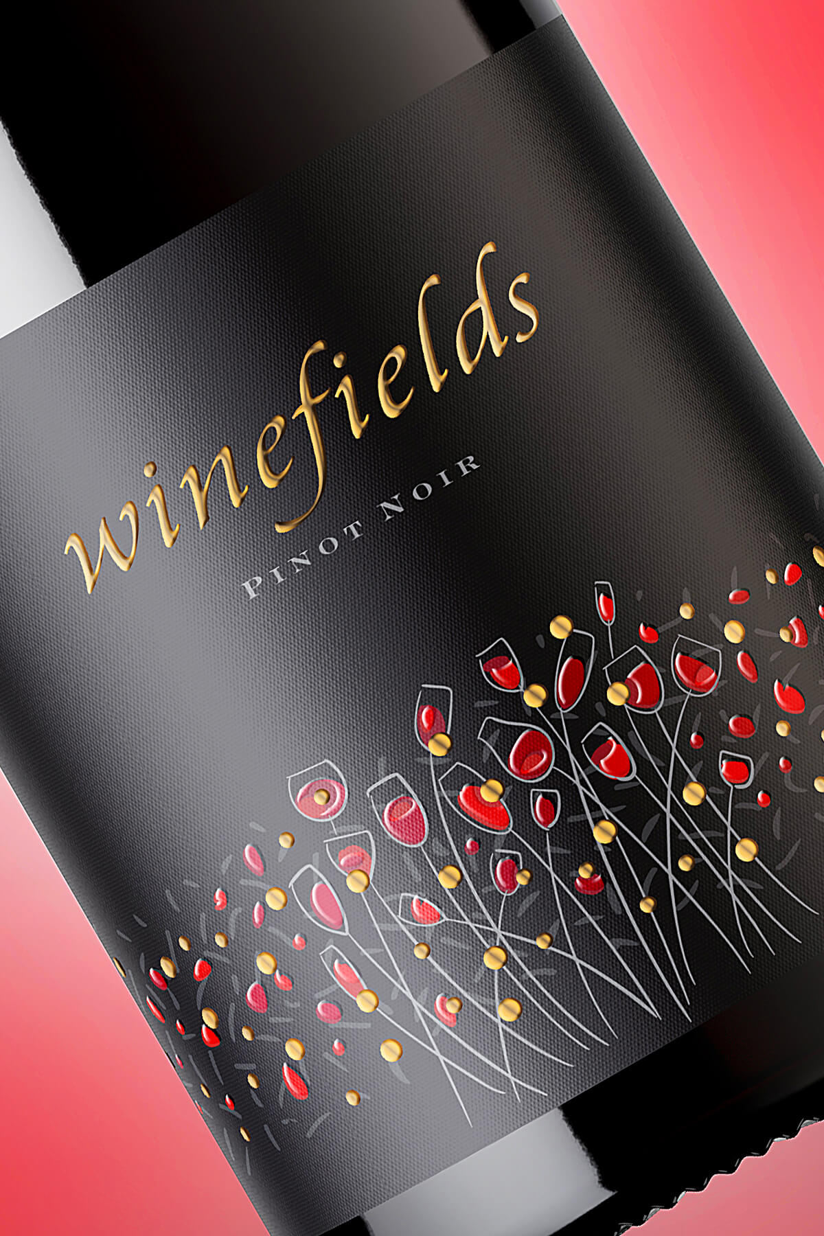
Paper – Winefields needed special paper to enhance the emotions in this new wine brand. I picked Jade Raster paper by Arconvert because I found it as best canvas for my artwork.
Print – I love to play with print extras and this project made no exception. I designed this label with clear idea that I would use both gold silk foil and transparent raised varnish. I combined these two processes in one image because I want to make it very attractive and irresistible to the audience.
The Result
Winefields started from an inspiration of my daughter’s painting and I did my best to preserve her colorful charming message in this new label design. I was aiming to create easy-to-remember meaningful brand with romantic compelling wine label design. The wines are very classy and elegant and I believe that my brand concept and label design somehow a true reflection of their character to the wine connoisseurs.


CREDIT
- Agency/Creative: the Labelmaker
- Article Title: Winefields – A Romantic Brand Concept for A New Wine Range
- Organisation/Entity: Agency, Published Commercial Design
- Project Type: Packaging
- Agency/Creative Country: United States
- Market Region: Global
- Project Deliverables: Brand Architecture, Brand Creation, Brand Identity, Brand Naming, Brand Strategy, Brand World, Branding, Graphic Design, Illustration, Packaging Design, Retail Brand Design
- Format: Bottle
- Substrate: Glass Bottle


